

Amnesty International: Designing the Experience

In the previous blog post about the product we built for Amnesty International, we explored the problem we tried to resolve, the assumptions we made, and the uncertainties we identified.
Now, how do we imagine a solution?
To go from vision to solution, we had the help of two UX and UI specialists, Nadège and Cécile. We chose to focus on what seemed the most important point of our product: make users participate in one urgent action.
Knowing Your Users: Personas and User Journeys
We believe in User-Centered Design (UCD): A good product should stick to the user habits, not force users to take new habits. That implies a deep and precise knowledge of users. The easiest - yet not broadly used - way to get to know people is to talk to them. Nadège ran many interviews, on-site and by phone, to understand who our users were.
Since we can't build a product that fits everyone, Nadège grouped users into a handful of fictive personas, based on what she discovered during the interviews. She summarized the characteristics of each persona into a one-page document, easy to scan and refer to.

In addition to understanding who the users are, the design and development teams also need to know what users want to do, and how they feel. Nadège summarized her learning from the interviews into user journeys using the same generalization principles.

User journeys help identify pain points, imagine quick wins, and know which part of the journey should be crafted with particular care. We should focus on the part that upsets the users the most, to solve an actual problem they have.
During the course of the project, the persona and user journey posters were constantly visible to the entire team. It's important to always remember who and what you're working for. It helps making quick decisions in the interest of the user, instead of using opinions or personal preferences.
Once we know our users, their problems and their expectations, we can start designing the experience of the product.
Designing The Experience
Our design process starts with some benchmarking: Is there any app or website providing a similar service? If so, are there some good ideas we can get inspiration from, or issues in the user experience we should avoid?

Starting with benchmarking is often counterintuitive for new product analysts. We've noticed that it's a great accelerator, as existing products have already solved some of the problems our users have. We should take advantage of their learnings. Also, designing an original user experience is the best way to lose most users, as they spend most of their time on other sites, and prefer that our application works the same way as all the other sites they already know (that's Jakob's law).

The second step of our design process is to imagine all the possible features a product could have to help users achieve their goal. This happens during a creative workshop akin to requirement discovery. We usually consume a lot of post-its during these sessions, and they can use many animation methods. But the result is always the same: a long, unordered list of features with short labels like "receive a notification for new actions". We don't spend too much time on formatting that list, because immediately after the creative phase comes the pruning phase, during which we remove as many features as possible by answering the simple question: if we had only two weeks to build the product, which features should it absolutely have?
Then, we put them on a timeline to visualize what part of the process they're supposed to serve.

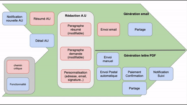
The full journey we designed goes as follows:
- the user receives a notification
- it opens the app: a mobile web app actually so that users don't need to install anything to take immediate action
- they slide through a few screens explaining the urgent action concisely
- they choose between an email or a physical letter
- they review and send the mail or the letter
- we thank them for their action
We believe these documents help to align everyone on a shared vision. They help making choices and focusing on what's important.
From Features to The Screen
Based on the list of features, we draw rough mockups to help identify visually what should appear on the screens and at which level of importance. That's the moment usability kicks in: we put ourselves in the user's shoes, minimize friction, maximize attraction, and use what we learned from other successful designs.
That's also an iterative process, because thinking about every possible use case in a single workshop is hard.
As much as possible, we draw one version of a mockup per feature. That means that we may draw a single screen several times, at several stages of the realization process. That's more work, but it gives us a view of the state of the application at any moment during development, so we make sure that the application is always in a usable state. Sometimes, adding a single feature "breaks" the application - and we need an additional feature to make it work again. That's the sign that some features need regrouping. Being able to deploy a single feature at any time is key to the agile process - otherwise we'd delay the user feedback and increase the danger of wasting our time in useless features. The journey we designed seems simple but actually contains many features!
From there, and with a few round-trips with the creative and marketing teams, we can build a more realistic prototype. It has two purposes: testing that the most important features still work when put together, and communicating progress with the stakeholders.

Some prototyping tools go as far as implementing navigation and come very handy when sharing the vision with stakeholders or running user tests even before writing the first line of code.
Conclusion
We don't spend too much time ironing out the prototypes. We know it's just a first step - real users will challenge our assumptions as soon as they put their hands on the app.
That means that all these documents are not written in stone. They're just a snapshot of where we want to go, at one point in time. Over time, we'll get more insights from users, when running tests sessions, or with a real production usage. We'll update the user journey, mockups and prototypes, until the running application becomes the living documentation.
Design documents take time to update, and in the early days of development, we change many, many things in a short amount of time. But that's another story, which we'll share in another post in this series.
