
Building Sophisticated WebApps For Mobile: A Bumpy Ride

For the past couple weeks, we’ve been working on a prototype mobile WebApp built in HTML5 and d3.js. The purpose was to test the performance of d3.js on mobile browsers, and the capacity of HTML5 to build touch-enabled interfaces as good as in native apps.
This has been a surprisingly hard journey, and we’ve learned a lot in the process. Read on for a detailed tale of our adventures in mobile JavaScript land.
Application Purpose
Visualizing lots of data on small screens is challenging. The d3.js library is pretty good at building data visualizations, but how does it behave on mobile?
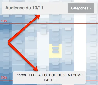
We chose TV audience as experimentation field. With complex program grids, with ads every now an then complicating the layout, many channels, many population categories, minute-by-minute audience data, all that across several days, it’s complex enough to require smart visualizations.
We tried to focus on a few use cases brought up by TV audience data analysts, such as comparing the audience of all channels at a given time, comparing the audience of a TV program with the programs before and after it, detecting not significant audiences quickly to move the focus elsewhere, and comparing audience day-by-day.
Sketching the principles of the visualization didn’t take long, implementing a proof of concept with d3.js didn’t take much longer. But between the initial proof-of-concept and the finally usable prototype demonstrated below, boy did it take us a long time!
The complete code is open-source, and available on GitHub: check out marmelab/MobileAudience
.Vimeo might track you and we would rather have your consent before loading this video.
Bootstrapping a Mobile Webapp
To get up and running in no time, we chose to use a mobile prototyping HTML5 framework called Ratchet . While Ratchet provides basic building blocks for mobile interfaces (iOS-looking buttons, menu bars, callouts, sliders), using it for a slightly sophisticated UI quickly showed its limits.
Ratchet has lots of little annoying bugs, and fixing them wasn’t trivial. One example: Ratchet associates the swipe gesture with sliding screens, even when the content is zoomed. In practice, this disables the pan gesture when zoomed, which is unfortunate to say the least. Furthermore, getting one of our fixes merged into the master branch proved unsuccessful. Relying on an unsupported framework is a good way to get stuck, so we chose to switch to another framework in the middle of the project.
jQTouch, SenchaTouch, Titanium, all these frameworks have a steep learning curve. Instead of diving into their documentation for days, we installed Bootstrap3 and jQuery2, which are both mobile-first frameworks. They easily fulfilled the basic requirements (layouts, interface components). Zepto would have been a good alternative to jQuery, except Bootstrap3 doesn’t support it (yet).
To detect more elaborate gestures (swipe, ping), we added Hammer.js (“You can touch this”) to the mix, and we were ready to roll.
D3.js on Mobile Browsers
D3.js is a wonderful tool for data visualization - this can’t be repeated enough. We developed a custom chart on a desktop browser in a few hours, made it fluid to adapt to smaller screen sizes in a few minutes, and then started the tests on actual mobile devices.
At first, we didn’t notice a longer time to render the chart. However, as soon as a user scrolled or zoomed in, the mobile browser would painfully redraw the chart block by block, making it flicker and freeze the app from time to time. The redraw could take up to 3 seconds in some cases. This wasn’t a good user experience at all.
It turns out that the culprit wasn’t d3.js, but SVG. SVG is the default way to draw charts with d3, but mobile browsers don’t handle it very well. Fortunately, the audience chart that we wanted to draw was mostly composed of rectangles, so switching from SVG to plain old HTML was possible. The only drawback was abandoning subpixel rendering, which was acceptable for our use cases.
Did I say that d3.js is a wonderful tool? Switching from SVG to HTML was
extremely simple. Instead of appending <rect> tags to an
SVG container, the chart adds <div> tags to a
<div> container. Also, CSS styling works a lot better on
HTML elements than on SVG elements. So it didn’t take long to remove all SVG
tags from the chart. Then came the mobile browser test: no more flickering, no
more painful redraw, the user experience was completely fluid. Hurray for d3!
// Initialize scales, domains, etc.
// Display the tiles for each showvar tile = chartContainer.selectAll(".tile").data(data);
// enter tilestile  .enter()  .append("div")  .style("position", "absolute")  .style("top", function (d) {    return y(d.start) + "px";  })  .style("left", function (d) {    return x(d.channel) + "px";  })  .style("width", x.rangeBand())  .style("height", function (d) {    return d.duration * yScale + "px";  });
// update tilestile.style("background-color", function (d) {  return z(d.audience);});
// exit tilestile.exit().remove();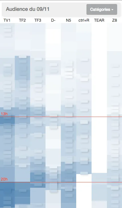
Clicks and Waits
Our TV audience chart provides a simple interaction for each TV show: click on a TV show rectangle once, the rectangle gets highlighted, and a tooltip shows up with the TV show name. Click on a highlighted rectangle, and it displays a callout with audience details about the TV show.
The problem was that clicks on mobile browsers weren’t very responsive. Between the actual screen tap and the rectangle highlight, a few hundred milliseconds passed, and that made the interface look less robust. Users testing the prototype would click or drag carefully, feeling that the whole think was kind of clunky.
Was hammer.js interfering with click detection by trying to detect more elaborate gestures? Not at all. It’s just that mobile browsers add a 300ms delay to every click on a web page, in order to determine if the user is performing another gesture, like double-tap zooming. The fix, however, is now easy: Fastclick is a drop-in click accelerator by the technical team at The Financial Times, and it works perfectly. We added the library to the main page, initialized it, refreshed the page, and then all the clicks became instantaneous.
<script src="js/lib/fastclick.js"></script><script> FastClick.attach(document.body);</script>There is one side effect, though: when dragging on the screen, a click event is sent, which selects an element in the TV audience application. It’s just asmall bug in the Fastclick library, and it’s being fixed.
This library is a must if you take the mobile webapp way.
Fixed Elements vs Zoomable Areas
On to the most painful part. Native mobile applications often offer elaborate layouts, with independent panes offering their own scroll and zoom behavior. In a native app, you wouldn’t find it exotic to zoom on one part of the screen (for instance on a map), while another part of the screen (for instance a search input) would remain at the same place and scale. And why should it be hard to do the same things in HTML5? After all, iframes have been part of HTML for ages, and they contain their own independent viewport.
Not in mobile, no. Try pinching on an iframe - or even a frameset - on a mobile browser: the whole page zooms. There is simply no way to tell the browser to “detach” iframes from the rest of the page. Either you zoom everything, or you don’t zoom.
There could be a solution for scroll gestures with fixed elements. It is
possible to fix a div to the top of the screen with simple CSS (
position:fixed), and it is not affected by drag gestures anymore,
while the rest of the page properly scrolls. But, when you add zoom to the
mix, it fails. Zooming out on a page with fixed elements, the elements
reattach to the main page at some point and become unfixed. It’s extremely
clunky.
The TV audience chart needed to be zoomable AND to have a fixed navbar always at the same scale. How to achieve that on a mobile browser?
Reimplementing Zoom
One solution is to disable native zoom on the page (using the
viewport meta tag), to detect pinch movements on the zoomable
area (using hammer.js), and to apply a CSS scale transformation to zoom the
pinched area. It sounds complicated, but there seemed to be no better
solution, so we went that path, first manually, then using a third-party
library called iScroll that we found
later.
The result was very bad with the manual implementation, and pretty bad using iScroll. The zoom effect wasn’t fluid, the browser redrew the chart only every second or so, and the user experience dropped again. That’s probably because this solution only fits for pages with few elements.
The reason why iScroll does better than a naive CSS transform is that this library uses 3D CSS transformations, which are accelerated by the GPU. The side effect is that, when the user zooms, the text becomes aliased (iScroll zooms an image, not a web page). On simple pages, the improvement can be enough to choose iScroll. But on the TV audience application, with thousands of divs to redraw at the end of the pinch gesture, this wasn’t satisfactory.
Most webapps allowing scroll and zoom on independent areas use iScroll, and yet that solution didn’t provide good enough performance for our use cases. We had to find something else.
Back to Native Zoom
We decided to let the browser do the zooming of the chart, by reenabling the
user-scalable=yes parameter in the viewport meta
tag, and to focus on fixing the nav bar by hand, using JavaScript. Once again,
the CSS position:fixed solution does not the trick, because it
only works up to a certain scale level.
We started by detecting pinch gestures using hammer.js, in order to scale the nav bar by an inverse factor than the one used on the main screen. This had to be done at very small time intervals, to avoid flickering on the navbar if it was zoomed with the rest of the page, then dezoomed manually. But that slowed down the redraw on zoom too much, since we had to apply a CSS transformation to every animation frame to get a smooth result.
Finally, we ended up hiding the navigation bar when a drag or pinch gesture
was detected. Mobile Safari freezes the DOM when doing native zoom, so you
have to bind to the correct event (gesturestart). Not only does
it improve the animation, it also increases the chart surface when a user
navigates on it. Overall, this was a global improvement to the user
experience.
In order to detect the zoom factor, since every browser uses its own way of doing things, we used the DetectZoom library.
var fixedElement = $(".fixed");window.addEventListener( "gesturestart", function () { fixedElement.hide(); }, false,);window.addEventListener( "gestureend", function () { fixedElement.show(); }, false,);$(window) .hammer() .on("release", function () { var top = $(window).scrollTop(); var left = $(window).scrollLeft(); var zoom = window.detectZoom.zoom(); fixedElement .css("transform-origin", "left top") .css( "transform", "scale(" + 1 / zoom + ") translate(" + left * zoom + "px, " + top * zoom + "px)", ); });There was one last difficulty to deal with: scroll inertia. Mobile Safari
sends the gestureend event when the user removes the finger from
the screen, but on a scroll gesture, that doesn’t mean that the scroll is
finished. The solution: watch the scrollTop and
scrollLeft window properties every hundred millisecond after the
gestureend event, until they don’t change anymore. That’s the
real end of the scroll.
Last Tips And Tricks
Improving the user experience on touch-enabled devices proved to be an incremental job. It’s when you manipulate an interface with your own fingers, or when you see a user doing it wrong, that you understand how to make it better. While using the TV audience app, we fixed a few small bugs and added a few small features, and this “final polish” contributes a lot to the quality of the user experience.
Among the improvements, we added more details to the program grid when zoomed in. This materializes the idea of “digging down into the data” by zooming in. To achieve this effect, the small details (show title, borders between shows) are invisible by default. Then, when the zoom level reacheds a certain value, we made the small details appear. To avoid slowing down the zoom animation, the control of the zoom level is only achieved once the pinch gesture stops.
Instead of using d3 or jQuery to show or hide elements, we used the dynamic
CSS trick. Adding CSS rules to an empty <style> tag
performs a lot better than iterating on a large collection of elements to
change one property for each of them.
<style type="text/css" rel="stylesheet" media="screen" id="tile_style"></style><script> // .. fixedElement.on("zoomEnd", function (e) { var scale = e.detail.scale; var isZoomedIn = getViewport()[0] < 180; var tileStyle = document.getElementById("tile_style"); if (isZoomedIn) { tileStyle.innerHTML = ".programName { display: block; } .tile:not(.ad) { outline: solid white 1px; }"; } else { tileStyle.innerHTML = ".programName { display: none; } .tile:not(.ad) { outline: none; }"; } });</script>Another notable improvement was to disable the carousel slider when zoomed. Otherwise, any “slide” gesture detected would slide to another day of data, instead of moving the zoomed area.
The prototype still has issues with SVG for the minute-by-minute chart when zoomed: the redraw is extremely slow. This minute-by minute chart could also be redone in pure HTML instead of using SVG, but since it’s a line chart, it’s harder to do. Lastly, the prototype only works on iOS for now - no Android compatibility
Conclusion
Native development for mobile devices is expensive, “You’d better go HTML5”, they say. We’ve tried the HTML5 path on a graphically intensive web application, and our conclusion is more nuanced. HTML5 can help to get up and running pretty fast, but the tweaking phase is extremely long and painful.
If you find the prototype appealing, you can contact marmelab to build something as fancy for you…
Authors
Full-stack web developer at marmelab, can learn any new language in about two hours. For real.