ArcheoloGit: Visualize Code Age and Dev Activity

The Problem: Preventing Bad Code From Hitting You
A few weeks ago, just before a demo, my staging environment suddenly went down. After digging deep into the code, I found the culprit in a file that had not been modified in the past 5 months. The bug appeared because of an untested edge case that was triggered by code committed the day before.
So the bug had been lying there all along, lurking in the shadows. I remember when this code was merged: we all agreed that it was low quality. But the feature had to be delivered, so we merged the code, and added a refactoring chore to the backlog. Then we forgot to prioritize it. Did something similar ever happen to you?
How can we keep track of this kind of risk in a huge codebase? How many other time bombs like this one are buried in the code? And if you start working on an existing project, how can you be aware of the time bombs planted by others?
Identifying “Dangerous” Code Ahead
Last week at marmelab, I had a some time to spend on side projects. I think it’s the funniest part of our job! But that’s also a big responsibility: as Agile developers, we must come up with new ideas, and use all our skills to make each project a success. I tried to find a way to prevent some of this potentially dangerous code from hitting me in the future.
But what defines “dangerous” code?
A file that has not been updated for a very long time may hide dangerous code. Or it may hide very good code. But as a matter of fact, nobody knows: It’s been too long. Good or bad, the code is forgotten, so such a file deserves attention.
It’s also relevant to know the number of times a file has been updated. If a file has been updated a lot, it might be part of a complicated feature, or a transversal feature. A weakness on this file may have a greater impact.
This gives us two dimensions to classify each file in a code repository. These metrics can give us a rough idea of the “dangerousness” of each file. But how can we design a visualization for those two dimensions that is compatible with a file tree structure?
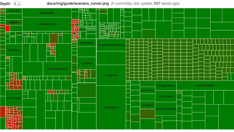
Introducing ArcheoloGit: A Data Visualization For Dangerous Code
So we have to display a two dimensions chart: the age and the activity of each file.
My dataviz framework of choice is d3.js. It offers a lot of different chart types, and is very powerful. I chose the Treemap Layout, as it allows to display a large number of file without loosing readability.
To display the activity of the files, it was simple: the more activity on the file, the larger the cell. For the age of the files, I chose to use colors, from green (for recently updated files), to red (for old ones).
That way:
- Large red rectangles show files modified often, but untouched for a long time. These are the files you should dig in first for refactoring.
- Small red rectangles show files seldom modified, and untouched for a long time. These files require your attention, because they could contain hidden bombs.
- Small green rectangles show files seldom modified, but created or modified recently. They won’t need refactoring for now.
- Large green rectangles show files modified a lot of times, including recently. They probably don’t deserve maintenance attention.
Data Retrieval
Obviously, we need the name (and path) of each files, and the number of days since their last update.
Git has a full set of commands to fetch data from a repository. I wrote a simple bash script to retrieve age and activity for each file, and put them in a CSV file.
It uses git ls-tree to get all the file paths of the project. Then, for each file, I use git log to retrieve the last update date, and the number of commits.
$ git ls-tree -r --name-only HEAD | while read filename; do echo "$(git log -1 --format="%ad" -- $filename),\ $(git log --oneline $filename | wc -l | tr -d ' '),\ $filename" >> $CSVFILEdoneThen, it’s really easy to grab this data from a d3.js script using the d3.csv() function.
The treemap customization is regular d3.js (functional) code. I used the reusable chart pattern, as explained is this article by Mike Bostock, and as done in Dependency Wheel. That makes the implementation really straightforward:
var chart = d3.chart  .archeologit()  .width(window.innerWidth - 200)  .height(window.innerHeight - 100);
d3.csv("/datas.csv", function (error, datas) {  d3.select("#body").datum(datas).call(chart);});
Improving Chart Usability
I tried the chart on many projects, and it turns out that the global view isn’t enough. For instance, when there are too many files, or when the actual code that matters to you is in a specific folder, the viewer needs to be able to zoom in to reveal more details.
To improve the readability, I had to make some changes to the original Treemap. First, I added the ability to choose the depth of the view. If you choose a depth of 3, the chart will show every file & folder from level 1 to 3. It aggregates the data of the files & folders with a higher depth. Then, I added the click to zoom feature. If you click on a folder, the chart will zoom on it to show you only what’s inside.
In addition, I used the HTML5 PushState API to keep the back button working: if a user displays level 1, then zooms on a folder to show only level 2, then a click on the back button returns to the global view of level 1. That keeps the navigation user friendly.
Conclusion
I look forward to getting feedback from the community, so if you take some time to use ArcheoloGit on your projects, don’t hesitate to tell me what can be done to improve it, or make a pull request!
The usage is pretty simple, you just have to clone the project, go inside the new directory, and run this command:
./run.sh /path/to/project/to/analyzeBy the way, here is the link to the repository.
Hope it can be helpful!
Authors
Full-stack web developer at marmelab, Daphne is curious, and a fast learner.