Lean Startup, day 13: The Teaser Video

After finding a product name, we can now focus on finishing the demo for our Lean startup Experiment. The heart of this demo, and the most difficult part of the landing page, is the teaser video. We want to measure our prospects’ appetite for an idea, but this requires showing a near-finished version of the idea - without actually developing it, or that would completely defeat the purpose of a Lean Startup experimentation.
Demo Videos and Lean Startup
In his book, Eric Ries mentions the famous Dropbox teaser video as the prototypal MVP of all Lean Startup projects. Drew Houston, the CEO of Dropbox, made the following video while developing Dropbox, before it was really functional, as a way to test users’ expectations in terms of cloud storage.
YouTube might track you and we would rather have your consent before loading this video.
After publishing the video, he quickly got 200,000 signups for a product that didn’t exist yet. With the insurance that there was a product-market fit, Drew could go and meet investors to have them fund the rest of the Dropbox development. The summary of his Lean Startup adventure is well worth a read.
The Scenario
A teaser video should illustrate the main User Journey, i.e. the path taken by a typical user to achieve their main goal with the product. For Admin-as-a-service/Misocell, we have already defined a Persona and a Business Model, helping us to design a typical user journey. For the domain, we choose a product list for an e-commerce website.
- Peter displays an empty Misocell admin page
- He switches to “configuration mode”
- He adds a new task called “Products”
- He configures the API endpoint for fetching and editing products
- He configures the look and feel of the new page, using a simple wizard
- Magic happens
- Tadaa! The Misocell admin page updates and now show products
- Peter customizes UI wording in a WYSIWYG way
- He switches to normal mode
- He continues to search and edit products using a full-featured GUI (CRUD)
In retrospect, this scenario starts in a very abrupt way. We should start with how Peter subscribes to misocell.io, then arrives in an empty admin page.
From that list of steps, we write a more detailed script for a 2 minutes video. So far, no developer is involved in the process, but it’s about to change.
Creating Random data
The teaser video will show a list of products. To be convincing and look real, the products can’t be named ‘lorem ipsum’. That means we need to create real looking product data (and an test API to connect to).
We use Faker and a few consumer electronics pictures grabbed from eCommerce platforms to generate the data, and json-server to turn this fake data into a fake API.
Tweaking The Product Design
We explicitly make the decision, at that point, not to spend much money on design, copywriting, and image/acquisition. The constraint is to produce a video only with the skills we have at work : developers, scrummaters, and product managers. This is both for budget constraints, and to be able to measure the positive impact of better design as compared to a raw design.
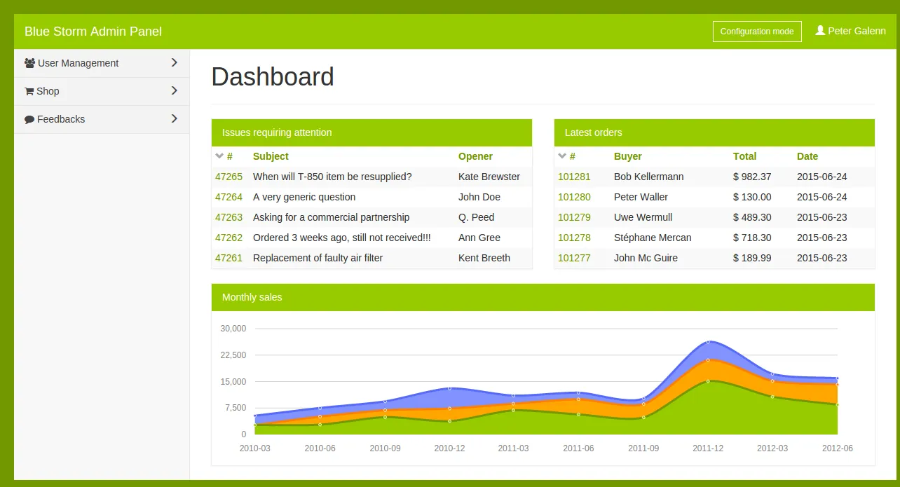
We will be showing screens based on ng-admin. But unfortunately, ng-admin was designed with a dull look and feel to let the content shine. For a teaser demo, we need something a bit sexier. We use our best CSS skills and produce a few colored variations of the original (grey) ng-admin theme :

OK, we are not designers, as you can tell.
We also work on a GUI for the “configuration mode”. This work takes place interactively, with one product manager giving ideas, and a developer implementing these ideas live, in static HTML5 and JavaScript. Our toolset is incredibly productive, and we manage to shape ideas in a few minutes, and test them for real. Adjusting the transition effects, the positioning of each element, and the wording of the wizard elements takes seconds.
After about a week of work, we have a completely functional configuration mode on the specific user journey we chose. It all relies on static pages with no server interaction, so the features aren’t really developed, but the illusion of reality is good enough for a screencast. Is takes us about a week of work for one developer.
Shooting The Screencast
If you’ve ever done a screencast, you know how time consuming it can be. It takes us an entire day to repeat, record, and edit the screencast into a fluid, 2 minutes video. We add a royalty free audio soundtrack that we buy for $15 on the Internet (Whistling Ukulele by Fleisis), and insert text comments to explain what happens. We use OpenShot Video Editor for composing, and YouTube to add the soundtrack.
Turn up the volume, go fullscreen, and experience the misocell product:
YouTube might track you and we would rather have your consent before loading this video.
Note: In retrospect, the soundtrack would be better with a voice track describing what this user actually tries to achieve. You can say much more with voice than with text.
We mostly focus on the design of the “Add Task” wizard, the configuration sidebars, and the visual transitions. The rest (CRUD, sorting, editing products) is classic ng-admin. This exercises pushes us to make many choices about the solution for the first time - in terms of features and usability.
Integration With The Landing Page
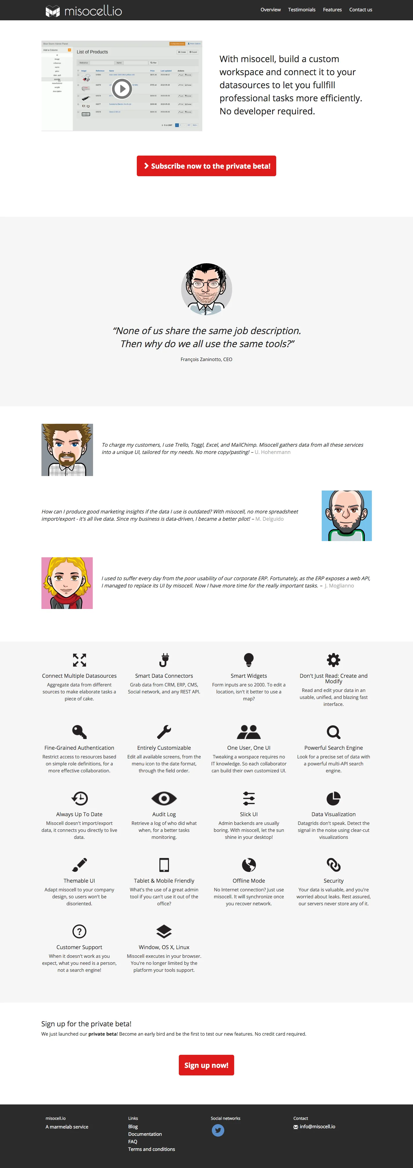
Now that the teaser video is finished, we can fine tune the landing page to make it look more professional. Here is the result when we finally gathered all these elements together.
Publishing it to the web is as simple as pushing to the gh-page branch in our GitHub repository. In a matter of seconds, the landing page is online! You can visit it at www.misocell.io.
Next Steps
We are happy with our brand new landing page, featuring a nice teaser video. Let’s see if customers will like it as much as we do!
In the next post, we will explore the tooling for customer acquisition, and particularly paid traffic and social media traffic.
Credits:
Thumbnail picture: The curve, by Michael Levine-Clark
Authors

Marmelab founder and CEO, passionate about web technologies, agile, sustainability, leadership, and open-source. Lead developer of react-admin, founder of GreenFrame.io, and regular speaker at tech conferences.
