Admin-on-rest 1.1 and 1.2: Focus On The New Features

We’re happy to announce not one, but two minor releases of admin-on-rest, the React admin GUI for REST APIs. Here are the highlights:
- Custom Redirection After Save
- Required Inputs Labels Now Contain An Asterisk
- New
<ReferenceArrayField> - New
<ReferenceArrayInput>and<SelectArrayInput>Components - New
<FileInput>component - Support For More Authentication Schemes
Custom Redirection After Save
This one was a long awaited feature. Default redirections have always been:
- Submitting the form in the
<Create>view redirects to the<Edit>view - Submitting the form in the
<Edit>view redirects to the<List>view
You can now customize the redirection by setting the redirect prop of the form component. Possible values are “edit”, “show”, “list”, and false to disable redirection. For instance, to redirect to the <Show> view after edition:
export const PostEdit = (props) => ( <Edit {...props}> <SimpleForm redirect="show">...</SimpleForm> </Edit>);This affects both the submit button, and the form submission when the user presses ENTER in one of the form fields.
And if you want a form with two submit buttons with different redirections (the usual “save” and “save and add” pattern), you can also provide a custom <Toolbar> to the form to replace the default bottom toolbar:
impot { SaveButton, Toolbar } from 'admin-on-rest';
const PostCreateToolbar = props => <Toolbar {...props} >    <SaveButton label="post.action.save_and_show" redirect="show" submitOnEnter={true} />    <SaveButton label="post.action.save_and_add" redirect={false} submitOnEnter={false} raised={false} /></Toolbar>;
export const PostEdit = (props) => (    <Edit {...props}>        <SimpleForm toolbar={<PostCreateToolbar />} redirect="show">            ...        </SimpleForm>    </Edit>);
Required Inputs Labels Now Contain An Asterisk
Without any change to your code, required fields now show up with an asterisk if you use admin-on-rest’s required validator:
import { required, minLength } from "admin-on-rest";
export const PostEdit = (props) => (  <Edit {...props}>    <SimpleForm>      <DisabledInput source="id" />      <TextInput source="title" validate={[required, minLength(10)]} />      <LongTextInput source="teaser" validate={minLength(20)} />      <RichTextInput source="body" validate={required} />      <DateInput source="published_at" validate={required} />    </SimpleForm>  </Edit>);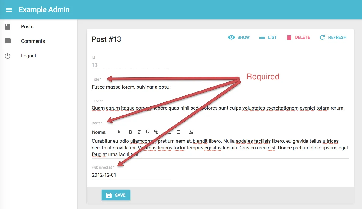
New <ReferenceArrayField>
The <ReferenceManyField> already allows to map one-to-many relationship, using a foreign key on the referenced resource. For instance, if a book has an author_id field:
// example book{ id: 1234, title: 'Lorem Ipsum', author_id: 56,}You can use the <ReferenceManyField> to display the list of books for a given author:
const AuthorShow = (props) => ( <Show {...props}> <SimpleShowLayout> <TextField source="last_name" /> <ReferenceManyField reference="books" target="author_id"> <SingleFieldList> <ChipField source="title" /> </SingleFieldList> </ReferenceManyField> </SimpleShowLayout> </Show>);The new <ReferenceArrayField> component allows to map one-to-many relationships the other way around, using an array of foreign keys on the main resource. For instance, if a book has a tag_ids referring to ids of tag resources:
// example book{ id: 1234, title: 'Lorem Ipsum', tag_ids: [1, 23, 4]}Then you can use the <ReferenceArrayField> to display the list of tags for a given book.
const BookShow = (props) => ( <Show {...props}> <SimpleShowLayout> <TextField source="title" /> <ReferenceArrayField reference="tags" source="tag_ids"> <SingleFieldList> <ChipField source="name" /> </SingleFieldList> </ReferenceManyField> </SimpleShowLayout> </Show>)<ReferenceArrayField> can fetch the tag resources related to this book resource by matching book.tag_ids to tag.id. <ReferenceArrayField reference="tags" source="tags_ids"> would issue an HTTP request looking like:
http://myapi.com/tags?id=[1,23,4]
<ReferenceArrayField> fetches the related resources using the GET_MANY REST method, so the actual HTTP request depends on your REST client.
In an Edit or Show view, you can combine <ReferenceArrayField> with <Datagrid> to display related resources in a table. For instance, to display more details about the tags related to a book in the BookShow view:
import React from 'react';import { Show, SimpleShowLayout, TextField, ReferenceArrayField, Datagrid, ShowButton } from 'admin-on-rest';
export const BookShow = (props) => (    <Show {...props}>        <SimpleShowLayout>            <TextField source="title" />            <ReferenceArrayField reference="tags" source="tag_ids">                <Datagrid>                    <TextField source="id" />                    <TextField source="name" />                    <ShowButton />                </SingleFieldList>            </ReferenceArrayField>        </SimpleShowLayout>    </Show>);
New <ReferenceArrayInput> and <SelectArrayInput> Components
To edit a one-to-many relationship using an array of foreign keys on the main resource, use the new <ReferenceArrayInput>. For instance, to edit the tags of a given book:
import { ReferenceArrayInput, SelectArrayInput } from 'admin-on-rest'
export const BookEdit = (props) => (    <Edit {...props}>        <SimpleForm>            <TextInput source="title" />            <ReferenceArrayInput reference="tags" source="tag_ids">                <SelectArrayInput optionText="name" />            </ReferenceArrayField>        </SimpleForm>    </Edit>);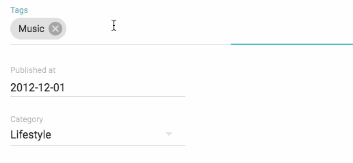
Just like other Reference components, <ReferenceArrayInput> just fetches the related resources, and delegates rendering to its child.
<SelectArrayInput> is also a new component, allowing to select an array of values inside a predefined list. You can use it outside of a reference context, for instance if the list of tags is static:
import { SelectArrayInput } from "admin-on-rest";
export const BookEdit = (props) => (  <Edit {...props}>    <SimpleForm>      <TextInput source="title" />      <SelectArrayInput        source="tags"        choices={[          { id: "music", name: "Music" },          { id: "photography", name: "Photo" },          { id: "programming", name: "Code" },          { id: "tech", name: "Technology" },          { id: "sport", name: "Sport" },        ]}      />    </SimpleForm>  </Edit>);
New <FileInput> component
By generalizing the <ImageInput> component, which supports dragging and dropping files, we created a new format agnostic file input. Whether you want to upload pdfs, text documents, or even binary files, you can use the <FileInput> component.
Previews (actually a simple list of files names) are enabled using <FileInput> children, as follows:
<FileInput source="files" label="Related files" accept="application/pdf"> <FileField source="src" title="title" /></FileInput>Writing a custom field component for displaying the current value(s) is easy: it’s a standard field.
When receiving new files, <FileInput> will add a rawFile property to the object passed as the record prop of children. This rawFile is a DOM File instance. This can be useful to display informations about size or mime type inside a custom field.
The <FileInput> component accepts all react-dropzone properties, in addition to those of admin-on-rest. For instance, if you need to upload several files at once, just add the multiple.
If the default placeholder text doesn’t fit with your needs, you can pass a placeholder attribute to overwrite it. The attribute can be anything React can render (PropTypes.node):
<FileInput source="files" label="Related files" accept="application/pdf" placeholder={<p>Drop your file here</p>}> <ImageField source="src" title="title" /></FileInput>Note that the file upload returns a File object. It is your responsibility to handle it depending on your API behavior. You can for instance encode it in base64, or send it as a multi-part form data. Check this example for base64 encoding data by extending the REST Client.
Support For More Authentication Schemes
Admin-on-rest is agnostic regarding the authentication service you use. But most of the time, your application must persist some sort of token on the client side. We recommend storing it outside of admin-on-rest - for example in localStorage. But what if you want to store credentials in the Redux store?
This is now possible: after calling the authClient with the AUTH_LOGIN verb, admin-on-rest will pass the returned value as the payload of the USER_LOGIN_SUCCESS action. So for instance, if your authClient grabs a token like this:
import { AUTH_LOGIN } from "admin-on-rest";
export default (type, params) => {  if (type === AUTH_LOGIN) {    const { username, password } = params;    const request = new Request("https://mydomain.com/authenticate", {      method: "POST",      body: JSON.stringify({ username, password }),      headers: new Headers({ "Content-Type": "application/json" }),    });    return fetch(request)      .then((response) => {        if (response.status < 200 || response.status >= 300) {          throw new Error(response.statusText);        }        return response.json();      })      .then(({ token }) => token);  }  return Promise.resolve();};
Now you can create a custom reducer triggered by USER_LOGIN_SUCCESS:
// in reducer/authReducer.jsimport { USER_LOGIN_SUCCESS } from "admin-on-rest";
const defaultState = {  token: null,};
export default (previousState = defaultState, { type, payload }) => {  switch (type) {    case USER_LOGIN_SUCCESS:      return { ...previousState, token: payload };    default:      return previousState;  }};
Register this reducer in the <Admin> component:
// in src/App.jsimport React from "react";import { Admin } from "admin-on-rest";
import authReducer from "./reducer/authReducer";
const App = () => (  <Admin    customReducers={{ auth: authReducer }}    restClient={jsonServerRestClient("http://jsonplaceholder.typicode.com")}  >    ...  </Admin>);
export default App;
And now the Redux state contains the current user token!
Many More Features
Versions 1.1 and 1.2 also introduced the following features:
- Add refresh button to
<Show>view - Add sort feature to
<ReferenceManyField> - Add ability to use custom history in
<Admin> - Add
<TabbedShowLayout>to mirror<TabbedForm> - Add
optionsprop to<BooleanInput>and pass them to mui<Toggle> - Add
AOR/prefix to Redux actions (ThieryMichel) - Add deep path support for
optionTextandoptionValueprops to theInputcomponents used asReferencechildren - Add ability to override
<SimpleShowLayout>container styles - Add
<MenuItemLink>to fix bad click handling of menu on mobile - Add reset state after logout
- Add ability to disable submit on enter in
<SimpleForm>and<TabbedForm> - Add integer casting to pagination params
- Add
elStyleprop to<DisabledInput>
Overall, admin-on-rest now covers more use cases, provides a better UX by default, and gives you more extension points. I recently summarized the aor philosophy in a GitHub Issue comment:
Our objective is not to build components that cover all your needs, but to build components that are easy to use and compose with your own components to cover all your needs.
Versions 1.1 and 1.2 also contain a few bug fixes, and several important additions to the documentaion. Most notably, the FAQ and Ecosystem pages already give useful pointers, and will grow over time.
Conclusion
These two versions see the acceleration of the community contributions. If you look at the changelog, you will see that, in addition to the names of marmelab developers (fzaninotto, jpetitcolas, djhi, ThieryMichel, JulienDemangeon), regular contributors like wesley6j and leesei. Overall, 68 developers have already contributed to admin-on-rest. You’re welcome to join them!
We’re happy to see more and more activity on GitHub and StackOverflow around admin-on-rest. The feedback from the numerous projects built with admin-on-rest helps us make it better and more flexible.
Expect a bit of a slowdown during the summer - the next minor version will probably be released in September. In the meantime, if you are authorized to share a few screenshots of the applications you’ve built with admin-on-rest, please send them at info@marmelab.com!


Authors
Marmelab founder and CEO, passionate about web technologies, agile, sustainability, leadership, and open-source. Lead developer of react-admin, founder of GreenFrame.io, and regular speaker at tech conferences.