React-admin 2.3: Better UI, User Menu, Tree Shaking, Tree List, and more!

React-admin is an open-source framework for building admin interfaces on top of REST or GraphQL APIs. Continuing the UI improvement started with version 2.2, react-admin 2.3, which we’ve just released, introduces many UI changes. We’re still giving more room to your content, and less to the chrome. This version is packed with many more features, so many in fact that it could be named react-admin 3.0. But since it’s backwards compatible with the 2.x branch, and since we’re not that good at marketing, it’s just a minor version by SemVer standards.
Here is a list of the highlights:
- Streamlined UI
- User Menu
- Sidebar width is now adjustable
- New Input: AutocompleteArrayInput
- Set Number Of Results Per Page
- Easier Redux Customization
- Improved GraphQL Providers
- Labs: the Tree List
- Tree Shaking
- Request Accumulation
Streamlined UI
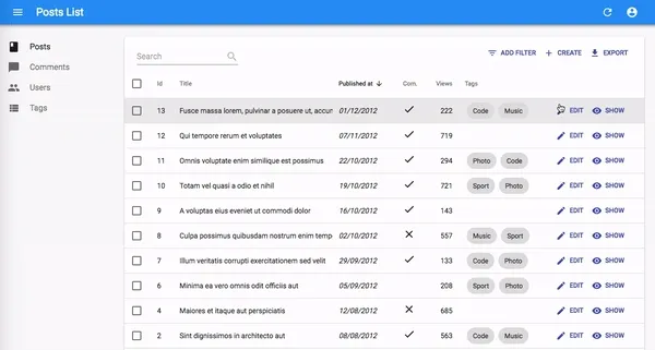
The Material Design guidelines were imagined primarily for mobile, where users only have a very imprecise pointer (their finger) and limited screen real estate. Using Material Design on a desktop-first interface leads to lots of white space, which is good for legibility and people with old mouses, but bad for 80% of the users. Starting with react-admin 2.2, we’ve started looking for a better balance between your content and the chrome (navigation, buttons, borders, etc). This effort focused on the List view in react-admin 2.3. And the changes will probably surprise you:
| Before | After |
|---|---|
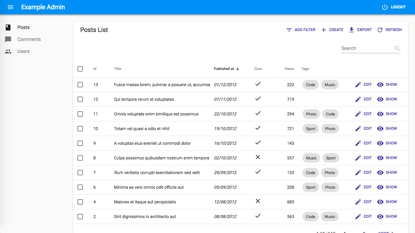 | |
The main benefit is that the content starts earlier in the page, and that users can see more of it without scrolling. To get there, we had to change many small details:
- Page title moved to AppBar: the AppBar title used to be just the name of your app (like ‘Acme Admin’), and never change during navigation. That felt like a waste of some important screen real estate, so we’ve taken advantage of the AppBar to display the page title (‘Post List’), etc. The app title remains displayed in the AppBar on the Dashboard and error pages.
- Filters inline on the left: Removing the title from the main card allowed us to move the filters to the left of the main card, gaining one line in the process.
- Reduced column width: The column headers no longer reserve horizontal space for the sort icon. As a consequence, numeric columns become narrower when they are not the active sort.
- Refresh moved to AppBar: To avoid conflicts between the filters on the left and the actions on the right, we removed one action button: the Refresh button moved up to the AppBar, and is displayed in the entire application. We’ve merged it with the loading indicator.
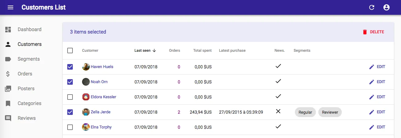
- Bulk Actions Revamp: Again, to free some space for the filters, we removed the Bulk Actions button, which used to appear when a user selected lines in the datagrid, from the Action buttons zone on the top right. We moved it to a new zone, which appears only after selecting lines, and covering other actions:
As a benefit, bulk actions are now much easier to implement, because they are just button components that receive an ids prop.
We also changed a few things in the Create, Edit and Show views:
| Before | After |
|---|---|
| 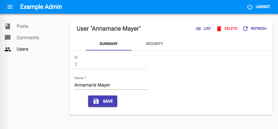 |
- Remove List Button: Users always had the ability to click on the sidebar menu or on the back button to come back to a list from a detail view. Having three ways to do one action is probably too much, so we removed the List button from the action buttons of the detail views. The
<ListButton>is still available in the react-admin code if you want to add it back to your views. - Move delete button to the bottom: It’s a good practice to put destructive buttons far from other buttons, to avoid accidental clicks with serious consequences. We’ve decided to put the Delete button far away from all the other buttons, in the bottom right.
As a consequence, since the page title and the Refresh button moved to the top bar, the Create and Edit views no longer have actions by default, and the form appears earlier in the page.
And maybe the most spectacular change: the AppBar disappears when users scroll down, and reappears when they scroll up. You’re probably familiar with this UI effect from mobile apps. In react-admin, and even on Desktop, it provides a great advantage: more room for content.
We’ve make numerous other adjustments in margins, to better match the Material Design guidelines. You probably won’t notice it, but your users will feel a better balance between content, chrome, and empty space.
These changes are backwards compatible, meaning that an admin using react-admin 2.2 can benefit from the react-admin 2.3 UI changes withut any update to its code.
User Menu
Now that the refresh button has moved in the AppBar, it’s dangerously close to the Logout button. To avoid accidental logouts, we’ve moved the Logout buttin inside a “User” menu, which reveals only when the user clicks on the User button.

The user menu is the ideal place to put user preferences, app settings, account details, etc. React-admin doesn’t provide any particular element for that domain - because it’s always custom.
You can replace the default user menu by your own by setting the userMenu prop of the <AppBar> component. For instance, to add custom menu items, just decorate the default <UserMenu> by adding children to it:
import { AppBar, UserMenu, MenuItemLink } from "react-admin";import SettingsIcon from "@material-ui/icons/Settings";
const MyUserMenu = (props) => (  <UserMenu {...props}>    <MenuItemLink      to="/configuration"      primaryText="Configuration"      leftIcon={<SettingsIcon />}    />  </UserMenu>);
const MyAppBar = (props) => <AppBar {...props} userMenu={<MyUserMenu />} />;
const MyLayout = (props) => <Layout {...props} appBar={MyAppBar} />;
Sidebar Width is now Adjustable
The default Sidebar has a fixed width (240px) that may be too narrow or too wide for your needs, depending on the labels of your resources. In previous versions, you had to copy and customize the Layout component to adjust this size. In react-admin 2.3, it’s as simple as passing a custom Sidebar component:
import { Sidebar } from "react-admin";
const MySidebar = (props) => <Sidebar {...props} size={200} />;const MyLayout = (props) => <Layout {...props} sidebar={MySidebar} />;
New Input: AutocompleteArrayInput
For editing many-to-many relationships (like the tags of a post), react-admin already provided the <SelectArrayInput>. But it had one major drawback when used inside a <ReferenceInput>: <SelectArrayInput> couldn’t handle long lists (100+) of possible choices, both in terms of performance and usability. There was no bundled solution for relationships to large tables.
React-admin 2.3 introduces a new Input component, similar to the <AutocompleteInput>, but it allows to select several items instead of just one. Meet the <AutocompleteArrayInput>:
It’s a drop-in replacement for the <SelectArrayInput>:
import { AutocompleteArrayInput, ReferenceArrayInput } from "react-admin";
<ReferenceArrayInput label="Tags" reference="tags" source="tags">  <AutocompleteArrayInput /></ReferenceArrayInput>;
Set Number Of Results Per Page
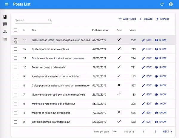
Developers can set the number of results per page in List views using the perPage props since long. But in react-admin 2.3, users can do it, too, in the UI:
You can replace the default pagination element by your own, using the pagination prop. The pagination element receives the current page, the number of records per page, the total number of records, as well as a setPage() function that changes the page.
That means you can modify the “rows per page” selector options simply by decorating the default <Pagination> component:
// in src/MyPagination.jsimport { Pagination } from "react-admin";
const PostPagination = (props) => (  <Pagination rowsPerPageOptions={[10, 25, 50, 100]} {...props} />);
export const PostList = (props) => ( <List {...props} pagination={<PostPagination />}> ... </List>);Tip: Pass an empty array to rowsPerPageOptions to disable the rows per page selection.
Easier Redux Customization
React-admin uses Redux, a fabulous yet ultra simple state container for React. We leverage only a small share of what’s possible with Redux. By adding custom middlewares, you can enable an offline mode, an audit log, or custom analytics (check list long list of Redux middlewares for an idea of the size of the Redux ecosystem). Except… adding custom middlewares used to require to copy and customize a big chunk of code (the “Custom App” path).
In react-admin 2.3, it’s much simpler. If the <Admin> component lives inside an existing <Provider>, the framework skips the entire store initialization. That means that all you have to use a custom store is:
// in src/App.jsimport React from "react";import { Provider } from "react-redux";import createHistory from "history/createHashHistory";import { Admin, Resource } from "react-admin";import restProvider from "ra-data-simple-rest";import defaultMessages from "ra-language-english";
import createAdminStore from "./createAdminStore";import messages from "./i18n";
// your app componentsimport Dashboard from "./Dashboard";import { PostList, PostCreate, PostEdit, PostShow } from "./Post";import { CommentList, CommentEdit, CommentCreate } from "./Comment";import { UserList, UserEdit, UserCreate } from "./User";
// side effectsconst authProvider = () => Promise.resolve();const dataProvider = restProvider("http://path.to.my.api/");const i18nProvider = (locale) => {  if (locale !== "en") {    return messages[locale];  }  return defaultMessages;};const history = createHistory();
const App = () => (  <Provider    store={createAdminStore({      authProvider,      dataProvider,      i18nProvider,      history,    })}  >    <Admin authProvider={authProvider} history={history} title="My Admin">      <Resource        name="posts"        list={PostList}        create={PostCreate}        edit={PostEdit}        show={PostShow}      />      <Resource        name="comments"        list={CommentList}        edit={CommentEdit}        create={CommentCreate}      />      <Resource        name="users"        list={UserList}        edit={UserEdit}        create={UserCreate}      />    </Admin>  </Provider>);
export default App;Tip: One thing to pay attention to is that you must pass the same history and authProvider to both the redux Store creator and the <Admin> component. But you don’t need to pass the dataProvider or the i18nProvider.
Find all the details in the Including on another app Documentation.
Improved GraphQL Providers
If you use a custon GraphQL service, you will need to adapt the existing GraphQL dataProvider to match the syntax of your service. More specifically, you’ll want to leverage GraphQL querying capabilities to embed related records in results. For instance, when querying a list of comments, you’ll want each comment to embed the related post title, instead of just the related post id. This is trivial in GraphQL, however the base GraphQL provider used to propose only two ways to query the backend: either let recat-admin build the queries entirely based on introspection, or write all the queries by hand.
React-admin 2.3 offers a way to catch queries for specific resources, and replace the query deduced from the introspection by one of your own.
For the provider to know how to map react-admin request to Apollo queries and mutations, you must provide a buildQuery option. The buildQuery is a factory function which will be called with the introspection query result.
The introspection result is an object with 4 properties:
types: an array of all the GraphQL types discovered on your endpointqueries: an array of all the GraphQL queries and mutations discovered on your endpointresources: an array of objects with atypeproperty, which is the GraphQL type for this resource, and a property for each react-admin fetch verb for which we found a matching query or mutationschema: the full schema
For example:
{ types: [ { name: 'Post', kind: 'OBJECT', fields: [ { name: 'id', type: { kind: 'NON_NULL', ofType: { kind: 'SCALAR', name: 'ID' } } }, { name: 'title', type: { kind: 'NON_NULL', ofType: { kind: 'SCALAR', name: 'String' } } }, ... ] }, ... ], queries: [ { name: 'createPost', args: [ { name: 'title', type: { kind: 'NON_NULL', ofType: { kind: 'SCALAR', name: 'String' } } } ], type : { kind: 'OBJECT', name: 'Category' } }, ... ], resources: [ { type: { name: 'Post', kind: 'OBJECT', fields: [ { name: 'id', type: { kind: 'NON_NULL', ofType: { kind: 'SCALAR', name: 'ID' } } }, { name: 'title', type: { kind: 'NON_NULL', ofType: { kind: 'SCALAR', name: 'String' } } }, ... ] }, GET_LIST: { name: 'createPost', args: [ { name: 'title', type: { kind: 'NON_NULL', ofType: { kind: 'SCALAR', name: 'String' } } } ], type : { kind: 'OBJECT', name: 'Category' } }, ... } ], schema: {} // Omitting for brevity}The buildQuery function must return a function which will be called with the same parameters as the react-admin data provider but must return an object matching the options of the ApolloClient query method with an additional parseResponse function.
This parseResponse function will be called with an ApolloQueryResult and must returns the data expected by react-admin.
For example:
import buildFieldList from "./buildFieldList";
const buildQuery =  (introspectionResults) => (raFetchType, resourceName, params) => {    const resource = introspectionResults.resource.find(      (r) => r.type.name === resourceName,    );
switch (raFetchType) { case "GET_ONE": return { query: gql`query ${resource[raFetchType].name}($id: ID) { data: ${resource[raFetchType].name}(id: $id) { ${buildFieldList(introspectionResults, resource, raFetchType)} } }`, variables: params, // params = { id: ... } parseResponse: (response) => response.data, }; break; // ... other types handled here } };buildGraphQLProvider({ buildQuery });Labs: the Tree List
How do you visualize a tree structure in a List view? Until now, you had to create a custom component. But react-admin 2.3 introduces a new component named <Tree> just for that purpose. As it incurs a significant bump in bundle size, we’ve added this component in a standalone package called ra-tree-material-ui.
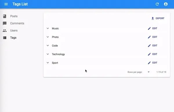
Here is a glimpse of how you can replace a <Datagrid> by a <Tree> in a <List>. With a tags ressource having this structure where a tag may have a parent tag referenced by the parent_id field:
[ { "id": 1, "name": "Clothing" }, { "id": 2, "name": "Men", "parent_id": 1 }, { "id": 3, "name": "Suits", "parent_id": 2 }, { "id": 4, "name": "Slacks", "parent_id": 3 }, { "id": 5, "name": "Jackets", "parent_id": 3 }, { "id": 6, "name": "Women", "parent_id": 1 }, { "id": 7, "name": "Dresses", "parent_id": 6 }, { "id": 8, "name": "Evening Gowns", "parent_id": 7 }, { "id": 9, "name": "Sun Dresses", "parent_id": 7 }, { "id": 10, "name": "Skirts", "parent_id": 6 }, { "id": 11, "name": "Blouses", "parent_id": 6 }]You can use the tree components as follows:
// in src/tag/list.jsimport React from "react";import { List, TextField, EditButton } from "react-admin";import { Tree, NodeView, NodeActions } from "ra-tree-ui-materialui";
const TagsActions = (props) => (  <NodeActions {...props}>    <EditButton />  </NodeActions>);
export const TagsList = (props) => (  <List {...props} perPage={10000}>    <Tree>      <NodeView actions={<TagsActions />}>        <TextField source="name" />      </NodeView>    </Tree>  </List>);
And that’s not all: the ra-ui-materialui package also features a <NodeForm> component, which lets you use inputs instead of fields to make the tree editable. And if you add the enableDragAndDrop prop, the user can move and reorder the tree leaves!
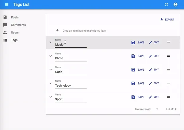
The tree view is still a bit rough, and know that we may change its API in the near future. Consider it an alpha feature - that’s why it’s published in the react-admin Labs, a place for the developers who want to be on the cutting edge.
Tree Shaking
React-admin doesn’t come as a standalone file that you can import in a <script> tag. We believe that single-page applications require a build step to let developers use advanced ECMAScript syntax, and to optimize the total JavaScript size of their applications. If you use a boilerplate like create-react-app, all that comes by default.
However, the way react-admin used to be released prevented an important optimization of modern bundlers: tree shaking, also called dead code elimination. Even though you didn’t use all of the react-admin components, they would appear in your production bundle.
React-admin 2.3 now bundles in 2 versions: cjs (the same as before) and esm (ECMAScript Modules, which allows tree shaking). The two versions are in the default react-admin package, so you don’t have to change your package list. If you use a tree shaking capable bundler (like Webpack 4, Rollup, or Parcel), any import { xxx } from 'react-admin' will use the esm version by default, and dead code will be dropped at compilation.
The result is a clear decrease in bundle size (up to 300kB, depending on how many features of react-admin you actually use), and a faster first load.
Again, this decrease requires no change on your side, and the new package structure changes nothing if you don’t use a tree-shaking compatible bundler. The benefit is backwards compatible.
Request Accumulation
React-admin relies on a dataProvider for the data, and most of the time it’s a web API. The number of calls to the API directly impacts the perceived performance of the admin. So we’ve included many tricks in react-admin to avoid calling the dataProvider altogether when we can. The most visible optimization is optimistic rendering, but we’re always looking for more.
React-admin 2.3 introduces request accumulation for SelectInputs. The use case is that of an <ArrayInput> using a <ReferenceInput> as child. A <ReferenceInput> must fetch the record related to the selected id, and the list of possible records to populate the options. In an <ArrayInput>, this was done as many times as there were items in the array. Now, react-admin decounces and accumulates the dataProvider calls, and sends the requests to the API only once. The difference, for the user, is a drastic acceleration of the form display, and for your API, a drastic decrease of the number of calls.
Conclusion
We’ve taken advantage of the relatively calm summer to work hard on react-admin. This is clearly a major release, adding many more features and enabling more configuration of the react-admin components.
React-admin 2.3 is backwards compatible with the 2.X release, and requires no special upgrade from your side - apart running yarn update of course. The full changelog is available on GitHub:
marmelab/react-admin/releases/tag/v2.3.0
In the future, we’ll slow down on new features, and focus more on developer experience. We’ve seen that the fast pace of development is hard to keep up with, even for some of marmelab developers. From documentation to tutorials, we’ll do our best to help both newcomers and seasoned react-admin developers get the best out of this library.
As always, feel free to give us your feedback on this release, and to mention any bug that we wouldn’t have catched during our tests.

Authors
Marmelab founder and CEO, passionate about web technologies, agile, sustainability, leadership, and open-source. Lead developer of react-admin, founder of GreenFrame.io, and regular speaker at tech conferences.