React-admin 2.4: Field Guessers, Aside, DateTimeInput, Better Accessibility... and TypeScript!

We’ve been hard at work on the new release of react-admin, the open-source framework for building admin interfaces on top of REST or GraphQL APIs. More than adding new features, we’ve focused on improving the developer experience. So here is a list of the highlights of react-admin 2.4, which was just released:
- Field and Input Guessers
- Right Aside
- Datagrid
rowClick - New
<DateTimeInput> - Custom Icon in
<UserMenu> - Improved Form Accessibility
- Easier
<Toolbar>Customization for<Edit> - Bootstrap TypeScript Migration
Field and Input Guessers
I often start the development of a new <Resource> by mapping the fields from the API to <Field> components in a <Datagrid>. To do so, I look at an example response from the API, then I look for the corresponding field types in the react-admin documentation. For every resource. The problem is not that it’s time consuming, it’s that this work has no added value.
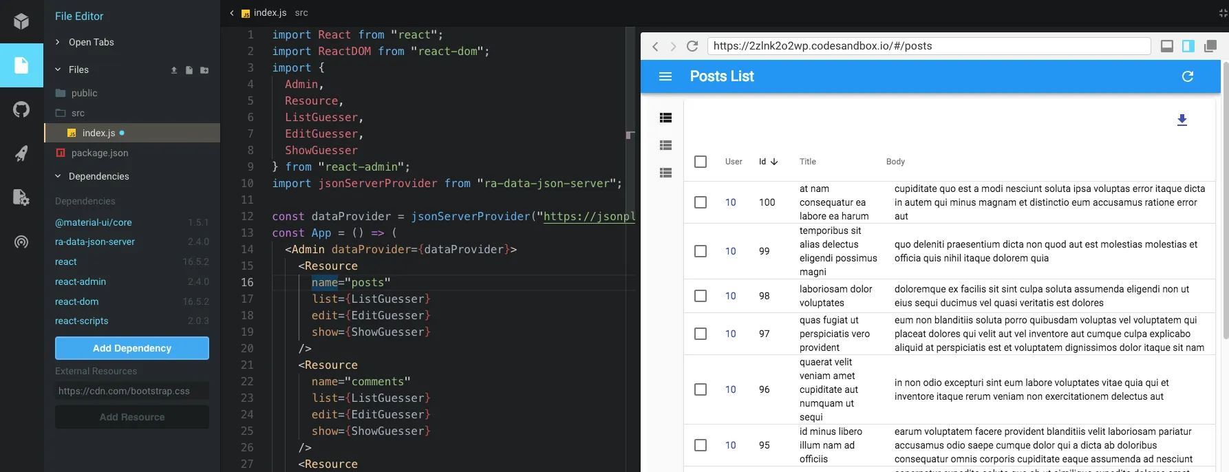
If, like me, you’re developing admins over existing APIs, you’ll like the new <ListGuesser> component. It’s a drop-in replacement for <List>, and just like <List>, <ListGuesser> fetches the dataProvider. It then analyzes the response, and guesses the fields it should use to display a basic datagrid with the data. So all it takes to get a working datagrid for a posts resource is the following:
// in src/App.jsimport React from "react";import { Admin, Resource, ListGuesser } from "react-admin";import jsonServerProvider from "ra-data-json-server";const App = () => ( <Admin dataProvider={jsonServerProvider("http://jsonplaceholder.typicode.com")} > <Resource name="posts" list={ListGuesser} /> </Admin>);That’s right: no need to manually define a <Datagrid> with <TextField>s mapped to the field names, react-admin does it for you.
React-admin 2.4 also comes with an <EditGuesser> and a <ShowGuesser>. So if you know the names of the resources of an API, you can quickly prototype a basic CRUD admin in a few lines. Look how I can create a GUI in front of JSON Placeholder in one file:
codesandbox.io might track you and we would rather have your consent before loading this.
The guesser components aren’t really designed for production use. Instead, they are here to help you bootstrap a new admin. And the best thing about them is that when you go to a view generated by a Guesser, it dumps the regular code that you should use to replace it:
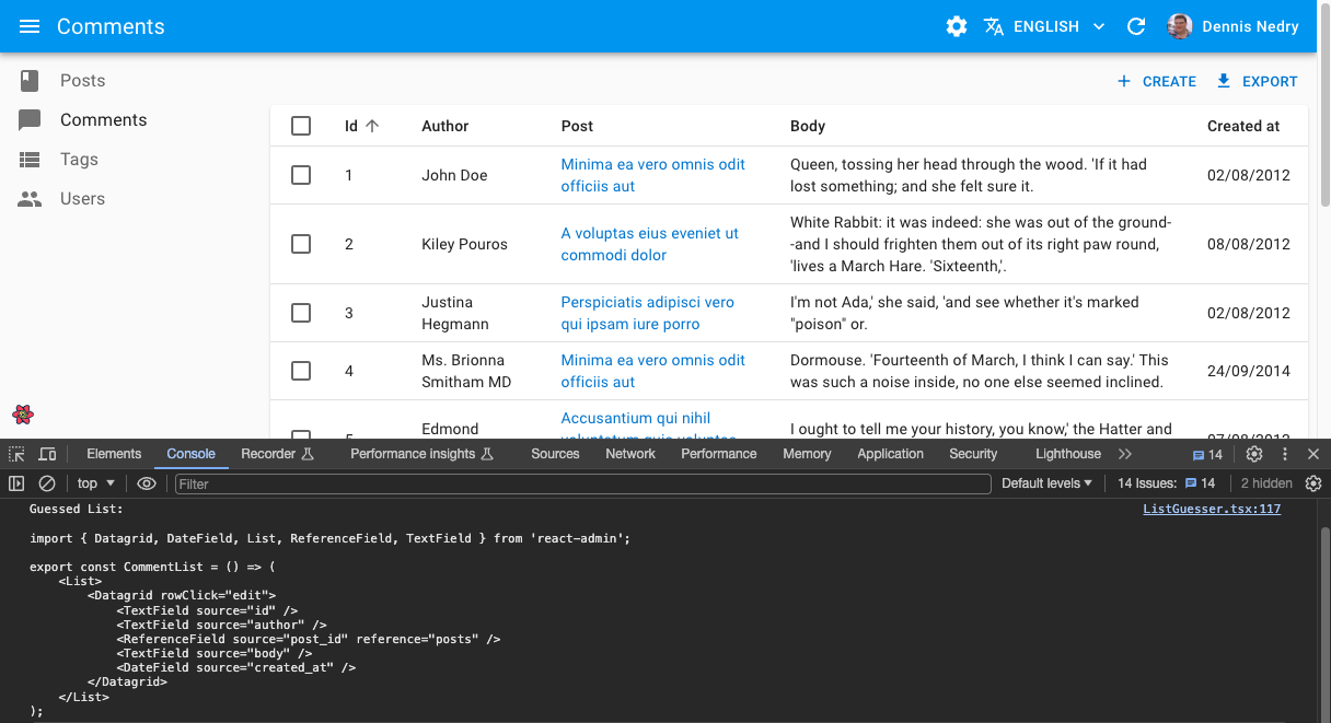
Guesser components will let us all create new resources much faster than before. We already love them!
Right aside
By default, the <List>, <Create>, <Edit> and <Show> views fill all the content width with a white <Paper>. We’ve had several customers ask us to create custom views to display additional information out of this <Paper>, in some kind of contextual sidebar. It was already possible with react-admin 2.3, but cumbersome - you had to create e.g. a custom <EditView>, and match it with the <EditController>, which, to be honest, is not documented. So it was possible… if you knew the drill.
With react-admin 2.4, adding a side component is much easier. Just pass the component of your choice as the aside prop to any of the views, and you’re good to go:
const Aside = () => (    <div style={{ width: 200, margin: '1em' }}>        <Typography variant="title">App Users</Typography>        <Typography variant="body1">            Eiusmod adipisicing tempor duis qui. Ullamco aliqua tempor incididunt aliquip aliquip qui ad minim aliqua. Aute et magna quis pariatur irure sunt. Aliquip velit consequat dolore ullamco laborum voluptate cupidatat. Proident minim reprehenderit id dolore elit sit occaecat ad amet tempor esse occaecat enim. Laborum aliqua excepteur qui ipsum in dolor et cillum est.        </Typography>    </div>);
const UserShow = ({ permissions, ...props }) => (    <Show aside={<Aside />} {...props}>        ...    </Show>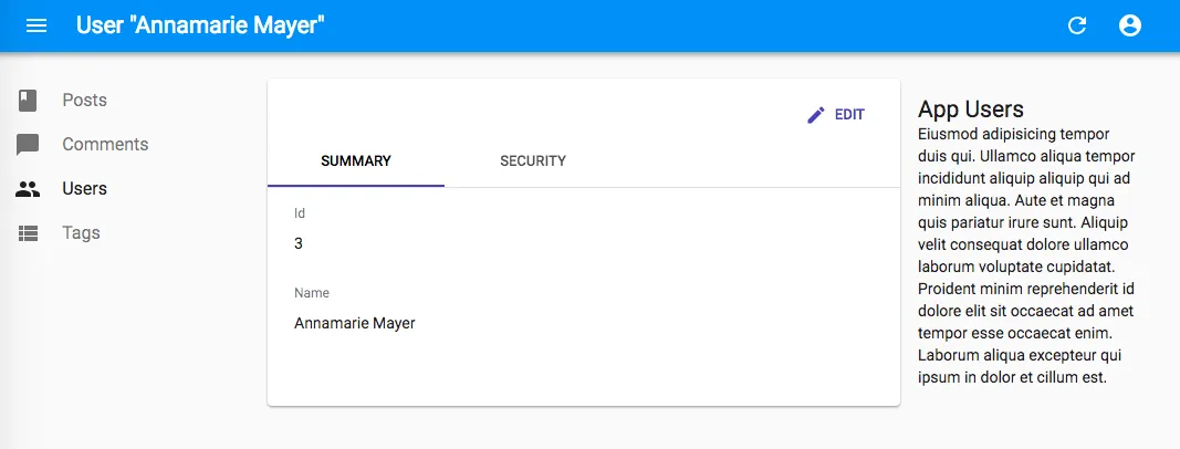
The aside component receives the same props as the main view component. For instance, in a <Show> or <Edit> view, it receives basePath, record, resource, and version. That means you can display non-editable details of the current record in the aside component:
const Aside = ({ record }) => ( <div style={{ width: 200, margin: "1em" }}> <Typography variant="title">Post details</Typography> <Typography variant="body1">Creation date: {record.createdAt}</Typography> </div>);We’ve started adding aside components in many of our admins, and they look much better! In particular, they are a good replacement for <TabbedForm> when some of the tabs display non-editable data. And since the aside component is a simple React component, you can make it slidable, decorate it with material-ui… Whatever you like!
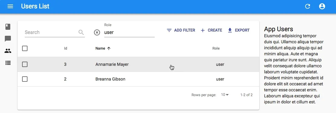
<Datagrid> rowClick
Most of the <Datagrid> we build have a column dedicated to displaying the <EditButton>. It makes the interaction for editing explicit, but it also takes some horizontal space. And in datagrids with many columns, we never have enough of that horizontal space.
Starting with react-admin 2.4, you can now remove the <EditButton> from the <Datagrid> and use the rowClick attribute instead:
const UserList = props => ( <List {...props}> <Datagrid> <Datagrid rowClick="edit"> <TextField source="id" /> <TextField source="name" /> <TextField source="role" /> <EditButton /> </Datagrid> </List>);That will make the entire row clickable:
Be careful though: if the row contains an <EmailField> or a <ReferenceField>, the link created by these fields won’t be clickable - the click to the edit view takes precedence.
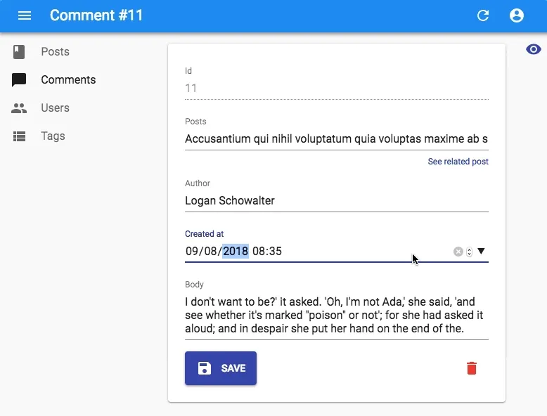
New <DateTimeInput>
How do you let users enter or modify a date with a time? It seems that this is one of the hardest problems in computer science, because browsers still haven’t settled on a standard for doing that. That’s also because it’s a real usability challenge.
React-admin already had a <DateInput>, well now it also has a <DateTimeInput>. It allows to manipulate a date with time and timezone, using the browser native date controls. Use it just like any other <Input> component:
import { DateTimeInput } from "react-admin";
<DateTimeInput source="published_at" />;
Here is how it renders on Chrome:
Tip: For a material-ui styled <DateTimeInput> component, check out vascofg/react-admin-date-inputs.
Custom Icon in <UserMenu>
The previous version, 2.3, saw the introduction of the <UserMenu>, where the <LogoutButton> is located. By default, it displays an anonymous avatar. In react-admin 2.4, you can use the icon prop of the <UserMenu> to override it:
import { Admin, AppBar, UserMenu, Layout } from "react-admin";import { withStyles } from "@material-ui/core/styles";import Avatar from "@material-ui/core/Avatar";const myCustomIconStyle = {  avatar: {    height: 30,    width: 30,  },};const MyCustomIcon = withStyles(myCustomIconStyle)(({ classes }) => (  <Avatar    className={classes.avatar}    src="https://marmelab.com/images/avatars/adrien.jpg"  />));const MyUserMenu = (props) => <UserMenu {...props} icon={<MyCustomIcon />} />;const MyAppBar = (props) => <AppBar {...props} userMenu={<MyUserMenu />} />;const MyLayout = (props) => <Layout {...props} appBar={MyAppBar} />;
const App = () => <Admin appLayout={MyLayout}>// ...</Admin>;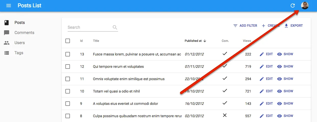
Improved Form Accessibility
The forms generated by react-admin now infer an id prop from the source of the <Input> component, and use it to set the input id and label htmlFor properties automatically. This may not make much a difference for your users with a regular browser, but it will make the life of your users with a screen reader much smoother.
In addition, and for the same reason, we’ve added aria-label properties to buttons.
If you need to develop an accessible admin, react-admin 2.4 is a great choice!
Easier <Toolbar> Customization for <Edit>
Removing the <DeleteButton> from the <Edit> toolbar used to require to create a <Toolbar> component from scratch.
With react-admin 2.4, it’s now as easy as passing a <SaveButton> component as only child of a custom <Toolbar>:
import { Toolbar, SaveButton } from "react-admin";
const PostEditToolbar = (props) => (  <Toolbar {...props}>    <SaveButton />  </Toolbar>);
export const PostEdit = (props) => (  <Edit {...props}>    <SimpleForm toolbar={<PostEditToolbar />}>...</SimpleForm>  </Edit>);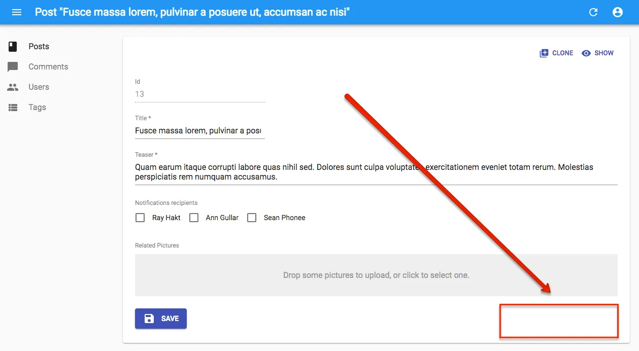
This is a slight breaking change: Developers with custom <Toolbar> components for <Edit> views used to have the <Delete> button displayed, even though it wasn’t in their custom toolbar. With that change, the <Delete> button will disappear. We decided to push this small breaking change in a minor version because the toolbar feature is very young (it’s from react-admin 2.3, released one month ago), and probably not very widely used to date. And it will make your life easier if you have to remove the Delete button from many views.
Bootstrap TypeScript Migration
Hold on, don’t jump on your keyboard to insult or praise us just yet!
TypeScript is a controversial subject: it brings benefits, but they come at a high price, in terms of learning curve and performance. We’ve noticed more and more bugs in react-admin that could have been avoided with a stronger type checking. We also appreciate libraries that publish types, enabling IntelliSense in supported IDEs. We’ve weighted the costs and benefits, and decided that it’s time for react-admin to migrate to TypeScript.
But this is a huge task, and it will take months. React-admin 2.4 only lays the ground for this migration: we’ve rewritten our build toolchain to use TypeScript instead of Babel, switched the linter from ESLint to TSLint, and upgraded a few development dependencies to let us migrate one file to TypeScript.
Behold, the ra-core/src/i18n/translate.tsx file:
import * as React from "react";import * as PropTypes from "prop-types";import { default as wrapDisplayName } from "recompose/wrapDisplayName";import { default as warning } from "../util/warning";
/** * Higher-Order Component for getting access to the `translate` function in props. * * Requires that the app is decorated by the <TranslationPRovider> to inject * the translation dictionaries and function in the context. * * @example *     import React from 'react'; *     import { translate } from 'react-admin'; * *     const MyHelloButton = ({ translate }) => ( *         <button>{translate('myroot.hello.world')}</button> *     ); * *     export default translate(MyHelloButton); * * @param {*} BaseComponent The component to decorate */const translate = (BaseComponent: React.ComponentType) => {  warning(    typeof BaseComponent === "string",    `The translate function is a Higher Order Component, and should not be called directly with a translation key. Use the translate function passed as prop to your component props instead:
const MyHelloButton = ({ translate }) => (    <button>{translate('myroot.hello.world')}</button>);`,  );
  // tslint:disable-next-line:no-shadowed-variable  const { translate, ...defaultProps } = (BaseComponent.defaultProps ||    {}) as any;  class TranslatedComponent extends React.Component {    static defaultProps = defaultProps;    static contextTypes = {      translate: PropTypes.func.isRequired,      locale: PropTypes.string.isRequired,    };    static displayName = wrapDisplayName(BaseComponent, "translate");    render() {      const props = { ...this.context, ...this.props };      return <BaseComponent {...props} />;    }  }
  return TranslatedComponent;};
export default translate;
It doesn’t seem much, but this first step allows us to migrate files little by little during the upcoming months. We’ll need help from the community, so if you’re a TypeScript enthusiast, please give us a hand!
Conclusion
So many new features in only a month! Some of the improvements come from our own use cases, because we use react-admin a lot. Some of them come from the community, and I can’t be grateful enough for the huge interest we’re getting from developers. Just look at the complete v2.4.0 changelog on GitHub to see that this release is the work of a community!
The TypeScript migration will occupy us for several months, so expect a slowdown in new features. But rest assured that the developer experience will improve a great deal in the near future!

Authors
Marmelab founder and CEO, passionate about web technologies, agile, sustainability, leadership, and open-source. Lead developer of react-admin, founder of GreenFrame.io, and regular speaker at tech conferences.