
React Multipass Render Pattern

We have been experimenting a new React pattern in react-admin. In a nutshell, it provides a way to build components that are both sophisticated AND customizable. We call it the Multipass Render pattern.
In this article, I’ll illustrate this pattern with a concrete example of a reusable and customizable Table component, based on the material-ui <Table> component. You can see the complete code in this codesandbox.
A Simple Table
First, let’s look at the implementation of a static datagrid using material-ui’s <Table> components. It takes an array of data and the current sort field as parameters:
import React from "react";import Table from "@material-ui/core/Table";import TableBody from "@material-ui/core/TableBody";import TableCell from "@material-ui/core/TableCell";import TableHead from "@material-ui/core/TableHead";import TableRow from "@material-ui/core/TableRow";
export const ClassicTable = ({ data, orderBy, direction }) => (  <Table>    <TableHead>      <TableRow>        <TableCell sortDirection={orderBy === "name" ? direction : false}>          Dessert (100g serving)        </TableCell>        <TableCell          sortDirection={orderBy === "calories" ? direction : false}          numeric        >          Calories        </TableCell>        <TableCell          sortDirection={orderBy === "fat" ? direction : false}          numeric        >          Fat (g)        </TableCell>        <TableCell          sortDirection={orderBy === "carbs" ? direction : false}          numeric        >          Carbs (g)        </TableCell>        <TableCell          sortDirection={orderBy === "protein" ? direction : false}          numeric        >          Protein (g)        </TableCell>      </TableRow>    </TableHead>    <TableBody>      {data.map((item) => (        <TableRow key={item.id}>          <TableCell>{item.name}</TableCell>          <TableCell numeric>{item.calories}</TableCell>          <TableCell numeric>{item.fat}</TableCell>          <TableCell numeric>{item.carbs}</TableCell>          <TableCell numeric>{item.protein}</TableCell>        </TableRow>      ))}    </TableBody>  </Table>);
That’s a lot of markup, but tables are verbose. This component can be used like this:
<ClassicTable data={data} orderBy="name" direction="asc" />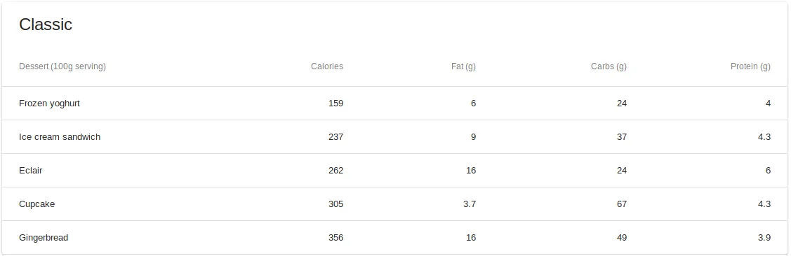
The Problem: Making a Component Configurable
What if I want to reuse the same markup, but with a different set of columns? The usual approach is to define the columns in a configuration prop.
<ReusableTable data={data} orderBy="name" direction="asc" columns={[ { name: "name", label: "Dessert (100g serving)", isNumeric: false }, { name: "calories", label: "Calories", isNumeric: true }, { name: "fat", label: "Fat (g)", isNumeric: true }, { name: "carbs", label: "Carbs (g)", isNumeric: true }, { name: "protein", label: "Protein (g)", isNumeric: true }, ]}/>You may implement it like this:
export const ReusableTable = ({ columns, data, orderBy, direction }) => ( <Table {...props}> <TableHead> <TableRow> {/* Dynamic generation of the header cells from the columns definitions */} {columns.map((column) => ( <TableCell key={column.name} sortDirection={orderBy === column.name ? direction : false} > {column.label} </TableCell> ))} </TableRow> </TableHead> <TableBody> {/* Dynamic generation of the cells from the columns definitions */} {data.map((item) => ( <TableRow key={item.id}> {columns.map((column) => ( <TableCell key={column.name} numeric={column.isNumeric}> {item[column.name]} </TableCell> ))} </TableRow> ))} </TableBody> </Table>);This works fine until I need to customize how a header or a cell is rendered. For example, how can I render some cells as Chip components? I need to introduce a way to specify the components to render.
Configuring With Components
To allow configuration by specifying components, I’m going to introduce a component property to the columns definition. It would be used like this:
const Column = ({ value }) => <span>{value}</span>;const ChipColumn = ({ value }) => <Chip label={value} />;
<ReusableTable  data={data}  orderBy="name"  direction="asc"  columns={[    {      component: Column,      name: "name",      label: "Dessert (100g serving)",      isNumeric: false,    },    {      component: ChipColumn,      name: "calories",      label: "Calories",      isNumeric: true,    },    { component: ChipColumn, name: "fat", label: "Fat (g)", isNumeric: true },    {      component: ChipColumn,      name: "carbs",      label: "Carbs (g)",      isNumeric: true,    },    {      component: ChipColumn,      name: "protein",      label: "Protein (g)",      isNumeric: true,    },  ]}/>;
I could then use the React createElement function in the Table component:
import React, { createElement } from "react";
export const ReusableTable = ({ columns, data, orderBy, direction }) => (  <Table {...props}>    <TableHead>      <TableRow>        {/* Dynamic generation of the header cells from the columns definitions */}        {columns.map((column) => (          <TableCell            key={column.name}            sortDirection={orderBy === column.name ? direction : false}          >            {column.label}          </TableCell>        ))}      </TableRow>    </TableHead>    <TableBody>      {/* Dynamic generation of the cells from the columns definitions */}      {data.map((item) => (        <TableRow key={item.id}>          {columns.map((column) => (            <TableCell key={column.name} numeric={column.isNumeric}>              {createElement(column.component, { value: item[column.name] })}            </TableCell>          ))}        </TableRow>      ))}    </TableBody>  </Table>);
All my Columns components need to know is that they will receive a value prop. However, the code does not look much like the usual react. What if I could use the standard React way of composing elements instead: aka the children?
<ReusableTable data={data} orderBy="name" direction="asc"> <Column name="name" label="Dessert (100g serving)" /> <ChipColumn name="calories" label="Calories" isNumeric /> <ChipColumn name="fat" label="Fat (g)" isNumeric /> <ChipColumn name="carbs" label="Carbs (g)" isNumeric /> <ChipColumn name="protein" label="Protein (g)" isNumeric /><ReusableTable />It looks better already. Here’s how it can be implemented:
import React, { cloneElement, Children } from "react";
export const ReusableTable = ({ children, data, orderBy, direction }) => (  <Table {...props}>    <TableHead>      <TableRow>        {/* Dynamic generation of the header cells from the children */}        {Children.map(children, (column) => (          <TableCell            key={column.props.name}            sortDirection={orderBy === column.props.name ? direction : false}          >            {column.props.label}          </TableCell>        ))}      </TableRow>    </TableHead>    <TableBody>      {/* Dynamic generation of the cells from the children */}      {data.map((item) => (        <TableRow key={item.id}>          {Children.map(children, (column) => (            <TableCell key={column.props.name} numeric={column.props.isNumeric}>              {/* Clone the child, adding a value prop to the props it already has */}              {cloneElement(column, { value: item[column.props.name] })}            </TableCell>          ))}        </TableRow>      ))}    </TableBody>  </Table>);
As before, my Column components will receive their item’s value through the value prop. I still have an issue though: I can customize the cells but what about the headers? For example, how can I add sorting by rendering a button for each header? Or searching inside a column by rendering an input for a header? This is where the Multipass rendering can help.
The Multipass Render Pattern
The ReusableTable is going to completely delegate the rendering of both the headers and the cells to its children component. To allow that, the children must be aware of the context into which they’re rendering: either the header or the cell. To avoid confusion with the React context, I will pass them an intent prop, which will specify whether we intend to render the header or the cell:
import React, { cloneElement, Children } from "react";
export const ReusableTable = ({ children, data, orderBy, direction }) => (  <Table {...props}>    <TableHead>      <TableRow>        {/* Dynamic generation of the header cells from the children */}        {Children.map(children, (column) => (          <TableCell            key={column.props.name}            sortDirection={orderBy === column.props.name ? direction : false}          >            {/* Clone the child, adding an intent prop to the props it already has */}            {cloneElement(column, { intent: "header" })}          </TableCell>        ))}      </TableRow>    </TableHead>    <TableBody>      {/* Dynamic generation of the cells from the children */}      {data.map((item) => (        <TableRow key={item.id}>          {Children.map(children, (column) => (            <TableCell key={column.props.name} numeric={column.props.isNumeric}>              {/* Clone the child, adding intent and value props to the props it already has */}              {cloneElement(column, {                intent: "cell",                value: item[column.props.name],              })}            </TableCell>          ))}        </TableRow>      ))}    </TableBody>  </Table>);
And this is how Column components are implemented:
const Column = ({ intent, label, value }) =>  intent === "header" ? <span>{label}</span> : <span>{value}</span>;
const ChipColumn = ({ intent, label, value }) =>  intent === "header" ? <span>{label}</span> : <Chip label={value} />;
Now, it’s possible to implement all sorts of rules without touching the ReusableTable component: make the cells green or red when the value is below or above a threshold for example, or sorting when clicking an header button:
import TableSortLabel from "@material-ui/core/TableSortLabel";
const HeaderWithSorting = ({  children,  isCurrentOrderBy,  onClick,  orderDirection,}) => (  <TableSortLabel    active={isCurrentOrderBy}    direction={orderDirection}    onClick={onClick}  >    {children}  </TableSortLabel>);
const Column = ({  intent,  label,  name,  value,  onSort,  orderBy,  orderDirection,}) =>  intent === "header" ? (    <HeaderWithSorting      onClick={() => onSort(name)}      isCurrentOrderBy={orderBy === name}      orderDirection={orderDirection}    >      {label}    </HeaderWithSorting>  ) : (    <span>{value}</span>  );
const ChipColumn = ({  intent,  label,  name,  value,  onSort,  orderBy,  orderDirection,}) =>  intent === "header" ? (    <HeaderWithSorting      onClick={() => onSort(name)}      isCurrentOrderBy={orderBy === name}      orderDirection={orderDirection}    >      {label}    </HeaderWithSorting>  ) : (    <Chip label={value} />  );
I can now apply sorting on my data:
<ReusableTable data={this.state.sortedData} orderBy="name" direction="asc"> <Column name="name" label="Dessert (100g serving)" onSort={this.handleSort} orderBy={this.state.orderBy} orderDirection={this.state.orderDirection} /> <ChipColumn name="calories" label="Calories" isNumeric onSort={this.handleSort} orderBy={this.state.orderBy} orderDirection={this.state.orderDirection} /> <ChipColumn name="fat" label="Fat (g)" isNumeric onSort={this.handleSort} orderBy={this.state.orderBy} orderDirection={this.state.orderDirection} /> <ChipColumn name="carbs" label="Carbs (g)" isNumeric onSort={this.handleSort} orderBy={this.state.orderBy} orderDirection={this.state.orderDirection} /> <ChipColumn name="protein" label="Protein (g)" isNumeric onSort={this.handleSort} orderBy={this.state.orderBy} orderDirection={this.state.orderDirection} /><ReusableTable />Conclusion
We think this pattern can be useful in some context as it does break the default react model. Indeed, you can’t use any component as child anymore. All children must be components that implement the multi-pass pattern. But this can be a good thing actually (provided you document it well), as it prevents the component from growing completely out of control.
The code is available on this codesandbox.
Authors
Full-stack web developer at marmelab, Gildas has a strong appetite for emerging technologies. If you want an informed opinion on a new library, ask him, he's probably used it on a real project already.