
React Admin v3: Zoom in the UI Changes

The next major release of React-admin, version 3, has been in the works for the past 6 months, and it’s getting ready for prime time. While it’s still in beta, let’s take a look at the few changes in User Interface, seen in the List page and in the form inputs.
Form Inputs Are Filled By Default
The Material Design specs have evolved: while text fields used to be shown by an underline (the “standard” variant), their guidelines now only propose the “filled” and “outline” variants. This change comes from user tests, which proved that the discoverability of the “standard” text fields wasn’t good enough.
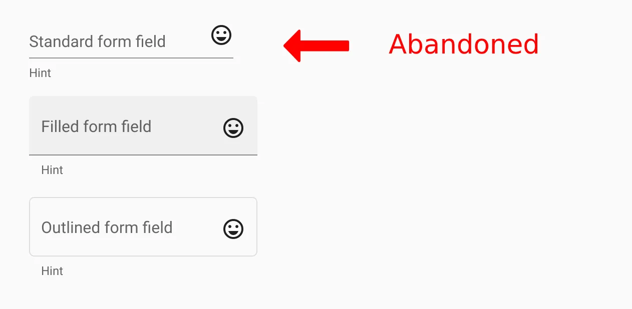
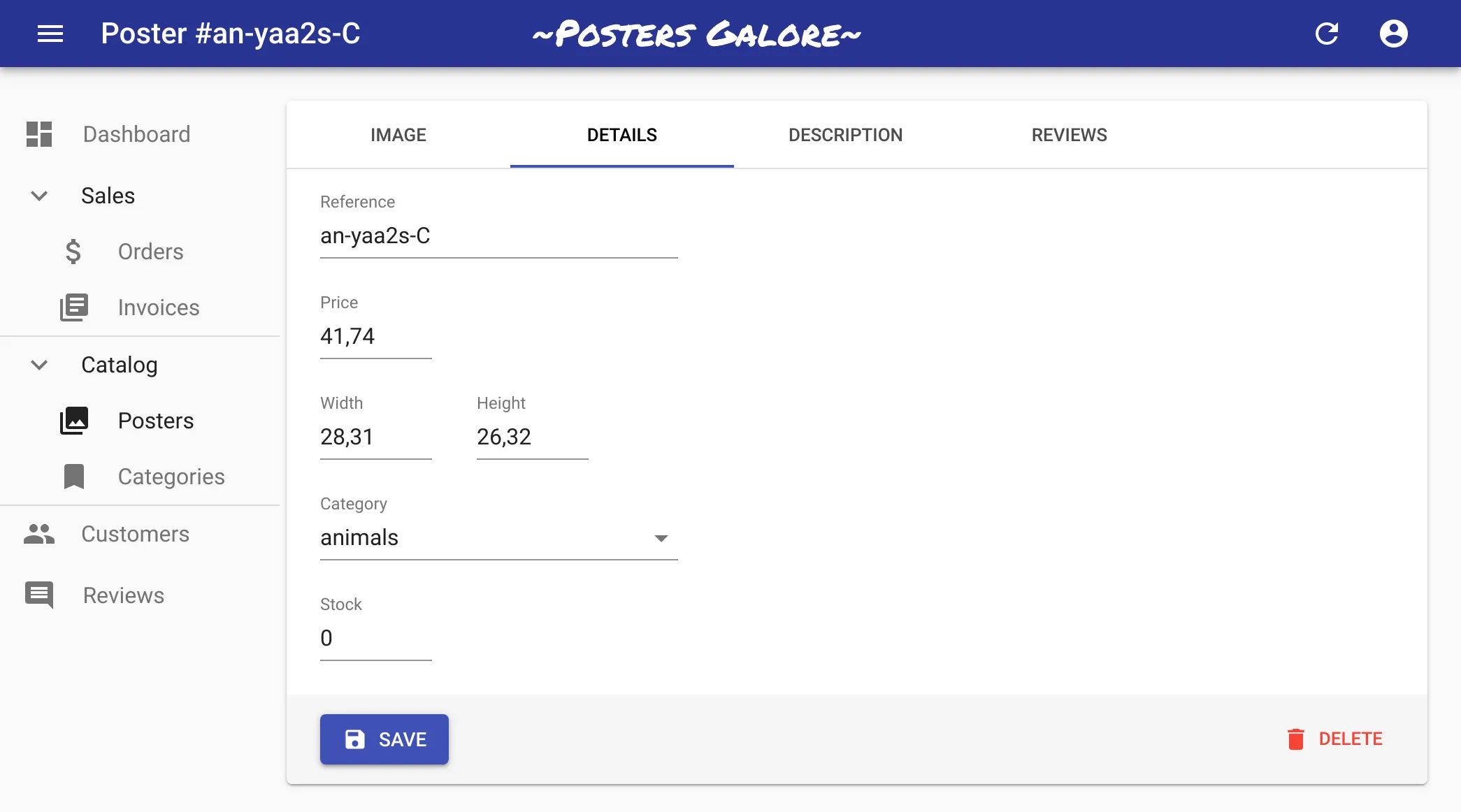
As a consequence, react-admin v3 embraces this change, and defaults to filled variant for all inputs (in forms and filters). So for instance, an edition form that used to look like the following in v2:
Now looks like that in v3:
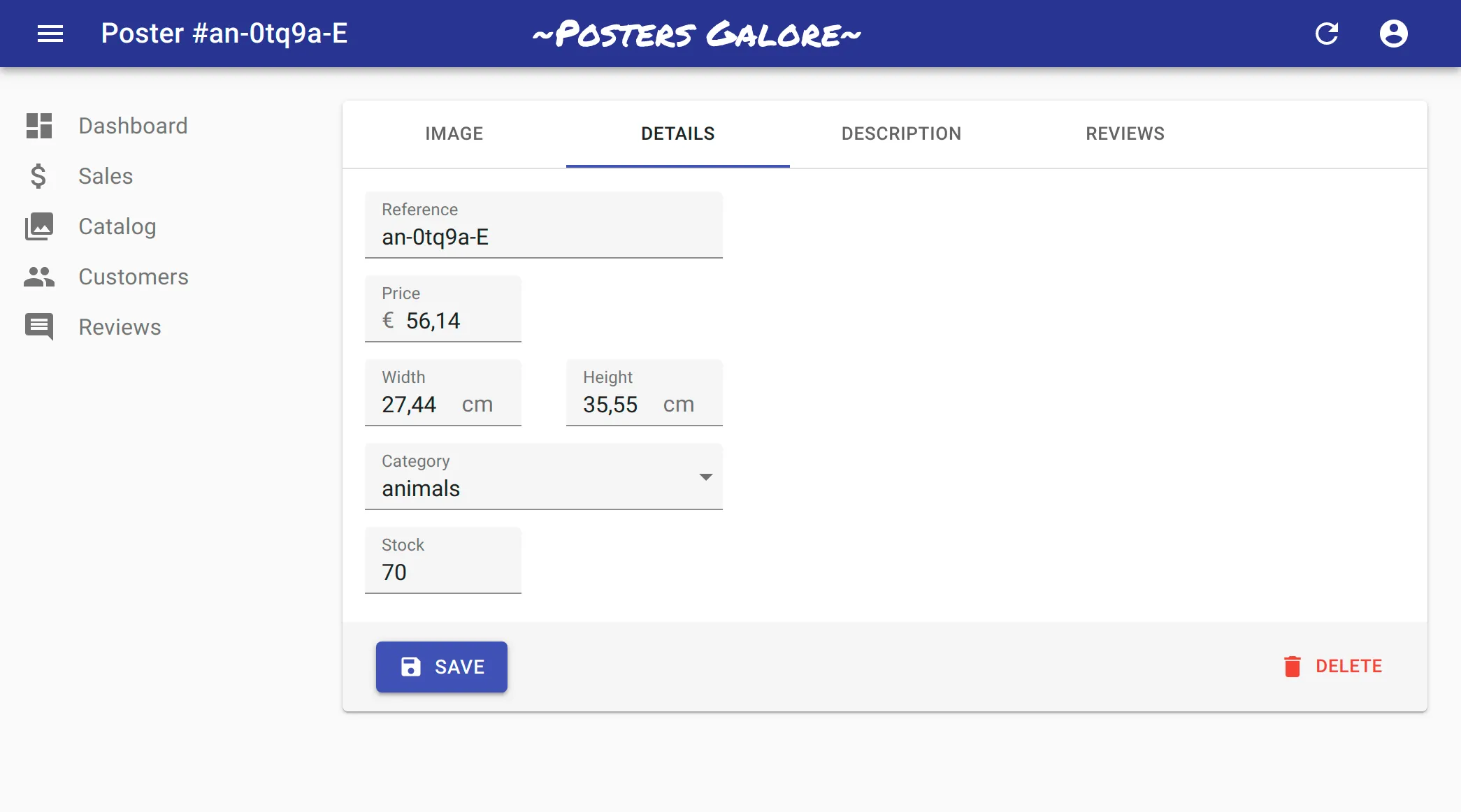
Form inputs use the dense margin by default on desktop, which means that long, complex forms will take less screen real estate and be less intimidating. The margin remains normal on mobile, where users need larger touch targets.
You can customize the variant at the input level, for instance to customize a single TextInput:
const PostEdit = props => <Edit {...props}> <SimpleForm> <TextInput source="title" variant="outlined"> // ... </SimpleForm> </Edit>;In react-admin v3, it’s also possible to have all the inputs of a SimpleForm or a TabbedForm use a given variant:
const PostEdit = (props) => ( <Edit {...props}> <SimpleForm variant="outlined">// ...</SimpleForm> </Edit>);If you really want your forms to look like they were in v2, set the form variant to standard and the margin to normal.
Buttons And Filters Get Out Of The Paper
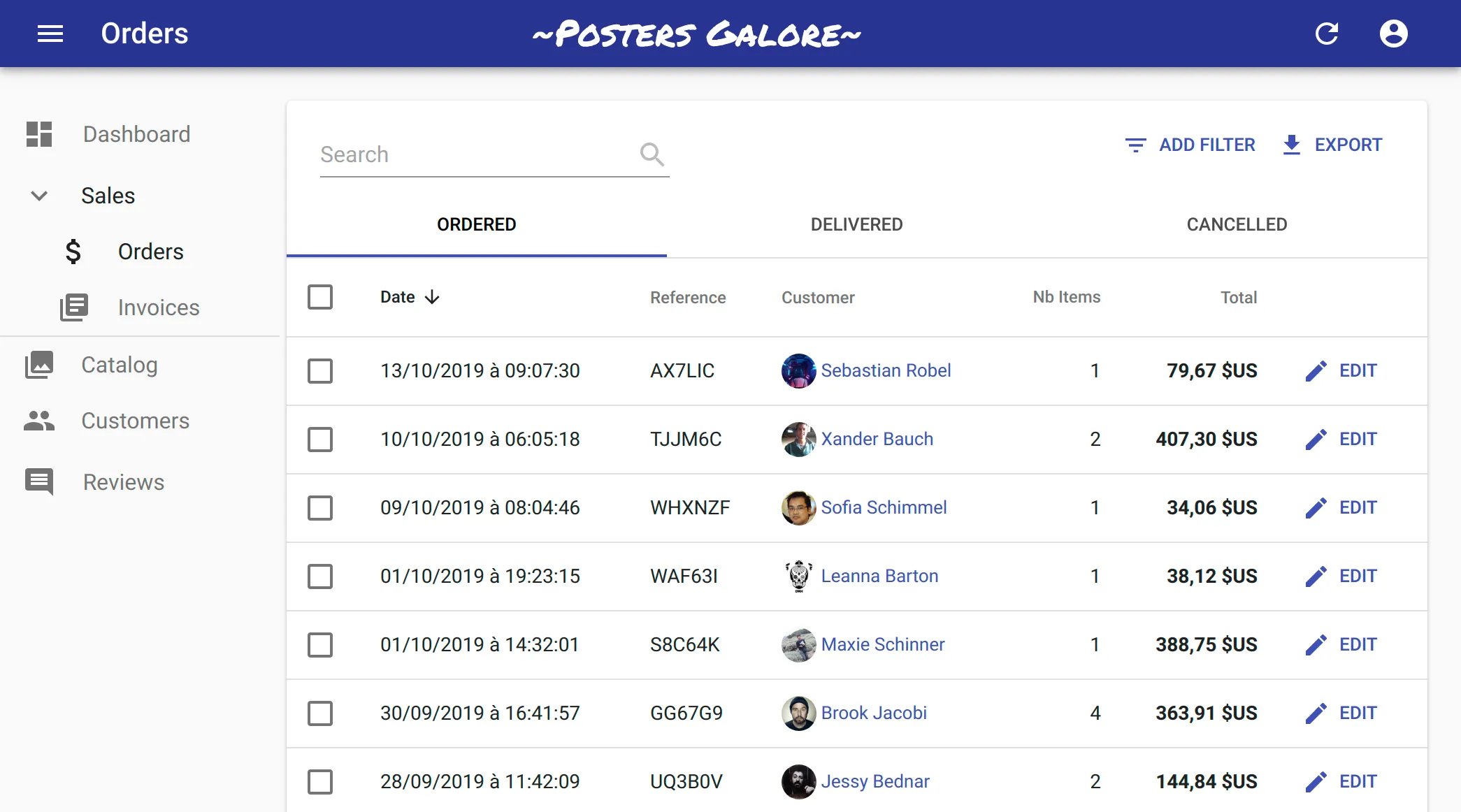
The second major change concerns the main content area, the one containing the list of results in the List page, or the edition form in the Edit page. To make it stand out, react-admin wraps the main content area with a Paper component. But in react-admin v2, the secondary buttons were also included in the Paper, like the “Add Filter” and “Export” buttons in a List:
In react-admin v3, only the main content remains in the Paper ; secondary buttons and filters get out of it:
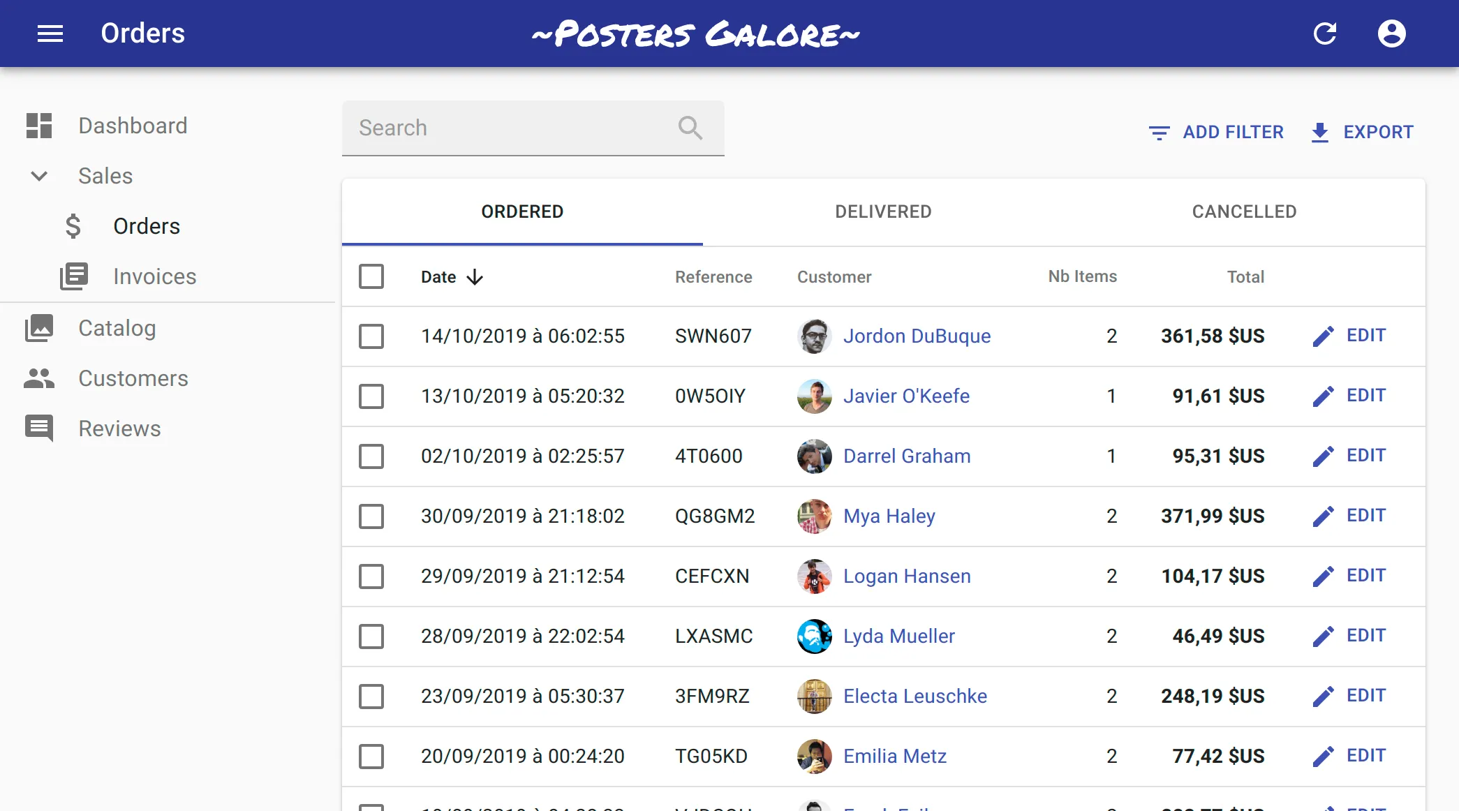
This subtle change gives a more polished look to react-admin apps, and helps users focus on the essential part - the content.
Conclusion
The react-admin default UI is now a bit more user friendly by default. We’ve also made it more consistent, tweaking margins and padding here and there. The users who have tested early versions of react-admin v3 tell us they love the changes. That’s another good reason to upgrade to react-admin v3!

Authors
Marmelab founder and CEO, passionate about web technologies, agile, sustainability, leadership, and open-source. Lead developer of react-admin, founder of GreenFrame.io, and regular speaker at tech conferences.