React Admin v3.1: Make Your Own Admin

The first minor release of react-admin 3, version 3.1, is out. If version 3.0 was focused on unleashing the power of React hooks, 3.1 is all about new features. Without much further ado, here are the highlights.
- Improved customization: Theme overrides, Custom Form Layout, Customizable
<Confirm> - New components:
<PasswordInput>,<BulkExportButton> - Miscellaneous changes
Improved Customization
One of our guiding principles about the react-admin architecture goes like this:
If a non supported feature can be achieved easily in userland by swapping a react-admin component with a custom component, do nothing.
But the opposite is also true:
If a non supported feature requires developers to write loads of boilerplate code copied from the react-admin source, then it’s time to add a new extension point.
Following this principle, we’ve added two new extension points in react-admin v3.1.
Theme Overrides
Material-ui supports overriding the CSS of a component using the theme:
const theme = createMuiTheme({ overrides: { // Style sheet name ⚛️ MuiButton: { // Name of the rule text: { // Some CSS color: "white", }, }, },});React-admin 3.1 supports this, too. All the components with custom style now declare an “override” key, prefixed with “Ra”. For instance, you can customize the <Notification> component colors by adding an override on RaNotification, as follows:
const theme = createMuiTheme({ overrides: { RaNotification: { error: { backgroundColor: "white", color: "red", }, warning: { backgroundColor: "white", color: "orange", }, undo: { color: "blue", }, }, },});To determine which keys can be overridden, check the source code for a given component.
We believe the ability to override all instances of a given component through theming will enable easier customization of the react-admin look and feel. Some people complain that the react-admin look is too much “Google-ish” ; with that change, that’s no longer true. The only limit is your imagination.
Custom Form Layout
React-admin ships two form layouts by default: <SimpleForm> and <TabbedForm>. For complex forms, this is not enough. To better use the screen real estate, developers need to build the layout they want, e.g. using several columns, or inlining related inputs like zipcode and city.
Instead of using the <SimpleForm> code as a starting point (which means copying about 250 lines of code), react-admin 3.1 offers a wrapper over react-final-form’s <Form> component called <FormWithRedirect>, which bundles all the form management logic, and lets you focus on the presentation code. It exposes the same API as <Form>, using a render prop.
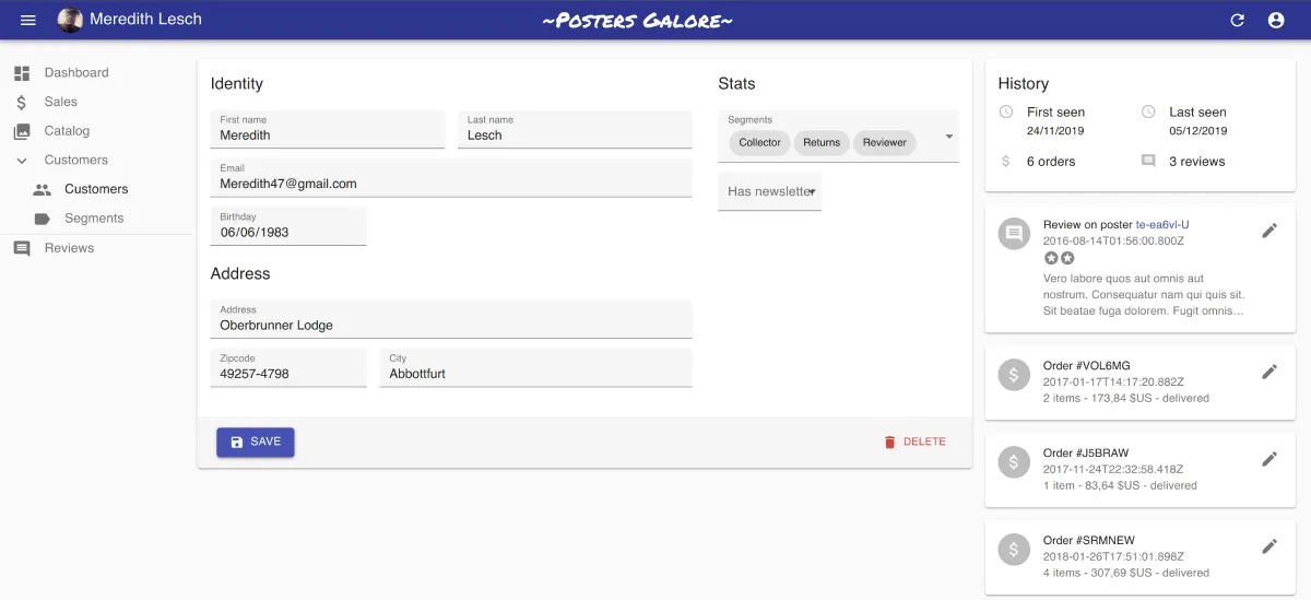
Here is an example of such custom form, taken from the Posters Galore demo. It uses material-ui’s <Box> component, and it’s a good starting point for your custom form layouts.
import {  FormWithRedirect,  DateInput,  SelectArrayInput,  TextInput,  Toolbar,  SaveButton,  DeleteButton,} from "react-admin";import { Typography, Box, Toolbar } from "@material-ui/core";
const VisitorForm = (props) => (  <FormWithRedirect    {...props}    render={(formProps) => (      // here starts the custom form layout      <form>        <Box p="1em">          <Box display="flex">            <Box flex={2} mr="1em">              <Typography variant="h6" gutterBottom>                Identity              </Typography>
              <Box display="flex">                <Box flex={1} mr="0.5em">                  <TextInput                    source="first_name"                    resource="customers"                    fullWidth                  />                </Box>                <Box flex={1} ml="0.5em">                  <TextInput                    source="last_name"                    resource="customers"                    fullWidth                  />                </Box>              </Box>              <TextInput                source="email"                resource="customers"                type="email"                fullWidth              />              <DateInput source="birthday" resource="customers" />              <Box mt="1em" />
              <Typography variant="h6" gutterBottom>                Address              </Typography>
              <TextInput                resource="customers"                source="address"                multiline                fullWidth              />              <Box display="flex">                <Box flex={1} mr="0.5em">                  <TextInput source="zipcode" resource="customers" fullWidth />                </Box>                <Box flex={2} ml="0.5em">                  <TextInput source="city" resource="customers" fullWidth />                </Box>              </Box>            </Box>
            <Box flex={1} ml="1em">              <Typography variant="h6" gutterBottom>                Stats              </Typography>
              <SelectArrayInput                source="groups"                resource="customers"                choices={segments}                fullWidth              />              <NullableBooleanInput                source="has_newsletter"                resource="customers"              />            </Box>          </Box>        </Box>        <Toolbar>          <Box display="flex" justifyContent="space-between" width="100%">            <SaveButton              saving={formProps.saving}              handleSubmitWithRedirect={formProps.handleSubmitWithRedirect}            />            <DeleteButton record={formProps.record} />          </Box>        </Toolbar>      </form>    )}  />);
To use this form layout, simply pass it as child to an <Edit> component:
const VisitorEdit = (props) => ( <Edit {...props}> <VisitorForm /> </Edit>);We’ve documented the FormWithRedirect usage, so you should be ready to build custom form layouts in minutes.
Customizable <Confirm>
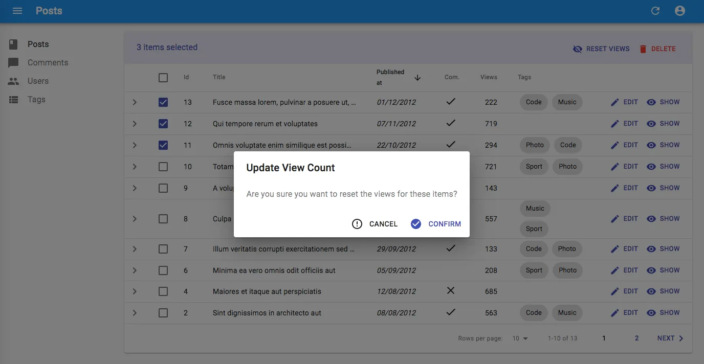
The <Confirm> component allows to display a confirmation dialog before executing an action. For instance, here is a button to reset the number of views for a set of posts… only after the user has confirmed it.
import React, { Fragment, useState } from "react";import {  Button,  Confirm,  useUpdateMany,  useRefresh,  useNotify,  useUnselectAll,} from "react-admin";import VisibilityOff from "@material-ui/icons/VisibilityOff";
const ResetViewsButton = ({ selectedIds }) => {  const [open, setOpen] = useState(false);  const refresh = useRefresh();  const notify = useNotify();  const unselectAll = useUnselectAll();  const [updateMany, { loading }] = useUpdateMany(    "posts",    selectedIds,    { views: 0 },    {      onSuccess: () => {        refresh();        notify("Posts updated");        unselectAll(resource);      },      onFailure: (error) => notify("Error: posts not updated", "warning"),    },  );  const handleClick = () => setOpen(true);  const handleDialogClose = () => setOpen(false);
  const handleConfirm = () => {    updateMany();    setOpen(false);  };
  return (    <Fragment>      <Button label="Reset Views" onClick={handleClick}>        <VisibilityOff />      </Button>      <Confirm        isOpen={open}        loading={loading}        title="Update View Count"        content="Are you sure you want to reset the views for these items?"        onConfirm={handleConfirm}        onClose={handleDialogClose}      />    </Fragment>  );};
export default ResetViewsButton;
Starting with react-admin 3.1, you can customize the confirmation and cancel buttons, using 4 new props:
<Confirm isOpen={open} loading={loading} title="Update View Count" content="Are you sure you want to reset the views for these items?" onConfirm={handleConfirm} onClose={handleDialogClose} confirm="Yes" ConfirmIcon={ThumbUp} cancel="Forget it" CancelIcon={TumbDown}/>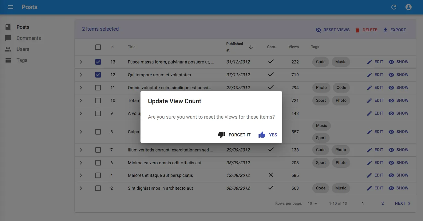
New Components
<PasswordInput>
You’ve seen that component everywhere: a password input that can be turned into a text input by the user to reveal temporarily the password and avoid typos. Material-ui doesn’t provide this component, yet it’s necessary in many login forms and admins.
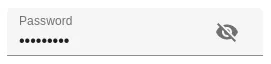
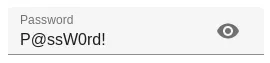
React-admin 3.1 introduces <PasswordInput>, which does exactly that:
import { Edit, SimpleForm, TextInput, PasswordInput } from "react-admin";
const UserEdit = (props) => {  <Edit {...props}>    <SimpleForm>      <TextInput source="username" />      <PasswordInput        source="password"        inputProps={{ autocomplete: "current-password" }}      />    </SimpleForm>  </Edit>;};
One less component to code yourself!
<BulkExportButton>
Developers use the <ExportButton> on the List view. It allows to download a CSV version of the current list, with filter and sorting applied, and without pagination. On the other hand, the checkboxes on each line allow to select a set of records, and to apply an action on all them (“bulk” actions).
Combine these two concepts, and you get the <BulkExportButton>: A button that appears once the user selects at least one record in the list, and allowing to download a CSV for a selection of records.
To use it, add it to the list of <BulkActionButtons>:
import React, { Fragment } from "react";import { List, BulkDeleteButton, BulkExportButton } from "react-admin";
const PostBulkActionButtons = (props) => (  <Fragment>    <BulkDeleteButton {...props} />    <BulkExportButton {...props} />  </Fragment>);
export const PostList = (props) => (  <List {...props} bulkActionButtons={<PostBulkActionButtons />}>    ...  </List>);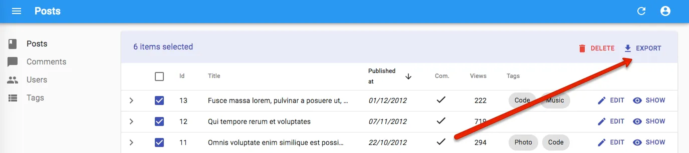
Miscellaneous Changes
React-admin 3.1 also brings a few minor enhancements, including:
- Ability to select the same option more than once in
<AutocompleteArrayInput>thanks to theallowDuplicatesprop - Ability to hide the selection checkbox in the datagrid on a per-row basis using the
isRowSelectableprop
We’ve also progressed in the TypeScript front - adding types to the ra-ui-material-ui package. This is a long and tedious work, and unfortunately the result will only be visible once the entire package is in TypeScript. So please be patient!
The 3.1.0 changelog lists many more minor changes and bug fixes.
Conclusion
React-admin 3.1 is backwards compatible with react-admin 3.0. The upgrade should be painless. Please open an issue on our GitHub repository if you find any regression.
We’ll continue to improve the configurability of react-admin in the next minor releases. Stay tuned!

Authors
Marmelab founder and CEO, passionate about web technologies, agile, sustainability, leadership, and open-source. Lead developer of react-admin, founder of GreenFrame.io, and regular speaker at tech conferences.