React Admin 3.6: Easier Customization Of Edit and Create Views

It’s been a while since we outlined the new features in react-admin. We release a minor version with new features every month, so we are about 3 versions late. Here is a highlight of what’s new since react-admin 3.3.
onSuccess, onFailure and transform props in <Create>, <Edit> and <SaveButton>
If you ever wanted to customize the notifications following the submission of a react-admin form, or to force a refresh when there is none, you may have entered a pit of complexity. The current solutions (successMessage, redirect, onSave) are hard to understand, scattered on different components with no apparent logic, and sometimes they don’t provide the right granularity.
Starting with react-admin 3.6, you can now override the side effects of an Edit or Create page simply by passing a function as onSuccess and onFailure prop in the <Edit> and <Create> components.
For instance, here is how you can customize the error notification based on the Error returned from the dataProvider:
import { Edit, useNotify, useRedirect } from "react-admin";
const PostEdit = (props) => {  const notify = useNotify();  const redirect = useRedirect();  const onFailure = (error) => {    if (error.code == 123) {      notify(        "Could not save changes: concurrent edition in progress",        "warning",      );    } else {      notify("ra.notification.http_error", "warning");    }    redirect("list", props.basePath);  };  return (    <Edit {...props} onFailure={onFailure}>      ...    </Edit>  );};
In addition, if you want to transform the data before it is sent to the dataProvider, you can now use the transform prop. For instance, here is how to force the date for a new post without using initialValues:
const PostCreate = (props) => { const transform = (data) => ({ ...data, createdAt: new Date(), }); return ( <Create {...props} transform={transform}> ... </Create> );};These three new props (onSuccess, onFailure, and transform) are also available on the <SaveButton>, which lets you create forms with several submit buttons, each with different side effects. This is a common need that used to be hard to implement. Not anymore!
For instance, to show a “Save” and a “Save and notify” button, here is how you would alter the form value only when the user clicks on the second save button:
const PostCreateToolbar = (props) => (  <Toolbar {...props}>    <SaveButton submitOnEnter={true} />    <SaveButton      label="post.action.save_and_notify"      transform={(data) => ({ ...data, notify: true })}      submitOnEnter={false}    />  </Toolbar>);
const PostCreate = (props) => (  <Create {...props}>    <SimpleForm toolbar={<PostCreateToolbar />}>// ...</SimpleForm>  </Create>);
Following the introduction of these new props, the successMessage and onSave props are now deprecated.
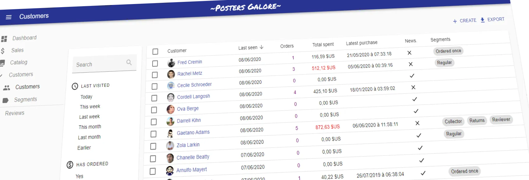
Deselect Rows in <Datagrid>
When users clicked on several checkboxes to select some rows, then changed their minds, they had to deselect the rows one by one. This is especially cumbersome because the row selection persists on navigation - i.e. users can’t navigate away and then back to reset the selection.
Starting with react-admin 3.6, the bulk actions toolbar shows a deselect button allowing to reset the selection. You don’t need to do anything to your code to allow this feature.
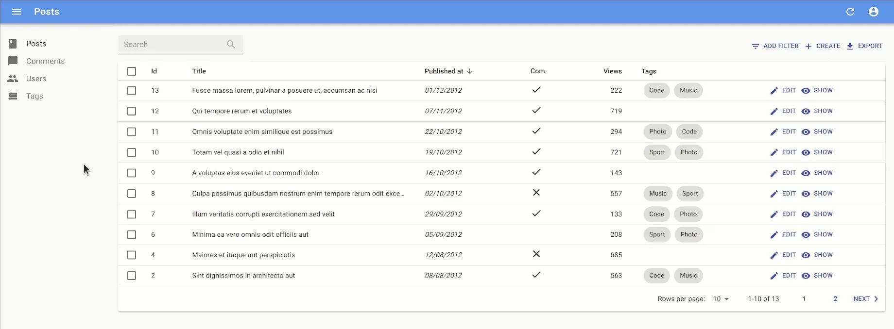
Use A React Element As Field Label
Did you ever try to use an icon as a table header in a react-admin List view? You may have hit a problem with a missing translation. This is no longer the case in react-admin 3.6, which now supports using a React element as a Field label.
import CommentIcon from "@material-ui/icons/CommentOutlined";
const PostList = (props) => (  <List {...props}>    <Datagrid>      <TextField source="title" />      <DateField source="published_at" />      <RatingField label={<CommentIcon fontSize="small" />} />    </Datagrid>  </List>);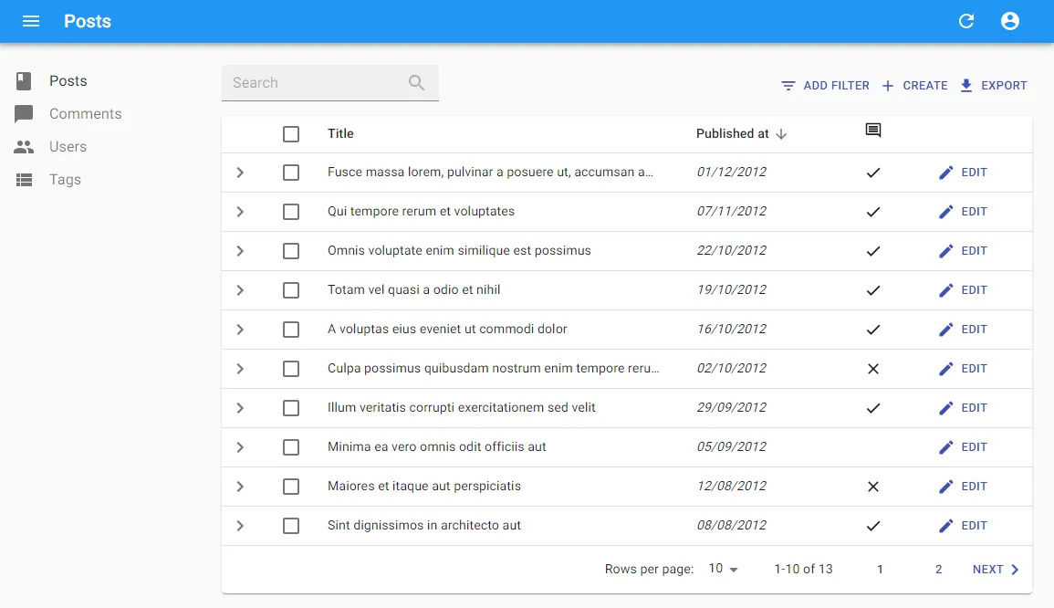
The <SaveButton> Is Disabled Until The Form Is Touched
Create and Edit views often show a form with a submit button. Starting with react-admin 3.6, this button is disabled by default. It becomes enabled as soon as the user makes a change in the form.
 .
.
This feature requires no setting and is enabled by default.
Note: We’ve already received mixed feedback about this feature, so we’ll consider adding an option to disable it, or making it opt-in, in a future bugfix release.
Support Function As linkType Prop In <SimpleList>
When using the <Datagird>, you can already use a function as rwoClick value, to change the click target depending on the record. this is useful for instance to allow the edition only on a subset of records.
Starting with react-admin 3.5, you can now do the same in a <SimpleList>. The prop is called linkType:
import React from "react";import { useMediaQuery } from "@material-ui/core";import {  List,  SimpleList,  Datagrid,  TextField,  ReferenceField,  EditButton,} from "react-admin";
export const PostList = (props) => {  const isSmall = useMediaQuery((theme) => theme.breakpoints.down("sm"));  return (    <List {...props}>      {isSmall ? (        <SimpleList          primaryText={(record) => record.title}          secondaryText={(record) => `${record.views} views`}          tertiaryText={(record) =>            new Date(record.published_at).toLocaleDateString()          }          linkType={(record) => (record.canEdit ? "edit" : "show")}        />      ) : (        <Datagrid rowClick={(record) => (record.canEdit ? "edit" : "show")}>          ...        </Datagrid>      )}    </List>  );};
Row Expansion State Is Now Persistent Upon Navigation
The <Datagrid> component accepts an expand prop, which allows you to display an expand panel under a row to reveal additional information.
Until react-admin 3.4, when users left the list, they lost the history of the expanded rows. Now, the expand state of a row is persisted in the session, so users can come back to a list and see the previously expanded rows still expanded.
That’s one more feature that makes react-admin feel more native and offline-first.
Auto Refresh When Coming Back From The Background
Users often keep react-admin applications open during long sessions. A react-admin app can sit in a tab in the foreground for hours, sometimes days. When a user clicks on a tab to bring such an app in the foreground, it may show outdated data, and lead to bad decisions.
React-admin 3.4 now detects when a tab comes back from the background after a delay (5 minutes), and triggers a refresh in that case. Users will see outdated data for only a short delay, quickly replaced by fresh data.
Customize <AppBar> Color
By default, react-admin uses the secondary color of the theme as the color for the <AppBar>. This is not exactly what the Material Design guidelines advocate. Unfortunately, customizing the <AppBar> color used to be cumbersome.
Not anymore in react-admin 3.4. Simply pass primary or transparent as the color prop value of the <AppBar> component to customize it:
const MyAppBar = (props) => <AppBar {...props} color="primary" />;const MyLayout = (props) => <Layout {...props} appBar={MyAppBar} />;
const App = () => <Admin layout={MyLayout}>...</Admin>;
TypeScript Migration Progress
This change isn’t visible yet, but under the hood, the TypeScript migration of the react-admin codebase is progressing. React-admin 3.6 is now about 71% TypeScript code. This means that some corner cases are more easily detected during development by the core team, and contributors are more guided when they try to understand and change an existing feature.
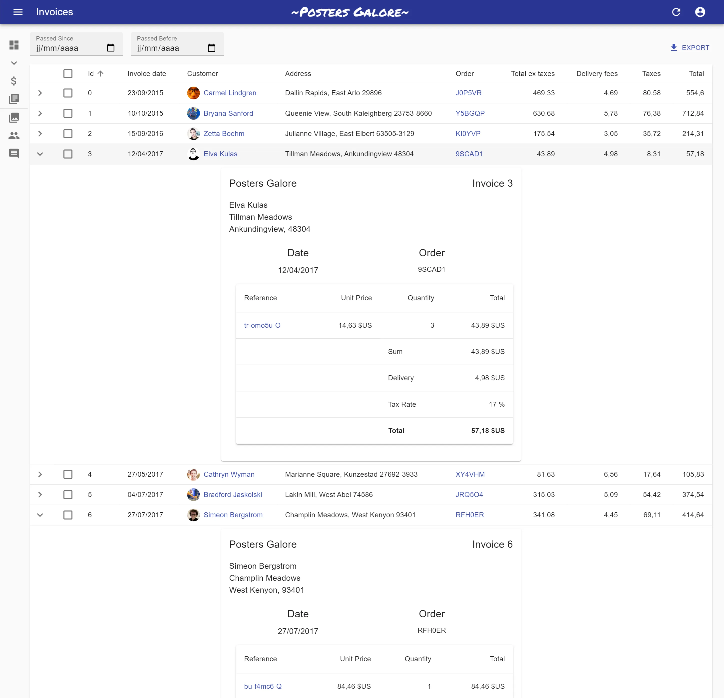
The react-admin and ra-ui-material-ui packages don’t emit types yet, because they’re incomplete and would break existing TypeScript apps. But we’ve made good progress, especially migrating the Posters Galore example entirely to TypeScript.
This was a community effort, so we want to thank all the contributors for that migration. Please join them to help and speed up the migration of the remaining JS files!
Conclusion
For the past 3 months, there have been more than 600 commits in react-admin. We’ve managed to keep up with our release schedule during this period - one bugfix release every week, one minor release with enhancements every month. React-admin now has more than 150 releases and counting. This means that the “cycle time” between the prioritization of a code change and its general availability is very short. Make sure you upgrade regularly - we’ve done our best to guarantee backward compatibility throughout the entire 3.x branch.
To get a complete list of the bug fixes and enhancements since react-admin 3.3, check out the react-admin releases page on GitHub.
Today, react-admin has more than 13,000 stars on GitHub, and it confirms our belief that this is a solid and useful library. We want to thank all the 338 contributors who’ve helped improve that library and to thank you all for your support. We have great plans for the future of react-admin - keep watching this blog for announcements!

Authors
Marmelab founder and CEO, passionate about web technologies, agile, sustainability, leadership, and open-source. Lead developer of react-admin, founder of GreenFrame.io, and regular speaker at tech conferences.