Changing The Look And Feel Of React-Admin Without JSX

This article in part of a serie of advanced tutorials for react-admin. It assumes you already understand the basics of react-admin and have at least completed the official tutorial. You should also be familiar with the material-ui styling methods: withStyles and makeStyles.
Today, we’ll completely redesign the simple example of react-admin just by using the power of themes. During this journey, you will learn how to create your own theme and how to connect it to react-admin. You will be able to change colors, fonts but also to change the layout of some pages. I’ll also reveal you the best practices to build customizable components.
Ready? Let’s go.
This article refers to an example application containing the final result. You can find its source code on Github: Luwangel/react-admin-tutorials-build-your-own-theme. To follow with me this tutorial, please clone the react-admin Simple Example or use its template on CodeSandbox.
Create Your Own Theme
Let’s start by creating a dedicated file for the theme named theme.js (no surprises). And because we don’t want to reinvent the wheel, we will build this theme on top of the default react-admin theme.
// In theme.jsimport { defaultTheme } from "react-admin";import createMuiTheme from "@material-ui/core/styles/createMuiTheme";import merge from "lodash/merge";
export const theme = createMuiTheme(  merge({}, defaultTheme, {    palette: {      // Your theme goes here      // Write the following code to have an orange app bar. We'll explain it later in this article.      secondary: {        main: "#ff9800", // Not far from orange      },    },  }),);
Don’t forget to use the createMuiTheme helper. It’s a powerful method that takes a partial theme and adds the missing parts. So I advise you to always use it.
Once your theme is defined, pass it to the <Admin> component using the appropriate prop.
// In index.jsimport { theme } from "./theme";
render(  <Admin    title="Example Admin"    layout={Layout}    theme={theme} // Add your theme to react-admin  >    {/* Resources goes here */}  </Admin>,  document.getElementById("root"),);
As you can see, the app bar is now orange:
Congratulations, you just created your first theme 🎉. Now react-admin will use it on every page displaying the default layout. We’ll see in the next section how to deal with the special pages.
Theming Custom Pages With No Layout
In react-admin, you can define custom routes and pass them to the <Admin> component. These routes use the default layout, and as a consequence our custom theme. But you can also disable the layout for some custom pages, by passing the noLayout prop . In this case, you’ll have to use the theme manually in the custom page.
Let’s do that for the /custom route.
First, create a <ThemedCustomRouteNoLayout> component which wrap the custom pages with our theme. It will be the only component we need to write.
// In ThemedCustomRouteNoLayout.jsimport { ThemeProvider } from "@material-ui/core/styles";
import { theme } from "./theme";import CustomRouteNoLayout from "./CustomRouteNoLayout";
const ThemedCustomRouteNoLayout = (props) => {  return (    <ThemeProvider theme={theme}>      <CustomRouteNoLayout {...props} />    </ThemeProvider>  );};
export default ThemedCustomRouteNoLayout;
Now replace the <CustomRouteNotLayout> by the <ThemedCustomRouteNoLayout> in the <Admin>.
// In index.jsimport ThemedCustomRouteNoLayout from "./ThemedCustomRouteNoLayout";
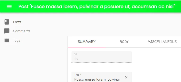
render( <Admin title="Example Admin" layout={Layout} theme={theme} customRoutes={[ <Route exact path="/custom" component={(props) => <ThemedCustomRouteNoLayout {...props} />} noLayout // Skip the layout />, ]} > {/* Resources goes here */} </Admin>, document.getElementById("root"),);The <CustomRouteNoLayout> component implements the following style:
// In CustomRouteNoLayout.jsconst useStyles = makeStyles((theme) => ({ root: { padding: theme.spacing(4), }, title: { color: theme.palette.secondary.main, // Should be orange with our theme },}));It works! The title is orange:
Red, Blue or Orange: Create Your Palette
Now that we have set up the architecture, let’s build a fancy theme.
The Material Design team created a color system, which is a solution to apply colors to your UI in a meaningful way. Each color is called an intention according to its role in the interface. That’s why we talk about the color used to display errors rather than red. The implementation of this color system in material-ui is called the palette (🎨).
A palette is composed of multiple intentions. But let’s focus on the two main intentions:
primary: used to represent primary interface elements for a user, like the color of the buttons.secondary: used to represent secondary interface elements for a user, like the app bar background.
The other ones are error, warning, info, success.
Each intention is also divided in four parts (main, light, dark and contrastText). But don’t worry, when you use the createPalette helper, you only need to pass the main color. The other sub-colors will be calculated automatically using the tonal offset and the contrast threshold.
You can customize the tonal offset and the contrast threshold in order to have a light color “lighter” and a dark color “darker”. But it’s not a common use case so I won’t cover it. Get more information by reading the material-ui documentation about the color calculation.
After these explanations, it’s time to come back to our palette:
// In theme.jsimport { defaultTheme } from "react-admin";import merge from "lodash/merge";import createMuiTheme from "@material-ui/core/styles/createMuiTheme";import createPalette from "@material-ui/core/styles/createPalette";
const palette = createPalette(  merge({}, defaultTheme.palette, {    primary: {      main: "#ff0266", // Not far from red    },    secondary: {      main: "#00ba00", // Not far from green    },  }),);
const rawTheme = {  palette,};
export const theme = createMuiTheme(merge({}, defaultTheme, rawTheme));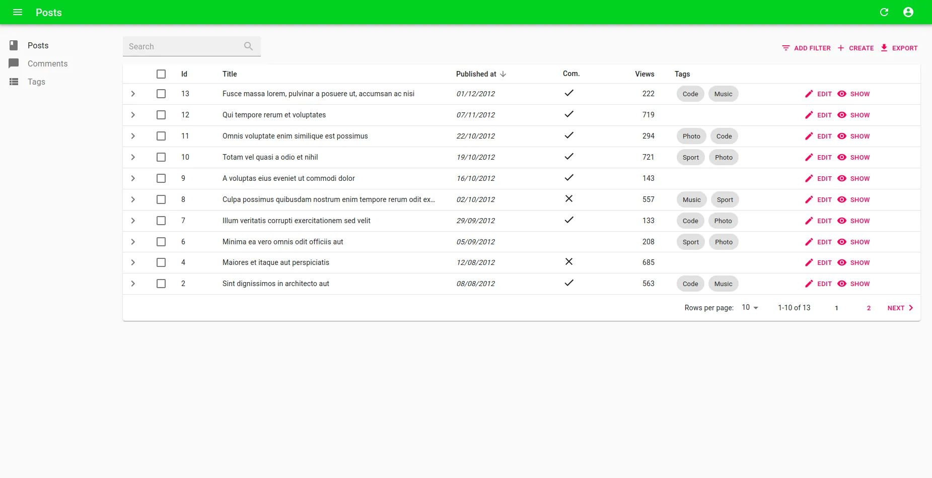
It’s better, right?
The palette also contains:
common: used to defineblackandwhitegrey: contains different levels of greytext: a special property containing several levels of text color (primary,secondary,disabledandhint)background: to define the default and the papers background (defaultandpaper)
Sometimes it’s difficult to build a beautiful palette, especially if you can’t see which part of the interface changes when a color changes. Fortunately, you can use the Material Design Color Tool, which lets you play with advanced color pickers. You can even download the palette and put it directly in your theme file.
Customizing the Default Font
By default we use the Roboto font and load it directly from Google Fonts using a script in the index.html file.
It’s often a good solution to use it because it’s a sans-serif font, it’s accessible and it fits Material Design styles. But for the purpose of this article, we’ll use two funnier fonts: Poppins and Comic+Neue.
<!-- In index.html --><!-- This script adds the Poppins and the Comic+Neue fonts to our project. --><script> var WebFontConfig = { google: { families: ["Poppins", "Comic+Neue"] }, }; (function () { var wf = document.createElement("script"); wf.src = "https://ajax.googleapis.com/ajax/libs/webfont/1/webfont.js"; wf.type = "text/javascript"; wf.async = "true"; var s = document.getElementsByTagName("script")[0]; s.parentNode.insertBefore(wf, s); })();</script>Then, we come back to the theme file to create a typography object. It includes the font families and different font weights. It will be used as a helper to define the rest of the theme.
We also build two different styles for the header and the body because not all fonts are suitable for all use cases. And finally, we set fallback fonts that are native but similar, in case the script cannot load the fonts.
// In theme.js
const typography = {  fontFamilySecondary: "'Poppins', sans-serif",  fontFamily: '"Comic Neue", cursive',  fontSize: 16, // Should be a number in pixels  fontStyle: "normal",  fontWeightLight: 400,  fontWeightRegular: 500,  fontWeightMedium: 600,  fontWeightBold: 700,  color: palette.text.primary,};
const typographyBase = {  fontFamily: typography.fontFamily,  fontSize: typography.fontSize,  fontStyle: typography.fontStyle,  color: typography.color,};
const typographyHeader = {  ...typographyBase,  fontWeight: typography.fontWeightBold,  fontFamily: typography.fontFamilySecondary, // Use a dedicated font for the header};
const typographyBody = {  ...typographyBase,  fontWeight: typography.fontWeightRegular,  fontFamily: typography.fontFamily,};
We can use them to customize the titles and the body:
// In theme.jsconst rawTheme = { palette, typography: { ...typographyBase, h1: { ...typographyHeader, textTransform: "uppercase", fontSize: "4rem", }, // ... Put other title styles below body1: { ...typographyBody, fontSize: "1rem", }, },};The main font size will serve as a reference for the entire style. So if you just want to write bigger text, you don’t need to customize everything.
Just write:
// In theme.jsconst rawTheme = { typography: { fontSize: 16, // Should be a number in pixels },};Unleash the Power of Overrides
Now that we changed the colors and the fonts, it’s time to change the style of some react-admin components and finally build your own theme.
Name Your Components
React-admin components use the material-ui theming mechanism to define their appearance. This mechanism allows to reference a specific component by its style name (such as MuiButton for material-ui buttons) and override parts of its styles. Almost all components provided by react-admin are customizable this way.
They all use a convention for their style names:
Mui[ComponentName]for material-ui componentsRa[ComponentName]for react-admin components
During the build process, default styles and overrides are merged, and passed to the DOM using classic CSS classes. The final result is an HTML component: <button class="MuiButton-root">Save</button>.
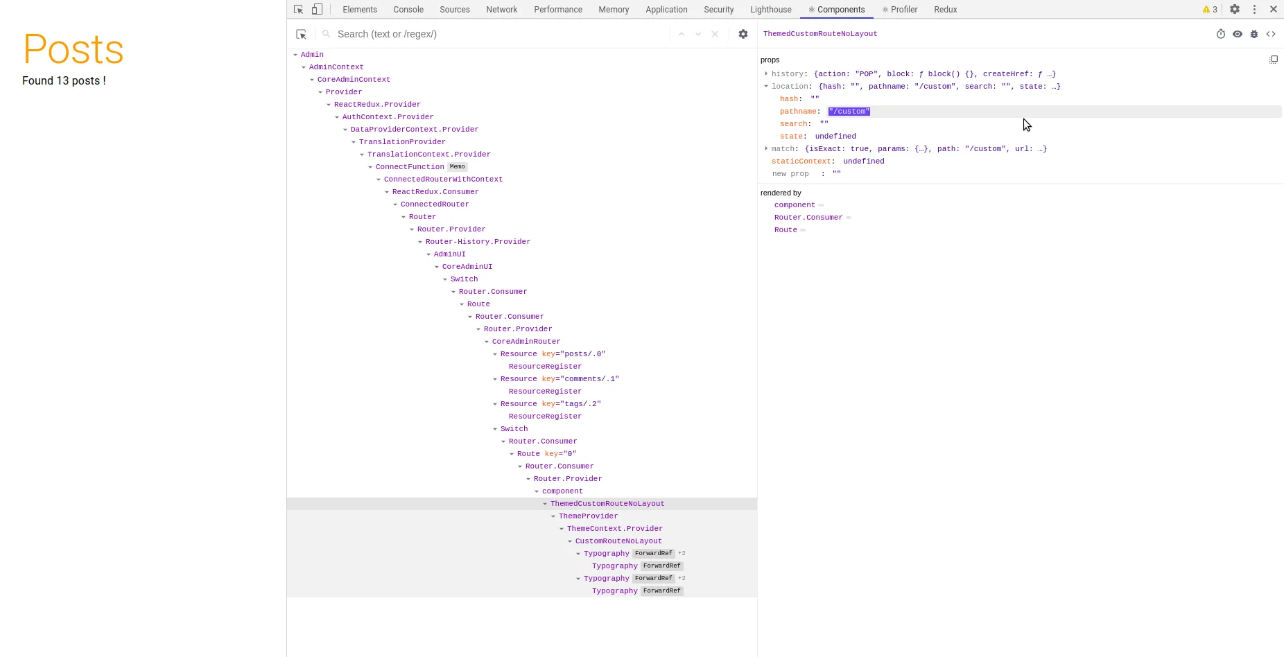
Let’s see it in practice. Start your react-admin project in development and inspect the DOM. You should see something like:
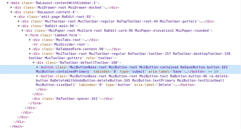
It works in both ways: you can also inspect the generated HTML to retrieve the name of the component your want to re-design. But don’t forget to start your application using the development mode. In production, all classes are minimized and look like jss2909.
To give a name to your component, you have to use the second argument of the material-ui makeStyles method, as you can see below.
// In react-adminimport { makeStyles } from "@material-ui/core/styles";
const useStyles = makeStyles(  (theme) => ({    button: {      position: "relative",    },    leftIcon: {      marginRight: theme.spacing(1),    },    icon: {      fontSize: 18,    },  }),  { name: "RaSaveButton" },);
You can also name your own styles. It’s particularly helpful if you’re building a library of components.
Example: How To Design the <Sidebar>
As an example, let’s style the left menu where the resources are displayed.
Here is the default react-admin <Sidebar>:
It has some advantages. It is simple and can be retracted to give more space to the main content. But it’s difficult to know which item is selected. That’s why I’ll redesign it in three steps.
Step 1: Design the <Sidebar>
First of all, let’s design the <Sidebar> to add a background and a box shadow.
The <Sidebar> is a component from react-admin built on top of a material-ui <Drawer>. The best way to know how things work internally is to read the source code:
// In react-adminconst useStyles = makeStyles(  (theme) => ({    drawerPaper: {      // ...    },  }),  { name: "RaSidebar" },);
const Sidebar = (props) => {  // ...  const classes = useStyles(props);  return (    <Drawer      variant="permanent"      PaperProps={{        className: classes.drawerPaper, // React-admin passes the classes to the <Paper>      }}      {...props}    >      {children}    </Drawer>  );};
As you can see, we should override the RaSidebar name using the key drawerPaper. In our custom theme, add the following code:
// In theme.jsconst rawTheme = { //... overrides: { RaSidebar: { drawerPaper: { backgroundColor: palette.common.white, color: palette.primary.main, height: "100%", boxShadow: "2px 0px 1px -1px rgba(0,0,0,0.2), 1px 0px 3px 0px rgba(0,0,0,0.1)", }, }, },};And the intermediate result is:
Step 2: Design the <MenuItem>
When using the default menu, the difference between the active link and the other links is very slight. The active one is just a little darker as we can see in the code.
// In react-adminconst useStyles = makeStyles( (theme) => ({ root: { color: theme.palette.text.secondary, }, active: { color: theme.palette.text.primary, // Text primary and secondary colors are almost the same }, icon: { minWidth: theme.spacing(5), }, }), { name: "RaMenuItemLink", },);To better highlight the active link, we will:
- Use a grey background
- Change its color
- Add a right border to distinguish the hovered link and the selected one
// In theme.jsconst rawTheme = { //... overrides: { //... RaMenuItemLink: { active: { borderLeftStyle: "none", borderRightColor: palette.secondary.main, borderRightWidth: defaultMuiTheme.spacing(0.5), borderRightStyle: "solid", backgroundColor: palette.action.selected, // Defined in the default palette color: palette.primary.main, fontWeight: typography.fontWeightBold, }, }, },};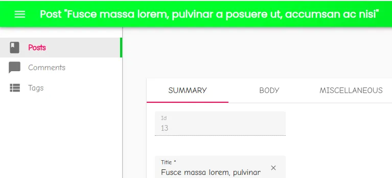
Step 3: Design the icon
In the style, the icon has its own key. But in the final DOM, the icon is a child of the <MenuItemLink>. So to have a red icon add:
// In theme.jsconst rawTheme = { //... overrides: { //... RaMenuItemLink: { // ... icon: { color: "inherit", }, }, },};Now we’re good. Here is the final result:
Write Your Theme
Just repeat the following process for all the existing components you want.
You can go as far as theming all the <Button> variants:
// In theme.js
import defaultMuiTheme from "@material-ui/core/styles/defaultTheme";
const rawTheme = {  overrides: {    MuiButton: {      root: {        color: palette.primary.main,        paddingTop: defaultMuiTheme.spacing(1),        paddingRight: defaultMuiTheme.spacing(4),        paddingBottom: defaultMuiTheme.spacing(1),        paddingLeft: defaultMuiTheme.spacing(4),        borderRadius: defaultMuiTheme.spacing(4),      },      sizeSmall: {        paddingTop: defaultMuiTheme.spacing(0),        paddingRight: defaultMuiTheme.spacing(2),        paddingBottom: defaultMuiTheme.spacing(0),        paddingLeft: defaultMuiTheme.spacing(2),      },      sizeLarge: {        paddingTop: defaultMuiTheme.spacing(2),        paddingRight: defaultMuiTheme.spacing(6),        paddingBottom: defaultMuiTheme.spacing(2),        paddingLeft: defaultMuiTheme.spacing(6),      },      contained: {        boxShadow: "none",      },      containedPrimary: {        color: palette.common.white,        backgroundColor: palette.primary.main,      },      containedSecondary: {        color: palette.common.white,        backgroundColor: palette.secondary.main,      },    },  },};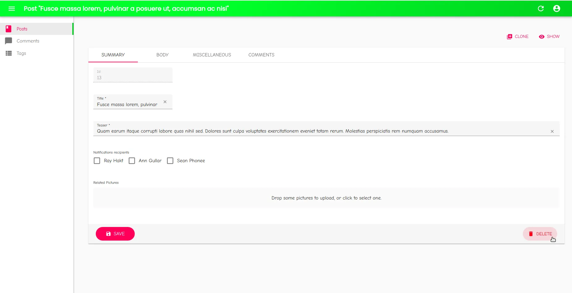
You may ask yourself why I use defaultMuiTheme.spacing(6). It’s just because the custom theme has not been created at this step. So it’s the simplest way to use the method spacing.
The final result is on Github: Luwangel/react-admin-tutorials-build-your-own-theme.
A Great Example of Customization: The React-admin Demo
The react-admin demo is a great example of a simple but efficient customization.
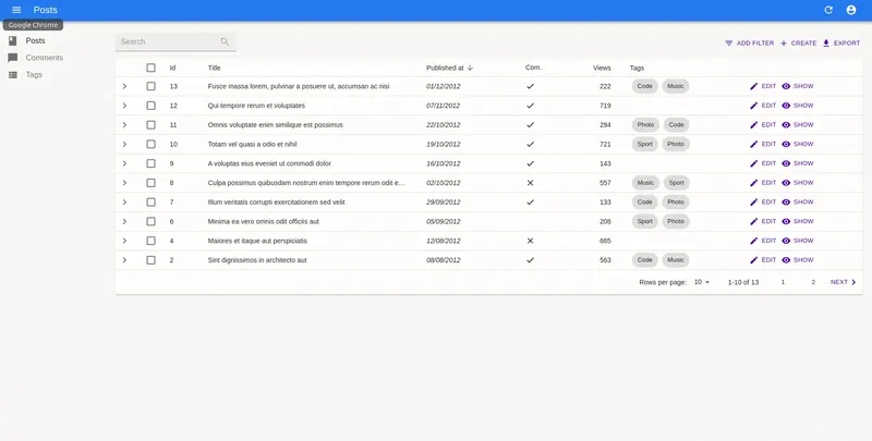
Without a custom theme:
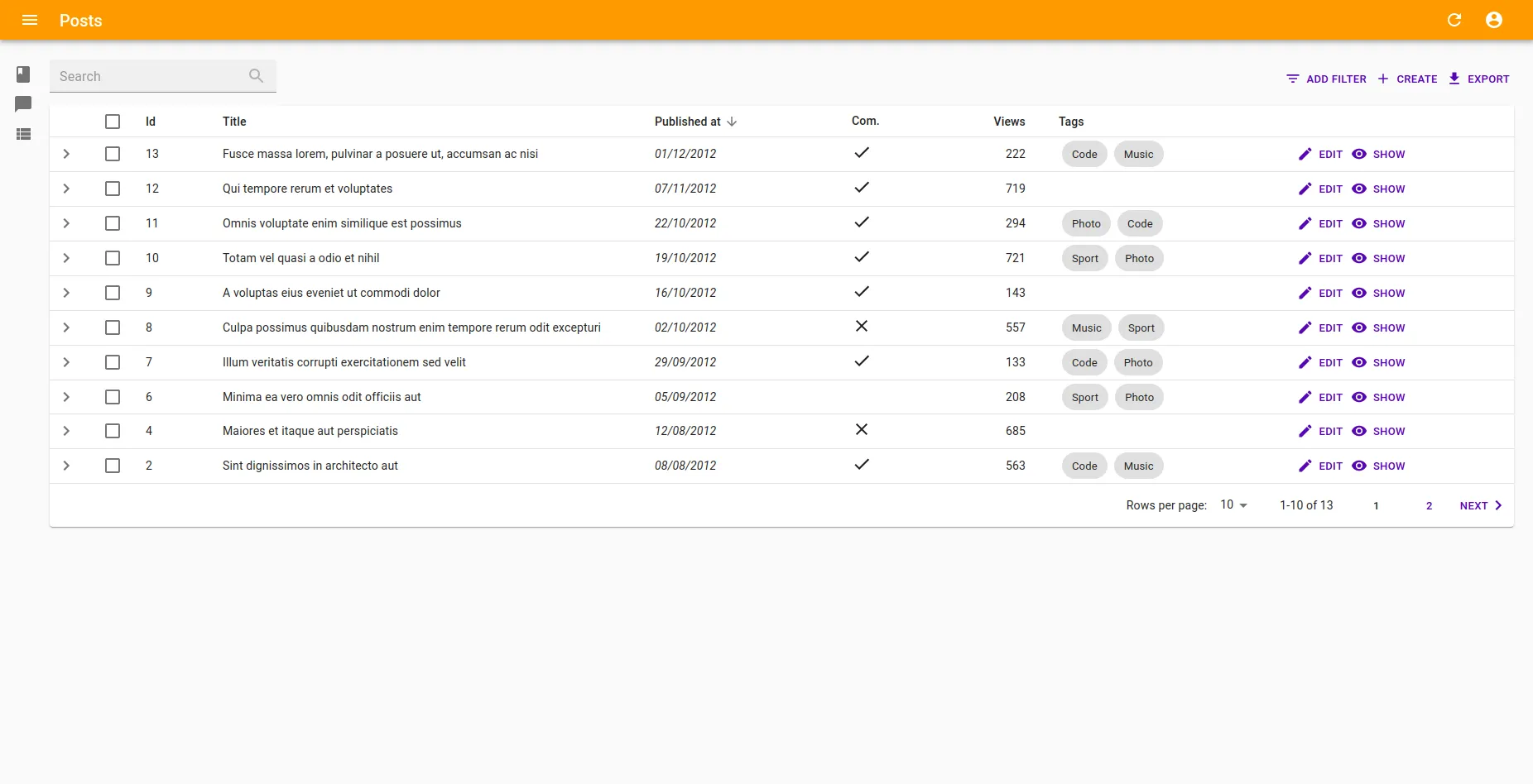
With a custom theme:
And it was done with only 77 lines of code. See by yourself on Github.
Conclusion
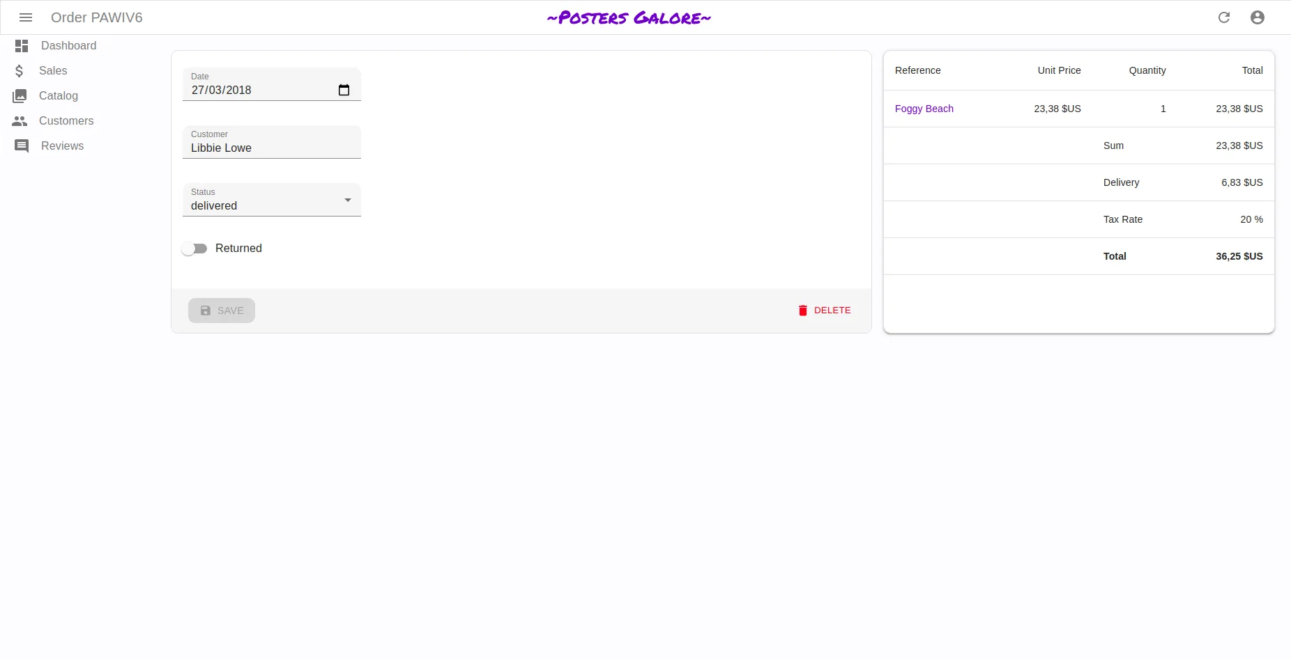
We went quite far just in style customization just by tweaking the react-admin theme. And it’s possible to do more by reorganizing the layout of some components, and rewriting some flexbox rules.
But sometimes it’s not possible to go further and the only solution is to create a custom component. For example if you want to display the inputs of an edit form in 2 columns, you may need to introduce a material-ui <Grid>. But do not worry, it’s just a matter of writing React and material-ui code.
Have fun theming things 🖌️.
Credits: cover picture by Daniel Chekalov.

Authors
Full-stack web developer at marmelab, Adrien is a Software Engineer with a strong taste for agile project management. He's also a judoka! He has only one goal: discover Irene's identity.