
Why You Should Upgrade To Material-UI V5

The excellent material-ui component library for React.js released its version 5 on September 2021, and it rocks!
I’ve been using this new version of material-ui for a few months, and my overall feeling is: I love it. It’s more polished, better documented, and more complete than the previous version. But what I love the most is how it simplifies custom styles.
Material-UI V5 In A Nutshell
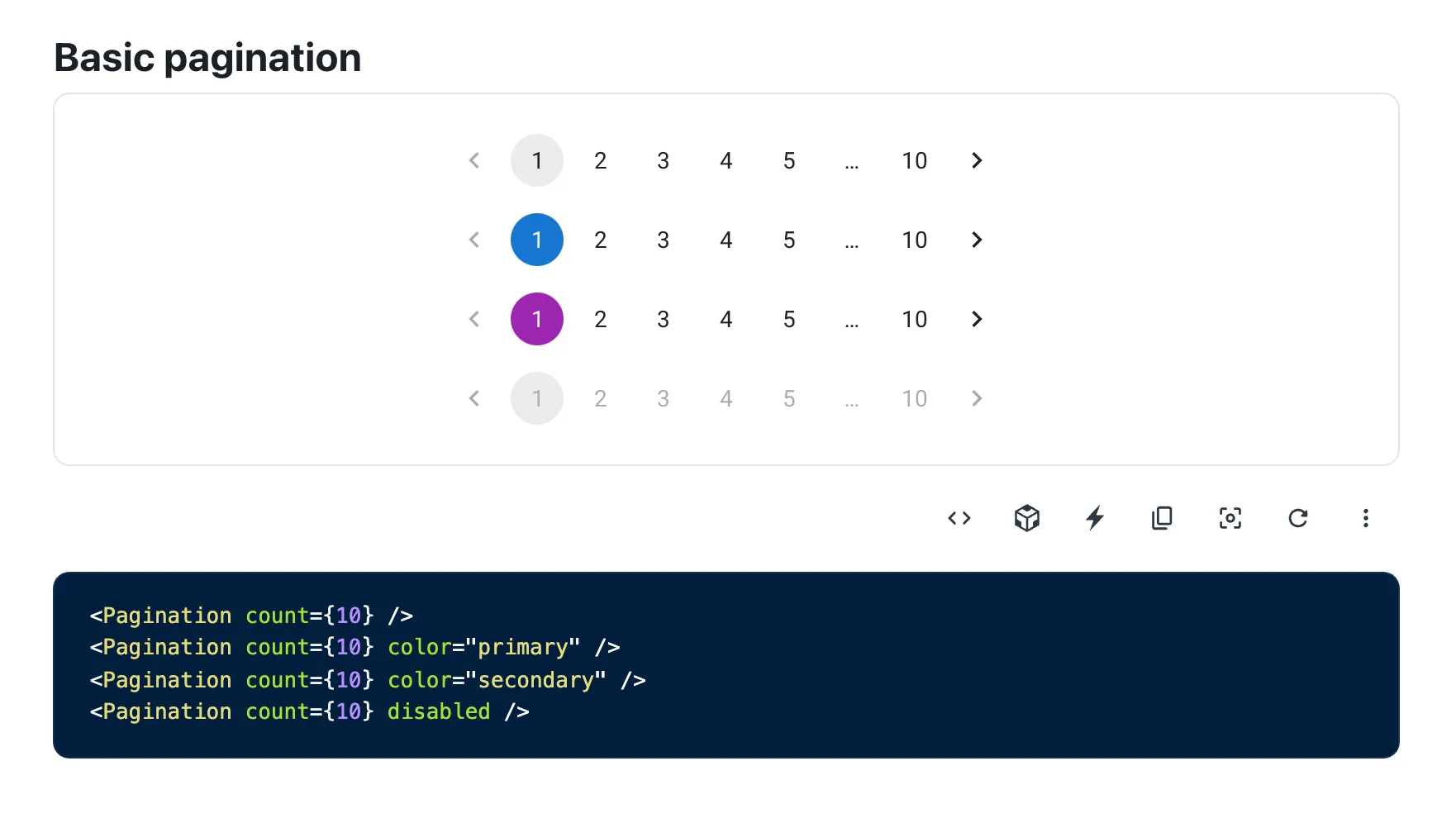
Material-ui V5 introduces some new components (<Stack>, <Autocomplete>, <Pagination>, <Skeleton>, <SpeedDial>, <ToggleButton>, and more), better TypeScript coverage, unstyled components, and the switch from JSS to emotion as the internal styling engine.
It’s mostly backward compatible with version 4, but there are some notable breaking changes. I won’t go over the details of the changes or the upgrade instructions here as the material-ui team already did a great job at it.
The documentation has also been reviewed, improving search, discoverability, and consistency. It only takes a few keystrokes to find an example close to what you’re looking for, and the instructions to customize it.
The killer feature of material-ui v5, though, is the new style system. Let’s see it in action.
makeStyles Was Really A Pain
Customizing a component style used to require too much work in material-ui v4, because of the makeStyles API.
For instance, to render a user card looking like this:

A React component would look like this:
// try me at https://codesandbox.io/s/user-card-mui4-njoxy8import { makeStyles } from "@material-ui/core/styles";import {  Card,  CardContent,  Avatar,  Box,  Typography,  IconButton,} from "@material-ui/core";import AddIcon from "@material-ui/icons/Add";
const useStyles = makeStyles((theme) => ({  card: {    display: "inline-block",    backgroundColor: theme.palette.grey[200],    margin: theme.spacing(1),  },  content: {    display: "flex",    alignItems: "center",    paddingTop: theme.spacing(2),    "&:last-child": {      paddingBottom: theme.spacing(2),    },  },  avatar: {    width: 48,    height: 48,  },  name: {    lineHeight: 1,  },  button: {    backgroundColor: "#fff",    boxShadow: "0 1px 4px 0 rgba(0,0,0,0.12)",    "&:hover": {      backgroundColor: "#fff",      color: "#000",    },  },}));
export const UserCard = ({ user }) => {  const classes = useStyles();  return (    <Card className={classes.card}>      <CardContent className={classes.content}>        <Avatar          variant="rounded"          className={classes.avatar}          src={user.avatar}        />        <Box px={3}>          <Typography variant="h6" className={classes.name}>            {user.name}          </Typography>          <Typography variant="caption" color="textSecondary">            {user.twitter}          </Typography>        </Box>        <IconButton size="small" className={classes.button}>          <AddIcon />        </IconButton>      </CardContent>    </Card>  );};
The big pain point in this code is the separation between styles and markup, and the need to “invent” class names to link the two.
And even for small components that only need a few styles, the makeStyles API is a bit cumbersome. Developers have to generate a useStyles hook outside of their React component, then call this hook inside the component to get a list of class names, then apply these class names to elements in JSX. That’s a lot of ceremony for something that has become much easier since the advent of Tailwind CSS and other utility-first CSS libraries.
I must admit that I’ve come to dislike this makeStyles API, because of its poor developer experience, and despite its great features like theming and performance.
Goodbye makeStyles, Hello sx
The material-ui team has listened, and they have replaced makeStyles with a much simpler and much better API in v5: the sx prop.
Here is the code for the user card component, rewritten for material-ui V5:
// try me at https://codesandbox.io/s/user-card-mui5-t724eoimport {  Card,  CardContent,  Avatar,  Box,  Typography,  IconButton,} from "@mui/material";import AddIcon from "@mui/icons-material/Add";
export const UserCard = ({ user }) => (  <Card sx={{ display: "inline-block", bgcolor: "grey.200", m: 1 }}>    <CardContent      sx={{        display: "flex",        alignItems: "center",        pt: 2,        "&:last-child": { pb: 2 },      }}    >      <Avatar        variant="rounded"        src={user.avatar}        sx={{ width: 48, height: 48 }}      />      <Box px={3}>        <Typography variant="h6" sx={{ lineHeight: 1 }}>          {user.name}        </Typography>        <Typography variant="caption" color="textSecondary">          {user.twitter}        </Typography>      </Box>      <IconButton        size="small"        sx={{          bgcolor: "#fff",          boxShadow: "0 1px 4px 0 rgba(0,0,0,0.12)",          "&:hover": {            bgcolor: "#fff",            color: "#000",          },        }}      >        <AddIcon />      </IconButton>    </CardContent>  </Card>);
That’s right: inline styles! And it’s much shorter, too.
Why sx Is Better
The sx prop (which works on most material-ui V5 components) looks like React’s style prop, but it’s much, much better:
- it supports all CSS properties, plus some shorthand for common CSS properties, e.g.
ptforpaddingTop
<CardContent sx={{ pt: 2 }}>- it allows to style pseudo-elements, like
:hoveror:last-child:
<CardContent sx={{ pt: 2, "&:last-child": { pb: 2 } }}>- It allows responsive values without media queries:
<Box sx={{ width: { xs: 100, // theme.breakpoints.up('xs') sm: 200, // theme.breakpoints.up('sm') md: 300, // theme.breakpoints.up('md') lg: 400, // theme.breakpoints.up('lg') xl: 500, // theme.breakpoints.up('xl') }, }}> This box has a responsive width.</Box>- It allows to style children, e.g. to style the
Avatarinside theCard:
<Card sx={{ '& .MuiAvatar': { width: 48, height: 48 } }}>- It allows to use theme variables, like the spacing or the palette colors:
<Card sx={{ bgcolor: "grey.200" }}>- It offers property name autocompletion in IDEs thanks to TypeScript
The sx API is optional for user land code - you can still use makeStyles in material-ui v5 if you want (but this will increase the bundle size).
The only drawback is speed: using the sx prop is roughly three times slower than using the styles prop. But the material-ui team has made a lot of benchmarks, and the conclusion is that it’s “fast enough” for most use cases.
Conclusion
Developing React applications with material-ui v5 is a joy. The component library never gets in the way, provides useful shortcuts where you need them, and the resulting code is both maintainable and easy to read.
We’ve upgraded to material-ui v5 in react-admin v4 (which is in alpha for now but will soon be ready for prime time). For react-admin developers, this means that it will become even easier to build B2B applications with nice and intuitive user interfaces.
I wanted to send a huge kudos to the mui core team. They’ve done a tremendous job. Long live material-ui!

Authors
Marmelab founder and CEO, passionate about web technologies, agile, sustainability, leadership, and open-source. Lead developer of react-admin, founder of GreenFrame.io, and regular speaker at tech conferences.