Building A Custom Tags Selector With React-Admin

One common task in admins and B2B apps is to define the tags, or categories, of a particular piece of content. Users have a preferred UI for that:
We’ve build such a component with react-admin, the frontend app framework for B2B apps. It’s part of the CRM demo, where it’s called <TagsListEdit>, and it allows the admin to select tags for a given contact.
This component is a great way to discover react-admin data provider hooks, so let’s see how to build it.
The Data Model
Our goal is to create a component that allows us to select tags for a given contact. Let’s see how the contact and tag resources are related.
┌──────────────┐ ┌─────────────┐│ contacts │ │ tags ││--------------│ │-------------││ id │ ┌───│ id ││ tags │╾──┘ │ name ││ first_name │ │ color ││ last_name │ └─────────────┘│ gender ││ ... │└──────────────┘As you can see, the contact resource has a tags property, which is an array of tag ids. So our custom component will need to change, add or remove tag ids from this array.
"contact": { "id": 59, "first_name": "Hattie", "last_name": "Fay", "gender": "female", "company_id": 34, "email": "Hattie34@yahoo.com", "has_newsletter": true, "status": "in-contract", "tags": [3, 4, 7]}Fetching The Tags
The first thing we need to do is to fetch the tags. Since we need to fetch many tags from their id, we will use the useGetMany hook for that.
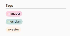
Once we have the tags, all we need to do is to display them as a list of <Chip> components.
import { Box, Chip } from "@mui/material";import { useGetMany, useRecordContext } from "react-admin";
export const TagsListEdit = () => {  const record = useRecordContext();  const { data: tags, isLoading: isLoadingRecordTags } = useGetMany(    "tags",    { ids: record.tags },    { enabled: record && record.tags && record.tags.length > 0 },  );
  if (isLoadingRecordTags || !tags) return null;  return (    <>      {tags.map((tag) => (        <Box mt={1} mb={1} key={tag.id}>          <Chip            size="small"            variant="outlined"            label={tag.name}            style={{ backgroundColor: tag.color, border: 0 }}          />        </Box>      ))}    </>  );};
That’s already enough to display our tags.
Removing Tags
Now that we can display the tags, we need to be able to remove them. To do so, we will add a small button with a ‘cross’ icon at the end of each chip, allowing us to remove the selected tag. Fortunately, with MUI’s <Chip> component, it’s only a matter of adding an onDelete prop.
<Chip size="small" variant="outlined" onDelete={() => handleDeleteTag(tag.id)} label={tag.name} style={{ backgroundColor: tag.color, border: 0 }}/>We can then use the useUpdate hook to update the tags array.
const [update] = useUpdate();
const handleDeleteTag = id => {    const tags: [] = record.tags.filter(tagId => tagId !== id);    update('contacts', {        id: record.id,        data: { tags },        previousData: record,    });};
Here is the full code:
import { Box, Chip } from '@mui/material';import { useGetMany, useRecordContext, useUpdate } from 'react-admin';
export const TagsListEdit = () => {    const record = useRecordContext();    const { data: tags, isLoading: isLoadingRecordTags } = useGetMany(        'tags',        { ids: record.tags },        { enabled: record && record.tags && record.tags.length > 0 },    );    const [update] = useUpdate();
    const handleDeleteTag = id => {        const tags: [] = record.tags.filter(tagId => tagId !== id);        update('contacts', {            id: record.id,            data: { tags },            previousData: record,        });    };
    if (isLoadingRecordTags || !tags) return null;    return (        <>            {tags.map(tag => (                <Box mt={1} mb={1} key={tag.id}>                    <Chip                        size="small"                        variant="outlined"                        onDelete={() => handleDeleteTag(tag.id)}                        label={tag.name}                        style={{ backgroundColor: tag.color, border: 0 }}                    />                </Box>            ))}        </>    );};
And here is the result:
Adding Existing Tags
Now let’s add a way to add existing (but unselected) tags to the contact.
To do so, we will use the useGetList hook to fetch all the unselected tags. Basically, we will fetch all available tags, and then filter the ones that are already selected on the record.
const { data: allTags, isLoading: isLoadingAllTags } = useGetList("tags", { pagination: { page: 1, perPage: 10 }, sort: { field: "name", order: "ASC" },});const unselectedTags = allTags && allTags.filter((tag) => !record.tags.includes(tag.id));Then, we will add a button at the end of the list, which will open an MUI <Menu> thanks to the handleOpen callback.
<Box mt={1}> <Chip icon={<ControlPointIcon />} size="small" variant="outlined" onClick={handleOpen} label="Add tag" color="primary" /></Box>This <Menu> will contain a list of all the unselected tags.
<Menu open={Boolean(anchorEl)} onClose={handleClose} anchorEl={anchorEl}> {unselectedTags?.map((tag) => ( <MenuItem key={tag.id} onClick={() => handleAddTag(tag.id)}> <Chip size="small" variant="outlined" label={tag.name} style={{ backgroundColor: tag.color, border: 0, }} onClick={() => handleAddTag(tag.id)} /> </MenuItem> ))}</Menu>When the user clicks on a tag, we will add it to the tags array, thanks to the handleAddTag callback.
const handleAddTag = id => { const tags: [] = [...record.tags, id]; update('contacts', { id: record.id, data: { tags }, previousData: record, }); setAnchorEl(null);};Here is the full code:
import { Box, Chip, Menu, MenuItem } from '@mui/material';import { useState } from 'react';import {    useGetMany,    useRecordContext,    useUpdate,    useGetList,} from 'react-admin';import ControlPointIcon from '@mui/icons-material/ControlPoint';
export const TagsListEdit = () => {    const record = useRecordContext();    const [anchorEl, setAnchorEl] = useState(null);
    const { data: allTags, isLoading: isLoadingAllTags } = useGetList('tags', {        pagination: { page: 1, perPage: 10 },        sort: { field: 'name', order: 'ASC' },    });    const { data: tags, isLoading: isLoadingRecordTags } = useGetMany(        'tags',        { ids: record.tags },        { enabled: record && record.tags && record.tags.length > 0 },    );    const [update] = useUpdate();
    const unselectedTags =        allTags && allTags.filter(tag => !record.tags.includes(tag.id));
    const handleOpen = event => {        setAnchorEl(event.currentTarget);    };
    const handleClose = () => {        setAnchorEl(null);    };
    const handleDeleteTag = id => {        const tags: [] = record.tags.filter(tagId => tagId !== id);        update('contacts', {            id: record.id,            data: { tags },            previousData: record,        });    };
    const handleAddTag = id => {        const tags: [] = [...record.tags, id];        update('contacts', {            id: record.id,            data: { tags },            previousData: record,        });        setAnchorEl(null);    };
    if (isLoadingRecordTags || !tags || isLoadingAllTags) return null;    return (        <>            {tags.map(tag => (                <Box mt={1} mb={1} key={tag.id}>                    <Chip                        size="small"                        variant="outlined"                        onDelete={() => handleDeleteTag(tag.id)}                        label={tag.name}                        style={{ backgroundColor: tag.color, border: 0 }}                    />                </Box>            ))}            <Box mt={1}>                <Chip                    icon={<ControlPointIcon />}                    size="small"                    variant="outlined"                    onClick={handleOpen}                    label="Add tag"                    color="primary"                />            </Box>            <Menu                open={Boolean(anchorEl)}                onClose={handleClose}                anchorEl={anchorEl}            >                {unselectedTags?.map(tag => (                    <MenuItem key={tag.id} onClick={() => handleAddTag(tag.id)}>                        <Chip                            size="small"                            variant="outlined"                            label={tag.name}                            style={{                                backgroundColor: tag.color,                                border: 0,                            }}                            onClick={() => handleAddTag(tag.id)}                        />                    </MenuItem>                ))}            </Menu>        </>    );};
And here is the result:
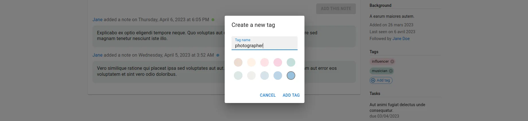
Creating And Adding A New Tag On The Fly
Now, let’s tackle the arguably most interesting part: creating a new tag on the fly.
For this, we will need an MUI <Dialog> displaying a form with a single text input to choose the new tag’s name. Let’s add the logic to control this <Dialog>:
const [open, setOpen] = useState(false);const handleOpenCreateDialog = () => { setOpen(true); setAnchorEl(null); setDisabled(false);};And let’s add a <MenuItem> to create a new tag:
<MenuItem onClick={handleOpenCreateDialog}> <Chip icon={<EditIcon />} size="small" variant="outlined" onClick={handleOpenCreateDialog} color="primary" label="Create new tag" /></MenuItem>Inside the <Dialog>, we will display a simple <form> with a single <TextField>, allowing you to choose the new tag’s name. Let’s add the logic to control this input.
const [newTagName, setNewTagName] = useState("");const handleNewTagNameChange = (event) => { setNewTagName(event.target.value);};And in the <Dialog>:
<Dialog open={open} onClose={() => setOpen(false)} aria-labelledby="form-dialog-title"> <form> <DialogTitle id="form-dialog-title">Create a new tag</DialogTitle> <DialogContent> <TextField autoFocus label="Tag name" fullWidth value={newTagName} onChange={handleNewTagNameChange} sx={{ mt: 1 }} /> </DialogContent> <DialogActions> <Button onClick={() => setOpen(false)} color="primary"> Cancel </Button> <Button type="submit" color="primary"> Add tag </Button> </DialogActions> </form></Dialog>We also would like to be able to choose the color of the new tag. For this, we will use a very simple color picker, consisting of a <Box> rendering a list of <RoundButton> components, each one with a different color, with <RoundButton> being a custom component:
const RoundButton = ({ color, handleClick, selected }) => ( <Box component="button" type="button" sx={{ bgcolor: color, width: 30, height: 30, borderRadius: 15, border: selected ? "2px solid grey" : "none", display: "inline-block", margin: 1, }} onClick={handleClick} />);Now let’s add a state to store the new tag’s color:
const [newTagColor, setNewTagColor] = useState(colors[0]);And let’s add the <Box> beneath the <TextField>:
<Box display="flex" flexWrap="wrap" width={230} mt={2}> {colors.map((color) => ( <RoundButton key={color} color={color} selected={color === newTagColor} handleClick={() => { setNewTagColor(color); }} /> ))}</Box>Now, all that is left is to add the logic to create the new tag when the user clicks on the “Add tag” button. For this, we will use the useCreate hook from react-admin. Let’s create a handleCreateTag callback, which will:
- Create the new tag (using the
useCreatehook) - On success, update the contact’s tags (using the
useUpdatehook) - On success, reset the form and close the dialog
const [create] = useCreate();
const handleCreateTag = (event) => {  event.preventDefault();  setDisabled(true);  create(    "tags",    { data: { name: newTagName, color: newTagColor } },    {      onSuccess: (tag) => {        update(          "contacts",          {            id: record.id,            data: { tags: [...record.tags, tag.id] },            previousData: record,          },          {            onSuccess: () => {              setNewTagName("");              setNewTagColor(colors[0]);              setOpen(false);            },          },        );      },    },  );};
As you can see, this is all done quite easily thanks to the onSuccess mutation options (provided by react-query).
Finally, we can add the onSubmit callback to the <form>:
<form onSubmit={handleCreateTag}>{/* ... */}</form>Here is the full code:
import ControlPointIcon from '@mui/icons-material/ControlPoint';import EditIcon from '@mui/icons-material/Edit';import {    Box,    Button,    Chip,    Dialog,    DialogActions,    DialogContent,    DialogTitle,    Menu,    MenuItem,    TextField,} from '@mui/material';import { useState } from 'react';import {    useGetList,    useGetMany,    useRecordContext,    useUpdate,    useCreate,} from 'react-admin';
import { colors } from '../tags/colors';
export const TagsListEdit = () => {    const record = useRecordContext();    const [open, setOpen] = useState(false);    const [newTagName, setNewTagName] = useState('');    const [newTagColor, setNewTagColor] = useState(colors[0]);    const [anchorEl, setAnchorEl] = useState(null);    const [disabled, setDisabled] = useState(false);
    const { data: allTags, isLoading: isLoadingAllTags } = useGetList('tags', {        pagination: { page: 1, perPage: 10 },        sort: { field: 'name', order: 'ASC' },    });    const { data: tags, isLoading: isLoadingRecordTags } = useGetMany(        'tags',        { ids: record.tags },        { enabled: record && record.tags && record.tags.length > 0 },    );    const [update] = useUpdate();    const [create] = useCreate();
    const unselectedTags =        allTags && allTags.filter(tag => !record.tags.includes(tag.id));
    const handleOpen = event => {        setAnchorEl(event.currentTarget);    };
    const handleClose = () => {        setAnchorEl(null);    };
    const handleDeleteTag = id => {        const tags: [] = record.tags.filter(tagId => tagId !== id);        update('contacts', {            id: record.id,            data: { tags },            previousData: record,        });    };
    const handleAddTag = id => {        const tags: [] = [...record.tags, id];        update('contacts', {            id: record.id,            data: { tags },            previousData: record,        });        setAnchorEl(null);    };
    const handleOpenCreateDialog = () => {        setOpen(true);        setAnchorEl(null);        setDisabled(false);    };
    const handleNewTagNameChange = event => {        setNewTagName(event.target.value);    };
    const handleCreateTag = event => {        event.preventDefault();        setDisabled(true);        create(            'tags',            { data: { name: newTagName, color: newTagColor } },            {                onSuccess: tag => {                    update(                        'contacts',                        {                            id: record.id,                            data: { tags: [...record.tags, tag.id] },                            previousData: record,                        },                        {                            onSuccess: () => {                                setNewTagName('');                                setNewTagColor(colors[0]);                                setOpen(false);                            },                        },                    );                },            },        );    };
    if (isLoadingRecordTags || !tags || isLoadingAllTags) return null;    return (        <>            {tags.map(tag => (                <Box mt={1} mb={1} key={tag.id}>                    <Chip                        size="small"                        variant="outlined"                        onDelete={() => handleDeleteTag(tag.id)}                        label={tag.name}                        style={{ backgroundColor: tag.color, border: 0 }}                    />                </Box>            ))}            <Box mt={1}>                <Chip                    icon={<ControlPointIcon />}                    size="small"                    variant="outlined"                    onClick={handleOpen}                    label="Add tag"                    color="primary"                />            </Box>            <Menu                open={Boolean(anchorEl)}                onClose={handleClose}                anchorEl={anchorEl}            >                {unselectedTags?.map(tag => (                    <MenuItem key={tag.id} onClick={() => handleAddTag(tag.id)}>                        <Chip                            size="small"                            variant="outlined"                            label={tag.name}                            style={{                                backgroundColor: tag.color,                                border: 0,                            }}                            onClick={() => handleAddTag(tag.id)}                        />                    </MenuItem>                ))}                <MenuItem onClick={handleOpenCreateDialog}>                    <Chip                        icon={<EditIcon />}                        size="small"                        variant="outlined"                        onClick={handleOpenCreateDialog}                        color="primary"                        label="Create new tag"                    />                </MenuItem>            </Menu>            <Dialog                open={open}                onClose={() => setOpen(false)}                aria-labelledby="form-dialog-title"            >                <form onSubmit={handleCreateTag}>                    <DialogTitle id="form-dialog-title">                        Create a new tag                    </DialogTitle>                    <DialogContent>                        <TextField                            autoFocus                            label="Tag name"                            fullWidth                            value={newTagName}                            onChange={handleNewTagNameChange}                            sx={{ mt: 1 }}                        />                        <Box display="flex" flexWrap="wrap" width={230} mt={2}>                            {colors.map(color => (                                <RoundButton                                    key={color}                                    color={color}                                    selected={color === newTagColor}                                    handleClick={() => {                                        setNewTagColor(color);                                    }}                                />                            ))}                        </Box>                    </DialogContent>                    <DialogActions>                        <Button onClick={() => setOpen(false)} color="primary">                            Cancel                        </Button>                        <Button                            type="submit"                            color="primary"                            disabled={disabled}                        >                            Add tag                        </Button>                    </DialogActions>                </form>            </Dialog>        </>    );};
const RoundButton = ({ color, handleClick, selected }) => (    <Box        component="button"        type="button"        sx={{            bgcolor: color,            width: 30,            height: 30,            borderRadius: 15,            border: selected ? '2px solid grey' : 'none',            display: 'inline-block',            margin: 1,        }}        onClick={handleClick}    />);
And here is the result:
Conclusion
In this post, we have seen how to leverage some of the most useful React-Admin hooks (useRecordContext, useGetList, useGetMany, useUpdate and useCreate), combined with pure React as well as some MUI components, to create a user-friendly tags list.
This example demonstrates how effective the React-Admin hooks can be when you need to build a custom component. They are very powerful and can be used to build complex components in a few lines of code.
Of course, the complete source code of this CRM demo is available on GitHub.

Authors
Full-stack web developer at marmelab, JB is a Software Engineer with a strong Java experience. He plays the piano and runs fast, and not only because he has long fingers and tall legs.