Porting React-Admin to Solid

Is Solid.js mature enough to build complex applications? What are the core differences with React?
Let’s find out by porting react-admin, the React framework for B2B apps, to Solid.
In order to understand Solid, I built solid-admin, a Solid-based framework for B2B apps. It’s currently a proof-of-concept doing basic CRUD. Keep in mind that I am no expert and am still trying to figure out how to write idiomatic code with Solid. In this article, I’ll explore the code of solid-admin and underline the differences with React.
What Is Solid.js?
SolidJS is a JavaScript framework released in 2020 by Ryan Carnito. Solid picked my interest because it looks very similar to React but doesn’t use a Virtual DOM. As such it claims to have better performances and can back it up too. More importantly it though, it brings new reactive primitives based on signals that do not require you to specify effects dependencies.
Ryan wrote many articles about the differences between Solid and the other frameworks:
- Why SolidJS: Do we need another JS UI Library?
- 5 Ways SolidJS Differs from Other JS Frameworks
- Components are Pure Overhead
Data Fetching Utilities With Signals And Stores
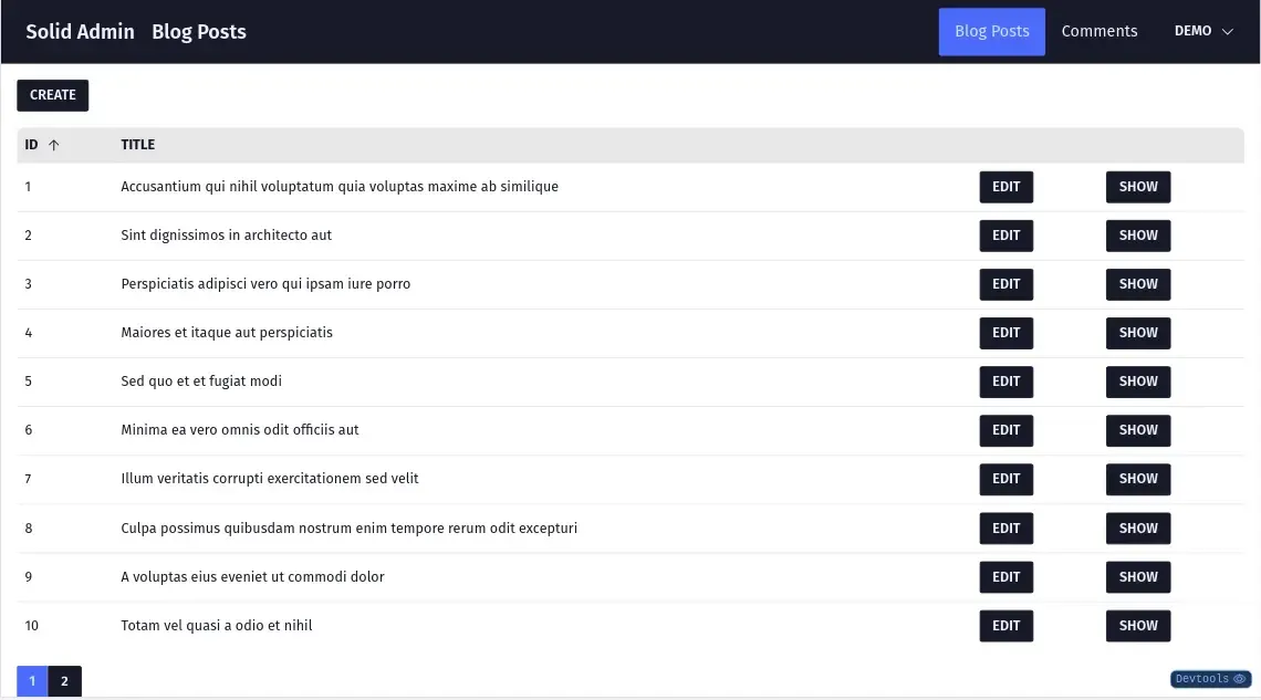
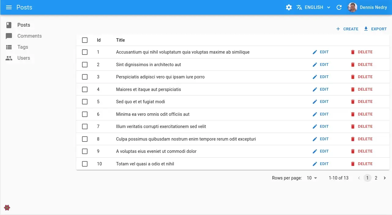
Let’s take a look at the createListController, responsible for fetching the data to display a list view such as the following:
 .
.
Here’s a breakdown of the createListController responsibilities:
- Fetch data according to different parameters such as pagination, sorting, and filters
- Allow consumers to change those parameters and update the URL accordingly
- React to URL changes and update the data by re-fetching it
As in react-admin, createListController delegates the data fetching itself to a custom TanStack/Query hook (I removed the types for clarity):
export const createGetListQuery = (variables, options) => {  const dataProvider = useDataProvider();
  const resource = () => variables().resource;  const params = () => variables().params;  const meta = () => variables().meta;
  const query = createQuery(    () => [resource(), "getList", params(), meta()],    () => {      return dataProvider.getList(resource(), params(), meta());    },    options,  );
  return query;};
There are a few things to note already:
- The
variablesparameter is a function. This is required to ensure the query will update whenever its parameters change. Consumers of the hook have to pass a signal. - To build the query key, I extracted the
variablesproperties into functions. This ensures Solid re-executes them whenevervariableschange.
The createQuery function actually returns a store. This is another reactive primitive in Solid that does not require you to access its value by calling a function. Instead it leverages Proxies to hide the function call to the consumer.
Leveraging Proxies For Better DX
Now, let’s take a look at createListController, the controller for the list page. First, it gets the current resource from a context. They work the same way as in React, no surprise here.
const resource = useResource(options);Then it resolves the list parameters by getting them from the URL and applying some default values:
const [searchParams, setSearchParams] = useSearchParams();
const merged = mergeProps(  { page: 1, perPage: 10, sort: "id", order: "ASC", filter: {} },  options,  {    page: searchParams.page ? parseInt(searchParams.page) : undefined,    perPage: searchParams.perPage ? parseInt(searchParams.perPage) : undefined,    sort: searchParams.sort,    order: searchParams.order,    filter: searchParams.filter ? JSON.parse(searchParams.filter) : {},  },);
The useSearchParams hook comes from solid-router, the official router for solid. As its name implies, it allows one to get and set the URL search parameters. It returns a store too. solid-router is very similar to react-router, providing the same components and hooks.
The merged variable is a merge of the options passed by the createListController consumer and some defaults. I use mergeProps from Solid to merge them as it preserves the reactivity.
Then, I create a signal from those merged options to structure them as the object expected by the createGetListQuery and dataProvider. I also ensure to keep this object synchronized with the URL using the createEffect hook, that do not require any dependencies as the compiler is smart enough to detect them:
const [params, setParams] = createSignal({  pagination: {    page: merged.page,    perPage: merged.perPage,  },  sort: {    field: merged.sort,    order: merged.order,  },  filter: merged.filter,});
createEffect(() => {  setParams({    pagination: {      page: searchParams.page ? parseInt(searchParams.page) : merged.page,      perPage: searchParams.perPage        ? parseInt(searchParams.perPage)        : merged.perPage,    },    sort: {      field: searchParams.sort ? searchParams.sort : merged.sort,      order: searchParams.order ? searchParams.order : merged.order,    },    filter: searchParams.filter      ? JSON.parse(searchParams.filter)      : merged.filter,  });});
const query = createGetListQuery(  () => ({ resource, params: params(), meta: options?.meta }),  options?.queryOptions,);
I then declare a few functions that will allow consumers to change those parameters:
const setPage = (page) => {  setSearchParams({ page });};
const setSort = (params) => {  setSearchParams({ sort: params.field, order: params.order });};
const setFilter = (filter) => {  setSearchParams({ filter: JSON.stringify({ ...merged.filter, filter }) });};
Finally, I build a Proxy that contains the result. It’s called listContextValue as it will be passed inside a context in the default consumer that will see just below. This also allows me to simplify the access to the data and total properties returned by the createGetListQuery hook:
const listContextValue = new Proxy(  {},  {    get(target, props) {      if (props === "setPage") {        return setPage;      }      if (props === "setSort") {        return setSort;      }      if (props === "setFilter") {        return setFilter;      }      if (props === "pagination") {        return params().pagination;      }      if (props === "sort") {        return params().sort;      }      if (props === "filter") {        return params().filter;      }      if (props === "data") {        return query.data?.data;      }      if (props === "total") {        return query.data?.total;      }
      return query[props];    },  },);
Why a proxy? This is because the query object returned by TanStack query is itself a store, hence a proxy and I can’t destructure it without losing the reactivity (e.g. reacting to its loading state or update of data). This is one of the fundamental differences between Solid and React. To preserve the reactivity, I use a Proxy that either calls the list functions or returns the query member that was called.
You can read the full code here.
Building Lists With Headless Components
Now, let’s take a look at the headless component that leverages this controller, the <List> component:
export const List = (props) => {  const list = createListController();  const resource = useResource();  const translate = useTranslate();  const title = createMemo(() =>    translate(`resources.${resource}.name`, {      _: humanize(pluralize(resource)),      smart_count: 2,    }),  );
  return (    <ListProvider value={list}>      <AppTitle>{title()}</AppTitle>      {props.children}    </ListProvider>  );};
As you can see, this component only calls the createListController hook and puts its value inside a context so that its children may access it. It also sets up the page title using the <AppTitle> component that leverages a context under the hood.
A Young Ecosytem And Few UI Libraries
To build the default UI package, I checked out the UI libraries available for Solid and eventually found a few such as SUID, Hope UI and solid-bootstrap. However, at the time of writing, none were close to what Material UI or Matine offer, missing components critical to us such as the Autocomplete.
I decided to try something new by using Kobalte. Kobalte approach it to provide headless components that implements behaviors. It let you fully in charge of the design while giving you everything you need to ensure your components are accessible. Similar libraries exist in React too, such as AriaKit, Radix UI and react-aria.
I also used Daisy UI for the design. It’s a TailwindCSS plugin that provide components for common cases while allowing customization through themes.
A Different Kind Of JSX
Let’s look at a possible child for the <List>: the <DataGrid> component. I took the opportunity to try out TanStack Table. This is quite a shift regarding the syntax to declare a Datagrid. As a reminder, here’s a Datagrid in react-admin:
import * as React from "react";import {  List,  Datagrid,  TextField,  EditButton,  DeleteButton,} from "react-admin";
export const PostList = () => (  <List>    <Datagrid>      <TextField source="id" />      <TextField source="title" />      <EditButton />      <DeleteButton />    </Datagrid>  </List>);
Here’s what it looks like in solid-admin:
import {  CreateButton,  DataGrid,  EditButton,  List,  ShowButton,  TextField,} from "@solid-admin/admin";
export const PostList = () => {  return (    <List>      <DataGrid        columns={[          {            accessorKey: "id",            header: "ID",            cell: () => <TextField source="id" />,          },          {            accessorKey: "title",            header: "Title",            cell: () => <TextField source="title" />,          },          {            accessorKey: "edit",            header: "",            cell: () => <EditButton />,          },          {            accessorKey: "show",            header: "",            cell: () => <ShowButton />,          },        ]}      />    </List>  );};
As you can see, the DataGrid is built with components in React, and with a configuration object that has some render props in Solid with TanStack Table. Note that using TanStack Table in React would lead to similar code.
However, the way that we build DataGrid in react-admin would be way more difficult to achieve in Solid. Indeed, there is another important difference between React and Solid. In Solid, you can’t inspect a component’s children’s props. The react-admin version uses this react feature to inspect the DataGrid children and generate the headers for instance. The same syntax would be possible in Solid by leveraging contexts and allowing the fields to register themselves as columns but it requires more work.
Some might argue that you should avoid inspecting children anyway as it make it difficult to wrap components for custom UI, and I agree for most cases. But, provided you also let users build their own components by leveraging primitives such as the createListController hook, it allows users to craft UI at an unparalleled speed for most cases.
A Solid Datagrid
Let’s break down the DataGrid code. First, it calls the useList hook to get the result of the createListController I introduced earlier from a context. This gives the component access to the list data and functions:
const list = useList();Then it handles the sorting by creating a signal that is passed to the TanStack Table hook. It also uses an effect to convert TanStack Table sorting to the simpler one supported by the createListController and apply it whenever it changes:
const [sorting, setSorting] = createSignal([  { id: list?.sort.field ?? "id", desc: list?.sort.order === "DESC" },]);
createEffect(() => {  const newSorting = sorting();
  if (newSorting.length > 0) {    const order = newSorting[0].desc ? "DESC" : "ASC";    const field = newSorting[0].id;    list?.setSort({ field, order });  }});
The TanStack Table is configured just below. Note the usage of getter functions for the data and sorting properties. This ensures that the table hook reacts to any change in those properties:
const table = createSolidTable({ get data() { return list?.data ?? []; }, columns: props.columns, state: { get sorting() { return sorting(); }, }, onSortingChange: setSorting, getCoreRowModel: getCoreRowModel(), getSortedRowModel: getSortedRowModel(), manualSorting: true, manualPagination: true,});Then, it declares an event handler for the click on the DataGrid headers that toggles sorting:
const handleHeaderClick = (header, event) => { event.preventDefault(); if (header.column.getCanSort()) { header.column.toggleSorting( header.column.getIsSorted() === "asc" ? true : false, ); }};Finally, it renders the UI using TanStack table functions. The rest of the code is very similar to what you would find in React except that you have to use the <Show> component instead of simple if and the <For> component instead of Array.map to play nicely with reactive properties. For instance:
<table class="table table-compact w-full"> <thead> <For each={table.getHeaderGroups()}> {(headerGroup) => ( <tr> <For each={headerGroup.headers}> {(header) => { return ( <th colSpan={header.colSpan} aria-sort={ header.column.getIsSorted() === "asc" ? "ascending" : "descending" } > <Show when={!header.isPlaceholder}> <Show when={header.column.getCanSort()} fallback={flexRender( header.column.columnDef.header, header.getContext(), )} > <button class={ header.column.getCanSort() ? "uppercase cursor-pointer select-none" : undefined } onClick={[handleHeaderClick, header]} > {flexRender( header.column.columnDef.header, header.getContext(), )} <Show when={header.column.getIsSorted() === "asc"}> <Icon class="h-4 w-4 inline-block ml-2" path={arrowSmallUp} /> </Show> <Show when={header.column.getIsSorted() === "desc"}> <Icon class="h-4 w-4 inline-block ml-2" path={arrowSmallDown} /> </Show> </button> </Show> </Show> </th> ); }} </For> </tr> )} </For> </thead> <tbody> <For each={table.getRowModel().rows.slice(0, 10)}> {(row) => ( <RecordProvider record={row.original}> <tr> <For each={row.getVisibleCells()}> {(cell) => ( <td> {flexRender(cell.column.columnDef.cell, cell.getContext())} </td> )} </For> </tr> </RecordProvider> )} </For> </tbody></table>You can read the full code here.
Conclusion
There are far too many things to cover in such a library for a single article but I hope this made you excited to learn more. As you probably realized, Solid does look similar to React but it also requires to question some of the patterns we are used to.
Solid provides a simpler approach to effects that does not require you to micro manage your dependencies and that alone makes it very attractive to me. On the other hand, reactivity requires that you wrap values in signals and that can be a bit tedious.
We released an early version of solid-admin for you to try. It’s an alpha so there will be dragons! As always, it’s open-source so feel free to explore the code at marmelab/solid-admin and contribute!

Authors

Full-stack web developer at marmelab, Gildas has a strong appetite for emerging technologies. If you want an informed opinion on a new library, ask him, he's probably used it on a real project already.