
Input Components
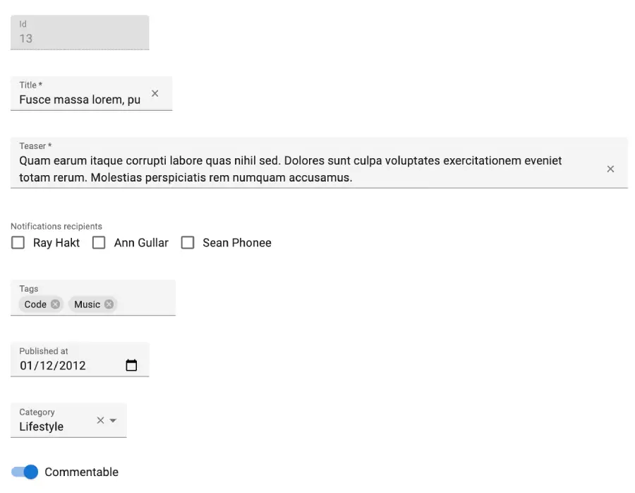
An Input component displays an input, or a dropdown list, a list of radio buttons, etc. Such components allow to update a record field and are common in the <Edit> and <Create> components, and in the List Filters.
Input components are usually wrappers around Material UI form components, bound to the current react-hook-form context.
Usage
Input components must be used inside a Form element (e.g. <Form>, <SimpleForm>, <TabbedForm>). These components create a react-hook-form form and context.
Input components require a source prop.
import { Edit, SimpleForm, ReferenceInput, SelectInput, TextInput, required } from 'react-admin';

export const PostEdit = () => (
    <Edit>
        <SimpleForm>
            <TextInput disabled source="id" />
            <ReferenceInput label="User" source="userId" reference="users" validate={[required()]}>
                <SelectInput optionText="name" />
            </ReferenceInput>
            <TextInput source="title" label="Post title" validate={[required()]} />
            <TextInput multiline source="body" defaultValue="Lorem Ipsum" />
        </SimpleForm>
    </Edit>
);
Common Input Props
All input components accept the following props:
| Prop | Required | Type | Default | Description |
|---|---|---|---|---|
source |
Required | string |
- | Name of the entity property to use for the input value |
className |
Optional | string |
- | Class name (usually generated by JSS) to customize the look and feel of the field element itself |
defaultValue |
Optional | any |
- | Default value of the input. |
disabled |
Optional | boolean |
- | If true, the input is disabled. |
format |
Optional | Function |
value => value == null ? '' : value |
Callback taking the value from the form state, and returning the input value. |
fullWidth |
Optional | boolean |
false |
If true, the input will expand to fill the form width |
helperText |
Optional | string |
- | Text to be displayed under the input (cannot be used inside a filter) |
label |
Optional | string |
- | Input label. In i18n apps, the label is passed to the translate function. Defaults to the humanized source when omitted. Set label={false} to hide the label. |
parse |
Optional | Function |
value => value === '' ? null : value |
Callback taking the input value, and returning the value you want stored in the form state. |
sx |
Optional | SxProps |
- | Material UI shortcut for defining custom styles |
validate |
Optional | Function | array |
- | Validation rules for the current property. See the Validation Documentation for details. |
React-admin uses react-hook-form to control form inputs. Each input component also accepts all react-hook-form useController hook options.
Additional props are passed down to the underlying component (usually an Material UI component). For instance, when setting the variant prop on a <TextInput> component, the underlying Material UI <TextField> receives it, and renders it with a different variant. Refer to the documentation of each Input component to see the underlying Material UI component and its props.
Which Input Component to Use?
React-admin provides a set of Input components, each one designed for a specific data type. Here is a list of the most common ones:
| Data Type | Example value | Input Components |
|---|---|---|
| String | 'Lorem Ipsum' |
<TextInput> |
| Rich text | <p>Lorem Ipsum</p> |
<RichTextInput> |
| Markdown | # Lorem Ipsum |
<MarkdownInput> |
| Password | '********' |
<PasswordInput> |
| Image URL | 'https://example.com/image.png' |
<ImageInput> |
| File URL | 'https://example.com/file.pdf' |
<FileInput> |
| Number | 42, 1.345 |
<NumberInput> |
| Boolean | true |
<BooleanInput>, <NullableBooleanInput> |
| Date | '2022-10-23' |
<DateInput> |
| Time | '14:30:00' |
<TimeInput> |
| Date & time | '2022-10-24T19:40:28.003Z' |
<DateTimeInput> |
| Object | { foo: 'bar' } |
All inputs (see source) |
| Enum | 'foo' |
<SelectInput>, <AutocompleteInput>, <RadioButtonGroupInput> |
| Foreign key | 42 |
<ReferenceInput> |
| Array of objects | [{ item: 'jeans', qty: 3 }, { item: 'shirt', qty: 1 }] |
<ArrayInput> |
| Array of Enums | ['foo', 'bar'] |
<SelectArrayInput>, <AutocompleteArrayInput>, <CheckboxGroupInput>, <DualListInput> |
| Array of foreign keys | [42, 43] |
<ReferenceArrayInput> |
| Translations | { en: 'Hello', fr: 'Bonjour' } |
<TranslatableInputs> |
| Related records | [{ id: 42, title: 'Hello' }, { id: 43, title: 'World' }] |
<ReferenceManyInput>, <ReferenceManyToManyInput>, <ReferenceOneInput> |
className
The className prop is passed to the root element.
<TextInput source="title" className="my-custom-class" />
Tip: Use the sx prop rather than className to style the component.
defaultValue
Value of the input if the record has no value for the source.
<Form record={{ id: 123, title: 'Lorem ipsum' }}>
    <NumberInput source="age" defaultValue={18} /> {/* input initially renders with value 18 */}
    <TextInput source="title" defaultValue="Hello, World!" /> {/* input initially renders with value "Lorem ipsum" */}
</Form>
React-admin will ignore these default values if the Form already defines a form-wide defaultValues:
export const PostCreate = () => (
    <Create>
        <SimpleForm defaultValues={{
            title: 'My first post',
            body: 'This is my first post',
            nb_views: 123,
        }}>
            <TextInput source="title" />
            <RichTextInput source="body" />
            {/* input initially renders with value 123 (form > input) */}
            <NumberInput source="nb_views" defaultValue={0} />
        </SimpleForm>
    </Create>
);
Tip: defaultValue cannot use a function as value. For default values computed at render time, set the defaultValues at the form level.
const postDefaultValue = () => ({ id: uuid(), created_at: new Date(), nb_views: 0 });

export const PostCreate = () => (
    <Create>
        <SimpleForm defaultValues={postDefaultValue}>
            <TextInput source="title" />
            <RichTextInput source="body" />
            <NumberInput source="nb_views" />
        </SimpleForm>
    </Create>
);
disabled
If true, the input is disabled and the user can’t change the value.
<TextInput source="title" disabled />
format
The format prop accepts a callback taking the value from the form state, and returning the input value (which should be a string).
form state value --> format --> form input value (string)
{/* Unit Price is stored in cents, i.e. 123 means 1.23 */}
<NumberInput
    source="unit_price"
    format={v => String(v * 100)}
    parse={v => parseFloat(v) / 100}
format often comes in pair with parse to transform the input value before storing it in the form state. See the Transforming Input Value section for more details.
Tip: By default, react-admin inputs have the following format function, which turns any null or undefined value into an empty string. This is to avoid warnings about controlled/uncontrolled input components:
const defaultFormat = (value: any) => value == null ? '' : value;
fullWidth
If true, the input will expand to fill the form width.

<TextInput source="title" />
<TextInput source="teaser" fullWidth multiline />
helperText
Most inputs accept a helperText prop to display a text below the input.

<NullableBooleanInput
    source="has_newsletter"
    helperText="User has opted in to the newsletter"
/>
Set helperText to false to remove the empty line below the input. Beware that the form may “jump” visually when the input contains an error, as the error message will appear below the input.
Tip: It is not possible to set a helperText for inputs used inside a filter.
label
Input label. Defaults to the humanized source when omitted. Set label={false} to hide the label.
<TextInput source="title" /> {/* input label is "Title" */}
<TextInput source="title" label="Post title" /> {/* input label is "Post title" */}
<TextInput source="title" label={false} /> {/* input has no label */}
Tip: If your interface has to support multiple languages, don’t use the label prop. Provide one label per locale based on the default label (which is resources.${resourceName}.fields.${fieldName}) instead.
const frenchMessages = {
    resources: {
        posts: {
            fields: {
                title: 'Titre',
                // ...
            },
        },
    },
};

<TextInput source="title" /> {/* input label is "Titre" */}
See the Translation documentation for details.
parse
The parse prop accepts a callback taking the value from the input (which is a string), and returning the value to put in the form state.
form input value (string) ---> parse ---> form state value
{/* Unit Price is stored in cents, i.e. 123 means 1.23 */}
<NumberInput
    source="unit_price"
    format={v => String(v * 100)}
    parse={v => parseFloat(v) / 100}
parse often comes in pair with format to transform the form value before passing it to the input. See the Transforming Input Value section for more details.
Tip: By default, react-admin inputs have the following parse function, which transforms any empty string into null:
const defaultParse = (value: string) => value === '' ? null : value;
source
Specifies the field of the record that the input should edit.
<Form record={{ id: 123, title: 'Hello, world!' }}>
    <TextInput source="title" /> {/* default value is "Hello, world!" */}
</Form>
If you edit a record with a complex structure, you can use a path as the source parameter. For instance, if the API returns the following ‘book’ record:
{
    "id": 1234,
    "title": "War and Peace",
    "author": {
        "firstName": "Leo",
        "lastName": "Tolstoi"
    }
}
Then you can display a text input to edit the author’s first name as follows:
<TextInput source="author.firstName" />
sx
Each individual input supports an sx prop to pass custom styles to the underlying component, relying on Material UI system.
<TextInput
    source="title"
    variant="filled"
    sx={{
        marginRight: '1em',
        '& .MuiFilledInput-input': {
            paddingTop: '10px',
        },
    }}
/>
Refer to the documentation of each input component to see what inner classes you can override.
validate
A function or an array of functions to validate the input value.
Validator functions should return undefined if the value is valid, or a string describing the error if it’s invalid.
const validateAge = (value) => {
    if (value < 18) {
        return 'Must be over 18';
    }
    return undefined;
}

<NumberInput source="age" validate={validate} />
Tip: If your admin has multi-language support, validator functions should return message identifiers rather than messages themselves. React-admin automatically passes these identifiers to the translation function:
// in validators/required.js
const required = () => (value) =>
    value
        ? undefined
        : 'myroot.validation.required';
React-admin comes with a set of built-in validators:
required(message)if the field is mandatory,minValue(min, message)to specify a minimum value for integers,maxValue(max, message)to specify a maximum value for integers,minLength(min, message)to specify a minimum length for strings,maxLength(max, message)to specify a maximum length for strings,number(message)to check that the input is a valid number,email(message)to check that the input is a valid email address,regex(pattern, message)to validate that the input matches a regex,choices(list, message)to validate that the input is within a given list,
These are validator factories, so you need to call the function to get the validator.
<NumberInput source="age" validate={required()} />
You can use an array of validators to apply different validation rules to the same input.
<NumberInput source="age" validate={[required(), validateAge]} />
Note: You can’t use both input-level validation and form-level validation - this is a react-hook-form limitation.
Check the Validation chapter for details.
Transforming Input Value to/from Record
The data format returned by the input component may not be what your API desires. You can use the parse and format functions to transform the input value when saving to and loading from the record.
Mnemonic for the two functions:
parse(): input -> recordformat(): record -> input
Let’s look at a simple example. Say the user would like to input values of 0-100 to a percentage field but your API (hence record) expects 0-1.0. You can use simple parse() and format() functions to archive the transform:
<NumberInput source="percent" format={v => v * 100} parse={v => parseFloat(v) / 100} label="Formatted number" />
Another classical use-case is with handling dates. <DateInput> stores and returns a string. If you would like to store a JavaScript Date object in your record instead, you can do something like this:
const dateFormatRegex = /^\d{4}-\d{2}-\d{2}$/;
const dateParseRegex = /(\d{4})-(\d{2})-(\d{2})/;

const convertDateToString = value => {
    // value is a `Date` object
    if (!(value instanceof Date) || isNaN(value.getDate())) return '';
    const pad = '00';
    const yyyy = value.getFullYear().toString();
    const MM = (value.getMonth() + 1).toString();
    const dd = value.getDate().toString();
    return `${yyyy}-${(pad + MM).slice(-2)}-${(pad + dd).slice(-2)}`;
};

const dateFormatter = value => {
    // null, undefined and empty string values should not go through dateFormatter
    // otherwise, it returns undefined and will make the input an uncontrolled one.
    if (value == null || value === '') return '';
    if (value instanceof Date) return convertDateToString(value);
    // Valid dates should not be converted
    if (dateFormatRegex.test(value)) return value;

    return convertDateToString(new Date(value));
};

const dateParser = value => {
    //value is a string of "YYYY-MM-DD" format
    const match = dateParseRegex.exec(value);
    if (match === null) return;
    const d = new Date(match[1], parseInt(match[2], 10) - 1, match[3]);
    if (isNaN(d.getDate())) return;
    return d;
};

<DateInput source="isodate" format={dateFormatter} parse={dateParser} defaultValue={new Date()} />
Tip: A common usage for this feature is to deal with empty values. Indeed, HTML form inputs always return strings, even for numbers and booleans, however most backends expect a value like null. This is why, by default, all react-admin inputs will store the value null when the HTML input value is ''.
Tip: If you need to do this globally, including for custom input components that do not use the useInput hook, have a look at the sanitizeEmptyValues prop of the <Form> component.
Marking An Input as Required
By default, react-admin will add an asterisk to the input label if the Input component uses the required validator.
import { TextInput, required } from 'react-admin';

<TextInput source="title" validate={required()} />
<TextInput source="teaser" multiline fullWidth validate={required()} />
Linking Two Inputs
Edition forms often contain linked inputs, e.g. country and city (the choices of the latter depending on the value of the former).
React-admin relies on react-hook-form for form handling. You can grab the current form values using react-hook-form’s useWatch hook.
import * as React from 'react';
import { Edit, SimpleForm, SelectInput } from 'react-admin';
import { useWatch } from 'react-hook-form';

const countries = ['USA', 'UK', 'France'];
const cities = {
    USA: ['New York', 'Los Angeles', 'Chicago', 'Houston', 'Phoenix'],
    UK: ['London', 'Birmingham', 'Glasgow', 'Liverpool', 'Bristol'],
    France: ['Paris', 'Marseille', 'Lyon', 'Toulouse', 'Nice'],
};
const toChoices = items => items.map(item => ({ id: item, name: item }));

const CityInput = props => {
    const country = useWatch({ name: 'country' });
    return (
        <SelectInput
            choices={country ? toChoices(cities[country]) : []}
            {...props}
        />
    );
};

const OrderEdit = () => (
    <Edit>
        <SimpleForm>
            <SelectInput source="country" choices={toChoices(countries)} />
            <CityInput source="cities" />
        </SimpleForm>
    </Edit>
);

export default OrderEdit;
Alternatively, you can use the react-admin <FormDataConsumer> component, which grabs the form values, and passes them to a child function. As <FormDataConsumer> uses the render props pattern, you can avoid creating an intermediate component like the <CityInput> component above:
import * as React from 'react';
import { Edit, SimpleForm, SelectInput, FormDataConsumer } from 'react-admin';

const OrderEdit = () => (
    <Edit>
        <SimpleForm>
            <SelectInput source="country" choices={toChoices(countries)} />
            <FormDataConsumer>
                {({ formData, ...rest }) => (
                    <SelectInput
                        source="cities"
                        choices={
                            formData.country
                                ? toChoices(cities[formData.country])
                                : []
                        }
                        {...rest}
                    />
                )}
            </FormDataConsumer>
        </SimpleForm>
    </Edit>
);
Tip: When using a FormDataConsumer inside an ArrayInput, the FormDataConsumer will provide three additional properties to its children function:
scopedFormData: an object containing the current values of the currently rendered item from theArrayInputgetSource: a function that translates the source into a valid one for theArrayInput
And here is an example usage for getSource inside <ArrayInput>:
import { FormDataConsumer } from 'react-admin';

const PostEdit = () => (
    <Edit>
        <SimpleForm>
            <ArrayInput source="authors">
                <SimpleFormIterator>
                    <TextInput source="name" />
                    <FormDataConsumer>
                        {({
                            formData, // The whole form data
                            scopedFormData, // The data for this item of the ArrayInput
                            getSource, // A function to get the valid source inside an ArrayInput
                            ...rest
                        }) =>
                            scopedFormData && scopedFormData.name ? (
                                <SelectInput
                                    source={getSource('role')} // Will translate to "authors[0].role"
                                    choices={[{ id: 1, name: 'Head Writer' }, { id: 2, name: 'Co-Writer' }]}
                                    {...rest}
                                />
                            ) : null
                        }
                    </FormDataConsumer>
                </SimpleFormIterator>
            </ArrayInput>
        </SimpleForm>
    </Edit>
);
Hiding Inputs Based On Other Inputs
You may want to display or hide inputs based on the value of another input - for instance, show an email input only if the hasEmail boolean input has been ticked to true.
For such cases, you can use the approach described above, using the <FormDataConsumer> component.
import { FormDataConsumer } from 'react-admin';

 const PostEdit = () => (
     <Edit>
         <SimpleForm shouldUnregister>
             <BooleanInput source="hasEmail" />
             <FormDataConsumer>
                 {({ formData, ...rest }) => formData.hasEmail &&
                      <TextInput source="email" {...rest} />
                 }
             </FormDataConsumer>
         </SimpleForm>
     </Edit>
 );
Note: By default, react-hook-form submits values of unmounted input components. In the above example, the shouldUnregister prop of the <SimpleForm> component prevents that from happening. That way, when end users hide an input, its value isn’t included in the submitted data.
Overriding The Input Variant
Material UI offers 3 variants for text fields: outlined, filled, and standard. The default react-admin theme uses the filled variant.
Most Input components pass their additional props down to the root component, which is often an Material UI Field component. This means you can pass a variant prop to override the variant of a single input:
<TextInput source="name" variant="outlined" />
If you want to use another variant in all the Inputs of your application, override the <Admin theme> prop with a custom theme, as follows:
import { defaultTheme } from 'react-admin';

const theme = {
    ...defaultTheme,
    components: {
        ...defaultTheme.components,
        MuiTextField: {
            defaultProps: {
                variant: 'outlined',
            },
        },
        MuiFormControl: {
            defaultProps: {
                variant: 'outlined',
            },
        },
    }
};

const App = () => (
    <Admin theme={theme}>
        // ...
    </Admin>
);
Tip: If you are a TypeScript user you may want to set the string values in the previous example as const to avoid TypeScript complaining about it:
import { defaultTheme } from 'react-admin';

const theme = {
    ...defaultTheme,
    components: {
        ...defaultTheme.components,
        MuiTextField: {
            defaultProps: {
                variant: 'outlined' as const,
            },
        },
        MuiFormControl: {
            defaultProps: {
                variant: 'outlined' as const,
            },
        },
    }
};

// ...
Writing Your Own Input Component
If you need a more specific input type, you can write it directly in React. You’ll have to rely on react-hook-form’s useController hook, to handle the value update cycle.
Using useController
For instance, let’s write a component to edit the latitude and longitude of the current record:
// in LatLongInput.js
import { useController } from 'react-hook-form';
const LatLngInput = () => {
const input1 = useController({ name: 'lat', defaultValue: '' });
const input2 = useController({ name: 'lng', defaultValue: '' });
return (
<span>
<input {...input1.field} type="number" placeholder="latitude" />
<input {...input2.field} type="number" placeholder="longitude" />
</span>
);
};
export default LatLngInput;
// in ItemEdit.js
const ItemEdit = () => (
<Edit>
<SimpleForm>
<LatLngInput />
</SimpleForm>
</Edit>
);
LatLngInput takes no props, because the useController component can access the current record via the form context. The name prop serves as a selector for the record property to edit. Executing this component will render roughly the following code:
<span>
    <input name="lat" type="number" placeholder="latitude" value={record.lat} />
    <input name="lng" type="number" placeholder="longitude" value={record.lng} />
</span>
Tip: Notice that we have added defaultValue: '' as one of the useController params. This is a good practice to avoid getting console warnings about controlled/uncontrolled components, that may arise if the value of record.lat or record.lng is undefined or null.
Tip: React-hook-form’s useController component supports dot notation in the name prop, to allow binding to nested values:
import { useController } from 'react-hook-form';
const LatLngInput = () => {
const input1 = useController({ name: 'position.lat', defaultValue: '' });
const input2 = useController({ name: 'position.lng', defaultValue: '' });
return (
<span>
<input {...input1.field} type="number" placeholder="latitude" />
<input {...input2.field} type="number" placeholder="longitude" />
</span>
);
};
export default LatLngInput;
Using <Labeled>
This component lacks a label. React-admin provides the <Labeled> component for that:
// in LatLongInput.js
import { useController } from 'react-hook-form';
import { Labeled } from 'react-admin';
const LatLngInput = () => {
const input1 = useController({ name: 'lat', defaultValue: '' });
const input2 = useController({ name: 'lng', defaultValue: '' });
return (
<Labeled label="position">
<span>
<input {...input1.field} type="number" placeholder="latitude" />
<input {...input2.field} type="number" placeholder="longitude" />
</span>
</Labeled>
);
};
export default LatLngInput;
Now the component will render with a label:
<label>Position</label>
<span>
    <input name="lat" type="number" placeholder="longitude" value={record.lat} />
    <input name="lng" type="number" placeholder="longitude" value={record.lng} />
</span>
Using Material UI Field Components
Instead of HTML input elements, you can use an Material UI component like TextField. To bind Material UI components to the form values, use the useController() hook:
// in LatLongInput.js
import TextField from '@mui/material/TextField';
import { useController } from 'react-hook-form';
const BoundedTextField = ({ name, label }) => {
const {
field,
fieldState: { isTouched, invalid, error },
formState: { isSubmitted }
} = useController(name, defaultValue: '');
return (
<TextField
{...field}
label={label}
error={(isTouched || isSubmitted) && invalid}
helperText={(isTouched || isSubmitted) && invalid ? error : ''}
/>
);
};
const LatLngInput = () => (
<span>
<BoundedTextField name="lat" label="latitude" />
<BoundedTextField name="lng" label="longitude" />
</span>
);
Tip: Material UI’s <TextField> component already includes a label, so you don’t need to use <Labeled> in this case.
Tip: Notice that we have added defaultValue: '' as one of the useController params. This is a good practice to avoid getting console warnings about controlled/uncontrolled components, that may arise if the value of record.lat or record.lng is undefined or null.
useController() returns three values: field, fieldState, and formState. To learn more about these props, please refer to the useController hook documentation.
Instead of HTML input elements or Material UI components, you can use react-admin input components, like <NumberInput> for instance. React-admin components already use useController(), and already include a label, so you don’t need either useController() or <Labeled> when using them:
// in LatLongInput.js
import { NumberInput } from 'react-admin';
const LatLngInput = () => (
<span>
<NumberInput source="lat" label="latitude" />
<NumberInput source="lng" label="longitude" />
</span>
);
export default LatLngInput;
The useInput() Hook
React-admin adds functionality to react-hook-form:
- handling of custom event emitters like
onChange, - support for an array of validators,
- detection of required fields to add an asterisk to the field label,
- parse and format to translate record values to form values and vice-versa.
So internally, react-admin components use another hook, which wraps react-hook-form’s useController() hook. It’s called useInput(); use it instead of useController() to create form inputs that have the exact same API as react-admin Input components:
// in LatLongInput.js
import TextField from '@mui/material/TextField';
import { useInput, required } from 'react-admin';
const BoundedTextField = (props) => {
const { onChange, onBlur, ...rest } = props;
const {
field,
fieldState: { isTouched, invalid, error },
formState: { isSubmitted },
isRequired
} = useInput({
// Pass the event handlers to the hook but not the component as the field property already has them.
// useInput will call the provided onChange and onBlur in addition to the default needed by react-hook-form.
onChange,
onBlur,
...props,
});
return (
<TextField
{...field}
label={props.label}
error={(isTouched || isSubmitted) && invalid}
helperText={(isTouched || isSubmitted) && invalid ? error : ''}
required={isRequired}
{...rest}
/>
);
};
const LatLngInput = props => {
const {source, ...rest} = props;
return (
<span>
<BoundedTextField source="lat" label="Latitude" validate={required()} {...rest} />
<BoundedTextField source="lng" label="Longitude" validate={required()} {...rest} />
</span>
);
};
Here is another example, this time using an Material UI Select component:
// in SexInput.js
import Select from '@mui/material/Select';
import MenuItem from '@mui/material/MenuItem';
import { useInput } from 'react-admin';

const SexInput = props => {
    const {
        field,
        fieldState: { isTouched, invalid, error },
        formState: { isSubmitted }
    } = useInput(props);

    return (
        <Select
            label="Sex"
            {...field}
        >
            <MenuItem value="M">Male</MenuItem>
            <MenuItem value="F">Female</MenuItem>
        </Select>
    );
};
export default SexInput;
Tip: useInput accepts all arguments that you can pass to useController. Besides, components using useInput accept props like format and parse, to convert values from the form to the input, and vice-versa:
const parse = value => {/* ... */};
const format = value => {/* ... */};

const PersonEdit = () => (
    <Edit>
        <SimpleForm>
            <SexInput
                source="sex"
                format={formValue => formValue === 0 ? 'M' : 'F'}
                parse={inputValue => inputValue === 'M' ? 0 : 1}
            />
        </SimpleForm>
    </Edit>
);
Reminder: react-hook-form’s formState is wrapped with a Proxy to improve render performance and skip extra computation if specific state is not subscribed. So, make sure you deconstruct or read the formState before render in order to enable the subscription.
const { isDirty } = useFormState(); // ✅
const formState = useFormState(); // ❌ should deconstruct the formState
Third-Party Components
You can find components for react-admin in third-party repositories.
- alexgschwend/react-admin-color-picker: a color input using React Color, a collection of color pickers.
- vascofg/react-admin-date-inputs: a collection of Date Inputs, based on material-ui-pickers
- MrHertal/react-admin-json-view: JSON field and input for react-admin.
- @bb-tech/ra-components:
JsonInputwhich allows only valid JSON as input,JsonFieldto view JSON properly on show card andTrimFieldto trim the fields while showing inDatagridinListcomponent. -
@react-page/react-admin: ReactPage is a rich content editor and comes with a ready-to-use React-admin input component. check out the demo
- DEPRECATED V3 LoicMahieu/aor-tinymce-input: a TinyMCE component, useful for editing HTML