
<SimpleForm>
The <SimpleForm> creates a <form> to edit a record, and renders its children (usually Input components) in a simple layout, one child per row.
Usage
<SimpleForm> reads the record from the RecordContext, uses it to initialize the defaultValues of a <Form>, renders its children in a Material UI <Stack>, and renders a toolbar with a <SaveButton> that calls the save callback prepared by the edit or the create controller when pressed.
<SimpleForm> is often used as child of <Create> or <Edit>. It accepts Input and Field components as children. It relies on react-hook-form for form handling. It requires no prop by default.
import { Create, SimpleForm, TextInput, RichTextInput, NumberInput } from 'react-admin';

export const PostCreate = () => (
    <Create>
        <SimpleForm>
            <TextInput source="title" />
            <RichTextInput source="body" />
            <NumberInput source="nb_views" />
        </SimpleForm>
    </Create>
);
<SimpleForm> calls react-hook-form’s useForm hook, and places the result in a FormProvider component. This means you can take advantage of the useFormContext and useFormState hooks to access the form state.
Here are all the props you can set on the <SimpleForm> component:
componentdefaultValuesidnoValidateonSubmitsanitizeEmptyValuessxtoolbarvalidatewarnWhenUnsavedChanges
Additional props are passed to the useForm hook.
Reminder: react-hook-form’s formState is wrapped with a Proxy to improve render performance and skip extra computation if specific state is not subscribed. So, make sure you deconstruct or read the formState before render in order to enable the subscription.
const { isDirty } = useFormState(); // ✅
const formState = useFormState(); // ❌ should deconstruct the formState
component
<SimpleForm> renders a Material UI <CardContent> by default. You replace it by any component you want as wrapper, just pass it as the component prop.
const PostCreate = () => (
    <Create>
        <SimpleForm component={MyWrapper}>
            <TextInput source="title" />
            <RichTextInput source="body" />
            <NumberInput source="nb_views" />
        </SimpleForm>
    </Create>
);
defaultValues
The value of the form defaultValues prop is an object, or a function returning an object, specifying default values for the created record. For instance:
const postDefaultValue = () => ({ id: uuid(), created_at: new Date(), nb_views: 0 });

export const PostCreate = () => (
    <Create>
        <SimpleForm defaultValues={postDefaultValue}>
            <TextInput source="title" />
            <RichTextInput source="body" />
            <NumberInput source="nb_views" />
        </SimpleForm>
    </Create>
);
Tip: You can include properties in the form defaultValues that are not listed as input components, like the created_at property in the previous example.
Tip: React-admin also allows to define default values at the input level. See the Setting default Values section.
id
Normally, a submit button only works when placed inside a <form> tag. However, you can place a submit button outside of the form if the submit button form matches the form id.
Set this form id via the id prop.
export const PostCreate = () => (
    <Create>
        <SimpleForm toolbar={false} id="post_create_form">
            <TextInput source="title" />
            <RichTextInput source="body" />
            <NumberInput source="nb_views" />
        </SimpleForm>
        <SaveButton form="post_create_form" />
    </Create>
);
noValidate
The <form novalidate> attribute prevents the browser from validating the form. This is useful if you don’t want to use the browser’s default validation, or if you want to customize the error messages. To set this attribute on the underlying <form> tag, set the noValidate prop to true.
const PostCreate = () => (
    <Create>
        <SimpleForm noValidate>
            <TextInput source="title" />
            <RichTextInput source="body" />
            <NumberInput source="nb_views" />
        </SimpleForm>
    </Create>
);
onSubmit
By default, the <SimpleForm> calls the save callback passed to it by the edit or create controller, via the SaveContext. You can override this behavior by setting a callback as the onSubmit prop manually.
export const PostCreate = () => {
    const [create] = useCreate();
    const postSave = (data) => {
        create('posts', { data });
    };
    return (
        <Create>
            <SimpleForm onSubmit={postSave}>
                <TextInput source="title" />
                <RichTextInput source="body" />
                <NumberInput source="nb_views" />
            </SimpleForm>
        </Create>
    );
};
sanitizeEmptyValues
In HTML, the value of empty form inputs is the empty string (''). React-admin inputs (like <TextInput>, <NumberInput>, etc.) automatically transform these empty values into null.
But for your own input components based on react-hook-form, this is not the default. React-hook-form doesn’t transform empty values by default. This leads to unexpected create and update payloads like:
{
    id: 1234,
    title: 'Lorem Ipsum',
    is_published: '',
    body: '',
    // etc.
}
If you prefer to omit the keys for empty values, set the sanitizeEmptyValues prop to true. This will sanitize the form data before passing it to the dataProvider, i.e. remove empty strings from the form state, unless the record actually had a value for that field before edition.
const PostCreate = () =>  (
    <Create>
        <SimpleForm sanitizeEmptyValues>
            ...
        </SimpleForm>
    </Create>
);
For the previous example, the data sent to the dataProvider will be:
{
    id: 1234,
    title: 'Lorem Ipsum',
}
Note: Setting the sanitizeEmptyValues prop to true will also have a (minor) impact on react-admin inputs (like <TextInput>, <NumberInput>, etc.): empty values (i.e. values equal to null) will be removed from the form state on submit, unless the record actually had a value for that field.
If you need a more fine-grained control over the sanitization, you can use the transform prop of <Edit> or <Create> components, or the parse prop of individual inputs.
sx: CSS API
Pass an sx prop to customize the style of the main component and the underlying elements.
The most common usage is to limit the width of the form, to avoid long inputs on large screens:
export const PostCreate = () => (
    <Create>
        <SimpleForm sx={{ maxWidth: 600 }}>
            <TextInput source="title" />
            <RichTextInput source="body" />
            <NumberInput source="nb_views" />
        </SimpleForm>
    </Create>
);
toolbar
By default, <SimpleForm> renders a toolbar at the bottom of the form, containing:
- a submit button on Creation pages,
- a submit button and a delete button on Edition pages.
If you want to tweak the look and feel of that toolbar, add or remove buttons, pass your own toolbar component to the form using the toolbar prop.
const PostCreate = () => (
    <Create>
        <SimpleForm toolbar={<MyToolbar />}>
            <TextInput source="title" />
            <RichTextInput source="body" />
            <NumberInput source="nb_views" />
        </SimpleForm>
    </Create>
);
Tip: Set the toolbar prop to false to hide the toolbar.
The most common use case is to display two submit buttons in the <Create> view:
- One that creates and redirects to the
<Show>view of the new resource, and - One that redirects to a blank
<Create>view after creation (allowing bulk creation)
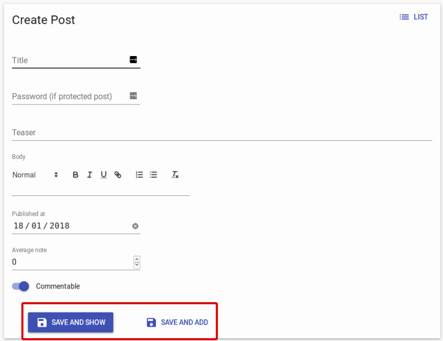
For that use case, use the <SaveButton> component with a custom onSuccess prop:
import * as React from "react";
import { Create, SimpleForm, SaveButton, Toolbar, useRedirect, useNotify } from 'react-admin';

const PostCreateToolbar = () => {
    const redirect = useRedirect();
    const notify = useNotify();
    return (
        <Toolbar>
            <SaveButton
                label="post.action.save_and_show"
            />
            <SaveButton
                label="post.action.save_and_add"
                mutationOptions={{
                    onSuccess: data => {
                        notify('ra.notification.created', {
                            type: 'info',
                            messageArgs: { smart_count: 1 },
                        });
                        redirect(false);
                    }}
                }
                type="button"
                variant="text"
            />
        </Toolbar>
    );
};

export const PostCreate = () => (
    <Create redirect="show">
        <SimpleForm toolbar={<PostCreateToolbar />}>
            ...
        </SimpleForm>
    </Create>
);
Another use case is to remove the <DeleteButton> from the toolbar in an edit view. In that case, create a custom toolbar containing only the <SaveButton> as a child:
import * as React from "react";
import { Edit, SimpleForm, SaveButton, Toolbar } from 'react-admin';

const PostEditToolbar = props => (
    <Toolbar {...props} >
        <SaveButton />
    </Toolbar>
);

export const PostEdit = () => (
    <Edit>
        <SimpleForm toolbar={<PostEditToolbar />}>
            // ...
        </SimpleForm>
    </Edit>
);
In the default <Toolbar>, the <SaveButton> is disabled when the form is pristine. You can bypass this behavior and always enable it thanks to the prop alwaysEnable:
import * as React from 'react';
import { Edit, SimpleForm, SaveButton, DeleteButton, Toolbar } from 'react-admin';

const PostEditToolbar = props => (
    <Toolbar {...props} >
        <SaveButton alwaysEnable />
        <DeleteButton />
    </Toolbar>
);

export const PostEdit = () => (
    <Edit>
        <SimpleForm toolbar={<PostEditToolbar />}>
            ...
        </SimpleForm>
    </Edit>
);
validate
The value of the form validate prop must be a function taking the record as input, and returning an object with error messages indexed by field. For instance:
const validateUserCreation = (values) => {
    const errors = {};
    if (!values.firstName) {
        errors.firstName = 'The firstName is required';
    }
    if (!values.age) {
        // You can return translation keys
        errors.age = 'ra.validation.required';
    } else if (values.age < 18) {
        // Or an object if the translation messages need parameters
        errors.age = {
            message: 'ra.validation.minValue',
            args: { min: 18 }
        };
    }
    return errors
};

export const UserCreate = () => (
    <Create>
        <SimpleForm validate={validateUserCreation}>
            <TextInput label="First Name" source="firstName" />
            <TextInput label="Age" source="age" />
        </SimpleForm>
    </Create>
);
Tip: The validate function can return a promise for asynchronous validation. See the Server-Side Validation section in the Validation documentation.
Tip: React-admin also allows to define validation rules at the input level. See the Validation chapter for details.
warnWhenUnsavedChanges
React-admin keeps track of the form state, so it can detect when the user leaves an Edit or Create page with unsaved changes. To avoid data loss, you can use this ability to ask the user to confirm before leaving a page with unsaved changes.
Warning about unsaved changes is an opt-in feature: you must set the warnWhenUnsavedChanges prop in the form component to enable it:
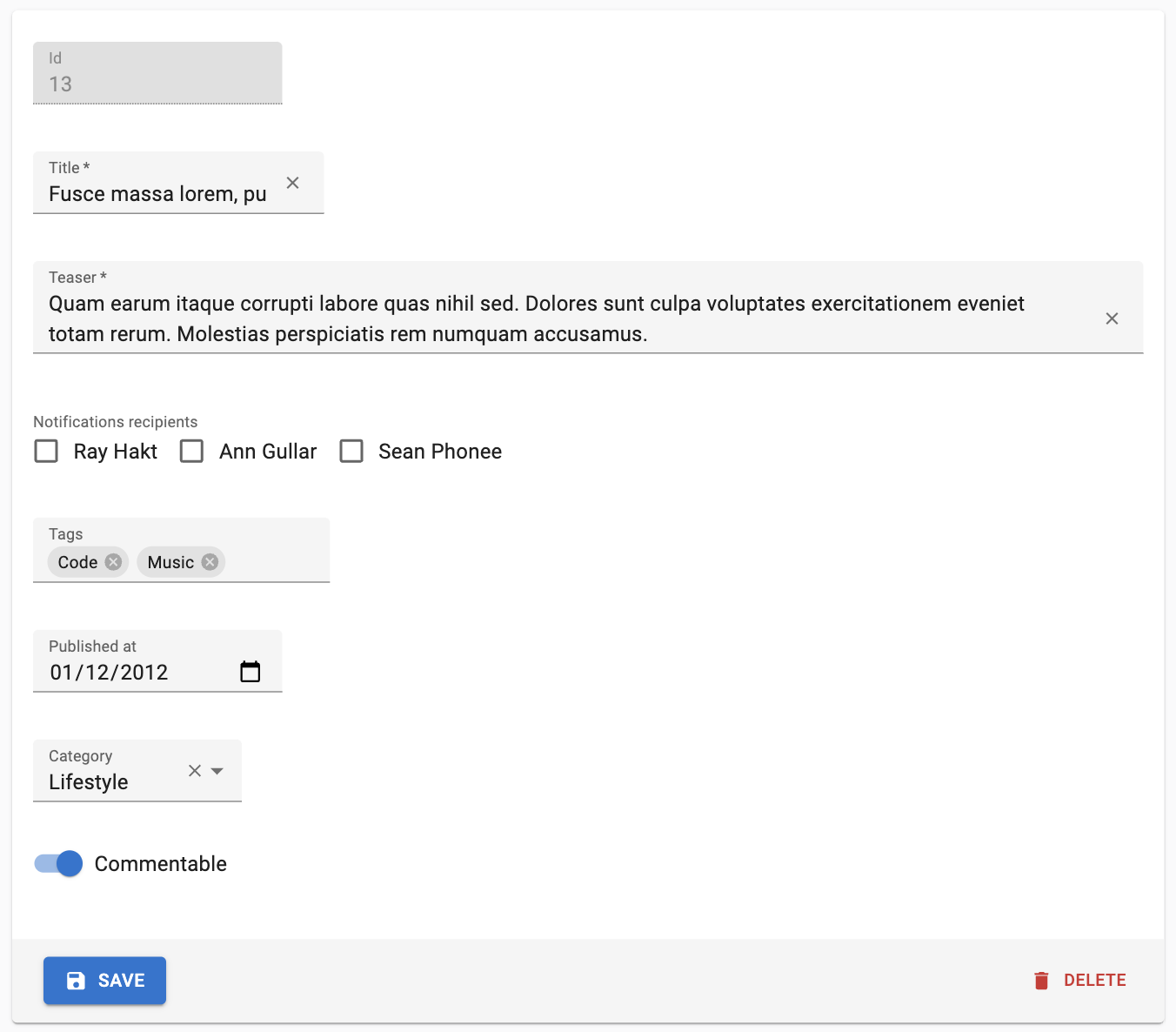
export const TagEdit = () => (
    <Edit>
        <SimpleForm warnWhenUnsavedChanges>
            <TextInput source="id" />
            <TextInput source="name" />
            ...
        </SimpleForm>
    </Edit>
);
Warning: This feature only works if you have a dependency on react-router 6.3.0 at most. The react-router team disabled this possibility in react-router 6.4, so warnWhenUnsavedChanges will silently fail with react-router 6.4 or later.
Using Fields As Children
The basic usage of <SimpleForm> is to pass Input components as children. For non-editable fields, you can pass disabled inputs, or even Field components. But since <Field> components have no label by default, you’ll have to wrap your inputs in a <Labeled> component in that case:
import { Edit, SimpleForm, TextInput, Labeled, TextField } from 'react-admin';

const PostEdit = () => (
    <Edit>
        <SimpleForm>
            <TextInput source="id" />
            <Labeled label="Title">
                <TextField source="title" />
            </Labeled>
            <TextInput source="body" />
        </SimpleForm>
    </Edit>
);
Complex Input Layout
<SimpleForm> can be used to render more than one input per row, and arrange inputs in a more user-friendly way.
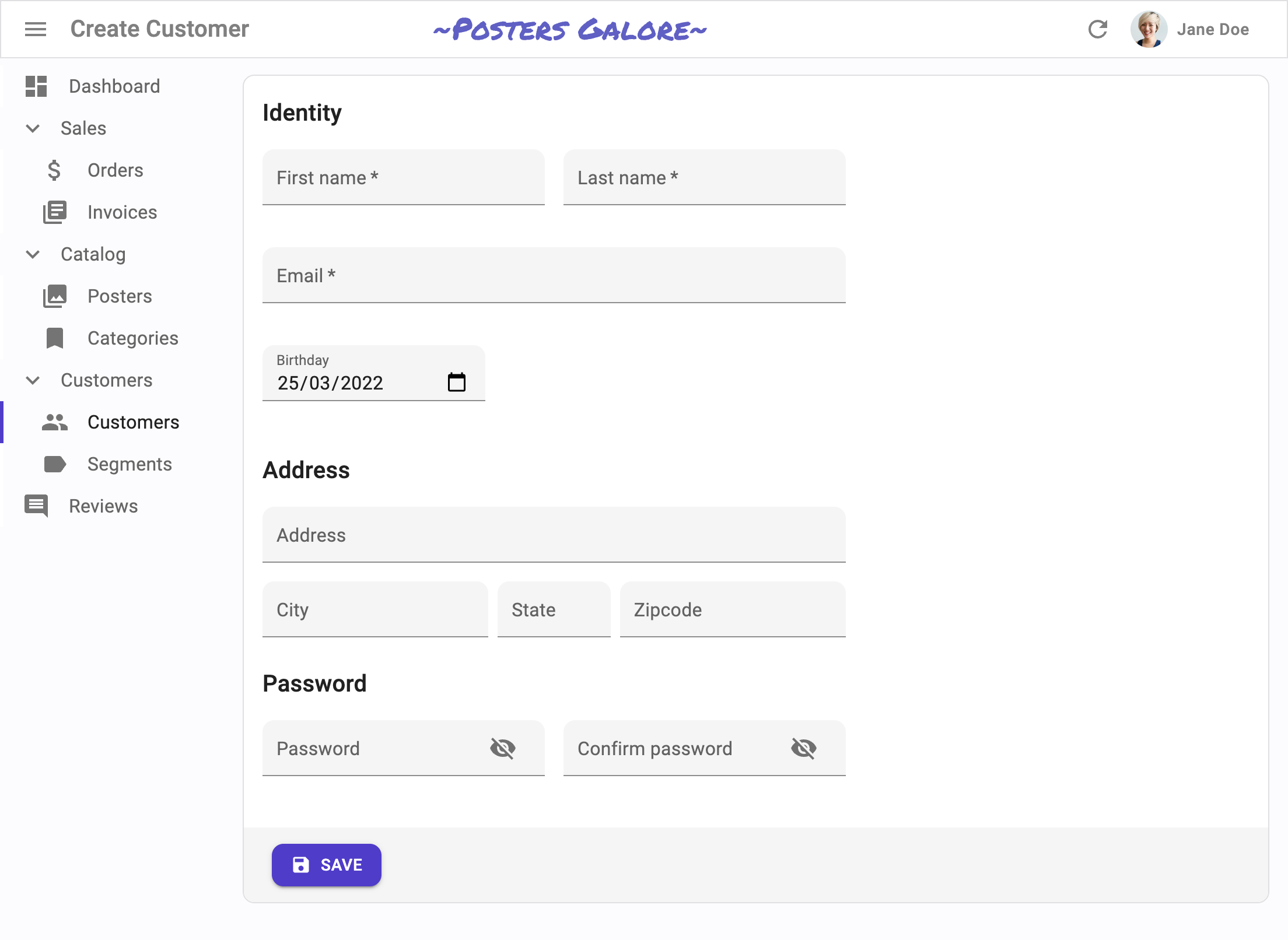
By default, <SimpleForm> renders one child per row. But a given child can be a layout element (e.g. <Grid>, <Stack>, <Box>) and contain several input elements. This lets you build form layouts of any complexity:
const UserCreate = () => (
    <Create>
        <SimpleForm sx={{ maxWidth: 500 }}>
            <Typography variant="h6" gutterBottom>
                Identity
            </Typography>
            <Box display={{ xs: 'block', sm: 'flex', width: '100%' }}>
                <Box flex={1} mr={{ xs: 0, sm: '0.5em' }}>
                    <TextInput source="first_name" isRequired fullWidth />
                </Box>
                <Box flex={1} ml={{ xs: 0, sm: '0.5em' }}>
                    <TextInput source="last_name" isRequired fullWidth />
                </Box>
            </Box>
            <TextInput type="email" source="email" isRequired fullWidth />
            <DateInput source="birthday" />
            <Separator />

            <Typography variant="h6" gutterBottom>
                Address
            </Typography>
            <TextInput
                source="address"
                multiline
                fullWidth
                helperText={false}
            />
            <Box display={{ xs: 'block', sm: 'flex' }}>
                <Box flex={2} mr={{ xs: 0, sm: '0.5em' }}>
                    <TextInput source="city" fullWidth helperText={false} />
                </Box>
                <Box flex={1} mr={{ xs: 0, sm: '0.5em' }}>
                    <TextInput
                        source="stateAbbr"
                        fullWidth
                        helperText={false}
                    />
                </Box>
                <Box flex={2}>
                    <TextInput source="zipcode" fullWidth helperText={false} />
                </Box>
            </Box>
            <Separator />

            <Typography variant="h6" gutterBottom>
                Password
            </Typography>
            <Box display={{ xs: 'block', sm: 'flex' }}>
                <Box flex={1} mr={{ xs: 0, sm: '0.5em' }}>
                    <PasswordInput source="password" fullWidth />
                </Box>
                <Box flex={1} ml={{ xs: 0, sm: '0.5em' }}>
                    <PasswordInput source="confirm_password" fullWidth />
                </Box>
            </Box>
        </SimpleForm>
    </Create>
);

const Separator = () => <Box pt="1em" />;
Displaying Inputs Based On Permissions
You can leverage the usePermissions hook to display inputs if the user has the required permissions.
import { usePermissions, Create, SimpleForm, TextInput } from 'react-admin';

export const UserCreate = () => {
    const { permissions } = useGetPermissions();
    return (
        <Create redirect="show">
            <SimpleForm>
                <TextInput source="name" validate={[required()]} />
                {permissions === 'admin' &&
                    <TextInput source="role" validate={[required()]} />}
            </SimpleForm>
        </Create>
    );
}
Configurable
You can let end users customize the fields displayed in the <SimpleForm> by using the <SimpleFormConfigurable> component instead.
import {
    Edit,
-   SimpleForm,
+   SimpleFormConfigurable,
    TextInput,
} from 'react-admin';

const PostEdit = () => (
    <Edit>
-       <SimpleForm>
+       <SimpleFormConfigurable>
            <TextInput source="title" />
            <TextInput source="author" />
            <TextInput source="year" />
-       </SimpleForm>
+       </SimpleFormConfigurable>
    </Edit>
);
When users enter the configuration mode and select the <SimpleForm>, they can show / hide SimpleForm inputs.
By default, <SimpleFormConfigurable> renders all child inputs. But you can also omit some of them by passing an omit prop containing an array of input sources:
// By default, hide the author input
// users can choose to show it in configuration mode
const PostEdit = () => (
    <Edit>
        <SimpleFormConfigurable omit={['author']}>
            <TextInput source="title" />
            <TextInput source="author" />
            <TextInput source="year" />
        </SimpleFormConfigurable>
    </Edit>
);
If you render more than one <SimpleFormConfigurable> in the same page, you must pass a unique preferenceKey prop to each one:
const PostEdit = () => (
    <Edit>
        <SimpleFormConfigurable preferenceKey="posts.simpleForm">
            <TextInput source="title" />
            <TextInput source="author" />
            <TextInput source="year" />
        </SimpleFormConfigurable>
    </Edit>
);
<SimpleFormConfigurable> accepts the same props as <SimpleForm>.