
<Show>
The <Show> component handles the logic of the Show page:
- it calls
useShowControllerto fetch the record from the dataProvider viadataProvider.getOne(), - it computes the default page title
- it creates a
ShowContextand aRecordContext, - it renders the page layout with the correct title and actions
- it renders its child component (a show layout component like
<SimpleShowLayout>) in a MUI<Card>
Usage
Here is the minimal code necessary to display a view to show a post:
// in src/posts.js
import * as React from "react";
import { Show, SimpleShowLayout, TextField, DateField, RichTextField } from 'react-admin';

export const PostShow = () => (
    <Show>
        <SimpleShowLayout>
            <TextField source="title" />
            <TextField source="teaser" />
            <RichTextField source="body" />
            <DateField label="Publication date" source="published_at" />
        </SimpleShowLayout>
    </Show>
);

// in src/App.js
import * as React from "react";
import { Admin, Resource } from 'react-admin';
import jsonServerProvider from 'ra-data-json-server';

import { PostShow } from './posts';

const App = () => (
    <Admin dataProvider={jsonServerProvider('https://jsonplaceholder.typicode.com')}>
        <Resource name="posts" show={PostShow} />
    </Admin>
);
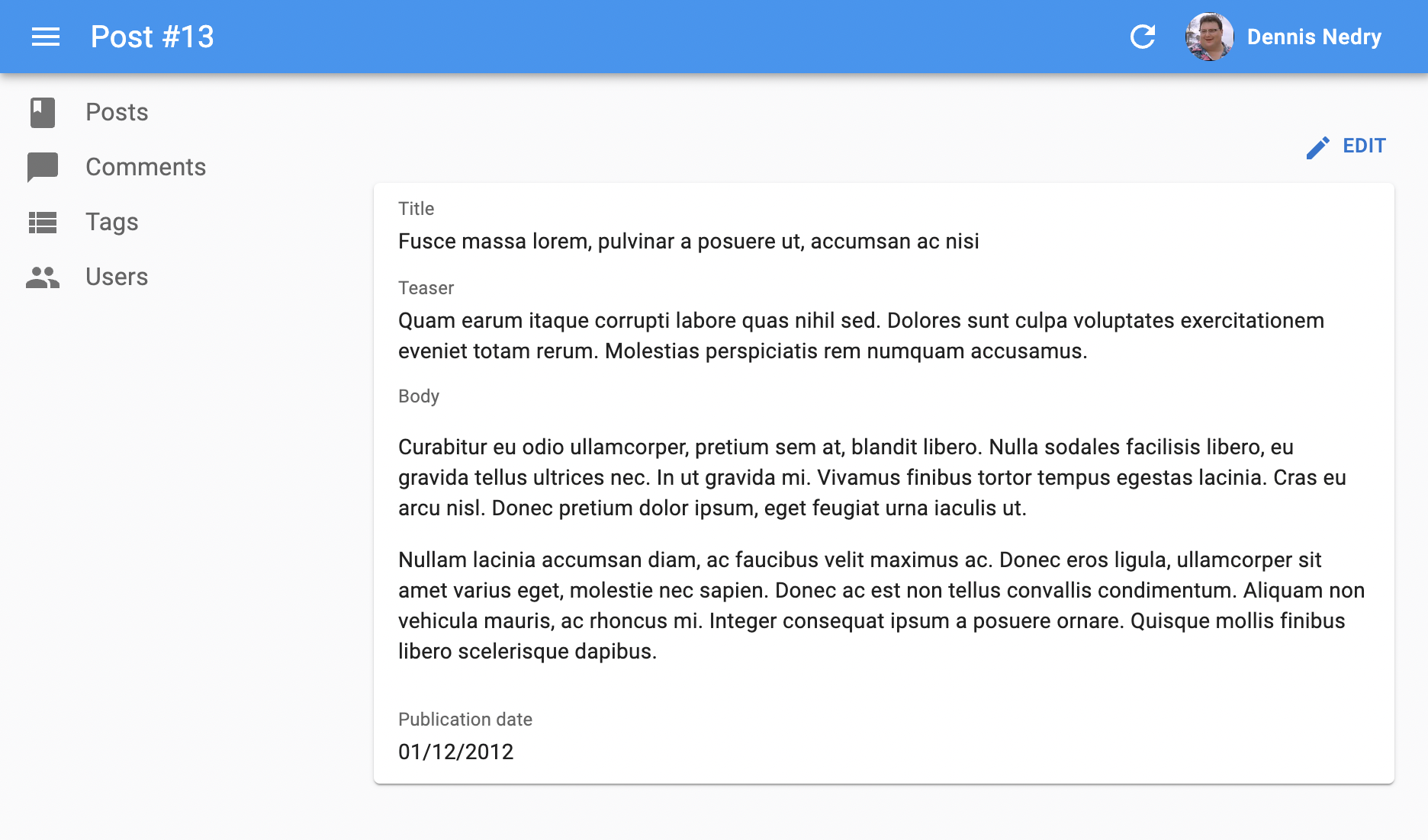
That’s enough to display the post show view:
Props
actions: override the actions toolbar with a custom componentclassName: passed to the root componentchildren: the components that render the record fieldscomponent: overrides the root componentdisableAuthentication: disable the authentication checkemptyWhileLoadingqueryOptions: options to pass to the react-query clientsx: Override the stylestitle
Layout
<Show> doesn’t render any field by default - it delegates this to its children. Show layout components grab the record from the RecordContext and render them on screen.
React-admin provides 2 show layout components:
<SimpleShowLayout>displays fields with a label in a single column<TabbedShowLayout>displays a list of tabs, each tab rendering a stack of fields with a label
To use an alternative layout, switch the <Show> child component:
export const PostShow = () => (
    <Show>
-       <SimpleShowLayout>
+       <TabbedShowLayout>
+           <TabbedShowLayout.Tab label="Main>
                <TextField source="title" />
                <TextField source="teaser" />
                <RichTextField source="body" />
                <DateField label="Publication date" source="created_at" />
+           </TabbedShowLayout.Tab>
-       </SimpleShowLayout>
+       </TabbedShowLayout>
    </Show>
);
You can also pass a React element as child, to build a custom layout. Check Building a custom Show Layout for more details.
title
By default, the title for the Show view is “[resource_name] #[record_id]”.
You can customize this title by specifying a custom title prop:
export const PostShow = () => (
    <Show title="Post view">
        ...
    </Show>
);
More interestingly, you can pass a component as title. React-admin clones this component, which can access the current record via useRecordContext. This allows to customize the title according to the current record:
import { useRecordContext, Show } from 'react-admin';

const PostTitle = () => {
    const record = useRecordContext();
    // the record can be empty while loading
    if (!record) return null;
    return <span>Post "{record.title}"</span>;
};

export const PostShow = () => (
    <Show title={<PostTitle />}>
        ...
    </Show>
);
actions
By default, <Show> includes an action toolbar with an <EditButton> if the <Resource> declared an edit component. You can replace the list of default actions by your own component using the actions prop:
import Button from '@mui/material/Button';
import { EditButton, TopToolbar } from 'react-admin';

const PostShowActions = () => (
    <TopToolbar>
        <EditButton />
        {/* Add your custom actions */}
        <Button color="primary" onClick={customAction}>Custom Action</Button>
    </TopToolbar>
);

export const PostShow = () => (
    <Show actions={<PostShowActions />}>
        ...
    </Show>
);
queryOptions
<Show> accepts a queryOptions prop to pass options to the react-query client.
This can be useful e.g. to pass a custom meta to the dataProvider.getOne() call.
import { Show } from 'react-admin';

export const PostShow = () => (
    <Show queryOptions={{ meta: { foo: 'bar' }}}>
        ...
    </Show>
);
With this option, react-admin will call dataProvider.getOne() on mount with the ` meta: { foo: ‘bar’ }` option.
You can also use the queryOptions prop to override the default error side effect. By default, when the dataProvider.getOne() call fails at the dataProvider level, react-admin shows an error notification and refreshes the page.
You can override this behavior and pass custom side effects by providing a custom queryOptions prop:
import * as React from 'react';
import { useNotify, useRefresh, useRedirect, Show, SimpleShowLayout } from 'react-admin';

const PostShow = props => {
    const notify = useNotify();
    const refresh = useRefresh();
    const redirect = useRedirect();

    const onError = (error) => {
        notify(`Could not load post: ${error.message}`, { type: 'error' });
        redirect('/posts');
        refresh();
    };

    return (
        <Show queryOptions= {...props}>
            <SimpleShowLayout>
                ...
            </SimpleShowLayout>
        </Show>
    );
}
The onError function receives the error from the dataProvider call (dataProvider.getOne()), which is a JavaScript Error object (see the dataProvider documentation for details).
The default onError function is:
(error) => {
    notify('ra.notification.item_doesnt_exist', { type: 'error' });
    redirect('list', resource);
    refresh();
}
component
By default, the Show view renders the main content area inside a MUI <Card>. The actual layout of the record fields depends on the Show Layout component you’re using (<SimpleShowLayout>, <TabbedShowLayout>, or a custom layout component).
You can override the main area container by passing a component prop:
import { Box } from '@mui/material';

const ShowWrapper = ({ children }) => (
    <Box sx={{ margin: 2, border: 'solid 1px grey' }}>
        {children}
    </Box>
);

// use a ShowWrapper as root component
const PostShow = props => (
    <Show component={ShowWrapper} {...props}>
        ...
    </Show>
);
disableAuthentication
By default, the <Show> component will automatically redirect the user to the login page if the user is not authenticated. If you want to disable this behavior and allow anonymous access to a show page, set the disableAuthentication prop to true.
const PostShow = () => (
    <Show disableAuthentication>
        ...
    </Show>
);
sx: CSS API
The <Show> component accepts the usual className prop but you can override many class names injected to the inner components by React-admin thanks to the sx property (as most MUI components, see their documentation about it). This property accepts the following subclasses:
| Rule name | Description |
|---|---|
& .RaShow-main |
Applied to the main container |
& .RaShow-card |
Applied to the <Card> element |
Here’s an example of how to override the default styles:
const PostShow = () => (
    <Show
        sx={{
            backgroundColor: 'yellow',
            '& .RaShow-main': {
                backgroundColor: 'red',
            },
        }}
    >
            ...
    </Show>
);
To override the style of all instances of <Show> using the MUI style overrides, use the RaShow key.
Loading State
Default layout components (<SimpleShowLayout> and <TabbedshowLayout>) return null when the record is loading. If you use a custom layout component instead, you’ll have to handle the case where the record is not yet defined.
That means that the following will fail on load with a “ReferenceError: record is not defined” error:
import { Show, useRecordContext } from 'react-admin';
import { Card } from '@mui/material';

const PostTitle = () => {
    const record = useRecordContext();
    return <span>{record.title}</span>;
};

const PostShow = () => (
    <Show>
        <Card>
            <div>Title: <PostTitle /></div>
        </Card>
    </Show>
);
You can handle this case by calling the useShowContext hook to get the loading state:
import { useShowContext, useRecordContext } from 'react-admin';

const PostTitle = () => {
    const record = useRecordContext();
    const { isLoading } = useShowContext();
    if (!isLoading) return null;
    return <span>{record.title}</span>;
};
But this can be cumbersome, as you need to do it in every field component.
The <Show emptyWhileLoading> prop provides a convenient shortcut for that use case. When enabled, <Show> won’t render its child until record is defined.
const PostTitle = () => {
    const record = useRecordContext();
    return <span>{record.title}</span>;
};

const PostShow = () => (
-   <Show>
+   <Show emptyWhileLoading>
        <Card>
            <div>Title: <PostTitle /></div>
        </Card>
    </Show>
);
Displaying Fields Depending On User Permissions
If you want to display some fields only to users with specific permissions, use the usePermissions hook and JSX conditions to show or hide fields.
Here’s an example inside a Show view with a SimpleShowLayout and a custom actions component:
import TopToolbar from '@mui/material/TopToolbar';
import Button from '@mui/material/Button';
import { Show, SimpleShowLayout, RichTextField, NumberField, usePermissions, EditButton, DeleteButton } from 'react-admin';

const PostShowActions = () => {
    const { permissions } = usePermissions();
    return (
        <TopToolbar>
            <EditButton />
            {permissions === 'admin' && <DeleteButton />}
        </TopToolbar>
    );
}

export const PostShow = () => {
    const { permissions } = usePermissions();
    return (
        <Show actions={<PostShowActions />}>
            <SimpleShowLayout>
                <TextField source="title" />
                <RichTextField source="body" />
                {permissions === 'admin' &&
                    <NumberField source="nb_views" />
                }
            </SimpleShowLayout>
        </Show>
    );
}
This also works inside a <TabbedShowLayout>, and you can hide a TabbedShowLayout.Tab completely:
import { Show, TabbedShowLayout, TextField } from 'react-admin';

export const UserShow = () => {
    const { permissions } = usePermissions();
    return (
        <Show>
            <TabbedShowLayout>
                <TabbedShowLayout.Tab label="user.form.summary">
                    {permissions === 'admin' && <TextField source="id" />}
                    <TextField source="name" />
                </TabbedShowLayout.Tab>
                {permissions === 'admin' &&
                    <TabbedShowLayout.Tab label="user.form.security">
                        <TextField source="role" />
                    </TabbedShowLayout.Tab>}
            </TabbedShowLayout>
        </Show>
    );
}
For more details about permissions, check out the authProvider documentation.
Adding meta To The DataProvider Call
Use the queryOptions prop to pass a custom meta to the dataProvider.getOne() call.
import { Show } from 'react-admin';

export const PostShow = () => (
    <Show queryOptions={{ meta: { foo: 'bar' }}}>
        ...
    </Show>
);
Live Updates
If you want to subscribe to live updates on the record (topic: resource/[resource]/[id]), use the <ShowLive> component instead.
-import { Show, SimpleShowLayout, TextField } from 'react-admin';
+import { SimpleShowLayout, TextField } from 'react-admin';
+import { ShowLive } from '@react-admin/ra-realtime';

const PostShow = () => (
-   <Show>
+   <ShowLive>
        <SimpleShowLayout>
            <TextField source="title" />
        </SimpleShowLayout>
-   </Show>
+   </ShowLive>
);
It shows a notification and refreshes the page when the record is updated by another user. Also, it displays a warning when the record is deleted by another user.