
<TextInput>
<TextInput> is the most common input. It is used for texts, emails, URL or passwords. In translates into an MUI <TextField>, and renders as <input type="text"> in HTML.
Usage
import { Edit, SimpleForm, TextInput, required } from 'react-admin';
export const PostEdit = () => (
<Edit title={<PostTitle />}>
<SimpleForm>
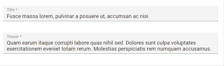
<TextInput source="title" validate={[required()]} fullWidth />
<TextInput source="teaser" validate={[required()]} defaultValue="Lorem Ipsum" multiline fullWidth />
</SimpleForm>
</Edit>
);
Props
| Prop | Required | Type | Default | Description |
|---|---|---|---|---|
multiline |
Optional | boolean |
false |
If true, the input height expands as the text wraps over several lines |
resettable |
Optional | boolean |
false |
If true, display a button to reset the changes in this input value |
type |
Optional | string |
text |
Type attribute passed to the <input> element |
<TextInput> also accepts the common input props.
Additional props are passed down to the underlying MUI <TextField> component.
multiline
You can make the <TextInput> expandable using the multiline prop for multiline text values. It renders as an auto expandable textarea.
<TextInput multiline source="body" />
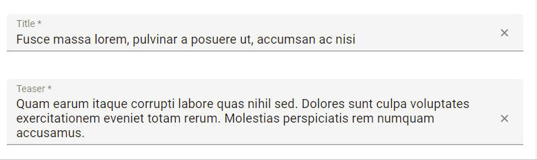
resettable
You can make the <TextInput> component resettable using the resettable prop. This will add a reset button which will be displayed only when the field has a value and is focused.
import { TextInput } from 'react-admin';

<TextInput source="title" resettable />
type
You can choose a specific input type using the type attribute, for instance text (the default), email, url, or password:
<TextInput label="Email Address" source="email" type="email" />
Warning: Do not use type="number", or you’ll receive a string as value (this is a known React bug). Instead, use <NumberInput>.