Theming
Whether you need to adjust a CSS rule for a single component, or change the color of the labels in the entire app, you’re covered!
sx: Overriding A Component Style
All react-admin components expose an sx property, which allows to customize the component style. It uses the CSS-in-JS solution offered by MUI, MUI System. This sx prop is kind of like React’s style prop, but it’s more powerful.
// It supports all CSS properties, plus some shorthand for common CSS properties,
// e.g. pt for paddingTop
<CardContent sx={{ pt: 2 }} />

// It allows to style pseudo-elements, like :hover or :last-child
<CardContent sx={{ pt: 2, "&:last-child": { pb: 2 } }} />

// It allows responsive values without media queries:
<Box
    sx={{
        width: {
            xs: 100, // theme.breakpoints.up('xs')
            sm: 200, // theme.breakpoints.up('sm')
            md: 300, // theme.breakpoints.up('md')
            lg: 400, // theme.breakpoints.up('lg')
            xl: 500, // theme.breakpoints.up('xl')
        },
    }}
>
    This box has a responsive width.
</Box>

// It allows to style children, e.g. to style the <Avatar> inside a <Card>:
<Card sx={{ '& .MuiAvatar': { width: 48, height: 48 } }} />

// It allows to use theme variables, like the spacing or the palette colors:
<Card sx={{ bgcolor: "grey.200" }} />

// It offers property name autocompletion in IDEs thanks to TypeScript
Check The MUI documentation on the sx prop for more information.
Here is an example: Customizing the <EditButton> inside a <Datagrid>, using the sx prop:
import { NumberField, List, Datagrid, TextField, EditButton } from 'react-admin';

export const ProductList = () => (
    <List>
        <Datagrid>
            <TextField source="sku" />
            <TextField source="price" />
            <EditButton sx={{ fontWeight: "bold" }}/>
        </Datagrid>
    </List>
);
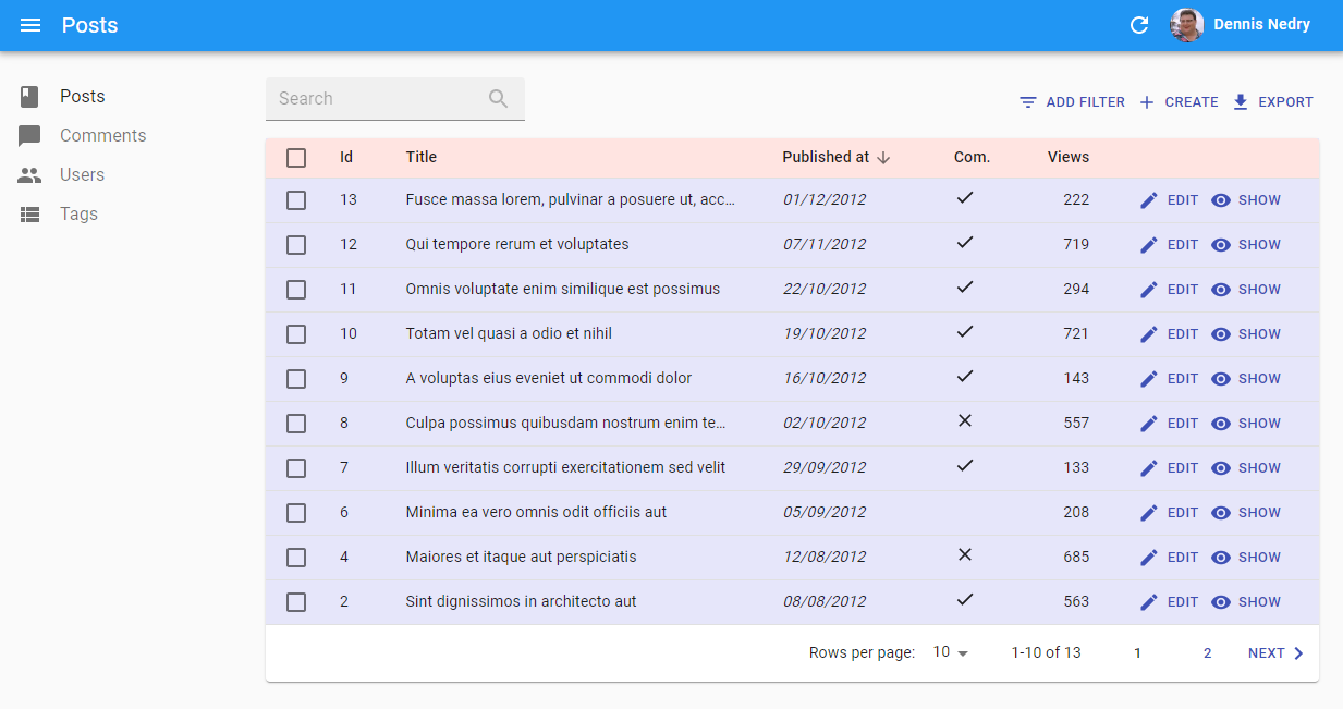
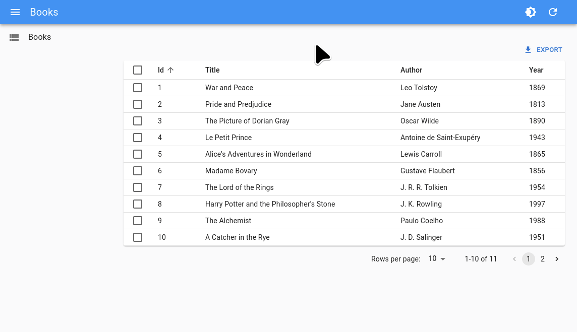
Here is another example, illustrating the ability to customize a specific part of a component - here, only the header of a <Datagrid>:
import {
    BooleanField,
    Datagrid,
    DateField,
    EditButton,
    List,
    NumberField,
    TextField,
    ShowButton,
} from 'react-admin';
import Icon from '@mui/icons-material/Person';

export const VisitorIcon = Icon;

export const PostList = () => (
    <List>
        <Datagrid
            sx={{
                backgroundColor: "Lavender",
                "& .RaDatagrid-headerCell": {
                    backgroundColor: "MistyRose",
                },
            }}
        >
            <TextField source="id" />
            <TextField source="title" />
            <DateField source="published_at" sortByOrder="DESC" />
            <BooleanField source="commentable" sortable={false} />
            <NumberField source="views" sortByOrder="DESC" />
            <EditButton />
            <ShowButton />
        </Datagrid>
    </List>
);
This example results in:
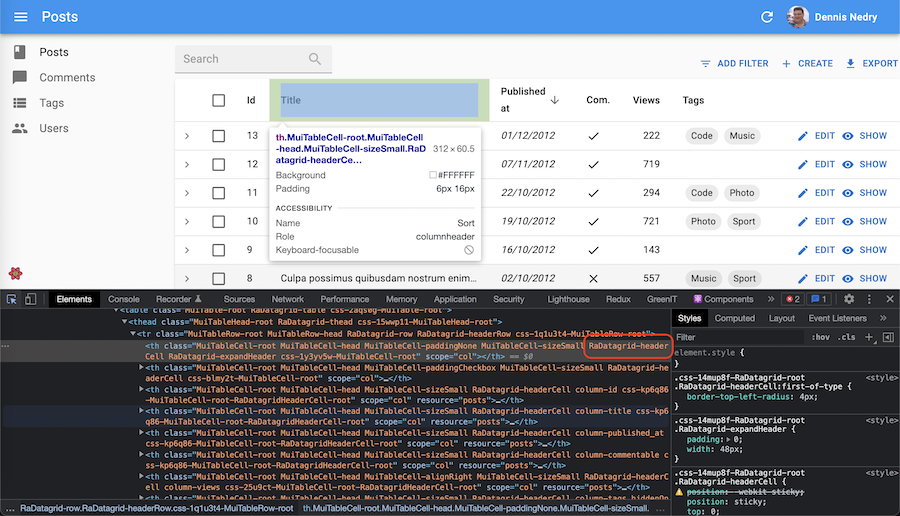
To guess the name of the subclass to use (like .RaDatagrid-headerCell above) for customizing a component, you can use the developer tools of your browser:
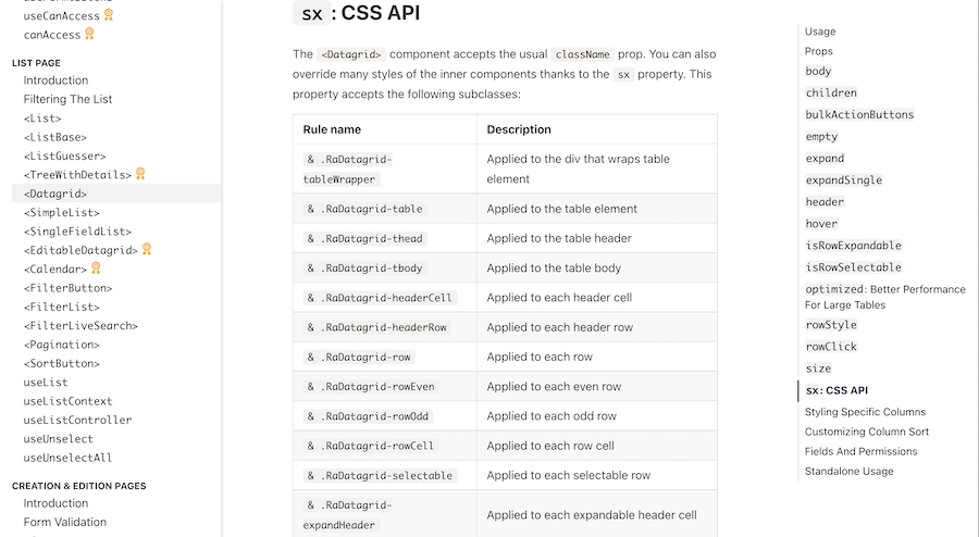
The react-admin documentation for individual components also lists the classes available for styling. For instance, here is the Datagrid CSS documentation:
Reusable Components
To reuse the same style overrides in different locations across your application, create a reusable component using the MUI styled() utility. It’s a function that creates a new component based on a source component and custom styles. The basic syntax is styled(Component)(styles) => Component (where styles follows the same syntax as the sx prop).
For instance, to create a custom <Datagrid> component with the header style defined in the previous section:
// in src/MyDatagrid.js
import { styled } from '@mui/system';
import { Datagrid } from 'react-admin';

export const MyDatagrid = styled(Datagrid)({
    backgroundColor: "Lavender",
    "& .RaDatagrid-headerCell": {
        backgroundColor: "MistyRose",
    },
});
You can then use this component instead of react-admin’s <Datagrid> component:
// in src/post/PostList.js
import {
    BooleanField,
-   Datagrid,
    DateField,
    EditButton,
    List,
    NumberField,
    TextField,
    ShowButton,
} from 'react-admin';
import Icon from '@mui/icons-material/Person';

export const VisitorIcon = Icon;

+import { MyDatagrid } from '../MyDatagrid';

export const PostList = () => (
    <List>
-       <Datagrid
-           sx={{
-               backgroundColor: "Lavender",
-               "& .RaDatagrid-headerCell": {
-                   backgroundColor: "MistyRose",
-               },
-           }}
-       >
+       <MyDatagrid>
            <TextField source="id" />
            <TextField source="title" />
            <DateField source="published_at" sortByOrder="DESC" />
            <BooleanField source="commentable" sortable={false} />
            <NumberField source="views" sortByOrder="DESC" />
            <EditButton />
            <ShowButton />
+       </MyDatagrid>
-       </Datagrid>
    </List>
);
Again, to guess the name of the subclass to use (like .RaDatagrid-headerCell above) for customizing a component, you can use the developer tools of your browser, or check the react-admin documentation for individual components (e.g. the Datagrid CSS documentation).
Tip: If you need more control over the HTML code, you can also create your own Field and Input components.
Global Theme Overrides
If you want to override the style of a component across the entire application, you can use a custom theme, leveraging the MUI Theming support.
React-admin already wraps the app with a MUI <ThemeProvider>. Pass a custom theme to the <Admin> component to override the style of the entire application:
const theme = { ... };

const App = () => (
    <Admin theme={theme}>
        // ...
    </Admin>
);
Leveraging this technique, you can create a custom theme that overrides the style of a component for the entire application.
For instance, to create a custom theme that overrides the style of the <Datagrid> component:
import { defaultTheme } from 'react-admin';

const theme = {
    ...defaultTheme,
    components: {
        ...defaultTheme.components,
        RaDatagrid: {
            styleOverrides: {
              root: {
                  backgroundColor: "Lavender",
                  "& .RaDatagrid-headerCell": {
                      backgroundColor: "MistyRose",
                  },
              }
           }
        }
    }
};

const App = () => (
    <Admin theme={theme}>
        // ...
    </Admin>
);
There are 2 important gotchas here:
- Don’t forget to merge your custom style overrides with the ones from react-admin’s
defaultTheme, otherwise the application will have the default MUI theme (most notably, outlined text inputs) - Custom style overrides must live under a
rootkey. Then, the style override syntax is the same as the one used for thesxprop.
Note that you don’t need to call createTheme yourself. React-admin will do it for you.
Again, to guess the name of the subclass to use (like .RaDatagrid-headerCell above) for customizing a component, you can use the developer tools of your browser, or check the react-admin documentation for individual components (e.g. the Datagrid CSS documentation).
You can use this technique to override not only styles, but also default for components. That’s how react-admin applies the filled variant to all TextField components. So for instance, to change the variant to outlined, create a custom theme as follows:
import { defaultTheme } from 'react-admin';

const theme = {
    ...defaultTheme,
    components: {
        ...defaultTheme.components,
        MuiTextField: {
            defaultProps: {
                variant: 'outlined',
            },
        },
        MuiFormControl: {
            defaultProps: {
                variant: 'outlined',
            },
        },
    }
};
Tip: TypeScript will be picky when overriding the variant defaultProp. To avoid compilation errors, type the variant value as const:
import { defaultTheme } from 'react-admin';

const theme = {
    ...defaultTheme,
    components: {
        ...defaultTheme.components,
        MuiTextField: {
            defaultProps: {
                variant: 'outlined' as const,
            },
        },
        MuiFormControl: {
            defaultProps: {
                variant: 'outlined' as const,
            },
        },
    }
};
Writing a Custom Theme
MUI theming also allows to change the default palette, typography, colors, etc. This is very useful to change the react-admin style to match the branding of your company.
For instance, here is how to override the default react-admin colors and fonts:
import { defaultTheme } from 'react-admin';
import indigo from '@mui/material/colors/indigo';
import pink from '@mui/material/colors/pink';
import red from '@mui/material/colors/red';

const myTheme = {
    ...defaultTheme,
    palette: {
        primary: indigo,
        secondary: pink,
        error: red,
        contrastThreshold: 3,
        tonalOffset: 0.2,
    },
    typography: {
        // Use the system font instead of the default Roboto font.
        fontFamily: ['-apple-system', 'BlinkMacSystemFont', '"Segoe UI"', 'Arial', 'sans-serif'].join(','),
    },
};
A theme object can contain the following keys:
breakpointsdirectionmixinscomponentspalettepropsshadowsspacingtransitionstypographyzIndex
Tip: Check MUI default theme documentation to see the default values and meaning for these keys.
Once your theme is defined, pass it to the <Admin> component, in the theme prop.
const App = () => (
    <Admin theme={myTheme} dataProvider={...}>
        // ...
    </Admin>
);
Using A Dark Theme
MUI ships two base themes: light and dark. React-admin uses the light one by default. To use the dark theme, create a custom theme object with a mode: 'dark' palette, and pass it as the <Admin theme> prop:
import { defaultTheme } from 'react-admin';
const theme = {
    ...defaultTheme,
    palette: {
        mode: 'dark', // Switching the dark mode on is a single property value change.
    },
};

const App = () => (
    <Admin theme={theme} dataProvider={...}>
        // ...
    </Admin>
);
Letting Users Choose The Theme
The <ToggleThemeButton> component lets users switch from light to dark mode, and persists that choice by leveraging the store.
You can add the <ToggleThemeButton> to a custom App Bar:
import * as React from 'react';
import { defaultTheme, Layout, AppBar, ToggleThemeButton } from 'react-admin';
import { createTheme, Box, Typography } from '@mui/material';

const darkTheme = createTheme({
    palette: { mode: 'dark' },
});

const MyAppBar = props => (
    <AppBar {...props}>
        <Box flex="1">
            <Typography variant="h6" id="react-admin-title"></Typography>
        </Box>
        <ToggleThemeButton
            lightTheme={defaultTheme}
            darkTheme={darkTheme}
        />
    </AppBar>
);

const MyLayout = props => <Layout {...props} appBar={MyAppBar} />;
Changing the Theme Programmatically
React-admin provides the useTheme hook to read and update the theme programmatically. It uses the same syntax as useState.
Its used internally by ToggleThemeButton component.
import { defaultTheme, useTheme } from 'react-admin';
import { Button } from '@mui/material';

const lightTheme = defaultTheme;
const darkTheme = {
    ...defaultTheme,
    palette: {
        mode: 'dark',
    },
};

const ThemeToggler = () => {
    const [theme, setTheme] = useTheme();

    return (
        <Button onClick={() => setTheme(theme.palette.mode === 'dark' ? lightTheme : darkTheme)}>
            {theme.palette.mode === 'dark' ? 'Switch to light theme' : 'Switch to dark theme'}
        </Button>
    );
}
Conditional Formatting
Sometimes you want the format to depend on the value. Use useRecordContext to grab the record in a component, and the sx prop to apply the format.
The following example shows how to create a new <ColoredNumberField> component, which renders with red text when its value is less than 0.
import { useRecordContext, NumberField, List, Datagrid, TextField, EditButton } from 'react-admin';

const ColoredNumberField = (props) => {
    const record = useRecordContext();
    return (
        <NumberField
            sx={{ color: record[prop.source] < 0 ? 'red' : 'black' }}
            {...props}
        />
    );
};

// Ensure the original component defaultProps are still applied as they may be used by its parents (such as the `Show` component):
ColoredNumberField.defaultProps = NumberField.defaultProps;

export const PostList = () => (
    <List>
        <Datagrid>
            <TextField source="id" />
            ...
            <ColoredNumberField source="nb_views" />
            <EditButton />
        </Datagrid>
    </List>
);
Tip: if you don’t want to create a custom component to apply conditional formatting, you can also use the <WithRecord> component.
useMediaQuery Hook
To provide an optimized experience on mobile, tablet, and desktop devices, you often need to display different components depending on the screen size. MUI provides a hook dedicated to help such responsive layouts: useMediaQuery.
It expects a function receiving the MUI theme as a parameter, and returning a media query. Use the theme breakpoints to check for common screen sizes. The hook returns a boolean indicating if the current screen matches the media query or not.
const isXSmall = useMediaQuery(theme => theme.breakpoints.down('xs'));
const isSmall = useMediaQuery(theme => theme.breakpoints.down('sm'));
const isDesktop = useMediaQuery(theme => theme.breakpoints.up('md'));
You can also pass a custom media query as a screen.
const isSmall = useMediaQuery('(min-width:600px)');
Here is an example for a responsive list of posts, displaying a SimpleList on mobile, and a Datagrid otherwise:
// in src/posts.js
import * as React from 'react';
import { useMediaQuery } from '@mui/material';
import { List, SimpleList, Datagrid, TextField, ReferenceField, EditButton } from 'react-admin';

export const PostList = () => {
    const isSmall = useMediaQuery(theme => theme.breakpoints.down('sm'));
    return (
        <List>
            {isSmall ? (
                <SimpleList
                    primaryText={record => record.title}
                    secondaryText={record => `${record.views} views`}
                    tertiaryText={record => new Date(record.published_at).toLocaleDateString()}
                />
            ) : (
                <Datagrid>
                    <TextField source="id" />
                    <ReferenceField label="User" source="userId" reference="users">
                        <TextField source="name" />
                    </ReferenceField>
                    <TextField source="title" />
                    <TextField source="body" />
                    <EditButton />
                </Datagrid>
            )}
        </List>
    );
};
Tip: Previous versions of react-admin shipped a <Responsive> component to do media queries. This component is now deprecated. Use useMediaQuery instead.
Using a Custom Layout
Instead of the default layout, you can use your own component as the admin layout. Just use the layout prop of the <Admin> component:
// in src/App.js
import MyLayout from './MyLayout';

const App = () => (
    <Admin layout={MyLayout} dataProvider={...}>
        // ...
    </Admin>
);
Your custom layout can extend the default <Layout> component if you only want to override the sidebar, the appBar, the menu or the error page. For instance:
// in src/MyLayout.js
import { Layout } from 'react-admin';
import MyAppBar from './MyAppBar';
import MySidebar from './MySidebar';
import MyMenu from './MyMenu';

const MyLayout = props => <Layout
    {...props}
    appBar={MyAppBar}
    sidebar={MySidebar}
    menu={MyMenu}
/>;

export default MyLayout;
UserMenu Customization
You can replace the default user menu by your own by setting the userMenu prop of the <AppBar> component. For instance, to add custom menu items, you can render the default <UserMenu> and add children to it. Don’t forget to include the <Logout> component if you want to keep the logout menu item. Besides, in order to properly close the menu once an item is added, call the onClose method retrieved from the UserContext through the useUserMenu hook. This is handled for you if you use <MenuItemLink>:
import * as React from 'react';
import { AppBar, Logout, UserMenu, useUserMenu } from 'react-admin';
import { Link } from 'react-router-dom';
import MenuItem from '@mui/material/MenuItem';
import ListItemIcon from '@mui/material/ListItemIcon';
import ListItemText from '@mui/material/ListItemText';
import SettingsIcon from '@mui/icons-material/Settings';
import LanguageIcon from '@mui/icons-material/Language';

// It's important to pass the ref to allow MUI to manage the keyboard navigation
const ConfigurationMenu = React.forwardRef((props, ref) => {
    return (
        <MenuItem
            ref={ref}
            component={Link}
            // It's important to pass the props to allow MUI to manage the keyboard navigation
            {...props}
            to="/configuration"
        >
            <ListItemIcon>
                <SettingsIcon />
            </ListItemIcon>
            <ListItemText>
               Configuration
            </ListItemText>
        </MenuItem>
    );
});

// It's important to pass the ref to allow MUI to manage the keyboard navigation
const SwitchLanguage = forwardRef((props, ref) => {
    const [locale, setLocale] = useLocaleState();
    // We are not using MenuItemLink so we retrieve the onClose function from the UserContext
    const { onClose } = useUserMenu();

    return (
        <MenuItem
            ref={ref}
            // It's important to pass the props to allow MUI to manage the keyboard navigation
            {...props}
            sx={{ color: 'text.secondary' }}
            onClick={event => {
                setLocale(locale === 'en' ? 'fr' : 'en');
                onClose(); // Close the menu
            }}
        >
            <ListItemIcon sx={{ minWidth: 5 }}>
                <LanguageIcon />
            </ListItemIcon>
            <ListItemText>
                Switch Language
            </ListItemText>
        </MenuItem>
    );
});

const MyUserMenu = props => (
    <UserMenu {...props}>
        <ConfigurationMenu />
        <SwitchLanguage />
        <Logout />
    </UserMenu>
);

const MyAppBar = props => <AppBar {...props} userMenu={<MyUserMenu />} />;

const MyLayout = props => <Layout {...props} appBar={MyAppBar} />;
You can also remove the <UserMenu> from the <AppBar> by passing false to the userMenu prop:
import * as React from 'react';
import { AppBar } from 'react-admin';

const MyAppBar = props => <AppBar {...props} userMenu={false} />;

const MyLayout = props => <Layout {...props} appBar={MyAppBar} />;
You can also customize the default icon by setting the icon prop to the <UserMenu /> component.
import { AppBar, UserMenu } from 'react-admin';
import Avatar from '@mui/material/Avatar';

const MyCustomIcon = () => (
    <Avatar
        sx={{
            height: 30,
            width: 30,
        }}
        src="https://marmelab.com/images/avatars/adrien.jpg"
    />
);

const MyUserMenu = props => (<UserMenu {...props} icon={<MyCustomIcon />} />);

const MyAppBar = props => <AppBar {...props} userMenu={<MyUserMenu />} />;
Sidebar Customization
You can specify the Sidebar width by setting the width and closedWidth properties on your custom MUI theme:
import { defaultTheme } from 'react-admin';

const theme = {
    ...defaultTheme,
    sidebar: {
        width: 300, // The default value is 240
        closedWidth: 70, // The default value is 55
    },
};

const App = () => (
    <Admin theme={theme} dataProvider={...}>
        // ...
    </Admin>
);
For more advanced sidebar theming, pass your own Sidebar component to a custom Layout:
import { Sidebar, Layout } from 'react-admin';

const MySidebar = (props) => (
    <Sidebar
        sx={{
            "& .RaSidebar-drawerPaper": {
                backgroundColor: "red",
            },
        }}
        {...props}
    />
);

const MyLayout = props => <Layout {...props} sidebar={MySidebar} />
Layout From Scratch
For more custom layouts, write a component from scratch. It must contain a {children} placeholder, where react-admin will render the resources. Use the default layout as a starting point. Here is a simplified version (with no responsive support):
// in src/MyLayout.js
import * as React from 'react';
import { useEffect } from 'react';
import PropTypes from 'prop-types';
import { styled } from '@mui/material';
import {
    AppBar,
    Menu,
    Sidebar,
    ComponentPropType,
    useSidebarState,
} from 'react-admin';

const Root = styled("div")(({ theme }) => ({
    display: "flex",
    flexDirection: "column",
    zIndex: 1,
    minHeight: "100vh",
    backgroundColor: theme.palette.background.default,
    position: "relative",
}));

const AppFrame = styled("div")(({ theme }) => ({
    display: "flex",
    flexDirection: "column",
    overflowX: "auto",
}));

const ContentWithSidebar = styled("main")(({ theme }) => ({
    display: "flex",
    flexGrow: 1,
}));

const Content = styled("div")(({ theme }) => ({
    display: "flex",
    flexDirection: "column",
    flexGrow: 2,
    padding: theme.spacing(3),
    marginTop: "4em",
    paddingLeft: 5,
}));

const MyLayout = ({
    children,
    dashboard,
    title,
}) => {
    const [open] = useSidebarState();

    return (
        <Root>
            <AppFrame>
                <AppBar title={title} open={open} />
                <ContentWithSidebar>
                    <Sidebar>
                        <Menu hasDashboard={!!dashboard} />
                    </Sidebar>
                    <Content>
                        {children}
                    </Content>
                </ContentWithSidebar>
            </AppFrame>
        </Root>
    );
};

MyLayout.propTypes = {
    children: PropTypes.oneOfType([PropTypes.func, PropTypes.node]),
    dashboard: PropTypes.oneOfType([
        PropTypes.func,
        PropTypes.string,
    ]),
    title: PropTypes.string.isRequired,
};

export default MyLayout;
Customizing the AppBar Content
By default, the react-admin <AppBar> component displays the page title. You can override this default by passing children to <AppBar> - they will replace the default title. And if you still want to include the page title, make sure you include an element with id react-admin-title in the top bar (this uses React Portals).
Here is an example customization for <AppBar> to include a company logo in the center of the page header:
// in src/MyAppBar.js
import * as React from 'react';
import { AppBar } from 'react-admin';
import Typography from '@mui/material/Typography';

import Logo from './Logo';

const MyAppBar = (props) => (
    <AppBar
        sx={{
            "& .RaAppBar-title": {
                flex: 1,
                textOverflow: "ellipsis",
                whiteSpace: "nowrap",
                overflow: "hidden",
            },
        }}
        {...props}
    >
        <Typography
            variant="h6"
            color="inherit"
            className={classes.title}
            id="react-admin-title"
        />
        <Logo />
        <span className={classes.spacer} />
    </AppBar>
);

export default MyAppBar;
To use this custom MyAppBar component, pass it as prop to a custom Layout, as shown below:
// in src/MyLayout.js
import * as React from 'react';
import { Layout } from 'react-admin';
import MyAppBar from './MyAppBar';

const MyLayout = (props) => <Layout {...props} appBar={MyAppBar} />;

export default MyLayout;
Then, use this layout in the <Admin> with the layout prop:
// in src/App.js
import MyLayout from './MyLayout';

const App = () => (
    <Admin layout={MyLayout} dataProvider={...}>
        // ...
    </Admin>
);
Tip: You can change the color of the <AppBar> by setting the color prop to default, inherit, primary, secondary or transparent. The default value is secondary.
Replacing The AppBar
By default, React-admin uses MUI’s <AppBar> component together with a custom container that internally uses a Slide to hide the AppBar on scroll. Here is an example of how to change this container with any component:
// in src/MyAppBar.js
import * as React from 'react';
import { Fragment } from 'react';
import { AppBar } from 'react-admin';

const MyAppBar = props => (
    <AppBar {...props} container={Fragment} />
);

export default MyAppBar;
For more drastic changes of the top component, you will probably want to create an <AppBar> from scratch instead of just passing children to react-admin’s <AppBar>. Here is an example top bar rebuilt from scratch:
// in src/MyAppBar.js
import * as React from 'react';
import AppBar from '@mui/material/AppBar';
import Toolbar from '@mui/material/Toolbar';
import Typography from '@mui/material/Typography';

const MyAppBar = props => (
    <AppBar {...props}>
        <Toolbar>
            <Typography variant="h6" id="react-admin-title" />
        </Toolbar>
    </AppBar>
);

export default MyAppBar;
Take note that this uses MUI’s <AppBar> instead of react-admin’s <AppBar>. To use this custom AppBar component, pass it as prop to a custom Layout, as explained in the previous section.
To make it easier to customize, we export some components and hooks used by the <AppBar>:
<LoadingIndicator>: ACircularProgressbound to the dataProvider activity.<SidebarToggleButton>: AnIconButtonused to toggle the<Sidebar>.useSidebarState: A hook that returns the sidebar open state and a function to toggle it. Used internally by<SidebarToggleButton>.
Using a Custom Menu
By default, React-admin uses the list of <Resource> components passed as children of <Admin> to build a menu to each resource with a list component. If you want to reorder, add or remove menu items, for instance to link to non-resources pages, you have to provide a custom <Menu> component to your Layout.
To do that, create a custom menu component using the <Menu, <Menu.DashboardItem>, and <Menu.Item> components:
// in src/MyMenu.js
import * as React from 'react';
import { Menu } from 'react-admin';
import BookIcon from '@mui/icons-material/Book';
import ChatBubbleIcon from '@mui/icons-material/ChatBubble';
import PeopleIcon from '@mui/icons-material/People';
import LabelIcon from '@mui/icons-material/Label';

export const MyMenu = (props) => (
    <Menu {...props}>
        <Menu.DashboardItem />
        <Menu.Item to="/posts" primaryText="Posts" leftIcon={<BookIcon />}/>
        <Menu.Item to="/comments" primaryText="Comments" leftIcon={<ChatBubbleIcon />}/>
        <Menu.Item to="/users" primaryText="Users" leftIcon={<PeopleIcon />}/>
        <Menu.Item to="/custom-route" primaryText="Miscellaneous" leftIcon={<LabelIcon />}/>
    </Menu>
);
To use this custom menu component, pass it to a custom Layout, as explained above:
// in src/Layout.js
import { Layout } from 'react-admin';
import { MyMenu } from './MyMenu';

export const Layout = (props) => <Layout {...props} menu={MyMenu} />;
Then, use this layout in the <Admin> layout prop:
// in src/App.js
import { Layout }  from './Layout';

const App = () => (
    <Admin layout={Layout} dataProvider={...}>
        // ...
    </Admin>
);
Tip: You can generate the menu items for each resource automatically by reading the Resource configuration context. You can also add a menu entry to a pre-filtered list. For more information, check the <Menu>component documenation.
Tip: If you need a multi-level menu, or a Mega Menu opening panels with custom content, check out the ra-navigation module (part of the Enterprise Edition)


Using a Custom Login Page
By default, the login page displays a gradient background. If you want to change the background, you can use the default Login page component and pass an image URL as the backgroundImage prop.
import { Admin, Login } from 'react-admin';

const MyLoginPage = () => (
    <Login
        // A random image that changes everyday
        backgroundImage="https://source.unsplash.com/random/1600x900/daily"
    />
);

const App = () => (
    <Admin loginPage={MyLoginPage}>
        // ...
    </Admin>
);
Using a Custom Logout Button
It is possible to use a completely custom logout button or you can simply override some properties of the default button. If you want to change the icon, you can use the default <Logout> component and pass a different icon as the icon prop.
import { Admin, AppBar, Layout, Logout, UserMenu } from 'react-admin';
import ExitToAppIcon from '@mui/icons-material/ExitToApp';

const MyLogoutButton = props => <Logout {...props} icon={<ExitToAppIcon/>} />;

const MyUserMenu = () => <UserMenu><MyLogoutButton /></UserMenu>;

const MyAppBar = () => <AppBar userMenu={<MyUserMenu />} />;

const MyLayout = (props) => <Layout {...props} appBar={MyAppBar} />;

const App = () => (
    <Admin layout={MyLayout}>
        // ...
    </Admin>
);
Notifications
You can override the notification component, for instance to change the notification duration. A common use case is to change the autoHideDuration, and force the notification to remain on screen longer than the default 4 seconds. For instance, to create a custom Notification component with a 5 seconds default:
// in src/MyNotification.js
import { Notification } from 'react-admin';

const MyNotification = () => <Notification autoHideDuration={5000} />;

export default MyNotification;
To use this custom notification component, pass it to the <Admin> component as the notification prop:
// in src/App.js
import MyNotification from './MyNotification';
import dataProvider from './dataProvider';

const App = () => (
    <Admin notification={MyNotification} dataProvider={dataProvider}>
        // ...
    </Admin>
);
Customizing The Error Page
Whenever a client-side error happens in react-admin, the user sees a default error message. If you want to customize this page, or log the error to a third-party service, create your own <Error> component. The following snippet is a simplified version of the react-admin Error component, that you can use as a base for your own:
// in src/MyError.js
import * as React from 'react';
import Button from '@mui/material/Button';
import ErrorIcon from '@mui/icons-material/Report';
import History from '@mui/icons-material/History';
import { Title, useTranslate } from 'react-admin';
import { useLocation } from 'react-router-dom';

const MyError = ({
    error,
    resetErrorBoundary,
    ...rest
}) => {
    const { pathname } = useLocation();
    const originalPathname = useRef(pathname);

    // Effect that resets the error state whenever the location changes
    useEffect(() => {
        if (pathname !== originalPathname.current) {
            resetErrorBoundary();
        }
    }, [pathname, resetErrorBoundary]);

    const translate = useTranslate();
    return (
        <div>
            <Title title="Error" />
            <h1><ErrorIcon /> Something Went Wrong </h1>
            <div>A client error occurred and your request couldn't be completed.</div>
            {process.env.NODE_ENV !== 'production' && (
                <details>
                    <h2>{translate(error.toString())}</h2>
                    {error.componentStack}
                </details>
            )}
            <div>
                <Button
                    variant="contained"
                    startIcon={<History />}
                    onClick={() => window.history.go(-1)}
                >
                    Back
                </Button>
            </div>
        </div>
    );
};

export default MyError;
To use this custom error component, pass it to a custom Layout, as explained above:
// in src/MyLayout.js
import { Layout } from 'react-admin';
import MyError from './MyError';

const MyLayout = (props) => <Layout {...props} error={MyError} />;

export default MyLayout;
Then, use this layout in the <Admin> layout prop:
// in src/App.js
import MyLayout from './MyLayout';

const App = () => (
    <Admin layout={MyLayout} dataProvider={...}>
        // ...
    </Admin>
);
Tip: React’s Error Boundaries are used internally to display the Error Page whenever an error occurs. Error Boundaries only catch errors during rendering, in lifecycle methods, and in constructors of the components tree. This implies in particular that errors during event callbacks (such as ‘onClick’) are not concerned. Also note that the Error Boundary component is only set around the main container of React Admin. In particular, you won’t see it for errors thrown by the sidebar Menu, nor the AppBar. This ensures the user is always able to navigate away from the Error Page.
Loading
Display a circular progress component with optional messages. Display the same loading component as react-admin on custom pages for consistency.
Supported props:
| Prop | Required | Type | Default | Descriptions |
|---|---|---|---|---|
loadingPrimary |
Optional | string |
ra.page.loading |
Label to use for primary loading message |
loadingSecondary |
Optional | string |
ra.message.loading |
Label to use for secondary loading message |
Usage:
<Loading loadingPrimary="app.page.loading" loadingSecondary="app.message.loading" />
LinearProgress
Display a linear progress component. Display the same loading component as react-admin on custom inputs for consistency.
Usage:
({ data, ...props }) => !data ?
        <LinearProgress /> :
        <MyInput data={data} />;