
<Confirm>
<Confirm> leverages MUI’s <Dialog> component to implement a confirmation popup.
Usage
To ask a confirmation to the user before performing an action, have the action button open a <Confirm>.
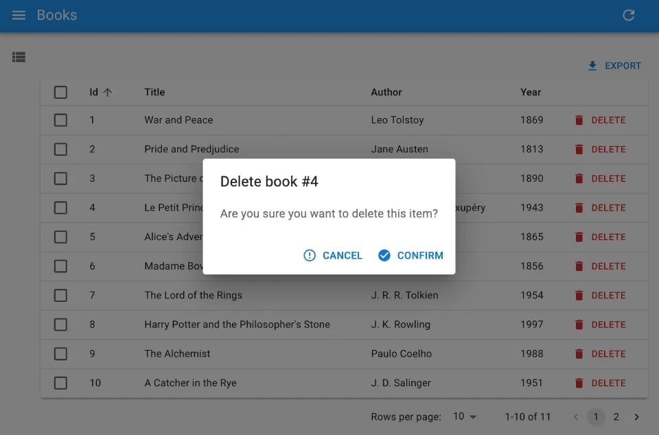
For instance, here is how to build a delete button that removes the record after asking for confirmation:
import { useState } from 'react';
import {
    Button,
    Confirm,
    useRecordContext,
    useDelete,
} from 'react-admin';

const BulkResetViewsButton = () => {
    const record = useRecordContext();
    const [open, setOpen] = useState(false);

    const [remove, { isLoading }] = useDelete(
        'posts',
        { id: record && record.id }
    );

    const handleClick = () => setOpen(true);
    const handleDialogClose = () => setOpen(false);
    const handleConfirm = () => {
        remove();
        setOpen(false);
    };

    return (
        <>
            <Button label="Delete" onClick={handleClick} />
            <Confirm
                isOpen={open}
                loading={isLoading}
                title={`Delete post #${record && record.id}`}
                content="Are you sure you want to delete this item?"
                onConfirm={handleConfirm}
                onClose={handleDialogClose}
            />
        </>
    );
};
Props
| Prop | Required | Type | Default | Description |
|---|---|---|---|---|
title |
Required | string |
- | Title of the dialog |
content |
Required | ReactNode |
- | Body of the dialog |
onClose |
Required | MouseEventHandler |
- | onClick event handler of the cancel button |
onConfirm |
Required | MouseEventHandler |
- | onClick event handler of the confirm button |
isOpen |
Optional | boolean |
false |
true to show the dialog, false to hide it |
loading |
Optional | boolean |
false |
Boolean to be applied to the disabled prop of the action buttons |
cancel |
Optional | string |
‘ra.action.cancel’ | Label of the cancel button |
confirm |
Optional | string |
‘ra.action.confirm’ | Label of the confirm button |
confirmColor |
Optional | string |
‘primary’ | Color of the confirm button |
ConfirmIcon |
Optional | ReactElement |
<CheckCircle/> |
Icon element of the confirm button |
CancelIcon |
Optional | ReactElement |
<ErrorOutlineIcon/> |
Icon element of the cancel button |
translateOptions |
Optional | { id?: string, name?: string } |
{} | Custom id and name to be used in the dialog title |
sx |
Optional | SxProps |
’’ | MUI shortcut for defining custom styles with access to the theme |
Text props such as title, content, cancel, confirm and translateOptions are translatable. You can pass translation keys in these props. Note: content is only translatable when value is string, otherwise it renders the content as a ReactNode.
sx: CSS API
The <Confirm> component accepts the usual className prop. You can also override many styles of the inner components thanks to the sx property (as most MUI components, see their documentation about it). This property accepts the following subclasses:
| Rule name | Description |
|---|---|
& .RaConfirm-confirmPrimary |
Applied to the confirm button when confirmColor is primary |
& .RaConfirm-confirmWarning |
Applied to the confirm button when confirmColor is warning |
To override the style of all instances of <Confirm> using the MUI style overrides, use the RaConfirm key.
Delete With Confirmation
React-admin’s <DeleteButton> lets user delete the current record in an optimistic way: after clicking the button, users see a notification for the deletion with an “undo” link to cancel the deletion.
Alternately, you can force the user to confirm the deletion by using <DeleteButton mutationMode="pessimistic">. Under the hood, this leverages the <Confirm> component to ask for confirmation before deleting the record.
import { List, Datagrid, TextField, DeleteButton } from 'react-admin';

const PostList = () => (
    <List>
        <Datagrid>
            <TextField source="id" />
            <TextField source="title" />
            <DeleteButton mutationMode="pessimistic" />
        </Datagrid>
    </List>
);
The same goes for deleting multiple records in a bulk action: use <BulkDeleteButton mutationMode="pessimistic"> to ask a confirmation before the deletion.
import { List, Datagrid, TextField, BulkDeleteButton } from 'react-admin';

const PostList = () => (
    <List>
        <Datagrid PostBulkActionButtons={<BulkDeleteButton mutationMode="pessimistic" />}>
            <TextField source="id" />
            <TextField source="title" />
        </Datagrid>
    </List>
);