<LongForm>
This Enterprise Edition component offers an alternative form layout, to be used as child of
 <Create> or <Edit>. Expects <LongForm.Section> elements as children.
Test it live on the Enterprise Edition Storybook.
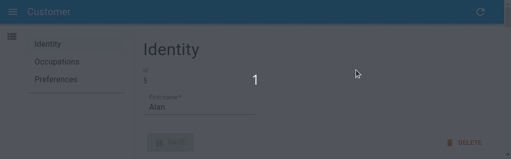
This component will come in handy if you need to create a long form, with many input fields divided into several sections. It makes navigation easier, by providing a TOC (Table Of Contents) and by keeping the toolbar fixed at the bottom position.
Usage
Use <LongForm> as a child of <Create> or <Edit>. It should have <LongForm.Section> children, which contain inputs.
import {
    ArrayInput,
    BooleanInput,
    DateInput,
    Edit,
    required,
    SelectInput,
    SimpleFormIterator,
    TextField,
    TextInput,
    Labeled,
} from 'react-admin';
import { LongForm } from '@react-admin/ra-form-layout';

const sexChoices = [
    { id: 'male', name: 'Male' },
    { id: 'female', name: 'Female' },
];

const languageChoices = [
    { id: 'en', name: 'English' },
    { id: 'fr', name: 'French' },
];

const CustomerEdit = () => (
    <Edit component="div">
        <LongForm>
            <LongForm.Section label="Identity">
                <Labeled label="id">
                    <TextField source="id" />
                </Labeled>
                <TextInput source="first_name" validate={required()} />
                <TextInput source="last_name" validate={required()} />
                <DateInput source="dob" label="born" validate={required()} />
                <SelectInput source="sex" choices={sexChoices} />
            </LongForm.Section>
            <LongForm.Section label="Occupations">
                <ArrayInput source="occupations" label="">
                    <SimpleFormIterator>
                        <TextInput source="name" validate={required()} />
                        <DateInput source="from" validate={required()} />
                        <DateInput source="to" />
                    </SimpleFormIterator>
                </ArrayInput>
            </LongForm.Section>
            <LongForm.Section label="Preferences">
                <SelectInput
                    source="language"
                    choices={languageChoices}
                    defaultValue="en"
                />
                <BooleanInput source="dark_theme" />
                <BooleanInput source="accepts_emails_from_partners" />
            </LongForm.Section>
        </LongForm>
    </Edit>
);
<LongForm> accepts the same props as the <Form> component.
defaultValuesidnoValidateonSubmitsxtoolbarvalidatewarnWhenUnsavedChanges
Additional props are passed to react-hook-form’s useForm hook.
toolbar
You can customize the form Toolbar by passing a custom element in the toolbar prop. The form expects the same type of element as <SimpleForm>, see the <SimpleForm toolbar> prop documentation in the react-admin docs.
import {
    Edit,
    SaveButton,
    Toolbar as RaToolbar,
} from 'react-admin';
import { LongForm } from '@react-admin/ra-form-layout';

const CustomerCustomToolbar = props => (
    <RaToolbar {...props}>
        <SaveButton label="Save and return" type="button" variant="outlined" />
    </RaToolbar>
);

const CustomerEditWithToolbar = () => (
    <Edit component="div">
        <LongForm toolbar={<CustomerCustomToolbar />}>
            <LongForm.Section label="Identity">
                ...
            </LongForm.Section>
            <LongForm.Section label="Occupations">
                ...
            </LongForm.Section>
            <LongForm.Section label="Preferences">
                ...
            </LongForm.Section>
        </LongForm>
    </Edit>
);
sx: CSS API
The <LongForm> component accepts the usual className prop. You can also override the styles of the inner components thanks to the sx property. This property accepts the following subclasses:
| Rule name | Description |
|---|---|
RaLongForm |
Applied to the root component |
& .RaLongForm-toc |
Applied to the TOC |
& .RaLongForm-main |
Applied to the main <Card> component |
& .RaLongForm-toolbar |
Applied to the toolbar |
& .RaLongForm-error |
Applied to the <MenuItem> in case the section has validation errors |
<LongForm.Section>
The children of <LongForm> must be <LongForm.Section> elements.
This component adds a section title (using a <Typography variant="h4">), then renders each child inside a MUI <Stack>, and finally adds an MUI <Divider> at the bottom of the section.
It accepts the following props:
| Prop | Required | Type | Default | Description |
|---|---|---|---|---|
label |
Required | string |
- | The main label used as the section title. Appears in red when the section has errors |
children |
Required | ReactNode |
- | A list of <Input> elements |
cardinality |
Optional | number |
- | A number to be displayed next to the label in TOC, to quantify it |
sx |
Optional | object |
- | An object containing the MUI style overrides to apply to the root component |
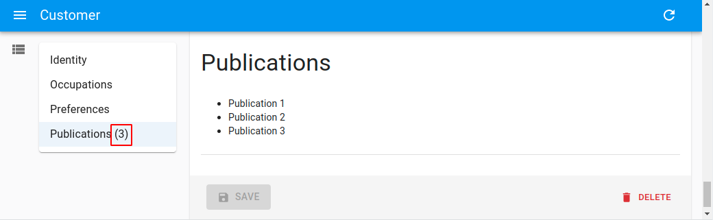
cardinality
The cardinality prop allows to specify a numeral quantity to be displayed next to the section label in the TOC.
import React, { useEffect, useState } from 'react';
import {
    Edit,
    TextField,
} from 'react-admin';

import { LongForm } from '@react-admin/ra-form-layout';

const CustomerEditWithCardinality = () => {
    const [publications, setPublications] = useState([]);
    useEffect(() => {
        setTimeout(() => {
            setPublications([
                { id: 1, title: 'Publication 1' },
                { id: 2, title: 'Publication 2' },
                { id: 3, title: 'Publication 3' },
            ]);
        }, 500);
    }, []);

    return (
        <Edit component="div">
            <LongForm>
                <LongForm.Section label="Identity">
                    ...
                </LongForm.Section>
                <LongForm.Section label="Occupations">
                    ...
                </LongForm.Section>
                <LongForm.Section label="Preferences">
                    ...
                </LongForm.Section>
                <LongForm.Section
                    label="Publications"
                    cardinality={publications.length}
                >
                    <ul>
                        {publications.map(publication => (
                            <li key={publication.id}>
                                <TextField
                                    source="title"
                                    record={publication}
                                />
                            </li>
                        ))}
                    </ul>
                </LongForm.Section>
            </LongForm>
        </Edit>
    );
};