
admin-on-rest 0.5 is out

Our first blog post about admin-on-rest was two months ago. If you missed it, we released a React library providing an admin GUI on top of any REST API, and it’s published on GitHub: marmelab/admin-on-rest. At the time, we were releasing version 0.3. Since then, we’ve released two versions (v0.4 and v0.5) to bring admin-on-rest closer to production level. So we have a lot to announce:
- New Documentation
- Form Validation
<RichTextField>and<RichTextInput>- Deep Field Selection
- Theming Support
- Implicit Labels
- The Show View
- Custom Headers
- Custom Styles
<Datagrid>Uses Real Tables
New In Admin-on-rest V0.4
New Documentation
We’ve written a lot of documentation for this version. It’s available both in the repository itself (under the /docs directory), and online, at http://marmelab.com/admin-on-rest/ (thanks to GitHub Pages).
You should now be able to write complete admins without ever looking at the components source.
Form Validation
For the <Edit> and <Create> views, you can now specify validation rules to force the existence and/or format of certain properties:
export const UserCreate = (props) => ( <Create {...props}> <TextInput label="First Name" source="firstName" validation={{ required: true }} /> <TextInput label="Age" source="age" validation={{ required: true, min: 18 }} /> </Create>);There is a dedicated chapter about validation in the documentation, make sure you read it to see how easy it is to validate your inputs
<RichTextField> and <RichTextInput>
Showing and Editing HTML is now possible thanks to these two new components. Under the hood, the edition is delegated to the quill editor, which is easy enough to customize to fit most of the WYSIWYG edition needs!
import { RichTextInput } from "admin-on-rest/mui";
<RichTextInput source="body" />;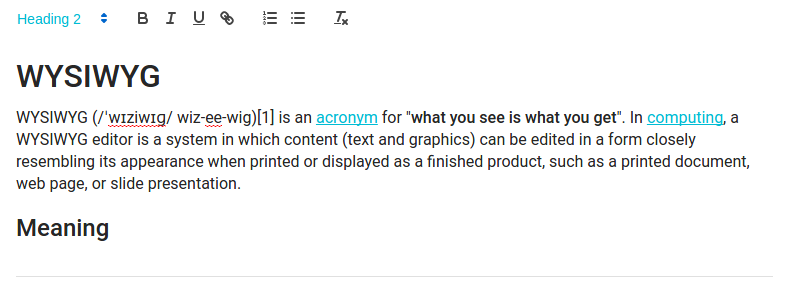
You can customize the rich text editor toolbar using the toolbar attribute, as described on the Quill official toolbar documentation.
<RichTextInput source="body" toolbar={[["bold", "italic", "underline", "link"]]}/>Deep Field Selection
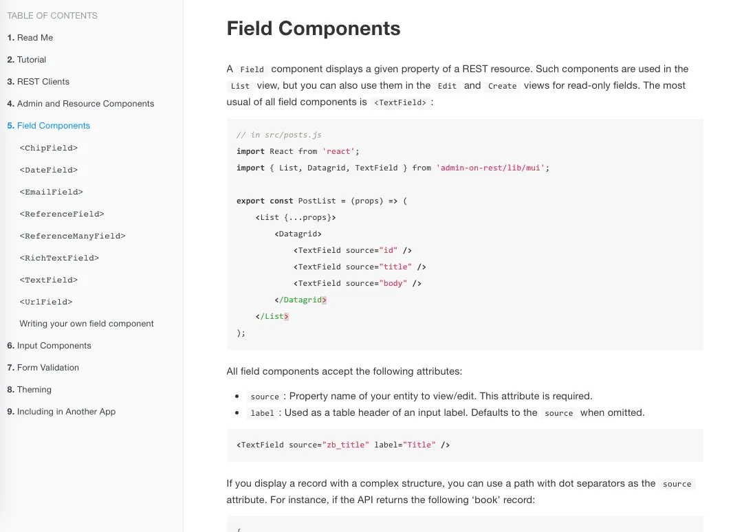
If you display a record with a complex structure, you can use a path with dot separators as the source attribute. For instance, if the API returns the following ‘book’ record:
{ id: 1234, title: 'War and Peace', author: { firstName: 'Leo', lastName: 'Tolstoi' }}Then you can display the author first name as follows:
<TextField source="author.firstName" />Theming Support
You can take advantage of material ui theming support right in admin-on-rest:
import darkBaseTheme from "material-ui/styles/baseThemes/darkBaseTheme";import getMuiTheme from "material-ui/styles/getMuiTheme";
const App = () => (  <Admin    theme={getMuiTheme(darkBaseTheme)}    restClient={simpleRestClient("http://path.to.my.api")}  >    // ...  </Admin>);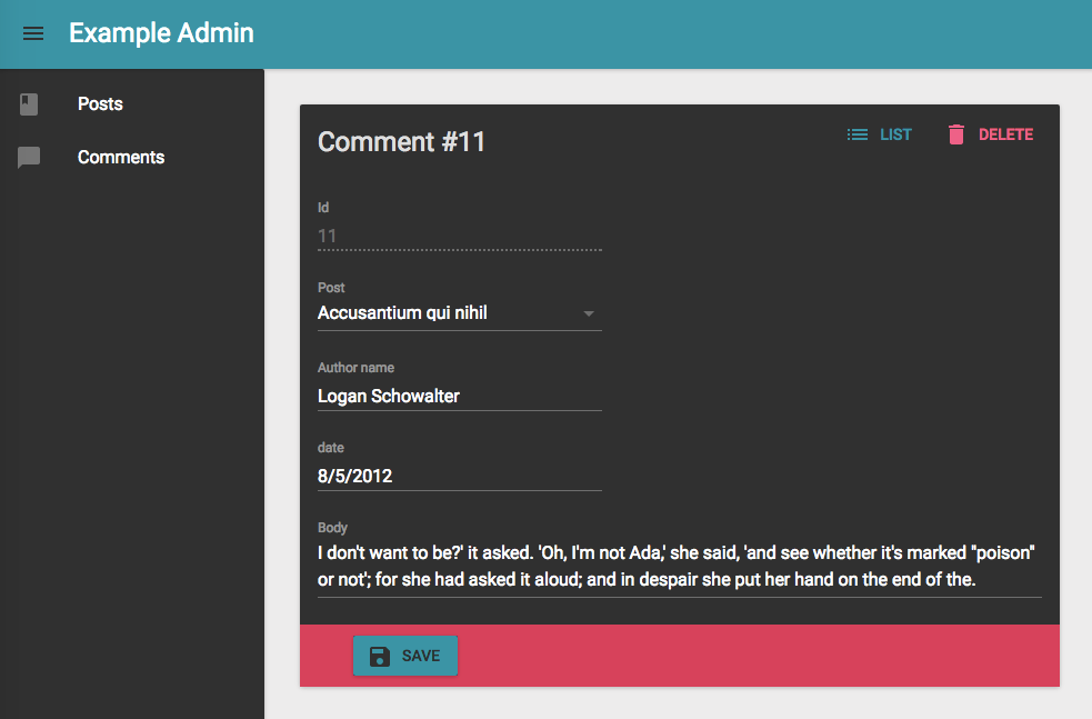
For more details on predefined themes and custom themes, refer to the Material UI Customization documentation.
Implicit Labels
To determine the column header, or the form label, Fields and Inputs components now use the source when there is no label. This usually means that you can omit the label:
// before<TextInput label="Title" source="title" /><TextInput label="Average note" source="average_note" />
// after<TextInput source="title" /><TextInput source="average_note" />
As you can see, admin-on-rest is smart enough to “humanize” the source so that it is readable by a human.
New In Admin-on-rest v0.5
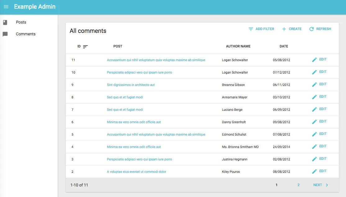
The Show View
If you want to show the detail of a resource, but without letting the end user edit it, the new <Show> component is your man. It expects <Field> components (the ones you use in <List>) as children:
const PostShow = (props) => (  <Show title={PostTitle} {...props}>    <TextField source="id" />    <TextField source="title" />    <TextField source="teaser" />    <RichTextField source="body" stripTags={false} />    <DateField source="published_at" />    <TextField source="average_note" />    <ReferenceManyField label="Comments" reference="comments" target="post_id">      <Datagrid selectable={false}>        <TextField source="body" />        <DateField source="created_at" />        <EditButton />      </Datagrid>    </ReferenceManyField>    <TextField label="Nb views" source="views" />  </Show>);
render(  <Admin restClient={myRestClient}>    <Resource name="posts" list={PostList} show={PostShow} icon={PostIcon} />  </Admin>,  document.getElementById("root"),);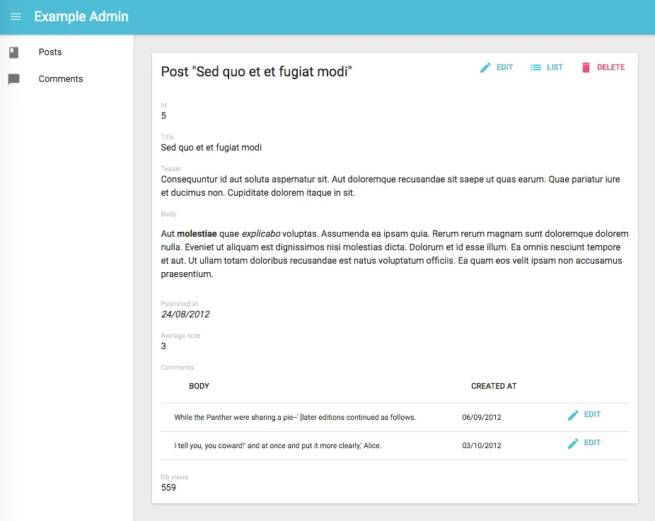
The <Show> view is ideal for read-only APIs.
Custom Headers
Although you can create a REST client function of your own, when all you need is to add custom headers to all the requests sent by admin-on-rest, it’s cumbersome to duplicate the existing code of simpleRestClient.
Fortunately, this new version allows to wrap the HTTP client function inside another function - it’s like adding an http interceptor:
import { simpleRestClient, fetchUtils, Admin, Resource } from "admin-on-rest";const httpClient = (url, options) => {  if (!options.headers) {    options.headers = new Headers({ Accept: "application/json" });  }  // add your own headers here  options.headers.set("X-Custom-Header", "foobar");  return fetchUtils.fetchJson(url, options);};const restClient = simpleRestClient("http://localhost:3000", httpClient);
render(  <Admin restClient={restClient} title="Example Admin">    ...  </Admin>,  document.getElementById("root"),);
Now all the requests to the REST API will contain the X-Custom-Header: foobar header.
See the details in the REST Client Documentation.
Custom Styles
You can now customize the style attribute of all the Field and Input components:
import { DateField } from "admin-on-rest/mui";
<DateField  source="publication_date"  style={{    fontWeight: "bold",  }}/>;
If you need more control over the HTML code, you can also create your own Field and Input components.
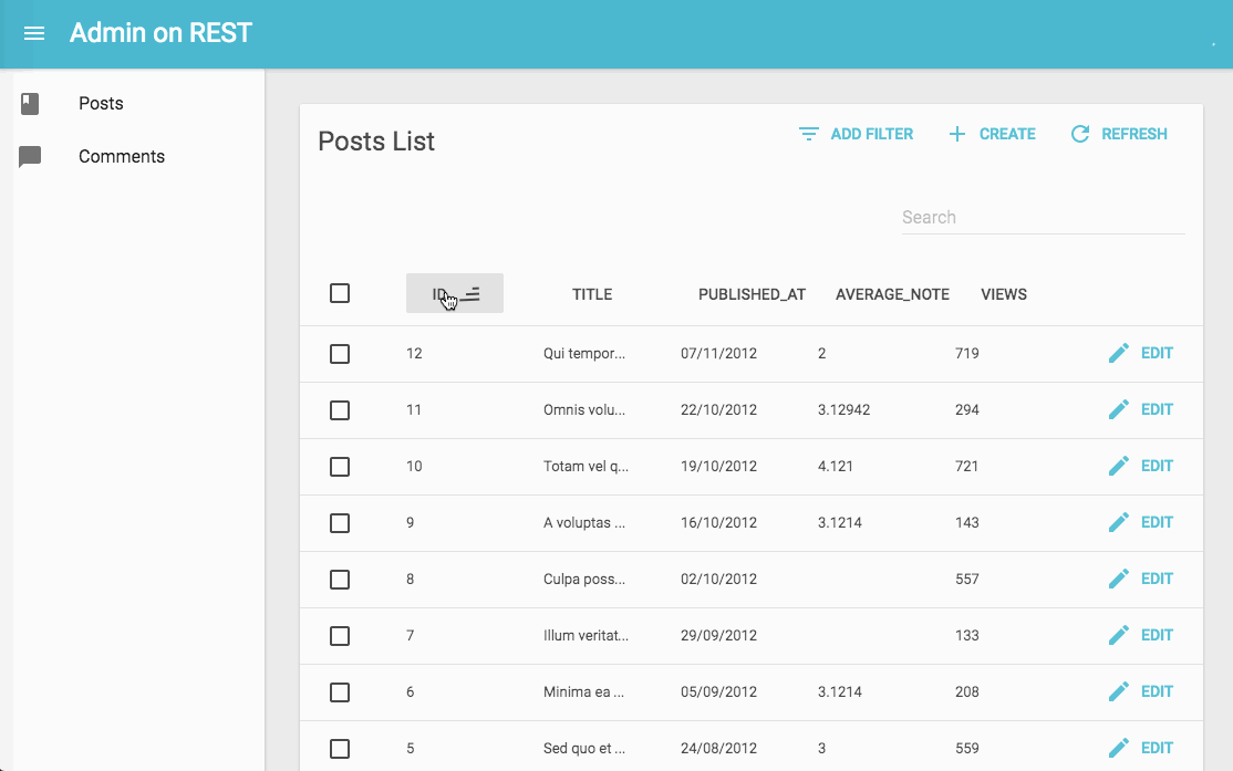
<Datagrid> Uses Real Tables
Material-ui’s <Table> component uses a column size strategy very uncommon in the web: all columns have the same width. For an admin app, the default behavior of HTML tables is preferable: adjust the column widths to better accommodate content.
Version 0.5 uses the html <table> element instead of material-ui’s <Table> component, and now column widths adjust automatically.
Check the Changelog
These two releases also fixed a few bugs, and improved the performance in a few places. Be sure to check the brand new Changelog to get a list of all the changes, including a few backwards compatibility breaks:
- [BC Break] Remove
credentials: includeheader enabled by default - [BC Break] Pass Headers object to
restClient
Next Steps
We’re super happy with the interest in the community about admin-on-rest. We’re receiving bug reports, pull requests, all of excellent quality! We’re also committed to making it grow fast, in order to become truly production-ready within a month or two. We’ll do our best to publish one release every month or so, so that you can benefit from the latest features and bugfixes within a short time.
If you like admin-on-rest, please talk about it, we need all the public interest we can get to make this library greater every day!

Authors
Marmelab founder and CEO, passionate about web technologies, agile, sustainability, leadership, and open-source. Lead developer of react-admin, founder of GreenFrame.io, and regular speaker at tech conferences.