
How To Implement Material Design Motion with React.js

There is a lot of talk about progressive web apps (PWA) recently. Most of the articles I’ve read only talk about manifests, service workers and HTTPS. But in my opinion, they miss the most important point of PWAs: they should feel native. And native apps usually contain a lot of animations. From my point of view, that’s what web apps lack the most.
Let’s explore what web technologies can do in animation, using our favorite stack, React. At marmelab, we really like Material Design, and it happens to have tons of recommendations related to motion. It’s a perfect fit for a tutorial.
A motion that caught my attention is that card-to-detail page transition:
storage.googleapis.com might track you and we would rather have your consent before loading this.
Success Criteria
Let’s build something that looks as much as possible as the video above. The card zooms to go full-screen ; it goes over the application bar, and pushes the next card below the view pane. The card content expands gracefully, and the card title zooms a bit as well.
There are also several animations that usually go unnoticed if you don’t look at the video carefully:
- The edit action button scales down until it disappears
- The like action button scales up from nowhere
- The card title goes a bit lower so that it leaves space for the like action button
- The 3 top right icons appear when the card expands
- The application icon and the search icon get pushed above the view pane when card expands
- And the funniest motion, the hamburger menu morphs to a back arrow
The motion seems so natural that, on first sight, we don’t even notice there are so many!
As this is a web application, I want my users to be able to share pages. It means that I need the URL to update when I see the details of the card, or when I go back.
As a starting point, I’ll use a basic React app with 2 pages: a Home page, and a Recipe Detail page. The routing uses react router v4.
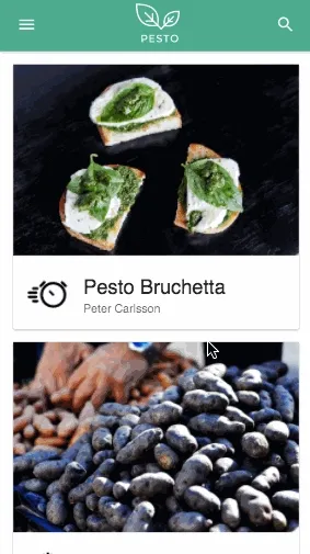
As this is neither a basic React nor a Material UI tutorial, let’s go straight to motions!
Displaying The Detail Page As A Modal
When the user clicks on a recipe in the Home page, I want the Recipe Detail page to first appear just where the card is, and then zoom to full-screen.
Actually, it would be weird if the detail page appeared right on top of the card and the rest of the list page disappeared. It means I need to have both routes displayed at the same time!
Fortunately, I can do exactly that with react-router v4. All I need to do is to store the previous location, and display it below the actual location.
class App extends Component {  componentWillReceiveProps(nextProps) {    this.previousView = this.props.location;  }
  render() {    const { location } = this.props;    const modal = location.state && location.state.to === "modal";
    return (      <div className="App">        <Header />        <div className="view-container">          <Switch location={modal ? this.previousView : location}>            <Route exact path="/" component={Home} />          </Switch>        </div>        <div className="modal-container">          <Switch location={location}>            <Route path="/recipe/:id" component={Recipe} />          </Switch>        </div>      </div>    );  }}
Using location.state lets me offer a generic way to decide whether a route should display as a modal or not. For instance, a click on a recipe on the home page links to the Recipe Detail page, but with a modal state:
history.push({ pathname: `/recipe/${recipe.id}`, state: { to: "modal", },});It means that pages can be rendered as modals or full-screen, and thus is better for reusability.
Here is some CSS (well, actually some LESS) to make the modal display full-screen:
.modal-container { position: fixed; overflow: hidden; top: 0; right: 0; bottom: 0; left: 0; height: 100vh; width: 100vw; z-index: 1200; background: white; /* add opacity to see if the other view is actually kept below */ opacity: 0.5;}And here is the result. You can see both views are rendered at the same time:

Positioning a Component On Top Of Another One
The full-screen Recipe Detail page now appears on top of the list. I’d like it make it appear superimposed on the small card first.
I’ve already used route states to flag links to a modal ; I can do exactly the same to set the position where I want that modal to appear.
All I need is a simple HOC that wraps my component into a div, and makes the DOM Element accessible through a ref. I can then call getBoundingClientRect on the DOM Element to get its positioning information, and add it to my route state:
export default (Component) =>  ({ history, recipe, ...rest }) => {    let element = null;
    const goToRecipe = () => {      const { top, right, bottom, left, width, height } =        element.getBoundingClientRect();
      history.push({        pathname: `/recipe/${recipe.id}`,        state: {          to: "modal",          meta: {            from: { top, right, bottom, left, width, height },          },        },      });    };
    return (      <div        ref={(el) => {          element = el;        }}      >        <Component recipe={recipe} onClick={goToRecipe} {...rest} />      </div>    );  };
I can then use that positioning information taken from state.from (top, right, bottom, left, width, and height) directly as CSS properties on the modal:
class App extends Component {  // ...
  render() {    const { location } = this.props;    const modal = location.state && location.state.to === "modal";
    const position = modal ? location.state.meta.from : {};
    return (      <div className="App">        <Header />        <div className="view-container">          <Switch location={modal ? this.previousView : location}>            <Route exact path="/" component={Home} />          </Switch>        </div>        <div className="modal-container" style={position}>          <Switch location={location}>            <Route path="/recipe/:id" component={Recipe} />          </Switch>        </div>      </div>    );  }}
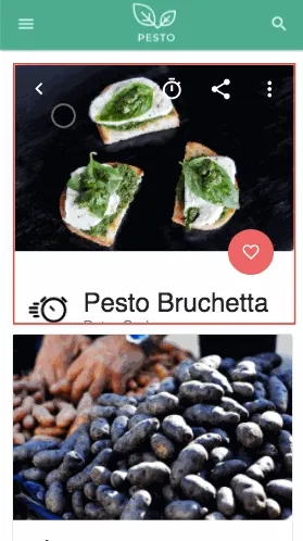
If I did everything right, the modal should now appear right on top of the card. Let’s add a large red border to make sure it does.
.modal-container { /* ...*/ border: 2px red solid;}And here is the result:
Adding CSS Transitions
I know how to render the modal both over the card and in full-screen, I would now like to animate from one state to the other.
I tried a lot of different libraries for that matter… React Motion, react-router-transition, and I found out they were all flickering on low-end devices. It really didn’t feel native.
I thought that maybe using plain CSS transitions could make it smoother. Here comes react-transition-group, which makes it possible to add classes whenever a component appears or disappears.
Let’s use it in the layout:
import { TransitionGroup, CSSTransition } from "react-transition-group";
class App extends Component {  // ...
  render() {    const { location } = this.props;    const modal = location.state && location.state.to === "modal";
    let pos = {};    if (modal) {      pos = location.state.meta.from;    }
    return (      <div className="App">        <Header />        <div className="view-container">          <Switch location={modal ? this.previousView : location}>            <Route exact path="/" component={Home} />          </Switch>        </div>        <TransitionGroup>          <CSSTransition            timeout={450}            classNames="modal"            key={location.pathname}            mountOnEnter            appear          >            <div className="modal-container" style={position}>              <Switch location={location}>                <Route path="/recipe/:id" component={Recipe} />              </Switch>            </div>          </CSSTransition>        </TransitionGroup>      </div>    );  }}
The CSSTransition component appends the modal-enter-active class when the Route appears, and modal-exit-active when it disappears (more details in the react-transition-group documentation). So it’s just a matter of implementing the transition in CSS:
.modal-container {  position: fixed;  transition: all 450ms cubic-bezier(0.23, 1, 0.32, 1);  overflow: hidden;  top: 0;  right: 0;  bottom: 0;  left: 0;  height: 100vh;  width: 100vw;  background: white;  z-index: 1200;
  .modal-enter-active {    top: 0 !important;    right: 0 !important;    bottom: 0 !important;    left: 0 !important;    width: 100vw !important;    height: 100vh !important;  }}
It means that by default, modal-container is full-screen. But the layout gives it inline styles, overriding default CSS-declared position, to where the card should first appear.
And when CSSTransition adds the modal-enter-active class, I set the position back to full-screen, with the help of the !important keyword.
I handled the animation back and forth, so it’s supposed to work:
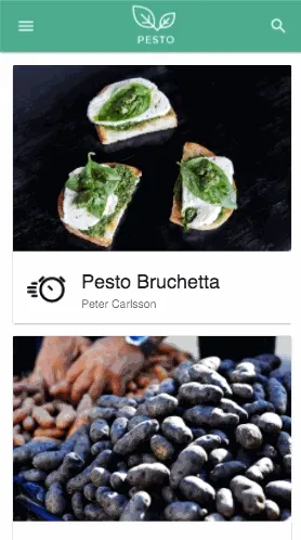
As you can notice, I didn’t touch the back arrow and it goes back to the card style itself.
Well actually, CSSTransition removes modal-enter-active class after the 450ms timeout, and makes the Route go back to its initial style.
We can introduce a dirty trick 🤐 to make it behave differently…
import {  TransitionGroup,  CSSTransition as OriginalCSSTransition,} from "react-transition-group";
class CSSTransition extends OriginalCSSTransition {  onEntered = () => {    // Do not remove enter classes when active  };}
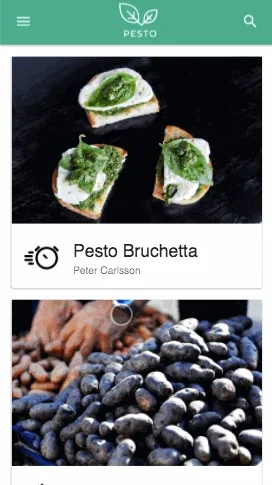
I overrode the original onEntered method to avoid it removing the classes. Not pretty, but it works, see for yourselves:
The Devil Is In The Details
First challenge and main risk tackled. But for the transition to feel completely native and seamless for the user, it needs even more sugar! All the small animations previously listed are what make the final experience perfect.
Thanks to CSSTransition, classes are added to our modal-container and help hugely with all those details!
Let’s define some LESS mixins to help with transitions:
.enable-transition {  transition: all 450ms cubic-bezier(0.23, 1, 0.32, 1) 0ms;}
.appear {  .enable-transition();  opacity: 0;
  .modal-enter-active & {    opacity: 1;  }}
When .appear() is called on a DOM element, it enables transitions, and turns its opacity to 0. And when that element is a child of .modal-enter-active, it sets the opacity to 1.
Since it’s parameterless, we can use this mixin as a plain class, or as an actual LESS mixin.
For instance, to make the top action buttons appear smoothly:
<div className="actions right appear"> <IconButton> <TimerIcon /> </IconButton> <IconButton> <ShareIcon /> </IconButton> <IconButton> <MoreIcon /> </IconButton></div>or the equivalent:
.actions { .appear();}
It works! The icons appear at the same time as the card expands to full-screen.
We’re almost there, let’s define some more animations, to zoom-in on an element or text:
.zoom-font(@to) {  .enable-transition();
  .modal-enter-active & {    font-size: @to;  }}
.zoom-element(@width, @height) {  .enable-transition();
  .modal-enter-active & {    width: @width;    height: @height;  }}
And apply them to the right element on the recipe page:
.title {  .header {    .zoom-font(32px);  }
  .sub {    .zoom-font(18px);  }}
.floating {  .like {    .zoom-element(56px, 56px);    .appear();  }}
That’s it! The title text is zooming-in and the floating action button seems to be coming from nowhere.

Success ?
Let’s get back to the success criteria from the first part of the article:
- ✅ Card zooms to go full-screen
- The edit action button scales down until it disappears
- ✅ The like action button scales up from nowhere
- ✅ The card title zooms-in and goes a bit lower so that it leaves space for the like action button
- ✅ The 3 top right icons appear when the card expands
- The application icon and the search icon get pushed above the view pane when the card expands
- And the funniest motion, the hamburger menu morphs to a back arrow
Well, so long for so few green checks. Checklists are harsh, but the most important point to me was that the page transitions needed to feel seamless, natural and native. It’s not exactly like in the video, but I think it’s already much better than no animation at all!
Wanna go further and tick the remaining boxes ? It’s open-source, go submit a pull request!
Authors

Facilitator at marmelab, Florian also gives lectures to IT students. He's a biker, plays the guitar, and brews his own beer.