
How to Create a Carousel and a Wizard Form With React and CSS-in-JS


Wizard forms, how common are they? There are about a gazillion open-source implementations of a wizard form on GitHub. Believe it or not, none of them matched our requirements for a particular project. We needed to display a poll sliding from one edge of the screen, and displaying one question at a time, in a wizard-like ui.

So even if we’re reluctant to reinvent the wheel (we always prefer using open-source projects and contributing to them), we had no other choice but to create a whole new wizard form module. In this article, we will explain how we did it, and what we’ve learned in the process, from its design to its integration into an existing project. You will learn a few tips about animation, performance, and composition. We’ve published the resulting package as marmelab/react-slider-poll on GitHub.
Technology Stack: ES6, React, Glamor
The form needs to be integrated into a legacy Angular.js application. However, the poll can be considered as a standalone application, with a limited public API. So we decided to use React just for this component, and to render it inside the Angular.js app.
Using both Angular.js and React may seem a strange choice, but that’s how we continuously migrate our legacy apps to more up-to-date technology. In this case, the bundle size isn’t a problem per se (the application is packaged as a native app with Cordova).
We chose to minimize the additional dependencies (no state management library, no form library). We had to use a CSS-in-JS library to overcome the limitations of inline styles in React (mostly the lack of support of media queries), and we chose Glamorous, based on Glamor.
Tip: Be cautious because Glamorous is now deprecated in favor of Emotion.
Separation Of Concerns
When using a component-based framework, web developers start by decomposing a feature into components. They should serve a single purpose, and compose well with each other. Here is how we decomposed the sliding wizard poll.
Sliding From The Side: The Drawer
First of all, in the feature we wanted to build, the poll is contained in a block sliding from one side of the screen. For that purpose, we’ve created the Drawer component. It contains a position state, which can be either POSITION_DISMISSED (the default position), POSITION_OPEN, or POSITION_CLOSED.
When dismissed, the drawer is partly visible, but doesn’t prevent reading the main content. When open, the drawer is displayed over the main content. When closed, the drawer disappears completely, and cannot be reopened. Note that the content of the drawer is not this component’s responsibility - it lets its children render themselves.
<Drawer delay={1000} defaultPosition={POSITION_DISMISSED} onPositionChange={handlePositionChange}> <OurPollHere /></Drawer>The delay prop is the time before the slider appears, and the two others are related to its position. The onPositionChange prop is a callback for reporting the drawer position when it changes (for analytics for example).

The Drawer implementation translates the position into classnames, and uses CSS transitions for the animation. The gist is in the DrawerContainer component, which is a simple styled div powered by Glamorous.
const DrawerContainer = glamorous.div({ bottom: 0, left: 0, margin: "0 auto", position: "fixed", right: 0, transition: transition(), transform: "translateZ(0)", width: "100%", ".closed": { maxHeight: 0, }, ".open": { maxHeight: "100%", }, ".dismissed": { maxHeight: 70, }, [mediaQueries.tablet]: { width: 500, ".dismissed": { maxHeight: 80, }, },});The Drawer render() method uses this styled component, enables classes depending on the state, and clones the child node:
    render() {        const { children } = this.props;        const { position } = this.state;
        return (            <DrawerContainer                className={classnames('slider', {                    open: position === POSITION_OPEN,                    dismissed: position === POSITION_DISMISSED,                    closed: position === POSITION_CLOSED,                })}            >                {React.cloneElement(children, {                    handleDismiss: this.handleDismiss,                    handleFinish: this.handleFinish,                    handleReopen: this.handleReopen,                    isDismissed: [POSITION_DISMISSED, POSITION_CLOSED].includes(                        position                    ),                })}            </DrawerContainer>        );    }
The controls for minimizing or closing the Drawer will be in its child component, but it’s the Drawer’s responsibility to manage the open state. That’s why the children don’t have access to the open state directly, but to function props like handleReopen, which they’ll use as a black box.
Displaying Questions One By One: The Carousel
In order to keep the user focused, the poll displays only one question at a time. To achieve that, we created the Carousel component. It shares the current step with a Pagination component, which is in charge of the user progression in the wizard.
<Fragment> <Carousel step={step} numberOfSteps={children.length}> {Children.map(children, (child, index) => ( <Step key={index} number={index} numberOfSteps={children.length}> {child} </Step> ))} </Carousel> <Pagination currentStep={step} numberOfSteps={children.length} handleClickPrevious={handleClickPrevious} handleClickNext={handleClickNext} nextStepAllowed={nextStepAllowed} /></Fragment>All the steps of the carousel are actually rendered in the DOM, and are siblings. We used CSS to display only the active step - that’s the responsibility of the Carousel. We use a common technique: all the steps are positionned on the same row, and the Carousel container acts like a window on the current step, hiding the others. This design is very useful to animate the transitions from one step to the other.
We took advantage of the ability to create styles based on props in Glamorous:
import glamorous from "glamorous";import { transition } from "../util";
const Carousel = glamorous.div(  {    position: "relative",    margin: 0,    padding: 0,    transition: transition(0.5),    transform: "translateZ(0)",    overflow: "hidden",  },  ({ numberOfSteps, step, height }) => ({    width: `${numberOfSteps * 100}%`,    height,    marginLeft: `-${(step - 1) * 100}%`,  }),);
export const Step = glamorous.div(  {    position: "absolute",    transition: transition(0.5),    transform: "translateZ(0)",  },  ({ step, numberOfSteps }) => ({    left: `${(100 / numberOfSteps) * step}%`,    width: `${100 / numberOfSteps}%`,  }),);
When the step changes, the active Step slides into view, and we don’t need anything else than a configurable CSS for that. Theses components are simply powered by Glamorous - no complex render() method involved. They are dumb with no state ; they receive the current step as prop, and the Pagination component receives a few callbacks to update the step upon navigation.
Glamorous (and CSS-in-JS in general) makes it super easy to design such UI-only components. This encourages a good discipline when splitting components responsibilities, and it makes the code easier to reason with.
Tip: The transition CSS property makes the transition smooth. We used a transition helper to share the same timing and easing across all transitions:
// In util/transition.jsexport default (duration = "1", items = "all") => `${items} ${duration}s cubic-bezier(0.23, 1, 0.32, 1)`;State Management
If you look at the Carousel carefuly, you can notice that all components listen to the step prop. And each time it changes, everything updates accordingly. It looks like magic, but in fact, the Carousel is wrapped into a main component which is basically a proxy with the rest of the code. Its only purpose is to managing the local state.
When the Carousel is created, its initial state is passed from the main component through his props, giving it for instance the step to display. Some callbacks are also passed to let its children interacts with the main state. For instance, everytime the user clicks on the Next button, the MoveStep callback coming from the main component is called. Then, it can update the wizard state and call the API to store the new current step.
Avoiding Putting Too Much Logic In CSS-in-JS
After learning how to use props in Glamorous components for styling, we were tempted to generalize this pattern. For instance, we have a generic <Button> component, which receives several props (active, selected, disabled). These props, combined, define the button state. So we could write the Button component as follows:
const Button = glamorous.span( { // boring styling // ... ({ primary, active, selected, disabled }) => { let style = {}; if (primary) { style = { ...style, borderColor: colors.yellow, color: colors.yellow, ':hover': hoverStyle, }; } if (active) { style = { ...style, boxShadow: `inset 0 0 0 3px ${colors.black}`, } } if (selected) { style = { ...style, backgroundColor: colors.yellow, borderColor: colors.black, color: colors.black, } } if (disabled) { style = { ...style, opacity: 0, } } return style; } });But putting too much logic in a Glamorous div felt wrong, especially when we wanted to unit test our components. Instead, we decided to use two components: one to handle styling, the other to handle the logic:
const ButtonContainer = glamorous.span(    {        // boring styling        // ...        '.primary': {            borderColor: colors.yellow,            color: colors.yellow,            ':hover': hoverStyle,        },        '.active': {            boxShadow: `inset 0 0 0 3px ${colors.black}`,        },        '.selected': {            backgroundColor: colors.yellow,            borderColor: colors.black,            color: colors.black,        },        '.disabled': {            opacity: 0,        },    });
const Button = ({ primary, active, selected, disabled, className, children }) => (    <ButtonContainer        className={classnames(className, {            primary,            active,            disabled,            selected,        })}    >        {children}    </ButtonContainer>;
This <Button> component is way easier to test, and to reason with. As a rule of thumb, we decided to use props in Glamorous components only when a class couldn’t do the job instead, and that means only when the style varies continuously (like changes in with, height, margin) instead of discretely (as in this example).
Extending Components Using Composition
Our wizard displayed mostly multiple choice questions, so our main UI components for interactions were buttons. But according to the question layout, the question itself, and specific business rules, we had to implement many variations of the buttons.
We used composition for that, separating the generic (state handling in the <span> component) from the specific, as in the RoundedButton:
import { css } from "glamor";import Button from "./Button";
const roundButtonStyle = css({  alignItems: "center",  borderRadius: "50%",  cursor: "pointer",  display: "flex",  flex: "1",  justifyContent: "center",  margin: "5%",  padding: 15,  textAlign: "center",  "&::after": {    content: `''`,    display: "table",    paddingBottom: "100%",  },});
const RoundButton = ({ children, ...rest }) => (  <Button {...rest} className={roundButtonStyle}>    {children}  </Button>);
That’s another neat trick from Glamorous: it’s possible to define a custom style without creating a component, using the css helper.
You can find below the round buttons, used in the wizard form.
All the buttons are available in the button directory.
Tip: On mobile, when you use some components like links, the tapped element is highlighted with a blue color. This kind of feedback is not useful if your design already responds to the user input. You can remove it using the following code.
const ComponentWithoutHighlight = glamorous.div({ WebkitTapHighlightColor: "transparent",});Let’s Add Some Fancy Animations
Animations are important because they make the UI expressive. However, a bad animation can also provide a negative experience to users.
Fun Fact: During the development of super mario bros, the beta players had the feeling that Mario was moving too slowly. In order to fix that, the Nintendo developers animated Mario’s legs twice faster without changing the actual speed of the character. It was enough to bring the illusion of speed.
That’s why you should animate your components with the right effect. The best example is to find in the animation of our buttons.
If you look closer, clicking on a button could be decomposed in 2 steps: moving the mouse to the button, and clicking on it. To give feedback, we choose to animate these two actions. The first one is quite simple: we just use the :hover property coming from pure css. But the second one should be decomposed in several actions to give a better feeling. First, the user presses the mouse left button, and then releases it.
In React it’s simple. When the MouseDown event is triggered, the button is active. When the MouseUp event is released, the button is inactive.
class Button extends Component {  state = {    active: false,  };
  handleMouseDown = () => {    this.setState({ active: true });  };
  handleMouseUp = () => {    this.setState({ active: false });  };
  render() {    return (      <span onMouseDown={this.handleMouseDown} onMouseUp={this.handleMouseUp}>        My button      </span>    );  }}
Now, we just have to bind css properties to animate it. We chose to slightly reduce the button’s size to simulate a pressure on it, that is made possible by the box-shadow property and its inset parameter. It puts the shadow inside the element and thanks to a smooth transition, we have a pressure effect.
.active { box-shadow: inset 0 0 0 3px black;}And now you can see the result with the following animation.

Tip: Some libs like React Motion can also help to animate React components. If you want to know more about that, have a look at Florian’s article: How To Implement Material Design Motion with React.
Performance Matters
Unfortunately, animations are often coming with noticeable performance cost. That’s why during the development, we have noticed some lags and low framerates, epecially on low end devices (tablets, mobile).
Tip: If you have this kind of issues, you could use the advices of the following article: React is slow, React is fast.
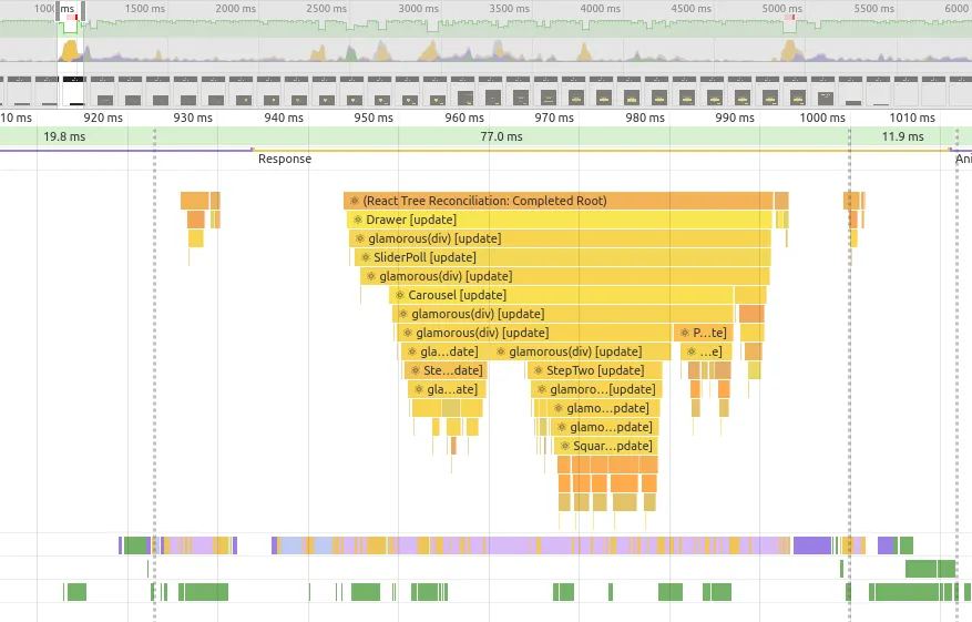
Detect Issues with the Chrome Profiling Tools
When a performance issue is detected, the first action is to open the chrome profiling. Thanks to that, we have detected that there was a significant number of glamorous(div) [update] mentions, and some components were rendered when they shouldn’t.
If you don’t know how the chrome profiling works, you can read the following article: Debugging React performance with React 16 and Chrome Devtools.
Tip: Firefox also provides a performance tool. Like in Chrome, you can open it from the developer tools.
Simple Optimizations
The profiler pointed the bottleneck and helped us to make quick optimizations.
First of all, Glamorous provides the shouldClassnameUpdate function. The name is close to shouldComponentUpdate of React components, and for a good reason: you can use it the same way.
const PaginationContainer = glamorous.div( { // props css }, { shouldClassNameUpdate: () => false, },);We can go even further like in the StepContainer component where we define exactly what should be updated depending on the props.
export const StepContainer = glamorous.div( { // props css }, ({ step, numberOfSteps }) => ({ left: `${(100 / numberOfSteps) * step}%`, width: `${100 / numberOfSteps}%`, }), { shouldClassNameUpdate: (prevProps, nextProps) => prevProps.step !== nextProps.step || prevProps.numberOfSteps !== nextProps.numberOfSteps, },);To avoid re-rendering big components, we separate the containers from the logic. For example, the PaginationContainer component and the Pagination component are two different components. This pattern offers a more optimized rendering because the only affected components are thoses depending on changed props. And the others like the PaginationContainer are never redrawn.
Tip: Instead of implementing shouldComponentUpdate() manually, we can make our components extend React’s PureComponent instead of Component. This would compare all props using strict equality (===), and re-render only if any of the props changes.
class Carousel extends Component {    render() {        return (            <Pagination ... />        );    }}
class Pagination extends PureComponent {    render() {        return (            <OtherComponent />        );    }
Transitions are often costly in term of FPS. The browser has a lot of things to compute. But you can fix it by adding a transform property next to your transition. The transform property forces the browser to use hardware acceleration using the device’s GPU.
const DrawerContainer = glamorous.div({ // ... some css transition: transition(), transform: "translateZ(0)",});Rethink the Component Design
We sometimes build our components in a too complicated way. In our app, each step in the wizard had different questions, and therefore different heights.
That’s why, at the beginning, the Carousel was designed to compute the height of its children automatically.
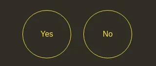
This design had been imagined to create resizable steps depending on the questions. That allowed us to ask questions in a progressive way. For instance, imagine a classic ‘Yes/No’ question, associated to a formular asking ‘Why’ when clicking on ‘Yes’. The ‘Why’ part, hidden at the beggining, is revealed after clicking on ‘Yes’, making the carousel growing up accordingly.
-
Carousel
-
Step #1
- ‘Yes / No’ Question
- ‘Why’ (hidden until previous question answered)
-
Step #2
- Question
-
This caused real performance issues, especially on iOS, due to a lot of re-rendering. In fact, each time the step changed, the Carousel computed the size and then created animations to render things smoothy. After several attempts to optimize transitions and components, we came to the conclusion that we had to do things differently.
We finally decided to fix the height of the steps in CSS. We lost some features, but we gained a lot in performance.
const stepHeights = [ { height: 250, [mediaQueries.tablet]: { height: 250, }, }, { height: 380, [mediaQueries.tablet]: { height: 420, }, },];Tip: If you are building a responsive app, don’t forget to use real phones during your tests. They often reveal a lot of performance issues.
Inserting a React Component in an Angular.js App
To test the wizard, we took the code and integrated it directly into a simple React app.
import React from "react";
import Drawer from "./sliderPoll/core/Drawer";import SliderPoll from "./sliderPoll/core/SliderPoll";
const poll = {  useReactAdmin: true,};
class App extends Component {  render() {    return (      <div className="app">        <header className="header">          <h1 className="title">Welcome to React</h1>        </header>        <Drawer>          <SliderPoll poll={poll} />        </Drawer>      </div>    );  }}
But we had to go further, and integrate it in an Angular.js application.
You will not believe us, but it’s quite simple to do that. You just need to create an Angular.js directive that will be in charge of rendering the React app. As you can see below, it’s very easy to bind elements from Angular.js to React, and vice-versa.
import React from "react";import ReactDOM from "react-dom";
import Drawer from "./sliderPoll/core/Drawer";import SliderPoll from "./sliderPoll/core/SliderPoll";
const angularSliderPoll = () => ({  template: '<div id="slider-poll"></div>',  scope: {    onStepSave: "&",    poll: "<",  },  link(scope) {    const divSliderPoll = document.getElementById("slider-poll");
    const handleSaveStep = (state) => {      scope.onStepSave({ $data: state });      scope.$applyAsync(); // The event is executed by react    };
    const unregisterWatchPoll = scope.$watch(      "poll",      (poll) => {        if (!angular.isDefined(poll)) {          return;        }        ReactDOM.render(          <Drawer>            <SliderPoll poll={poll} handleSaveStep={handleSaveStep} />          </Drawer>,          divSliderPoll,        );      },      true,    );
    scope.$on("$destroy", () => {      ReactDOM.unmountComponentAtNode(divSliderPoll);      unregisterWatchPoll();    });  },});
angular.directive("angularSliderPoll", angularSliderPoll);Tip: Don’t forget that React events are managed outside Angular.js. So you should use $applyAsync to keep the two frameworks synchronized.
References
You can find all the sources and examples on GitHub, it’s open-source:
Feel free to use =).
Picture by Glenn Carstens-Peters on Unsplash
Authors
Full-stack web developer at marmelab, Adrien is a Software Engineer with a strong taste for agile project management. He's also a judoka! He has only one goal: discover Irene's identity.
Full-stack web developer at marmelab, Maxime knows both the open-source and the Microsoft sides of things. Pragmatic, he always takes the best tool for the job.
Marmelab founder and CEO, passionate about web technologies, agile, sustainability, leadership, and open-source. Lead developer of react-admin, founder of GreenFrame.io, and regular speaker at tech conferences.