React-admin 2.6: Datagrid Improvements, UI Polish, and Better Styling

Thanks to the hard work of more than a dozen developers, 2019 starts with a new react-admin release, version 2.6. If the words “react-admin” don’t mean anything to you, they relate to a frontend framework for building admin GUIs on top of REST/GraphQL APIs, that we’ve been working on for more than 2 years, and that is stable, used in production, and open-source.
And since we didn’t blog about the new features of the previous minor version (react-admin 2.5), this post will list the enhancements from both versions. Indeed, if you’re still using react-admin 2.4, upgrading to react-admin 2.6 will change a lot of little things for admin developers and end users - without any breaking changes! Here are the highlights:
- Datagrid Improvements: Expansion panel, row override, row click, export disable
- UI polish: Datagrid skeleton, Form autofocus, Export button disable, Edit toolbar background
- Better Styling: Better Login page, custom icon on all buttons
- ReferenceManyField Pagination
- Miscellaneous
Let’s dive in!
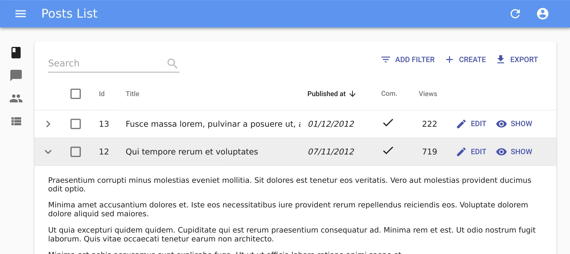
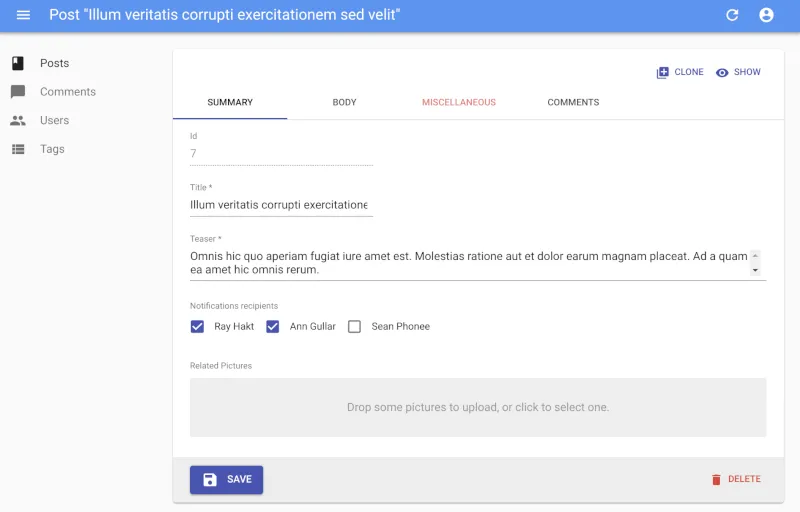
Datagrid Expansion Panel
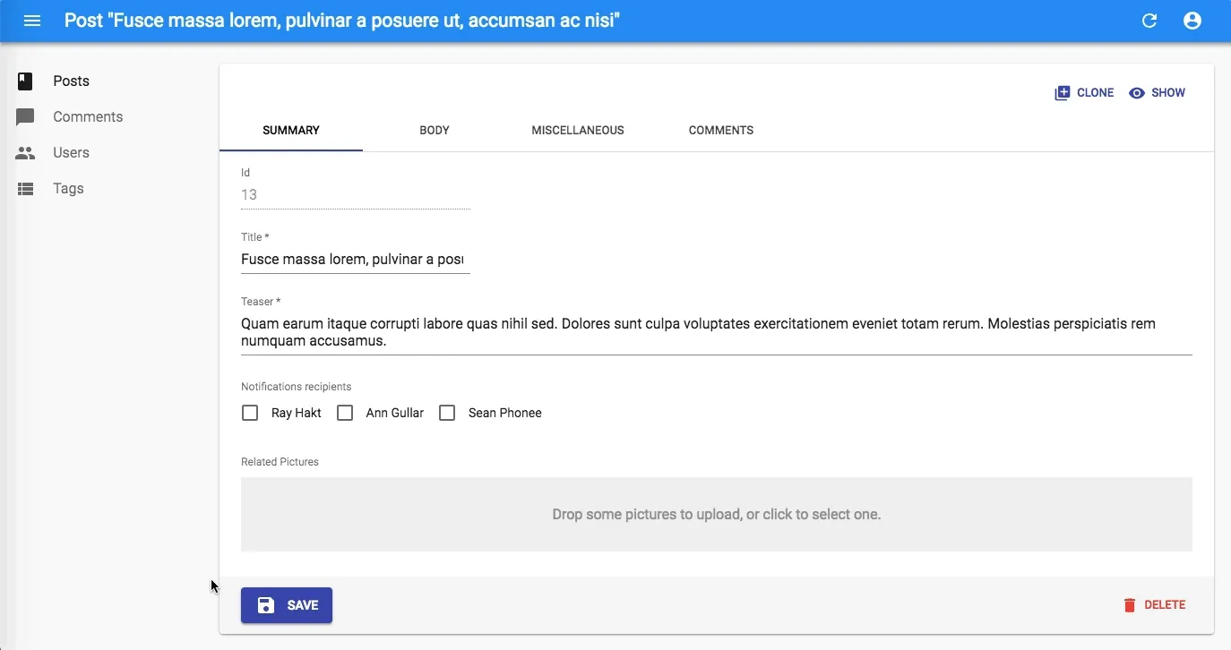
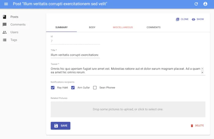
The <Datagrid> component is a central part of many admin UIs. With react-admin 2.5 and 2.6, we’ve made it even more flexible, so that it can be used in more use cases.
As a starter, you can now attach an expansion panel to every datagrid row. So if the tabular presentation isn’t enough to show important information, you can still make it available one click away! For instance, the following code shows the body of a post in an expandable panel:
const PostPanel = ({ id, record, resource }) => (  <div dangerouslySetInnerHTML={{ __html: record.body }} />);
const PostList = (props) => (  <List {...props}>    <Datagrid expand={<PostPanel />}>      <TextField source="id" />      <TextField source="title" />      <DateField source="published_at" />      <BooleanField source="commentable" />      <NumberField source="views" />      <EditButton />      <ShowButton />    </Datagrid>  </List>);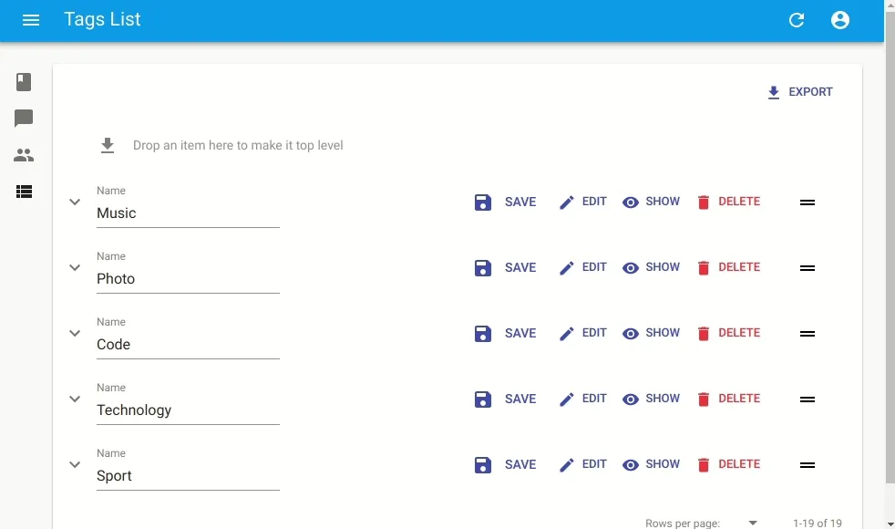
The expand prop expects a react element. When the user chooses to expand the row, the Datagrid clones the element and passes the current record, id, and resource.
Tip: Since the expand element receives the same props as a detail view, you can actually use an <Edit> view as expand element, albeit with a twist:
const UserEdit = (props) => (  <Edit    {...props}    /* disable the app title change when shown */    title=" "  >    <SimpleForm      /* The form must have a name dependent on the record, because by default all forms have the same name */      form={`post_edit_${props.id}`}    >      <TextInput source="name" />    </SimpleForm>  </Edit>);
const UserList = (props) => (  <List {...props}>    <Datagrid expand={<UserEdit />}>      <TextField source="id" />      <TextField source="name" />      <TextField source="role" />    </Datagrid>  </List>);
The expansion panel breaks the traditional table layout to offer inline editing user experiences. We can’t wait to see what you will do with this feature!
Datagrid Row Override
The <Datagrid> component renders a list of records using material-ui’s <Table> element - and other components like <TableRow>, <TableHeader>, <TableCell>, etc. In fact, these components have so many options that it’s not possible to expose them all in <Datagrid>. To let developers customize absolutely everything about the <Datagrid>, we’ve added the ability to override the subcomponents used for rendering.
By default, <Datagrid> renders its body using <DatagridBody>, an internal react-admin component. You can pass a custom component as the body prop to override that default. And by the way, <DatagridBody> has a row property set to <DatagridRow> by default for the same purpose. <DatagridRow> receives the row record, the resource, and a copy of the datagrid children. That means you can create a custom datagrid logic without copying several components from the react-admin source.
For instance, to show the selection checkbox only for records that have a status field not set to Pending, you can override <DatagridRow> and <DatagridBody> as follows:
// in src/ReviewList.jsimport { Datagrid, DatagridBody, List, TextField } from "react-admin";import TableCell from "@material-ui/core/TableCell";import TableRow from "@material-ui/core/TableRow";import Checkbox from "@material-ui/core/Checkbox";
const MyDatagridRow = ({  record,  resource,  id,  onToggleItem,  children,  selected,  basePath,}) => (  <TableRow key={id}>    {/* first column: selection checkbox */}    <TableCell padding="none">      {record.status !== "pending" && (        <Checkbox checked={selected} onClick={() => onToggleItem(id)} />      )}    </TableCell>    {/* data columns based on children */}    {React.Children.map(children, (field) => (      <TableCell key={`${id}-${field.props.source}`}>        {React.cloneElement(field, {          record,          basePath,          resource,        })}      </TableCell>    ))}  </TableRow>);
const MyDatagridBody = (props) => (  <DatagridBody {...props} row={<MyDatagridRow />} />);const MyDatagrid = (props) => <Datagrid {...props} body={<MyDatagridBody />} />;
const ReviewList = (props) => (  <List {...props}>    <MyDatagrid>...</MyDatagrid>  </List>);
export default reviewList;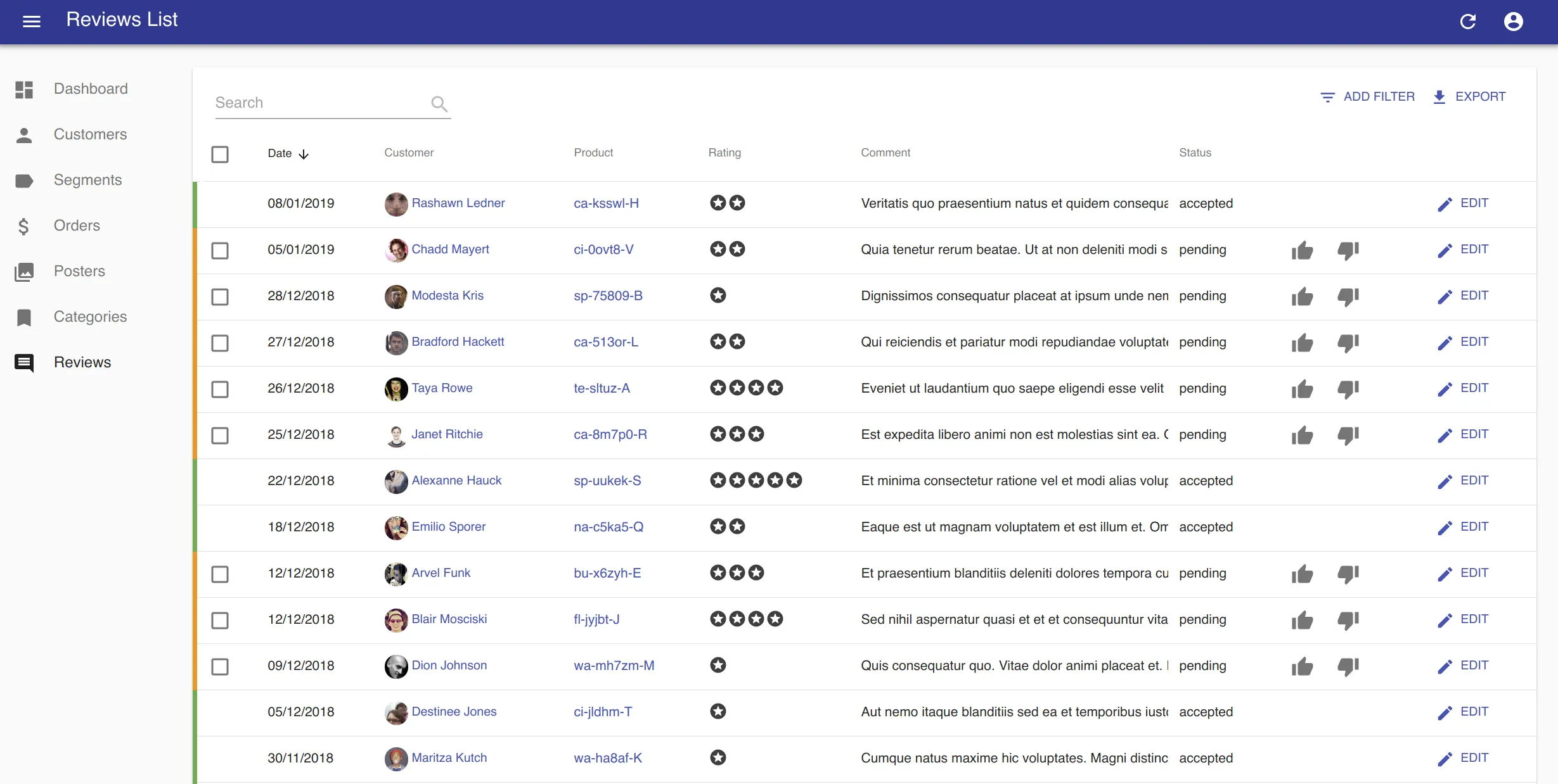
More Powerful Row Click
React-admin 2.4 introduced the Datagrid rowClick, a way to make each row clickable without displaying a button. With this new release, rowClick becomes even more powerful, as it can now be a function, in which case it receives the current record as a parameter. That way, the page displayed after the click can depend on some field in the record.
For instance, the following row click handler redirects to either edit or show after checking if the record is editable:
const postRowClick = (id, basePath, record) =>  record.editable ? "edit" : "show";
const PostList = (props) => (  <List {...props}>    <Datagrid rowClick={postRowClick}>...</Datagrid>  </List>);
The function can even return a Promise, allowing you to check an external API before returning a path:
import fetchUserRights from './fetchUserRights';const postRowClick = (id, basePath, record) => fetchUserRights().then(({ canEdit }) canEdit ? 'edit' : 'show');Hiding the Export Button
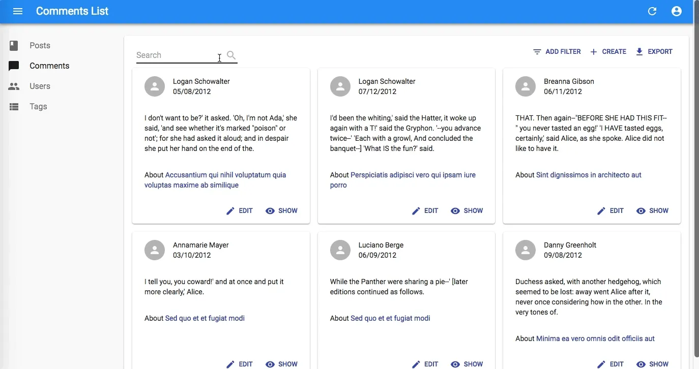
Every List view displays an Export button by default. You can customize the shape of the exported data, and fetch related data, using the exporter prop, as explained in the documentation. But react-admin 2.6 now allows you to disable the export feature altogether, simply by passing false to the exporter prop:
const PostList = (props) => ( <List {...props} exporter={false}> ... </List>);| List with export button | List without export button |
|---|---|
 |  |
If for whatever reason, you don’t want to let users download the data they see as a CSV file, now you can!
Datagrid Skeleton
On slow networks, the previous Datagrid user experience could let users think of a bug when the screen rendered nothing while loading. React-admin 2.6 now shows a skeleton datagrid during the first load instead of nothing.
Note that this only affects the first load. On subsequent renderings of the datagrid, react-admin still displays stale data while fetching up-to-date data (that’s optimistic rendering).
The skeleton tries to minimize screen flickering by displaying checkboxes only when bulk actions are on, by showing as many columns as the datagrid has children, etc.
Incidentally, this also solves a UI problem that I used to think of “the lone record”. When a user opens the app directly in a record detail page and goes back to the list, the list used to display only that record while loading the first page. Now it displays the skeleton instead.
Form Autofocus
HTML inputs support the autoFocus prop, to force the focus on a form element on page load. React-admin lets developers set that props directly on Input components - usually the first of the form:
const PostEdit = (props) => ( <Edit {...props}> <SimpleForm> <TextInput source="title" autoFocus /> <DateInput source="publication_date" /> ... </SimpleForm> </Edit>);React-admin can’t force the autofocus on a particular input if there is none - it would imply too much magic, and wouldn’t work in many cases. Yet, we encourage developers to set autoFocus on the first input of most edition forms. React-admin now follows this guideline in the LoginForm, and in the examples.

Export Button Disable
A good User Interface properly handles at least 4 states: loaded, loading, empty, and error. Guided by this principle, we’re improving the react-admin UI little by little. An example of such improvement is the Export button on empty lists.
When a user filters a list so much that there is no result, or when they simply display an empty list, the react-admin UI used to show an Export button that didn’t make sense. Starting with react-admin 2.6, the export button is now disabled in such cases. Not only does it draw less attention from the user, but it also doesn’t trigger a troublesome bug.
Edit Toolbar Background
Sometimes very small visual changes improve the user experience a lot. That’s what we think of a minor change from 2.5, the background color of the Edit form toolbar:
| Before | After |
|---|---|
 |  |
The Save and Delete buttons don’t float anymore, and the end of the form input zone is clearly underlined. Early feedback from end users tells us they appreciate.
Better Login Page
The login page background is a random image from Unsplash, an online collection of free to use and beautiful pictures. But too much randomness is sometimes distractive. In react-admin 2.5, the random background image only changes once a day.
Incidentally, this image now loads in a non-blocking way, which means that the page will be responsive even before the image finishes loading. This is particularly interesting in e2e tests because a test framework like Cypress.io no longer needs to wait for the background image to start filling the form. In our e2e test suite, it helped reduce the overall test duration by about 10 seconds, which is great!
One last addition: The Login page now uses any custom theme passed to the <Admin> element.

Custom Button Icons
React-admin exposes many button components: SaveButton, CloneButton, DeleteButton, etc. Each of these buttons use a particular material design icon. But sometimes, developers reuse these buttons for something a little bit different. For instance, in a list of messages, saving actually means sending the message. In a list of change, deleting actually means rejecting the change.
To let developers display buttons that stick to the user domain, you can now customize both the label and the icon of all the react-admin buttons.
import RejectIcon from "@material-ui/icons/ThumbsDown";import { DeleteButton } from "react-admin";
const RejectButton = (props) => (  <DeleteButton label="Reject" icon={<RejectIcon />} />);
ReferenceManyField Pagination
The <ReferenceManyfield> component is very useful to represent a list of linked records, e.g. a list of reviews on an item in an e-commerce shop. And the most common use is to combine it with <Datagrid>, so that the related records appear in a table.
With react-admin 2.5, you can now paginate this list. That means that you can add a pagination component (for instance react-admin’s <Pagination>) to display pagination controls. No need to change anything in the data provider.
import { Pagination } from "react-admin";
<ReferenceManyField  pagination={<Pagination />}  reference="reviews"  target="post_id">  ...</ReferenceManyField>;
Miscellaneous Changes
There are more changes in react-admin 2.5 and 2.6 than what can fit in a blog post. Without getting into details, here is a list of minor enhancements:
- Add support for arrays of references in exporter
fetchRelatedRecords(#2461) - Add ability to extend the buttons
onClickhandlers (2640) - Add the ability to disable the
/loginroute and component (2622) - Add
enableReducersandrenderPropoptions to<TestContext>to help with integration testing (2614) - Add ability to disable some options in
<SelectInput>(#2555)
You can read the full changelog for 2.5 and 2.6 in the CHANGELOG.md file, in the project source code.
Conclusion
React-admin 2.6 is a solid release, giving even more control to the developer, and improving the user experience. It is backward compatible with the 2.x branch, so don’t delay the upgrade!
And as always, if you find a regression in this release, please don’t hesitate to open an issue in the react-admin bug tracker on GitHub.

Authors
Marmelab founder and CEO, passionate about web technologies, agile, sustainability, leadership, and open-source. Lead developer of react-admin, founder of GreenFrame.io, and regular speaker at tech conferences.