
React Admin September 2021 Update


Over the past few months, react-admin, the open-source frontend framework for building B2B applications on top of REST/GraphQL APIs, continued to evolve at a fast pace. This article lists the highlights published in the 4 latest minor versions (3.15, 3.16, 3.17, and 3.18).
There is a lot to say, so let’s dive in!
- [UI]: Fixed Sidebar
- [Forms]: Quick choice creation
- [Forms]: Allow item reordering in SimpleFormIterator
- [DataProvider]: Refetch a query
- [DataProvider]: Simpler and more versatile callbacks for mutation hooks
- [List]: Support Field components in SimpleList
- [List]: Easier ListActions customization
- [List]: useList, a new hook to reuse the list pagination/sorting/filtering logic
- [List]: Easier bulk update actions with the BulkUpdateButton component
- [List]: Display column headers even on empty lists
- [Auth]: Auth redirection improvements
- [SideEffects]: Set the location state via useRedirect
Oh, and since the last article, we also added a new CRM Demo!
Fixed Sidebar
End-users of react-admin apps have often complained that the sidebar menu wasn’t fixed. In long pages, when they scrolled down to see the content, they didn’t see the menu anymore and had to scroll back up to the top to see it again. Most of the web applications with large content have a fixed sidebar, so it was about time we fixed ours.
In react-admin 3.18, the sidebar is now fixed on Desktop. Users rejoice!

If you want to override that new default, you can pass your own sidebar to the layout using the <Layout sidebar> prop.
Quick Choice Creation
The most popular feature request for react-admin was the ability to create and select new choices when editing a choice input. Think about choosing the tags for an article, and being able to add a new tag on the fly. It has always been possible in userland, but it required a lot of custom code.
From react-admin 3.15, all choice inputs allow quick choice creation. This includes <SelectInput>, <AutocompleteInput> and their array counterpart <SelectArrayInput> and <AutocompleteArrayInput>.
For instance, here is how to allow users to create new tags for a post right inside an <AutocompleteArrayInput>:
import {  AutocompleteArrayInput,  Create,  SimpleForm,  TextInput,} from "react-admin";
const PostCreate = (props) => {  const tags = [    { name: "Tech", id: "tech" },    { name: "Lifestyle", id: "lifestyle" },  ];  return (    <Create {...props}>      <SimpleForm>        <TextInput source="title" />        <AutocompleteArrayInput          onCreate={() => {            const newTag = prompt("Enter a new tag");            const newCategory = {              id: newTag.toLowerCase(),              name: newTag,            };            tags.push(newCategory);            return newCategory;          }}          source="tag"          choices={tags}        />      </SimpleForm>    </Create>  );};
This also works for references with the <ReferenceInput> and <ReferenceArrayInput> components! Besides, should you need a more polished UI than a prompt, such as a Material UI <Dialog> asking for multiple fields, we got you covered:
import {  AutocompleteArrayInput,  Create,  ReferenceArrayInput,  SimpleForm,  TextInput,  useCreateSuggestion,} from "react-admin";import {  Box,  BoxProps,  Button,  Dialog,  DialogActions,  DialogContent,  TextField,} from "@material-ui/core";const PostCreate = (props) => {  return (    <Create {...props}>      <SimpleForm>        <TextInput source="title" />        <ReferenceArrayInput source="tags" reference="tags">          <AutocompleteArrayInput create={<CreateTag />} />        </ReferenceArrayInput>      </SimpleForm>    </Create>  );};
const CreateTag = () => {  const { filter, onCancel, onCreate } = useCreateSuggestion();  const [value, setValue] = React.useState(filter || "");  const [create] = useCreate("tags");  const handleSubmit = (event) => {    event.preventDefault();    create(      {        payload: {          data: {            title: value,          },        },      },      {        onSuccess: ({ data }) => {          setValue("");          onCreate(data);        },      },    );  };  return (    <Dialog open onClose={onCancel}>      <form onSubmit={handleSubmit}>        <DialogContent>          <TextField            label="New tag"            value={value}            onChange={(event) => setValue(event.target.value)}            autoFocus          />        </DialogContent>        <DialogActions>          <Button type="submit">Save</Button>          <Button onClick={onCancel}>Cancel</Button>        </DialogActions>      </form>    </Dialog>  );};
Allow Item Reordering In <SimpleFormIterator>
When using an <ArrayInput>, developers can pass a form iterator component to display an “array of forms”, one for each value in the array. The default form iterator is SimpleFormIterator:
import {  ArrayInput,  SimpleFormIterator,  DateInput,  TextInput,} from "react-admin";
<ArrayInput source="authors">  <SimpleFormIterator>    <DateInput source="user" />    <TextInput source="role" />  </SimpleFormIterator></ArrayInput>;
This allows adding, edit or remove elements from the array. Starting with react-admin 3.18, <SimpleFormIterator> also allows to reorder existing items:
This requires no change on your side, as reordering is now enabled by default. You can opt-out of this feature by setting the <SimpleFormIterator disableReordering> prop.
Refetch A Query
Since react-admin 3.16, each data provider query hook returns a refetch callback. You can call this refetch to force the query to run again. This helps to refresh the page more granularly than when using the useRefresh hook.
Let’s see an example usage.
import { useGetList, useDelete } from 'react-admin';
const LatestNews = () => {    const { data, ids, loading, error, refetch } = useGetList(        'posts',        { page: 1, perPage: 10 },        { field: 'published_at', order: 'DESC' }    );    const [delete] = useDelete();
    const handleDelete = (record) => () => {        delete('posts', record.id, record, {            // the list now has 9 records. Refrsh it to show 10 records            refetch();        });    }
    if (loading) { return <Loading />; }    if (error) { return <p>ERROR</p>; }    return (        <ul>            {ids.map(id =>                <li key={id}>                    {data[id].title}                    <button onClick={handleDelete(data[id])}>Delete</button>                </li>            )}        </ul>    );};
This list of news displays the 10 latest news, each with its own ‘delete’ inline button. When the user clicks on the Delete button, this calls dataProvider.delete(), and the list now only has 9 lines. To fix that, in the success callback of the delete mutation, we call the refetch callback of the useGetList query. The result is that this query will return the 10 latest news, and the list will show 10 results again.
With refetch, dependent queries, optimistic rendering, query aggregation, and deduplication, the dataProvider hooks offer a developer experience on par with the best in class data fetching libraries like react-query and swr - plus the benefit of knowing the data model.
Simpler And More Versatile Callbacks For Mutation Hooks
Specialized useMutation queries, like useCreate and useUpdate, used to return a callback. The signature of the callback and the one of the initial hook were different. E.g:
// build-time queryconst [update] = useUpdate("likes", record.id, diff, record);// call-time queryupdate({ resource: "likes", payload: { id: record.id, data: diff, previousData: record },});But the callbacks are more often used with call-time params, and this was cumbersome.
With version 3.15, we introduced 3 different signatures for the mutation callbacks, making them more versatile:
- with the same syntax as
useMutation:create({ resource, payload: { data } }, options)(the only possible syntax until then) - with the same parameters as the hook:
create(resource, data, options) - with no parameter (if they were already passed to
useCreate()):create()
Here is an example of the new syntax:
// 2. set params when calling the update callback using the same signature as the hookimport { useCreate } from "react-admin";
const LikeButton = ({ record }) => {  const like = { postId: record.id };  const [create, { loading, error }] = useCreate();
  const handleClick = () => {    create("likes", like);  };
  if (error) {    return <p>ERROR</p>;  }  return (    <button disabled={loading} onClick={handleClick}>      Like    </button>  );};
// 3. set params when calling the hook, and call the callback with no argsimport { useCreate } from "react-admin";
const LikeButton = ({ record }) => {  const like = { postId: record.id };  const [create, { loading, error }] = useCreate("likes", like);
  if (error) {    return <p>ERROR</p>;  }  return (    <button disabled={loading} onClick={create}>      Like    </button>  );};
Support Field Components in <SimpleList>
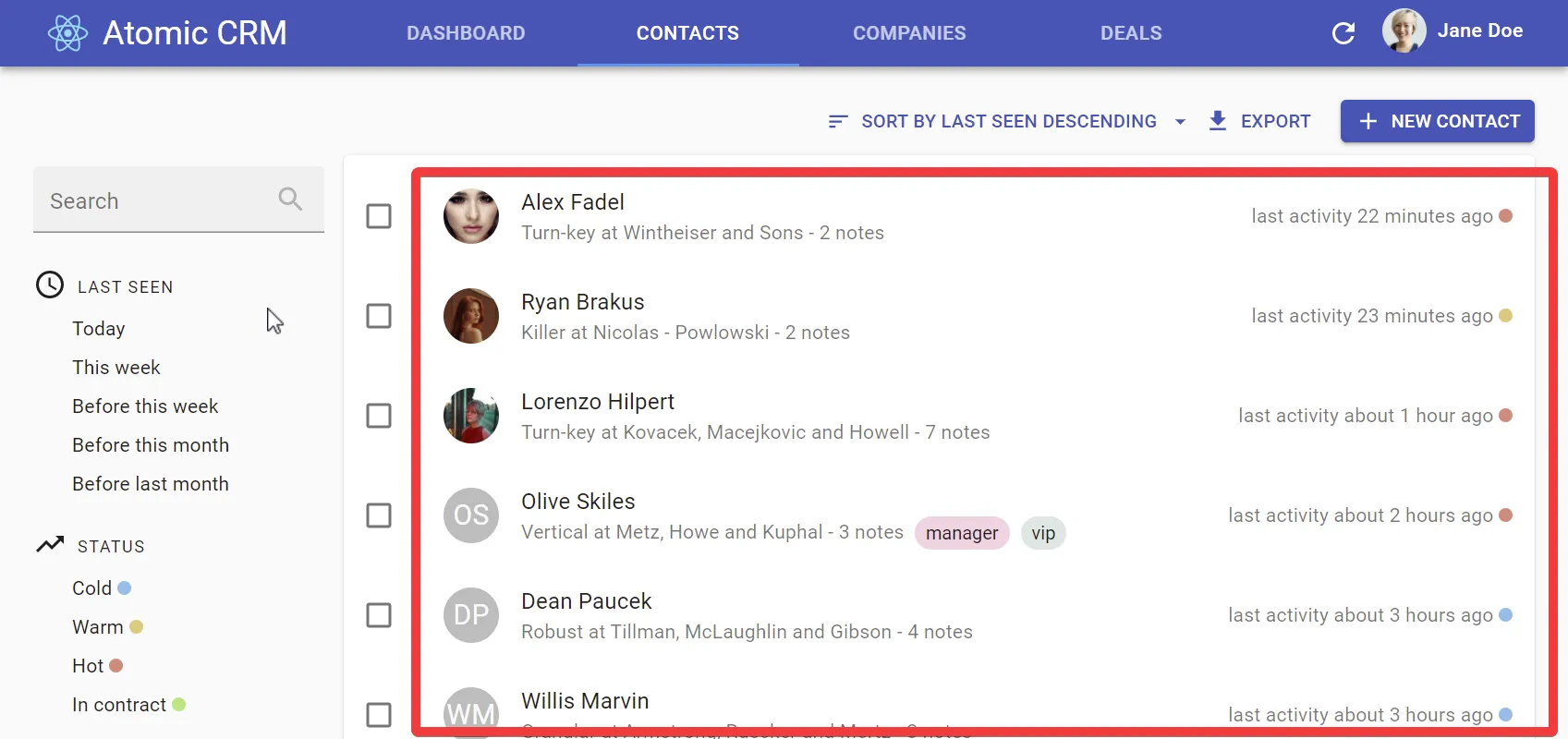
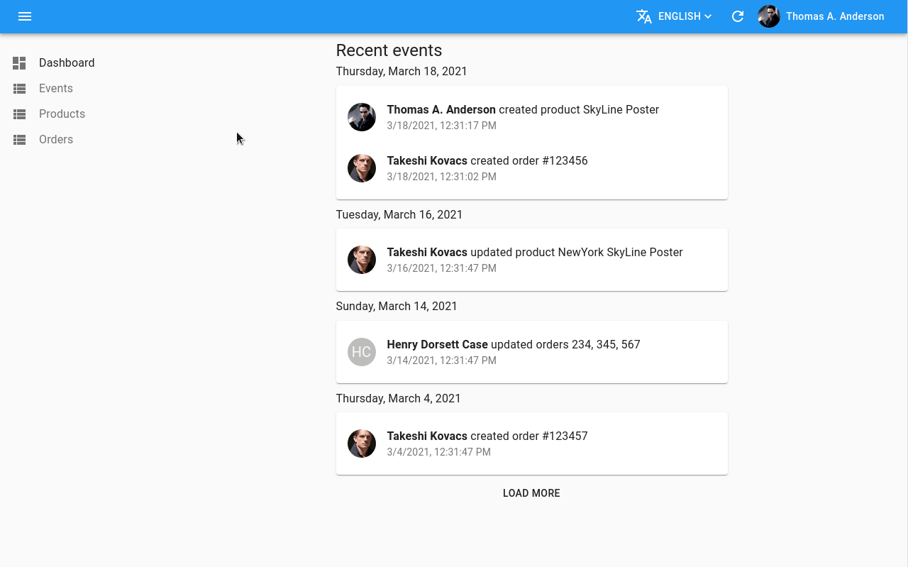
The <SimpleList> component, which displays a list of records as a list with a single column, is very useful both for Mobile devices and on Desktop, for simple lists. See for instance how we’ve used in the CRM demo:
You can currently customize what <SimpleList> renders using template functions, but this limits the possibilities to simple cases. It doesn’t allow e.g. to use <ReferenceFields> to render the company name in the secondaryText:
// in src/posts.jsimport * as React from "react";import { List, SimpleList } from 'react-admin';
export const ContactList = (props) => (    <List {...props}>        <SimpleList            primaryText={record => `${record.first_name} ${record.last_name}`}            secondaryText={record => `${record.role} at ${/* how do you fetch the company name here? */}`}            tertiaryText={record => `last activity ${formatDistance(new Date(record.last_seen), Date.now())} ago`}            linkType={record => record.canEdit ? "edit" : "show"}        />    </List>);
Starting with react-admin 3.18, the <SimpleList> component creates a <RecordContext> for every list item. This means you can use all the Field components inside the xxxText props - including <ReferenceField>:
// in src/posts.jsimport * as React from "react";import { List, SimpleList, ReferenceField, TextField } from "react-admin";
const ContactBio = () => (  <>    <TextField source="role" /> at    <ReferenceField source="company_id" reference="companies">      <TextField source="name" />    </ReferenceField>  </>);
export const ContactList = (props) => (  <List {...props}>    <SimpleList      primaryText={(record) => `${record.first_name} ${record.last_name}`}      secondaryText={<ContactBio />}      tertiaryText={(record) =>        `last activity ${formatDistance(new Date(record.last_seen), Date.now())} ago`      }      linkType={(record) => (record.canEdit ? "edit" : "show")}    />  </List>);
This should make <SimpleList> an even better choice for lists.
Easier List Actions Customization
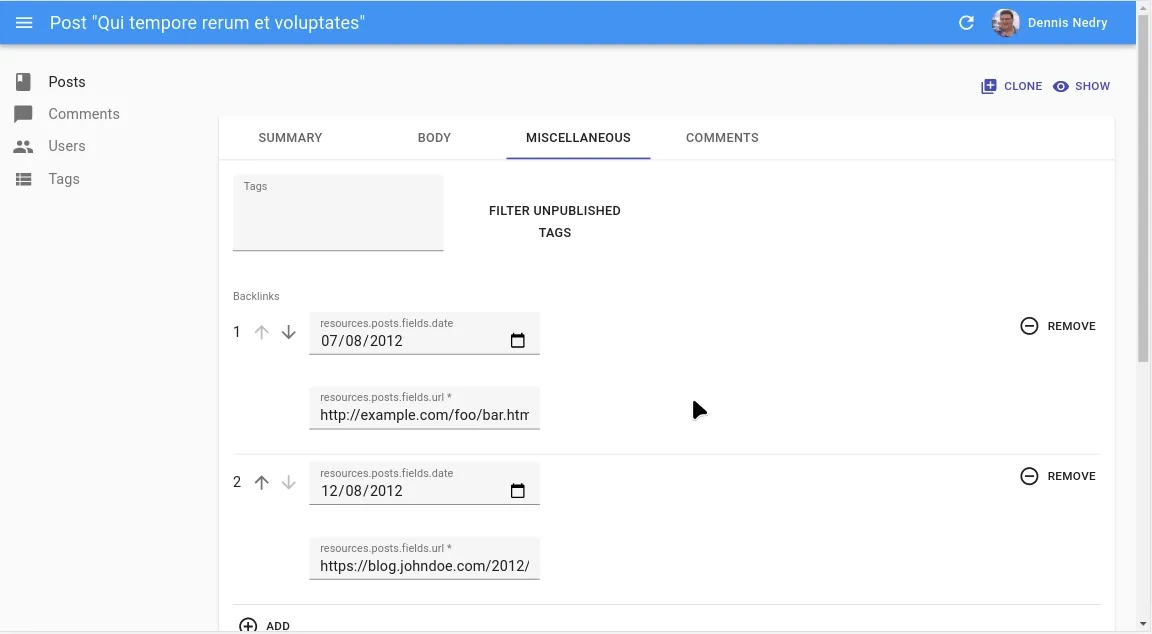
<ListActions> was hard to override, partly because of the filter button/form combo. The <Filter> element renders twice, which isn’t a common practice.
Version 3.17 introduces an easier way to define filters, leveraging React contexts. While we still support the previous way to provide filters, you should now define your filters as an array of components:
const PostFilter = props => (    <Filter {...props}>        <SearchInput source="q" alwaysOn />        <TextInput            source="title"            defaultValue="Qui tempore rerum et voluptates"        />        <QuickFilter            label="resources.posts.fields.commentable"            source="commentable"            defaultValue        />    </Filter>);const postFilters = [    <SearchInput source="q" alwaysOn />,    <TextInput source="title" defaultValue="Qui tempore rerum et voluptates" />,    <QuickFilter        label="resources.posts.fields.commentable"        source="commentable"        defaultValue    />,];
const PostList = props => {    <List        {...props}        bulkActionButtons={<PostListBulkActions />}       filters={<PostFilter />}       filters={postFilters}        sort={{ field: 'published_at', order: 'DESC' }}        exporter={exporter}    >    </List>}
When filters is an array, the <List> component puts the filters in a <FilterContext>. It makes customizing the <ListActions> way easier:
import {  TopToolbar,  FilterButton,  CreateButton,  ExportButton,} from "react-admin";
const ListActions = () => (  <TopToolbar>    <FilterButton />    <CreateButton />    <ExportButton />  </TopToolbar>);
useList: Reuse The List Pagination/Sorting/Filtering Logic
Version 3.17 introduces a new hook that applies list filtering, sorting, and pagination to any provided data. This can be useful for example when an API route doesn’t handle filtering server-side, and you want to do it client-side.
Thanks to useList, you can use react-admin component designed to render inside a <ListContext> (such as <Datagrid> or <SimpleList>) in your own components.
// data is an array of recordsconst MyComponent = ({ data }) => { // Call useList to get a ListContext-compatible value based on ids and data // It will contain callbacks like setFilters, setSort, setPage, etc. const listContext = useList({ ids: data.map(item => item.identifier), data: data, basePath: '/resource'; resource: 'resource'; }); return ( <ListContextProvider value={listContext}> <Datagrid> <TextField source="id" /> <TextField source="name" /> </Datagrid> </ListContextProvider> );};Easier Bulk Update Actions With The BulkUpdateButton Component
Although react-admin already had support for bulk actions, it only provided one pre-built bulk action button: <BulkDeleteButton>. Implementing custom updates used to require a bit of boilerplate code. With version 3.16, we now ship the <BulkUpdateButton> element, which makes it way easier!
Here is an example of <BulkUpdateButton> usage, which sets the views property of all posts to 0 optimistically:
// in ./ResetViewsButton.jsimport * as React from "react";import { VisibilityOff } from "@material-ui/icons";import { BulkUpdateButton } from "react-admin";
const views = { views: 0 };
const ResetViewsButton = (props) => (  <BulkUpdateButton    {...props}    label="Reset Views"    data={views}    icon={VisibilityOff}  />);
export default ResetViewsButton;
Display Column Headers Even On Empty Lists
By default, react-admin displays a special component when a list is empty, inviting users to create the first record. You can already provide a custom <List empty> prop to override that default. However, the <Datagrid> component can be used outside a <List>, and it used to render nothing when it received an empty array of records.
From version 3.15, <Datagrid> now accepts an empty prop allowing you to pass a custom component for this case.
const MyEmpty = () => <p>My empty component</p>;
const MyDatagrid = (props) => <Datagrid empty={<MyEmpty />} {...props} />;
Auth Redirection Improvements
By default, react-admin logs users out when the authProvider.catchError method throws an error. But if this is because the user doesn’t have the right permissions, you’d rather keep the user signed in, and show them an unauthorized page instead.
From version 3.17, you can now specify to which page users will be redirected and whether they should be logged out:
// in src/authProvider.jsexport default { login: ({ username, password }) => { /* ... */ }, checkError: (error) => { const status = error.status; if (status === 401 || status === 403) { return Promise.reject({ redirectTo: "/unauthorized", logoutUser: false, }); } // other error code (404, 500, etc): no need to log out return Promise.resolve(); }, // ...};Also, you may want to redirect users to an external page when they’re logged out - for instance when returning an exception in authProvider.checkAuth(). This wasn’t supported before react-admin 3.18, but it’s now possible:
const authProvider = { checkAuth: (params) => { // let's say user is not logged in return Promise.reject({ redirectTo: "https://accounts.domain.com", }); },};This change facilitates the integration of external authentication providers, including OAuth and OpenId Connect (OIDC).
Set The Location State Via useRedirect
From version 3.16, you can now specify the location state when redirecting users with the useRedirect hook. This is useful in side effects functions when you want to link to a prefilled create page for instance:
import { Create, useRedirect } from "react-admin";
const ProductCreate = (props) => {  const redirect = useRedirect();
  const handleSuccess = (data) => {    // Redirects users to the product create page with the same product category    // already filled    redirect("/product/create", {      record: { category_id: data.category_id },    });  };
  return (    <Create onSuccess={handleSuccess} {...props}>      // ...    </Create>  );};
Miscellaneous Changes
There are many, many more minor changes in 3.15, 3.16, 3.17, and 3.18, including;
<AppBar>: Addcontainerprop to override the root App Bar element<BooleanField>: Add support for truthy/falsy values<Datagrid>: Add ability to override the header row<Error>: Add links to documentation to help troubleshoot<ReferenceXXX>: Throw an error when using a reference field without the associated<Resource><RouteWithoutLayout>: New component enabling TS-compatible custom routes withnoLayout<SaveButton>: Disable submission while Inputs are being validated asynchronously<SimpleList>: Add support for image path value in theleftAvatarprop<TestContext>: AddcustomReducersprops to allow to customize reducers<TranslatableInputs>: Improve the UI to allow more languages to be selected<XXXInput>: Add ability to hide labels withlabel={false}useGetList: Add ability to call the hook without pagination, sort, or filter params- Improvements to TypeScript types and generic support on the mutation hooks
Check out the react-admin changelog for more details.
A Word About React-Admin Enterprise Edition
The open-source version of react-admin is not the only one to benefit from great new features. Over the past months, Marmelab has been hard at work polishing 2 new modules for the Enterprise Version:
- ra-audit-log lets you display event lists and audit logs, keep track of user actions, and get an overview of the activity of your admin.
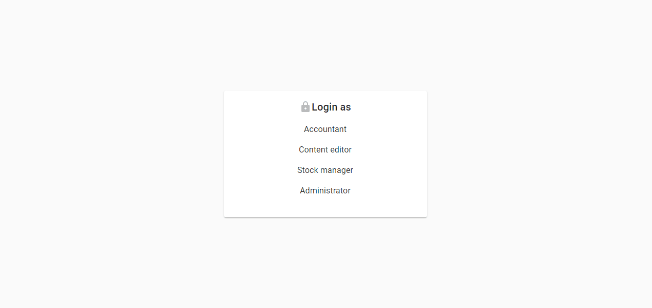
- ra-rbac lets you manage roles and fine-grained permissions, and adds replacement for many react-admin components that use these permissions.
In addition, we’ve added more configuration capabilities for end-users, lettings them customize the look and feel of their admin. This we’ll write more about this “no-code” layer on top of the “low-code” layer, which is truly unique. Stay tuned!

Authors
Full-stack web developer at marmelab, Gildas has a strong appetite for emerging technologies. If you want an informed opinion on a new library, ask him, he's probably used it on a real project already.
Marmelab founder and CEO, passionate about web technologies, agile, sustainability, leadership, and open-source. Lead developer of react-admin, founder of GreenFrame.io, and regular speaker at tech conferences.