Client-Side React Rocks

React Server Components (RSC) are an awesome addition to the React ecosystem and address the requirements of SEO-intensive web apps beautifully. But this isn’t an article about RSCs, because many web apps still use the Single-Page Application (SPA) architecture and are fine with it. These apps can take advantage of the React client API, which is more powerful than that of Server Components (as it allows for effects, context, and other features). The consequence, in my opinion, is that client-side React provides a superior Developer Experience (DX) that no server-side framework, even React itself, can match.
In this post, I’ll illustrate this better DX through the example of a data table component. I’ll explain why it can’t be implemented in RSC and share some tricks to implement it with client-side React. It’s going to be pretty technical, so buckle up and let’s dive in!
The Problem: A Better Datagrid API
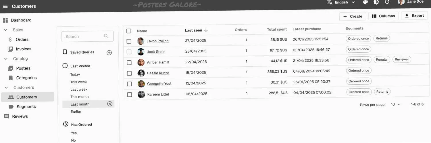
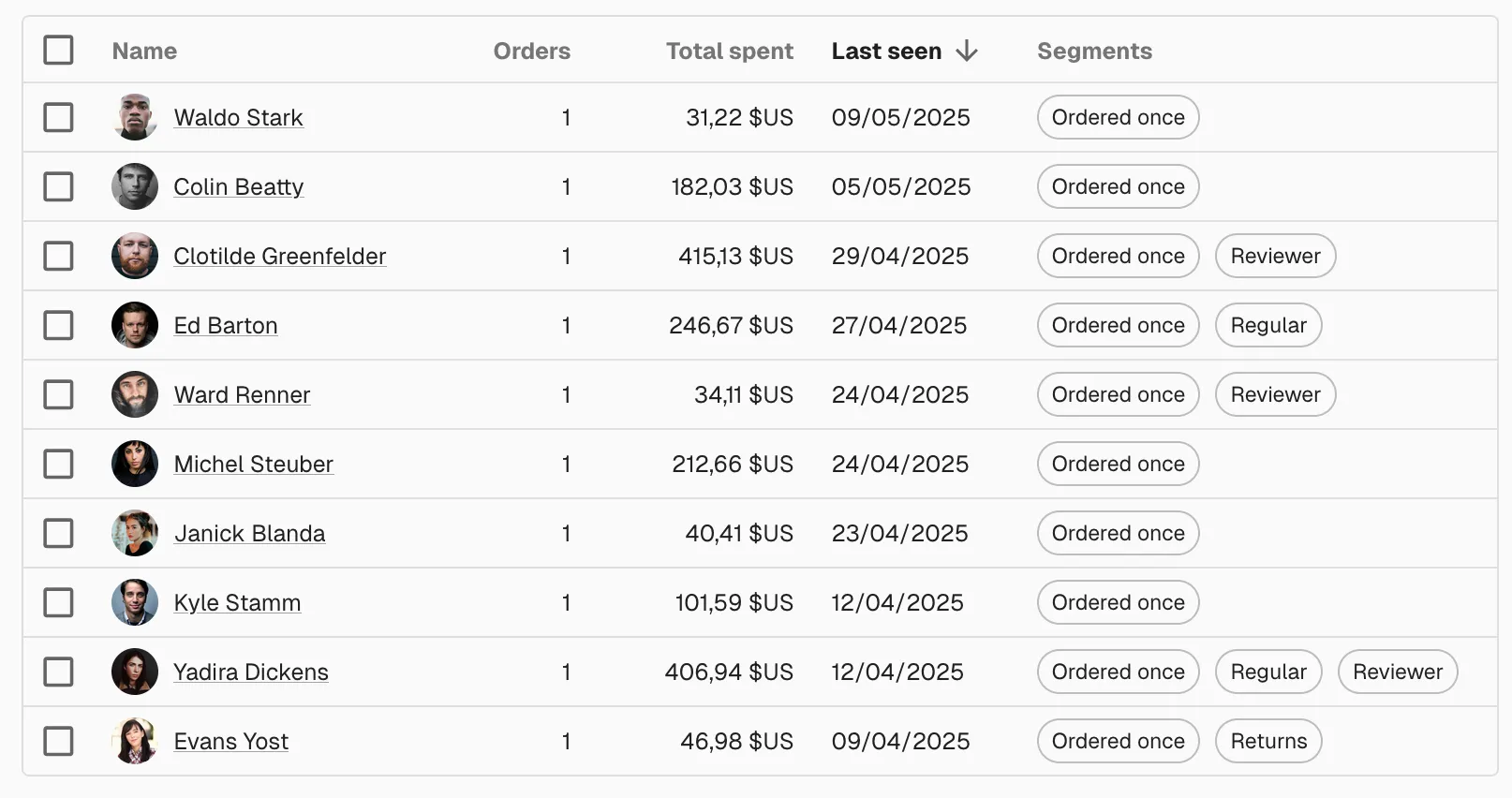
All B2B apps have to display tabular data. They usually use some sort of <Datagrid> component to avoid repeating <tr> and <td> elements. React-admin has a <Datagrid> element for that.
<Datagrid> elements usually pass the data and the column definitions as props, as follows:
const CustomersTable = ({ data }) => ( <Datagrid data={data} columnDefs={[ { field: "lastName", // used only for sorting when render is defined title: "Name", render: customer => `${customer.firstName} ${customer.lastName}`, }, { field: "nbOrders", title: "Orders", align: "right", type: "number", }, { field: "totalSpent", title: "Total spent", align: "right", type: "number", options: { style: 'currency', currency: 'USD', minimumFractionDigits: 2 }, }, { field: "updatedAt", title: "Last seen", type: "date", }, { title: "Segments", render: customer => <SegmentsField record={customer} />, }, ]} />);Many open-source Datagrid components use a similar API (ag-grid, MUI X Datagrid, etc.). Yet this API has several drawbacks:
-
Composability: Although you can use a React component to render a column, it’s not possible to compose it with another component. For instance, to restrict columns to certain users, you might want to use access control on the “Total spent” column. React-admin has a
<CanAccess>component for that, which only renders its children if the current user has access to the XXX resource.{field: "totalSpent",title: "Total spent",align: "right",type: "number",render: customer => (<CanAccess resource="customers.totalSpent">{customer.totalSpent}</CanAccess>),options: { style: 'currency', currency: 'USD', minimumFractionDigits: 2 },},But in this case, it doesn’t work, because even if the column content doesn’t render for users without the right permissions, they will still see the column header.
-
Reusability: Two of the columns in the previous table are number columns. It makes sense to right-align number columns, but it feels cumbersome to have to repeat the
align: "right"field for each numeric column. In the React world, we would use a component for that, encapsulating the behavior of a numeric column to avoid repeating thealignprop:<NumberField field="nbOrders" title="Orders" /><NumberField field="totalSpent" title="Total spent" options={{ style: 'currency', currency: 'USD', minimumFractionDigits: 2 }}/>Components are a natural language for configuring the UI because they can encapsulate and hide repetitive details.
-
Performance: The
columnDefsprop is a JSON object, which means it will be recreated on each render, so theDatagridwill rerender all its columns on each render. For certain user actions, like row selection, this can lead to performance problems. This forces you to extract thecolumnDefsto a constant outside of the component:const columnDefs = [{field: "lastName",title: "Name",render: customer => `${customer.firstName} ${customer.lastName}`,},{field: "nbOrders",title: "Orders",align: "right",type: "number",},{field: "totalSpent",title: "Total spent",align: "right",type: "number",options: { style: 'currency', currency: 'USD', minimumFractionDigits: 2 },},{field: "updatedAt",title: "Last seen",type: "date",},{title: "Segments",render: customer => <SegmentsField record={customer} />,},];const CustomersTable = ({ data }) => (<Datagrid data={data} columnDefs={columnDefs} />);But then you lose the ability to type-check the
renderfunctions based on a generic type passed to the<Datagrid>component, so you have to trade performance for type safety. -
Legibility: Render props and JSON configuration like the
columnDefsvalue above are more verbose and harder to read than JSX, in my opinion. Besides, using components to define columns would allow the use of thechildrenprop of the<Datagrid>component, reducing the need to extract or memoize thecolumnDefsto reduce rerenderings and improve performance.const CustomersTable = ({ data }) => (<Datagrid data={data}><FunctionField source="lastName" title="Name" render={customer => `${customer.firstName} ${customer.lastName}`} /><NumberField source="nbOrders" title="Orders" /><NumberField source="totalSpent" title="Total spent" options={{ style: 'currency', currency: 'USD', minimumFractionDigits: 2 }} /><DateField source="updatedAt" title="Last seen" /><SegmentsField source="segments" title="Segments" /></Datagrid>);
However, this last solution (which is the current <Datagrid> API in react-admin) also has its shortcomings:
-
Discoverability: Developers cannot guess the components to use as children for column definitions (
FunctionField,NumberField, etc.). IDEs can’t autosuggest them either. -
Type Safety: Developers want autocompletion and linter warnings when they mistype a field name. This is not possible with the Field approach unless you pass a generic type to all fields:
const CustomersTable = ({ data }) => (<Datagrid data={data}><FunctionField<Customer> source="lastName" title="Name" render={customer => `${customer.firstName} ${customer.lastName}`} /><NumberField<Customer> source="nbOrders" title="Orders" /><NumberField<Customer> source="totalSpent" title="Total spent" options={{ style: 'currency', currency: 'USD', minimumFractionDigits: 2 }} /><DateField<Customer> source="updatedAt" title="Last seen" /><SegmentsField<Customer> source="segments" title="Segments" /></Datagrid>);
This is cumbersome and not very readable.
So it seems that, even though using a JSON object for configuring columns has many shortcomings, it is still the least problematic API for a Datagrid. Or is it?
The Solution: Columns As Components
A better API for a datagrid would be as follows:
const Column = DataTable.Col<Customer>;const NumberColumn = DataTable.NumberCol<Customer>;
const CustomersTable = ({ data }) => (  <DataTable data={data}>    <Column source="lastName" title="Name" field={CustomerName} />    <NumberColumn source="nbOrders" title="Orders" />    <CanAccess resource="customers.totalSpent">      <NumberColumn        source="totalSpent"        options={{ style: 'currency', currency: 'USD', minimumFractionDigits: 2 }}      />    </CanAccess>    <Column source="updatedAt" title="Last seen" field={DateField} />    <Column source="segments" field={SegmentsField} />  </DataTable>);
A few important things to notice in this syntax:
- The
Columncomponent is typed with theCustomertype, so thesourceprop is type-checked. - There are only two column types: text and number. For other column types, the component to render the column is passed as a
fieldprop (as in thelastNameandupdatedAtcolumns). This allows any component to be used to render the column, including custom components, and is less verbose than a render prop. - Columns are composable: you can wrap them with other components, like
<CanAccess>.
This <DataTable> component is a superior alternative to both the “column definitions as JSON” syntax and the current react-admin <Datagrid> component. It is more composable, reusable, performant, and readable.
Good news: <DataTable> is available in react-admin v5.8! Check out the demos, usage, and options in the <DataTable> documentation.
The reason this article mentions client-side React is that the <DataTable> component, with its superior DX, requires client-side React due to two implementation challenges. In other words, you need to use React client-side to get the best developer experience and performance.
Reading Props From Children
The first challenge is to display the column title (or its humanized source when the title isn’t defined) in the datagrid header. This is the DataTable component’s responsibility, but how can it render a header based on props defined in its children?
Our initial idea was to inspect the children props, as in this pseudo-code:
const DataTableHeader = ({ children }) => ( <thead> <tr> {React.Children.map(children, column => ( <th>{column.props.title ?? humanize(column.props.source)}</th> ))} </tr> </thead>);This somehow works, including with React Server Components. However, this fails for the totalSpent column.
const CustomersTable = ({ data }) => ( <DataTable data={data}> <Column source="lastName" title="Name" render={customer => `${customer.firstName} ${customer.lastName}`} /> <NumberColumn source="nbOrders" title="Orders" /> <CanAccess resource="customers.totalSpent"> <NumberColumn source="totalSpent" options={{ style: 'currency', currency: 'USD', minimumFractionDigits: 2 }} /> </CanAccess> <Column source="updatedAt" title="Last seen" component={DateField} /> <Column source="segments" component={SegmentsField} /> </DataTable>);Because it’s using access control, the column returned by React.Children.map is the <CanAccess> element, so column.props.title and column.props.source are empty. Inspecting children breaks composability, which is why React discourages the usage of React.Children.
Our second idea was to use a React Context to let each column register its title. The <DataTable> would render its children twice: once in the header and once in the body:
const DataTable = ({ children }) => ( <DataTableHeaderContextProvider> {children} <DataTableHeader /> </DataTableHeaderContextProvider> <DataTableBody> {children} </DataTableBody>);The DataTableHeaderContext would contain the list of column titles and let its children register new ones:
const DataTableHeaderContext = React.createContext(undefined);
const DataTableHeaderContextProvider = ({ children }) => {  const columnNames = [];  const context = {    columnNames,    registerColumnTitle: (title) => {      columnNames.push(title);      return () => {        columnNames.splice(columnNames.indexOf(title), 1);      }    },  };  return (    <DataTableHeaderContext.Provider value={context}>      {children}    </DataTableHeaderContext.Provider>  );};
For this trick to work, the DataTableColumn must behave differently when used inside or outside of a DataTableHeaderContext:
const DataTableColumn = ({ title, source, ...props }) => { const dataTableHeaderContext = React.useContext(DataTableHeaderContext); React.useEffect(() => { if (dataTableHeaderContext) { // the column is rendered in the header, register its title return dataTableHeaderContext.registerColumnTitle(title ?? humanize(source)); } }, [title, source]); if (dataTableHeaderContext) { // render nothing; return null; } else { // render the column content // ... }};And so the DataTableHeader doesn’t need to rely on inspecting children anymore; it can read the column titles from the DataTableHeaderContext:
const DataTableHeader = ({ children }) => { const { columnNames } = React.useContext(DataTableHeaderContext) return ( <thead> <tr> {columnNames.map(title => ( <th>{title}</th> ))} </tr> </thead> );};This solution can only work in client-side React because Server Components don’t have access to useContext.
However, this solution doesn’t work in all cases. Not because of missing null checks, but because when rendering columns conditionally, the order of columns isn’t preserved. For instance, in react-admin, <CanAccess> renders its content after calling the authProvider, so the totalSpent column renders after the others.
<CanAccess resource="customers.totalSpent"> <NumberColumn source="totalSpent" options={{ style: 'currency', currency: 'USD', minimumFractionDigits: 2 }} /></CanAccess>This can lead to unexpected header orders in the DataTable, which can confuse users and affect the overall usability of the component.
As a consequence, the order of columns in the header will be wrong:
lastName | nbOrders | updatedAt | segments | totalSpent// instead oflastName | nbOrders | totalSpent | updatedAt | segmentsTo solve this problem, we need one last trick: moving the responsibility for rendering the title in the column headers back to <DataTableColumn>. This component will decide whether to render a title or content based on a context:
const DataTableRenderContext = React.createContext(undefined);
const DataTableColumn = ({ title, source, ...props }) => {  const renderContext = React.useContext(DataTableRenderContext);  if (renderContext === 'header') {    // render the column title    return (      <th>{title ?? humanize(source)}</th>    );  } else if (renderContext === 'body') {    // render the column content    // ...  } else {      throw new Error('DataTableColumn must be used inside a DataTableRenderContext');  }};
For this to work, we need to modify the way <DataTable> renders its children twice in different contexts:
const DataTable = ({ data, children }) => ( <table> <DataTableRenderContext.Provider value="header"> <thead> <tr> {children} </tr> </thead> </DataTableRenderContext.Provider> <DataTableRenderContext.Provider value="body"> <tbody> {data.map(record => ( <RecordContextProvider value={record} key={record.id}> <tr > {children} </tr> </RecordContextProvider> ))} </tbody> </DataTableRenderContext.Provider> </table>);This works great, even with components rendering conditionally. This third trick allows to define columns as JSX components, preserves composability, and has a great DX.
As explained earlier, this implementation uses useContext and is not compatible with server components.
Rendering Outside of the React Tree
The second challenge concerns the ability to show or hide columns. React-admin provides a <ColumnsButton> for that.
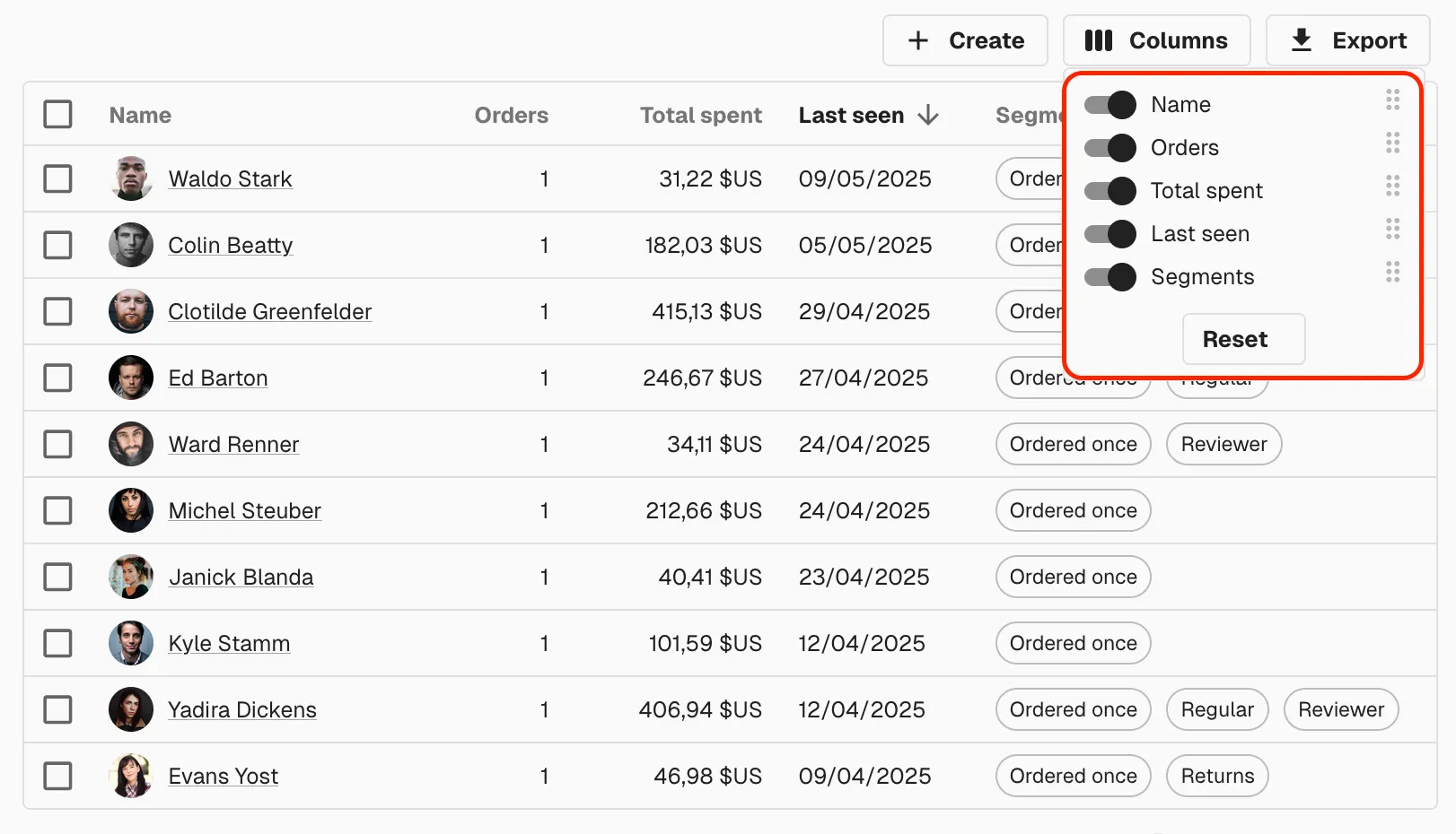
The problem is that this button renders in a different branch of the React tree than the <DataTable>, and it has no knowledge of the columns displayed there:
const CustomerListActions = () => ( <TopToolbar> <CreateButton /> <ColumnsButton /> <ExportButton /> </TopToolbar>)const CustomersList = () => ( <List actions={<CustomerListActions />}> <DataTable> {/* Columns are defined here */} </DataTable> </List>);How can the <ColumnsButton>, which is not a child of <DataTable>, know which columns to show in its dropdown?
The solution is to use a React Portal. Once again, this is only possible in client-side React. React Portals rely on the presence of a browser DOM to function. The ReactDOM.createPortal() method, which is the core of Portals, requires a valid DOM node as its second argument, specifying where the portal’s children should be rendered in the live document tree. This client-side DOM manipulation is not possible in the server-only execution context of RSCs.
We’ll render the <DataTable children> a third time, in a portal to be used by the <ColumnButton>:
const DataTable = ({ data, children }) => ( <table> <DataTableRenderContext.Provider value="header"> <thead> <tr> {children} </tr> </thead> </DataTableRenderContext.Provider> <DataTableRenderContext.Provider value="body"> <tbody> {data.map(record => ( <RecordContextProvider value={record} key={record.id}> <tr > {children} </tr> </RecordContextProvider> ))} </tbody> </DataTableRenderContext.Provider> <DataTableRenderContext.Provider value="columnsSelector"> <ColumnsSelector>{children}</ColumnsSelector> </DataTableRenderContext.Provider> </table>);The <ColumnsSelector> will use React.createPortal to render the column elements in the columns dropdown.
const ColumnsSelector = ({ children }: ColumnsSelectorProps) => {    const elementId = `${storeKey}-columnsSelector`;
    const [container, setContainer] = React.useState<HTMLElement | null>(() =>        typeof document !== 'undefined'            ? document.getElementById(elementId)            : null    );
    React.useEffect(() => {      if (        container &&            typeof document !== 'undefined' &&            document.body.contains(container)        )            return;        // on first mount, we don't have the container yet, so we wait for it        const interval = setInterval(() => {            const target = document.getElementById(elementId);            if (target) setContainer(target);        }, 100);        // stop looking after 500ms (for pages that don't contain the `<ColumnsButton>`)        const timeout = setTimeout(() => clearInterval(interval), 500);        return () => {            clearInterval(interval);            clearTimeout(timeout);        };    }, [elementId, container]);
    if (!container) return null;
    return createPortal(        <>            {children}        </>,        container    );};
And for this to work, we need to modify the <DataTableColumn> component to let it render menu items when rendered in a columnsSelector render context:
const DataTableRenderContext = React.createContext(undefined);
const DataTableColumn = ({ title, source, ...props }) => {  const renderContext = React.useContext(DataTableRenderContext);  if (renderContext === 'header') {    // render the column title    return (      <th>{title ?? humanize(source)}</th>    );  } elseif (renderContext === 'body') {    // render the column content    // ...  } elseif (renderContext === 'columnsSelector') {    // render the menu item for the columns selector    return <MenuItem>{title ?? humanize(source)}</MenuItem>;  } else {      throw new Error('DataTableColumn must be used inside a DataTableRenderContext');  }};
We used a few more tricks to let the <SelectColumns> button communicate the selected columns back to the <DataTable> (using localStorage and an added React context for the column ranks), but you get the gist: this can only work with client-side React.
Conclusion
The new <DataTable> component in react-admin uses the tricks described here, and many more. Early developer feedback shows that they appreciate it much more than using a column definition object or Field components as children. If you haven’t tested it yet, we encourage you to use it in all your new list pages.
React Server Components solve some requirements (faster time to content and reduced bundle size) that single-page apps can’t properly address. Yet they come at a cost: a more constrained developer experience.
When designing reusable React components, and especially when building a framework like react-admin, this quickly becomes a blocker. This is why, in my opinion, server-side React frameworks feel harder to use, and developers quickly resort to "use client".
Let’s hope the React core team addresses these limitations and lets us use useContext, useEffect, and createPortal on the server-side, too!

Authors
Marmelab founder and CEO, passionate about web technologies, agile, sustainability, leadership, and open-source. Lead developer of react-admin, founder of GreenFrame.io, and regular speaker at tech conferences.