<DataTable>
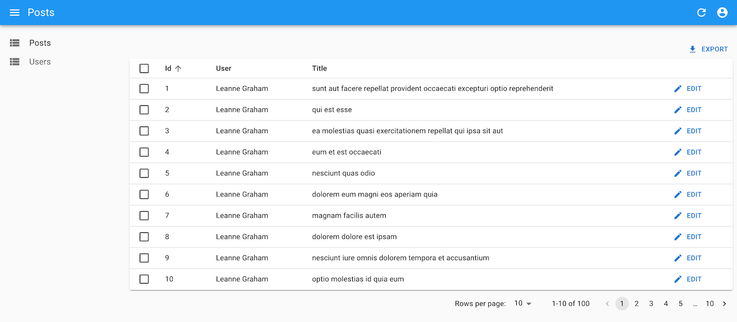
The <DataTable> component renders a list of records as a table. It supports sorting, row selection for bulk actions, a collapsible panel, hiding and reordering columns, dynamic row and cell styles, and more.
Usage
Use <DataTable> inside a ListContext (e.g., as a descendent of <List> or <ReferenceManyField>). Define the table columns with its children using <DataTable.Col> components:
import { List, DataTable, ReferenceField, EditButton } from 'react-admin';

export const PostList = () => (
    <List>
        <DataTable>
            <DataTable.Col source="id" />
            <DataTable.Col label="User">
                <ReferenceField source="user_id" reference="users" />
            </DataTable.Col>
            <DataTable.Col source="title" />
            <DataTable.Col>
                <EditButton />
            </DataTable.Col>
        </DataTable>
    </List>
);
Each <DataTable.Col> defines one column of the table: its source (used for sorting), its header label (inferred from the source when missing), its style, etc.
<DataTable.Col> also defines how to render the cells of the column. When used without a child, it outputs the record source using lodash.get. When used with a child, it renders this child in a RecordContext. This means you can use any Field component as child.
<DataTable> is an iterator component: it gets an array of records from the ListContext, and iterates to display each record in a row. Other examples of iterator components are:
<SimpleList>renders each record as a single line in a vertical list<SingleFieldList>renders a single field for each record<DatagridAG> is a more advanced spreadsheet component with support for aggregation, pivoting, row grouping, infinite scroll, etc.
Tip: If you want to use <DataTable> as a way to let users select one or more records in a list, check out the <DataTableInput> component.
Props
| Prop | Required | Type | Default | Description |
|---|---|---|---|---|
children |
Required | Element | n/a | The list of columns to render. |
body |
Optional | Element | <DataTable Body> |
The component rendering the table body. |
bulkActionButtons |
Optional | Element | <BulkDelete Button> |
The buttons to display when records are selected. |
bulkActionToolbar |
Optional | Element | <BulkDelete Button> |
The component rendering the bulk action toolbar. |
empty |
Optional | Element | <Empty> |
The component to render when the list is empty. |
expand |
Optional | Element | The component rendering the expand panel for each row. | |
expandSingle |
Optional | Boolean | false |
Whether to allow only one expanded row at a time. |
head |
Optional | Element | <DataTable Header> |
The component rendering the table header. |
hiddenColumns |
Optional | Array | [] |
The list of columns to hide by default. |
foot |
Optional | Element | The component rendering the table footer. | |
hover |
Optional | Boolean | true |
Whether to highlight the row under the mouse. |
isRowExpandable |
Optional | Function | () => true |
A function that returns whether a row is expandable. |
isRowSelectable |
Optional | Function | () => true |
A function that returns whether a row is selectable. |
rowClick |
Optional | mixed | The action to trigger when the user clicks on a row. | |
rowSx |
Optional | Function | A function that returns the sx prop to apply to a row. |
|
size |
Optional | 'small' or 'medium' |
'small' |
The size of the table. |
storeKey |
Optional | String | The key to use to store the hidden columns in local storage. | |
sx |
Optional | Object | The sx prop passed down to the Material UI <Table> element. |
Additional props are passed down to the Material UI <Table> element.
body
By default, <DataTable> renders its body using <DataTableBody>, an internal react-admin component. You can pass a custom component as the body prop to override that default. And by the way, <DataTableBody> renders each row using <DataTableRow>, and you can override this default by passing a custom row component. This means you can customize the <DataTable> UI without copying several components from the react-admin source.
For instance, the following code creates a striped table, where only odd rows get a background:
import {
    DataTable,
    DataTableBody,
    List,
    SelectRowCheckbox,
    useRecordContext,
    type DataTableRowProps,
    type DataTableBodyProps,
    type DataTableProps,
} from "react-admin";
import { TableCell, TableRow } from "@mui/material";

const MyDataTableRow = ({ children }: DataTableRowProps) => {
    const record = useRecordContext();
    return record ? (
        <TableRow
            sx={{
                '&:nth-of-type(odd)': {
                    backgroundColor: theme.palette.action.hover,
                },
            }}
        >
            <TableCell padding="checkbox">
                <SelectRowCheckbox />
            </TableCell>
            {children}
        </TableRow>
    ) : null;
};

const MyDataTableBody = (props: DataTableBodyProps) => (
    <DataTableBody {...props} row={MyDataTableRow} />
);
const MyDataTable = (props: DataTableProps) => (
    <DataTable {...props} body={MyDataTableBody} />
);

const PostList = () => (
    <List>
        <MyDataTable>
            <DataTable.Col source="title" />
            ...
        </MyDataTable>
    </List>
);

export default PostList;
Tip: <DataTable> already sets RaDataTable-rowEven and RaDataTable-rowOdd classes on the rows, so you don’t need to use a custom DataTable body to implement zebra stripes. You can just use the sx prop to set the background color of these classes.
const PostList = () => (
    <List>
        <DataTable
            sx={{ '& .RaDataTable-rowOdd': { backgroundColor: '#fee' } }}
        >
            ...
        </DataTable>
    </List>
);
Tip: <DataTable> also lets you customize the table header and footer components.
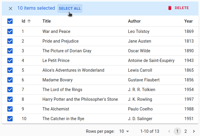
bulkActionButtons
Bulk action buttons appear when users select one or several rows. Clicking on a bulk action button affects all the selected records. This is useful for actions like mass deletion or mass edition.
You can disable this feature by setting the bulkActionButtons prop to false:
import { DataTable, List } from 'react-admin';

export const PostList = () => (
    <List>
        <DataTable bulkActionButtons={false}>
            ...
        </DataTable>
    </List>
);
By default, all DataTables have a single bulk action button, the bulk delete button. You can add other bulk action buttons by passing a custom element as the <DataTable bulkActionButtons> prop:
import { List, DataTable, BulkUpdateButton, BulkDeleteButton, BulkExportButton } from 'react-admin';
import { VisibilityOff } from '@mui/icons-material';

const PostBulkActionButtons = () => (
    <>
        <BulkUpdateButton label="Reset Views" data={{ views: 0 }} icon={<VisibilityOff/>} />
        <BulkDeleteButton />
        <BulkExportButton />
    </>
);

export const PostList = () => (
    <List>
        <DataTable bulkActionButtons={<PostBulkActionButtons />}>
            ...
        </DataTable>
    </List>
);
React-admin provides four bulk action buttons that you can use in data tables:
<BulkDeleteButton>(enabled by default)<BulkExportButton>to export only the selection<BulkUpdateButton>to immediately update the selection<BulkUpdateFormButton>to display a form allowing to update the selection
Tip: Users can select a range of rows by pressing the shift key while clicking a row checkbox.
Tip: When users select all the records of the current page using the “select all” checkbox in the header, the bulk actions toolbar shows a “Select All” button to let them select all the records regardless of pagination.
You can write a custom bulk action button components using the useListContext hook to get the following data and callbacks:
selectedIds: the identifiers of the currently selected items.onUnselectItems: a callback to empty the selection.resource: the currently displayed resource (e.g.,posts,comments, etc.)filterValues: the filter values. This can be useful if you want to apply your action on all items matching the filter.
Here is an example leveraging the useUpdateMany hook, which sets the views property of all posts to 0:
// in ./CustomResetViewsButton.tsx
import {
    useListContext,
    useUpdateMany,
    useRefresh,
    useNotify,
    useUnselectAll,
    Button,
} from 'react-admin';
import { VisibilityOff } from '@mui/icons-material';

const CustomResetViewsButton = () => {
    const { selectedIds } = useListContext();
    const refresh = useRefresh();
    const notify = useNotify();
    const unselectAll = useUnselectAll('posts');
    const [updateMany, { isPending }] = useUpdateMany();
    const handleClick = () => {
        updateMany(
            'posts',
            { ids: selectedIds, data: { views: 0 } },
            {
                onSuccess: () => {
                    notify('Posts updated');
                    unselectAll();
                },
                onError: () => {
                    notify('Error: posts not updated', { type: 'error' });
                    refresh();
                },
            }
        );
    }

    return (
        <Button label="Reset views" onClick={handleClick} disabled={isPending}>
            <VisibilityOff />
        </Button>
    );
};
But most of the time, bulk actions are mini-applications with a standalone user interface (in a Dialog). Here is the same <CustomResetViewsAction> implemented behind a confirmation dialog:
// in ./CustomResetViewsButton.tsx
import { useState } from 'react';
import {
    Button,
    Confirm,
    useListContext,
    useUpdateMany,
    useNotify,
    useRefresh,
    useUnselectAll,
} from 'react-admin';

const CustomResetViewsButton = () => {
    const { selectedIds } = useListContext();
    const [open, setOpen] = useState(false);
    const refresh = useRefresh();
    const notify = useNotify();
    const unselectAll = useUnselectAll('posts');
    const [updateMany, { isPending }] = useUpdateMany(
        'posts',
        { ids: selectedIds, data: { views: 0 } },
        {
            onSuccess: () => {
                notify('Posts updated');
                unselectAll();
            },
            onError: error => {
                notify('Error: posts not updated', { type: 'error' });
                refresh();
            },
        }
    );
    const handleClick = () => setOpen(true);
    const handleDialogClose = () => setOpen(false);

    const handleConfirm = () => {
        updateMany();
        setOpen(false);
    };

    return (
        <>
            <Button label="Reset Views" onClick={handleClick} />
            <Confirm
                isOpen={open}
                loading={isPending}
                title="Update View Count"
                content="Are you sure you want to reset the views for these items?"
                onConfirm={handleConfirm}
                onClose={handleDialogClose}
            />
        </>
    );
};

export default CustomResetViewsButton;
Tip: <Confirm> leverages Material UI’s <Dialog> component to implement a confirmation popup. Feel free to use it in your admins!
Tip: <Confirm> text props such as title and content are translatable. You can pass translation keys in these props. Note: content is only translatable when the value is a string. Otherwise, it renders the content as a ReactNode.
Tip: You can customize the text of the two <Confirm> component buttons using the cancel and confirm props which accept translation keys. You can customize the icons by setting the ConfirmIcon and CancelIcon props, which accept a SvgIcon type.
Tip: React-admin doesn’t use the <Confirm> component internally because deletes and updates are applied locally immediately and then dispatched to the server after a few seconds unless the user chooses to undo the modification. That’s what we call optimistic rendering. You can do the same for the <ResetViewsButton> by setting undoable: true in the last argument of useUpdateMany(), as follows:
// in ./CustomResetViewsButton.js
import * as React from "react";
import {
    Button,
-   Confirm,
    useListContext,
    useUpdateMany,
-   useRefresh,
    useNotify,
    useUnselectAll,
} from 'react-admin';
import { VisibilityOff } from '@mui/icons-material';

const CustomResetViewsButton = () => {
    const { selectedIds } = useListContext();
-   const refresh = useRefresh();
    const notify = useNotify();
    const unselectAll = useUnselectAll('posts');
    const [updateMany, { isPending }] = useUpdateMany(
        'posts',
        { ids: selectedIds, data: { views: 0 } },
        {
            onSuccess: () => {
-               refresh();
-               notify('Posts updated');
+               notify('Posts updated', { undoable: true }); // the last argument forces the display of 'undo' in the notification
                unselectAll();
            },
            onError: error => notify('Error: posts not updated', { type: 'error' }),
+           mutationMode: 'undoable'
        }
    );

    return (
        <Button
            label="simple.action.resetViews"
            disabled={isPending}
            onClick={updateMany}
        >
            <VisibilityOff />
        </Button>
    );
};
children
<DataTable> delegates the rendering of table columns to its children. Use <DataTable.Col> elements to define the characteristics of each column.
Columns need only to define a source. <DataTable.Col> uses this source to determine the column label (formed by humanizing the source), the field to use for sorting, and the field to render in each cell:
import { List, DataTable } from 'react-admin';

export const OrderList = () => (
    <List>
        <DataTable>
            <DataTable.Col source="reference" />
            <DataTable.Col source="date" />
            <DataTable.Col source="customer.lastName" />
            <DataTable.Col source="amount" />
            <DataTable.Col source="status" />
        </DataTable>
    </List>
);
To render data differently in a column, you can pass a custom <DataTable.Col field>. For example, you can use <NumberField> to render a numeric field:
<DataTable.Col source="amount" align="right" field={NumberField} />
If you need to pass props to the custom field, use the <DataTable.Col children> instead:
<DataTable.Col source="amount" align="right">
    <NumberField source="amount" options={{ style: 'currency', currency: 'USD' }} />
</DataTable.Col>
Tip: Rendering numeric values in a table is such a common need that react-admin provides <DataTable.NumberCol> just for that:
<DataTable.NumberCol source="amount" options={{ style: 'currency', currency: 'USD' }} />
<NumberField> is a Field component: it reads the record (via useRecordContext) and renders a value. React-admin includes many Field components that you can use as field or children of <DataTable.Col> (<TextField>, <NumberField>, <DateField>, <ReferenceField>, and many more). Check the Fields documentation for more information.
You can build your own if none of the react-admin Field components fit your need. For example, to render the first name and last name in a cell:
import { useRecordContext, List, DataTable } from 'react-admin';

const CustomerField = () => {
    const record = useRecordContext();
    if (!record) return null;
    return (
        <>
            {record.customer.firstName} {record.customer.lastName}
        </>
    );
}

export const OrderList = () => (
    <List>
        <DataTable>
            <DataTable.Col source="reference" />
            <DataTable.Col source="date" />
            <DataTable.Col
                source="customer.lastName"
                label="Customer"
                field={CustomerField}
            />
            <DataTable.NumberCol source="amount" />
            <DataTable.Col source="status" />
        </DataTable>
    </List>
);
Tip: You can even go one step further and create reusable columns:
import { DataTable, List, WithRecord } from 'react-admin';

const CustomerColumn = () => (
    <DataTable.Col source="customer.lastName" label="Customer">
        <WithRecord render={record => `${record.customer.firstName} ${record.customer.lastName}`} />
    </DataTable.Col>
);

export const OrderList = () => (
    <List>
        <DataTable>
            <DataTable.Col source="reference" />
            <DataTable.Col source="date" />
            <CustomerColumn />
            <DataTable.NumberCol source="amount" />
            <DataTable.Col source="status" />
        </DataTable>
    </List>
);
Learn more about how to customize columns in the <DataTable.Col> section below.
empty
When rendered inside an empty list with no records, <DataTable> displays a message instead of a table:
No books found
You can customize this message via react-admin’s translation system, by setting a custom translation for the ra.navigation.no_results key.
const messages = {
    ra: {
        navigation: {
            no_results: 'No %{name} found',
        }
    }
}
If you need to go beyond text, pass a custom element as the <DataTable empty> prop:
const EmptyBooks = () => (
    <p>
        No books found. Do you want to <Link to="/books/create">create one</Link>?
    </p>
);

const BookList = () => (
    <List>
        <DataTable empty={<EmptyBooks />}>
            ...
        </DataTable>
    </List>
);
Tip: <List> and other list components usually manage the empty state themselves (e.g., via the <List empty> prop), so the empty prop will only be useful if you render a <DataTable> manually in a ListContext.
expand
To show more data without adding too many columns, <DataTable> offers a collapsible panel for each row. Use the expand prop to define the panel element rendered inside a RecordContext.
For instance, this code shows the HTML body of a post in an expandable panel:
import { useRecordContext, List, DataTable } from 'react-admin';

const PostPanel = () => {
    const record = useRecordContext();
    return (
        <div dangerouslySetInnerHTML={{ __html: record.body }} />
    );
};

const PostList = () => (
    <List>
        <DataTable expand={<PostPanel />}>
            ...
        </DataTable>
    </List>
)
Tip: You can actually use a Show Layout component for the expand prop:
const PostPanel = () => (
    <SimpleShowLayout>
        <RichTextField source="body" />
    </SimpleShowLayout>
);
Tip: You can go one step further and embed an <Edit> view in the expand panel:
const PostPanel = () => {
    const record = useRecordContext();
    const resource = useResourceContext();
    return (
        <Edit
            resource={resource}
            id={record.id}
            /* disable the app title change when shown */
            title=" "
        >
            <SimpleForm>
                <RichTextInput source="body" />
            </SimpleForm>
        </Edit>
    );
};
Tip: To enable the expand panel only for some rows, use the isRowExpandable prop.
expandSingle
By default, when using an expand panel, users can expand as many rows as they want. The expandSingle prop changes that behavior: when a user clicks on the expand button of a row, other expanded rows collapse. Consequently, only a single row can be expanded at a time.
export const PostList = () => (
    <List>
        <DataTable expand={<PostPanel />} expandSingle>
            ...
        </DataTable>
    </List>
);
foot
Use the foot prop to add a table footer component, e.g., to display totals or averages.
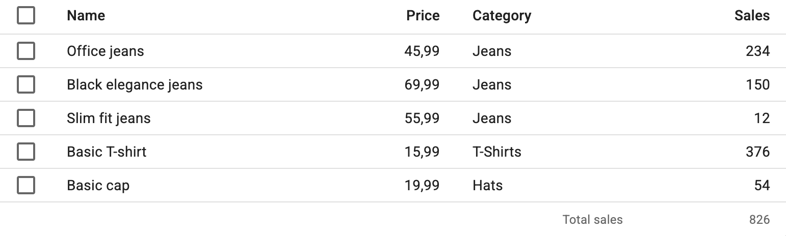
Use the useDataTableDataContext hook to access the data displayed in the table.
import { TableFooter, TableRow, TableCell } from '@mui/material';
import { DataTable, useDataTableDataContext } from 'react-admin';

const ProductTableFoot = () => {
    const data = useDataTableDataContext();
    const totalSales = data.reduce(
        (sum, record) => sum + (record.sales ? record.sales : 0),
        0
    );
    return (
        <TableFooter>
            <TableRow>
                <TableCell
                    variant="footer"
                    colSpan={4}
                    sx={{ textAlign: 'right' }}
                >
                    Total sales
                </TableCell>
                <TableCell variant="footer" align="right">
                    {totalSales}
                </TableCell>
            </TableRow>
        </TableFooter>
    );
};

const ProductList = () => (
    <List>
        <DataTable foot={ProductTableFoot}>
            ...
        </DataTable>
    </List>
);
head
By default, <DataTable> renders the table head using <DataTableHead>, an internal react-admin component. To override that default, you can pass a custom component as the head prop. This can be useful, e.g., to add a second header row or to create headers spanning multiple columns.
For instance, here is a simple DataTable header that displays column names with no sort and no “select all” button:
import { TableHead, TableRow, TableCell } from "@mui/material";
import { DataTable, DataTableHeadProps, List, SelectPageCheckbox } from "react-admin";

const MyDataTableHead = ({ children }: DataTableHeadProps) => (
    <TableHead>
        <TableRow>
            <TableCell variant="head"></TableCell>
            <TableCell variant="head" colSpan={2} sx={{ textAlign: 'center' }}>
                Main info
            </TableCell>
            <TableCell variant="head" colSpan={2} sx={{ textAlign: 'center' }}>
                Misc info
            </TableCell>
        </TableRow>
        <TableRow>
            <TableCell variant="head" padding="checkbox">
                <SelectPageCheckbox />
            </TableCell>
            {children}
        </TableRow>
    </TableHead>
);

const PostList = () => (
    <List>
        <DataTable head={MyDataTableHead}>
            <DataTable.Col source="id" />
            <DataTable.Col source="title" />
            <DataTable.Col source="author" />
            <DataTable.Col source="year" />
        </DataTable>
    </List>
);
Tip: To handle sorting in your custom DataTable head component, check out the Building a custom sort control section.
hiddenColumns
By default, <DataTable> renders all <DataTable.Col> children. Use the hiddenColumns property to set hidden columns by default.
import { ColumnsButton, TopToolbar, List, DataTable } from 'react-admin';

const PostListActions = () => (
        <TopToolbar>
          <ColumnsButton />
        </TopToolbar>
)

const PostList = () => (
    <List actions={<PostListActions />}>
        <DataTable hiddenColumns={['id', 'author']}>
            <DataTable.Col source="id" />
            <DataTable.Col source="title" />
            <DataTable.Col source="author" />
            <DataTable.Col source="year" />
        </DataTable>
    </List>
);
Using hiddenColumns instead of removing <DataTable.Col> elements allows hidden columns to be displayed again using a <ColumnsButton>, as explained in the Hiding or Reordering Columns section.
hover
By default, when a user hovers over a row, the background color changes to indicate the row is active. Set the hover prop to false to disable this behavior.
const PostList = () => (
    <List>
        <DataTable hover={false}>
            <DataTable.Col source="id" />
            <DataTable.Col source="title" />
            <DataTable.Col source="views" />
        </DataTable>
    </List>
);
isRowExpandable
Using the isRowExpandable prop, you can customize which rows can have a collapsible panel. It expects a function that receives the row record and returns a boolean.
For instance, this code shows an expand button only for rows that have a detail to show:
import { List, DataTable, useRecordContext } from 'react-admin';

const PostPanel = () => {
    const record = useRecordContext();
    return (
        <div dangerouslySetInnerHTML={{ __html: record.body }} />
    );
};

const PostList = () => (
    <List>
        <DataTable
            expand={<PostPanel />}
            isRowExpandable={row => row.has_detail}
        >
            ...
        </DataTable>
    </List>
)
isRowSelectable
You can customize which rows are selectable using the isRowSelectable prop. It expects a function that receives the row record and returns a boolean. When the function returns false, the selection checkbox is disabled.
For instance, this code enables a checkbox only for rows with an ID greater than 300:
import { List, DataTable } from 'react-admin';

export const PostList = () => (
    <List>
        <DataTable isRowSelectable={record => record.id > 300 }>
            ...
        </DataTable>
    </List>
);
rowClick
By default, <DataTable> uses the current resource definition to determine what to do when the user clicks on a row. If the resource has a show page, a row click redirects to the Show view. If the resource has an edit page, a row click redirects to the Edit view. Otherwise, the row is not clickable.
Tip: If you enable Access Control, react-admin also checks that the current user can access the Show and Edit views. For instance, for a DataTable on the posts resource, react-admin calls canAccess with the following parameters for each record:
{ action: "show", resource: 'posts', record: Object }if thepostsresource has a Show view,{ action: "edit", resource: 'posts', record: Object }if thepostsresource has an Edit view.
You can choose what happens when the user clicks on a row by setting the rowClick prop. For instance, set the rowClick prop to "edit" to redirect to the Edit view:
import { List, DataTable } from 'react-admin';

export const PostList = () => (
    <List>
        <DataTable rowClick="edit">
            ...
        </DataTable>
    </List>
);
rowClick accepts the following values:
"edit"to redirect to the edition view"show"to redirect to the show view"expand"to open theexpandpanel"toggleSelection"to trigger theonToggleItemfunctionfalseto do nothing- a function
(id, resource, record) => paththat may return any of the above values or a custom path
Tip: If you pass a function, it can return 'edit', 'show', false or a router path. This allows redirecting to either the Edit or Show view after checking a condition on the record. For example:
import type { Identifier, RaRecord } from 'react-admin';
const postRowClick = (id: Identifier, resource: string, record: RaRecord) => record.editable ? 'edit' : 'show';
Tip: rowClick accepts async functions, allowing you to call an external API to determine the action to trigger.
rowSx
You can customize the styles of rows and cells in <DataTable> (applied to the <DataTableRow> element) based on the record, thanks to the rowSx prop, which expects a function.
For instance, this allows to add a custom left border to reviews in a list depending on their status:
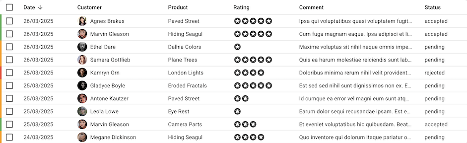
React-admin calls the rowSx function for each row, passing the current record and index as arguments. The function should return a Material UI sx value, which react-admin uses to set the <TableRow sx>.
import { List, DataTable } from 'react-admin';
import { type SxProps } from '@mui/system';
import { green, orange, red } from '@mui/material/colors';

import { type Review } from './types';

const colorByStatus = {
    accepted: green[500],
    pending: orange[500],
    rejected: red[500],
};

const reviewRowSx = (record: Review): SxProps => {
    if (!record) return;
    return {
        borderLeftColor: colorByStatus[record.status],
        borderLeftWidth: 5,
        borderLeftStyle: 'solid',
    };
}

export const ReviewList = () => (
    <List>
        <DataTable rowSx={reviewRowSx}>
            ...
        </DataTable>
    </List>
);
size
The <DataTable> is designed for a high content density, so the row padding is low. If you want to add more margin to each cell, set the size prop to medium.
export const PostList = () => (
    <List>
        <DataTable size="medium">
            ...
        </DataTable>
    </List>
);
Tip: size is actually a prop of the Material UI <Table> component. Like all additional <DataTable> props, it is passed down to the <Table> component.
sx: CSS API
The <DataTable> component accepts the usual className prop. You can also override many styles of the inner components thanks to the sx property (see the sx documentation for syntax and examples).
This property accepts the following subclasses:
| Rule name | Description |
|---|---|
& .RaDataTable-root |
Applied to the root div element |
& .RaDataTable-tableWrapper |
Applied to the div that wraps table element |
& .RaDataTable-table |
Applied to the table element |
& .RaDataTable-thead |
Applied to the table header |
& .RaDataTable-tbody |
Applied to the table body |
& .RaDataTable-headerCell |
Applied to each header cell |
& .RaDataTable-headerRow |
Applied to each header row |
& .RaDataTable-row |
Applied to each row |
& .RaDataTable-rowEven |
Applied to each even row |
& .RaDataTable-rowOdd |
Applied to each odd row |
& .RaDataTable-rowCell |
Applied to each row cell |
& .RaDataTable-selectable |
Applied to each selectable row |
& .RaDataTable-expandHeader |
Applied to each expandable header cell |
& .RaDataTable-clickableRow |
Applied to each row if rowClick prop is truthy |
& .RaDataTable-expandIconCell |
Applied to each expandable cell |
& .RaDataTable-expandIcon |
Applied to each expand icon |
& .RaDataTable-expandable |
Applied to each expandable row |
& .RaDataTable-expanded |
Applied to each expanded icon |
& .RaDataTable-expandedPanel |
Applied to each expandable panel |
& .RaDataTable-checkbox |
Applied to each checkbox cell |
For instance, here is how you can leverage these styles to implement zebra stripes (a.k.a. alternate row styles)
const PostList = () => (
    <List>
        <DataTable
            sx={{
                '& .RaDataTable-rowOdd': {
                    backgroundColor: '#fee',
                },
            }}
        >
            ...
        </DataTable>
    </List>
);
Tip: The DataTable component classes can also be customized for all instances of the component with its global CSS name "RaDataTable" as described in the theme override tutorial
<DataTable.Col>
<DataTable.Col> elements define columns of the data table. They let you set the column title, sort behavior, content, style, etc.
Usage
Use <DataTable.Col> as a descendant of <DataTable>, to define columns.
import { List, DataTable } from 'react-admin';

export const PostList = () => (
    <List>
        <DataTable>
            <DataTable.Col source="title" />
            <DataTable.Col label="Author">
                <ReferenceField source="author" reference="users" />
            </DataTable.Col>
            <DataTable.Col source="published_at" field={DateField} />
            <DataTable.Col
                label="Summary"
                render={record => record.summary.substr(0, 10) + '...'}
            />
            <DataTable.Col source="nb_views" align="right" field={NumberField} />
        </DataTable>
    </List>
);
<DataTable.Col> lets you define how the data renders in 4 different ways:
- By passing a
sourceprop and no child. - By passing child elements (e.g.
<ReferenceField>,<DateField>, etc.). - By using the
fieldprop to specify a field component. - By passing a
renderprop to define a custom rendering function.
Props
| Prop | Required | Type | Default | Description |
|---|---|---|---|---|
align |
Optional | "left" | "right" |
"left" |
The alignment of the column. |
children |
Optional | ReactNode | - | The content of the column. |
cellClassName |
Optional | string | - | The class name of the cells. |
cellSx |
Optional | function | - | A function that returns the sx prop to apply to a cell. |
className |
Optional | string | - | The class name of the column. |
disableSort |
Optional | boolean | false |
Set to true to disable sort. |
field |
Optional | Component | - | The field component to use for the column. |
headerClassName |
Optional | string | - | The class name of the header cell. |
label |
Optional | string | - | The column label, displayed in the header. |
render |
Optional | (record) => ReactNode | - | A function to render the column content. |
sortByOrder |
Optional | "ASC" | "DESC" |
"ASC" |
The order to use for sorting the column. |
source |
Optional | string | - | The source of the column, used for sorting and to read the data from the record when there is no child. |
sx |
Optional | SxProps | - | The styles to apply to the column. |
Additional props are passed to the MUI <TableCell> component.
align
Table cells are left-aligned by default. To right-align a column, set the align prop to "right". This is useful for numeric columns:
<DataTable.Col
    source="nb_views"
    field={NumberField}
    align="right"
/>
Tip: Rendering numeric values in a table is such a common need the react-admin provides <DataTable.NumberCol> just for that:
<DataTable.NumberCol source="nb_views" />
children
<DataTable.Col> renders its children in a RecordContext on each row. This allows you to use any react-admin Field component as a child of <DataTable.Col>, or even a custom component.
This lets you pass custom options to Field elements:
<DataTable.Col source="total_spent" align="right">
    <NumberField
        source="total_spent"
        options={{ style: 'currency', currency: 'USD' }}
    />
</DataTable.Col>
You can use more than one field as a child, for instance, to display a first name and last name in the same column:
<DataTable.Col source="lastName">
    <TextField source="firstName" />{" "}<TextField source="lastName" />
</DataTable.Col>
You can also use your own field components. They need to grab the current record from recordContext:
const FullNameField = (props: Props) => {
    const record = useRecordContext<Customer>();
    if (!record) return null;
    return (
        <Typography
            variant="body2"
            display="flex"
            flexWrap="nowrap"
            alignItems="center"
        >
            <Avatar
                src={record.avatar}
                style={{ width: parseInt(size, 10), height: parseInt(size, 10) }}
                alt={`${record.first_name} ${record.last_name}`}
                sx={{
                    width: 25,
                    height: 25,
                    mr: 1,
                    mt: -0.5,
                    mb: -0.5,
                    textDecoration: 'underline',
                    textDecorationColor: '#bdbdbd',
                }}
            />
            {record.firstName} {record.lastName}
        </Typography>
    );
};

const CustomerList = () => (
    <List>
        <DataTable>
            <DataTable.Col label="Name" source="lastName">
                <FullNameField />
            </DataTable.Col>
            ...
        </DataTable>
    </List>
);
Tip: If you don’t need to pass custom props to the field, you can use the field prop instead:
<DataTable.Col label="Name" source="lastName" field={FullNameField} />
cellClassName
You can pass a custom class name to the cells of a column using the cellClassName prop. This class name will not be applied to the header cell.
<DataTable.NumberCol source="balance" cellClassName="highlighted" />
cellSx
You can pass a function to the cellSx prop to customize the style of the cells of a column based on the record.
This function receives the current record as an argument and should return a Material UI sx value.
<DataTable.NumberCol
    source="total"
    label="Total spent"
    cellSx={record => ({
        color: record.total > 0 ? 'black' : 'red',
    })}
/>
disableSort
By default, a column is sortable if it has a source. You can turn off sorting by setting the disableSort prop. This can be useful, e.g., for reference fields, which are not sortable by default.
<DataTable.Col source="author" disableSort>
    <ReferenceField source="author" reference="users" />
</DataTable.Col>
Tip: Instead of using disableSort, you can also remove the source and define your own label.
<DataTable.Col label="Author">
    <ReferenceField source="author" reference="users" />
</DataTable.Col>
field
By default, when specifying a source and passing no child, <DataTable.Col> renders the value using lodash.get. You can override this behavior by passing a field prop, which should be a react-admin Field component.
<DataTable.Col source="published_at" field={DateField} />
If you need to pass custom props to the field, you can use the children prop instead:
<DataTable.Col source="published_at">
    <DateField source="published_at" showTime />
</DataTable.Col>
headerClassName
You can pass a custom class name to the header cell of a column using the headerClassName prop. This class name will not be applied to the cells.
<DataTable.Col source="title" headerClassName="dimmed" />
label
The default label of a column, displayed in the table header, is the humanized version of the source prop. You can override this default label by passing a label prop to <DataTable.Col>.
<DataTable.Col source="published_at" label="Published on" />
You can use a React element for the label:
<DataTable.Col
    source="balance"
    label={
        <span>
            Balance <em>in USD</em>
        </span>
    }
/>
render
To define a custom rendering function, you can pass a render prop to <DataTable.Col>. This function receives the current record as an argument and should return a React element.
<DataTable.Col
    label="Summary"
    render={record => record.summary.substr(0, 10) + '...'}
/>
Note: The render prop is ignored if you pass a child to <DataTable.Col>.
sortByOrder
By default, when users click on the header of a sortable column, the list is reordered in ascending order. You can change this behavior by passing the sortByOrder prop to <DataTable.Col>. This prop accepts either "ASC" or "DESC".
<DataTable.Col source="published_at" sortByOrder="DESC" />
source
<DataTable.Col> uses the source prop for three different purposes:
- It defines the field to use for sorting when the user clicks on the column header.
- It defines the column label, by humanizing the source.
- It defines the field to use for reading the data from the record when there is no child.
<DataTable.Col source="published_at" />
The source can be a path to a nested field, e.g., customer.lastName.
Yet, this prop is optional: if you want to create a column that is not sortable, has no label, and uses children for rendering, you can omit the source prop. This is the case e.g., for action columns:
<DataTable.Col>
    <EditButton />
    <DeleteButton />
</DataTable.Col>
sx
You can style a column using the <DataTable.Col sx> prop. The style will be applied both to the header and the body cells.
<DataTable.Col
    source="author"
    sx={{ color: 'darkgray' }}
/>
If you want to style only the header or the body cells, use the MuiTableCell-head and MuiTableCell-body classes:
<DataTable.Col
    source="author"
    sx={{
        '&.MuiTableCell-body': { color: 'black' },
        '&.MuiTableCell-head': { color: 'darkgray' },
    }}
/>
Tip: If you want to apply a conditional style to a column, use the cellSx prop instead:
<DataTable.NumberCol>
<DataTable.NumberCol> lets you define numeric columns where the label and the value are right-aligned, and the value is rendered using the <NumberField> component.
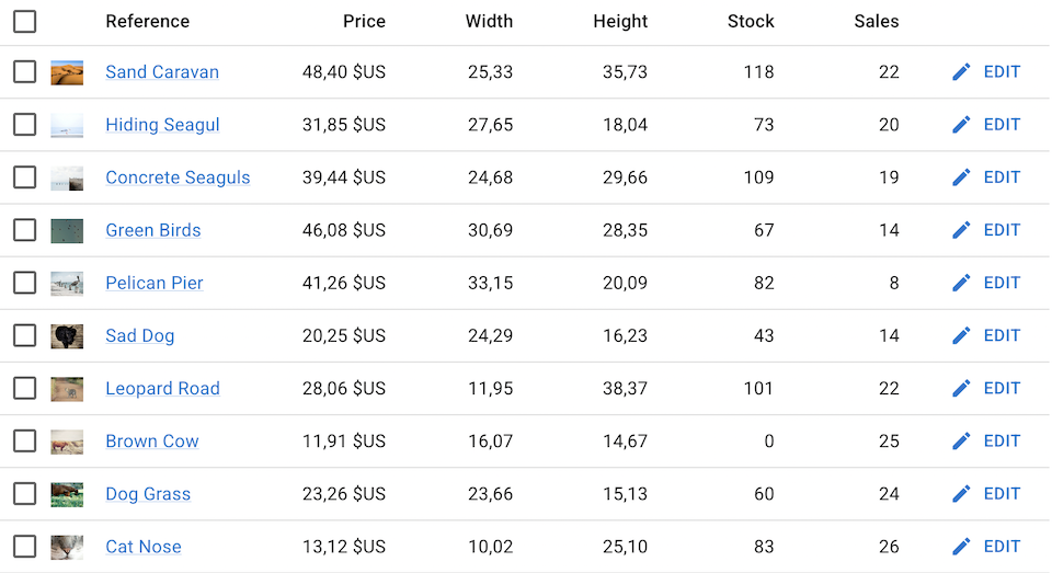
Use it just like <DataTable.Col>, as a descendant of <DataTable>:
import { List, DataTable, NumberField } from 'react-admin';

export const ProductList = () => (
    <List>
        <DataTable>
            <DataTable.Col field={ThumbnailField} />
            <DataTable.Col source="reference" field={ProductRefField} />
            <DataTable.NumberCol
                source="price"
                options={{ style: 'currency', currency: 'USD' }}
            />
            <DataTable.NumberCol
                source="width"
                options={{ minimumFractionDigits: 2 }}
            />
            <DataTable.NumberCol
                source="height"
                options={{ minimumFractionDigits: 2 }}
            />
            <DataTable.NumberCol source="stock" />
            <DataTable.NumberCol source="sales" />
            <DataTable.Col align="right">
                <EditButton />
            </DataTable.Col>
        </DataTable>
    </List>
)
<DataTable.NumberCol> accepts the same props as <DataTable.Col>, plus the following props, passed to <NumberField>:
options: An object to customize the number formatting (e.g., style, currency). See Intl.NumberFormat documentation for more details.locales: A string or array of strings to specify the locale for number formatting. This is useful for internationalization.
Refer to the <NumberField> documentation for more details.
Header Pinning
<DataTable> has sticky headers, which means that the header row will remain visible even when scrolling down the page.
You don’t need to do anything for this to work, as it’s enabled by default.
Hiding or Reordering Columns
You can let end users customize the fields displayed in the <DataTable> by using the <ColumnsButton> in the <List actions>. When users click on this button, they can show / hide columns and reorder them.
import { ColumnsButton, TopToolbar, List, DataTable } from 'react-admin';

const PostListActions = () => (
    <TopToolbar>
        <ColumnsButton />
    </TopToolbar>
)

const PostList = () => (
    <List actions={<PostListActions />}>
        <DataTable>
            <DataTable.Col source="id" />
            <DataTable.Col source="title" />
            <DataTable.Col source="author" />
            <DataTable.Col source="year" />
        </DataTable>
    </List>
);
By default, <DataTable> renders all <DataTable.Col> children. But you can also omit some of them by setting the hiddenColumns prop. Hidden columns are still displayed in the <ColumnsButton> dialog, so users can show them again.
const PostList = () => (
    <List actions={<PostListActions />}>
        <DataTable hiddenColumns={['id', 'author']}>
            <DataTable.Col source="id" />
            <DataTable.Col source="title" />
            <DataTable.Col source="author" />
            <DataTable.Col source="year" />
        </DataTable>
    </List>
);
If you render more than one <DataTable> in the same page, you must pass a unique storeKey prop to each one:
const PostList = () => (
    <List>
        <DataTable storeKey="posts.DataTable">
            ...
        </DataTable>
    </List>
);
If you include a <ColumnsButton> in a page that has more than one <DataTable>, you have to link the two components by giving them the same storeKey:
const PostListActions = () => (
    <TopToolbar>
        <ColumnsButton storeKey="posts.DataTable" />
    </TopToolbar>
);

const PostList = () => (
    <List actions={<PostListActions />}>
        <DataTable storeKey="posts.DataTable">
            ...
        </DataTable>
    </List>
);
Tip: For even more column customization (resizable columns, column grouping, etc.), check out the <DatagridAG> component.
Hiding Checkboxes
The checkboxes appear on the first column because the default value for the bulkActionButtons prop is <BulkDeleteButton />.
You can hide these checkboxes by passing false to the bulkActionButtons prop:
import { DataTable, List } from 'react-admin';

export const PostList = () => (
    <List>
        <DataTable bulkActionButtons={false}>
            ...
        </DataTable>
    </List>
);
Editable Spreadsheet
The separation between list pages and edit pages is not always relevant. Sometimes, you want to let users edit records directly in the list page. React-admin proposes an alternative component to edit records in a DataTable called <DatagridAG>, which provides a spreadsheet-like interface, “à la” Excel, using the ag-Grid library.
<DatagridAG> is an advanced DataTable component based on ag-grid. Here is a (non-exhaustive) list of features that <DatagridAG> offers:
- In-place editing of cells or rows
- Advanced filtering
- Columns resizing and reordering
- Automatic page size
- Automatic column size
- Themes
- Row selection and bulk actions
- Compatibility with React Admin fields
Additionally, <DatagridAG> is compatible with the Enterprise version of ag-grid, which offers even more features:
- Row Grouping
- Aggregation
- Tree Data
- Pivoting
- More advanced filtering
- Master Detail views
- Range Selection
- Excel Export
- And more…
Check the <DatagridAG> documentation for more details.
Standalone Usage
You can use the <DataTable> component to display data you’ve fetched. You’ll need to pass all the props required for its features:
import { useGetList, DataTable } from 'react-admin';

const MyCustomList = () => {
    const { data, total, isPending } = useGetList('books', {
        pagination: { page: 1, perPage: 10 },
        sort: { field: 'id', order: 'DESC' },
    });

    return (
        <DataTable
            resource="books"
            data={data}
            total={total}
            isPending={isPending}
        >
            <DataTable.Col source="id" />
            <DataTable.Col source="title" />
        </DataTable>
    );
};
This list is static and has no filtering, sorting, or row selection. If you want to allow users to interact with the <DataTable>, use the useList hook to build callbacks to manipulate local data. You will have to put the result in a <ListContextProvider> parent component:
import {
    useGetList,
    useList,
    ListContextProvider,
    DataTable,
} from 'react-admin';

const sort = { field: 'id', order: 'DESC' };

const MyCustomList = () => {
    const { data, isPending } = useGetList('books', {
        pagination: { page: 1, perPage: 10 },
        sort,
    });
    const listContext = useList({ data, isPending });

    return (
        <ListContextProvider value={listContext}>
            <DataTable>
                <DataTable.Col source="id" />
                <DataTable.Col source="title" />
            </DataTable>
        </ListContextProvider>
    );
};
Styling Specific Columns
If you want to style a particular column, set the <DataTable.Col sx> prop.
<DataTable.Col
    source="author"
    sx={{ color: 'darkgray' }}
/>
If you want to style only the header or the body cells, use the MuiTableCell-head and MuiTableCell-body classes:
<DataTable.Col
    source="author"
    sx={{
        '&.MuiTableCell-body': { color: 'black' },
        '&.MuiTableCell-head': { color: 'darkgray' },
    }}
/>
You can also style columns using the <DataTable sx> prop by taking advantage of the generated class names per column. Each <DataTable.Col> sets the class name of its cells to column-[source] by default.
For instance, for <DataTable.Col source="author" />, both the column header and the cells will have the class column-author.
import { List, DataTable } from 'react-admin';

const PostList = () => (
    <List>
        <DataTable
            sx={{ '& .column-author': { color: 'darkgray' } }}
        >
            <DataTable.Col source="id" />
            <DataTable.Col source="title" />
            {/* will have different color */}
            <DataTable.Col source="author" />
            <DataTable.Col source="year" />
        </DataTable>
    </List>
);
A common practice is to hide specific columns on smaller screens. You can use the same technique:
import { List, DataTable } from 'react-admin';

const PostList = () => (
    <List>
        <DataTable
            sx={{
                '& .hiddenOnSmallScreens': {
                    sm: { display: 'none' },
                    md: { display: 'table-cell' },
                },
            }}
        >
            <DataTable.Col source="id" />
            <DataTable.Col source="title" />
            <DataTable.Col source="author" />
            <DataTable.Col source="year" className="hiddenOnSmallScreens"/>
        </DataTable>
    </List>
);
Conditional Formatting
You can use the cellSx prop to apply conditional styles to a column based on the record. This prop is a function that receives the current record as an argument and should return a Material UI sx value.
<DataTable.NumberCol
    source="total"
    label="Total spent"
    cellSx={record => ({
        color: record.total > 0 ? 'black' : 'red',
    })}
/>
Customizing Column Sort
The column headers are buttons that allow users to change the list sort field and order. This feature requires no configuration and works out of the box. The next sections explain how to disable or modify the field used for sorting a particular column.
Disabling Sorting
It is possible to disable sorting for a specific <DataTable.Col> by passing the disableSort property:
// in src/posts.tsx
import { List, DataTable } from 'react-admin';

export const PostList = () => (
    <List>
        <DataTable>
            <DataTable.Col source="id" disableSort />
            <DataTable.Col source="title" />
            <DataTable.Col source="body" />
        </DataTable>
    </List>
);
Specifying A Sort Field
By default, a column is sorted by the <DataTable.Col source> property.
For example, the following column displays the full name of a contact and is sortable by their last name:
<DataTable.Col
    label="Name"
    source="lastName"
    render={record => `${record.firstName} ${record.lastName}`}
/>
An action column should not be sortable, so you don’t need to specify a source:
<DataTable.Col>
    <EditButton />
    <DeleteButton />
</DataTable.Col>
You can also use a different source for the column and its child. This is very useful for reference fields, where users expect the column to be sortable by the reference (e.g., author.name) rather than the foreign key (e.g., author_id):
<DataTable.Col source="authors(name)" label="Author" >
    <ReferenceField source="author_id" reference="authors" />
</DataTable.Col>
Note: Support for sorting by related fields depends on the data provider.
Specifying The Sort Order
By default, when the user clicks on a column header, the list becomes sorted in ascending order. You change this behavior by setting the sortByOrder prop to "DESC" in a <DataTable.Col> element:
<DataTable.Col source="published_at" sortByOrder="DESC"/>
Access Control
If you need to hide some columns based on a set of permissions, wrap these columns with <CanAccess>.
const ProductList = () => (
    <List>
        <DataTable>
            <CanAccess action="read" resource="products.thumbnail">
                <DataTable.Col source="thumbnail" field={ImageField} />
            </CanAccess>
            <CanAccess action="read" resource="products.reference">
                <DataTable.Col source="reference" />
            </CanAccess>
            <CanAccess action="read" resource="products.category_id">
                <DataTable.Col source="category_id">
                    <ReferenceField source="category_id" reference="categories" />
                </DataTable.Col>
            </CanAccess>
            <CanAccess action="read" resource="products.width">
                <DataTable.NumberCol source="width" />
            </CanAccess>
            <CanAccess action="read" resource="products.height">
                <DataTable.NumberCol source="height" />
            </CanAccess>
            <CanAccess action="read" resource="products.price">
                <DataTable.NumberCol source="price" />
            </CanAccess>
            <CanAccess action="read" resource="products.description">
                <DataTable.Col source="description" />
            </CanAccess>
            <CanAccess action="read" resource="products.stock">
                <DataTable.NumberCol source="stock" />
            </CanAccess>
            <CanAccess action="read" resource="products.sales">
                <DataTable.NumberCol source="sales" />
            </CanAccess>
        </DataTable>
    </List>
);
As this is quite verbose, you may prefer using the <Datagrid> component from the @react-admin/ra-rbac package, which has several built-in access controls:
- Users must have the
'read'permission on a resource column to see it in the export:
{ action: "read", resource: `${resource}.${source}` }
// or
{ action: "read", resource: `${resource}.*` }
-
Users must have the
'delete'permission on the resource to see the<BulkExportButton>. -
The default
rowClickdepends on the user permissions:"edit"if the user can access the current resource with theeditaction"show"if the user can access the current resource with theshowaction- empty otherwise
Here is an example of <Datagrid> with RBAC:
import { canAccessWithPermissions, List, Datagrid } from '@react-admin/ra-rbac';
import {
    ImageField,
    TextField,
    ReferenceField,
    NumberField,
} from 'react-admin';

const authProvider = {
    // ...
    canAccess: async ({ action, record, resource }) =>
        canAccessWithPermissions({
            permissions: [
                { action: 'list', resource: 'products' },
                { action: 'read', resource: 'products.thumbnail' },
                { action: 'read', resource: 'products.reference' },
                { action: 'read', resource: 'products.category_id' },
                { action: 'read', resource: 'products.width' },
                { action: 'read', resource: 'products.height' },
                { action: 'read', resource: 'products.price' },
                { action: 'read', resource: 'products.description' },
                // { action: 'read', resource: 'products.stock' },
                // { action: 'read', resource: 'products.sales' },
                // { action: 'delete', resource: 'products' },
                { action: 'show', resource: 'products' },
            ],
            action,
            record,
            resource
        }),
};

const ProductList = () => (
    <List>
        {/* The datagrid has no bulk actions as the user doesn't have the 'delete' permission */}
        <Datagrid>
            <ImageField source="thumbnail" />
            <TextField source="reference" />
            <ReferenceField source="category_id" reference="categories">
                <TextField source="name" />
            </ReferenceField>
            <NumberField source="width" />
            <NumberField source="height" />
            <NumberField source="price" />
            <TextField source="description" />
            {/** These two columns are not visible to the user **/}
            <NumberField source="stock" />
            <NumberField source="sales" />
        </Datagrid>
    </List>
);
Tip: Adding the ‘read’ permission for the resource itself doesn’t grant the ‘read’ permission on the columns. If you want a user to see all possible columns, add the ‘read’ permission on columns using a wildcard:
{ action: "read", resource: "products.*" }
Typescript
<DataTable.Col> and <DataTable.NumberCol> are generic components, You can pass a type parameter to get hints for the source prop and type safety for the record argument of the render and rowSx functions.
The most convenient way to benefit from this capability is to alias column components for your resource:
import { List, DataTable, ReferenceField } from 'react-admin';
import { type Review } from '../types';
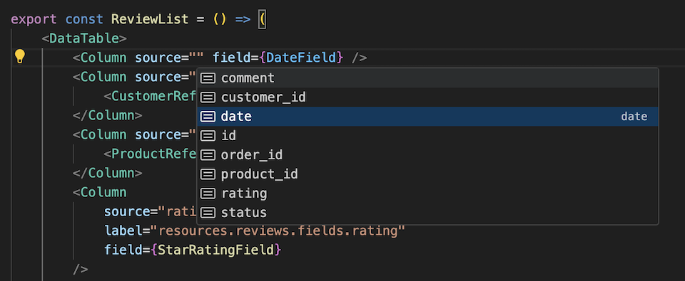
const Column = DataTable.Col<Review>;
const ReviewList = () => (
<List>
<DataTable>
<Column source="date" field={DateField} />
<Column source="customer_id">
<ReferenceField source="customer_id" reference="customers"/>
</Column>
<Column source="product_id">
<ReferenceField source="product_id" reference="products" />
</Column>
<Column source="rating" field={StarRatingField} />
<Column
source="comment"
render={record => record.comment.substr(0, 10) + '...'}
/>
<Column source="status" />
</DataTable>
</List>
);
<DataTable> is also a generic component. You can pass a type parameter to get autocompletion and type safety for its props.
import { List, DataTable } from 'react-admin';
import { type Review } from '../types';

const ReviewList = () => (
    <List>
        <DataTable<Review>
            // TypeScript knows that record type is Review
            rowSx={record => ({
                backgroundColor: record.status === 'approved' ? 'green' : 'red',
            })}
        >
            ...
        </DataTable>
    </List>
);
Migrating From <Datagrid> To <DataTable>
To help you migrate from <Datagrid> to <DataTable>, we’ve created a codemod.
DISCLAIMER Please review the generated changes thoroughly!
Applying the codemod might break your code formatting, so don’t forget to run your formatter (prettier, eslint, biome, etc.) after you’ve applied the codemod!
For .js or .jsx files:
npx jscodeshift ./path/to/src/ \
    --extensions=js,jsx \
    --transform=./node_modules/ra-core/codemods/replace-Datagrid-DataTable.ts
For .ts or .tsx files:
npx jscodeshift ./path/to/src/ \
    --extensions=ts,tsx \
    --parser=tsx \
    --transform=./node_modules/ra-core/codemods/replace-Datagrid-DataTable.ts
Here is what the codemod will transform for you:
- Replace
<Datagrid>with<DataTable>. - Replace
rowStylewithrowSx. - Remove the
optimizedprop (which isn’t necessary anymore) - Rename the keys in
sxprop from"& .RaDatagrid-xxxx"to"& .RaDataTable-xxxx". - Replace simple
<TextField>with<DataTable.Col>. - Replace simple
<NumberField>with<DataTable.NumberCol>. - Wrap all other fields in
<DataTable.Col>, keepingsourceandlabelproperties in<DataTable.Col>. - Replace
Datagridimports byDataTable, and remove unusedTextFieldandNumberFieldimports if they are now all replaced.
However, the codemod will not:
- Replace
<DatagridConfigurable>with<DataTable>(column selection is now natively supported by<DataTable>). - Remove the
sortByandsortableprops on fields (sorting is now managed by<DataTable.Col source>) - Move the
sortByOrderprop from the field to<DataTable.Col> - Replace a
<FunctionField>child with<DataTable.Col render> - Replace
<Datagrid>from@react-admin/ra-rbac(and all its children). Refer to Access Control section to use<DataTable>with<CanAccess>. - Move the column styles from
<Datagrid sx>to the individual<DataTable.Col sx>