
<SingleFieldList>
Use <SingleFieldList> when you want to display only one property for each record in a list, for instance, to display the list of tag names for a post.

<SingleFieldList> is an iterator component: it gets data from the ListContext, and iterates over it to display each record. It creates a <RecordContext> for each record, and delegates the actual rendering to its child - usually a Field component.
Usage
<SingleFieldList> grabs the current ListContext, and renders a Material UI <Stack> with one <ChipField> for each record in the list, using the recordRepresentation. It is especially useful as child of <ReferenceManyField> and <ReferenceArrayField> components.
Here is an example of a Post show page showing the list of tags for the current post:
import {
    Show,
    SimpleShowLayout,
    TextField,
    ReferenceArrayField,
    SingleFieldList
} from 'react-admin';

const PostShow = () => (
    <Show>
        <SimpleShowLayout>
            <TextField source="title" />
            <ReferenceArrayField label="Tags" reference="tags" source="tags">
                <SingleFieldList />
            </ReferenceArrayField>
        </SimpleShowLayout>
    </Show>
);
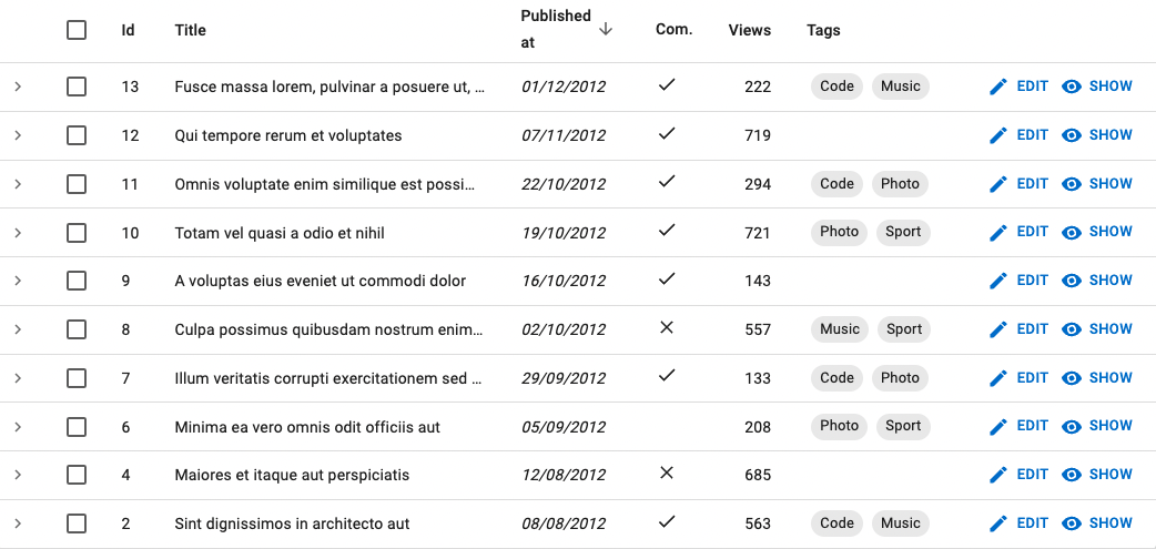
You can also use <SingleFieldList> in a list view, e.g. to display the tags for each post in a <DataTable>:
import {
    List,
    DataTable,
    ReferenceArrayField,
    SingleFieldList,
    DateField,
    BooleanField,
    ChipField
} from 'react-admin';

const PostList = () => (
    <List>
        <DataTable>
            <DataTable.Col source="id" />
            <DataTable.Col source="title" />
            <DataTable.Col source="published_at" field={DateField} />
            <DataTable.Col source="commentable" field={BooleanField} />
            <DataTable.NumberCol source="views" />
            <DataTable.Col source="tags" label="Tags">
                <ReferenceArrayField  reference="tags" source="tags">
                    <SingleFieldList />
                </ReferenceArrayField>
            </DataTable.Col>
        </DataTable>
    </List>
)
You can customize how each record is displayed by passing a Field component as child. For example, you can change the field name used by the <ChipField>:
<SingleFieldList>
    <ChipField source="tag" clickable />
</SingleFieldList>
Props
<SingleFieldList> accepts the following props:
| Prop | Required | Type | Default | Description |
|---|---|---|---|---|
children |
Optional | ReactNode |
React element to render for each record | |
empty |
Optional | ReactNode |
React element to display when the list is empty | |
linkType |
Optional | 'edit' | 'show' | false |
edit |
The target of the link on each item |
sx |
Optional | object |
The sx props of the Material UI Box component |
Additional props are passed down to the underlying Material UI <Stack> component.
children
By default, <SingleFieldList> renders a <ChipField> for each record. You can customize the rendering by passing a Field component as child.
For example, if you want to customize the field name used by the <ChipField>:
<SingleFieldList>
    <ChipField source="tag" clickable />
</SingleFieldList>
empty
When the list is empty, <SingleFieldList> displays nothing. You can customize this behavior by passing a React element as the empty prop. For example, to display a message:
<SingleFieldList empty={<p>Nothing to display</p>} />
linkType
The <SingleFieldList> items link to the edition page by default. You can set the linkType prop to show to link to the <Show> page instead.
// Display all the tags for the current post
<ReferenceArrayField
    label="Tags"
    reference="tags"
    source="tags"
>
    <SingleFieldList linkType="show" />
</ReferenceArrayField>
linkType accepts the following values:
linkType="edit": links to the edit page. This is the default behavior.linkType="show": links to the show page.linkType={false}: does not create any link.
sx: CSS API
The <SingleFieldList> component accepts the usual className prop. You can also override the styles of the inner components thanks to the sx property. This property accepts the following subclasses:
| Rule name | Description |
|---|---|
& .RaSingleFieldList-link |
Applied to each link |
Tip: You can override these classes for all <SingleFieldList> instances by overriding them in a Material UI theme, using the key “RaSingleFieldList”.
Rendering An Array Of Strings
If you need to render a custom collection (e.g. an array of tags ['dolor', 'sit', 'amet']), you may want to use the <TextArrayField> component instead.
<TextArrayField source="tags" />