<Breadcrumb>
This Enterprise Edition component renders a breadcrumb path that automatically adapts to the page location. It helps users navigate large web applications.
Test it live on the Enterprise Edition demo.
The breadcrumb path can complement and/or replace navigation menus, back buttons, page titles, and site maps. It’s a small but effective navigation control.
React-admin’s <Breadcrumb> is not a pure UI component that you use in each page to manually render a breadcrumb path (for that, you can use Material-UI’s <Breadcrumbs>). It’s a smart component designed to be inserted in the application layout that renders the breadcrumb path of the current page. Breadcrumb items can be completely customized, and may include data from the current context (e.g. the name or title of the current record).
Usage
Create a custom layout component containing the <Breadcrumb> component. For example, using the default <Layout> component from react-admin:
// in src/MyLayout.jsx
import { AppLocationContext, Breadcrumb } from '@react-admin/ra-navigation';
import { Layout } from 'react-admin';

export const MyLayout = ({ children }) => (
    <AppLocationContext>
        <Layout>
            <Breadcrumb />
            {children}
        </Layout>
    </AppLocationContext>
);
Tip: The layout must be wrapped with <AppLocationContext>, as <Breadcrumb> reads the app location from this context and not the URL. Layout components from ra-navigation (<ContainerLayout> or <SolarLayout>) already include that context, so it’s not necessary to include it in the custom layout.
Tip: The ra-enterprise package exports an alternative <Layout>, which contains a pre-configured <Breadcrumb> that renders breadcrumb paths for all resources.
Next, set this custom layout as the <Admin layout> component:
import { Admin } from 'react-admin';
import { DataProvider } from './dataProvider';
import { MyLayout } from './MyLayout';

const App = () => (
    <Admin dataProvider={dataProvider} layout={MyLayout}>
        ...
    </Admin>
);
Now every CRUD page for the declared resources displays a breadcrumb path. For example, for the posts resource:
- “Posts” on the Post List page
- “Posts / #1” on the Post Edition page with id = 1
- “Posts / #1” on the Post Show page with id = 1
- “Posts / Create” on the Post Creation page
By default, <Breadcrumb> uses the id field to identify the current record on show and edit pages. You can customize it by setting the <Resource recordRepresentation> prop to a string or a function:
const App = () => {
    <Admin dataProvider={dataProvider} layout={MyLayout}>
        <Resource
            name="posts"
            recordRepresentation="title"
            list={PostList}
            edit={PostEdit}
            show={PostShow}
            create={PostCreate}
        />
        ...
    </Admin>
};
With this setup, the breadcrumb on the post pages will use the title field of the record:
- “Posts” on the Post List page
- “Posts / Lorem ipsum” on the Post Edition page with id = 1
- “Posts / Lorem ipsum” on the Post Show page with id = 1
- “Posts / Create” on the Post Creation page
The Breadcrumb component will automatically detect if your app has a home or dashboard page, thanks to react-admin’s useHasDashboard hook.
With a dashboard, the breadcrumb on the post pages now renders as:
- “🏠️ / Posts” on the Post List page
- “🏠️ / Posts / Lorem ipsum” on the Post Edition page with id = 1
- “🏠️ / Posts / Lorem ipsum” on the Post Show page with id = 1
- “🏠️ / Posts / Create” on the Post Creation page
You can customize the breadcrumb path of each page, as well as add custom pages to the breadcrumb, by adding children to the <Breadcrumb> component. See the children section below for more information.
App Location
<Breadcrumb> relies on the application location, which is distinct from the browser location. This distinction is important as it allows displaying a navigation UI independent of the URL (e.g. grouping resources under a common section, like “Catalog / Products” and “Catalog / Categories”, or nesting resources, like “Customers / John Doe / Orders / 1234”).
Each page in a react-admin application can define its app location using a custom hook called useDefineAppLocation. ra-navigation stores this location in the <AppLocationContext>. UI components like <Breadcrumb> use that context to display consistent navigation information.
You don’t need to define the app location for CRUD pages as react-admin does it by default:
- List:
[resource] - Create:
[resource].create - Edit:
[resource].edit. The location also contains the currentrecord - Show:
[resource].show. The location also contains the currentrecord
However, you can customize these default app locations in your CRUD pages, and you must define the location for custom pages.
To leverage the provided components such as the <Breadcrumb> or <MultiLevelMenu>, the layout must be wrapped with <AppLocationContext>.
Layout components from ra-navigation (<ContainerLayout> or <SolarLayout>) already include that context, so you can skip that step if you are using one of these layouts.
If, however, you are using the default <Layout> component from react-admin, or a custom layout, you must wrap it with <AppLocationContext>:
import { AppLocationContext } from '@react-admin/ra-navigation';
import { Admin, Resource, Layout } from 'react-admin';

const MyLayout = ({ children }) => (
    <AppLocationContext>
        <Layout>
            {children}
        </Layout>
    </AppLocationContext>
);

const App = () => (
    <Admin dataProvider={dataProvider} layout={MyLayout}>
        <Resource name="posts" list={PostList} />
    </Admin>
);
Props
| Prop | Required | Type | Default | Description |
|---|---|---|---|---|
children |
Optional | ReactNode |
- | The Breadcrumb Items to be rendered. |
separator |
Optional | string or function | ’ / ‘ | The character user as separator |
sx |
Optional | SxProps |
- | Style overrides, powered by MUI System |
Additional props are passed down to the root <nav> component.
children
Use the <Breadcrumb> children prop to define how a given app location renders in the breadcrumb. Children of the <Breadcrumb> component must be <Breadcrumb.Item> components, or any of its derivatives (<Breadcrumb.ResourceItem>, <Breadcrumb.ResourceItems>). These components can themselves have children in order to create a breadcrumb path of any depth.
Every <Breadcrumb> child must have a name prop. This name corresponds to a segment of the app location. For example, for an app location catalog.categories.list, the <Breadcrumb> will display the child with the name prop set to catalog. If no child matches the current app location, the <Breadcrumb> won’t display anything.
For instance, Here’s how you can create a custom breadcrumb for two resources: posts and comments.
// in src/MyBreadcrumb.jsx
import { Breadcrumb } from '@react-admin/ra-navigation';

export const MyBreadcrumb = () => (
    <Breadcrumb>
        <Breadcrumb.Item name="posts" label="Posts" to="/posts">
            <Breadcrumb.Item
                name="edit"
                label={({ record }) => `Edit #${record.id}`}
                to={({ record }) => `/posts/${record.id}`}
            />
            <Breadcrumb.Item
                name="show"
                label={({ record }) => `Show #${record.id}`}
                to={({ record }) => `/posts/${record.id}/show`}
            />
            <Breadcrumb.Item name="create" label="Create" to="/posts/create" />
        </Breadcrumb.Item>
        <Breadcrumb.Item name="comments" label="Comments" to="/comments">
            <Breadcrumb.Item
                name="edit"
                label={({ record }) => `Edit #${record.id}`}
                to={({ record }) => `/comments/${record.id}`}
            />
            <Breadcrumb.Item
                name="show"
                label={({ record }) => `Show #${record.id}`}
                to={({ record }) => `/comments/${record.id}/show`}
            />
            <Breadcrumb.Item
                name="create"
                label="Create"
                to="/comments/create"
            />
        </Breadcrumb.Item>
    </Breadcrumb>
);
Replace the default <Breadcrumb> in your layout with your custom <MyBreadcrumb> component:
// in src/MyLayout.jsx
import { AppLocationContext, Breadcrumb } from '@react-admin/ra-navigation';
import { Layout } from 'react-admin';

import { MyBreadcrumb } from './MyBreadcrumb';

export const MyLayout = ({ children }) => (
    <AppLocationContext>
        <Layout>
            <MyBreadcrumb />
            {children}
        </Layout>
    </AppLocationContext>
);
The above breadcrumb setup will display:
- “Posts” on the Post List page
- “Posts / Show #1” on the Post Show page with id = 1
- “Posts / Edit #1” on the Post Edition page with id = 1
- “Posts / Create” on the Post Creation page
- “Comments” on the Comment list page
- “Comments / Show #1” on the Comment Show page with id = 1
- “Comments / Edit #1” on the Comment Edition page with id = 1
- “Comments / Create” on the Comment Creation page
As defining the paths for all the resources is a common use case, <Breadcrumb> provides a component that does the same. It’s called <Breadcrumb.ResourceItems>. So the following breadcrumb is equivalent to the previous one:
// in src/MyBreadcrumb.jsx
import { Breadcrumb } from '@react-admin/ra-navigation';

export const MyBreadcrumb = () => (
    <Breadcrumb>
        <Breadcrumb.ResourceItems />
    </Breadcrumb>
);
This means you can use the default breadcrumb for CRUD pages, and only define breadcrumb items for custom pages. For instance, to set up a breadcrumb for an app with a Settings page, you can do the following:
// in src/MyBreadcrumb.jsx
import { Breadcrumb } from '@react-admin/ra-navigation';

const MyBreadcrumb = () => (
    <Breadcrumb>
        <Breadcrumb.ResourceItems />
        <Breadcrumb.Item name="settings" label="Settings" to="/settings" />
    </Breadcrumb>
);
See the following sections for the detailed syntax of possible <Breadcrumb> children:
separator
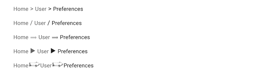
The breadcrumb separator used by default is “ / “. You can override it by passing a string or a function as the separator prop.
// use a separator string
const MyBreadcrumb = () => (
    <Breadcrumb separator=" > ">
        ...
    </Breadcrumb>
);

// use a separator function to set the separator pseudo-content CSS
const MyBreadcrumb = () => (
    <Breadcrumb separator={() => `url('data:image/png;base64,iVBORw0KGgoAA....')`}>
        ...
    </Breadcrumb>
);
sx
You can override the style of the breadcrumb and its items using the sx prop.
const MyBreadcrumb = () => (
    <Breadcrumb
        sx={{
            '& ul': { padding: 1, paddingLeft: 0 },
            '& ul:empty': { padding: 0 },
        }}
    >
        // ...
    </Breadcrumb>
);
<Breadcrumb.Item>
The <Breadcrumb.Item> component is responsible for rendering individual breadcrumb items. It displays the item when the app’s location matches the specified name. You can nest this component to create breadcrumb paths of varying depths.
It requires the following props:
name: Represents the item’s name, which is used to determine its full path in the breadcrumb.label: Specifies the display label for the item. Can be a string (including a translation key) or a function returning a string based on the location context.
It accepts the following optional props:
to: Defines the react-router path for the link. Can be a string, or a function that returns a string based on the location context.
Note: If the to prop is provided, <Breadcrumb.Item> will render as a link. Without it, the component will render as a <span>.
Here is an example breadcrumb rendering the CRUD path for a posts resource:
import { Breadcrumb } from '@react-admin/ra-navigation';

const MyBreadcrumb = () => (
    <Breadcrumb>
        <Breadcrumb.Item name="posts" label="Posts">
            <Breadcrumb.Item
                name="edit"
                label={({ record }) => `Edit "${record.title}"`}
                to={({ record }) => `/posts/${record.id}`}
            />
            <Breadcrumb.Item
                name="show"
                label={({ record }) => record.title}
                to={({ record }) => `/posts/${record.id}/show`}
            />
            <Breadcrumb.Item name="list" label="My Post List" />
            <Breadcrumb.Item name="create" label="Let's write a Post!" />
        </Breadcrumb.Item>
    </Breadcrumb>
);
Here is another example, showing how to use a React component as label:
import { Breadcrumb } from '@react-admin/ra-navigation';
import { Typography, Stack } from '@mui/material';
import NewspaperIcon from '@mui/icons-material/Newspaper';

const IconAndLabel = ({
    label,
    icon,
}: {
    label: string;
    icon: React.ReactNode;
}) => (
    <Stack
        direction="row"
        spacing={1}
        sx={{ alignItems: "center" }}
    >
        {icon}
        <Typography variant="body2">{label}</Typography>
    </Stack>
);

const MyBreadcrumb = () => (
    <Breadcrumb>
        <Breadcrumb.Item
            name="posts"
            label={
                <IconAndLabel
                    label="My Fabulous Posts"
                    icon={<NewspaperIcon />}
                />
            }
        >
            <Breadcrumb.Item
                name="edit"
                label={({ record }) => `Edit "${record.title}"`}
                to={({ record }) => `/posts/${record.id}`}
            />
            <Breadcrumb.Item
                name="show"
                label={({ record }) => record.title}
                to={({ record }) => `/posts/${record.id}/show`}
            />
            <Breadcrumb.Item name="create" label="Let's write a Post!" />
        </Breadcrumb.Item>
    </Breadcrumb>
);
<Breadcrumb> contains shortcut components for defining several <Breadcrumb.Item> children in a row: <Breadcrumb.ResourceItem>and <Breadcrumb.ResourceItems>.
<Breadcrumb.ResourceItem>
This component renders the 4 breadcrumb items for the CRUD routes of a given resource. It only takes the resource name and relies on the label prop defined in the <Resource options> for the label.
import { Breadcrumb } from '@react-admin/ra-navigation';

const MyBreadcrumb = () => (
    <Breadcrumb>
        <Breadcrumb.ResourceItem resource="posts" />
        <Breadcrumb.ResourceItem resource="comments" />
    </Breadcrumb>
);
is equivalent to:
// in src/MyBreadcrumb.jsx
import { Breadcrumb } from '@react-admin/ra-navigation';

export const MyBreadcrumb = () => (
    <Breadcrumb>
        <Breadcrumb.Item name="posts" label="Posts" to="/posts">
            <Breadcrumb.Item
                name="edit"
                label={({ record }) => `#${record.id}`}
                to={({ record }) => `/posts/${record.id}`}
            />
            <Breadcrumb.Item
                name="show"
                label={({ record }) => `#${record.id}`}
                to={({ record }) => `/posts/${record.id}/show`}
            />
            <Breadcrumb.Item name="create" label="Create" to="/posts/create" />
        </Breadcrumb.Item>
        <Breadcrumb.Item name="comments" label="Comments" to="/comments">
            <Breadcrumb.Item
                name="edit"
                label={({ record }) => `#${record.id}`}
                to={({ record }) => `/comments/${record.id}`}
            />
            <Breadcrumb.Item
                name="show"
                label={({ record }) => `#${record.id}`}
                to={({ record }) => `/comments/${record.id}/show`}
            />
            <Breadcrumb.Item
                name="create"
                label="Create"
                to="/comments/create"
            />
        </Breadcrumb.Item>
    </Breadcrumb>
);
Tip: If you need more fine-grained control over the labels, you can override the Resource Breadcrumb items.
<Breadcrumb.ResourceItems>
This component renders one <Breadcrumb.ResourceItem> for each of the <Resource> declared in the admin.
import { Breadcrumb } from '@react-admin/ra-navigation';

const MyBreadcrumb = () => (
    <Breadcrumb>
        <Breadcrumb.ResourceItems />
    </Breadcrumb>
);
Given the following app:
const App = () => (
    <Admin dataProvider={dataProvider} layout={MyLayout}>
        <Resource name="posts" list={PostList} />
        <Resource name="comments" list={CommentList} />
        <Resource name="tags" list={TagList} />
    </Admin>
);
The <Breadcrumb.ResourceItems> is equivalent to:
const MyBreadcrumb = () => (
    <Breadcrumb>
        <Breadcrumb.ResourceItem resource="posts" />
        <Breadcrumb.ResourceItem resource="comments" />
        <Breadcrumb.ResourceItem resource="tags" />
    </Breadcrumb>
);
This component can render <Breadcrumb.ResourceItem> for only a subset of resources defined in the resources prop.
const MyBreadcrumb = () => (
    <Breadcrumb>
        <Breadcrumb.ResourceItems resources={['posts', 'comments']} />
    </Breadcrumb>
);
This is equivalent to:
const MyBreadcrumb = () => (
    <Breadcrumb>
        <Breadcrumb.ResourceItem resource="posts" />
        <Breadcrumb.ResourceItem resource="comments" />
    </Breadcrumb>
);
Check the <Breadcrumb.ResourceItem> section for more information.
<Breadcrumb.DashboardItem>
A version of the <Breadcrumb.Item> dedicated to the dashboard.
It is convenient for customizing the dashboard item label.
const MyBreadcrumbCustomHome = () => (
    <Breadcrumb>
        <Breadcrumb.DashboardItem label="My Home">
            <Breadcrumb.ResourceItem resource="posts" />
            <Breadcrumb.ResourceItem resource="comments" />
        </Breadcrumb.DashboardItem>
    </Breadcrumb>
);
Just like with <Breadcrumb.Item>, you can also use a React component as label:
import { Breadcrumb } from '@react-admin/ra-navigation';
import { Box, Stack } from '@mui/material';
import { visuallyHidden } from '@mui/utils';
import CabinIcon from '@mui/icons-material/Cabin';

const MyBreadcrumbCustomHome = () => (
    <Breadcrumb>
        <Breadcrumb.DashboardItem
            label={
                <Stack
                    direction="row"
                    spacing={1}
                    sx={{ alignItems: "center" }}
                >
                    <CabinIcon />
                    <Box sx={visuallyHidden}>Dashboard</Box>
                </Stack>
            }
        >
            <Breadcrumb.ResourceItem resource="posts" />
            <Breadcrumb.ResourceItem resource="comments" />
        </Breadcrumb.DashboardItem>
    </Breadcrumb>
);
Tip: It’s a good practice to include a visually hidden placeholder (‘Dashboard’ in this example) for screen readers when using an icon as label.
<Breadcrumb.ListItem>
A version of the <Breadcrumb.Item> dedicated to list views. It accepts all <Breadcrumb.Item> props.
It is convenient for building custom breadcrumbs.
const MyBreadcrumb = () => (
    <Breadcrumb>
        <Breadcrumb.ListItem resource="posts">
            <Breadcrumb.EditItem resource="posts" />
            <Breadcrumb.ShowItem resource="posts" />
            <Breadcrumb.CreateItem resource="posts" />
        </Breadcrumb.ListItem>
    </Breadcrumb>
);
<Breadcrumb.CreateItem>
A version of the <Breadcrumb.Item> dedicated to create views. It accepts all <Breadcrumb.Item> props.
It is convenient for building custom breadcrumbs.
const MyBreadcrumb = () => (
    <Breadcrumb>
        <Breadcrumb.ListItem resource="posts">
            <Breadcrumb.EditItem resource="posts" />
            <Breadcrumb.ShowItem resource="posts" />
            <Breadcrumb.CreateItem resource="posts" />
        </Breadcrumb.ListItem>
    </Breadcrumb>
);
<Breadcrumb.EditItem>
A version of the <Breadcrumb.Item> dedicated to edit views. It is convenient for building custom breadcrumbs.
It accepts all <Breadcrumb.Item> props and an optional meta prop that allows you to provide a meta parameter matching the one set in the <Edit> component:
const MyBreadcrumb = () => (
    <Breadcrumb>
        <Breadcrumb.ListItem resource="posts">
            <Breadcrumb.EditItem resource="posts" meta={ { test: true } } />
            <Breadcrumb.ShowItem resource="posts" />
            <Breadcrumb.CreateItem resource="posts" />
        </Breadcrumb.ListItem>
    </Breadcrumb>
);

const PostEdit = () => (
    <Edit queryOptions={ { meta: { test: true } } }>
        // ...
    </Edit>
);
Tip: If your <Edit> component has a meta parameter but manually calls useDefineAppLocation and provides it with the record, you don’t need to set the meta prop on the <Breadcrumb.EditItem> as it will read the record from the AppLocationContext:
const MyBreadcrumb = () => (
    <Breadcrumb>
        <Breadcrumb.ListItem resource="posts">
            {/* meta are not provided here */}
            <Breadcrumb.EditItem resource="posts" />
            <Breadcrumb.ShowItem resource="posts" />
            <Breadcrumb.CreateItem resource="posts" />
        </Breadcrumb.ListItem>
    </Breadcrumb>
);

const PostEdit = () => (
    {/* meta are provided here */}
    <Edit queryOptions={ { meta: { test: true } } }>
        // ...
    </Edit>
);

const PostAppLocation = () => {
    const record = useRecordContext();
    // Pass the current record in the app location
    useDefineAppLocation('posts.edit', { record });
    return null;
}
<Breadcrumb.ShowItem>
A version of the <Breadcrumb.Item> dedicated to show views. It is convenient for building custom breadcrumbs.
It accepts all <Breadcrumb.Item> props and an optional meta prop that allows you to provide a meta parameter matching the one set in the <Show> component:
const MyBreadcrumb = () => (
    <Breadcrumb>
        <Breadcrumb.ListItem resource="posts">
            <Breadcrumb.EditItem resource="posts" />
            <Breadcrumb.ShowItem resource="posts" meta={ { test: true } } />
            <Breadcrumb.CreateItem resource="posts" />
        </Breadcrumb.ListItem>
    </Breadcrumb>
);


const PostShow = () => (
    <Show queryOptions={ { meta: { test: true } } }>
        // ...
    </Show>
);
Tip: If your <Show> component has a meta parameter but manually calls useDefineAppLocation and provides it with the record, you don’t need to set the meta prop on the <Breadcrumb.ShowItem> as it will read the record from the AppLocationContext:
const MyBreadcrumb = () => (
    <Breadcrumb>
        <Breadcrumb.ListItem resource="posts">
            <Breadcrumb.EditItem resource="posts" />
            {/* meta are not provided here */}
            <Breadcrumb.ShowItem resource="posts" />
            <Breadcrumb.CreateItem resource="posts" />
        </Breadcrumb.ListItem>
    </Breadcrumb>
);

const PostShow = () => (
    {/* meta are provided here */}
    <Show queryOptions={ { meta: { test: true } } }>
        // ...
    </Show>
);

const PostAppLocation = () => {
    const record = useRecordContext();
    // Pass the current record in the app location
    useDefineAppLocation('posts.show', { record });
    return null;
}
Admins With A Dashboard
If the app has a home page defined via the <Admin dashboard> prop, the Breadcrumb will automatically detect it and set the root of the Breadcrumb to this page.
The breadcrumb will show respectively:
- “🏠️ / Posts” on the Post List page
- “🏠️ / Posts / Show #1” on the Post Show page with id = 1
- “🏠️ / Posts / Edit #1” on the Post Edition page with id = 1
- “🏠️ / Posts / Create” on the Post Creation page
Tip: Even though it is rendered as a ‘home’ icon (🏠️), the dashboard breadcrumb item also contains the hidden placeholder text ‘Dashboard’, for screen readers. If you want to customize this text, e.g. to rename “Dashboard” to “Home”, provide a custom translation for the ra.page.dashboard message.
If you want to provide your own label for the dashboard breadcrumb item (either a string or a React component), you can use the <Breadcrumb.DashboardItem> component.
Adding Custom Pages
A page component can define its app location using the useDefineAppLocation hook:
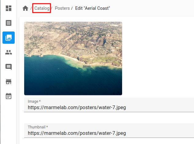
// in src/UserPreferences.jsx
import { useDefineAppLocation } from '@react-admin/ra-navigation';

const UserPreferences = () => {
    useDefineAppLocation('user.preferences');
    return <span>My Preferences</span>;
};
Let’s say that this custom page is added to the app under the /settings URL:
// in src/App.jsx
import { Admin, Resource, CustomRoutes, } from 'react-admin';
import { Route } from 'react-router-dom';

import { MyLayout } from './MyLayout';
import { UserPreferences } from './UserPreferences';

const App = () => (
    <Admin dataProvider={dataProvider} layout={MyLayout}>
        ...
        <CustomRoutes>
            <Route exact path="/settings" component={UserPreferences} />,
        </CustomRoutes>
    </Admin>
);
It’s the job of the <Breadcrumb> component to define the breadcrumb path for this page location using its children:
// in src/MyBreadcrumb.jsx
import { Breadcrumb } from '@react-admin/ra-navigation';

export const MyBreadcrumb = () => (
    <Breadcrumb>
        <Breadcrumb.ResourceItems />
        <Breadcrumb.Item name="user" label="User">
            <Breadcrumb.Item name="preferences" label="Preferences" to="/settings" />
        </Breadcrumb.Item>
    </Breadcrumb>
);
Finally, don’t forget to use the <MyBreadcrumb> component in the layout:
// in src/MyLayout.jsx
import { AppLocationContext, Breadcrumb } from '@react-admin/ra-navigation';
import { Layout } from 'react-admin';

import { MyBreadcrumb } from './MyBreadcrumb';

export const MyLayout = ({ children }) => (
    <AppLocationContext>
        <Layout>
            <MyBreadcrumb />
            {children}
        </Layout>
    </AppLocationContext>
);
Overriding Items For One Resource
In some cases, it’s useful to override the default resource breadcrumb path, e.g. to add a custom label instead of “Show #1”, “Edit #1”, etc. If the <Resource recordRepresentation> is not enough, you can disable the concerned resources in the <Breadcrumb.ResourceItems resources> prop, and declare the breadcrumb items for these resources manually.
import React from 'react';
import { AppLocationContext, Breadcrumb } from '@react-admin/ra-navigation';
import { Admin, Resource, Layout, useCreatePath, List } from 'react-admin';

const MyBreadcrumb = () => {
    const createPath = useCreatePath();

    return (
        <Breadcrumb>
            {/* no Breadcrumb.ResourceItem for the 'posts' resource */}
            <Breadcrumb.ResourceItems resources={['comments', 'tags']} />
            {/* we define it manually */}
            <Breadcrumb.Item name="posts" label="Posts">
                <Breadcrumb.Item
                    name="edit"
                    label={({ record }) => `Edit "${record.title}"`}
                    to={({ record }) => `/posts/${record.id}`}
                />
                <Breadcrumb.Item
                    name="show"
                    label={({ record }) => record.title}
                    to={({ record }) => `/posts/${record.id}/show`}
                />
                <Breadcrumb.Item name="create" label="Create" to="/posts/create" />
            </Breadcrumb.Item>
        </Breadcrumb>
    );
};

const MyLayout = ({ children }) => (
    <AppLocationContext>
        <Layout>
            <MyBreadcrumb />
            {children}
        </Layout>
    </AppLocationContext>
);

const App = () => (
    <Admin dataProvider={dataProvider} layout={MyLayout}>
        <Resource name="posts" list={PostList} />
        <Resource name="comments" list={CommentList} />
        <Resource name="tags" list={TagList} />
    </Admin>
);
Nested Resources
When using nested resources, you should create breadcrumb items for the sub-resources.
For instance, the screencast at the top of this page shows a songs resource nested in an artists resource, using the following routes:
import { Admin, Resource } from 'react-admin';
import { Route } from 'react-router-dom';

export const App = () => (
    <Admin dataProvider={dataProvider}>
        <Resource name="artists" list={ArtistList} edit={ArtistDetail}>
            <Route path=":id/songs" element={<SongList />} />
            <Route path=":id/songs/:songId" element={<SongDetail />} />
        </Resource>
    </Admin>
);
This setup creates four routes:
/artistsrenders the<ArtistList>element/artists/:idrenders the<ArtistDetail>element/artists/:id/songsrenders the<SongList>element/artists/:id/songs/:songIdrenders the<SongDetail>element
One app location is defined for each route:
/artists:artists(defined automatically)/artists/:id:artists.edit(defined automatically)/artists/:id/songs:artists.edit.songs(defined manually)/artists/:id/songs/:songId:artists.edit.songs.edit(defined manually)
Let’s see how the components for the songs list and detail pages define their app location:
// in src/songs/SongList.js
import { useGetOne, List, SearchInput, DataTable, DateField, useParams } from 'react-admin';
import { useDefineAppLocation } from '@react-admin/ra-navigation';

export const SongList = () => {
    const { id } = useParams();
    const { data: record } = useGetOne('artists', { id });
    useDefineAppLocation('artists.edit.songs', { record });
    return (
        <List
            resource="songs"
            filter={{ artist_id: id }}
            filters={[<SearchInput key="q" source="q" alwaysOn />]}
        >
            <DataTable>
                <DataTable.Col source="title" />
                <DataTable.Col source="released" field={DateField} />
                <DataTable.Col source="writer" />
                <DataTable.Col source="producer" />
                <DataTable.Col source="recordCompany" label="Label" />
                <DataTable.Col>
                    <EditSongButton />
                </DataTable.Col>
            </DataTable>
        </List>
    );
};

const EditSongButton = () => {
    const song = useRecordContext();
    return (
        <Button
            component={Link}
            to={`/artists/${song?.artist_id}/songs/${song?.id}`}
            startIcon={<EditIcon />}
        >
            Edit
        </Button>
    );
};
// in src/songs/SongDetail.js
import { useGetOne, Edit, SimpleForm, TextInput, DateInput, useParams } from 'react-admin';
import { useDefineAppLocation } from '@react-admin/ra-navigation';

export const SongDetail = () => {
    const { id, songId } = useParams();
    const { data: record } = useGetOne('artists', { id });
    const { data: song } = useGetOne('songs', { id: songId });
    useDefineAppLocation('artists.edit.songs.edit', { record, song });
    return (
        <Edit resource="songs" id={songId} redirect={`/artists/${id}/songs`}>
            <SimpleForm>
                <TextInput source="title" />
                <DateInput source="released" />
                <TextInput source="writer" />
                <TextInput source="producer" />
                <TextInput source="recordCompany" label="Label" />
            </SimpleForm>
        </Edit>
    );
};
Tip: The <Edit> component will call dataProvider.getOne("songs", { id: songId }) to fetch the song record. Since the <SongDetail> component makes the same request, React-admin will deduplicate the calls and only make one request to the dataProvider.
Tip: You don’t need to call useDefineAppLocation for the pages of the parent resource (artists) as this resource uses the default URLs (/artists, /artists/:id). The app location will be deduced automatically from these URLs (i.e. artists and artists.edit).
Once the app locations are properly set up, the Breadcrumb code comes naturally as:
const MyBreadcrumb = () => (
    <Breadcrumb>
        <Breadcrumb.Item name="artists" label="Artists" to="/artists">
            <Breadcrumb.Item
                name="edit"
                label={({ record }) => record?.name}
                to={({ record }) => `/artists/${record?.id}`}
            >
                <Breadcrumb.Item
                    name="songs"
                    label="Songs"
                    to={({ record }) => `/artists/${record?.id}/songs`}
                >
                    <Breadcrumb.Item
                        name="edit"
                        label={({ song }) => song?.title}
                        to={({ song }) => `/artists/${song?.artist_id}/songs/${song?.id}`}
                    />
                </Breadcrumb.Item>
            </Breadcrumb.Item>
            <Breadcrumb.Item
                name="create"
                label="Create"
                to="/artists/create"
            />
        </Breadcrumb.Item>
    </Breadcrumb>
);
Grouping Resources
You may want to group CRUD pages for several resources under a common parent item. For instance, let’s say that the pages for the songs and artists resources have to be grouped under a “Music” item. The breadcrumb path for the list pages of these resources should look like the following:
- “Music / Songs” on the Song List page
- “Music / Artists” on the Artist List page
To do so, override the app location of the CRUD pages using the useDefineAppLocation hook. Here is an example for the songs resource:
// in src/songs/SongList.jsx
import { List, DataTable } from 'react-admin';
import { useDefineAppLocation } from '@react-admin/ra-navigation';

export const SongList = () => {
    useDefineAppLocation('music.songs');
    return (
        <List>
            <DataTable>
                <DataTable.Col source="title" />
            </DataTable>
        </List>
    );
};

// in src/songs/SongEdit.jsx
import { Edit, SimpleForm, TextInput, useRecordContext } from 'react-admin';
import { useDefineAppLocation } from '@react-admin/ra-navigation';

const SongEditAppLocation = () => {
    const record = useRecordContext();
    useDefineAppLocation('music.songs.edit', { record });
    return null;
};

export const SongEdit = () => (
    <Edit>
        <SongEditAppLocation />
        <SimpleForm>
            <TextInput source="title" />
        </SimpleForm>
    </Edit>
);

// in src/songs/SongShow.jsx
import { Show, SimpleShowLayout, TextField, useRecordContext } from 'react-admin';
import { useDefineAppLocation } from '@react-admin/ra-navigation';

const SongShowAppLocation = () => {
    const record = useRecordContext();
    useDefineAppLocation('music.songs.show', { record });
    return null;
};

export const SongShow = () => (
    <Show>
        <SongShowAppLocation />
        <SimpleShowLayout>
            <TextField source="title" />
        </SimpleShowLayout>
    </Show>
);

// in src/songs/SongCreate.jsx
import { Create, SimpleForm, TextInput } from 'react-admin';
import { useDefineAppLocation } from '@react-admin/ra-navigation';

export const SongCreate = () => {
    useDefineAppLocation('music.songs.create');
    return (
        <Create>
            <SimpleForm>
                <TextInput source="title" />
            </SimpleForm>
        </Create>
    );
};
Then, in the breadcrumb, nest <Breadcrumb.ResourceItem> elements for the songs and artists resources under a parent <Breadcrumb.Item name="music">:
const MyBreadcrumb = () => (
    <Breadcrumb>
        <Breadcrumb.Item name="music" label="Music">
            <Breadcrumb.ResourceItem resource="songs" />
            <Breadcrumb.ResourceItem resource="artists" />
        </Breadcrumb.Item>
    </Breadcrumb>
);
As you see, you can compose Breadcrumb item elements at will.