<MultiLevelMenu>
This Enterprise Edition component adds support for nested sub menus in the left navigation bar.
When a React-admin application grows significantly, the default menu might not be the best solution. The <MultiLevelMenu> can help unclutter the navigation: it renders a menu with an infinite number of levels and sub-menus. Menu Items that are not at the top level are rendered inside a collapsible panel.
When a React-admin application grows significantly, the default <Menu> component might not be the best solution. The <MultiLevelMenu> can help unclutter the navigation: it renders a menu with an infinite number of levels and sub menus. Menu Items that are not at the top level are rendered inside a collapsible panel.
Test it live on the Enterprise Edition Storybook.
Usage
Create a custom Menu component using <MultiLevelMenu> as root instead of <Menu>. Menu entries should be <MultiLevelMenu.Item>, <MultiLevelMenu.ResourceItem> or <MultiLevelMenu.DashboardItem> components.
They are very similar to the default <MenuItemLink> from react-admin, except that they accept other <MultiLevelMenu.Item> (or <MultiLevelMenu.ResourceItem> or <MultiLevelMenu.DashboardItem>) as their children.
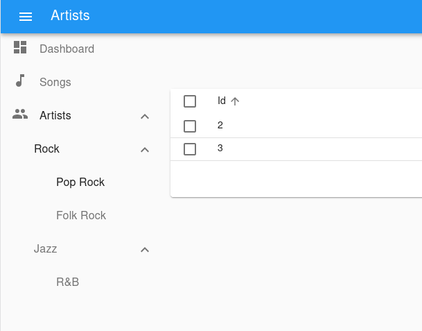
For instance, here is how to create a menu with sub menus for each artist genre. The menu target is actually the same page - the artists list - but with a different filter:
import { MultiLevelMenu } from '@react-admin/ra-navigation';

import DashboardIcon from '@mui/icons-material/Dashboard';
import MusicIcon from '@mui/icons-material/MusicNote';
import PeopleIcon from '@mui/icons-material/People';

const MyMenu = () => (
    <MultiLevelMenu>
        <MultiLevelMenu.DashboardItem />
        <MultiLevelMenu.ResourceItem resource="songs" icon={<MusicIcon />}  />
        {/* The empty filter is required to avoid falling back to the previously set filter */}
        <MultiLevelMenu.ResourceItem resource="artists" to={'/artists?filter={}'} icon={<PeopleIcon />}>
            <MultiLevelMenu.Item name="artists.rock" to={'/artists?filter={"type":"Rock"}'} label="Rock">
                <MultiLevelMenu.Item name="artists.rock.pop" to={'/artists?filter={"type":"Pop Rock"}'} label="Pop Rock" />
                <MultiLevelMenu.Item name="artists.rock.folk" to={'/artists?filter={"type":"Folk Rock"}'} label="Folk Rock" />
            </MultiLevelMenu.Item>
            <MultiLevelMenu.Item name="artists.jazz" to={'/artists?filter={"type":"Jazz"}'} label="Jazz">
                <MultiLevelMenu.Item name="artists.jazz.rb" to={'/artists?filter={"type":"RB"}'} label="R&B" />
            </MultiLevelMenu.Item>
        </MultiLevelMenu.ResourceItem>
    </MultiLevelMenu>
);
Note that each <MultiLevelMenu.Item> requires a unique name attribute.
Then, create a custom layout using the <Layout> component and pass your custom menu component to it. Make sure you wrap the layout with the <AppLocationContext> component.
// in src/MyLayout.js
import { Layout } from 'react-admin';
import { AppLocationContext } from '@react-admin/ra-navigation';

import { MyMenu } from './MyMenu';

export const MyLayout = ({ children }) => (
  <AppLocationContext>
    <Layout menu={MyMenu}>
        {children}
    </Layout>
  </AppLocationContext>
);
<AppLocationContext> is necessary because ra-navigation doesn’t use the URL to detect the current location. Instead, page components declare their location using a custom hook (useDefineAppLocation()). This allows complex site maps, with multiple levels of nesting. That’s the reason why each <MultiLevelMenu.Item> requires a unique name, that matches a particular page location.
You can set the AppLocation for a given page like so:
import { useDefineAppLocation } from '@react-admin/ra-navigation';

const ArtistRockList = () => {
    useDefineAppLocation('artists.rock');
    return <h1>Artist Rock List</h1>;
};
And then use this AppLocation as name for <MultiLevelMenu.Item>:
<MultiLevelMenu.Item
    name="artists.rock"
    to={'/artists/rock'}
    label="Rock"
>
Check the ra-navigation documentation to learn more about App Location.
Finally, pass this custom layout to the <Admin> component
// in src/App.js
import { Admin, Resource } from "react-admin";

import { MyLayout } from './MyLayout';

const App = () => (
    <Admin
        layout={MyLayout}
        dataProvider={...}
    >
        // ...
    </Admin>
);
Props
| Prop | Required | Type | Default | Description |
|---|---|---|---|---|
children |
Optional | ReactNode |
- | The Menu Items to be rendered. |
initialOpen |
Optional | boolean |
false |
Whether the menu items with sub menus should be open initially. Has no effect if using the categories variant. |
openItemList |
Optional | string[] |
- | List of names of menu items that should be opened by default. |
sx |
Optional | SxProps |
- | Style overrides, powered by MUI System |
Additional props are passed down to the root <div> component.
children
The menu items to render:
// in src/MyMenu.js
import { MultiLevelMenu } from "@react-admin/ra-navigation";

import MusicIcon from '@mui/icons-material/MusicNote';
import PeopleIcon from '@mui/icons-material/People';

const MyMenu = () => (
    <MultiLevelMenu>
        <MultiLevelMenu.DashboardItem />
        <MultiLevelMenu.ResourceItem resource="songs" icon={<MusicIcon />}  />
        {/* The empty filter is required to avoid falling back to the previously set filter */}
        <MultiLevelMenu.ResourceItem
            resource="artists"
            to={'/artists?filter={}'}
            icon={<PeopleIcon />}
        >
            <MultiLevelMenu.Item
                name="artists.rock"
                to={'/artists?filter={"type":"Rock"}'}
                label="Rock"
            >
                <MultiLevelMenu.Item
                    name="artists.rock.pop"
                    to={'/artists?filter={"type":"Pop Rock"}'}
                    label="Pop Rock"
                />
                <MultiLevelMenu.Item
                    name="artists.rock.folk"
                    to={'/artists?filter={"type":"Folk Rock"}'}
                    label="Folk Rock"
                />
            </MultiLevelMenu.Item>
            <MultiLevelMenu.Item
                name="artists.jazz"
                to={'/artists?filter={"type":"Jazz"}'}
                label="Jazz"
            >
                <MultiLevelMenu.Item
                    name="artists.jazz.rb"
                    to={'/artists?filter={"type":"RB"}'}
                    label="R&B"
                />
            </MultiLevelMenu.Item>
        </MultiLevelMenu.ResourceItem>
    </MultiLevelMenu>
);
Check the <MultiLevelMenu.Item> section for more information.
initialOpen
Whether the menu items with sub menus should be open initially. Has no effect if using the categories variant. Defaults to false.
export const MyMenu = () => (
    <MultiLevelMenu initialOpen>
        // ...
    </MultiLevelMenu>
);
openItemList
List of names of menu items that should be opened by default.
If the menu item to be opened is nested, you have to fill in the name of all the parent items. Ex: ['artists', 'artists.rock', 'artists.rock.pop']
import { MultiLevelMenu } from '@react-admin/ra-navigation';
const MyMenu = () => (
    <MultiLevelMenu openItemList={['artists', 'artists.rock', 'artists.rock.pop']}>
        <MultiLevelMenu.DashboardItem />
        <MultiLevelMenu.ResourceItem resource="songs" />
        {/* The empty filter is required to avoid falling back to the previously set filter */}
        <MultiLevelMenu.ResourceItem
            resource="artists"
            to={'/artists?filter={}'}
        >
            <MultiLevelMenu.Item
                name="artists.rock"
                to={'/artists?filter={"type":"Rock"}'}
                label="Rock"
            >
                <MultiLevelMenu.Item
                    name="artists.rock.pop"
                    to={'/artists?filter={"type":"Pop Rock"}'}
                    label="Pop Rock"
                />
                <MultiLevelMenu.Item
                    name="artists.rock.folk"
                    to={'/artists?filter={"type":"Folk Rock"}'}
                    label="Folk Rock"
                />
            </MultiLevelMenu.Item>
            <MultiLevelMenu.Item
                name="artists.jazz"
                to={'/artists?filter={"type":"Jazz"}'}
                label="Jazz"
            >
                <MultiLevelMenu.Item
                    name="artists.jazz.rb"
                    to={'/artists?filter={"type":"RB"}'}
                    label="R&B"
                />
            </MultiLevelMenu.Item>
        </MultiLevelMenu.ResourceItem>
    </MultiLevelMenu>
);
sx: CSS API
Pass an sx prop to customize the style of the main component and the underlying elements.
export const MyMenu = () => (
    <MultiLevelMenu sx={{ marginTop: 0 }}>
        // ...
    </MultiLevelMenu>
);
To override the style of <MultiLevelMenu> using the application-wide style overrides, use the RaMenuRoot key.
Style overrides, powered by MUI System:
| Rule name | Description |
|---|---|
RaMultiLevelMenu |
Applied to the root div element |
& .RaMultiLevelMenu-nav |
Applied to the nav element |
& .RaMultiLevelMenu-navWithCategories |
Applied to the nav element when using the categories variant |
& .RaMultiLevelMenu-list |
Applied to the MUI <List> |
<MultiLevelMenu.Item>
The <MultiLevelMenu.Item> component displays a menu item with a label and an icon.
<MultiLevelMenu.Item
    name="songs"
    to="/songs"
    label="Songs"
    icon={<MusicIcon />}
/>
Usage
import { MultiLevelMenu } from '@react-admin/ra-navigation';
const MyMenu = () => (
    <MultiLevelMenu>
        {/* The empty filter is required to avoid falling back to the previously set filter */}
        <MultiLevelMenu.Item
            name="artists"
            to={'/artists?filter={}'}
            label="artists"
        >
            <MultiLevelMenu.Item
                name="artists.rock"
                to={'/artists?filter={"type":"Rock"}'}
                label="Rock"
            >
                <MultiLevelMenu.Item
                    name="artists.rock.pop"
                    to={'/artists?filter={"type":"Pop Rock"}'}
                    label="Pop Rock"
                />
                <MultiLevelMenu.Item
                    name="artists.rock.folk"
                    to={'/artists?filter={"type":"Folk Rock"}'}
                    label="Folk Rock"
                />
            </MultiLevelMenu.Item>
            <MultiLevelMenu.Item
                name="artists.jazz"
                to={'/artists?filter={"type":"Jazz"}'}
                label="Jazz"
            >
                <MultiLevelMenu.Item
                    name="artists.jazz.rb"
                    to={'/artists?filter={"type":"RB"}'}
                    label="R&B"
                />
            </MultiLevelMenu.Item>
        </MultiLevelMenu.Item>
    </MultiLevelMenu>
);
Props
In addition to the props of react-router <NavLink> and those of material-ui <ListItem>.
| Prop | Required | Type | Default | Description |
|---|---|---|---|---|
children |
Optional | ReactNode |
The sub-menu items to be rendered. | |
name |
Required | string |
The name of the item. Used to manage its open/closed state. | |
icon |
Optional | ReactNode |
- | An icon element to display in front of the item. |
label |
Optional | string |
- | The label to display for this item. Accepts translation keys. |
to |
Required | string |
- | The location to link to. |
sx |
Optional | SxProps |
- | Style overrides, powered by MUI System. |
Additional props are passed down to the underling Material UI <listItem> component.
Tip: You can omit the to from <NavLink> property for <MultiLevelMenu.Item> elements that have a child menu item.
children
Pass a children to <MultiLevelMenu.Item> to define the sub-menu entries:
import { MultiLevelMenu } from "@react-admin/ra-navigation";
import PeopleIcon from '@mui/icons-material/People';

const MyMenu = () => (
    <MultiLevelMenu>
        <MultiLevelMenu.Item
            name="artists"
            to={'/artists?filter={}'}
            label="Artists"
            icon={<PeopleIcon />}
        >
            <MultiLevelMenu.Item
                name="artists.rock"
                to={'/artists?filter={"type":"Rock"}'}
                label="Rock"
            >
                <MultiLevelMenu.Item
                    name="artists.rock.pop"
                    to={'/artists?filter={"type":"Pop Rock"}'}
                    label="Pop Rock"
                />
                <MultiLevelMenu.Item
                    name="artists.rock.folk"
                    to={'/artists?filter={"type":"Folk Rock"}'}
                    label="Folk Rock"
                />
            </MultiLevelMenu.Item>
            <MultiLevelMenu.Item
                name="artists.jazz"
                to={'/artists?filter={"type":"Jazz"}'}
                label="Jazz"
            >
                <MultiLevelMenu.Item
                    name="artists.jazz.rb"
                    to={'/artists?filter={"type":"RB"}'}
                    label="R&B"
                />
            </MultiLevelMenu.Item>
        </MultiLevelMenu.Item>
    </MultiLevelMenu>
);
name
The name of the item. Used to manage its open/closed state.
import { MultiLevelMenu } from '@react-admin/ra-navigation';
const MyMenu = () => (
    <MultiLevelMenu>
        <MultiLevelMenu.Item name="artists" to={'/artists?filter={}'} />
    </MultiLevelMenu>
);
icon
An icon element to display in front of the item.
import { MultiLevelMenu } from '@react-admin/ra-navigation';
import PeopleIcon from '@mui/icons-material/People';
const MyMenu = () => (
    <MultiLevelMenu>
        <MultiLevelMenu.Item name="artists" to={'/artists?filter={}'} icon={<PeopleIcon />} />
    </MultiLevelMenu>
);
label
The label to display for this item. Accepts translation keys.
import { MultiLevelMenu } from '@react-admin/ra-navigation';
import PeopleIcon from '@mui/icons-material/People';
const MyMenu = () => (
    <MultiLevelMenu>
        <MultiLevelMenu.Item name="artists" to={'/artists?filter={}'} label="Artists" />
        <MultiLevelMenu.Item name="settings" to={'/artists?filter={}'} label="myapp.menu.settings" />
    </MultiLevelMenu>
);
to
The location to go to for this item. Accepts a path.
import { MultiLevelMenu } from '@react-admin/ra-navigation';

const MyMenu = () => (
    <MultiLevelMenu>
        <MultiLevelMenu.Item name="artists" to="/artists" />
        <MultiLevelMenu.Item name="settings" to="/settings" />
    </MultiLevelMenu>
);
sx
Style overrides, powered by MUI System:
| Rule name | Description |
|---|---|
RaMenuItem |
Applied to the root div element |
& .RaMenuItem-container |
Applied to the MUI <ListItem> element |
& .RaMenuItem-link |
Applied to the text of the NavLink |
& .RaMenuItem-active |
Applied to the text of the NavLink when active (this item is the current page) |
& .RaMenuItem-menuIcon |
Applied to the MUI <ListItemIcon> element |
& .RaMenuItem-icon |
Applied to the item icon element |
& .RaMenuItem-button |
Applied to the MUI <IconButton> that open/closes the item children list |
& .RaMenuItem-nestedList |
Applied to the MUI <List> element that contains the item children |
& .RaMenuItem-hiddenNestedList |
Applied to the MUI <List> element that contains the item children when collapsed |
& .RaMenuItem-itemButton |
Applied to the MUI <ListItemButton> |
import { MultiLevelMenu } from '@react-admin/ra-navigation';
const MyMenu = () => (
    <MultiLevelMenu>
        <MultiLevelMenu.Item name="artists" to={'/artists?filter={}'} sx={{ border: 'solid 1px #000' }} />
    </MultiLevelMenu>
);
<MultiLevelMenu.DashboardItem>
A <MultiLevelMenu.Item> for the dashboard.
Usage
import { MultiLevelMenu } from '@react-admin/ra-navigation';

const MyMenu = () => (
    <MultiLevelMenu>
        <MultiLevelMenu.DashboardItem />
    </MultiLevelMenu>
);
It accepts all props from <MultiLevelMenu.Item>
<MultiLevelMenu.ResourceItem>
A <MultiLevelMenu.Item> for resources. It only needs the resource name and automatically applies access control if your authProvider implements canAccess by calling it with the following parameters:
{
    resource: "posts",
    action: "list",
}
Usage
import { MultiLevelMenu } from '@react-admin/ra-navigation';

const MyMenu = () => (
    <MultiLevelMenu>
        <MultiLevelMenu.ResourceItem resource="artists" />
    </MultiLevelMenu>
);
Props
In addition to the props of <MultiLevelMenu.Item>, it accepts the following props
| Prop | Required | Type | Default | Description |
|---|---|---|---|---|
resource |
Required | string |
The resource this item refers to. |
Tip: Note that the name prop from <MultiLevelMenu.Item> is optional for <MultiLevelMenu.ResourceItem>.
resource
The resource this item refers to
import { MultiLevelMenu } from '@react-admin/ra-navigation';

const MyMenu = () => (
    <MultiLevelMenu>
        <MultiLevelMenu.ResourceItem resource="artists" />
    </MultiLevelMenu>
);
Creating Menu Items For Resources
If you want to render a custom menu item and the default resource menu items, use the useResourceDefinitions hook to retrieve the list of resources and create one menu item per resource.
// in src/MyMenu.js
import { createElement } from 'react';
import { useResourceDefinitions } from 'react-admin';
import { MultiLevelMenu } from "@react-admin/ra-navigation";
import LabelIcon from '@mui/icons-material/Label';

export const MyMenu = () => {
    const resources = useResourceDefinitions();

    return (
        <MultiLevelMenu>
            {Object.keys(resources).map(name => (
                <MultiLevelMenu.ResourceItem
                    key={name}
                    resource={name}
                    label={resources[name].options && resources[name].options.label || name}
                    icon={createElement(resources[name].icon)}
                />
            ))}
            <MultiLevelMenu.Item name="custom.route" to="/custom-route" label="Miscellaneous" icon={<LabelIcon />} />
        </MultiLevelMenu>
    );
};