
Application Theme
If you want to override some styles across the entire application, you can use a custom theme, leveraging the Material UI Theming support. Custom themes let you override colors, fonts, spacing, and even the style of individual components.
The e-commerce demo contains a theme switcher, so you can test them in a real application.
Setting The Application Theme
You can override the style of the entire application by passing a custom theme to the <Admin> component:
import { Admin, defaultTheme } from 'react-admin';
import { deepmerge } from '@mui/utils';
import indigo from '@mui/material/colors/indigo';
import pink from '@mui/material/colors/pink';
import red from '@mui/material/colors/red';

const myTheme = deepmerge(defaultTheme, {
    palette: {
        primary: indigo,
        secondary: pink,
        error: red,
        contrastThreshold: 3,
        tonalOffset: 0.2,
    },
    typography: {
        // Use the system font instead of the default Roboto font.
        fontFamily: ['-apple-system', 'BlinkMacSystemFont', '"Segoe UI"', 'Arial', 'sans-serif'].join(','),
    },
});

const App = () => (
    <Admin theme={myTheme}>
        // ...
    </Admin>
);
You can either use built-in themes, or write your own.
Note that you don’t need to call Material-UI’s createTheme yourself. React-admin will do it for you.
Light And Dark Themes
It’s a common practice to support both a light theme and a dark theme in an application, and let users choose which one they prefer.
React-admin provides a built-in dark theme by default, the default application theme depends on the user’s system settings. If the user has chosen a dark mode in their OS, react-admin will use the dark theme. Otherwise, it will use the light theme.
In addition, users can switch from one theme to the other using the <ToggleThemeButton> component, that appears in the AppBar as soon as you define a darkTheme prop.
You can override the dark theme by setting the <Admin>’s darkTheme prop with your own theme:
import { Admin, defaultDarkTheme, defaultLightTheme } from 'react-admin';
import { deepmerge } from '@mui/utils';

const lightTheme = defaultLightTheme;
const darkTheme = deepmerge(defaultDarkTheme, { palette: { mode: 'dark' } });

const App = () => (
    <Admin
        dataProvider={...}
        theme={lightTheme}
        darkTheme={darkTheme}
    >
        // ...
    </Admin>
);
Tip: If you don’t need the default dark theme, you can set the <Admin>’s darkTheme prop to null:
const App = () => (
    <Admin darkTheme={null}>
        // ...
    </Admin>
);
Tip: If you provide both a theme and a darkTheme, react-admin will choose the default theme to use for each user based on their OS preference. If you prefer to always default to the light or the dark theme regardless of the user’s OS preference, you can set the <Admin defaultTheme> prop to either “light” or “dark”:
const App = () => (
    <Admin defaultTheme="light">
        // ...
    </Admin>
);
Built-In Themes
React-admin comes with 5 built-in themes, each one having a light and a dark variant. You can use them as a starting point for your custom theme, or use them as-is.
Default 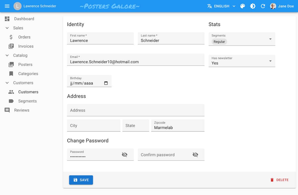 |
B&W 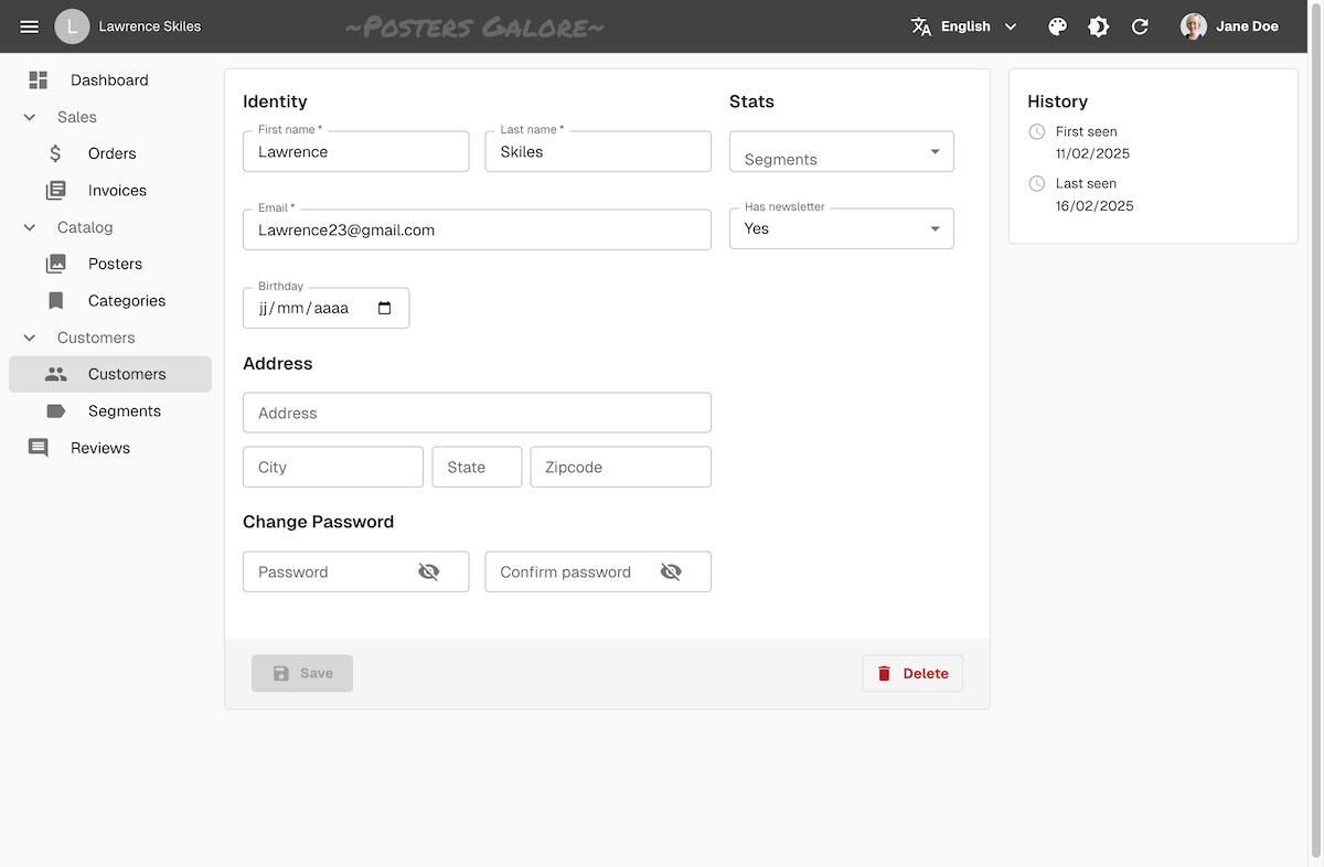 |
Nano 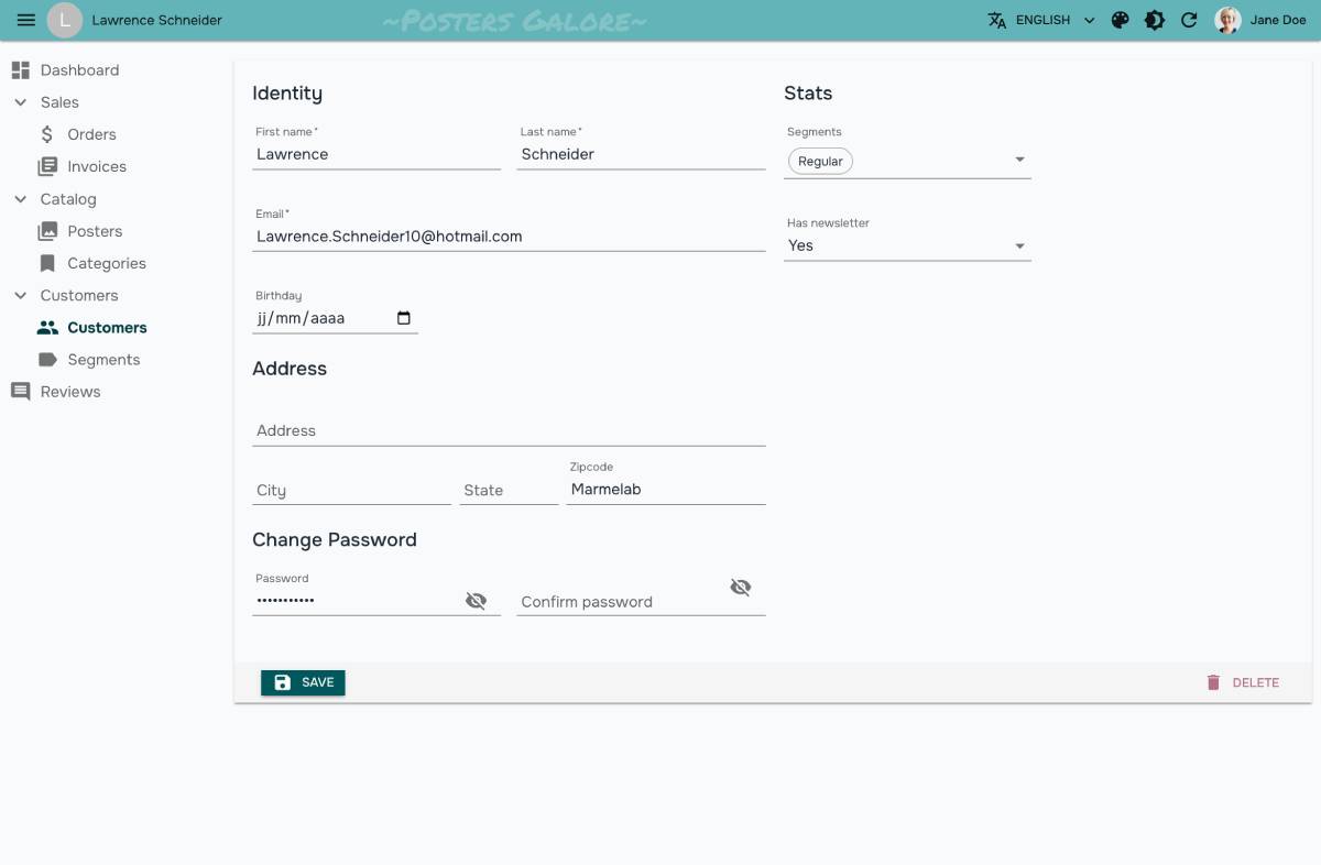 |
Radiant 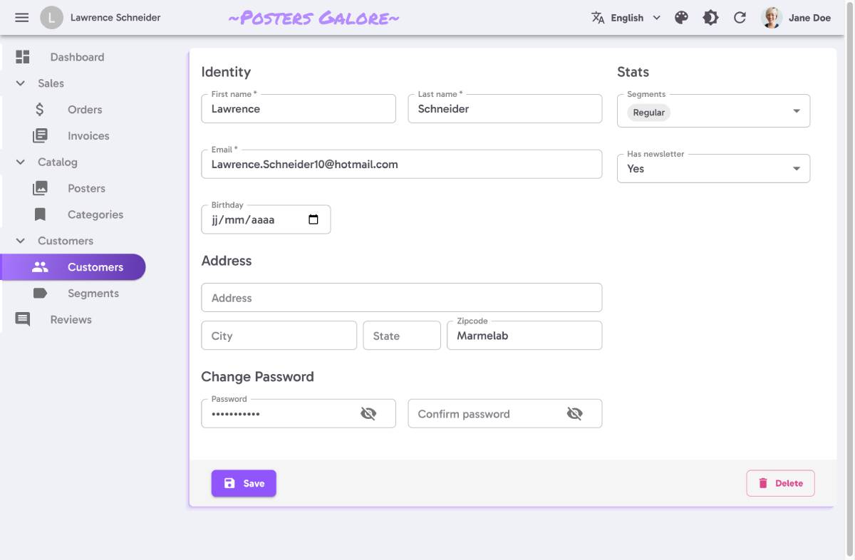 |
House 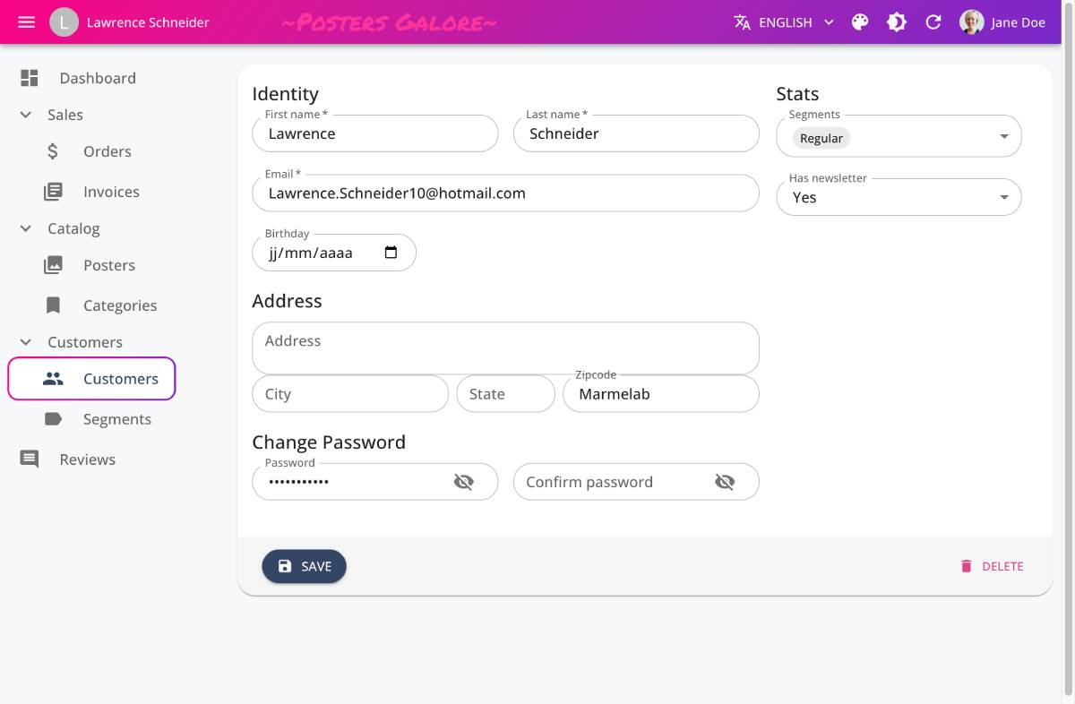 |
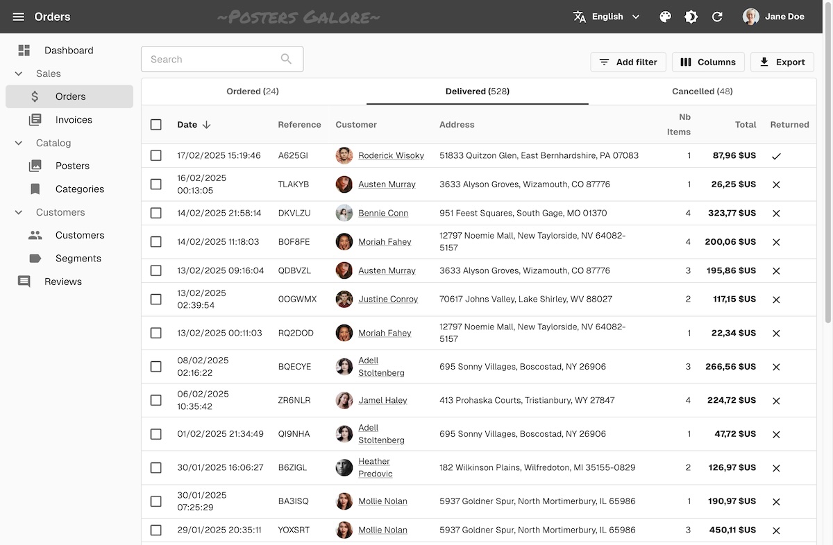
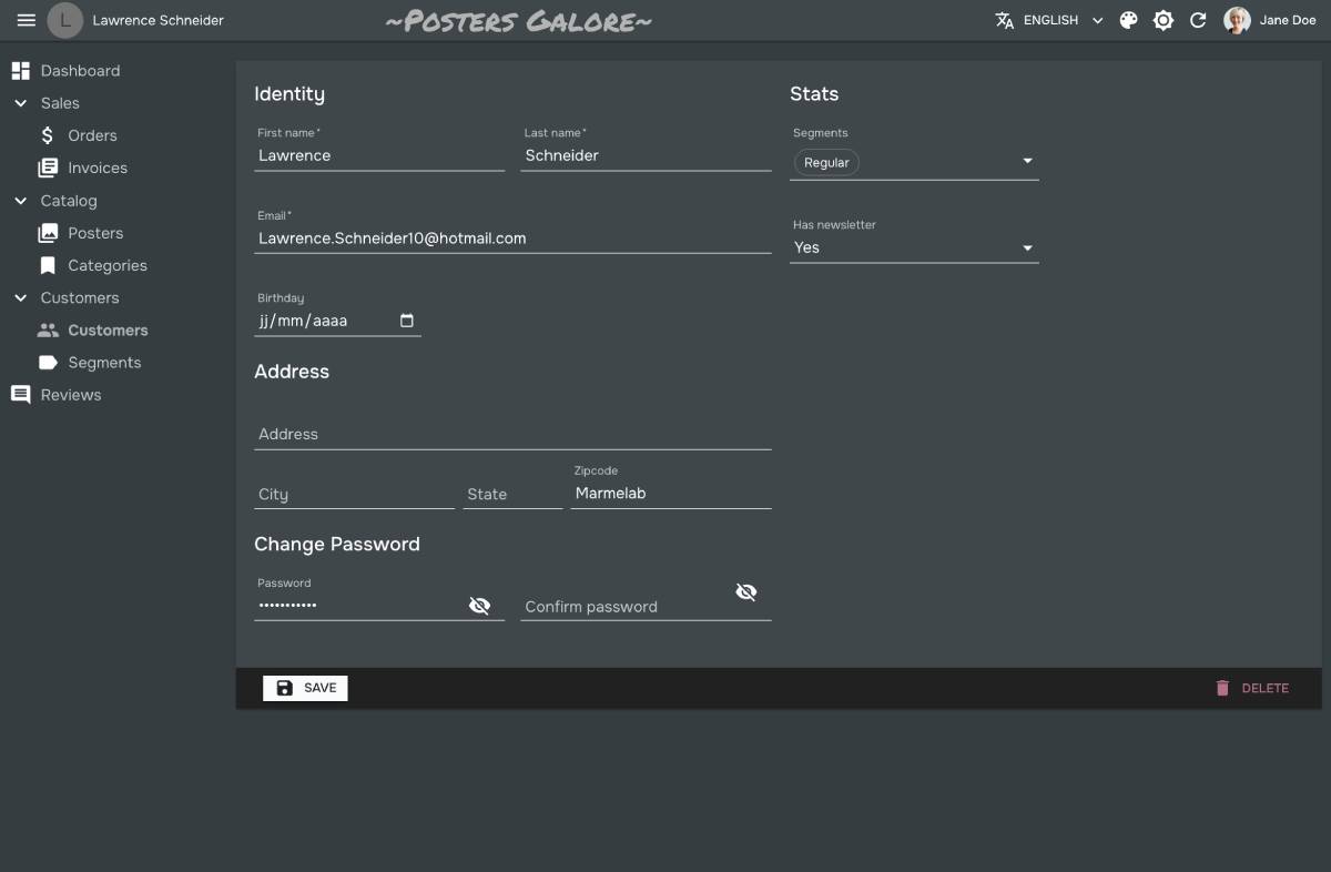
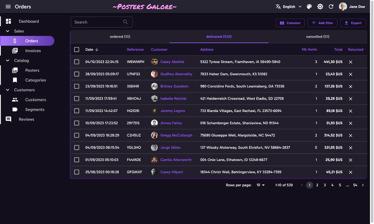
Default
The default theme is a good fit for every application, and works equally well on desktop and mobile.

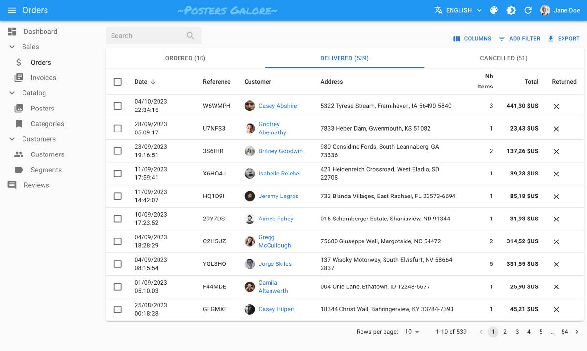
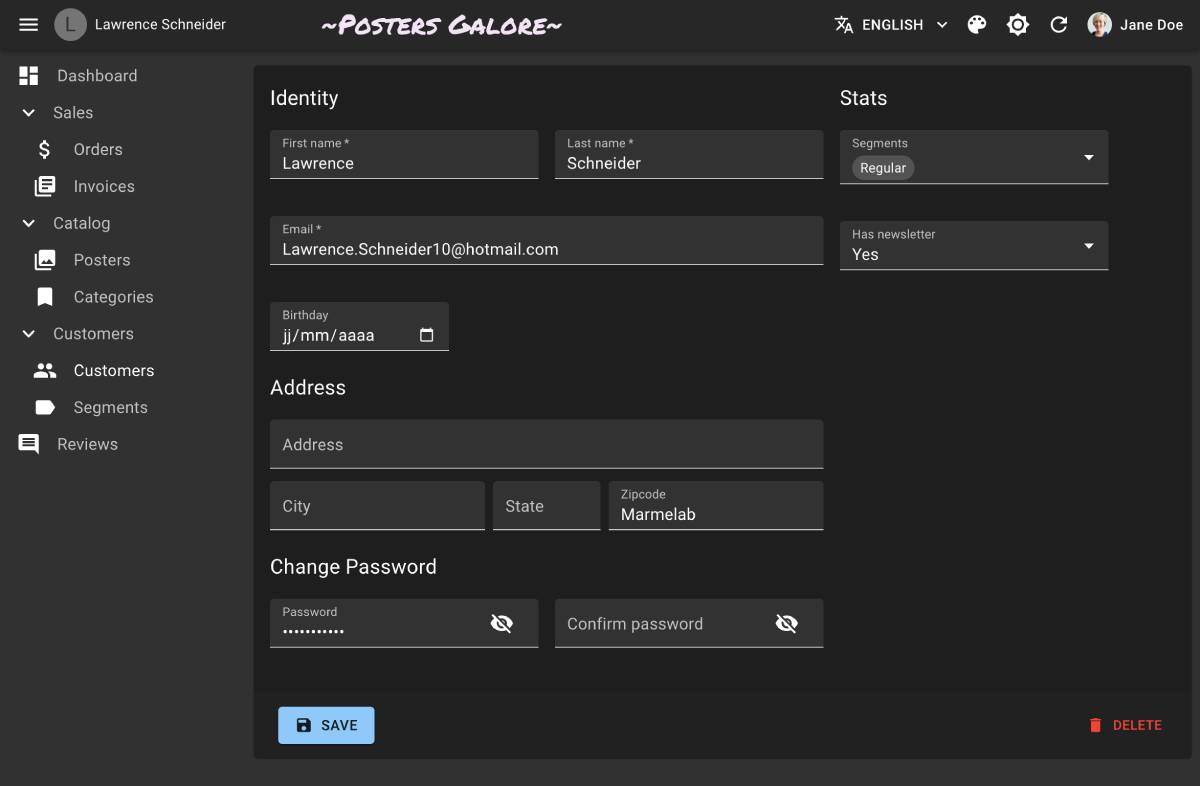
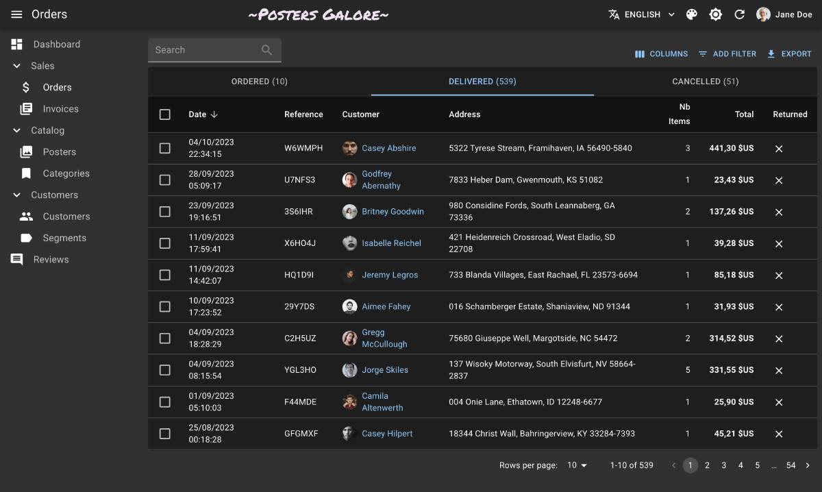
You don’t need to configure anything to use the default theme - it comes out of the box with react-admin.
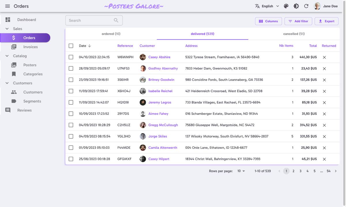
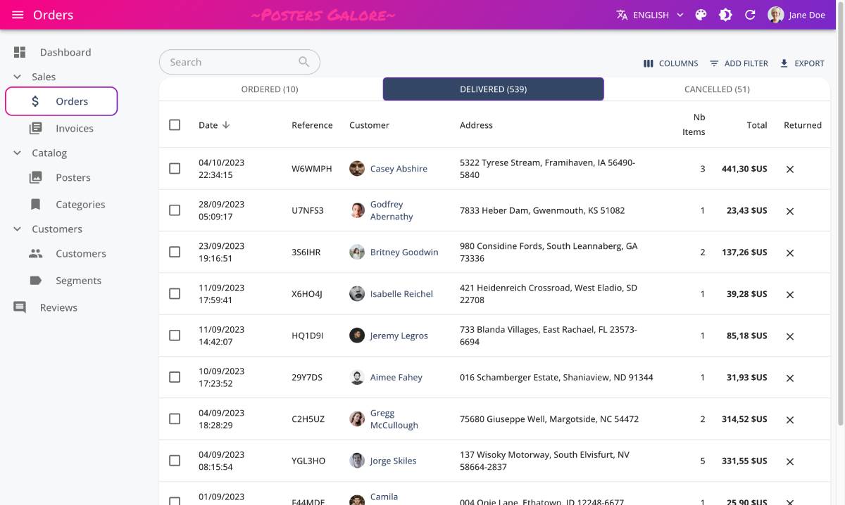
B&W
A high-contrast theme with a black and white palette, ideal for visually impaired users. Its modern-looking style, reminiscent of shadcn, is suitable for desktop apps.

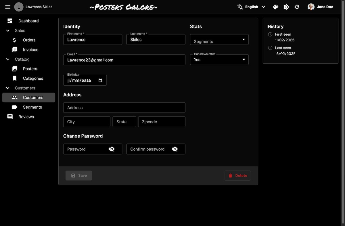
To use the B&W theme, import the bwLightTheme and bwDarkTheme objects, and pass them to the <Admin> component:
import { Admin, bwLightTheme, bwDarkTheme } from 'react-admin';

export const App = () => (
    <Admin
        dataProvider={dataProvider}
        theme={bwLightTheme}
        darkTheme={bwDarkTheme}
    >
        // ...
    </Admin>
);
You must also import the Geist font in your index.html file:
<link href="https://fonts.googleapis.com/css2?family=Geist:wght@100..900&display=swap" rel="stylesheet">
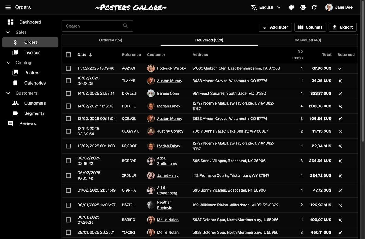
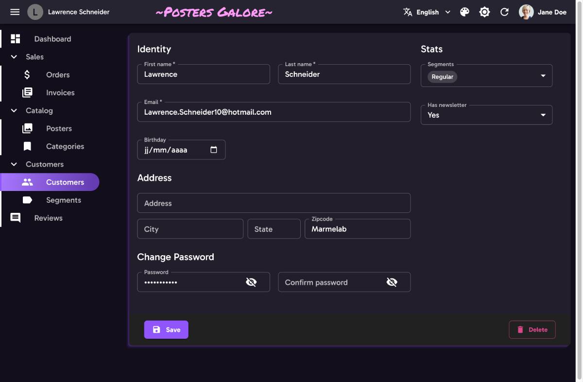
Nano
A dense theme with minimal chrome, ideal for complex apps. It uses a small font size, reduced spacing, text buttons, standard variant inputs, pale colors. Only fit for desktop apps.

To use the Nano theme, import the nanoLightTheme and nanoDarkTheme objects, and pass them to the <Admin> component:
import { Admin, nanoLightTheme, nanoDarkTheme } from 'react-admin';
import { dataProvider } from './dataProvider';

export const App = () => (
    <Admin
        dataProvider={dataProvider}
        theme={nanoLightTheme}
        darkTheme={nanoDarkTheme}
    >
        // ...
    </Admin>
);
You must also import the Inter font in your index.html file:
<link href="https://fonts.googleapis.com/css2?family=Inter:wght@300;400;500;700&display=swap" rel="stylesheet">
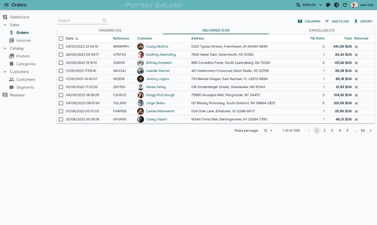
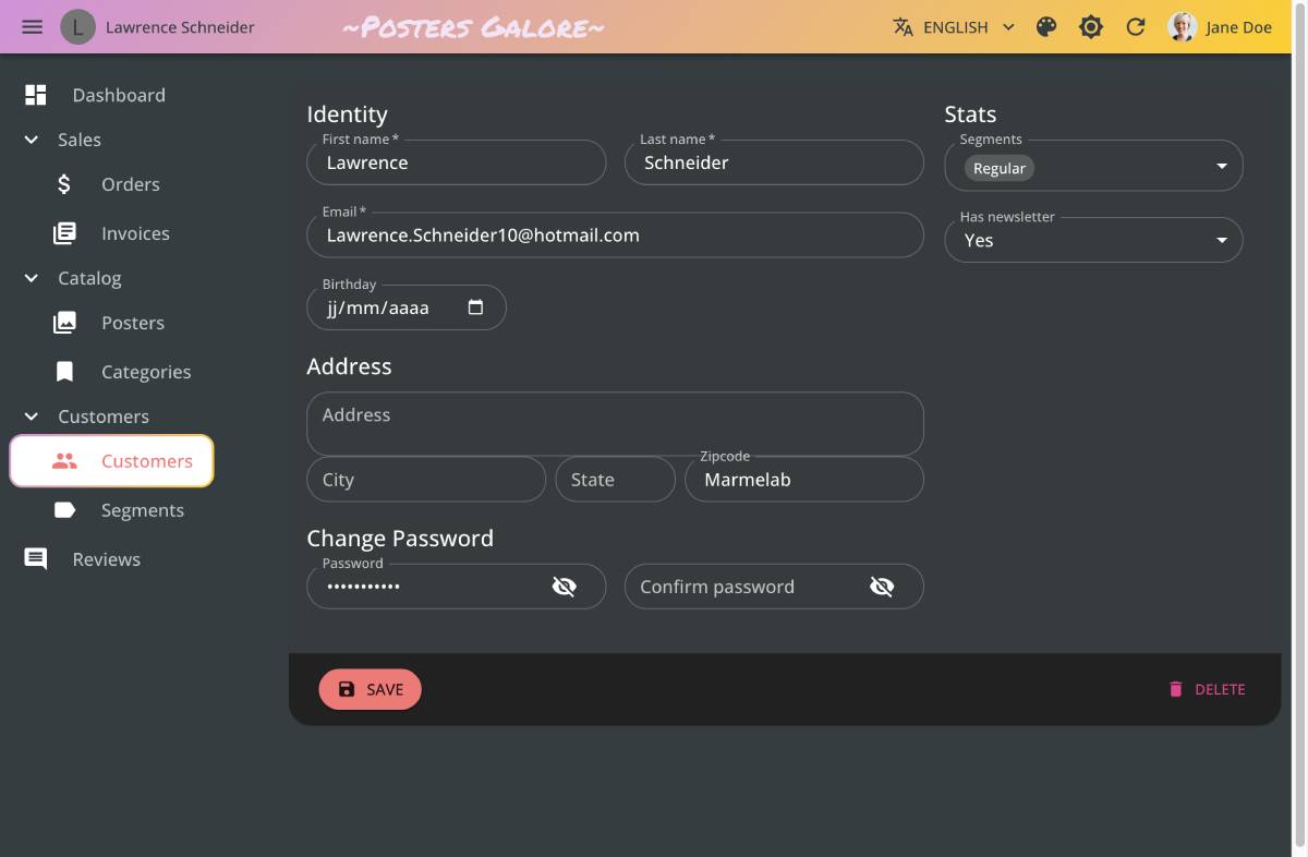
Radiant
A theme emphasizing clarity and ease of use. It uses generous margins, outlined inputs and buttons, no uppercase, and an acid color palette.

To use the Radiant theme, import the radiantLightTheme and radiantDarkTheme objects, and pass them to the <Admin> component:
import { Admin, radiantLightTheme, radiantDarkTheme } from 'react-admin';
import { dataProvider } from './dataProvider';

export const App = () => (
    <Admin
        dataProvider={dataProvider}
        theme={radiantLightTheme}
        darkTheme={radiantDarkTheme}
    >
        // ...
    </Admin>
);
You must also import the Gabarito font in your index.html file:
<link href="https://fonts.googleapis.com/css2?family=Gabarito:wght@500;600;700;900&display=swap" rel="stylesheet">
House
A young and joyful theme. It uses rounded corners, blurry backdrop, large padding, and a bright color palette.

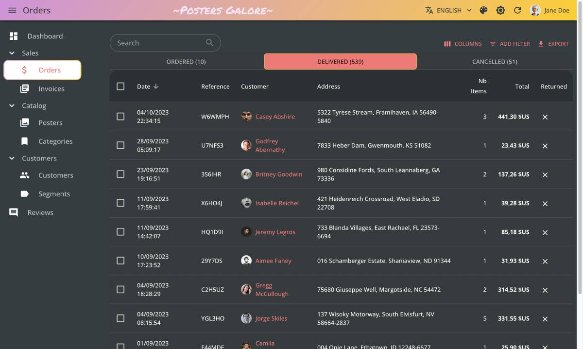
To use the House theme, import the houseLightTheme and houseDarkTheme objects, and pass them to the <Admin> component:
import { Admin, houseLightTheme, houseDarkTheme } from 'react-admin';
import { dataProvider } from './dataProvider';

export const App = () => (
    <Admin
        dataProvider={dataProvider}
        theme={houseLightTheme}
        darkTheme={houseDarkTheme}
    >
        // ...
    </Admin>
);
You must also import the Open Sans font in your index.html file:
<link href="https://fonts.googleapis.com/css2?family=Open+Sans:wght@300;500;600;700&display=swap" rel="stylesheet">
Changing the Theme Programmatically
React-admin provides the useTheme hook to read and update the theme programmatically. It uses the same syntax as useState. Its used internally by the <ToggleThemeButton> component.
import { defaultTheme, useTheme } from 'react-admin';
import { Button } from '@mui/material';

const ThemeToggler = () => {
    const [theme, setTheme] = useTheme();

    return (
        <Button onClick={() => setTheme(theme === 'dark' ? 'light' : 'dark')}>
            {theme === 'dark' ? 'Switch to light theme' : 'Switch to dark theme'}
        </Button>
    );
}
Theming Individual Components
In a custom theme, you can override the style of a component for the entire application using the components key.
For instance, to create a custom theme that overrides the style of the <DataTable> component:
import { defaultTheme } from 'react-admin';
import { deepmerge } from '@mui/utils';

const theme = deepmerge(defaultTheme, {
    components: {
        RaDataTable: {
            styleOverrides: {
              root: {
                  backgroundColor: "Lavender",
                  "& .RaDataTable-headerCell": {
                      backgroundColor: "MistyRose",
                  },
              }
           }
        }
    }
});

const App = () => (
    <Admin theme={theme}>
        // ...
    </Admin>
);
There are 2 important gotchas here:
- Don’t forget to merge your custom style overrides with the ones from react-admin’s
defaultTheme, otherwise the application will have the default Material UI theme (most notably, outlined text inputs) - Custom style overrides must live under a
rootkey. Then, the style override syntax is the same as the one used for thesxprop.
To guess the name of the subclass to use (like .RaDataTable-headerCell above) for customizing a component, you can use the developer tools of your browser, or check the react-admin documentation for individual components (e.g. the <DataTable> CSS documentation).
Tip: As an alternative, you can also re-export styled components, and use them instead of the react-admin components. Check the Reusable Components documentation for an example.
Overriding Default Props
You can use this technique to override not only styles, but also defaults for components. That’s how react-admin applies the filled variant to all TextField components. So for instance, to change the variant to outlined, create a custom theme as follows:
import { defaultTheme } from 'react-admin';
import { deepmerge } from '@mui/utils';

const theme = deepmerge(defaultTheme, {
    components: {
        MuiTextField: {
            defaultProps: {
                variant: 'outlined',
            },
        },
        MuiFormControl: {
            defaultProps: {
                variant: 'outlined',
            },
        },
    }
});
Tip: TypeScript will be picky when overriding the variant defaultProp. To avoid compilation errors, type the variant value as const:
import { defaultTheme } from 'react-admin';
import { deepmerge } from '@mui/utils';

const theme = deepmerge(defaultTheme, {
    components: {
        MuiTextField: {
            defaultProps: {
                variant: 'outlined' as const,
            },
        },
        MuiFormControl: {
            defaultProps: {
                variant: 'outlined' as const,
            },
        },
    }
});
This also works with many React Admin components. For instance, here’s how to change the icon for all <SaveButton>:
import { defaultTheme } from 'react-admin';
import { deepmerge } from '@mui/utils';
import CheckIcon from '@mui/icons-material/Check';

const theme = deepmerge(defaultTheme, {
    components: {
        RaSaveButton: {
            defaultProps: {
                icon: <CheckIcon />,
            },
        },
    }
});
Customizing The Sidebar Width
You can specify the Sidebar width by setting the width and closedWidth properties on your custom Material UI theme:
import { defaultTheme } from 'react-admin';
import { deepmerge } from '@mui/utils';

const theme = deepmerge(defaultTheme, {
    sidebar: {
        width: 300, // The default value is 240
        closedWidth: 70, // The default value is 55
    },
});

const App = () => (
    <Admin theme={theme} dataProvider={...}>
        // ...
    </Admin>
);
For more advanced sidebar theming, pass your own Sidebar component to a custom Layout:
import { Sidebar, Layout } from 'react-admin';

const MySidebar = (props) => (
    <Sidebar
        sx={{
            "& .RaSidebar-drawerPaper": {
                backgroundColor: "red",
            },
        }}
        {...props}
    />
);

const MyLayout = ({ children }) => (
    <Layout sidebar={MySidebar}>
        {children}
    </Layout>
);
Writing a Custom Theme
Material UI theming also allows to change the default palette, typography, colors, etc. This is very useful to change the react-admin style to match the branding of your company.
A theme object can contain the following keys:
breakpointsdirectionmixinscomponentspalettepropsshadowsspacingtransitionstypographyzIndex
Tip: Check Material UI default theme documentation to see the default values and meaning for these keys.
import { lime, purple } from '@mui/material/colors';
import type { ThemeOptions } from '@mui/material';

const theme: ThemeOptions = {
  palette: {
    primary: {
      main: '#FF5733',
      // light: will be calculated from palette.primary.main,
      // dark: will be calculated from palette.primary.main,
      // contrastText: will be calculated to contrast with palette.primary.main
    },
    secondary: {
      main: '#E0C2FF',
      light: '#F5EBFF',
      // dark: will be calculated from palette.secondary.main,
      contrastText: '#47008F',
    },
  },
  spacing: 4,
  typography: {
    fontFamily: 'Raleway, Arial',
  },
  components: {
    MuiCssBaseline: {
      styleOverrides: `
        @font-face {
          font-family: 'Raleway';
          font-style: normal;
          font-display: swap;
          font-weight: 400;
          src: local('Raleway'), local('Raleway-Regular'), url(${RalewayWoff2}) format('woff2');
          unicodeRange: U+0000-00FF, U+0131, U+0152-0153, U+02BB-02BC, U+02C6, U+02DA, U+02DC, U+2000-206F, U+2074, U+20AC, U+2122, U+2191, U+2193, U+2212, U+2215, U+FEFF;
        }
      `,
    },
  },
};
Once your theme is defined, pass it to the <Admin> component, in the theme prop.
const App = () => (
    <Admin theme={myTheme} dataProvider={...}>
        // ...
    </Admin>
);
You can write a custom theme from scratch, or start from the default theme and override some values, using Material UI’s utility function deepmerge:
import { deepmerge } from '@mui/utils';
import { defaultTheme } from 'react-admin';

const theme = deepmerge(defaultTheme, {
    components: {
        RaDataTable: {
            styleOverrides: {
              root: {
                  backgroundColor: "Lavender",
                  "& .RaDataTable-headerCell": {
                      backgroundColor: "MistyRose",
                  },
              }
           }
        }
    }
});
Default Theme
React-admin provides a theme that customizes a few Material-UI settings. You can import and use this react-admin default theme as a starting point for your custom theme:
import { defaultTheme } from 'react-admin';
import { deepmerge } from '@mui/utils';

const myTheme = deepmerge(defaultTheme, {
    palette: {
        secondary: {
            main: '#11cb5f',
        },
    },
});
Here is the default theme:
import type { ThemeOptions } from '@mui/material';
import { deepmerge } from '@mui/utils';

const defaultThemeInvariants: ThemeOptions = {
    typography: {
        h6: {
            fontWeight: 400,
        },
    },
    sidebar: {
        width: 240,
        closedWidth: 50,
    },
    components: {
        MuiAutocomplete: {
            defaultProps: {
                fullWidth: true,
            },
            variants: [
                {
                    props: {},
                    style: ({ theme }) => ({
                        [theme.breakpoints.down('sm')]: { width: '100%' },
                    }),
                },
            ],
        },
        MuiTextField: {
            defaultProps: {
                variant: 'filled' as const,
                margin: 'dense' as const,
                size: 'small' as const,
                fullWidth: true,
            },
            variants: [
                {
                    props: {},
                    style: ({ theme }) => ({
                        [theme.breakpoints.down('sm')]: { width: '100%' },
                    }),
                },
            ],
        },
        MuiFormControl: {
            defaultProps: {
                variant: 'filled' as const,
                margin: 'dense' as const,
                size: 'small' as const,
                fullWidth: true,
            },
        },
        RaSimpleFormIterator: {
            defaultProps: {
                fullWidth: true,
            },
        },
        RaTranslatableInputs: {
            defaultProps: {
                fullWidth: true
            },
        },
    },
};

export const defaultLightTheme: ThemeOptions = deepmerge(
    defaultThemeInvariants,
    {
        palette: {
            background: {
                default: '#fafafb',
            },
            secondary: {
                light: '#6ec6ff',
                main: '#2196f3',
                dark: '#0069c0',
                contrastText: '#fff',
            },
        },
        components: {
            MuiFilledInput: {
                styleOverrides: {
                    root: {
                        backgroundColor: 'rgba(0, 0, 0, 0.04)',
                        '&$disabled': {
                            backgroundColor: 'rgba(0, 0, 0, 0.04)',
                        },
                    },
                },
            },
        },
    }
);

export const defaultDarkTheme: ThemeOptions = deepmerge(
    defaultThemeInvariants,
    {
        palette: {
            mode: 'dark',
            primary: {
                main: '#90caf9',
            },
            background: {
                default: '#313131',
            },
        },
    }
);

export const defaultTheme = defaultLightTheme;