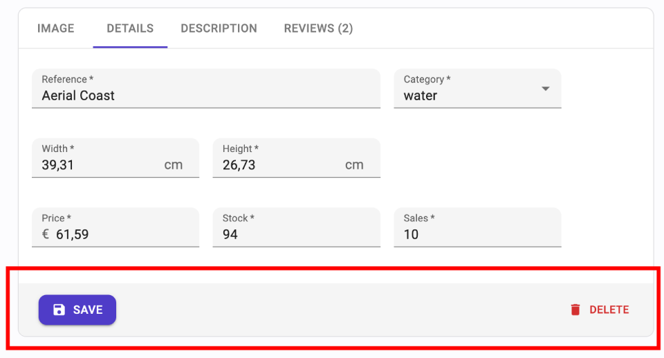
<Toolbar>
<Toolbar> is the component react-admin renders at the bottom of <SimpleForm> and <TabbedForm>. By default, it renders a <SaveButton> and, on edition pages, a <DeleteButton>. On mobile, it is fixed at the bottom of the screen.

Tip: Use react-admin’s <Toolbar> component instead of Material UI’s <Toolbar> component. The former builds upon the latter and adds support for an alternative mobile layout (and is therefore responsive).
Usage
Create a custom toolbar using <Toolbar>, then inject it to <SimpleForm> or <TabbedForm> using the toolbar prop:
// in src/MyToolbar.jss
import { Toolbar, SaveButton } from 'react-admin';

export const MyToolbar = () => (
    <Toolbar>
        <SaveButton label="Save" />
    </Toolbar>
);

// in src/CommentCreate.jsx
import { Create, SimpleForm, DateInput, TextInput } from 'react-admin';
import { MyToolbar } from './MyToolbar';

const CommentCreate = () => (
    <Create>
        <SimpleForm toolbar={<MyToolbar />}>
            <TextInput source="author.name" />
            <DateInput source="created_at" />
            <TextInput source="body" />
        </SimpleForm>
    </Create>
);
Props
<Toolbar> accepts the following props:
Additional props are passed down to the Material UI <Toolbar> component.
children
When rendered without children, <Toolbar> renders a <SaveButton> and, on edition page, a <DeleteButton>. Create a toolbar with children to customize the buttons displayed, or the options of the buttons.
For instance, to display two save buttons in a creation form, one to save and redirect to the edition page, and the second to save and empty the form:
import { Toolbar, SaveButton, useRedirect, useNotify } from 'react-admin';
import { useFormContext } from 'react-hook-form';

const MyToolbar = () => {
    const { reset } = useFormContext();
    const notify = useNotify();
    return (
        <Toolbar>
            <SaveButton label="Save" />
            <SaveButton
                label="Save and add"
                mutationOptions={{
                    onSuccess: () => {
                        notify('Element created');
                        reset();
                    }}
                }
                type="button"
                variant="text"
            />
        </Toolbar>
    );
};
sx: CSS API
You can override the style of the toolbar using the sx prop. Use the class names of the inner commponents to tweak their styles:
| Rule name | Description |
|---|---|
&.RaToolbar-desktopToolbar |
Applied to the underlying MuiToolbar component for medium and large screens |
&.RaToolbar-mobileToolbar |
Applied to the underlying MuiToolbar component for small screens |
& .RaToolbar-defaultToolbar |
Applied to the internal wrapper of the <Toolbar> buttons when no children are passed |
To override the style of all instances of <Toolbar> components using the application-wide style overrides, use the RaToolbar key.
Soft Delete
<Toolbar> displays a <DeleteButton> by default. React-admin provides a <SoftDeleteButton> variant, which archives the record instead of deleting it.
To replace the default <DeleteButton> with a <SoftDeleteButton>, create a custom toolbar:
import { Toolbar, SaveButton } from 'react-admin';
import { SoftDeleteButton } from '@react-admin/ra-soft-delete';

const MyToolbar = () => (
    <Toolbar sx={{ justifyContent: 'space-between' }}>
        <SaveButton label="Save" />
        <SoftDeleteButton />
    </Toolbar>
);
Then inject it to <SimpleForm> or <TabbedForm> using the toolbar prop.

