Buttons
React-Admin provides button components for all the common uses.
- Navigation Buttons: to navigate between the various react-admin views.
- List Buttons: to be used in List views.
- Record Buttons: To be used in detail views
- Miscellaneous
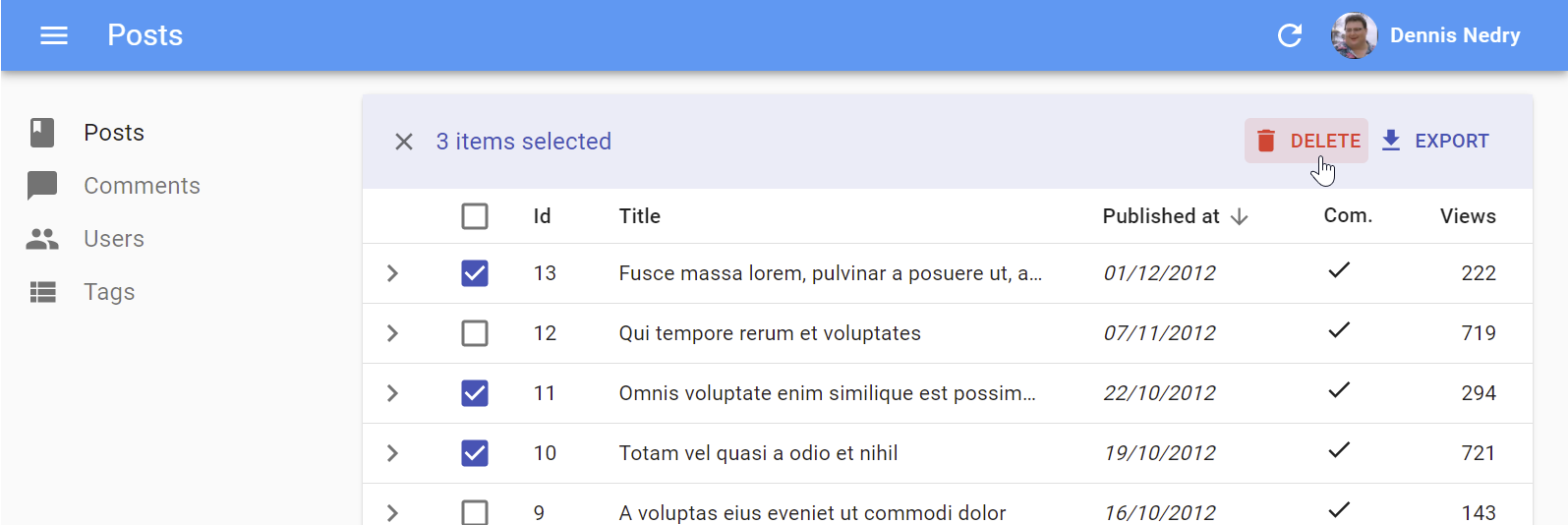
<BulkDeleteButton>
Deletes the selected rows. To be used inside the <DataTable bulkActionButtons> prop (where it’s enabled by default).
Usage
<BulkDeleteButton> reads the current record from RecordContext, and the current resource from ResourceContext, so in general it doesn’t need any props:
import * as React from 'react';
import { Fragment } from 'react';
import { BulkDeleteButton, BulkExportButton, DataTable } from 'react-admin';

const PostBulkActionButtons = () => (
    <Fragment>
        <BulkExportButton />
        <BulkDeleteButton />
    </Fragment>
);

export const PostList = () => (
    <List>
        <DataTable bulkActionButtons={<PostBulkActionButtons />}>
            ...
        </DataTable>
    </List>
);
Props
| Prop | Required | Type | Default | Description |
|---|---|---|---|---|
confirmContent |
Optional | React node | - | Lets you customize the content of the confirm dialog. Only used in 'pessimistic' or 'optimistic' mutation modes |
confirmTitle |
Optional | string |
- | Lets you customize the title of the confirm dialog. Only used in 'pessimistic' or 'optimistic' mutation modes |
confirmColor |
Optional | 'primary' | 'warning' |
‘primary’ | Lets you customize the color of the confirm dialog’s “Confirm” button. Only used in 'pessimistic' or 'optimistic' mutation modes |
label |
Optional | string |
‘ra.action.delete’ | label or translation message to use |
icon |
Optional | ReactElement |
<DeleteIcon> |
iconElement, e.g. <CommentIcon /> |
mutationMode |
Optional | string |
'undoable' |
Mutation mode ('undoable', 'pessimistic' or 'optimistic') |
mutationOptions |
Optional | object |
null | options for react-query useMutation hook |
successMessage |
Optional | string |
‘ra.notification.deleted’ | Lets you customize the success notification message. |
Tip: If you choose the 'pessimistic' or 'optimistic' mutation mode, a confirm dialog will be displayed to the user before the mutation is executed.
successMessage

On success, <BulkDeleteButton> displays a “XX elements deleted” notification in English. <BulkDeleteButton> uses two successive translation keys to build the success message:
resources.{resource}.notifications.deletedas a first choicera.notification.deletedas a fallback
To customize the notification message, you can set custom translation for these keys in your i18nProvider.
Tip: If you choose to use a custom translation, be aware that react-admin uses the same translation message for the <DeleteButton>, so the message must support pluralization:
const englishMessages = {
    resources: {
        posts: {
            notifications: {
                deleted: 'Post deleted |||| %{smart_count} postss deleted',
                // ...
            },
        },
    },
};
Alternately, pass a successMessage prop:
<BulkDeleteButton successMessage="Posts deleted successfully" />
Access Control
If your authProvider implements Access Control, <BulkDeleteButton> will only render if the user has the “delete” access to the related resource.
<BulkDeleteButton> will call authProvider.canAccess() using the following parameters:
{ action: "delete", resource: [current resource] }
Soft Delete
Should you need to only archive records, the soft delete feature from the Enterprise Edition add-on provides the <BulkSoftDeleteButton />, a drop-in replacement for <BulkDeleteButton>.
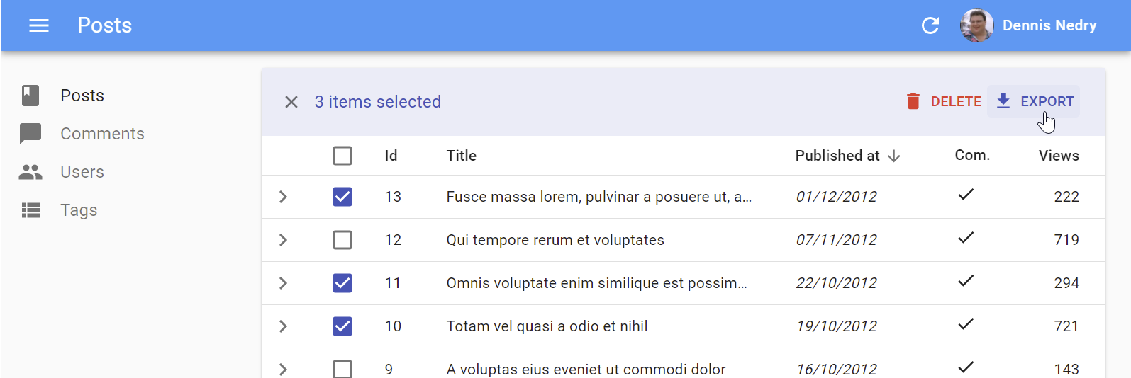
<BulkExportButton>
Same as <ExportButton>, except it only exports the selected rows instead of the entire list. To be used inside the <DataTable bulkActionButtons> prop.
Usage
import * as React from 'react';
import { Fragment } from 'react';
import { BulkDeleteButton, BulkExportButton, DataTable, List } from 'react-admin';

const PostBulkActionButtons = () => (
    <Fragment>
        <BulkExportButton />
        <BulkDeleteButton />
    </Fragment>
);

export const PostList = () => (
    <List>
        <DataTable bulkActionButtons={<PostBulkActionButtons />}>
            ...
        </DataTable>
    </List>
);
Props
| Prop | Required | Type | Default | Description |
|---|---|---|---|---|
label |
Optional | string |
‘ra.action.export’ | label or translation message to use |
icon |
Optional | ReactElement |
<DownloadIcon> |
iconElement, e.g. <CommentIcon /> |
exporter |
Optional | Function |
- | Override the List exporter function |
meta |
Optional | any |
undefined | Metadata passed to the dataProvider |
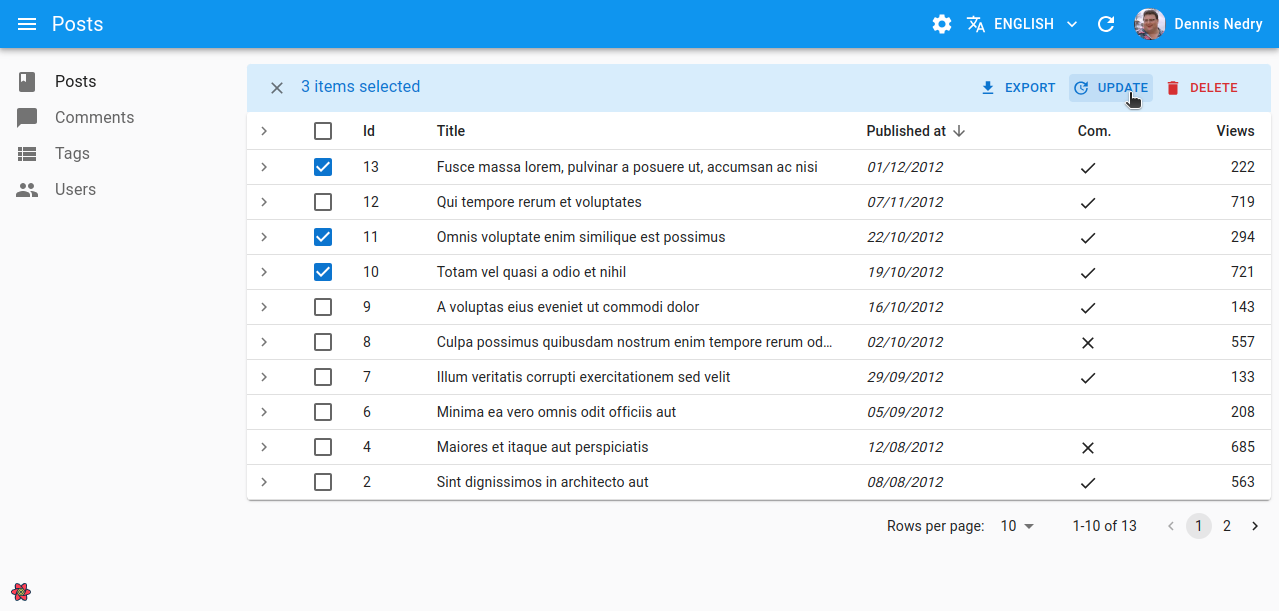
<BulkUpdateButton>
Partially updates the selected rows. To be used inside the <DataTable bulkActionButtons> prop.
Usage
import * as React from 'react';
import { Fragment } from 'react';
import { BulkDeleteButton, BulkExportButton, BulkUpdateButton, DataTable, List } from 'react-admin';

const PostBulkActionButtons = () => (
    <Fragment>
        <BulkExportButton />
        <BulkUpdateButton data={{ published_at: new Date() }} />
        <BulkDeleteButton />
    </Fragment>
);

export const PostList = () => (
    <List>
        <DataTable bulkActionButtons={<PostBulkActionButtons />}>
            ...
        </DataTable>
    </List>
);
Props
| Prop | Required | Type | Default | Description |
|---|---|---|---|---|
data |
Required | object |
- | An object with the fields that need to be updated on the selected records |
confirmContent |
Optional | React node | - | Lets you customize the content of the confirm dialog. Only used in 'pessimistic' or 'optimistic' mutation modes |
confirmTitle |
Optional | string |
- | Lets you customize the title of the confirm dialog. Only used in 'pessimistic' or 'optimistic' mutation modes |
icon |
Optional | ReactElement |
<ActionUpdate> |
An icon element |
label |
Optional | string |
‘ra.action.update’ | Label or translation message to use |
mutationMode |
Optional | string |
'undoable' |
Mutation mode ('undoable', 'pessimistic' or 'optimistic') |
mutationOptions |
Optional | object |
null | Options for react-query useMutation hook |
successMessage |
Optional | string |
‘ra.notification.updated’ | Lets you customize the success notification message. |
Tip: If you choose the 'pessimistic' or 'optimistic' mutation mode, a confirm dialog will be displayed to the user before the mutation is executed.
successMessage
On success, <BulkUpdateButton> displays a “XX elements updated” notification in English. <BulkUpdateButton> uses two successive translation keys to build the success message:
resources.{resource}.notifications.updatedas a first choicera.notification.updatedas a fallback
To customize the notification message, you can set custom translation for these keys in your i18nProvider.
Tip: If you choose to use a custom translation, be aware that react-admin uses the same translation message for the <Edit> success notification, so the message must support pluralization:
const englishMessages = {
    resources: {
        posts: {
            notifications: {
                updated: 'Post updated |||| %{smart_count} postss updated',
                // ...
            },
        },
    },
};
Alternately, pass a successMessage prop:
<BulkUpdateButton
    data={{ published_at: new Date() }}
    successMessage="Posts deleted successfully"
/>
<BulkUpdateFormButton>
This component, part of the enterprise edition , lets users edit multiple records at once. To be used inside the
 <DataTable bulkActionButtons> prop.
The button opens a dialog containing the form passed as children. When the form is submitted, it will call the dataProvider’s updateMany method with the ids of the selected records.
Usage
<BulkUpdateFormButton> can be used inside <DataTable>’s bulkActionButtons.
import * as React from 'react';
import {
    Admin,
    BooleanField,
    BooleanInput,
    DataTable,
    DateField,
    DateInput,
    List,
    Resource,
    SimpleForm,
} from 'react-admin';
import { BulkUpdateFormButton } from '@react-admin/ra-form-layout';

import { dataProvider } from './dataProvider';
import { i18nProvider } from './i18nProvider';

export const App = () => (
    <Admin dataProvider={dataProvider} i18nProvider={i18nProvider}>
        <Resource name="posts" list={PostList} />
    </Admin>
);

const PostBulkUpdateButton = () => (
    <BulkUpdateFormButton>
        <SimpleForm>
            <DateInput source="published_at" />
            <BooleanInput source="is_public" />
        </SimpleForm>
    </BulkUpdateFormButton>
);

const PostList = () => (
    <List>
        <DataTable bulkActionButtons={<PostBulkUpdateButton />}>
            <DataTable.Col source="id" />
            <DataTable.Col source="title" />
            <DataTable.Col source="published_at" field={DateField} />
            <DataTable.Col source="is_public" field={BooleanField} />
        </DataTable>
    </List>
);
Tip: You are not limited to using a <SimpleForm> as children. You can for instance use an <InputSelectorForm>, which allows to select the fields to update. Check out the <InputSelectorForm> below for more information.
Props
| Prop | Required | Type | Default | Description |
|---|---|---|---|---|
children |
Required (*) | Element | - | A form component to render inside the Dialog |
DialogProps |
- | Object | - | Additional props to pass to the MUI Dialog |
mutationMode |
- | string |
'pessimistic' |
The mutation mode ('undoable', 'pessimistic' or 'optimistic') |
mutationOptions |
- | Object | - | Mutation options passed to React Query when calling updateMany |
children
<BulkUpdateFormButton> expects a form component as children, such as <SimpleForm> or <InputSelectorForm>.
import { BulkUpdateFormButton } from '@react-admin/ra-form-layout';
import * as React from 'react';
import { BooleanInput, DateInput, SimpleForm } from 'react-admin';

const PostBulkUpdateButton = () => (
    <BulkUpdateFormButton>
        <SimpleForm>
            <DateInput source="published_at" />
            <BooleanInput source="is_public" />
        </SimpleForm>
    </BulkUpdateFormButton>
);
DialogProps
The DialogProps prop can be used to pass additional props to the MUI Dialog.
import { Slide } from '@mui/material';
import { TransitionProps } from '@mui/material/transitions';
import { BulkUpdateFormButton } from '@react-admin/ra-form-layout';
import * as React from 'react';
import { BooleanInput, DateInput, SimpleForm } from 'react-admin';

const Transition = React.forwardRef(function Transition(
    props: TransitionProps & {
        children: React.ReactElement<any, any>;
    },
    ref: React.Ref<unknown>
) {
    return <Slide direction="left" ref={ref} {...props} />;
});

const PostBulkUpdateButtonWithTransition = () => (
    <BulkUpdateFormButton DialogProps={{ TransitionComponent: Transition }}>
        <SimpleForm>
            <DateInput source="published_at" />
            <BooleanInput source="is_public" />
        </SimpleForm>
    </BulkUpdateFormButton>
);
mutationMode
Use the mutationMode prop to specify the mutation mode.
import { BulkUpdateFormButton } from '@react-admin/ra-form-layout';
import * as React from 'react';
import { BooleanInput, DateInput, SimpleForm } from 'react-admin';

const PostBulkUpdateButton = () => (
    <BulkUpdateFormButton mutationMode="undoable">
        <SimpleForm>
            <DateInput source="published_at" />
            <BooleanInput source="is_public" />
        </SimpleForm>
    </BulkUpdateFormButton>
);
mutationOptions and meta
The mutationOptions prop can be used to pass options to the react-query mutation used to call the dataProvider’s updateMany method.
import { BulkUpdateFormButton } from '@react-admin/ra-form-layout';
import * as React from 'react';
import { BooleanInput, DateInput, SimpleForm } from 'react-admin';

const PostBulkUpdateButton = () => (
    <BulkUpdateFormButton mutationOptions={{ retry: false }}>
        <SimpleForm>
            <DateInput source="published_at" />
            <BooleanInput source="is_public" />
        </SimpleForm>
    </BulkUpdateFormButton>
);
You can also use this prop to pass a meta object, that will be passed to the dataProvider when calling updateMany.
import { BulkUpdateFormButton } from '@react-admin/ra-form-layout';
import * as React from 'react';
import { BooleanInput, DateInput, SimpleForm } from 'react-admin';

const PostBulkUpdateButton = () => (
    <BulkUpdateFormButton mutationOptions={{ meta: { foo: 'bar' } }}>
        <SimpleForm>
            <DateInput source="published_at" />
            <BooleanInput source="is_public" />
        </SimpleForm>
    </BulkUpdateFormButton>
);
Usage with <TabbedForm> or other location based form layouts
<BulkUpdateFormButton> can be used with any form layout. However, for form layouts that are based on location by default, such as <TabbedForm>, you will need to disable the location syncing feature, as it may conflict with the Edit route declared by React Admin (/<resource>/<id>).
For instance, with <TabbedForm>, you can use the syncWithLocation prop to disable it:
import { BulkUpdateFormButton } from '@react-admin/ra-form-layout';
import * as React from 'react';
import { BooleanInput, DateInput, TabbedForm } from 'react-admin';

const PostBulkUpdateButton = () => (
    <BulkUpdateFormButton>
        <TabbedForm syncWithLocation={false}>
            <TabbedForm.Tab label="Publication">
                <DateInput source="published_at" />
            </TabbedForm.Tab>
            <TabbedForm.Tab label="Visibility">
                <BooleanInput source="is_public" />
            </TabbedForm.Tab>
        </TabbedForm>
    </BulkUpdateFormButton>
);
Usage With <InputSelectorForm>
<BulkUpdateFormButton> works best with <InputSelectorForm>, which component renders a form allowing to select the fields to update in a record.
<InputSelectorForm> expects a list of inputs passed in the inputs prop. Each input must have a label and an element.
import {
    BulkUpdateFormButton,
    InputSelectorForm,
} from '@react-admin/ra-form-layout';
import * as React from 'react';
import { BooleanInput, DateInput } from 'react-admin';

const PostBulkUpdateButton = () => (
    <BulkUpdateFormButton>
        <InputSelectorForm
            inputs={[
                {
                    label: 'Published at',
                    element: <DateInput source="published_at" />,
                },
                {
                    label: 'Is public',
                    element: <BooleanInput source="is_public" />,
                },
            ]}
        />
    </BulkUpdateFormButton>
);
Use the inputs prop to specify the list of inputs from which the user can pick. Each input must have a label and an element.
import { InputSelectorForm } from '@react-admin/ra-form-layout';
import * as React from 'react';
import {
    BooleanInput,
    DateInput,
    SelectArrayInput,
    TextInput,
} from 'react-admin';

const PostEdit = () => (
    <InputSelectorForm
        inputs={[
            {
                label: 'Title',
                element: <TextInput source="title" />,
            },
            {
                label: 'Body',
                element: <TextInput source="body" multiline />,
            },
            {
                label: 'Published at',
                element: <DateInput source="published_at" />,
            },
            {
                label: 'Is public',
                element: <BooleanInput source="is_public" />,
            },
            {
                label: 'Tags',
                element: (
                    <SelectArrayInput
                        source="tags"
                        choices={[
                            { id: 'react', name: 'React' },
                            { id: 'vue', name: 'Vue' },
                            { id: 'solid', name: 'Solid' },
                            { id: 'programming', name: 'Programming' },
                        ]}
                    />
                ),
            },
        ]}
    />
);
Limitations
If you look under the hood, you will see that <BulkUpdateFormButton> provides a <SaveContext> to its children, which allows them to call updateMany with the ids of the selected records.
However since we are in the context of a list, there is no <RecordContext> available. Hence, the following inputs cannot work inside a <BulkUpdateFormButton>:
<ReferenceOneInput><ReferenceManyInput><ReferenceManyToManyInput>
<Button>
Base component for most react-admin buttons. Responsive (displays only the icon with a tooltip on mobile) and accessible.
<Button label="Ban user" onClick={handleClick}>
    <BanIcon />
</Button>
Props
| Prop | Required | Type | Default | Description |
|---|---|---|---|---|
alignIcon |
Optional | 'left' | 'right |
'left' |
Icon position relative to the label |
children |
Optional | ReactNode |
- | icon to use |
className |
Optional | string |
- | Class name to customize the look and feel of the button element itself |
color |
Optional | 'default' | 'inherit'| 'primary' | 'secondary' |
'primary' |
Label and icon color |
disabled |
Optional | boolean |
false |
If true, the button will be disabled |
label |
Optional | ReactNode |
false |
The button label |
size |
Optional | 'large' | 'medium' | 'small' |
'small' |
Button size |
Other props are passed down to the underlying Material UI <Button>.
alignIcon
The icon position relative to the label. Defaults to left.
<Button label="Ban user" onClick={handleClick} alignIcon="right" />
children
The button icon:
<Button label="Ban user" onClick={handleClick}>
    <BanIcon />
</Button>
className
The button CSS classes:
<Button label="Ban user" onClick={handleClick} className="ban-button" />
color
The button label and icon color. Accepts default, inherit, primary, secondary or error.
<Button label="Ban user" onClick={handleClick} color="secondary" />
disabled
A boolean value indicating whether the button is disabled.
<Button label="Ban user" onClick={handleClick} disabled={canBanUsers} />
label
A ReactNode used as the button label.
If you pass a string, it will be automatically translated, so you can use either a simple string or a translation key:
<Button label="Ban user" onClick={handleClick} />
<Button label="myapp.actions.ban_user" onClick={handleClick} />
Pass false or null if you don’t want a label at all:
<Button label={false} onClick={handleClick} />
<Button label={null} onClick={handleClick} />
size
The button size. Accepts large, medium or small. Defaults to small.
<Button label="Ban user" onClick={handleClick} size="large" />
sx: CSS API
| Rule name | Description |
|---|---|
& .RaButton-button |
Applied to the underlying MuiButton component |
& .RaButton-label |
Applied to the Button’s label when alignIcon prop is ‘left’ |
& .RaButton-labelRightIcon |
Applied to the Button’s label when alignIcon prop is ‘left’ |
& .RaButton-smallIcon |
Applied to the Button’s children when size prop is small and alignIcon prop is ‘right’ |
& .RaButton-mediumIcon |
Applied to the Button’s children when size prop is medium and alignIcon prop is ‘right’ |
& .RaButton-largeIcon |
Applied to the Button’s children when size prop is large and alignIcon prop is ‘right’ |
To override the style of all instances of <Button> using the application-wide style overrides, use the RaButton key.
<CloneButton>
The <CloneButton> can be added anywhere there is a RecordContext to redirect users to the record’s resource create page. The create page form will be prefilled with the record values (except the id).
Usage
<CloneButton> reads the current resource from ResourceContext, so in general it doesn’t need any props:
import { CloneButton, TopToolbar, List } from 'react-admin';

const PostList = () => (
    <List>
        <TextField source="title" />
        <CloneButton />
    </List>
);
<CloneButton> is based on react-admin’s base <Button>, so it’s responsive, accessible, and the label is translatable.
Props
| Prop | Required | Type | Default | Description |
|---|---|---|---|---|
resource |
Optional | string |
- | Target resource, e.g. ‘posts’ |
label |
Optional | string |
‘ra.action.create’ | label or translation message to use |
icon |
Optional | ReactElement |
- | iconElement, e.g. <CommentIcon /> |
scrollToTop |
Optional | boolean |
true |
Scroll to top after link |
It also supports all the other <Button> props.
scrollToTop
By default, <CloneButton> scrolls the page to the top after redirecting to the create view. You can disable it as follows:
const CloneButtonWithoutScrollToTop = () => <CloneButton scrollToTop={false} />
Access Control
If you want to control whether this button should be displayed based on users permissions, use the <CloneButton> exported by the @react-admin/ra-rbac Enterprise package.
-import { CloneButton } from 'react-admin';
+import { CloneButton } from '@react-admin/ra-rbac';
This component adds the following RBAC controls:
- It will only render if the user has the
'clone'permission on the current resource.
{ action: "clone", resource: [current resource] }
Here is an example of how to use the <CloneButton> with RBAC:
import { Edit, TopToolbar } from 'react-admin';
import { CloneButton } from '@react-admin/ra-rbac';

const PostEditActions = () => (
    <TopToolbar>
        <CloneButton />
    </TopToolbar>
);

export const PostEdit = () => (
    <Edit actions={<PostEditActions />}>
        {/* ... */}
    </Edit>
);
This component accepts additional props:
| Prop | Required | Type | Default | Description |
|---|---|---|---|---|
accessDenied |
Optional | ReactNode | null | The content to display when users don’t have the 'clone' permission |
action |
Optional | String | "clone" |
The action to call authProvider.canAccess with |
authorizationError |
Optional | ReactNode | null | The content to display when an error occurs while checking permission |
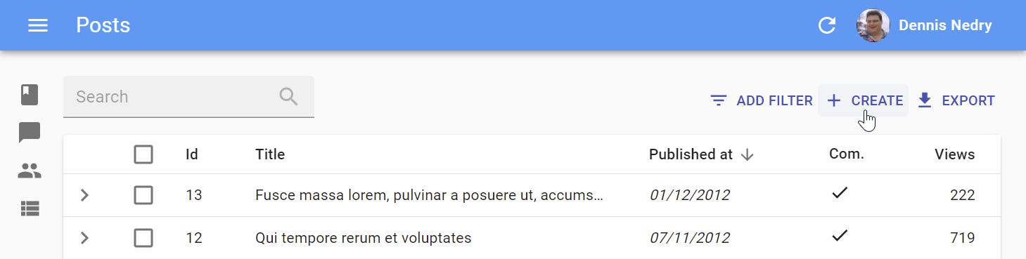
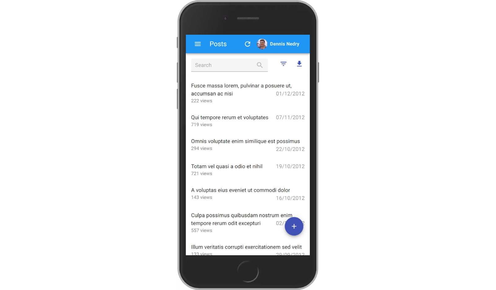
<CreateButton>
Opens the Create view of the current resource:
On mobile, it turns into a “Floating Action Button”.
Usage
<CreateButton> reads the current resource from ResourceContext, so in general it doesn’t need any props:
import { CreateButton, TopToolbar, List } from 'react-admin';

const ListActions = () => (
    <TopToolbar>
        <CreateButton />
    </TopToolbar>
);

const CommentList = () => (
    <List actions={<ListActions />}>
        {/* ... */}
    </List>
);
<CreateButton> is based on react-admin’s base <Button>, so it’s responsive, accessible, and the label is translatable.
Props
| Prop | Required | Type | Default | Description |
|---|---|---|---|---|
resource |
Optional | string |
- | Target resource, e.g. ‘posts’ |
label |
Optional | string |
- | label or translation message to use |
icon |
Optional | ReactElement |
- | iconElement, e.g. <CommentIcon /> |
scrollToTop |
Optional | boolean |
true |
Scroll to top after link |
It also supports all the other <Button> props.
Tip: If you want to link to the Create view manually, use the /{resource}/create location.
Tip: To allow users to create a record without leaving the current view, use the <CreateInDialogButton> component.
label
By default, the label for the <CreateButton> is the translation key ra.action.create that translates to “Create”.
You can customize this label by providing a resource specific translation with the key resources.RESOURCE.action.create (e.g. resources.posts.action.create):
// in src/i18n/en.js
import englishMessages from 'ra-language-english';

export const en = {
    ...englishMessages,
    resources: {
        posts: {
            name: 'Post |||| Posts',
            action: {
                create: 'New post'
            }
        },
    },
    ...
};
You can also customize this label by specifying a custom label prop:
export const PostCreateButton = () => (
    <CreateButton label="New post" />
);
Custom labels are automatically translated, so you can use a translation key, too:
<CreateButton label="resources.comments.actions.create" />
scrollToTop
By default, <CreateButton> scrolls the page to the top after redirecting. You can disable it as follows:
const CreateButtonWithoutScrollToTop = () => <CreateButton scrollToTop={false} />
sx: CSS API
| Rule name | Description |
|---|---|
&.RaCreateButton-floating |
Applied to the underlying MuiFab component used in small screens |
To override the style of all instances of <CreateButton> using the application-wide style overrides, use the RaCreateButton key.
Access Control
If your authProvider implements Access Control, <CreateButton> will only render if the user has the “create” access to the related resource.
<CreateButton> will call authProvider.canAccess() using the following parameters:
{ action: "create", resource: [current resource] }
<DeleteButton>
Deletes the current record.

Usage
<DeleteButton> reads the current record from RecordContext, and the current resource from ResourceContext, so in general it doesn’t need any props:
import { DeleteButton } from 'react-admin';

const CommentShow = () => (
    <>
        {/* ... */}
        <DeleteButton />
    </>
);
When pressed, it will call dataProvider.delete() with the current record’s id.
You can also call it with a record and a resource:
<DeleteButton record={{ id: 123, author: 'John Doe' }} resource="comments" />
Tip: React-admin provides a <SoftDeleteButton> variant, which archives the record instead of deleting it. Check out the Soft Delete documentation for more information.
Props
| Prop | Required | Type | Default | Description |
|---|---|---|---|---|
className |
Optional | string |
- | Class name to customize the look and feel of the button element itself |
label |
Optional | string |
- | label or translation message to use |
icon |
Optional | ReactElement |
<DeleteIcon> |
iconElement, e.g. <CommentIcon /> |
mutationMode |
Optional | string |
'undoable' |
Mutation mode ('undoable', 'pessimistic' or 'optimistic') |
mutation Options |
Optional | null | options for react-query useMutation hook |
|
record |
Optional | Object |
- | Record to delete, e.g. { id: 12, foo: 'bar' } |
redirect |
Optional | string | false | Function |
‘list’ | Custom redirection after success side effect |
resource |
Optional | string |
- | Resource to delete, e.g. ‘posts’ |
sx |
Optional | SxProps |
- | The custom styling for the button |
success Message |
Optional | string |
‘Element deleted’ | Lets you customize the success notification message. |
label
By default, the label is Delete in English. In other languages, it’s the translation of the 'ra.action.delete' key.
You can customize this label by providing a resource specific translation with the key resources.RESOURCE.action.delete (e.g. resources.posts.action.delete):
// in src/i18n/en.js
import englishMessages from 'ra-language-english';

export const en = {
    ...englishMessages,
    resources: {
        posts: {
            name: 'Post |||| Posts',
            action: {
                delete: 'Permanently remove %{recordRepresentation}'
            }
        },
    },
    ...
};
You can also customize this label by specifying a custom label prop:
<DeleteButton label="Delete this comment" />
Custom labels are automatically translated, so you can use a translation key, too:
<DeleteButton label="resources.comments.actions.delete" />
icon
Customize the icon of the button by passing an icon prop:
import DeleteForeverIcon from '@mui/icons-material/DeleteForever';

<DeleteButton icon={<DeleteForeverIcon />} />
mutationMode
<DeleteButton> has three modes, depending on the mutationMode prop:
'undoable'(default): Clicking the button will update the UI optimistically and display a confirmation snackbar with an undo button. If the user clicks the undo button, the record will not be deleted and the UI will be rolled back. Otherwise, the record will be deleted after 5 seconds.optimistic: Clicking the button will update the UI optimistically and delete the record. If the deletion fails, the UI will be rolled back.pessimistic: Clicking the button will display a confirmation dialog. If the user confirms, the record will be deleted. If the user cancels, nothing will happen.
Note: When choosing the pessimistic mode, <DeleteButton> will actually render a <DeleteWithConfirmButton> component and accept additional props to customize the confirm dialog (see below).
mutationOptions
<DeleteButton> calls the useMutation hook internally to delete the record. You can pass options to this hook using the mutationOptions prop.
<DeleteButton mutationOptions={{ onError: () => alert('Record not deleted, please retry') }} />
Check out the useMutation documentation for more information on the available options.
record
By default, <DeleteButton> reads the current record from the RecordContext. If you want to delete a different record, you can pass it as a prop:
<DeleteButton record={{ id: 123, author: 'John Doe' }} />
redirect
By default, <DeleteButton> redirects to the list page after a successful deletion. You can customize the redirection by passing a path as the redirect prop:
<DeleteButton redirect="/comments" />
resource
By default, <DeleteButton> reads the current resource from the ResourceContext. If you want to delete a record from a different resource, you can pass it as a prop:
<DeleteButton record={{ id: 123, author: 'John Doe' }} resource="comments" />
successMessage

On success, <DeleteButton> displays a “Element deleted” notification in English. <DeleteButton> uses two successive translation keys to build the success message:
resources.{resource}.notifications.deletedas a first choicera.notification.deletedas a fallback
To customize the notification message, you can set custom translation for these keys in your i18nProvider.
Tip: If you choose to use a custom translation, be aware that react-admin uses the same translation message for the <BulkDeleteButton>, so the message must support pluralization:
const englishMessages = {
    resources: {
        comments: {
            notifications: {
                deleted: 'Comment deleted |||| %{smart_count} comments deleted',
                // ...
            },
        },
    },
};
Alternately, pass a successMessage prop:
<DeleteButton successMessage="Comment deleted successfully" />
Access Control
If your authProvider implements Access Control, <DeleteButton> will only render if the user has the “delete” access to the related resource.
<DeleteButton> will call authProvider.canAccess() using the following parameters:
{ action: "delete", resource: [current resource], record: [current record] }
Soft Delete
Should you need to only archive records, the soft delete feature from the Enterprise Edition add-on provides the <SoftDeleteButton />, a drop-in replacement for <DeleteButton>.
<DeleteWithConfirmButton>
Delete the current record after a confirm dialog has been accepted. To be used inside a <Toolbar/> component.
| Prop | Required | Type | Default | Description |
|---|---|---|---|---|
className |
Optional | string |
- | Class name to customize the look and feel of the button element itself |
confirmTitle |
Optional | ReactNode |
‘ra.message.delete_title’ | Title of the confirm dialog |
confirmContent |
Optional | ReactNode |
‘ra.message.delete_content’ | Message or React component to be used as the body of the confirm dialog |
confirmColor |
Optional | 'primary' | 'warning' |
‘primary’ | The color of the confirm dialog’s “Confirm” button |
contentTranslateOptions |
Optional | Object |
{} | Custom id, name and record representation to be used in the confirm dialog’s content |
icon |
Optional | ReactElement |
<DeleteIcon> |
iconElement, e.g. <CommentIcon /> |
label |
Optional | string |
‘ra.action.delete’ | label or translation message to use |
mutationOptions |
Optional | null | options for react-query useMutation hook |
|
redirect |
Optional | string | false | Function |
‘list’ | Custom redirection after success side effect |
titleTranslateOptions |
Optional | Object |
{} | Custom id, name and record representation to be used in the confirm dialog’s title |
successMessage |
Optional | string |
‘ra.notification.deleted’ | Lets you customize the success notification message. |
import * as React from 'react';
import { DeleteWithConfirmButton, Toolbar, Edit, SaveButton,useRecordContext } from 'react-admin';

const EditToolbar = () => {
    const record = useRecordContext();

    <Toolbar>
        <SaveButton/>
        <DeleteWithConfirmButton
            confirmContent="You will not be able to recover this record. Are you sure?"
            confirmColor="warning"
            contentTranslateOptions={{ name: record.name }}
            titleTranslateOptions={{ name: record.name }}
        />
    </Toolbar>
};

const MyEdit = () => (
    <Edit>
        <SimpleForm toolbar={<EditToolbar />}>
            ...
        </SimpleForm>
    </Edit>
);
<EditButton>
Opens the Edit view of the current record.
Usage
<EditButton> reads the current record from RecordContext, and the current resource from ResourceContext, so in general it doesn’t need any props:
import { EditButton, TopToolbar } from 'react-admin';

const ShowActions = () => (
    <TopToolbar>
        <EditButton />
    </TopToolbar>
);

const CommentShow = () => (
    <Show actions={<ShowActions />}>
        {/* ... */}
    </Show>
);
<EditButton> is based on react-admin’s base <Button>, so it’s responsive, accessible, and the label is translatable.
Props
| Prop | Required | Type | Default | Description |
|---|---|---|---|---|
resource |
Optional | string |
- | Resource to link to, e.g. ‘posts’ |
record |
Optional | Object |
- | Record to link to, e.g. { id: 12, foo: 'bar' } |
label |
Optional | string |
- | Label or translation message to use |
icon |
Optional | ReactElement |
- | Icon element, e.g. <CommentIcon /> |
scrollToTop |
Optional | boolean |
true |
Scroll to top after link |
It also supports all the other <Button> props.
Tip: You can use it as <DataTable> child, too. However, you should use the <DataTable rowClick="edit"> prop instead to avoid using one column for the Edit button.
Tip: If you want to link to the Edit view manually, use the /{resource}/{record.id} location.
Tip: To allow users to edit a record without leaving the current view, use the <EditInDialogButton> component.
label
By default, the label for the <EditButton> is the translation key ra.action.edit that translates to “Edit”.
You can customize this label by providing a resource specific translation with the key resources.RESOURCE.action.edit (e.g. resources.posts.action.edit):
// in src/i18n/en.js
import englishMessages from 'ra-language-english';

export const en = {
    ...englishMessages,
    resources: {
        posts: {
            name: 'Post |||| Posts',
            action: {
                edit: 'Modify %{recordRepresentation}'
            }
        },
    },
    ...
};
You can also customize this label by specifying a custom label prop:
export const PostEditButton = () => (
    <EditButton label="Modify" />
);
Custom labels are automatically translated, so you can use a translation key, too:
<EditButton label="resources.comments.actions.edit" />
scrollToTop
By default, <EditButton> scrolls the page to the top after redirecting. You can disable it as follows:
const EditButtonWithoutScrollToTop = () => <EditButton scrollToTop={false} />
Access Control
If your authProvider implements Access Control, <EditButton> will only render if the user has the “edit” access to the related resource.
<EditButton> will call authProvider.canAccess() using the following parameters:
{ action: "edit", resource: [current resource], record: [current record] }
<ExportButton>
Exports the current list, with filters applied, but without pagination.
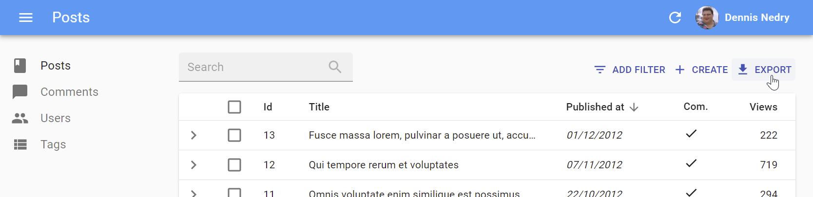
It relies on the exporter function passed to the <List> component, via the ListContext. It’s disabled for empty lists.
Usage
By default, the <ExportButton> is included in the List actions.
You can add it to a custom actions toolbar:
import { CreateButton, ExportButton, TopToolbar } from 'react-admin';

const PostListActions = () => (
    <TopToolbar>
        <PostFilter context="button" />
        <CreateButton />
        <ExportButton />
    </TopToolbar>
);

export const PostList = () => (
    <List actions={<PostListActions />}>
        ...
    </List>
);
Props
| Prop | Required | Type | Default | Description |
|---|---|---|---|---|
maxResults |
Optional | number |
1000 | Maximum number of records to export |
label |
Optional | string |
‘ra.action.export’ | label or translation message to use |
icon |
Optional | ReactElement |
<DownloadIcon> |
iconElement, e.g. <CommentIcon /> |
exporter |
Optional | Function |
- | Override the List exporter function |
meta |
Optional | any |
undefined | Metadata passed to the dataProvider |
Tip: If you are looking for an <ImportButton>, check out this third-party package: benwinding/react-admin-import-csv.
Access Control
If you want to control whether this button should be displayed based on users permissions, use the <ExportButton> exported by the @react-admin/ra-rbac Enterprise package.
-import { ExportButton } from 'react-admin';
+import { ExportButton } from '@react-admin/ra-rbac';
This component adds the following RBAC controls:
- It will only render if the user has the
'export'permission on the current resource.
{ action: "export", resource: [current resource] }
- It will only export the fields the user has the
'read'permission on.
{ action: "read", resource: `${resource}.${source}` }
Here is an example usage:
import { CreateButton, TopToolbar } from 'react-admin';
import { ExportButton } from '@react-admin/ra-rbac';

const PostListActions = () => (
    <TopToolbar>
        <PostFilter context="button" />
        <CreateButton />
        <ExportButton />
    </TopToolbar>
);

export const PostList = () => (
    <List actions={<PostListActions />}>
        ...
    </List>
);
This component accepts additional props:
| Prop | Required | Type | Default | Description |
|---|---|---|---|---|
accessDenied |
Optional | ReactNode | null | The content to display when users don’t have the 'export' permission |
action |
Optional | String | "export" |
The action to call authProvider.canAccess with |
authorizationError |
Optional | ReactNode | null | The content to display when an error occurs while checking permission |
<FilterButton>
This button is an internal component used by react-admin in the Filter button/form combo.
sx: CSS API
To override the style of all instances of <FilterButton> using the application-wide style overrides, use the RaFilterButton key.
<ListButton>
Opens the List view of a given resource.
<ListButton> is based on react-admin’s base <Button>, so it’s responsive, accessible, and the label is translatable.
Usage
By default, react-admin doesn’t display a <ListButton> in Edit and Show views action toolbar. This saves visual clutter, and users can always use the back button.
You can add it by specifying your own actions:
// linking back to the list from the Show view
import { TopToolbar, ListButton, Show } from 'react-admin';

const PostShowActions = () => (
    <TopToolbar>
        <ListButton />
    </TopToolbar>
);

export const PostShow = () => (
    <Show actions={<PostShowActions />}>
        ...
    </Show>
);
Tip: If you want to link to the List view manually, use the /{resource} location.
Props
| Prop | Required | Type | Default | Description |
|---|---|---|---|---|
resource |
Optional | string |
- | target resource, e.g. ‘posts’ |
label |
Optional | string |
- | label or translation message to use |
icon |
Optional | ReactElement |
- | iconElement, e.g. <CommentIcon /> |
scrollToTop |
Optional | boolean |
true |
Scroll to top after link |
It also supports all the other <Button> props.
label
By default, the label is List in English. In other languages, it’s the translation of the 'ra.action.list' key.
You can customize this label by providing a resource specific translation with the key resources.RESOURCE.action.list (e.g. resources.posts.action.list):
// in src/i18n/en.js
import englishMessages from 'ra-language-english';

export const en = {
    ...englishMessages,
    resources: {
        posts: {
            name: 'Post |||| Posts',
            action: {
                list: 'See all posts'
            }
        },
    },
    ...
};
You can also customize this label by specifying a custom label prop:
<ListButton label="See all comments" />
Custom labels are automatically translated, so you can use a translation key, too:
<ListButton label="resources.comments.actions.list" />
scrollToTop
By default, <ListButton> scrolls the page to the top after redirecting. You can disable it as follows:
const ListButtonWithoutScrollToTop = () => <ListButton scrollToTop={false} />
Access Control
If your authProvider implements Access Control, <ListButton> will only render if the user has the “list” access to the related resource.
<ListButton> will call authProvider.canAccess() using the following parameters:
{ action: "list", resource: [current resource] }
<RefreshButton>
<SelectAllButton>
The <SelectAllButton> component allows users to select all items from a resource, no matter the pagination.
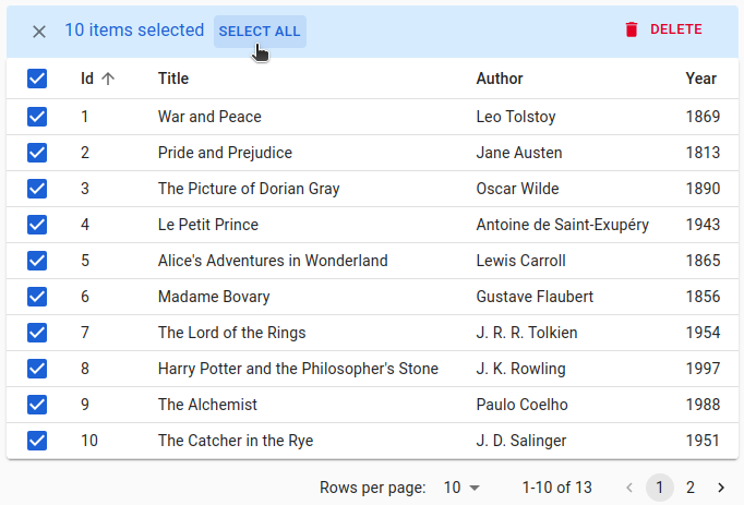
Usage
By default, react-admin’s <DataTable> displays a <SelectAllButton> in its bulkActionsToolbar. You can customize it by specifying your own <BulkActionsToolbar selectAllButton>:
import { List, DataTable, BulkActionsToolbar, SelectAllButton, BulkDeleteButton } from 'react-admin';

const PostSelectAllButton = () => (
    <SelectAllButton
        label="Select all records"
        queryOptions={{ meta: { foo: 'bar' } }}
    />
);

export const PostList = () => (
    <List>
        <DataTable
            bulkActionsToolbar={
                <BulkActionsToolbar selectAllButton={<PostSelectAllButton />}>
                    <BulkDeleteButton />
                </BulkActionsToolbar>
            }
        >
            ...
        </DataTable>
    </List>
);
label
By default, the <SelectAllButton> label is “Select all” (or the ra.action.select_all_button message translation). You can also pass a custom label:
const PostSelectAllButton = () => <SelectAllButton label="Select all posts" />;
Tip: The label will go through the useTranslate hook, so you can use translation keys.
limit
By default, <SelectAllButton> selects the 250 first items of your list. To customize this limit, you can use the limit prop:
const PostSelectAllButton = () => <SelectAllButton limit={100} />;
queryOptions
<SelectAllButton> calls a get method of your dataProvider via a react-query’s useQuery hook. You can customize the options you pass to this hook, e.g. to pass a custom meta to the call.
const PostSelectAllButton = () => <SelectAllButton queryOptions={{ meta: { foo: 'bar' } }} />;
sx: CSS API
To override the style of all instances of <SelectAllButton> components using the application-wide style overrides, use the RaSelectAllButton key.
<SkipNavigationButton>
sx: CSS API
| Rule name | Description |
|---|---|
&.RaSkipNavigationButton-skipToContentButton |
Applied to the underlying MuiButton component |
To override the style of all instances of <SkipNavigationButton> using the application-wide style overrides, use the RaSkipNavigationButton key.
<ShowButton>
Opens the Show view of the current record:
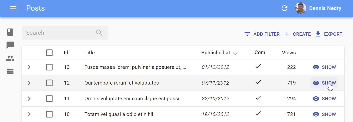
Usage
<ShowButton> reads the current record from RecordContext, and the current resource from ResourceContext, so in general it doesn’t need any props:
import { ShowButton, TopToolbar, Edit } from 'react-admin';

const EditActions = () => (
    <TopToolbar>
        <ShowButton />
    </TopToolbar>
);

const CommentEdit = () => (
    <Edit actions={<EditActions />}>
        {/* ... */}
    </Edit>
);
<ShowButton> is based on react-admin’s base <Button>, so it’s responsive, accessible, and the label is translatable.
Props
| Prop | Required | Type | Default | Description |
|---|---|---|---|---|
resource |
Optional | string |
- | The target resource, e.g. ‘posts’ |
record |
Optional | Object |
- | Record to link to, e.g. { id: 12, foo: 'bar' } |
component |
Optional | ReactElement |
- | Base path to resource, e.g. ‘/posts’ |
label |
Optional | string |
- | Label or translation message to use |
icon |
Optional | ReactElement |
- | Icon element, e.g. <CommentIcon /> |
scrollToTop |
Optional | boolean |
true |
Scroll to top after link |
It also supports all the other <Button> props.
Tip: You can use it as <DataTable> child with no props too. However, you should use the <DataTable rowClick="show"> prop instead to avoid using one column for the Edit button.
Tip: If you want to link to the Show view manually, use the /{resource}/{record.id}/show location.
label
By default, the label for the <ShowButton> is the translation key ra.action.show that translates to “Show”.
You can customize this label by providing a resource specific translation with the key resources.RESOURCE.action.show (e.g. resources.posts.action.show):
// in src/i18n/en.js
import englishMessages from 'ra-language-english';

export const en = {
    ...englishMessages,
    resources: {
        posts: {
            name: 'Post |||| Posts',
            action: {
                show: 'Display %{recordRepresentation}'
            }
        },
    },
    ...
};
You can also customize this label by specifying a custom label prop:
export const PostShowButton = () => (
    <ShowButton label="Display" />
);
Custom labels are automatically translated, so you can use a translation key, too:
<ShowButton label="resources.comments.actions.show" />
scrollToTop
By default, <ShowButton> scrolls the page to the top after redirecting. You can disable it as follows:
const ShowButtonWithoutScrollToTop = () => <ShowButton scrollToTop={false} />
Access Control
If your authProvider implements Access Control, <ShowButton> will only render if the user has the “show” access to the related resource.
<ShowButton> will call authProvider.canAccess() using the following parameters:
{ action: "show", resource: [current resource], record: [current record] }
<UpdateButton>
This component allows to create a button that updates a record by calling the useUpdate hook.
Usage
Use <UpdateButton> inside the actions toolbar of the Edit or Show views.
import { Edit, SimpleForm, TextInput, TopToolbar, UpdateButton } from 'react-admin';

const PostEditActions = () => (
    <TopToolbar>
        <UpdateButton label="Reset views" data={{ views: 0 }} />
    </TopToolbar>
);

export const PostEdit = () => (
    <Edit actions={<PostEditActions />}>
        <SimpleForm>
            <TextInput source="title" />
            <TextInput source="body" />
        </SimpleForm>
    </Edit>
);
Props
<UpdateButton> accepts the following props:
| Prop | Required | Type | Default | Description |
|---|---|---|---|---|
data |
Required | Object |
The data used to update the record | |
confirmTitle |
Optional | ReactNode |
ra.message.bulk_update_title |
The title of the confirmation dialog when mutationMode is not undoable |
confirmContent |
Optional | ReactNode |
ra.message.bulk_update_content |
The content of the confirmation dialog when mutationMode is not undoable |
contentTranslateOptions |
Optional | Object |
{} | Custom id, name and record representation to be used in the confirm dialog’s content |
mutationMode |
Optional | string |
undoable |
Mutation mode ('undoable', 'pessimistic' or 'optimistic') |
mutationOptions |
Optional | Object |
The react-query mutation options | |
titleTranslateOptions |
Optional | Object |
{} | Custom id, name and record representation to be used in the confirm dialog’s title |
<UpdateButton> also accepts the Button props.
data
The data used to update the record. Passed to the dataProvider.update method. This prop is required.
import { TopToolbar, UpdateButton } from 'react-admin';

const PostEditActions = () => (
    <TopToolbar>
        <UpdateButton label="Reset views" data={{ views: 0 }} />
    </TopToolbar>
);
mutationMode
The mutation mode determines when the side effects (redirection, notifications, etc.) are executed:
pessimistic: The mutation is passed to the dataProvider first. When the dataProvider returns successfully, the mutation is applied locally, and the side effects are executed.optimistic: The mutation is applied locally and the side effects are executed immediately. Then the mutation is passed to the dataProvider. If the dataProvider returns successfully, nothing happens (as the mutation was already applied locally). If the dataProvider returns in error, the page is refreshed and an error notification is shown.undoable(default): The mutation is applied locally and the side effects are executed immediately. Then a notification is shown with an undo button. If the user clicks on undo, the mutation is never sent to the dataProvider, and the page is refreshed. Otherwise, after a 5 seconds delay, the mutation is passed to the dataProvider. If the dataProvider returns successfully, nothing happens (as the mutation was already applied locally). If the dataProvider returns in error, the page is refreshed and an error notification is shown.
By default, the <UpdateButton> uses the undoable mutation mode. This is part of the “optimistic rendering” strategy of react-admin ; it makes user interactions more reactive.
You can change this default by setting the mutationMode prop. For instance, to remove the ability to undo the changes, use the optimistic mode:
import { TopToolbar, UpdateButton } from 'react-admin';

const PostEditActions = () => (
    <TopToolbar>
        <UpdateButton label="Reset views" data={{ views: 0 }} mutationMode="optimistic" />
    </TopToolbar>
);
And to make the action blocking, and wait for the dataProvider response to continue, use the pessimistic mode:
import { TopToolbar, UpdateButton } from 'react-admin';

const PostEditActions = () => (
    <TopToolbar>
        <UpdateButton label="Reset views" data={{ views: 0 }} mutationMode="pessimistic" />
    </TopToolbar>
);
Tip: When using any other mode than undoable, the <UpdateButton> displays a confirmation dialog before calling the dataProvider.
confirmTitle
Only used when mutationMode is either optimistic or pessimistic to change the confirmation dialog title:
import { TopToolbar, UpdateButton } from 'react-admin';

const PostEditActions = () => (
    <TopToolbar>
        <UpdateButton
            label="Reset views"
            data={{ views: 0 }}
            mutationMode="optimistic"
            confirmTitle="Reset views"
        />
    </TopToolbar>
);
confirmContent
Only used when mutationMode is either optimistic or pessimistic to change the confirmation dialog content:
import { TopToolbar, UpdateButton } from 'react-admin';

const PostEditActions = () => (
    <TopToolbar>
        <UpdateButton
            label="Reset views"
            data={{ views: 0 }}
            mutationMode="optimistic"
            confirmContent="Do you really want to reset the views?"
        />
    </TopToolbar>
);
mutationOptions
<UpdateButton> calls dataProvider.update() via react-query’s useMutation hook. You can customize the options you pass to this hook, e.g. to pass a custom meta to the dataProvider.update() call.
import { TopToolbar, UpdateButton } from 'react-admin';

const PostEditActions = () => (
    <TopToolbar>
        <UpdateButton
            label="Reset views"
            data={{ views: 0 }}
            mutationOptions={{ meta: { foo: 'bar' } }}
        />
    </TopToolbar>
);
You can also use mutationOptions to override success or error side effects, by setting the mutationOptions prop. Refer to the useMutation documentation in the react-query website for a list of the possible options.
Let’s see an example with the success side effect. By default, when the action succeeds, react-admin shows a notification, and refreshes the view. You can override this behavior and pass custom success side effects by providing a mutationOptions prop with an onSuccess key:
import * as React from 'react';
import { useNotify, useRefresh, useRedirect, TopToolbar, UpdateButton } from 'react-admin';

const PostEditActions = () => {
    const notify = useNotify();
    const redirect = useRedirect();

    const onSuccess = () => {
        notify(`Changes saved`);
        redirect('/posts');
    };

    return (
        <TopToolbar>
            <UpdateButton
                label="Reset views"
                data={{ views: 0 }}
                mutationOptions={{ onSuccess }}
            />
        </TopToolbar>
    );
}
The default onSuccess function is:
() => {
    notify('ra.notification.updated', {
        messageArgs: { smart_count: 1 },
        undoable: mutationMode === 'undoable'
    });
}
Tip: When you use mutationMode="pessimistic", the onSuccess function receives the response from the dataProvider.update() call, which is the edited record (see the dataProvider documentation for details). You can use that response in the success side effects:
import * as React from 'react';
import { useNotify, useRefresh, useRedirect, TopToolbar, UpdateButton } from 'react-admin';

const PostEditActions = () => {
    const notify = useNotify();
    const redirect = useRedirect();

    const onSuccess = (data) => {
        notify(`Changes to post "${data.title}" saved`);
        redirect('/posts');
    };

    return (
        <TopToolbar>
            <UpdateButton
                label="Reset views"
                data={{ views: 0 }}
                mutationOptions={{ onSuccess }}
            />
        </TopToolbar>
    );
}
Similarly, you can override the failure side effects with an onError option. By default, when the save action fails at the dataProvider level, react-admin shows a notification error.
import * as React from 'react';
import { useNotify, useRefresh, useRedirect, TopToolbar, UpdateButton } from 'react-admin';

const PostEditActions = () => {
    const notify = useNotify();
    const refresh = useRefresh();
    const redirect = useRedirect();

    const onError = (error) => {
        notify(`Could not edit post: ${error.message}`);
        redirect('/posts');
        refresh();
    };

    return (
        <TopToolbar>
            <UpdateButton
                label="Reset views"
                data={{ views: 0 }}
                mutationOptions={{ onError }}
            />
        </TopToolbar>
    );
}
The onError function receives the error from the dataProvider.update() call. It is a JavaScript Error object (see the dataProvider documentation for details).
The default onError function is:
(error) => {
    notify(typeof error === 'string' ? error : error.message || 'ra.notification.http_error', { type: 'error' });
}
sx
The sx prop lets you style the component and its children using Material-ui’s sx syntax.
import { TopToolbar, UpdateButton } from 'react-admin';

const PostEditActions = () => (
    <TopToolbar>
        <UpdateButton label="Reset views" data={{ views: 0 }} sx={{ width: 500 }} />
    </TopToolbar>
);
<UserMenu>
| Prop | Required | Type | Default | Description |
|---|---|---|---|---|
children |
Optional | ReactElement |
- | elements to use as menu items |
label |
Required | string |
‘ra.auth.user_menu’ | label or translation message to use |
icon |
Optional | ReactElement |
<AccountCircle> |
iconElement, e.g. <CommentIcon /> |
sx: CSS API
| Rule name | Description |
|---|---|
& .RaUserMenu-userButton |
Applied to the underlying MuiButton component when useGetIdentity().loaded is true and useGetIdentity().identity.fullName is set |
& .RaUserMenu-avatar |
Applied to the underlying MuiAvatar component when useGetIdentity().avatar is true |
To override the style of all instances of <UserMenu> using the application-wide style overrides, use the RaUserMenu key.
See The AppBar documentation for more details.
Performance
The ripple effect can cause performance issues when displaying a large number of buttons (e.g. in a large <DataTable>). It’s possible to remove the ripple effect from within your Material UI theme. The Material UI docs provide instructions on how to do this.
It’s worth noting that removing the ripple will cause accessibility issues, including a lack of focus states during tab navigating for components like BooleanInput and CheckboxGroupInput.
Note: The disableRipple was set to true in React Admin for a time, but was reimplemented due to accessibility concerns. If you’d like to reimplement the static ripple color effect, you can use React Admin’s previous implementation as a starting point. The Material UI docs also gives details on how to reimplement focus styles using the Mui-focusVisible class.