
<Box>, <Stack> and <Grid>
To facilitate the creation of custom layouts, Material-UI provides three layout components that you will use all the time. It’s important that you understand how they work.
<Box>
The <Box> component serves as a wrapper component for most of the CSS utility needs. By default, it renders a <div> element.

It accepts all the sx prop, which makes it easy to style:
import { Box } from '@mui/material';

const MyComponent = () => (
    <Box
        sx={{
          width: 300,
          height: 300,
          bgcolor: 'primary.main',
          '&:hover': {
            backgroundColor: 'primary.dark',
            opacity: [0.9, 0.8, 0.7],
          },
        }}
    >
        // ...
    </Box>
);
You can render any component with <Box>, not only a <div>. For instance, to render a <span> with custom styles:
export default function BoxComponent() {
  return (
    <Box component="span" sx={{ p: 2, border: '1px dashed grey' }}>
      <Button>Save</Button>
    </Box>
  );
}
If you need to customize the spacing of a react-admin or a Material-UI element, use their sx prop instead of a <Box> wrapper:
// prefer
<NumberField
    source="total"
    options={{ style: 'currency', currency: 'USD' }}
    sx={{ fontWeight: 'bold' }}
/>
// to
<Box fontWeight="bold">
    <NumberField
        source="total"
        options={{ style: 'currency', currency: 'USD' }}
    />
</Box>
Tip: If you use <Box> to lay out elements with display:flex or display:grid, prefer the dedicated <Stack> and <Grid> components instead.
To learn more, read the Material-UI Box documentation.
<Stack>
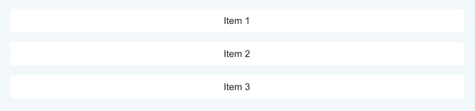
<Stack> is a container component for arranging elements vertically or horizontally. Use it whenever you need to lay out elements in a column or a row.
import { Stack } from '@mui/material';

const Items = () => (
    <Stack spacing={2}>
        <Item>Item 1</Item>
        <Item>Item 2</Item>
        <Item>Item 3</Item>
    </Stack>
);
<Stack> renders a <div> with display:flex. It accepts any React element as child - even other <Stack> components.
<Stack> accepts all the FlexBox properties as props, so you can write layouts as follows:
<Stack
  direction="row"
  justifyContent="center"
  alignItems="center"
  spacing={2}
>
Use the spacing prop to control the space between children. The spacing value can be any number, including decimals, or a string. The prop is converted into a CSS property using the theme.spacing() helper.
<Stack spacing={2}>
  <Item>Item 1</Item>
  <Item>Item 2</Item>
  <Item>Item 3</Item>
</Stack>
By default, <Stack> arranges items vertically in a column. Use the direction prop to position items horizontally in a row:

<Stack direction="row" spacing={2}>
  <Item>Item 1</Item>
  <Item>Item 2</Item>
  <Item>Item 3</Item>
</Stack>
Use the divider prop to insert an element between each child.
import { Stack } from '@mui/material';

export const DividerStack = () => (
    <div>
      <Stack
        direction="row"
        divider={
          <Box
            component="hr"
            sx={{
              border: (theme) =>
                `1px solid ${theme.palette.mode === 'dark' ? '#262B32' : '#fff'}`,
            }}
          />
        }
        spacing={2}
      >
        <Item>Item 1</Item>
        <Item>Item 2</Item>
        <Item>Item 3</Item>
      </Stack>
    </div>
);
To learn more, read the Material-UI Stack documentation.
<Grid>
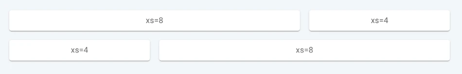
<Grid> is a container component for arranging elements in a grid. It is based on a 12-column grid layout.
import Grid from '@mui/material/Grid';

export const BasicGrid = () => (
    <Box sx={{ flexGrow: 1 }}>
      <Grid container spacing={2}>
        <Grid item xs={8}>
          <Item>xs=8</Item>
        </Grid>
        <Grid item xs={4}>
          <Item>xs=4</Item>
        </Grid>
        <Grid item xs={4}>
          <Item>xs=4</Item>
        </Grid>
        <Grid item xs={8}>
          <Item>xs=8</Item>
        </Grid>
      </Grid>
    </Box>
);
Column widths are integer values between 1 and 12; they apply at any breakpoint and indicate how many columns are occupied by the component.
A value given to a breakpoint applies to all the other breakpoints wider than it (unless overridden, as you can read later in this page). For example, xs={12} sizes a component to occupy the whole viewport width regardless of its size.
Components may have multiple widths defined, causing the layout to change at the defined breakpoint. Width values given to larger breakpoints override those given to smaller breakpoints.
For example, xs={12} sm={6} sizes a component to occupy half of the viewport width (6 columns) when viewport width is 600 or more pixels. For smaller viewports, the component fills all 12 available columns.
To control space between children, use the spacing prop. The spacing value can be any positive number, including decimals and any string. The prop is converted into a CSS property using the theme.spacing() helper.
<Grid container spacing={2}>
The rowSpacing and columnSpacing props allow for specifying the row and column gaps independently. It’s similar to the row-gap and column-gap properties of CSS Grid.
<Grid container rowSpacing={1} columnSpacing={{ xs: 1, sm: 2, md: 3 }}>
  <Grid item xs={6}>
    <Item>1</Item>
  </Grid>
  <Grid item xs={6}>
    <Item>2</Item>
  </Grid>
  <Grid item xs={6}>
    <Item>3</Item>
  </Grid>
  <Grid item xs={6}>
    <Item>4</Item>
  </Grid>
</Grid>
The Auto-layout makes the items equitably share the available space. That also means you can set the width of one item and the others will automatically resize around it.
<Grid container spacing={3}>
  <Grid item xs>
    <Item>xs</Item>
  </Grid>
  <Grid item xs={6}>
    <Item>xs=6</Item>
  </Grid>
  <Grid item xs>
    <Item>xs</Item>
  </Grid>
</Grid>
You can switch the props’ value based on the active breakpoint.
<Grid container spacing={{ xs: 2, md: 3 }} columns={{ xs: 4, sm: 8, md: 12 }}>
  {Array.from(Array(6)).map((_, index) => (
    <Grid item xs={2} sm={4} md={4} key={index}>
      <Item>xs=2</Item>
    </Grid>
  ))}
</Grid>
Responsive values is supported by:
columnscolumnSpacingdirectionrowSpacingspacing
Check the Material-UI Grid documentation for more information.