<Tree>
This Enterprise Edition component renders a tree based on tree data.
It is a wrapper for rc-tree’s <Tree>, with Material Design style.
Usage
<Tree> expects a data prop containing a tree of nodes as returned by the dataProvider tree methods.
import { Tree } from '@react-admin/ra-tree';
// tree data format
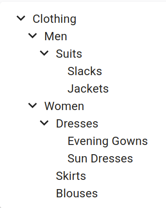
const data = [
{ id: 1, name: 'Clothing', children: [2, 6] },
{ id: 2, name: 'Men', children: [3] },
{ id: 3, name: 'Suits', children: [4, 5] },
{ id: 4, name: 'Slacks', children: [] },
{ id: 5, name: 'Jackets', children: [] },
{ id: 6, name: 'Women', children: [7, 10, 11] },
{ id: 7, name: 'Dresses', children: [8, 9] },
{ id: 8, name: 'Evening Gowns', children: [] },
{ id: 9, name: 'Sun Dresses', children: [] },
{ id: 10, name: 'Skirts', children: [] },
{ id: 11, name: 'Blouses', children: [] },
];
const SimpleTree = () => <Tree data={data} titleField="name" />;
Props
The <Tree> component accepts the rc-tree’s <Tree> props but a few of them differ from the original.
| Prop | Required | Type | Default | Description |
|---|---|---|---|---|
data |
Required | TreeRecord[] |
- | The tree data to display in the format returned by the dataProvider. |
className |
Optional | string |
- | The CSS class name to apply on the Root component. |
defaultExpandedKeys |
Optional | Identifier[] |
- | An array of identifiers defining the records that should be expanded by default. |
defaultSelectedKeys |
Optional | Identifier[] |
- | An array of identifiers defining the records that should be selected by default. |
expandedKeys |
Optional | Identifier[] |
- | An array of identifiers defining the records that should be expanded (controlled mode). |
hideRootNodes |
Optional | boolean |
false |
A boolean indicating whether the root nodes should be hidden. |
motion |
Optional | boolean |
false |
To enable rc-tree’s <Tree> transitions |
nodeActions |
Optional | ReactNode |
- | The React node to display at the end of each node. |
onCheck |
Optional | function |
- | The function to execute when a node is checked or unchecked. |
onClick |
Optional | function |
- | The function to execute when a node is clicked. |
onDrop |
Optional | function |
- | The function to execute when a node is dropped on another. |
onExpand |
Optional | function |
- | The function to execute when a node is expanded or collapsed. |
onSelect |
Optional | function |
- | The function to execute when a node is selected. |
selectedKeys |
Optional | Identifier[] |
- | An array of identifiers defining the records that should be selected (controlled mode). |
sx |
Optional | SxProps |
- | Material UI shortcut for defining custom styles. |
titleField |
Optional | string |
- | Set the record field to display in the tree. |
className
The CSS class name to apply on the Root component.
import { Tree } from '@react-admin/ra-tree';
import { data } from './data';

export const SimpleTree = () => <Tree data={data} className="my-class" />;
data
The tree data to display in the format returned by the dataProvider.
import { Tree } from '@react-admin/ra-tree';

// tree data format
const data = [
    { id: 1, name: 'Clothing', children: [2, 6] },
    { id: 2, name: 'Men', children: [3] },
    { id: 3, name: 'Suits', children: [4, 5] },
    { id: 4, name: 'Slacks', children: [] },
    { id: 5, name: 'Jackets', children: [] },
    { id: 6, name: 'Women', children: [7, 10, 11] },
    { id: 7, name: 'Dresses', children: [8, 9] },
    { id: 8, name: 'Evening Gowns', children: [] },
    { id: 9, name: 'Sun Dresses', children: [] },
    { id: 10, name: 'Skirts', children: [] },
    { id: 11, name: 'Blouses', children: [] },
];

export const SimpleTree = () => <Tree data={data} />;
defaultExpandedKeys
An array of identifiers defining the records that should be expanded by default.
import { Tree } from '@react-admin/ra-tree';
import { data } from './data';

export const SimpleTree = () => <Tree data={data} defaultExpandedKeys={[0, 1]} />;
defaultSelectedKeys
An array of identifiers defining the records that should be selected by default.
import { Tree } from '@react-admin/ra-tree';
import { data } from './data';

export const SimpleTree = () => <Tree data={data} defaultSelectedKeys={[0, 1]} />;
hideRootNodes
A boolean indicating whether the root nodes should be hidden.
import { Tree } from '@react-admin/ra-tree';
import { data } from './data';

export const SimpleTree = () => <Tree data={data} hideRootNodes />;
motion
A boolean indicating whether to enable rc-tree’s <Tree> transitions.
import { Tree } from '@react-admin/ra-tree';
import { data } from './data';

export const SimpleTree = () => <Tree data={data} motion />;
With a custom motion:
import { Tree } from '@react-admin/ra-tree';
import { data } from './data';

const motion = {
  motionName: 'node-motion',
  motionAppear: false,
  onAppearStart: node => {
    console.log('Start Motion:', node);
    return { height: 0 };
  },
  onAppearActive: node => ({ height: node.scrollHeight }),
  onLeaveStart: node => ({ height: node.offsetHeight }),
  onLeaveActive: () => ({ height: 0 }),
};

export const SimpleTree = () => (
    <Tree data={data} motion={motion} sx={{
        '& .rc-tree-child-tree': {
            display: 'block'
        }

        '& .node-motion' {
            transition: 'all .3s',
            overflowY: 'hidden',
        }
    }} />
);
nodeActions
The React node to display at the end of each node.
import { DeleteMenuItem, NodeActions, Tree } from '@react-admin/ra-tree';
import { data } from './data';

const MyCustomActionMenuItem = forwardRef(
    ({ record, resource, parentId }, ref) => {
        const handleClick = () => {
            // Do something with dataProvider ?
        };
        return (
            <MenuItem ref={ref} onClick={handleClick}>
                Do something
            </MenuItem>
        );
    }
);

const MyActions = () => (
    <NodeActions>
        <MyCustomActionMenuItem />
        <DeleteMenuItem />
    </NodeActions>
);

export const SimpleTree = () => <Tree data={data} nodeActions={<MyActions />} />;
onCheck
The function to execute when a node is checked. It receives the event and an array of the checked TreeRecord.
It receives the following parameters:
event: the originalMouseEventselectedRecords: an array of the currently selectedTreeRecordobjectsrecord: theTreeRecordthat has just been selected or unselectedisSelected: a boolean indicating whether therecordis now selected or not
import { Tree } from '@react-admin/ra-tree';
import { data } from './data';

export const SimpleTree = () => (
    <Tree
        data={data}
        onCheck={(event, selectedRecords, record, isSelected) => console.log({ selectedRecords })}
    />
);
onClick
The function to execute when a node is clicked. It receives the event and the clicked TreeRecord.
import { Tree } from '@react-admin/ra-tree';
import { data } from './data';

export const SimpleTree = () => <Tree data={data} onClick={(event, record) => console.log({ record })} />;
onDrop
The function to execute when a node is dropped on another. It receives the event and an object with the following properties:
source: theTreeRecordthat has been droppeddestination: theTreeRecordonto which the node has been droppedposition: the position at which the node has been droppedtype: a value indicating whether the node should be moved as asiblingor achildof theTreeRecordindestination.
import { Tree } from '@react-admin/ra-tree';
import { data } from './data';

export const SimpleTree = () => (
    <Tree
        data={data}
        onDrop={(event, { source, destination, position, type }) => {
            console.log(`Node ${source.id} has been moved as a ${type} of node ${destination.id} at position ${position}`)
        }}
    />
);
onExpand
The function to execute when a node is expanded or collapsed. It receives the event and an array of the expanded TreeRecord.
It receives the following parameters:
event: the originalMouseEventexpandedRecords: an array of the currently expandedTreeRecordobjectsrecord: theTreeRecordthat has just been expanded or collapsedisExpanded: a boolean indicating whether therecordis now expanded or collapsed
import { Tree } from '@react-admin/ra-tree';
import { data } from './data';

export const SimpleTree = () => (
    <Tree
        data={data}
        onExpand={(event, expandedRecords, record, isExpanded) => console.log({ expandedRecords })}
    />
);
onSelect
The function to execute when a node is expanded or collapsed. It receives the event and the selected TreeRecord.
It receives the following parameters:
event: the originalMouseEventselectedRecord: The currently selectedTreeRecordorundefinedrecord: theTreeRecordthat has just been selected or unselectedisSelected: a boolean indicating whether therecordis now selected or not
import { Tree } from '@react-admin/ra-tree';
import { data } from './data';

export const SimpleTree = () => (
    <Tree
        data={data}
        onSelect={(event, selectedRecord, record, isSelected) => console.log({ record })}
    />
);
selectedKeys
An array of identifiers defining the records that should be selected (controlled mode).
import { Tree } from '@react-admin/ra-tree';
import { data } from './data';

export const SimpleTree = () => <Tree data={data} selectedKeys={[0, 1]} />;
sx
Material UI shortcut for defining custom styles.
import { Tree } from '@react-admin/ra-tree';
import { data } from './data';

export const SimpleTree = () => (
    <Tree data={data} sx={{
        '&': {
            border: 'solid 1px red'
        }
    }} />
);
titleField
The default node title uses the recordRepresentation of the resource. Use the titleField prop to specify the name of the field holding the node title:
import { Tree } from '@react-admin/ra-tree';

const data = [
    { id: 1, name: 'Clothing', children: [2, 6] },
    { id: 2, name: 'Men', children: [3] },
    { id: 3, name: 'Suits', children: [4, 5] },
    { id: 4, name: 'Slacks', children: [] },
    { id: 5, name: 'Jackets', children: [] },
    { id: 6, name: 'Women', children: [7, 10, 11] },
    { id: 7, name: 'Dresses', children: [8, 9] },
    { id: 8, name: 'Evening Gowns', children: [] },
    { id: 9, name: 'Sun Dresses', children: [] },
    { id: 10, name: 'Skirts', children: [] },
    { id: 11, name: 'Blouses', children: [] },
];

export const SimpleTree = () => <Tree data={data} titleField="name" />;