
<InfiniteList>
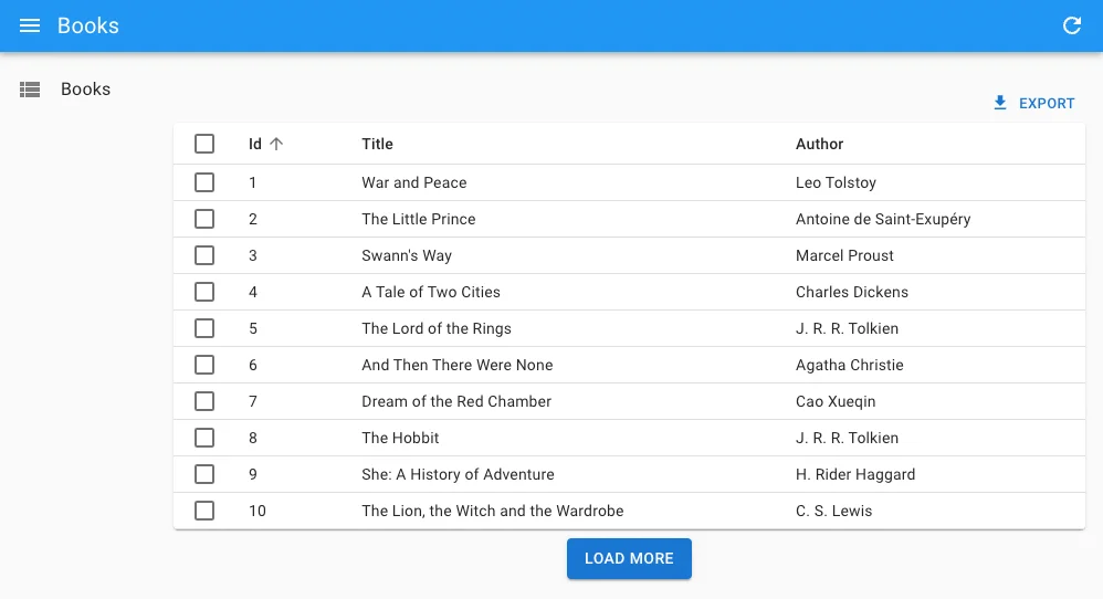
The <InfiniteList> component is an alternative to the <List> component that allows user to load more records when they scroll to the bottom of the list. It’s useful when you have a large number of records, or when users are using a mobile device.
<InfiniteList> fetches the list of records from the data provider, and renders the default list layout (title, buttons, filters). It delegates the rendering of the list of records to its child component. Usually, it’s a <DataTable> or a <SimpleList>, responsible for displaying a table with one row for each record.
Usage
Here is the minimal code necessary to display a list of books with infinite scroll:
// in src/books.js
import { InfiniteList, DataTable, DateField } from 'react-admin';

export const BookList = () => (
    <InfiniteList>
        <DataTable>
            <DataTable.Col source="id" />
            <DataTable.Col source="title" />
            <DataTable.Col source="author" field={DateField} />
        </DataTable>
    </InfiniteList>
);

// in src/App.js
import { Admin, Resource } from 'react-admin';
import jsonServerProvider from 'ra-data-json-server';

import { BookList } from './books';

const App = () => (
    <Admin dataProvider={jsonServerProvider('https://jsonplaceholder.typicode.com')}>
        <Resource name="books" list={BookList} />
    </Admin>
);

export default App;
That’s enough to display a basic post list, that users can sort and filter, and load additional records when they reach the bottom of the list.
Tip: <DataTable> has a sticky header by default, so the user can always see the column names when they scroll down.
Props
The props are the same as the <List> component:
| Prop | Required | Type | Default | Description |
|---|---|---|---|---|
children |
Required if no render | ReactNode |
- | The component to use to render the list of records. |
render |
Required if no children | ReactNode |
- | A function that render the list of records, receives the list context as argument. |
actions |
Optional | ReactElement |
- | The actions to display in the toolbar. |
aside |
Optional | (listContext) => ReactNode |
- | The component to display on the side of the list. |
authLoading |
Optional | ReactNode |
- | The component to render while checking for authentication and permissions. |
component |
Optional | Component |
Card |
The component to render as the root element. |
debounce |
Optional | number |
500 |
The debounce delay in milliseconds to apply when users change the sort or filter parameters. |
disable Authentication |
Optional | boolean |
false |
Set to true to disable the authentication check. |
disable SyncWithLocation |
Optional | boolean |
false |
Set to true to disable the synchronization of the list parameters with the URL. |
empty |
Optional | ReactNode |
- | The component to display when the list is empty. |
empty WhileLoading |
Optional | boolean |
false |
Set to true to return null while the list is loading. |
error |
Optional | ReactNode |
- | The component to render when failing to load the list of records. |
exporter |
Optional | function |
- | The function to call to export the list. |
filters |
Optional | ReactElement |
- | The filters to display in the toolbar. |
filter |
Optional | object |
- | The permanent filter values. |
filter DefaultValues |
Optional | object |
- | The default filter values. |
loading |
Optional | ReactNode |
- | The component to render while loading the list of records. |
offline |
Optional | ReactNode |
<Offline> |
The component to render when there is no connectivity and there is no data in the cache |
pagination |
Optional | ReactNode |
<Infinite Pagination> |
The pagination component to use. |
perPage |
Optional | number |
10 |
The number of records to fetch per page. |
queryOptions |
Optional | object |
- | The options to pass to the useQuery hook. |
resource |
Optional | string |
- | The resource name, e.g. posts. |
sort |
Optional | object |
- | The initial sort parameters. |
storeKey |
Optional | string |
- | The key to use to store the current filter & sort. |
title |
Optional | ReactNode / string / false |
- | The title to display in the App Bar. |
sx |
Optional | object |
- | The CSS styles to apply to the component. |
Check the <List> component for details about each prop.
Additional props are passed down to the root component (a MUI <Card> by default).
offline
By default, <InfiniteList> renders the <Offline> component when there is no connectivity and there are no records in the cache yet for the current parameters (page, sort, etc.). You can provide your own component via the offline prop:
import { InfiniteList, InfinitePagination } from 'react-admin';
import { Alert } from '@mui/material';

const offline = <Alert severity="warning">No network. Could not load the posts.</Alert>;
// The offline component may be displayed at the bottom of the page if the network connectivity is lost
// when loading new pages. Make sure you pass your custom offline component here too
const pagination = <InfinitePagination offline={offline} />;

export const PostList = () => (
    <InfiniteList offline={offline} pagination={pagination}>
        ...
    </InfiniteList>
);
Tip: If the record is in the Tanstack Query cache but you want to warn the user that they may see an outdated version, you can use the <IsOffline> component:
import { InfiniteList, InfinitePagination, IsOffline } from 'react-admin';
import { Alert } from '@mui/material';

const offline = <Alert severity="warning">No network. Could not load the posts.</Alert>;
// The offline component may be displayed at the bottom of the page if the network connectivity is lost
// when loading new pages. Make sure you pass your custom offline component here too
const pagination = <InfinitePagination offline={offline} />;

export const PostList = () => (
    <InfiniteList offline={offline} pagination={pagination}>
        <IsOffline>
           <Alert severity="warning">
                You are offline, the data may be outdated
            </Alert>
        </IsOffline>
        ...
    </InfiniteList>
);
pagination
You can replace the default “load on scroll” pagination (triggered by a component named <InfinitePagination>) by a custom pagination component. To get the pagination state and callbacks, you’ll need to read the InfinitePaginationContext.
For example, here is a custom infinite pagination component displaying a “Load More” button at the bottom of the list:
import { InfiniteList, useInfinitePaginationContext, DataTable } from 'react-admin';
import { Box, Button } from '@mui/material';

const LoadMore = () => {
    const {
        hasNextPage,
        fetchNextPage,
        isFetchingNextPage,
    } = useInfinitePaginationContext();
    return hasNextPage ? (
        <Box sx={{ mt: 1, textAlign: "center" }}>
            <Button
                disabled={isFetchingNextPage}
                onClick={() => fetchNextPage()}
            >
                Load more
            </Button>
        </Box>
    ) : null;
};

export const BookList = () => (
    <InfiniteList pagination={<LoadMore />}>
        <DataTable>
            <DataTable.Col source="id" />
            <DataTable.Col source="title" />
            <DataTable.Col source="author" />
        </DataTable>
    </InfiniteList>
);
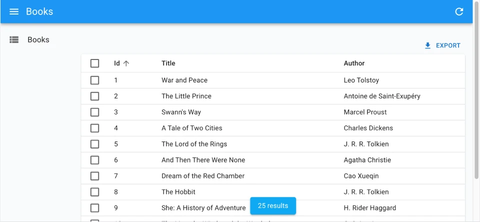
Showing The Record Count
One drawback of the <InfiniteList> component is that it doesn’t show the number of results. To fix this, you can use useListContext to access the total property of the list, and render the total number of results in a sticky footer:
import { useListContext, InfinitePagination, InfiniteList } from 'react-admin';
import { Box, Card, Typography } from '@mui/material';

const CustomPagination = () => {
    const { total } = useListContext();
    return (
        <>
            <InfinitePagination />
            {total > 0 && (
                <Box sx={{ position: "sticky", bottom: 0, textAlign: "center" }}>
                    <Card
                        elevation={2}
                        sx={{ px: 2, py: 1, mb: 1, display: 'inline-block' }}
                    >
                        <Typography variant="body2">{total} results</Typography>
                    </Card>
                </Box>
            )}
        </>
    );
};

export const BookList = () => (
    <InfiniteList pagination={<CustomPagination />}>
        // ...
    </InfiniteList>
);
Controlled Mode
<InfiniteList> deduces the resource and the list parameters from the URL. This is fine for a page showing a single list of records, but if you need to display more than one list in a page, you probably want to define the list parameters yourself.
In that case, use the resource, sort, and filter props to set the list parameters.
import { InfiniteList, InfinitePagination, SimpleList } from 'react-admin';
import { Container, Typography } from '@mui/material';

const Dashboard = () => (
    <Container>
        <Typography>Latest posts</Typography>
        <InfiniteList
            resource="posts"
            sort={{ field: 'published_at', order: 'DESC' }}
            filter={{ is_published: true }}
            disableSyncWithLocation
        >
            <SimpleList
                primaryText={record => record.title}
                secondaryText={record => `${record.views} views`}
            />
            <InfinitePagination />
        </InfiniteList>
        <Typography>Latest comments</Typography>
        <InfiniteList
            resource="comments"
            sort={{ field: 'published_at', order: 'DESC' }}
            perPage={10}
            disableSyncWithLocation
        >
            <SimpleList
                primaryText={record => record.author.name}
                secondaryText={record => record.body}
                tertiaryText={record => new Date(record.published_at).toLocaleDateString()}
            />
            <InfinitePagination />
        </InfiniteList>
    </Container>
)
Headless Version
Besides fetching a list of records from the data provider, <InfiniteList> renders the default list page layout (title, buttons, filters, a Material-UI <Card>, infinite pagination) and its children. If you need a custom list layout, you may prefer the <InfiniteListBase> component, which only renders its children in a ListContext.
import { InfiniteListBase, InfinitePagination, WithListContext } from 'react-admin';
import { Card, CardContent, Container, Stack, Typography } from '@mui/material';

const ProductList = () => (
    <InfiniteListBase>
        <Container>
            <Typography variant="h4">All products</Typography>
            <WithListContext render={({ isPending, data }) => (
                    !isPending && (
                        <Stack spacing={1}>
                            {data.map(product => (
                                <Card key={product.id}>
                                    <CardContent>
                                        <Typography>{product.name}</Typography>
                                    </CardContent>
                                </Card>
                            ))}
                        </Stack>
                    )
                )} />
            <InfinitePagination />
        </Container>
    </InfiniteListBase>
);
The previous example leverages <WithListContext> to grab the data that <ListBase> stores in the ListContext.
If you don’t need the ListContext, you can use the useInfiniteListController hook, which does the same data fetching as <InfiniteListBase> but lets you render the content.
import { useInfiniteListController } from 'react-admin';
import { Card, CardContent, Container, Stack, Typography } from '@mui/material';

const ProductList = () => {
    const { isPending, data } = useInfiniteListController();
    return (
        <Container>
            <Typography variant="h4">All products</Typography>
                {!isPending && (
                    <Stack spacing={1}>
                        {data.map(product => (
                            <Card key={product.id}>
                                <CardContent>
                                    <Typography>{product.name}</Typography>
                                </CardContent>
                            </Card>
                        ))}
                    </Stack>
                )}
        </Container>
    );
};
useInfiniteListController returns callbacks to sort, filter, and paginate the list, so you can build a complete List page.
Security
The <InfiniteList> component requires authentication and will redirect anonymous users to the login page. If you want to allow anonymous access, use the disableAuthentication prop.
If your authProvider implements Access Control, <InfiniteList> will only render if the user has the “list” access to the related resource.
For instance, for the <PostList> page below:
import { InfiniteList, DataTable } from 'react-admin';

// Resource name is "posts"
const PostList = () => (
    <InfiniteList>
        <DataTable>
            <DataTable.Col source="title" />
            <DataTable.Col source="author" />
            <DataTable.Col source="published_at" />
        </DataTable>
    </InfiniteList>
);
<InfiniteList> will call authProvider.canAccess() using the following parameters:
{ action: "list", resource: "posts" }
Users without access will be redirected to the Access Denied page.
Note: Access control is disabled when you use the disableAuthentication prop.