<Calendar>
This Enterprise Edition component, part of the
 ra-calendar module, renders a list of events as a calendar.
The user interface offers everything you expect:
- month, week, day views
- list view
- drag and resize events
- whole-day events
- creating an event by clicking in the calendar
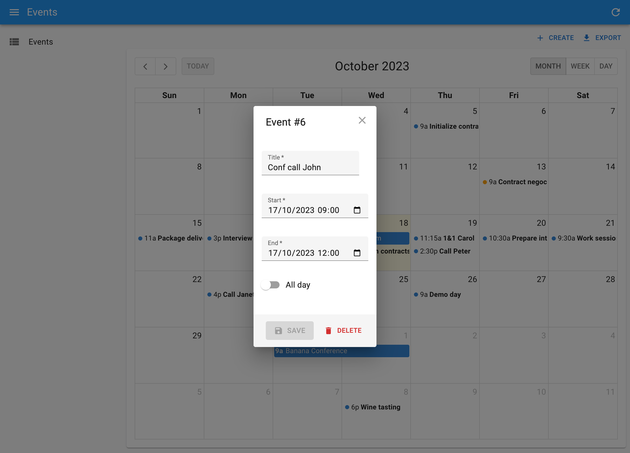
- edition of event title, and metadata
- events spanning on multiple days
- recurring events
- background events
- theming
- locales and timezones
- resource time grid (e.g. rooms) (requires additional licence from Full Calendar)
Usage
React-admin provides 2 components for viewing and editing events in a calendar: <CompleteCalendar> and <Calendar>.
<CompleteCalendar> is an all-in one component that renders a calendar, as well as a dialog with an event form when users want to edit or create an event.
<CompleteCalendar> is a full replacement for the <List> component, expecting an event form as child:
// in src/events/EventList.tsx
import { CompleteCalendar } from '@react-admin/ra-calendar';
import { SimpleForm, TextInput, DateTimeInput } from 'react-admin';

export const EventList = () => (
    <CompleteCalendar>
        <SimpleForm>
            <TextInput source="title" autoFocus />
            <DateTimeInput source="start" />
            <DateTimeInput source="end" />
        </SimpleForm>
    </CompleteCalendar>
);
Use it as the list prop of a <Resource>. No need to specify an edit or create prop for this resource, as <CompleteCalendar> will the edit and create forms in a dialog.
import { Admin, Resource } from 'react-admin';

import dataProvider from './dataProvider';
import { EventList } from './events/EventList.tsx';

export const App = () => (
    <Admin dataProvider={dataProvider}>
        <Resource name="events" list={EventList} />
    </Admin>
);
<Calendar>, on the other hand, doesn’t render the event form in a dialog. Instead, it redirects to the Edition or Creation pages when users click on an event or the Create button.
<Calendar> must be used as a child of react-admin’s <List> component:
// in src/events/EventList.tsx
import { Calendar, getFilterValuesFromInterval } from '@react-admin/ra-calendar';
import { List } from 'react-admin';

export const EventList = () => (
    <List
        filterDefaultValues={getFilterValuesFromInterval()}
        perPage={1000}
        pagination={false}
    >
        <Calendar />
    </List>
);
To allow creation and edition of events with <Calendar>, you must provide edit and create components to the event resource:
import { Admin, Resource } from 'react-admin';

import dataProvider from './dataProvider';
import { EventList, EventEdit, EventCreate } from './events';

export const App = () => (
    <Admin dataProvider={dataProvider}>
        <Resource
            name="events"
            list={EventList}
            edit={EventEdit}
            create={EventCreate}
        />
    </Admin>
);
Both <CompleteCalendar> and <Calendar> expect the dataProvider to return events in a predefined format (see Event format below).
Events Format
The calendar can display a list of Events. Events must be resources with at least a string id, a title, and a start date. Here is a typical event:
{
    id: '432646',
    title: 'Package delivery',
    start: '2020-10-20T08:00:00.000Z',
    end: '2020-10-20T09:30:00.000Z',
},
That means that in order to be able to use ra-calendar, your dataProvider must return event-like objects for at least one resource. In case your event records don’t exactly match this format, ra-calendar allows to specify a function to convert records to Events. See Using A Custom Event Format for an example.
Events can have many more fields, e.g. for recurrent events, groups, colors, etc. Check the Event format on the Full Calendar documentation.
In addition, the calendar queries a list of events in a time interval. Your dataProvider must support getList() queries with an interval filter. By default, the interval filter looks like the following:
{
    // lower time boundary (gte stands for 'greater than or equal')
    start_gte: '2020-10-01T00:00:00.000Z',
    // upper time boundary (lte stands for 'less than or equal')
    start_lte: '2020-12-31T23:59:59.000Z'
}
The ra-calendar provides a function to transform the display interval into a dataProvider filter. Again, see Using A Custom Event Format for an example.
<CompleteCalendar>
This all-in one component renders a calendar, as well as a form to edit or create new events that opens in a dialog. It is deeply integrated with react-admin, and benefits from the same speed optimizations.
Use it as the list prop of a <Resource>. No need to specify an edit or create prop for this resource, but you’ll have to pass a form component (like <SimpleForm>) as child of <CompleteCalendar> to define the event edition form.
Here is an example:
import React from 'react';
import {
    Admin,
    Resource,
    List,
    SimpleForm,
    TextInput,
    DateTimeInput,
} from 'react-admin';
import { CompleteCalendar } from '@react-admin/ra-calendar';

import dataProvider from './dataProvider';

const EventList = () => (
    <CompleteCalendar>
        <SimpleForm>
            <TextInput source="title" autoFocus />
            <DateTimeInput source="start" />
            <DateTimeInput source="end" />
        </SimpleForm>
    </CompleteCalendar>
);

export const Basic = () => (
    <Admin dataProvider={dataProvider}>
        <Resource name="events" list={EventList} />
    </Admin>
);
ListProps
<CompleteCalendar> renders a react-admin <List> element, that you can customize by specifying a ListProps prop.
For instance, to limit the number of events fetched from the server to 100 (instead of the default 1000), you can override the <List perPage> prop as follows:
import React from 'react';
import { DateTimeInput, SimpleForm, TextInput } from 'react-admin';
import { CompleteCalendar } from '@react-admin/ra-calendar';

const EventList = () => (
    <CompleteCalendar
        ListProps={{
            perPage: 100,
        }}
    >
        <SimpleForm>
            <TextInput source="title" />
            <DateTimeInput source="start" />
            <DateTimeInput source="end" />
        </SimpleForm>
    </CompleteCalendar>
);
Check the possible values for ListProps in the <List> component documentation.
CalendarProps
Under the hood, <CompleteCalendar> renders a <Calendar> element, which is a react-admin wrapper for Full Calendar. You can customize all the <Calendar> and FullCalendar props by passing a CalendarProps prop.
For instance, to set a French locale, map non-standard event records to the expected Event type, and define boundaries to the possible events:
import React from 'react';
import { DateTimeInput, SimpleForm, TextInput } from 'react-admin';
import { CompleteCalendar } from '@react-admin/ra-calendar';
import frLocale from '@fullcalendar/core/locales/fr';
import { EventInput } from '@fullcalendar/core';

const EventList = () => (
    <CompleteCalendar
        CalendarProps={{
            locale: frLocale,
            convertToEvent: (event: any): EventInput => ({
                id: String(event.id),
                title: event.name,
                start: event.begin,
                end: event.finish,
                backgroundColor: colorForCategory(event.category),
                borderColor: colorForCategory(event.category),
                editable: event.can_edit,
                url: `https://meet.jit.si/${event.jitsi_meet_id}`,
            }),
            validRange: {
                start: '2017-05-01',
                end: '2017-06-01',
            },
        }}
    >
        <SimpleForm>
            <TextInput source="title" />
            <DateTimeInput source="start" />
            <DateTimeInput source="end" />
        </SimpleForm>
    </CompleteCalendar>
);
Check the possible values for CalendarProps in the <Calendar> and <FullCalendar> documentation.
EditDialogProps
For content edition, <CompleteCalendar> relies on ra-form-layout’s <EditDialog> to display its child form in a dialog.
You can customize <EditDialog> props like title, redirect, onSuccess and onFailure by passing a custom EditDialogProps prop.
For instance, to customize the title of the Edit dialog:
import React from 'react';
import { DateTimeInput, SimpleForm, TextInput, useRecordContext } from 'react-admin';
import { CompleteCalendar } from '@react-admin/ra-calendar';

const EventEditTitle = () => {
    const record = useRecordContext();
    return <span>Edit {record ? `"${record.title}"` : ''}</span>;
}

const EventList = () => (
    <CompleteCalendar
        EditDialogProps={{
            title: <EventEditTitle />,
        }}
    >
        <SimpleForm>
            <TextInput source="title" />
            <DateTimeInput source="start" />
            <DateTimeInput source="end" />
        </SimpleForm>
    </CompleteCalendar>
);
Check the possible values for EditDialogProps in the <EditDialog> component documentation.
CreateDialogProps
For content addition, <CompleteCalendar> relies on ra-form-layout’s <CreateDialog> to display its child form in a dialog.
You can customize <CreateDialog> props like title, redirect, onSuccess and onFailure by passing a custom CreateDialogProps prop.
For instance, to customize the title of the Creation dialog:
import React from 'react';
import { DateTimeInput, SimpleForm, TextInput } from 'react-admin';
import { CompleteCalendar } from '@react-admin/ra-calendar';

const EventList = () => (
    <CompleteCalendar
        CreateDialogProps={{
            title: () => <span>Create new appointment</span>,
        }}
    >
        <SimpleForm>
            <TextInput source="title" />
            <DateTimeInput source="start" />
            <DateTimeInput source="end" />
        </SimpleForm>
    </CompleteCalendar>
);
Check the possible values for CreateDialogProps in the <CreateDialog> component documentation.
mutationOptions
An options object used for the event mutation when it’s updated or created by the underlying <Calendar>, <EditDialog>, and <CreateDialog> components. Use it to set custom side effects for all the mutations performed by the calendar.
The mutationOptions prop provided directly through CalendarProps, EditDialogProps or CreateDialogProps will take precedence.
import React, { ComponentProps } from 'react';
import { List, useNotify } from 'react-admin';
import { CompleteCalendar } from '@react-admin/ra-calendar';

const EventList = () => {
    const notify = useNotify();

    const handleError = err => {
        notify(err.message, 'error');
    };

    return (
        <CompleteCalendar mutationOptions={{ onError: handleError }}>
            <SimpleForm>
                <TextInput source="title" autoFocus />
                <DateTimeInput source="start" />
                <DateTimeInput source="end" />
            </SimpleForm>
        </CompleteCalendar>
    );
};
transform
A function that receives the event from full-calendar and returns the data that should be sent to the dataProvider method. It affects the create and edit dialogs, and the Calendar itself.
The transform prop provided directly through CalendarProps, EditDialogProps or CreateDialogProps will take precedence.
import React, { ComponentProps } from 'react';
import { List } from 'react-admin';
import { Calendar } from '@react-admin/ra-calendar';

const EventList = () => {
    const handleTransform = eventData => {
        return { ...eventData, customParameter: true };
    };

    return (
        <CompleteCalendar transform={handleTransform}>
            <SimpleForm>
                <TextInput source="title" autoFocus />
                <DateTimeInput source="start" />
                <DateTimeInput source="end" />
            </SimpleForm>
        </CompleteCalendar>
    );
};
Using A Custom Event Format
If your events don’t match the Full Calendar event format, you can still use <CompleteCalendar>.
You will need to:
- Use the
convertToEventprop to tell<CompleteCalendar>how to convert the events - Use a custom function to compute the filter values from the current date interval (called
customGetFilterValuesin our example) - Use your own field names in the form (e.g. use
start_dateandend_dateinstead ofstartandend)
Here is an example:
import { DatesSetArg } from '@fullcalendar/core';
import { add, set, sub } from 'date-fns';
import {
    BooleanInput,
    DateTimeInput,
    SimpleForm,
    TextInput,
} from 'react-admin';
import { CompleteCalendar } from '@react-admin/ra-calendar';

const EventListEventFormat = () => {
    const converter = ({ start_date, end_date, ...rest }) => ({
        ...rest,
        start: start_date,
        end: end_date,
    });
    const customGetFilterValues = (
        dateInfo?: DatesSetArg,
        filterValues: any = {}
    ): any => {
        const now = set(new Date(), {
            hours: 0,
            minutes: 0,
            seconds: 0,
            milliseconds: 0,
        });
        const nowMinus1Month = sub(now, { months: 1 });
        const nowPlus2Months = add(now, { months: 2 });
        return !dateInfo ||
            (dateInfo.start > nowMinus1Month && dateInfo.end < nowPlus2Months)
            ? {
                  ...filterValues,
                  start_date_gte: nowMinus1Month.toISOString(),
                  start_date_lte: nowPlus2Months.toISOString(),
              }
            : {
                  ...filterValues,
                  start_date_gte: dateInfo.startStr,
                  start_date_lte: dateInfo.endStr,
              };
    };
    return (
        <CompleteCalendar
            ListProps={{
                filterDefaultValues: customGetFilterValues(),
            }}
            CalendarProps={{
                getFilterValueFromInterval: customGetFilterValues,
                convertToEvent: converter,
            }}
        >
            <SimpleForm>
                <TextInput source="title" autoFocus isRequired />
                <DateTimeInput source="start_date" />
                <DateTimeInput source="end_date" />
                <BooleanInput source="allDay" fullWidth />
            </SimpleForm>
        </CompleteCalendar>
    );
};
<Calendar>
A wrapper around full-calendar’s <FullCalendar> component, using react-admin’s useListContext hook to read data, and linking to the edit and create views of the current resource. Must be used inside a <ListContext>.
Use this component as a child of <List>, as follows:
import {
    Admin,
    Resource,
    List,
    Edit,
    EditProps,
    Create,
    CreateProps,
    SimpleForm,
    TextInput,
    DateTimeInput,
} from 'react-admin';
import {
    Calendar,
    getFilterValuesFromInterval,
} from '@react-admin/ra-calendar';

const EventList = () => (
    <List
        filterDefaultValues={getFilterValuesFromInterval()}
        perPage={1000}
        pagination={false}
    >
        <Calendar />
    </List>
);

const EventEdit = () => (
    <Edit>
        <SimpleForm>
            <TextInput source="title" />
            <DateTimeInput source="start" />
            <DateTimeInput source="end" />
        </SimpleForm>
    </Edit>
);

const EventCreate = () => (
    <Create>
        <SimpleForm>
            <TextInput source="title" />
            <DateTimeInput source="start" />
            <DateTimeInput source="end" />
        </SimpleForm>
    </Create>
);

export const App = () => (
    <Admin dataProvider={dataProvider}>
        <Resource
            name="events"
            list={EventList}
            edit={EventEdit}
            create={EventCreate}
        />
    </Admin>
);
In this example, the <List> is initialized to load at most 1000 events, in a 3-months interval around the current date.
Props passed to the <Calendar> element are passed down to an underlying <FullCalendar> element, so you can set every Full Calendar options via the <Calendar> props. For instance, to customize the content rendered for each event, use the eventContent prop:
<Calendar
    eventContent={(eventContent: EventContentArg): JSX.Element => (
        <>
            <b>{eventContent.timeText}</b> <i>{eventContent.event.title}</i>
        </>
    )}
/>
In addition to Full Calendar props, ra-calendar’s <Calendar> supports a few more additional props, documented below.
locale
The locale and locales options allow you to localize certain aspects of the calendar:
- the text in buttons, as defined by headerToolbar
- text that contains month or day-of-week strings
- date formatting, such as eventTimeFormat
- weekNumberCalculation
- firstDay
If your admin uses only one locale, import the localization from @fullcalendar/core/locales, and pass it as locale:
import { List } from 'react-admin';
import {
    Calendar,
    getFilterValuesFromInterval,
} from '@react-admin/ra-calendar';
import frLocale from '@fullcalendar/core/locales/fr';

const EventList = () => (
    <List
        filterDefaultValues={getFilterValuesFromInterval()}
        perPage={1000}
        pagination={false}
    >
        <Calendar locale={frLocale} />
    </List>
);
If your admin can have a finite number of locales, load them all in the locales prop, and set the initial locale via the locale prop:
import { List } from 'react-admin';
import {
    Calendar,
    getFilterValuesFromInterval,
} from '@react-admin/ra-calendar';
import esLocale from '@fullcalendar/core/locales/es';
import frLocale from '@fullcalendar/core/locales/fr';

const EventList = () => (
    <List
        filterDefaultValues={getFilterValuesFromInterval()}
        perPage={1000}
        pagination={false}
    >
        <Calendar locales={[esLocale, frLocale]} locale="fr" />
    </List>
);
Tip: You don’t need to load the 'en' locale as it is already loaded by default.
If you’d like the calendar to use the same locale as the rest of your admin, simply use the locale provided by useLocaleState:
import { List, useLocaleState } from 'react-admin';
import {
    Calendar,
    getFilterValuesFromInterval,
} from '@react-admin/ra-calendar';
import esLocale from '@fullcalendar/core/locales/es';
import frLocale from '@fullcalendar/core/locales/fr';

const EventList = () => {
    const [locale] = useLocaleState();
    return (
        <List
            filterDefaultValues={getFilterValuesFromInterval()}
            perPage={1000}
            pagination={false}
        >
            <Calendar locales={[esLocale, frLocale]} locale={locale} />
        </List>
    )
};
And if you want to support all locales and initialize the calendar based on the user navigator preferences, use ra-calendar’s getNavigatorLanguage() helper:
import { List } from 'react-admin';
import {
    Calendar,
    getFilterValuesFromInterval,
    getNavigatorLanguage,
} from '@react-admin/ra-calendar';
import allLocales from '@fullcalendar/core/locales-all';

const EventList = () => (
    <List
        filterDefaultValues={getFilterValuesFromInterval()}
        perPage={1000}
        pagination={false}
    >
        <Calendar locales={allLocales} locale={getNavigatorLanguage()} />
    </List>
);
Note that using allLocales make the JS bundle significantly larger - avoid it if you only need to support a few locales.
getFilterValuesFromInterval
The getFilterValuesFromInterval() function returns filter values based on the interval displayed on the screen (e.g. the current mont, the current week, etc.). ra-calendar does its best to minimize queries to the dataProvider by requesting a 3 months interval by default (1 month before the current day, and 2 months after). You can change that behavior, and transform the filter object sent to the dataProvider.getList() method, by passing your own getFilterValueFromInterval prop:
import { List } from 'react-admin';
import { Calendar } from '@react-admin/ra-calendar';
import { DatesSetArg } from '@fullcalendar/core';
import { add, sub, set } from 'date-fns';

/**
 * By default, return an interval of 3 months around now (1 month before, 2 months after)
 * unless the user requires a larger interval.
 *
 * This minimizes queries while navigating.
 */
const customGetFilterValues = (
    dateInfo?: DatesSetArg,
    filterValues: any = {}
): any => {
    const now = set(new Date(), {
        hours: 0,
        minutes: 0,
        seconds: 0,
        milliseconds: 0,
    });
    const nowMinus1Month = sub(now, { months: 1 });
    const nowPlus2Months = add(now, { months: 2 });
    return !dateInfo ||
        (dateInfo.start > nowMinus1Month && dateInfo.end < nowPlus2Months)
        ? {
              ...filterValues,
              start_gte: nowMinus1Month.toISOString(),
              start_lte: nowPlus2Months.toISOString(),
          }
        : {
              ...filterValues,
              start_gte: dateInfo.startStr,
              start_lte: dateInfo.endStr,
          };
};

const EventList = () => (
    <List
        filterDefaultValues={customGetFilterValues()}
        perPage={1000}
        pagination={false}
    >
        <Calendar getFilterValueFromInterval={customGetFilterValues} />
    </List>
);
Note: You have to pass customGetFilterValues both to the <List> and the <Calendar> component. Indeed, the first is called without parameters, and is only used to initialize a default filter in the List context, in order to limit the number of events fetched. The latter is the actual filter that will be updated according to the <Calendar>’s current view.
convertToEvent
Full Calendar accepts many properties for events, like allDay, backgroundColor, url, editable, etc. If you build an admin for an existing API, your events structure will probably not match that shape. In that case, use the convertToEvent prop to convert records of arbitrary shape to the Full Calendar event format.
For instance, let’s say your dataProvider returns records like the following:
{
    "id": 8,
    "name": "Interview Helen",
    "begin": "2020-04-23 11:30:00",
    "finish": "2020-04-23 12:00:00",
    "category": "job_interview",
    "can_edit": false,
    "jitsi_meet_id": "CynicalOxygensContainOut"
}
Full Calendar won’t work unless you convert these records to events looking like the following:
{
    "id": 8,
    "title": "Interview Helen",
    "start": "2020-04-23 11:30:00",
    "end": "2020-04-23 12:00:00",
    "backgroundColor": "orange",
    "borderColor": "orange",
    "editable": false,
    "url": "https://meet.jit.si/CynicalOxygensContainOut"
}
Pass a convertion function as the convertToEvent prop of the <Calendar> element:
import { List } from 'react-admin';
import { Calendar } from '@react-admin/ra-calendar';
import { EventInput, DatesSetArg } from '@fullcalendar/core';

const converter = (event: any): EventInput => ({
    id: String(event.id),
    title: event.name,
    start: event.begin,
    end: event.finish,
    backgroundColor: colorForCategory(event.category),
    borderColor: colorForCategory(event.category),
    editable: event.can_edit,
    url: `https://meet.jit.si/${event.jitsi_meet_id}`,
});

const customGetFilterValues = (dateInfo?: DatesSetArg): any =>
    dateInfo
        ? {
              begin_gte: dateInfo.startStr,
              begin_lte: dateInfo.endStr,
          }
        : {
              begin_gte: new Date('2020-10-01'),
              begin_lte: new Date('2020-10-31'),
          };

const EventList = () => (
    <List
        filterDefaultValues={customGetFilterValues()}
        perPage={1000}
        pagination={false}
    >
        <Calendar
            convertToEvent={converter}
            getFilterValueFromInterval={customGetFilterValues}
        />
    </List>
);
mutationOptions
An options object used for the event mutation when it has been resized or moved. Use it e.g. to override success or error side effects.
import { List, useNotify } from 'react-admin';
import { Calendar } from '@react-admin/ra-calendar';

const EventList = () => {
    const notify = useNotify();

    const handleError = err => {
        notify(err.message, 'error');
    };

    return (
        <List perPage={1000} pagination={false}>
            <Calendar mutationOptions={{ onError: handleError }} />
        </List>
    );
};
transform
A function that receives the event from full-calendar and return the data that should be sent to the dataProvider method:
import { List } from 'react-admin';
import { Calendar } from '@react-admin/ra-calendar';

const EventList = () => {
    const handleTransform = eventData => {
        return { ...eventData, customParameter: true };
    };

    return (
        <List perPage={1000} pagination={false}>
            <Calendar transform={handleTransform} />
        </List>
    );
};
plugins
FullCalendar offers a variety of plugins, allowing to add more features to the calendar.
For instance, let’s add the rrule plugin, which will add support for recurring events.
To add a new plugin, you must first install it.
npm install --save @fullcalendar/rrule
# or
yarn add @fullcalendar/rrule
Then, import it in your app, and pass it to the <Calendar> component via the plugins prop.
Tip: ra-calendar already comes with pre-enabled plugins: dayGridPlugin, timeGridPlugin and interactionPlugin. You will probably want to include them too.
import { List } from 'react-admin';
import { Calendar } from '@react-admin/ra-calendar';
import dayGridPlugin from '@fullcalendar/daygrid';
import timeGridPlugin from '@fullcalendar/timegrid';
import interactionPlugin from '@fullcalendar/interaction';
import rrulePlugin from '@fullcalendar/rrule';

const EventList = () => (
    <List perPage={1000} pagination={false}>
        <Calendar plugins={[ dayGridPlugin, timeGridPlugin, interactionPlugin, rrulePlugin ]} />
    </List>
);
That’s it! You can now use the rrule plugin’s features in your calendar.