
<Show>
The <Show> component is a page component that renders a single record.
<Show> handles the logic of the Show page:
- it calls
useShowControllerto fetch the record from the dataProvider viadataProvider.getOne(), - it computes the default page title
- it creates a
ShowContextand aRecordContext, - it renders the page layout with the correct title and actions
- it renders its child component (a show layout component like
<SimpleShowLayout>or<TabbedShowLayout>) in a Material UI<Card>
Usage
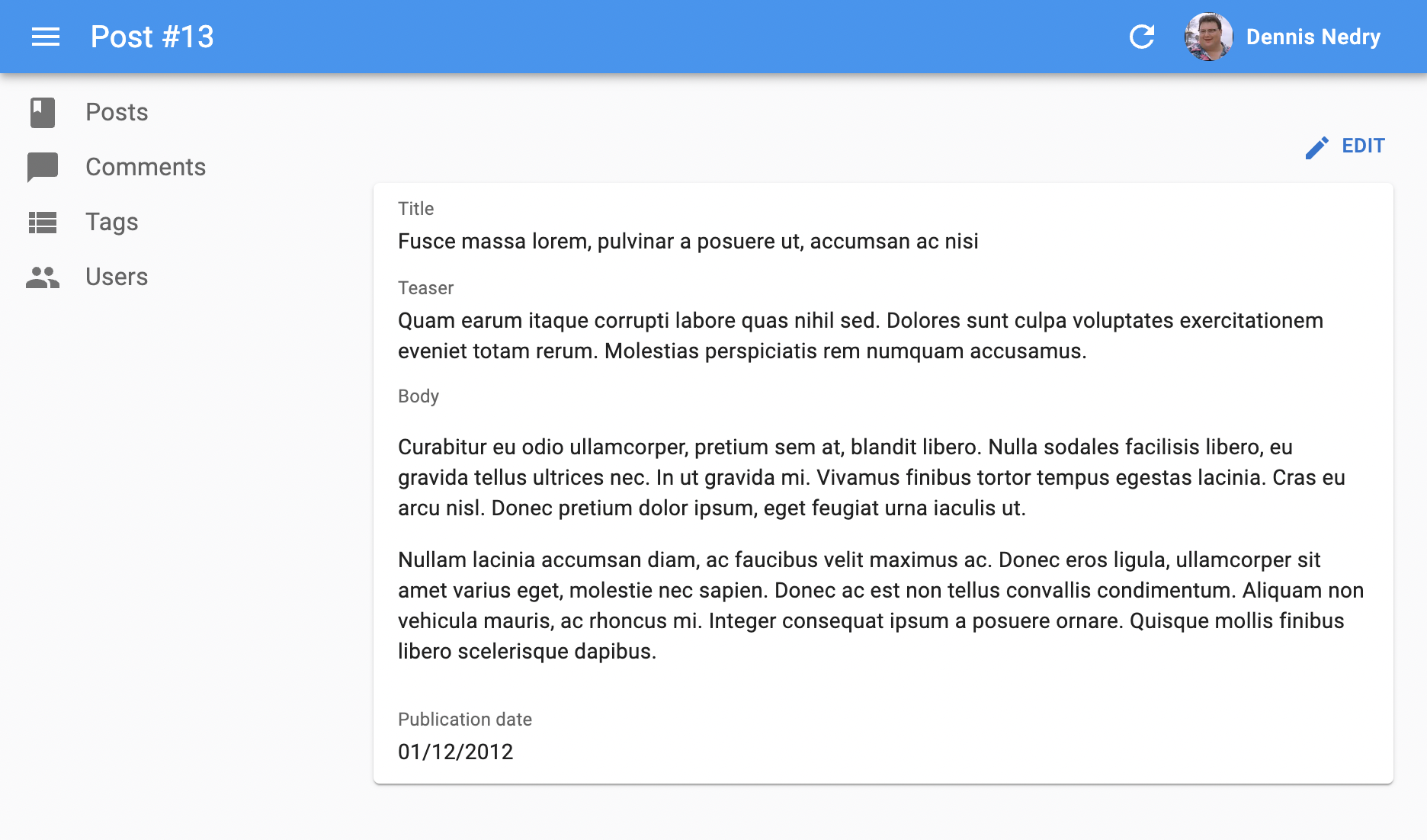
Here is the minimal code necessary to display a view to show a post:
// in src/posts.jsx
import { Show, SimpleShowLayout, TextField, DateField, RichTextField } from 'react-admin';

export const PostShow = () => (
    <Show>
        <SimpleShowLayout>
            <TextField source="title" />
            <TextField source="teaser" />
            <RichTextField source="body" />
            <DateField label="Publication date" source="published_at" />
        </SimpleShowLayout>
    </Show>
);
Components using <Show> can be used as the show prop of a <Resource> component:
// in src/App.jsx
import { Admin, Resource } from 'react-admin';

import { dataProvider } from './dataProvider';
import { PostShow } from './posts';

const App = () => (
    <Admin dataProvider={dataProvider}>
        <Resource name="posts" show={PostShow} />
    </Admin>
);
That’s enough to display the post show view above.
Props
| Prop | Required | Type | Default | Description |
|---|---|---|---|---|
children |
Optional * | ReactNode |
The components rendering the record fields | |
render |
Optional * | (showContext) => ReactNode |
A function rendering the record fields, receive the show context as its argument | |
authLoading |
Optional | ReactNode |
The component to render while checking for authentication and permissions | |
actions |
Optional | ReactElement |
The actions to display in the toolbar | |
aside |
Optional | ReactElement |
The component to display on the side of the list | |
className |
Optional | string |
passed to the root component | |
component |
Optional | Component |
Card |
The component to render as the root element |
disable Authentication |
Optional | boolean |
Set to true to disable the authentication check |
|
empty WhileLoading |
Optional | boolean |
Set to true to return null while the show is loading |
|
error |
Optional | ReactNode |
The component to render when failing to load the record | |
id |
Optional | string | number |
The record id. If not provided, it will be deduced from the URL | |
loading |
Optional | ReactNode |
The component to render while loading the record to show | |
offline |
Optional | ReactNode |
The component to render when there is no connectivity and the record isn’t in the cache | |
queryOptions |
Optional | object |
The options to pass to the useQuery hook |
|
redirectOnError |
Optional | 'list' | false | function |
'list' |
The page to redirect to when an error occurs |
resource |
Optional | string |
The resource name, e.g. posts |
|
sx |
Optional | object |
Override or extend the styles applied to the component | |
title |
Optional | ReactNode / string / false |
The title to display in the App Bar |
* You must provide either children or render.
actions
By default, <Show> includes an action toolbar with an <EditButton> if the <Resource> declared an edit component. You can replace the list of default actions by your own component using the actions prop:
import Button from '@mui/material/Button';
import { EditButton, Show, TopToolbar } from 'react-admin';

const PostShowActions = () => (
    <TopToolbar>
        <EditButton />
        {/* Add your custom actions */}
        <Button color="primary" onClick={customAction}>Custom Action</Button>
    </TopToolbar>
);

export const PostShow = () => (
    <Show actions={<PostShowActions />}>
        ...
    </Show>
);
aside
You can pass an aside element to the <Show> component. It will be rendered on the right side of the page, below the action toolbar.
The aside component renders in the same RecordContext as the Show child component. That means you can display details of the current record in the aside component by calling useRecordContext:
import {
    Show,
    SimpleShowLayout,
    TextField,
    DateField,
    RichTextField,
    useRecordContext
} from 'react-admin';

export const PostShow = () => (
    <Show aside={<Aside />}>
        <SimpleShowLayout>
            <TextField source="title" />
            <TextField source="teaser" />
            <RichTextField source="body" />
            <DateField label="Publication date" source="published_at" />
        </SimpleShowLayout>
    </Show>
);

const Aside = () => {
    const record = useRecordContext();
    return (
        <div style={{ width: 200, margin: '1em' }}>
            <Typography variant="h6">Post details</Typography>
            {record && (
                <Typography variant="body2">
                    Creation date: {record.createdAt}
                </Typography>
            )}
        </div>
    );
};
Tip: Always test the record is defined before using it, as react-admin starts rendering the UI before the dataProvider.getOne() call is over.
authLoading
By default, <Show> renders the <Loading> component while checking for authentication and permissions. You can display a custom component via the authLoading prop:
import { Show } from 'react-admin';

export const PostShow = () => (
    <Show authLoading={<p>Checking for permissions...</p>}>
        ...
    </Show>
);
children
<Show> doesn’t render any field by default - it delegates this to its children, called “Show layout components”. These components read the record from the RecordContext and render its fields.
React-admin provides 2 built-in show layout components:
<SimpleShowLayout>displays fields with a label in a single column<TabbedShowLayout>displays a list of tabs, each tab rendering a stack of fields with a label
To use an alternative layout, switch the <Show> child component:
import { Show } from 'react-admin';

export const PostShow = () => (
    <Show>
-       <SimpleShowLayout>
+       <TabbedShowLayout>
+           <TabbedShowLayout.Tab label="Main">
                <TextField source="title" />
                <TextField source="teaser" />
                <RichTextField source="body" />
                <DateField label="Publication date" source="created_at" />
+           </TabbedShowLayout.Tab>
-       </SimpleShowLayout>
+       </TabbedShowLayout>
    </Show>
);
You can also pass a React element as child, to build a custom layout. Check Building a custom Show Layout for more details.
You can also use the render prop to define a custom render function for the show view.
Tip: Use <ShowGuesser> instead of <Show> to let react-admin guess the fields to display based on the dataProvider response.
component
By default, the Show view renders the main content area inside a Material UI <Card>. The actual layout of the record fields depends on the Show Layout component you’re using (<SimpleShowLayout>, <TabbedShowLayout>, or a custom layout component).
You can override the main area container by passing a component prop:
import { Show } from 'react-admin';
import { Box } from '@mui/material';

const ShowWrapper = ({ children }) => (
    <Box sx={{ margin: 2, border: 'solid 1px grey' }}>
        {children}
    </Box>
);

// use a ShowWrapper as root component
const PostShow = () => (
    <Show component={ShowWrapper}>
        ...
    </Show>
);
disableAuthentication
By default, the <Show> component will automatically redirect the user to the login page if the user is not authenticated. If you want to disable this behavior and allow anonymous access to a show page, set the disableAuthentication prop to true.
import { Show } from 'react-admin';

const PostShow = () => (
    <Show disableAuthentication>
        ...
    </Show>
);
emptyWhileLoading
By default, <Show> renders its child component even before the dataProvider.getOne() call returns. If you use <SimpleShowLayout> or <TabbedShowLayout>, this isn’t a problem as these components only render when the record has been fetched.
But if you use a custom child component that expects the record context to be defined, your component will throw an error. For instance, the following will fail on load with a “ReferenceError: data is not defined” error:
import { Show, useShowContext } from 'react-admin';
import { Stack, Typography } from '@mui/icons-material/Star';

const SimpleBookShow = () => {
    const { record } = useShowContext();
    return (
        <Typography>
            <i>{record.title}</i>, by {record.author} ({record.year})
        </Typography>
    );
}

const BookShow = () => (
    <Show>
        <SimpleBookShow />
    </Show>
);
You can handle this case by getting the isPending variable from the useShowContext hook:
const SimpleBookShow = () => {
    const { record, isPending } = useShowContext();
    if (isPending) return null;
    return (
        <Typography>
            <i>{record.title}</i>, by {record.author} ({record.year})
        </Typography>
    );
}
The <Show emptyWhileLoading> prop provides a convenient shortcut for that use case. When enabled, <Show> won’t render its child until data is defined.
const BookShow = () => (
-   <Show>
+   <Show emptyWhileLoading>
        <SimpleBookShow />
    </Show>
);
error
By default, <Show> redirects to the list when an error happens while loading the record to show. You can render an error component via the error prop:
import { Show } from 'react-admin';

export const PostShow = () => (
    <Show error={<p>Something went wrong while loading your post!</p>}>
        ...
    </Show>
);
id
By default, <Show> deduces the identifier of the record to show from the URL path. So under the /posts/123/show path, the id prop will be 123. You may want to force a different identifier. In this case, pass a custom id prop.
import { Show } from 'react-admin';

export const PostShow = () => (
    <Show id="123">
        ...
    </Show>
);
Tip: Pass both a custom id and a custom resource prop to use <Show> independently of the current URL. This even allows you to use more than one <Show> component in the same page.
loading
By default, <Show> renders the children while loading the record to show. You can display a component during this time via the loading prop:
import { Show } from 'react-admin';

export const PostShow = () => (
    <Show loading={<p>Loading the post...</p>}>
        ...
    </Show>
);
offline
By default, <Show> renders the <Offline> component when there is no connectivity and the record hasn’t been cached yet. You can provide your own component via the offline prop:
import { Show } from 'react-admin';

export const PostShow = () => (
    <Show offline={<p>No network. Could not load the post.</p>}>
        ...
    </Show>
);
Tip: If the record is in the Tanstack Query cache but you want to warn the user that they may see an outdated version, you can use the <IsOffline> component:
import { Show, IsOffline } from 'react-admin';
import { Alert } from '@mui/material';

export const PostShow = () => (
    <Show offline={<p>No network. Could not load the post.</p>}>
        <IsOffline>
           <Alert severity="warning">
                You are offline, the data may be outdated
            </Alert>
        </IsOffline>
        ...
    </Show>
);
queryOptions
<Show> accepts a queryOptions prop to pass options to the react-query client.
This can be useful e.g. to pass a custom meta to the dataProvider.getOne() call.
import { Show } from 'react-admin';

export const PostShow = () => (
    <Show queryOptions={{ meta: { foo: 'bar' }}}>
        ...
    </Show>
);
With this option, react-admin will call dataProvider.getOne() on mount with the ` meta: { foo: ‘bar’ }` option.
You can also use the queryOptions prop to override the default error side effect. By default, when the dataProvider.getOne() call fails at the dataProvider level, react-admin shows an error notification and refreshes the page.
You can override this behavior and pass custom side effects by providing a custom queryOptions prop:
import * as React from 'react';
import { useNotify, useRefresh, useRedirect, Show, SimpleShowLayout } from 'react-admin';

const PostShow = () => {
    const notify = useNotify();
    const refresh = useRefresh();
    const redirect = useRedirect();

    const onError = (error) => {
        notify(`Could not load post: ${error.message}`, { type: 'error' });
        redirect('/posts');
        refresh();
    };

    return (
        <Show queryOptions={{ onError }}>
            <SimpleShowLayout>
                ...
            </SimpleShowLayout>
        </Show>
    );
}
The onError function receives the error from the dataProvider call (dataProvider.getOne()), which is a JavaScript Error object (see the dataProvider documentation for details).
The default onError function is:
(error) => {
    notify('ra.notification.item_doesnt_exist', { type: 'error' });
    redirect('list', resource);
    refresh();
}
redirectOnError
By default, <Show> redirects to the list when an error happens while loading the record to show. You can change the default redirection by setting the redirectOnError prop:
'list': redirect to the List view (the default)false: do not redirect- A function
(resource, id) => stringto redirect to different targets depending on the record
import { Show } from 'react-admin';

export const PostShow = () => (
    <Show redirectOnError={false}>
        ...
    </Show>
);
render
Instead of passing a children prop, you can pass a render prop, which is a function that receives the ShowContext as an argument and returns the React element to render. This allows you to access the record, isPending, and other properties from the showContext.
import { Show } from 'react-admin';

export const PostShow = () => (
    <Show render={({ record, error, isPending }) => {
        if (isPending) return <p>Loading...</p>;
        if (error) return <p>Error: {error.message}</p>;
        if (!record) return <p>No record found</p>;
        return (
            <div>
                <h1>{record.title}</h1>
                <p>{record.body}</p>
            </div>
        );
    }} />
);
resource
By default, <Show> operates on the current ResourceContext (defined at the routing level), so under the /posts/1/show path, the resource prop will be posts. You may want to force a different resource. In this case, pass a custom resource prop, and it will override the ResourceContext value.
import { Show } from 'react-admin';

export const UsersShow = () => (
    <Show resource="users">
        ...
    </Show>
);
Tip: Pass both a custom id and a custom resource prop to use <Show> independently of the current URL. This even allows you to use more than one <Show> component in the same page.
sx: CSS API
The <Show> component accepts the usual className prop, but you can override many class names injected to the inner components by React-admin thanks to the sx property (see the sx documentation for syntax and examples). This property accepts the following subclasses:
| Rule name | Description |
|---|---|
& .RaShow-main |
Applied to the main container |
& .RaShow-card |
Applied to the <Card> element |
Here’s an example of how to override the default styles:
const PostShow = () => (
    <Show
        sx={{
            backgroundColor: 'yellow',
            '& .RaShow-main': {
                backgroundColor: 'red',
            },
        }}
    >
            ...
    </Show>
);
To override the style of all instances of <Show> using the application-wide style overrides, use the RaShow key.
title
By default, the title for the Show view is the translation key ra.page.show that translates to “[resource_name] [record representation]”. Check the <Resource recordRepresentation> prop for more details.
You can customize this title by providing a resource specific translation with the key resources.RESOURCE.page.show (e.g. resources.posts.page.show):
// in src/i18n/en.js
import englishMessages from 'ra-language-english';

export const en = {
    ...englishMessages,
    resources: {
        posts: {
            name: 'Post |||| Posts',
            page: {
                show: 'Details of post "%{recordRepresentation}"'
            }
        },
    },
    ...
};
You can also customize this title by specifying a custom title string:
export const PostShow = () => (
    <Show title="Post view">
        ...
    </Show>
);
More interestingly, you can pass an element as title. This element can access the current record via useRecordContext. This allows to customize the title according to the current record:
import { useRecordContext, Show } from 'react-admin';

const PostTitle = () => {
    const record = useRecordContext();
    // the record can be empty while loading
    if (!record) return null;
    return <span>Post "{record.title}"</span>;
};

export const PostShow = () => (
    <Show title={<PostTitle />}>
        ...
    </Show>
);
Finally, you can also pass false to disable the title:
export const PostShow = () => (
    <Show title={false}>
        ...
    </Show>
);
Loading State
Default layout components (<SimpleShowLayout> and <TabbedshowLayout>) return null when the record is loading. If you use a custom layout component instead, you’ll have to handle the case where the record is not yet defined.
That means that the following will fail on load with a “ReferenceError: record is not defined” error:
import { Show, useRecordContext } from 'react-admin';
import { Card } from '@mui/material';

const PostTitle = () => {
    const record = useRecordContext();
    return <span>{record.title}</span>;
};

const PostShow = () => (
    <Show>
        <Card>
            <div>Title: <PostTitle /></div>
        </Card>
    </Show>
);
You can handle this case by calling the useShowContext hook to get the loading state:
import { useShowContext, useRecordContext } from 'react-admin';

const PostTitle = () => {
    const record = useRecordContext();
    const { isPending } = useShowContext();
    if (!isPending) return null;
    return <span>{record.title}</span>;
};
But this can be cumbersome, as you need to do it in every field component.
The <Show emptyWhileLoading> prop provides a convenient shortcut for that use case. When enabled, <Show> won’t render its child until record is defined.
const PostTitle = () => {
    const record = useRecordContext();
    return <span>{record.title}</span>;
};

const PostShow = () => (
-   <Show>
+   <Show emptyWhileLoading>
        <Card>
            <div>Title: <PostTitle /></div>
        </Card>
    </Show>
);
Displaying Fields Depending On User Permissions
If you want to display some fields only to users with specific permissions, use the usePermissions hook and JSX conditions to show or hide fields.
Here’s an example inside a Show view with a SimpleShowLayout and a custom actions component:
import TopToolbar from '@mui/material/TopToolbar';
import Button from '@mui/material/Button';
import { Show, SimpleShowLayout, RichTextField, NumberField, usePermissions, EditButton, DeleteButton } from 'react-admin';

const PostShowActions = () => {
    const { permissions } = usePermissions();
    return (
        <TopToolbar>
            <EditButton />
            {permissions === 'admin' && <DeleteButton />}
        </TopToolbar>
    );
}

export const PostShow = () => {
    const { permissions } = usePermissions();
    return (
        <Show actions={<PostShowActions />}>
            <SimpleShowLayout>
                <TextField source="title" />
                <RichTextField source="body" />
                {permissions === 'admin' &&
                    <NumberField source="nb_views" />
                }
            </SimpleShowLayout>
        </Show>
    );
}
This also works inside a <TabbedShowLayout>, and you can hide a TabbedShowLayout.Tab completely:
import { Show, TabbedShowLayout, TextField } from 'react-admin';

export const UserShow = () => {
    const { permissions } = usePermissions();
    return (
        <Show>
            <TabbedShowLayout>
                <TabbedShowLayout.Tab label="user.form.summary">
                    {permissions === 'admin' && <TextField source="id" />}
                    <TextField source="name" />
                </TabbedShowLayout.Tab>
                {permissions === 'admin' &&
                    <TabbedShowLayout.Tab label="user.form.security">
                        <TextField source="role" />
                    </TabbedShowLayout.Tab>}
            </TabbedShowLayout>
        </Show>
    );
}
For more details about permissions, check out the authProvider documentation.
Adding meta To The DataProvider Call
Use the queryOptions prop to pass a custom meta to the dataProvider.getOne() call.
import { Show } from 'react-admin';

export const PostShow = () => (
    <Show queryOptions={{ meta: { foo: 'bar' }}}>
        ...
    </Show>
);
Live Updates
If you want to subscribe to live updates on the record (topic: resource/[resource]/[id]), use the <ShowLive> component instead.
-import { Show, SimpleShowLayout, TextField } from 'react-admin';
+import { SimpleShowLayout, TextField } from 'react-admin';
+import { ShowLive } from '@react-admin/ra-realtime';

const PostShow = () => (
-   <Show>
+   <ShowLive>
        <SimpleShowLayout>
            <TextField source="title" />
        </SimpleShowLayout>
-   </Show>
+   </ShowLive>
);
It shows a notification and refreshes the page when the record is updated by another user. Also, it displays a warning when the record is deleted by another user.
Navigating Through Records
The <PrevNextButtons renders a navigation with two buttons, allowing users to navigate through records without leaving a <Show> view.
The following code is an example of how you can use it:
export const PostShow = () => (
    <Show
        actions={
            <TopToolbar>
                <PrevNextButtons linkType="show"/>
            </TopToolbar>
        }
    >
    ...
    </Show>
);
Tips: If you want the <PrevNextButtons> to link to the <Show> view, you have to set the linkType to show. See the <PrevNextButtons linkType> prop.
Controlled Mode
<show> deduces the resource and the record id from the URL. This is fine for a detail page, but if you need to embed the details of a record in another page, you probably want to define these parameters yourself.
In that case, use the resource and id props to set the show parameters regardless of the URL.
import { Show, SelectField, SimpleShowLayout, TextField } from "react-admin";

export const BookShow = ({ id }) => (
    <Show resource="books" id={id}>
        <SimpleShowLayout>
            <TextField source="title" />
            <TextField source="author" />
            <SelectField source="availability" choices={[
                { id: "in_stock", name: "In stock" },
                { id: "out_of_stock", name: "Out of stock" },
                { id: "out_of_print", name: "Out of print" },
            ]} />
        </SimpleShowLayout>
    </Show>
);
Headless Version
Besides fetching a record, <Show> renders the default detail page layout (title, actions, a Material UI <Card>) and its children. If you need a custom detail layout, you may prefer the <ShowBase> component, which only renders its children in a ShowContext.
import { ShowBase, SelectField, SimpleShowLayout, TextField, Title } from "react-admin";
import { Card, CardContent, Container } from "@mui/material";

export const BookShow = () => (
    <ShowBase>
        <Container>
            <Title title="Book Detail" />
            <Card>
                <CardContent>
                    <SimpleShowLayout>
                        <TextField source="title" />
                        <TextField source="author" />
                        <SelectField source="availability" choices={[
                            { id: "in_stock", name: "In stock" },
                            { id: "out_of_stock", name: "Out of stock" },
                            { id: "out_of_print", name: "Out of print" },
                        ]} />
                    </SimpleShowLayout>
                </CardContent>
            </Card>
        </Container>
    </ShowBase>
);
In the previous example, <SimpleShowLayout> grabs the record from the ShowContext.
If you don’t need the ShowContext, you can use the useShowController hook, which does the same data fetching as <ShowBase> but lets you render the content.
import { useShowController, SelectField, SimpleShowLayout, TextField, Title } from "react-admin";
import { Card, CardContent, Container } from "@mui/material";

export const BookShow = () => {
    const { record } = useShowController();
    return (
        <Container>
            <Title title={`Edit book ${record?.title}`} />
            <Card>
                <CardContent>
                    <SimpleShowLayout record={record}>
                        <TextField source="title" />
                        <TextField source="author" />
                        <SelectField source="availability" choices={[
                            { id: "in_stock", name: "In stock" },
                            { id: "out_of_stock", name: "Out of stock" },
                            { id: "out_of_print", name: "Out of print" },
                        ]} />
                    </SimpleShowLayout>
                </CardContent>
            </Card>
        </Container>
    );
};
Anonymous Access
The <Show> component requires authentication and will redirect anonymous users to the login page. If you want to allow anonymous access, use the disableAuthentication prop.
const PostShow = () => (
    <Show disableAuthentication>
        ...
    </Show>
);
Access Control
If your authProvider implements Access Control, <Show> will only render if the user has the “show” access to the related resource.
For instance, for the <PostShow>page below:
import { Show, SimpleShowLayout, TextField } from 'react-admin';

// Resource name is "posts"
const PostShow = () => (
    <Show>
        <SimpleShowLayout>
            <TextField source="title" />
            <TextField source="author" />
            <TextField source="published_at" />
        </SimpleShowLayout>
    </Show>
);
<Show> will call authProvider.canAccess() using the following parameters:
{ action: "show", resource: "posts" }
Users without access will be redirected to the Access Denied page.
Note: Access control is disabled when you use the disableAuthentication prop.