<SolarLayout>
This Enterprise Edition component is an alternative application layout without top bar, and using a narrow menu to maximize the usable screen real estate. The menu items can reveal a secondary panel to show sub menus, preference forms, a search engine, etc. Ideal for applications with a large number of resources.
On mobile, it shows the AppBar to allow opening the navigation menu:
<SolarLayout> is part of the ra-navigation package.
Usage
import { Admin, Resource, ListGuesser } from 'react-admin';
import { SolarLayout } from '@react-admin/ra-navigation';

export const App = () => (
    <Admin dataProvider={dataProvider} layout={SolarLayout}>
        <Resource name="songs" list={ListGuesser} />
        <Resource name="artists" list={ListGuesser} />
    </Admin>
);
By default, <SolarLayout> creates a menu based on the <Resource> components passed to <Admin>. You can customize the menu by passing a custom menu component to the menu prop.
App Location
<SolarLayout> relies on the application location, which is distinct from the browser location. This distinction is important as it allows displaying a navigation UI independent of the URL (e.g. grouping resources under a common section).
Each page in a react-admin application can define its app location using a custom hook called useDefineAppLocation. ra-navigation stores this location in the <AppLocationContext>. UI components like <SolarLayout> use that context to display consistent navigation information.
You don’t need to define the app location for CRUD pages as react-admin does it by default:
- List:
[resource] - Create:
[resource].create - Edit:
[resource].edit. The location also contains the currentrecord - Show:
[resource].show. The location also contains the currentrecord
However, you can customize these default app locations in your CRUD pages, and you must define the location for custom pages.
Props
| Prop | Required | Type | Default | Description |
|---|---|---|---|---|
appBar |
Optional | Component | SolarAppBar | Allows to customize the AppBar |
className |
Optional | string | A class name to apply to the AppBar container. | |
error |
Optional | Component | A React component rendered in the content area in case of error | |
logo |
Optional | Component | A React component used as the dashboard icon | |
menu |
Optional | Component | SolarMenu | A React component used as the sidebar menu. Pass a custom SolarMenu to leverage this layout design |
sx |
Optional | SxProps |
Style overrides, powered by MUI System |
appBar
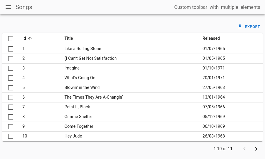
You can customize the AppBar that appears on Mobile by setting the appBar prop. For instance, here’s how you could customize its colors and add some extra content to its far right:
import type { ReactNode } from 'react';
import { Admin, Resource, ListGuesser } from 'react-admin';
import {
    SolarAppBar,
    SolarLayout,
} from '@react-admin/ra-navigation';

const CustomAppBar = () => (
    <SolarAppBar
        sx={{ color: 'text.secondary', bgcolor: 'background.default' }}
        toolbar={
            <Box
                sx={{
                    display: "flex",
                    justifyContent: "space-between",
                    alignItems: "center"
                }}
            >
                <Box sx={{ mr: 1 }}>
                    Custom toolbar
                </Box>
                <Box sx={{ mr: 1 }}>
                    with
                </Box>
                <Box sx={{ mr: 1 }}>
                    multiple
                </Box>
                <Box sx={{ mr: 1 }}>
                    elements
                </Box>
            </Box>
        }
    />
);

const CustomLayout = ({ children }: { children: ReactNode }) => (
    <SolarLayout appBar={CustomAppBar}>
        {children}
    </SolarLayout>
);

export const App = () => (
    <Admin layout={CustomLayout}>
        <Resource name="songs" list={ListGuesser} />
        <Resource name="artists" list={ListGuesser} />
    </Admin>
);
className
className is passed to the root <div> component. It lets you style the layout with CSS - but the sx prop is preferred.
error
Whenever a client-side error happens in react-admin, the user sees an error page. React-admin uses React’s Error Boundaries to render this page when any component in the page throws an unrecoverable error.
If you want to customize this page, or log the error to a third-party service, create your own <Error> component, and pass it to a custom Layout, as follows:
// in src/MyLayout.tsx
import type { ReactNode } from 'react';
import { Layout } from 'react-admin';
import { MyError } from './MyError';

export const MyLayout = ({ children }: { children: ReactNode }) => (
    <SolarLayout error={MyError}>
        {children}
    </SolarLayout>
);
The following snippet is a simplified version of the react-admin Error component, that you can use as a base for your own:
// in src/MyError.tsx
import * as React from 'react';
import Button from '@mui/material/Button';
import ErrorIcon from '@mui/icons-material/Report';
import History from '@mui/icons-material/History';
import { Title, useTranslate, useLocation } from 'react-admin';

export const MyError = ({
    error,
    resetErrorBoundary,
}: {
    error: any;
    errorInfo: any;
    resetErrorBoundary: (...args: any[]) => void;
}) => {
    const { pathname } = useLocation();
    const originalPathname = useRef(pathname);

    // Effect that resets the error state whenever the location changes
    useEffect(() => {
        if (pathname !== originalPathname.current) {
            resetErrorBoundary();
        }
    }, [pathname, resetErrorBoundary]);

    const translate = useTranslate();
    return (
        <div>
            <Title title="Error" />
            <h1>
                <ErrorIcon /> Something Went Wrong{' '}
            </h1>
            <div>
                A client error occurred and your request couldn't be completed.
            </div>
            {process.env.NODE_ENV !== 'production' && (
                <details>
                    <h2>{translate(error.toString())}</h2>
                    {errorInfo.componentStack}
                </details>
            )}
            <div>
                <Button
                    variant="contained"
                    startIcon={<History />}
                    onClick={() => history.go(-1)}
                >
                    Back
                </Button>
            </div>
        </div>
    );
};
Tip: React’s Error Boundaries are used internally to display the Error Page whenever an error occurs. Error Boundaries only catch errors during rendering, in lifecycle methods, and in constructors of the components tree. This implies in particular that errors during event callbacks (such as ‘onClick’) are not concerned. Also note that the Error Boundary component is only set around the main container of React Admin. In particular, you won’t see it for errors thrown by the sidebar Menu, nor the AppBar. This ensures the user is always able to navigate away from the Error Page.
logo
You can customize the icon of the dashboard menu item of the default menu by setting the logo prop:
import type { ReactNode } from 'react';
import { Admin, Resource, ListGuesser } from 'react-admin';
import { SolarLayout } from '@react-admin/ra-navigation';
import { Dashboard } from './Dashboard';
import { Logo } from './Logo';

const CustomLayout = ({ children }: { children: ReactNode }) => (
    <SolarLayout logo={<Logo />}>
        {children}
    </SolarLayout>
);

export const WithDashboardAndCustomLogo = () => (
    <Admin dashboard={Dashboard} layout={CustomLayout}>
        <Resource name="songs" list={SongList} />
        <Resource name="artists" list={ArtistList} />
    </Admin>
);
menu
If you need a customized menu, pass it to the menu prop. It’s recommended to pass a customized <SolarMenu> to leverage this layout. This is useful to organize many resources into categories or to provide shortcuts to filtered lists:
import type { ReactNode } from 'react';
import { Admin, Resource, ListGuesser } from 'react-admin';
import { SolarLayout, SolarMenu } from '@react-admin/ra-navigation';

export const App = () => (
    <Admin
        dashboard={Dashboard}
        dataProvider={dataProvider}
        layout={CustomLayout}
    >
        <Resource name="songs" icon={MusicNote} list={ListGuesser} />
        <Resource name="artists" icon={People} list={ListGuesser} />
    </Admin>
);

const CustomLayout = ({ children }: { children: ReactNode }) => (
    <SolarLayout menu={CustomMenu}>
        {children}
    </SolarLayout>
);

const CustomMenu = () => (
    <SolarMenu>
        <SolarMenu.Item
            label="Sales"
            subMenu={
                <SolarMenu.List>
                    <SolarMenu.ResourceItem name="orders" />
                    <SolarMenu.ResourceItem name="invoices" />
                </SolarMenu.List>
            }
        />
        <SolarMenu.Item
            label="Catalog"
            subMenu={
                <SolarMenu.List>
                    <SolarMenu.ResourceItem name="products" />
                    <SolarMenu.ResourceItem name="categories" />
                </SolarMenu.List>
            }
        />
        <SolarMenu.Item
            label="Customers"
            subMenu={
                <SolarMenu.List>
                    <SolarMenu.Item
                        name="customers.all"
                        label="All customers"
                        to={`/customers?filter=${encodeURIComponent(
                            JSON.stringify({ filter: {} })
                        )}`}
                    />
                    <SolarMenu.Item
                        name="customers.new"
                        label="New customers"
                        to={`/customers?filter=${encodeURIComponent(
                            JSON.stringify({
                                filter: {
                                    last_seen_gte:
                                        endOfYesterday().toISOString(),
                                },
                            })
                        )}`}
                    />
                </SolarMenu.List>
            }
        />
        <SolarMenu.Item
            label="Reviews"
            subMenu={
                <SolarMenu.List>
                    <SolarMenu.Item
                        name="reviews.all"
                        label="New reviews"
                        to={`/reviews?filter=${encodeURIComponent(
                            JSON.stringify({ filter: {} })
                        )}`}
                    />
                    <SolarMenu.Item
                        name="reviews.pending"
                        label="Pending reviews"
                        to={`/reviews?filter=${encodeURIComponent(
                            JSON.stringify({ filter: { status: 'pending' } })
                        )}`}
                    />
                    <SolarMenu.Item
                        name="reviews.bad"
                        label="Bad reviews"
                        to={`/reviews?filter=${encodeURIComponent(
                            JSON.stringify({ filter: { rating_lte: 2 } })
                        )}`}
                    />
                </SolarMenu.List>
            }
        />
        <SolarMenu.ResourceItem name="stores" />
        <SolarMenu.ResourceItem name="events" />
    </SolarMenu>
);
sx
The sx prop allows you to customize the layout styles using a MUI SX object:
import type { ReactNode } from 'react';
import { Admin, Resource, ListGuesser } from 'react-admin';
import { SolarLayout } from '@react-admin/ra-navigation';

const CustomLayout = ({ children }: { children: ReactNode }) => (
    <SolarLayout sx={{ bgcolor: 'white' }}>
        {children}
    </SolarLayout>
);

export const App = () => (
    <Admin layout={CustomLayout}>
        <Resource name="songs" list={ListGuesser} />
        <Resource name="artists" list={ListGuesser} />
    </Admin>
);
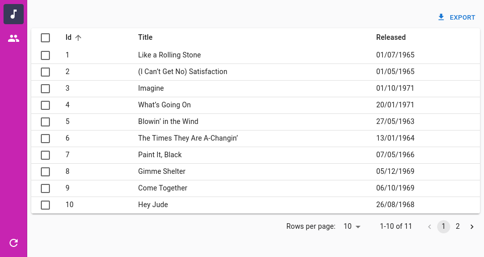
<SolarMenu>
The default menu for the <SolarLayout>. It displays a thin sidebar with menu items and a second sliding sidebar for its items that have children. On small devices, it is hidden and can be displayed by clicking on the <SolarAppBar> toggle button.
By default, just like the classic react-admin menu, it contains menu items for each resource and the dashboard if present, without any secondary sliding menu.
Props
| Prop | Required | Type | Default | Description |
|---|---|---|---|---|
bottomToolbar |
Optional | ReactNode | The content to render inside the bottom section of the menu. | |
children |
Optional | ReactNode | The content to render inside the top section of the menu. | |
className |
Optional | string | A class name to apply to the AppBar container. | |
dense |
Optional | boolean | false | Whether the menu should be dense. |
logo |
Optional | Component | A React component used as the dashboard icon | |
userMenu |
Optional | Component | Allows to customize the user menu | |
sx |
Optional | SxProps |
Style overrides, powered by MUI System |
It also accepts the props of its root HTMLDivElement.
In addition, the SolarMenu object provides shortcuts to its items components:
SolarMenu.Item, the base itemSolarMenu.ResourceItem, an item generated from a resource definitionSolarMenu.DashboardItem, an item for the dashboardSolarMenu.UserItem, an item for the user menuSolarMenu.LoadingIndicatorIteman item for the loading indicator and refresh buttonSolarMenu.Lista list of menu itemsSolarMenu.LocalesIteman item that displays the list of supported localesSolarMenu.ToggleThemeIteman item that displays the theme switcherSolarMenu.UserProfileIteman item that displays the user full name and/or the logout button
children
The children prop is the primary way to leverage the <SolarMenu> component. It allows you to pass the menu items that are displayed in the top section of the sidebar while keeping the bottom section defaults.
For instance, here’s how to group resources into categories or provide shortcuts to pre-filtered lists:
import { Admin, Resource, ListGuesser } from 'react-admin';
import {
    SolarLayoutProps,
    SolarLayout,
    SolarMenu,
} from '@react-admin/ra-navigation';
import { dataProvider } from './dataProvider';

const CustomMenu = () => (
    <SolarMenu>
        <SolarMenu.Item
            label="Sales"
            subMenu={
                <SolarMenu.List>
                    <SolarMenu.ResourceItem name="orders" />
                    <SolarMenu.ResourceItem name="invoices" />
                </SolarMenu.List>
            }
        />
        <SolarMenu.Item
            label="Catalog"
            subMenu={
                <SolarMenu.List>
                    <SolarMenu.ResourceItem name="products" />
                    <SolarMenu.ResourceItem name="categories" />
                </SolarMenu.List>
            }
        />
        <SolarMenu.Item
            label="Customers"
            subMenu={
                <SolarMenu.List>
                    <SolarMenu.Item
                        name="customers.all"
                        label="All customers"
                        to={`/customers?filter=${encodeURIComponent(
                            JSON.stringify({ filter: {} })
                        )}`}
                    />
                    <SolarMenu.Item
                        name="customers.new"
                        label="New customers"
                        to={`/customers?filter=${encodeURIComponent(
                            JSON.stringify({
                                filter: {
                                    last_seen_gte:
                                        endOfYesterday().toISOString(),
                                },
                            })
                        )}`}
                    />
                </SolarMenu.List>
            }
        />
        <SolarMenu.Item
            label="Reviews"
            subMenu={
                <SolarMenu.List>
                    <SolarMenu.Item
                        name="reviews.all"
                        label="New reviews"
                        to={`/reviews?filter=${encodeURIComponent(
                            JSON.stringify({ filter: {} })
                        )}`}
                    />
                    <SolarMenu.Item
                        name="reviews.pending"
                        label="Pending reviews"
                        to={`/reviews?filter=${encodeURIComponent(
                            JSON.stringify({ filter: { status: 'pending' } })
                        )}`}
                    />
                    <SolarMenu.Item
                        name="reviews.bad"
                        label="Bad reviews"
                        to={`/reviews?filter=${encodeURIComponent(
                            JSON.stringify({ filter: { rating_lte: 2 } })
                        )}`}
                    />
                </SolarMenu.List>
            }
        />
        <SolarMenu.ResourceItem name="stores" />
        <SolarMenu.ResourceItem name="events" />
    </SolarMenu>
);
className
className is passed to the root <div> component. It lets you style the layout with CSS - but the sx prop is preferred.
dense
Set the dense prop to true to reduce the vertical space between items:
import type { ReactNode } from 'react';
import { Admin, Resource, ListGuesser } from 'react-admin';
import { SolarLayout, SolarMenu } from '@react-admin/ra-navigation';
import { ListItemButton } from '@mui/material';
import { dataProvider } from './dataProvider';

const CustomMenu = () => <SolarMenu dense />;

const CustomLayout = ({ children }: { children: ReactNode }) => (
    <SolarLayout menu={CustomMenu}>
        {children}
    </SolarLayout>
);

export const App = () => (
    <Admin dataProvider={dataProvider} layout={CustomLayout}>
        <Resource name="songs" list={ListGuesser} />
        <Resource name="artists" list={ListGuesser} />
    </Admin>
);
userMenu
The userMenu prop allows you to customize the very last menu item of the sidebar.
By default, if you have an authProvider, this menu item will have the user avatar as its icon when available from the authProvider.getIdentity function. If not available, it will display a user icon.
If you don’t have an authProvider but have configured a dark theme or your i18nProvider supports multiple locales, this menu item will have a settings icon.
Besides, this default menu has a secondary sliding panel.
If you have an authProvider, this secondary sliding panel will show the user full name when available from the authProvider.getIdentity function and a logout button. If the user full name is not available, it will display a logout button only.
If you have configured a dark theme, the secondary sliding panel will show a button to toggle it.
If your i18nProvider supports multiple locales, it will display a list of the supported locales so that users can switch to them.
You can customize it by passing your own content to the userMenu prop.
For instance, here’s how to only show a logout button:
import type { ReactNode } from 'react';
import { Admin, Resource, ListGuesser } from 'react-admin';
import { SolarLayout, SolarMenu } from '@react-admin/ra-navigation';
import { ListItemButton } from '@mui/material';
import { dataProvider } from './dataProvider';

const CustomUserMenu = () => {
    const logout = useLogout();

    return (
        <ListItemButton onClick={() => logout()} aria-label="Logout">
            <ExitIcon />
        </ListItemButton>
    );
};

const CustomMenu = () => <SolarMenu userMenu={<CustomUserMenu />} />;

const CustomLayout = ({ children }: { children: ReactNode }) => (
    <SolarLayout menu={CustomMenu}>
        {children}
    </SolarLayout>
);

export const App = () => (
    <Admin
        dashboard={Dashboard}
        dataProvider={dataProvider}
        layout={CustomLayout}
    >
        <Resource name="songs" list={ListGuesser} />
        <Resource name="artists" list={ListGuesser} />
    </Admin>
);
bottomToolbar
The bottom section of the <SolarMenu> contains the refresh button and the user menu by default.
You can customize it by passing your own content to the bottomToolbar prop.
For instance, here’s how to show a settings menu item in addition to the existing bottom menu items:
import type { ReactNode } from 'react';
import { Admin, Resource, ListGuesser } from 'react-admin';
import { SolarLayout, SolarMenu } from '@react-admin/ra-navigation';
import { ListItemButton } from '@mui/material';
import { dataProvider } from './dataProvider';

const CustomBottomToolbar = () => (
    <SolarMenu.List>
        <SolarMenu.Item
            name="settings"
            label="Settings"
            to="/settings"
            icon={<Settings />}
        />
        <SolarMenu.LoadingIndicatorItem />
        <SolarMenu.UserItem />
    </SolarMenu.List>
);

const CustomMenu = () => <SolarMenu bottomToolbar={<CustomBottomToolbar />} />;

const CustomLayout = ({ children }: { children: ReactNode }) => (
    <SolarLayout menu={CustomMenu}>
        {children}
    </SolarLayout>
);

export const App = () => (
    <Admin dataProvider={dataProvider} layout={CustomLayout}>
        <Resource name="songs" list={ListGuesser} />
        <Resource name="artists" list={ListGuesser} />
    </Admin>
);
sx
The sx prop allows you to customize the menu styles using a MUI SX object:
For instance, here is how to change the background color of the menu:
import type { ReactNode } from 'react';
import { Admin, Resource, ListGuesser } from 'react-admin';
import { SolarLayout, SolarMenu, SolarMenuProps } from '@react-admin/ra-navigation';

const CustomMenu = (props: SolarMenuProps) => (
    <SolarMenu
        sx={{
            '& .RaSolarPrimarySidebar-root .MuiDrawer-paper': {
                backgroundColor: '#C724B1',

                '& .MuiButtonBase-root': {
                    color: '#ffffff',
                },
                '& .MuiButtonBase-root.Mui-selected': {
                    backgroundColor: '#3A3A59',
                    color: '#ffffff',
                },
            },
        }}
        {...props}
    />
);

const CustomLayout = ({ children }: { children: ReactNode }) => (
    <SolarLayout menu={CustomMenu}>
        {children}
    </SolarLayout>
);

export const App = () => (
    <Admin layout={CustomLayout}>
        <Resource name="songs" list={ListGuesser} />
        <Resource name="artists" list={ListGuesser} />
    </Admin>
);
The <SolarMenu> component accepts the usual className prop. You can also override the styles of the inner components thanks to the sx property. This property accepts the following subclasses:
| Rule name | Description |
|---|---|
RaSolarMenu |
Applied to the root component |
& .RaSolarMenu-topToolbar |
Applied to the upper section of the menu |
& .RaSolarMenu-bottomToolbar |
Applied to the lower section of the menu |
& .RaSolarPrimarySidebar-root |
Applied to the primary sidebar |
& .RaSolarSecondarySidebar-root |
Applied to the secondary sidebar |
<SolarMenu.Item>
An item for the <SolarMenu> component. <SolarMenu.Item> components require an icon and a label, as well as a name to determine if they match the current app location.
There are two types of item components:
- Those that render a link to a resource or a custom page, and contain a
toprop:
<SolarMenu.Item
    label="Customers"
    icon={<PeopleOutlined />}
    name="customers"
    to="/customers"
/>
- Those that render a sub menu when clicked, and contain a
subMenuprop:
<SolarMenu.Item
    label="Reports"
    icon={<ReportsIcon />}
    name="reports"
    subMenu={
        <SolarMenu.List dense disablePadding sx={{ gap: 0 }}>
            <Typography variant="h6" sx={{ px: 1, my: 1 }}>
                Reports
            </Typography>
            <SolarMenu.Item
                name="reports.password_reports"
                to="/reports/password_reports"
                label="Password Reports"
            />
            <SolarMenu.Item
                name="reports.user_reports"
                to="/reports/user_reports"
                label="User Reports"
            />
            <SolarMenu.Item
                name="reports.general_reports"
                to="/reports/general_reports"
                label="General Reports"
            />
            <SolarMenu.Item
                name="reports.compliance_reports"
                to="/reports/compliance_reports"
                label="Compliance Reports"
            />
            <SolarMenu.Item
                name="reports.custom_reports"
                to="/reports/custom_reports"
                label="Custom Reports"
            />
            <SolarMenu.Item
                name="reports.certificate_reports"
                to="/reports/certificate_reports"
                label="Certificate Reports"
            />
            <SolarMenu.Item
                name="reports.ssh_key_reports"
                to="/reports/ssh_key_reports"
                label="SSH Key Reports"
            />
        </SolarMenu.List>
    }
/>
Notice how sub menus are also collections of <SolarMenu.Item> components.
Props
| Prop | Required | Type | Default | Description |
|---|---|---|---|---|
children |
Optional | ReactNode | The content to render inside the secondary sliding sidebar when this item is clicked. | |
icon |
Optional | ReactNode | The icon. Required for the primary sidebar, optional for the secondary sliding sidebar | |
label |
Optional | string | The text to display as a tooltip inside the primary sidebar or in plain inside the secondary sliding sidebar. | |
subMenu |
Optional | ReactNode | The content to display inside the secondary sliding sidebar when this item is clicked. | |
to |
Optional | string or To |
The path to which users must be redirected when clicking this item. | |
tooltipProps |
Optional | object | The props for the Tooltip component. |
Additional props are passed to the underlying Material-UI <ListItem> component.
<SolarMenu.ResourceItem>
An item for the <SolarMenu> component. Its children will be rendered inside the secondary sliding sidebar.
It accepts the same props as MUI’s <SolarMenuItem> component.
| Prop | Required | Type | Default | Description |
|---|---|---|---|---|
name |
Required | string | The name of the resource this item represents. |
If you provided an icon on the <Resource> component, it will be used by default. It sets the <SolarMenuItem> to prop to the resource list page and the label prop to the resource label.
<SolarMenu.DashboardItem>
An item for the <SolarMenu> component. Its children will be rendered inside the secondary sliding sidebar.
It accepts the same props as MUI’s <SolarMenuItem> component. It sets the <SolarMenuItem> to prop to the root page and the label prop to the ra.page.dashboard. You can override its default icon by either passing the logo prop to the <SolarMenu> component or setting the icon prop on this component directly.
<SolarMenu.UserItem>
A <SolarMenu> item that displays a user menu item when an authProvider is available or a settings menu item when no authProvider is available but the <Admin> has a darkTheme set or the i18nProvider supports multiple locales.
It accepts the same props as the <SolarMenuItem> component.
<SolarMenu.LocalesItem>
Language selector. Changes the locale in the app and persists it in the store so that the app opens with the right locale in the future.
Uses i18nProvider.getLocales() to get the list of available locales.
Enabled by default in the <SolarMenu> when the <i18nProvider.getLocales()> returns multiple locales.
Meant to be used in the secondary sidebar of the <SolarMenu> component.
It accepts the same props as MUI’s <ListItem> component.
import { SolarMenu } from '@react-admin/navigation';

const MyMenu = () => (
    <SolarMenu>
        <SolarMenu.LocalesItem />
    </SolarMenu>
);
<SolarMenu.ToggleThemeItem>
Button toggling the theme (light or dark).
Enabled by default in the <SolarMenu> when the <Admin> component has a darkMode.
It accepts the same props as MUI’s <ListItem> component.
import { SolarMenu } from '@react-admin/navigation';

const MyMenu = () => (
    <SolarMenu>
        <SolarMenu.ToggleThemeItem />
    </SolarMenu>
);
<SolarMenu.UserProfileItem>
This <SolarMenu> item displays the user name from the authProvider.getIdentity if available and a logout button.
Meant to be used in the secondary sidebar of the <SolarMenu> component.
Used by default in the <SolarMenu.UserItem> component.
It accepts the same props as MUI’s <ListItem> component.
| Prop | Required | Type | Default | Description |
|---|---|---|---|---|
| redirectTo | Optional | string | false | The location to redirect the user to when clicking on the logout button. Defaults to ‘/’. Set to false to disable redirection. |
<SolarAppBar>
An AppBar alternative for the SolarLayout that is only shown on small devices. It displays the app title if provided and the button allowing to open the sidebar.
Usage
You can customize it by passing children:
import type { ReactNode } from 'react';
import { Admin, AppBarProps, Resource, LoadingIndicator } from 'react-admin';
import { SolarAppBar, SolarLayout } from '@react-admin/ra-navigation';
import { Search } from '@react-admin/ra-search';

const CustomAppBar = () => (
    <SolarAppBar>
        <Search />
        <LoadingIndicator />
    </SolarAppBar>
);

export const CustomLayout = ({ children }: { children: ReactNode }) => (
    <SolarLayout appBar={CustomAppBar}>
        {children}
    </SolarLayout>
);

export const App = () => (
    <Admin dataProvider={dataProvider} layout={CustomLayout}>
        <Resource name="songs" list={SongList} />
        <Resource name="artists" list={ArtistList} />
    </Admin>
);
Props
| Prop | Required | Type | Default | Description |
|---|---|---|---|---|
alwaysOn |
Optional | boolean | false | This prop is injected by Layout. You should not use it directly unless you are using a custom layout. If you are using the default layout, use <Layout appBarAlwaysOn> instead. On small devices, this prop make the AppBar always visible. |
children |
Optional | ReactNode | The content to render inside the AppBar. | |
className |
Optional | string | A class name to apply to the AppBar container. | |
color |
Optional | string | ‘secondary’ | The color of the AppBar. Can be primary, secondary, or inherit. Defaults to secondary. |
container |
Optional | ElementType | HideOnScroll | The component used for the root node. |
Use It With <SearchWithResult>
The <SearchWithResult> component works perfectly when used inside the <SolarLayout> menu.
The useSolarSidebarActiveMenu hook combined with the onNavigate prop allow you to close the <SolarMenu> when the user selects an element in the result.
Here is an implementation example:
import { Admin } from 'react-admin';
import { Box } from '@mui/material';
import SearchIcon from '@mui/icons-material/Search';
import AlbumIcon from '@mui/icons-material/Album';
import Groups3Icon from '@mui/icons-material/Groups3';
import {
    SolarLayout,
    SolarLayoutProps,
    SolarMenu,
    useSolarSidebarActiveMenu,
} from '@react-admin/ra-navigation';
import { SearchWithResult } from '@react-admin/ra-search';
import { searchDataProvider } from './searchDataProvider';

const MySolarLayout = (props: SolarLayoutProps) => (
    <SolarLayout {...props} menu={MySolarMenu} />
);

const MySolarMenu = () => (
    <SolarMenu bottomToolbar={<CustomBottomToolbar />}>
        <SolarMenu.Item
            name="artists"
            to="/artists"
            icon={<Groups3Icon />}
            label="resources.stores.name"
        />
        <SolarMenu.Item
            name="songs"
            to="/songs"
            icon={<AlbumIcon />}
            label="resources.events.name"
        />
    </SolarMenu>
);

const CustomBottomToolbar = () => (
    <>
        <SearchMenuItem />
        <SolarMenu.LoadingIndicatorItem />
    </>
);

const SearchMenuItem = () => {
    const [, setActiveMenu] = useSolarSidebarActiveMenu();
    const handleClose = () => {
        setActiveMenu('');
    };

    return (
        <SolarMenu.Item
            icon={<SearchIcon />}
            label="Search"
            name="search"
            subMenu={
                <Box sx={{ maxWidth: 298 }}>
                    <SearchWithResult onNavigate={handleClose} />
                </Box>
            }
            data-testid="search-button"
        />
    );
};

export const App = () => (
    <Admin dataProvider={searchDataProvider} layout={MySolarLayout}>
        {/*...*/}
    </Admin>
);