
<TranslatableInputs>
You may have inputs which are translated in multiple languages and want users to edit translations for each language separately. To display them, you can use the <TranslatableInputs> component.
Usage
<TranslatableInputs> allows to edit several fields at a time. The fields must have one value per language, for instance:
{
    id: 1234,
    name: {
        en: 'White trousers',
        fr: 'Pantalon blanc',
    },
    description: {
        en: 'Slim fit trousers for every day use'
        fr: 'Pantalon ajusté pour un usage quotidien',
    }
}
<TranslatableInputs> does not require a source prop. But it requires one or more child <Input>, each one with a source prop. And you must pass the locales prop determine the languages to display.
<TranslatableInputs locales={['en', 'fr']}>
    <TextInput source="name" />
    <RichTextInput source="description" />
</TranslatableInputs>
Props
| Prop | Required | Type | Default | Description |
|---|---|---|---|---|
locales |
Required | Array |
- | An array of locales. |
defaultLocale |
Optional | string |
en |
The default locale to display |
fullWidth |
Optional | boolean |
true |
If false, the inputs will not expand to fill the form width |
groupKey |
Optional | string |
- | A unique key for accessibility purpose |
selector |
Optional | ReactNode |
- | A selector to choose the locale to display |
StackProps |
Optional | object |
- | Props passed to the rendered MUI Stack |
sx |
Optional | SxProps |
- | Material UI shortcut for defining custom styles |
defaultLocale
React-admin uses the user locale as the default locale in this field. You can override this setting using the defaultLocale prop.
<TranslatableInputs locales={['en', 'fr']} defaultLocale="fr">
    <TextInput source="name" />
    <RichTextInput source="description" />
</TranslatableInputs>
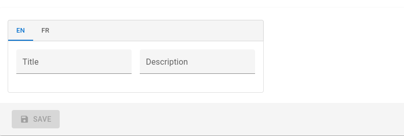
By default, <TranslatableInputs> will allow users to select the displayed locale using Material UI tabs with the locale code as their labels.
fullWidth
By default, a <TranslatableInputs> group expands to fill the form width. You can disable this behaviour by setting the fullWidth prop to false:
<TranslatableInputs locales={['en', 'fr']} fullWidth={false}>
    <TextInput source="title" />
    <TextInput source="description" />
</TranslatableInputs>
groupKey
If you have multiple TranslatableInputs on the same page, you should specify a groupKey so that react-admin can create unique identifiers for accessibility.
<TranslatableInputs locales={['en', 'fr']} groupKey="essential-fields">
    <TextInput source="name" />
    <RichTextInput source="description" />
</TranslatableInputs>
locales
Set the locales to display with an array of strings - each string becoming a key in the input value - . The order of the locales will be the order of the tabs.
<TranslatableInputs locales={['en', 'fr']}>
    <TextInput source="name" />
    <RichTextInput source="description" />
</TranslatableInputs>
You may override the tab labels using translation keys following this format: ra.locales.[locale_code]. For instance, ra.locales.en or ra.locales.fr.
selector
You may override the language selector using the selector prop, which accepts a React element:
const Selector = () => {
    const {
        locales,
        selectLocale,
        selectedLocale,
    } = useTranslatableContext();

    const handleChange = event => {
        selectLocale(event.target.value);
    };

    return (
        <select
            aria-label="Select the locale"
            onChange={handleChange}
            value={selectedLocale}
        >
            {locales.map(locale => (
                <option
                    key={locale}
                    value={locale}
                    // This allows to correctly link the containers for each locale to their labels
                    id={`translatable-header-${locale}`}
                >
                    {locale}
                </option>
            ))}
        </select>
    );
};

<TranslatableInputs
    record={record}
    resource="products"
    locales={['en', 'fr']}
    selector={<Selector />}
>
    <TextInput source="name" />
    <RichTextInput source="description" />
</TranslatableInputs>
StackProps
Use the StackProps prop to pass props to the rendered MUI Stack component.
For instance, you can use direction: 'row' to display the inputs side by side instead of stacked:
<TranslatableInputs
    locales={['en', 'fr']}
    StackProps={{ direction: 'row' }}
>
    <TextInput source="title" />
    <TextInput source="description" sx={{ marginLeft: 2 }} />
</TranslatableInputs>
sx
Use the sx prop to pass additional styles to the component:
<TranslatableInputs
    locales={['en', 'fr']}
    sx={{ border: 'solid 1px red' }}
>
    <TextInput source="title" />
    <TextInput source="description" />
</TranslatableInputs>
Validation
You can add validators to any of the inputs inside a TranslatableInputs. If an input has some validation error, the label of its parent tab will be highlighted as invalid:
<TranslatableInputs locales={['en', 'fr']}>
    <TextInput source="name" validate={[required()]} />
    <RichTextInput source="description" validate={[maxLength(100)]} />
</TranslatableInputs>
Changing The Value Programmatically
You can leverage react-hook-form’s setValue method to change an input’s value programmatically.
However you need to know the name under which the input was registered in the form, and this name is dynamically generated depending on the locale.
To get the name of the input for a given locale, you can leverage the SourceContext created by react-admin, which can be accessed using the useSourceContext hook.
This context provides a getSource function that returns the effective source for an input in the current context, which you can use as input name for setValue.
Here is an example where we leverage getSource and setValue to pre-fill the ‘description’ input using the value of the ‘title’ input when the corresponding button is clicked:
import { TranslatableInputs, TextInput, useSourceContext } from 'react-admin';
import { useFormContext } from 'react-hook-form';
import { Button } from '@mui/material';

const PrefillWithTitleButton = () => {
    const sourceContext = useSourceContext();
    const { setValue, getValues } = useFormContext();

    const onClick = () => {
        setValue(
            // sourceContext.getSource('description') will for instance return
            // 'description.en'
            sourceContext.getSource('description'),
            getValues(sourceContext.getSource('title'))
        );
    };

    return (
        <Button onClick={onClick} size="small" sx={{ maxWidth: 140 }}>
            Prefill with title
        </Button>
    );
};

const MyInputs = () => (
    <TranslatableInputs locales={['en', 'fr']}>
        <TextInput source="title" />
        <TextInput source="description" helperText={false} />
        <PrefillWithTitleButton />
    </TranslatableInputs>
);