
CRUD pages
Most admin and B2B apps start with a few basic screens to manipulate records:
- A list page, including the ability to filter, paginate, and sort the records
- A read-only page displaying the record details
- An edition page, allowing to update the record via a form
- A creation page
We call this type of interface a “CRUD” interface because it allows us to Create, Read, Update, and Delete records.
React-admin started as an engine to generate such CRUD interfaces, and it still does it very well. Building CRUD interfaces with react-admin requires little to no effort, and it’s very easy to customize them.
Page Components
React-admin provides page components for CRUD operations:
<List>displays a list of records<Show>displays a record in read-only mode<Edit>displays a form to edit a record<Create>displays a form to create a record
Each component reads the parameters from the URL, fetches the data from the data provider, stores the data in a context, and renders its child component.
For example, to display a list of posts, you would use the <List> component:
import { List, DataTable } from 'react-admin';

const PostList = () => (
    <List resource="posts">
        <DataTable>
            <DataTable.Col source="id" />
            <DataTable.Col source="title" />
            <DataTable.Col source="body" />
        </DataTable>
    </List>
);
Here, the <List> component will call dataProvider.getList('posts') to fetch the list of posts and create a ListContext to store the data. The <DataTable> component will read the data from that ListContext and render a row for each post. That’s why there is no need to explicitly pass the data to the <DataTable> component.
Page Context
<List> and other page components don’t just fetch data; they provide a way to update the page settings:
- Sort field and order
- Current page & page size
- Filters
- Record selection
The ListContext exposes callbacks to update these settings, and <List>’s children components like <DataTable> use these callbacks to update the data.
const listContext = useListContext();
const {
    // Data
    data, // Array of the list records, e.g. [{ id: 123, title: 'hello world' }, { ... }
    total, // Total number of results for the current filters, excluding pagination. Useful to build the pagination controls, e.g. 23
    meta, // Additional information about the list, like facets & statistics
    isPending, // Boolean, true until the data is available
    isFetching, // Boolean, true while the data is being fetched, false once the data is fetched
    isLoading, // Boolean, true until the data is fetched for the first time

    // Pagination
    page, // Current page. Starts at 1
    perPage, // Number of results per page. Defaults to 25
    setPage, // Callback to change the page, e.g. setPage(3)
    setPerPage, // Callback to change the number of results per page, e.g. setPerPage(25)
    hasPreviousPage, // Boolean, true if the current page is not the first one
    hasNextPage, // Boolean, true if the current page is not the last one

    // Sorting
    sort, // Sort object { field, order }, e.g. { field: 'date', order: 'DESC' }
    setSort, // Callback to change the sort, e.g. setSort({ field: 'name', order: 'ASC' })

    // Filtering
    filterValues, // Dictionary of filter values, e.g. { title: 'lorem', nationality: 'fr' }
    displayedFilters, // Dictionary of displayed filters, e.g. { title: true, nationality: true }
    setFilters, // Callback to update the filters, e.g. setFilters(filters, displayedFilters)
    showFilter, // Callback to show one of the filters, e.g. showFilter('title', defaultValue)
    hideFilter, // Callback to hide one of the filters, e.g. hideFilter('title')

    // Record selection
    selectedIds, // Array listing the ids of the selected records, e.g. [123, 456]
    onSelect, // Callback to change the list of selected records, e.g. onSelect([456, 789])
    onToggleItem, // Callback to toggle the record selection for a given id, e.g. onToggleItem(456)
    onUnselectItems, // Callback to clear the record selection, e.g. onUnselectItems();

    // Misc
    defaultTitle, // Translated title based on the resource, e.g. 'Posts'
    resource, // Resource name, deduced from the location. e.g. 'posts'
    refetch, // Callback for fetching the list data again
} = listContext;
CRUD Routes
You could declare the CRUD routes manually using react-router’s <Route> component. But it’s such a typical pattern that react-admin provides a shortcut: the <Resource> component.
<Resource
    name="posts"
    list={PostList}     // maps PostList to /posts
    show={PostShow}     // maps PostShow to /posts/:id/show
    edit={PostEdit}     // maps PostEdit to /posts/:id
    create={PostCreate} // maps PostCreate to /posts/create
/>
This is the equivalent of the following react-router configuration:
<ResourceContextProvider value="posts">
    <Routes>
        <Route path="/posts" element={<PostList />} />
        <Route path="/posts/:id/show" element={<PostShow />} />
        <Route path="/posts/:id" element={<PostEdit />} />
        <Route path="/posts/create" element={<PostCreate />} />
    </Routes>
</ResourceContextProvider>
<Resource> defines a ResourceContext storing the current resource name. This context is used by the <List>, <Edit>, <Create>, and <Show> components to determine the resource they should fetch. So when declaring page components with <Resource>, you don’t need to pass the resource prop to them.
import { List, DataTable } from 'react-admin';

const PostList = () => (
-   <List resource="posts">
+   <List>
        <DataTable>
            <DataTable.Col source="id" />
            <DataTable.Col source="title" />
            <DataTable.Col source="body" />
        </DataTable>
    </List>
);
Check the <Resource> documentation to learn more about routing and resource context.
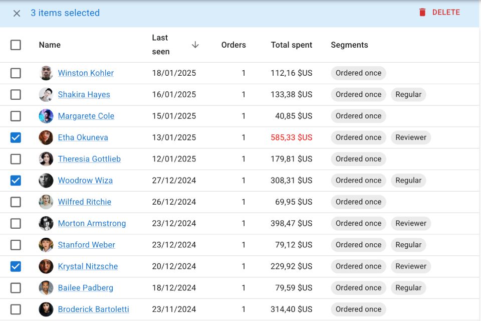
The List Page
To build list pages, developers primarily use the <List> component. It fetches a list of records from the data provider and delegates the rendering to its child component (often a <DataTable>, as in the example below).
import { List, DataTable, TextInput} from 'react-admin';

const filters = [<TextInput label="Search" source="q" size="small" alwaysOn />];

const BookList = () => (
    <List filters={filters}>
        <DataTable>
            <DataTable.Col source="id" />
            <DataTable.Col source="title" />
            <DataTable.Col source="author" />
            <DataTable.Col source="year" />
        </DataTable>
    </List>
);
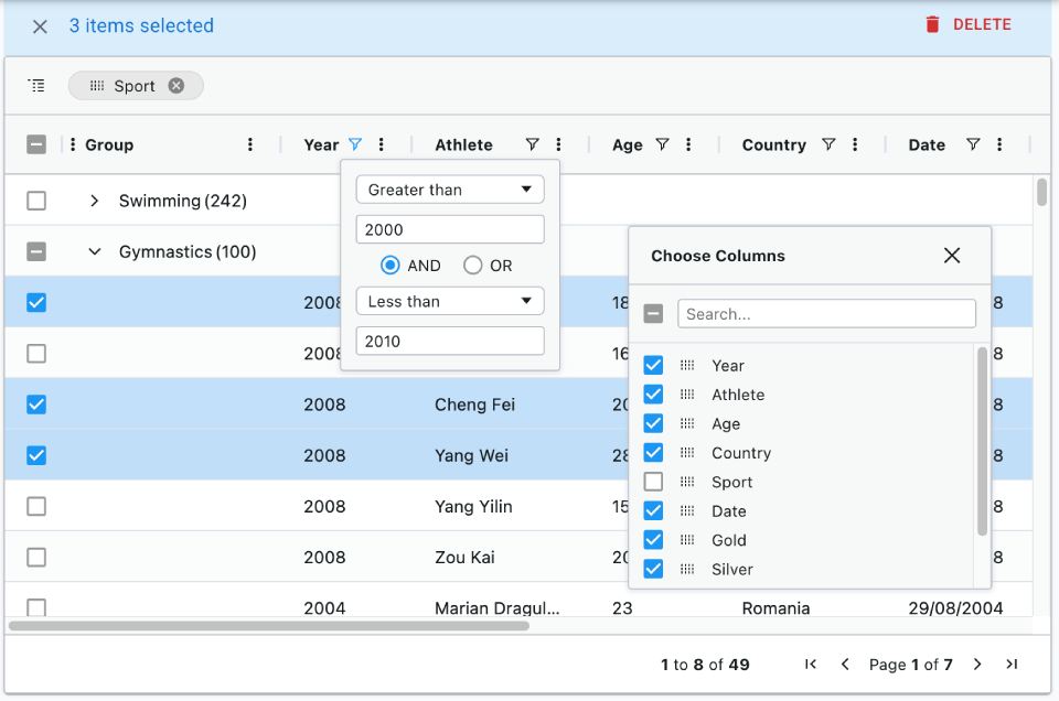
<List> also lets you customize the UI for filters and pagination. As for <DataTable>, it provides tons of customization options, like row expanders, bulk actions, and column chooser. You can learn more in the List Tutorial.
List Layouts
You can use any of the following components to build the list page:
<DataTable>
|
<DatagridAG>
|
<SimpleList>
|
<Calendar>
|
Inside these list layouts, you can use any of react-admin’s Field components to display the record data.
Filter Components
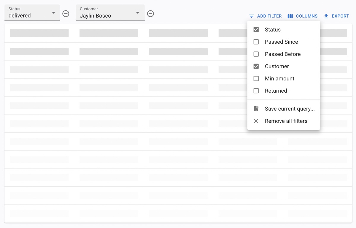 Filter Button/Form Combo
|
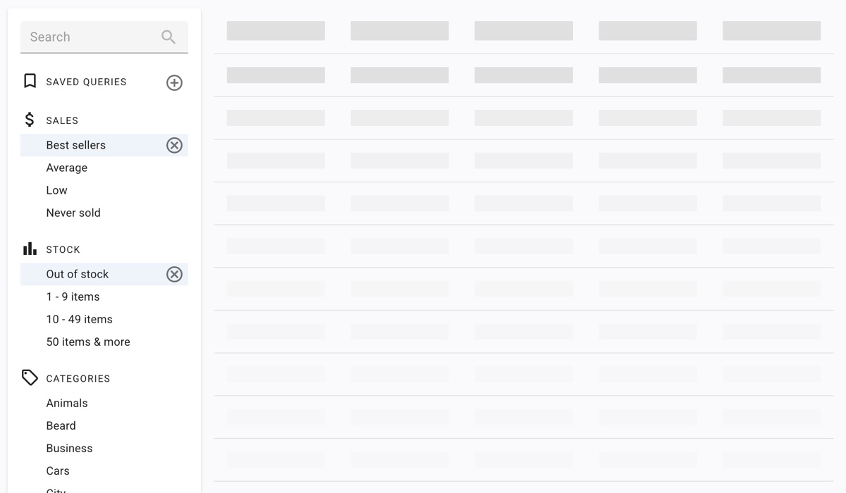
<FilterList> Sidebar
|
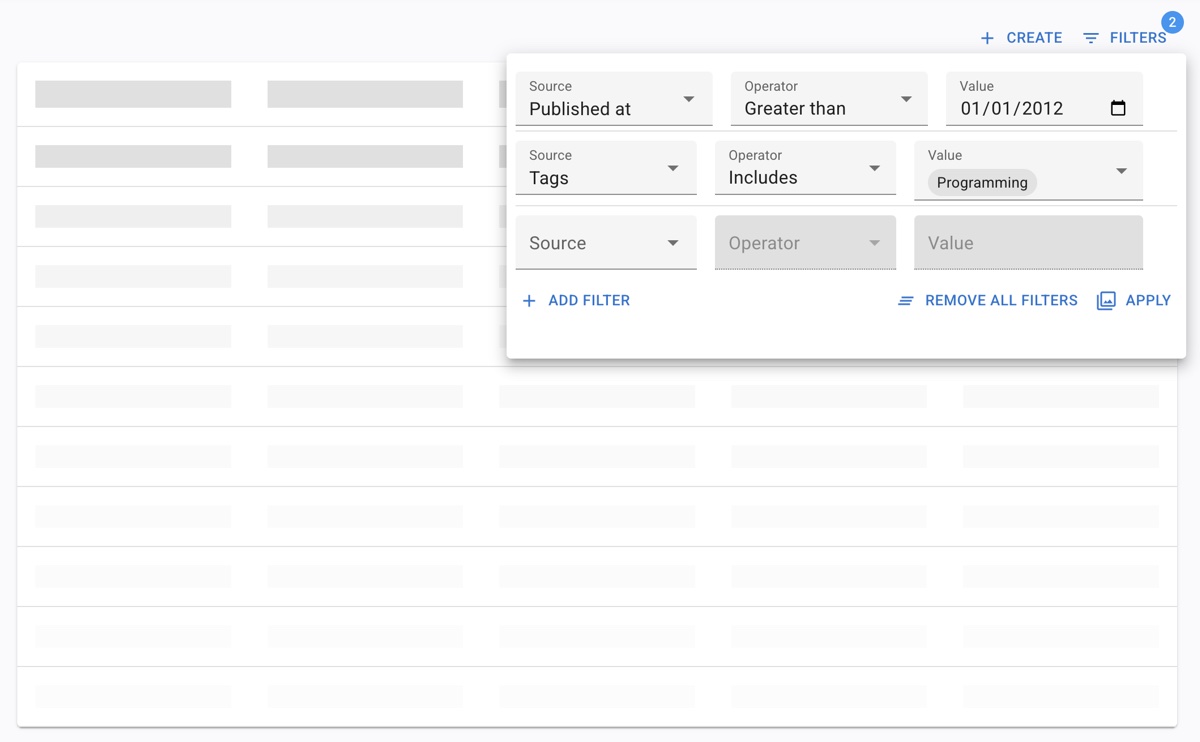
<StackedFilters> Dialog
|
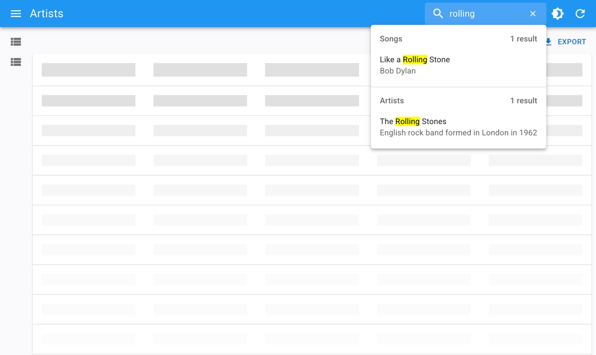 Global
 <Search>
|
Buttons
<EditButton>: Go to the edit page for a record<EditInDialogButton>: Edit a record in a dialog<ExportButton>: A button to export the list data<CreateButton>: A button to create a new record<SortButton>: A button to sort the list<SelectColumnsButton>: A button to select the columns to display in a DataTable<BulkUpdateButton>: A button to update selected records<BulkDeleteButton>: A button to delete selected records<ListActions>: A toolbar with a create and an export button
Misc
<Pagination>: Renders the page count and buttons to navigate to the previous and next pages<SavedQueriesList>: Lets user save a combination of filters
Alternatives to List
You can also use specialized alternatives to the <List> component, which offer type-specific features:
<TreeWithDetails>: A tree view with a detail view for each node<CompleteCalendar>: A calendar view for events<InfiniteList>: A list with infinite scrolling
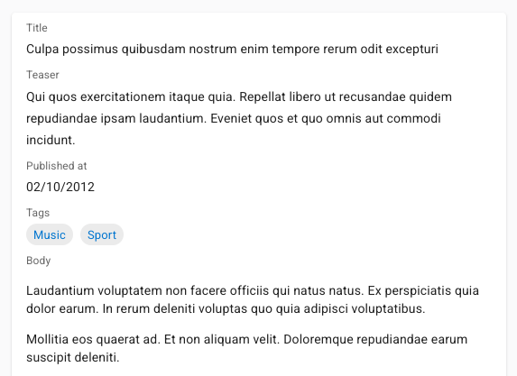
The Show Page
Show pages rely on the <Show> component. It reads the record id from the URL, fetches the record from the data provider, and delegates the rendering to its child component, e.g., a <SimpleShowLayout>:
import { Show, SimpleShowLayout, TextField} from 'react-admin';

const BookShow = () => (
    <Show>
        <SimpleShowLayout>
            <TextField source="id" />
            <TextField source="title" />
            <TextField source="author" />
            <TextField source="year" />
        </SimpleShowLayout>
    </Show>
);
You can learn more in the Show Tutorial.
Show Layouts
You can use any of the following components to build the show page:
<SimpleShowLayout>
|
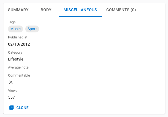
<TabbedShowLayout>
|
Inside these show layouts, you can use any of react-admin’s Field components to display the record data.
Buttons
<EditButton>: Go to the edit page for a record<CreateButton>: A button to create a new record<ListButton>: Go to the list page for a record<CloneButton>: Clone a record
Misc
<Labeled>: A component to display a field with a label
The Edit & Create Pages
The <Edit> and <Create> components are very similar. They are useful for editing a record - either fetched from the API or a new record. Typically, the child component of these pages is a form layout, like a <SimpleForm>:
import { Edit, SimpleForm, TextInput} from 'react-admin';

const BookEdit = () => (
    <Edit>
        <SimpleForm>
            <TextInput source="id" />
            <TextInput source="title" />
            <TextInput source="author" />
            <TextInput source="year" />
        </SimpleForm>
    </Edit>
);
You can learn more in the Edit Tutorial.
Form Layouts
You can use any of the following components to build the edit and create pages:
Forms are very powerful in react-admin. They support default values, sync and async validation, dependent inputs, access control, sub-forms, and more. Check out the Forms introduction for more information. Inside the form layouts, you can use any of react-admin’s Input components to edit the record data.
Buttons
<ShowButton>: Go to the show page for a record<SaveButton>: The submit button for the form<CloneButton>: Clone a record
Misc
<Toolbar>: Customize the form toolbar<JsonSchemaForm>: A form based on a JSON schema<AutoSave>: Automatically save the form
Guessers & Scaffolding
When mapping a new API route to a CRUD view, adding fields one by one can be tedious. React-admin provides a set of guessers that can automatically generate a complete CRUD UI based on an API response.
For instance, the following code will generate a complete CRUD UI for the users resource:
import { Admin, Resource, ListGuesser, EditGuesser, ShowGuesser } from 'react-admin';

const App = () => (
    <Admin dataProvider={dataProvider}>
        <Resource name="users" list={ListGuesser} edit={EditGuesser} show={ShowGuesser} />
    </Admin>
);
Guesser components start by fetching data from the API, analyzing the shape of the response, and then picking up Field and Input components that match the data type. They also dump the generated code in the console to let you start customizing the UI.
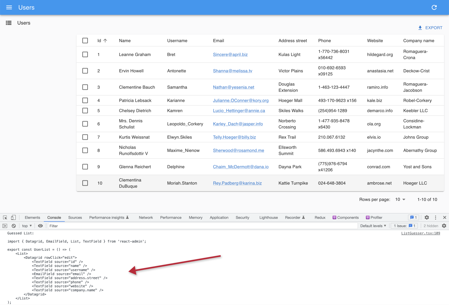
Check the following components to learn more about guessers:
Headless Variants
<List> and other page components render their children (e.g., <DataTable>) in a page layout. This layout contains a page title (e.g., “Posts”), toolbars for action buttons & filters, a footer for pagination, and a side column.
But sometimes, you want to use the list data in a different layout, without the page title and toolbar, or with a different UI kit. For these use cases, you can use the headless variants of the page components, which come in two flavors:
- Hook:
useListController,useEditController,useCreateController,useShowController - Component:
<ListBase>,<ShowBase>,<EditBase>,<CreateBase>
For instance, to use the list data in a custom layout, you can use the useListController hook:
import { useListController } from 'react-admin';

const MyList = () => {
    const { data, ids, total } = useListController({ resource: 'posts' });
    return (
        <div>
            <h1>Posts</h1>
            <ul>
                {ids.map(id => (
                    <li key={id}>{data[id].title}</li>
                ))}
            </ul>
            <p>Total: {total}</p>
        </div>
    );
};
If you want to use react-admin components, prefer the Base components, which call the hooks internally and store the values in a context:
import { ListBase, DataTable } from 'react-admin';

const MyList = () => (
    <ListBase resource="posts">
        <DataTable>
            <DataTable.Col source="id" />
            <DataTable.Col source="title" />
            <DataTable.Col source="body" />
        </DataTable>
    </ListBase>
);