
<FileInput>
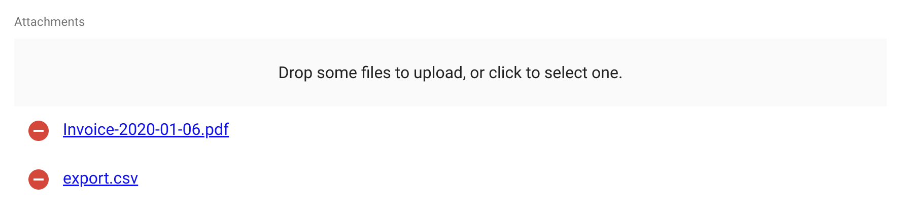
<FileInput> allows editing and uploading file attachments (pdfs, csv, images, etc.). It is powered by react-dropzone.
Tip: To upload images, prefer the <ImageInput> component.
Usage
import { FileInput, FileField } from 'react-admin';

<FileInput source="attachments">
    <FileField source="src" title="title" />
</FileInput>
<FileInput> uses its child component to give a preview of the files. <FileInput> renders its child once per file, inside a <RecordContext>, so the child can be a Field component. The default <FileField> renders the name of the file(s), with a hyperlink.
The input value must be an object or an array of objects with a title and a src property, e.g.:
{
    id: 123,
    attachments: [
        {
            title: 'Invoice-2929-01-06.pdf',
            src: 'https://example.com/uploads/invoice-2929-01-06.pdf',
        },
        {
            title: 'export.pdf',
            src: 'https://example.com/uploads/export.pdf',
        },
    ],
}
After modification by the user, the value is stored as an array of objects with 3 properties:
title: the file name with extension, e.g. ‘Invoice-2929-01-06.pdf’,src: An object URL for theFile, e.g. ‘blob:https://example.com/1e67e00e-860d-40a5-89ae-6ab0cbee6273’rawFile: TheFileobject itself
It is the responsibility of your dataProvider to send the file to the server (encoded in Base64, or using multipart upload) and to transform the src property. See the Data Provider documentation for an example.
Files are accepted or rejected based on the accept, multiple, minSize and maxSize props.
Props
| Prop | Required | Type | Default | Description |
|---|---|---|---|---|
accept |
Optional | Object |
- | Accepted file type(s). When empty, all file types are accepted. |
children |
Optional | ReactNode |
- | Element used to preview file(s) |
minSize |
Optional | number |
0 | Minimum file size (in bytes), e.g. 5000 for 5KB |
maxSize |
Optional | number |
Infinity |
Maximum file size (in bytes), e.g. 5000000 for 5MB |
multiple |
Optional | boolean |
false |
Whether the inputs can accept multiple files. |
options |
Optional | Object |
{} |
Additional options passed to react-dropzone’s useDropzone() hook. |
placeholder |
Optional | ReactNode |
- | Invite displayed in the drop zone |
removeIcon |
Optional | ReactNode |
MUI’s RemoveCircle icon | The clickable icon for removing files |
validateFile Removal |
Optional | function |
- | Allows to cancel the removal of files |
<FileInput> also accepts the common input props.
accept
Equivalent of the accept attribute of an <input type="file">. accept must be a valid MIME type, according to input element specification or a valid file extension.
<FileInput source="attachments" accept={{ 'application/pdf': ['.pdf'] }}>
    <FileField source="src" title="title" />
</FileInput>
Examples of valid accept values:
- ‘.doc,.docx’
- ‘application/json,video/*’
- ‘application/vnd.openxmlformats-officedocument.spreadsheetml.sheet’.
If left empty, all file types are accepted.
children
<FileInput> clones its child component once per file, inside a <RecordContext>, so the child can be a Field component. The default <FileField> renders the name of the file(s), with a hyperlink.
<FileInput source="attachments">
    <FileField source="src" title="title" />
</FileInput>
Writing a custom preview component is quite straightforward: it’s a standard field.
minSize
Minimum file size (in bytes), e.g. 5000 for 5KB. Defaults to 0.
<FileInput source="attachments" minSize={5000}>
    <FileField source="src" title="title" />
</FileInput>
maxSize
Maximum file size (in bytes), e.g. 5000000 for 5MB. Defaults to Infinity.
<FileInput source="attachments" maxSize={5000000}>
    <FileField source="src" title="title" />
</FileInput>
multiple
Set to true if the input should accept a list of files, false if it should only accept one file. Defaults to false.
If multiple is set to false and additional files are dropped, all files besides the first will be rejected. Any file which does not have a size in the [minSize, maxSize] range, will be rejected as well.
<FileInput source="attachments" multiple>
    <FileField source="src" title="title" />
</FileInput>
options
<FileInput> accepts an options prop into which you can pass all the react-dropzone properties.
placeholder
The default droppable area renders the following text:
- ‘Drop a file to upload, or click to select it.’ for single file inputs
- ‘Drop some files to upload, or click to select one.’ for multiple file inputs
You can customize these labels using the following translation keys:
ra.input.file.upload_singlera.input.file.upload_several
If that’s not enough, you can pass a placeholder prop to overwrite it. The value can be anything React can render:
<FileInput source="files" placeholder={<p>Drop your file here</p>}>
    <ImageField source="src" title="title" />
</FileInput>
removeIcon
Use the removeIcon prop to change the icon displayed as the remove button:
<ImageInput source="attachments" removeIcon={CustomSvgIcon}>
    <ImageField source="src" title="title" />
</ImageInput>
sx: CSS API
The <FileInput> component accepts the usual className prop. You can also override many styles of the inner components thanks to the sx property (see the sx documentation for syntax and examples). This property accepts the following subclasses:
| Rule name | Description |
|---|---|
& .RaFileInput-dropZone |
Applied to the main container of the component |
& .RaFileInput-removeButton |
Applied to each of the Material UI’s IconButton component used as remove button |
To override the style of all instances of <FileInput> using the application-wide style overrides, use the RaFileInput key.
validateFileRemoval
To prevent selected files from being removed from the FileInput when submitting the form, use the validateFileRemoval prop. It should return either an empty promise (validated) or a rejected promise (failed). The latter will prevent items from being removed from the component.
This prop can also be used to confirm the deletion of items to users.
The following example shows a react-admin’s Confirm dialog when clicking the delete button of an FileInput item. It will interrupt the removal of items if “dataProvider.deleteImages” fails or cancel button is clicked.
This example asumes the implementation of a deleteImages function in the dataProvider.
import { Edit, SimpleForm, ImageInput, Confirm, useDataProvider } from 'react-admin';
import { useMutation } from '@tanstack/react-query';

const MyEdit = () => {
    const [removeImage, setRemoveImage] = React.useState(null);
    const [showModal, setShowModal] = React.useState(false);
    const dataProvider = useDataProvider();
    const { mutate } = useMutation();

    return (
        <Edit>
            <SimpleForm>
                <ImageInput
                    source="images"
                    src="image"
                    validateFileRemoval={(file, _record) => {
                        const promise = new Promise((_resolve, reject) => {
                            setRemoveImage({
                                fileName: `Image ID: ${file.id}`,
                                delete: async (result) => {
                                    await mutate(
                                        ['deleteImages', { ids: [file.id] }],
                                        () => dataProvider.deleteImages({ ids: [file.id] })
                                    );
                                    return _resolve(result);
                                },
                                cancel: reject,
                            });
                        });
                        setShowModal(true);
                        return promise.then((result) => {
                            console.log('Image removed!');
                        });
                    }}
                />
                <Confirm
                    isOpen={showModal}
                    title="Delete image"
                    content={`${removeImage ? removeImage.fileName: ''} will be deleted`}
                    onConfirm={() => {
                        setShowModal(false);
                        removeImage && removeImage.delete();
                    }}
                    onClose={() => {
                        setShowModal(false);
                        removeImage && removeImage.cancel();
                    }}
                />
            </SimpleForm>
        </Edit>
    )
}
Uploading Files
Handling files uploads in react-admin is the dataProvider’s job. Learn how to do that in the Handling File Uploads section from the dataProvider documentation.