<HorizontalMenu>
This Enterprise Edition renders a horizontal menu component, alternative to react-admin’s
 <Menu>, to be used in the AppBar of the <ContainerLayout>.
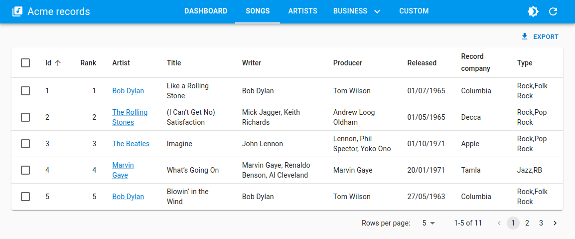
<HorizontalMenu> is part of the ra-navigation package.
Usage
Create a menu component based on <HorizontalMenu> and <HorizontalMenu.Item> (or <HorizontalMenu.DashboardItem>) children.
Each child should have a value corresponding to the application location of the target, and can have a to prop corresponding to the target location if different from the app location.
import { HorizontalMenu } from '@react-admin/ra-navigation';

export const Menu = () => (
    <HorizontalMenu>
        <HorizontalMenu.DashboardItem label="Dashboard" value="" />
        <HorizontalMenu.Item label="Songs" to="/songs" value="songs" />
        <HorizontalMenu.Item label="Artists" to="/artists" value="artists" />
        <HorizontalMenu.Item label="Business" value="business">
            <HorizontalMenu.Item label="Producers" to="/producers" value="producers" />
            <HorizontalMenu.Item label="Label" to="/label" value="label" />
        </HorizontalMenu.Item>
        <HorizontalMenu.Item label="Custom" to="/custom" value="custom" />
    </HorizontalMenu>
);
Then pass it to ta custom layout based on <ContainerLayout>, and make it the <Admin layout>:
import { Admin, Resource } from 'react-admin';
import { ContainerLayout } from '@react-admin/ra-navigation';

import { Menu } from './Menu';

const MyLayout = ({ children }) => (
    <ContainerLayout menu={<Menu />}>
        {children}
    </ContainerLayout>
);

const App = () => (
    <Admin dataProvider={dataProvider} layout={MyLayout}>
        ...
    </Admin>
);
Props
<HorizontalMenu> accepts the following props:
| Prop | Required | Type | Default | Description |
|---|---|---|---|---|
children |
Optional | The menu items to display. | ||
hasDashboard |
Optional | Boolean | Display an <HorizontalMenu.DashboardItem> with your resources if no children specified |
It also accept the props of MUI Tabs.
children
When you use <HorizontalMenu> without any child, it automatically adds one menu item per resource.
If you want to customize the menu items, pass them as children to the <HorizontalMenu>. Each child should be a <HorizontalMenu.Item> or a <HorizontalMenu.DashboardItem>.
import { HorizontalMenu } from '@react-admin/ra-navigation';

export const Menu = () => (
    <HorizontalMenu>
        <HorizontalMenu.DashboardItem label="Dashboard" value="" />
        <HorizontalMenu.Item label="Songs" to="/songs" value="songs" />
        <HorizontalMenu.Item label="Artists" to="/artists" value="artists" />
        <HorizontalMenu.Item label="Business" value="business">
            <HorizontalMenu.Item label="Producers" to="/producers" value="producers" />
            <HorizontalMenu.Item label="Label" to="/label" value="label" />
        </HorizontalMenu.Item>
        <HorizontalMenu.Item label="Custom" to="/custom" value="custom" />
    </HorizontalMenu>
);
hasDashboard
This prop lets you add a dashboard item when using <HorizontalMenu> with no children.
import { ContainerLayout, HorizontalMenu } from '@react-admin/ra-navigation';

const MyLayout = ({ children }) => (
    <ContainerLayout menu={<HorizontalMenu hasDashboard />}>
        {children}
    </ContainerLayout>
);
<HorizontalMenu.Item>
An item for the <HorizontalMenu> component. Used to define access to a list view for a resource, or a custom route.
<HorizontalMenu>
    <HorizontalMenu.DashboardItem label="Home" value="" />
    <HorizontalMenu.Item label="Artists" to="/artists" value="artists" />
    <HorizontalMenu.Item label="Songs" to="/songs" value="songs" />
    <HorizontalMenu.Item label="Labels" to="/labels" value="labels" />
</HorizontalMenu>
Props
| Prop | Required | Type | Default | Description |
|---|---|---|---|---|
value |
Required | string | The value of the Tab and the default route to use if no to is provided |
|
label |
Optional | string | The text to display | |
to |
Optional | string | The route to which the item redirects | |
TabProps |
Optional | TabProps | Additional props of the Tab | |
MenuProps |
Optional | MenuProps | Additional props of the Menu (HorizontalMenu.Item with children) |
|
MenuItemProps |
Optional | MenuItemProps | Additional props of the MenuItem (children of a HorizontalMenu.Item) |
label
You can customize the label by setting the label prop. It is inferred from the value prop by default.
<HorizontalMenu.Item> uses the i18n layer, so you can translate the label. Check the Translation chapter for more information.
<HorizontalMenu>
    <HorizontalMenu.Item label="Artists" value="artists" />
    <HorizontalMenu.Item label="ra.custom.path.resource.song" value="songs" />
</HorizontalMenu>
MenuProps
Additional props passed to the Menu (item displayed if it has children).
<HorizontalMenu>
    <HorizontalMenu.Item
        value="songs"
        MenuProps={{ open: true, autoFocus: true }}
    >
        <HorizontalMenu.Item value="albums" />
        <HorizontalMenu.Item value="singles" />
    </HorizontalMenu.Item>
</HorizontalMenu>
MenuItemProps
Additional props passed to the MenuItem (item displayed in a sub-menu).
<HorizontalMenu>
    <HorizontalMenu.Item value="songs">
        <HorizontalMenu.Item
            value="albums"
            MenuItemProps={{
                divider: true,
                selected: isSelected(),
            }}
        />
        <HorizontalMenu.Item value="singles" />
    </HorizontalMenu.Item>
</HorizontalMenu>
TabProps
Additional props passed to the Tab.
import { HorizontalMenu } from '@react-admin/ra-navigation';
import MusicNoteIcon from '@mui/icons-material/MusicNote';

const Menu = () => (
    <HorizontalMenu>
        <HorizontalMenu.Item
            value="songs"
            TabProps={{ icon: <MusicNoteIcon />, iconPosition: 'start' }}
        />
    </HorizontalMenu>
);
to
You can customize the link of your resource by setting the to prop. It is inferred from the value prop by default as /${value}.
<HorizontalMenu>
    <HorizontalMenu.Item to="/artists" value="artists" />
    <HorizontalMenu.Item to="/musics" value="songs" />
</HorizontalMenu>
value
The value passed to the MUI Tab:
<HorizontalMenu>
    <HorizontalMenu.Item value="artists" />
    <HorizontalMenu.Item value="songs" />
</HorizontalMenu>
<HorizontalMenu.DashboardItem>
This component adds a menu item that redirects to the / route. It accepts the same props as <HorizontalMenu.Item>.
<HorizontalMenu.DashboardItem value="" />
Adding Sub-Menus
<HorizontalMenu.Item> creates a menu item for a given path. But you can also add <HorizontalMenu.Item> components as a child to create a submenu.
<HorizontalMenu>
    <HorizontalMenu.DashboardItem label="Home" value="" />
    <HorizontalMenu.Item label="artists" to="/artists" value="artists" />
    <HorizontalMenu.Item label="Business" value="business">
        <HorizontalMenu.Item label="Producers" to="/producers" value="producers" />
        <HorizontalMenu.Item label="Label" to="/label" value="label" />
    </HorizontalMenu.Item>
    <HorizontalMenu.Item label="songs" to="/songs" value="songs" />
</HorizontalMenu>