
<AppBar>
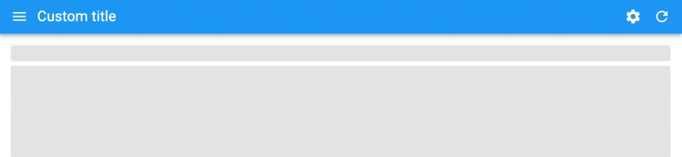
The default react-admin layout renders a horizontal app bar at the top, which is rendered by the <AppBar> component.
By default, the <AppBar> component displays:
- a hamburger icon to toggle the sidebar width,
- the page title,
- a button to change locales (if the application uses i18n),
- a button to change the theme (unless the dark theme is disabled),
- a loading indicator,
- a button to display the user menu.
You can customize the App Bar by creating a custom component based on <AppBar>, with different props.
Tip: Don’t mix react-admin’s <AppBar> component with Material UI’s <AppBar> component. The first one leverages the second but adds some react-admin-specific features.
Usage
Create a custom app bar based on react-admin’s <AppBar>:
// in src/MyAppBar.js
import { AppBar } from 'react-admin';
import { Typography } from '@mui/material';

const MyAppBar = () => <AppBar color="primary" position="sticky" />;
Then, create a custom layout based on react-admin’s <Layout>:
// in src/MyLayout.js
import { Layout } from 'react-admin';
import { MyAppBar } from './MyAppBar';

export const MyLayout = ({ children }) => (
    <Layout appBar={MyAppBar}>
        {children}
    </Layout>
);
Then pass this custom layout to the <Admin> component:
// in src/App.js
import { MyLayout } from './MyLayout';

const App = () => (
    <Admin layout={MyLayout} dataProvider={...}>
        // ...
    </Admin>
);
Props
| Prop | Required | Type | Default | Description |
|---|---|---|---|---|
children |
Optional | ReactElement |
- | What to display in the central part of the app bar |
color |
Optional | string |
- | The background color of the app bar |
sx |
Optional | SxProps |
- | Style overrides, powered by MUI System |
toolbar |
Optional | ReactElement |
- | The content of the toolbar |
userMenu |
Optional | ReactElement |
- | The content of the dropdown user menu |
Additional props are passed to the underlying Material UI <AppBar> element.
children
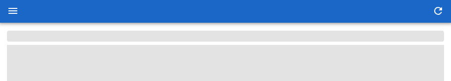
The <AppBar> component accepts a children prop, which is displayed in the central part of the app bar. This is useful to add buttons to the app bar, for instance, a settings button.
// in src/MyAppBar.js
import { AppBar, TitlePortal } from 'react-admin';
import SettingsIcon from '@mui/icons-material/Settings';
import { IconButton } from '@mui/material';

const SettingsButton = () => (
    <IconButton color="inherit">
        <SettingsIcon />
    </IconButton>
);

export const MyAppBar = () => (
    <AppBar>
        <TitlePortal />
        <SettingsButton />
    </AppBar>
);
Tip: What’s the <TitlePortal>? It’s a placeholder for the page title, that components in the page can fill using the <Title> component. <Title> uses a React Portal under the hood. <TitlePortal> takes all the available space in the app bar, so it “pushes” the following children to the right.
Tip: <TitlePortal> renders a Material-ui <Typography> element that you can customize by passing your own props:
export const MyAppBar = () => (
    <AppBar>
        <TitlePortal variant="body2" component="h3" />
        <SettingsButton />
    </AppBar>
);
If you omit <TitlePortal>, <AppBar> will no longer display the page title. This can be done on purpose, e.g. if you want to render something completely different in the AppBar, like a company logo and a search engine:
// in src/MyAppBar.js
import { AppBar } from 'react-admin';
import { Box } from '@mui/material';
import { Search } from "@react-admin/ra-search";

import { Logo } from './Logo';

const MyAppBar = () => (
    <AppBar>
        <Box component="span" sx={{ flex: 1 }} />
        <Logo />
        <Box component="span" sx={{ flex: 1 }} />
        <Search />
    </AppBar>
);
color
React-admin’s <AppBar> renders a Material UI <AppBar>, which supports a color prop to set the app bar color depending on the theme. By default, the app bar color is set to the secondary theme color.
This means you can set the app bar color to ‘default’, ‘inherit’, ‘primary’, ‘secondary’, ‘transparent’, or any string.
// in src/MyAppBar.js
import { AppBar } from 'react-admin';

export const MyAppBar = () => <AppBar color="primary" />;
sx: CSS API
Pass an sx prop to customize the style of the main component and the underlying elements (see the sx documentation for syntax and examples).
// in src/MyAppBar.js
import { AppBar } from 'react-admin';

export const MyAppBar = () => (
    <AppBar
        sx={{
            color: 'lightblue',
            '& .RaAppBar-toolbar': { padding: 0 },
        }}
    />
);
This property accepts the following subclasses:
| Rule name | Description |
|---|---|
& .RaAppBar-toolbar |
Applied the main toolbar |
& .RaAppBar-menuButton |
Applied to the hamburger icon |
& .RaAppBar-title |
Applied to the title portal |
To override the style of <AppBar> using the application-wide style overrides, use the RaAppBar key.
toolbar
By default, the <AppBar> renders three buttons in addition to the user menu:
- the language menu button,
- the theme toggle button,
- and the refresh button, which is also a loading indicator.
If you want to reorder or remove these buttons, you can customize the toolbar by passing a toolbar prop.
// in src/MyAppBar.js
import {
    AppBar,
    LocalesMenuButton,
    ToggleThemeButton,
    LoadingIndicator,
} from 'react-admin';

export const MyAppBar = () => (
    <AppBar toolbar={
        <>
            <LocalesMenuButton />
            <ToggleThemeButton />
            <LoadingIndicator />
        </>
    } />
);
Tip: If you only need to add buttons to the toolbar, you can pass them as children instead of overriding the entire toolbar.
// in src/MyAppBar.js
import { AppBar, TitlePortal } from 'react-admin';
import SettingsIcon from '@mui/icons-material/Settings';
import { IconButton } from '@mui/material';

const SettingsButton = () => (
    <IconButton color="inherit" onClick={/* ... */}>
        <SettingsIcon />
    </IconButton>
);

export const MyAppBar = () => (
    <AppBar>
        <TitlePortal />
        <SettingsButton />
    </AppBar>
);
userMenu
If your app uses authentication, the <AppBar> component displays a button to display the user menu on the right side. By default, the user menu only contains a logout button.
The content of the user menu depends on the return value of authProvider.getIdentity(). The user menu icon renders an anonymous avatar, or the avatar property of the identity object if present. If the identity object contains a fullName property, it is displayed after the avatar.
You can customize the user menu by passing a userMenu prop to the <AppBar> component.
import * as React from 'react';
import { AppBar, Logout, UserMenu, useUserMenu, LinkBase } from 'react-admin';
import { MenuItem, ListItemIcon, ListItemText } from '@mui/material';
import SettingsIcon from '@mui/icons-material/Settings';

// It's important to pass the ref to allow Material UI to manage the keyboard navigation
const SettingsMenuItem = React.forwardRef<HTMLAnchorElement>((props, ref) => {
    const userMenuContext = useUserMenu();
    if (!userMenuContext) {
        throw new Error("<SettingsMenuItem> should be used inside a <UserMenu>");
    }
    const { onClose } = userMenuContext;
    return (
        <MenuItem
            onClick={onClose}
            ref={ref}
            component={LinkBase}
            to="/settings"
            // It's important to pass the props to allow Material UI to manage the keyboard navigation
            {...props}
        >
            <ListItemIcon>
                <SettingsIcon fontSize="small" />
            </ListItemIcon>
            <ListItemText>Customize</ListItemText>
        </MenuItem>
    );
});

export const MyAppBar = () => (
    <AppBar
        userMenu={
            <UserMenu>
                <SettingsMenuItem />
                <Logout />
            </UserMenu>
        }
    />
);
Note that you still have to include the <Logout> component in the user menu, as it is responsible for the logout action. Also, for other menu items to work, you must call the onClose callback when the user clicks on them to close the user menu.
You can also customize the default icon by setting the icon prop to the <UserMenu /> component.
import { AppBar, UserMenu } from 'react-admin';
import Avatar from '@mui/material/Avatar';

const MyCustomIcon = () => (
    <Avatar
        sx={{
            height: 30,
            width: 30,
        }}
        src="https://marmelab.com/images/avatars/adrien.jpg"
    />
);

const MyUserMenu = props => (<UserMenu {...props} icon={<MyCustomIcon />} />);

const MyAppBar = () => <AppBar userMenu={<MyUserMenu />} />;
Finally, you can hide the user menu by setting the userMenu prop to false.
const MyAppBar = () => <AppBar userMenu={false} />;
Changing The Page Title
The app bar displays the page title. CRUD page components (<List>, <Edit>, <Create>, <Show>) set the page title based on the current resource and record, and you can override the title by using their title prop:
// in src/posts/PostList.js
import { List } from 'react-admin';

export const PostList = () => (
    <List title="All posts">
        ...
    </List>
);
On your custom pages, you need to use the <Title> component to set the page title:
// in src/MyCustomPage.js
import { Title } from 'react-admin';

export const MyCustomPage = () => (
    <>
        <Title title="My custom page" />
        <div>My custom page content</div>
    </>
);
Tip: The <Title> component uses a React Portal to modify the title in the app bar. This is why you need to include the <TitlePortal> component when you customize the <AppBar> children.
Displaying The Language Menu
The language menu only appears if you use the i18n feature and if you have more than one possible language.
The <AppBar> calls i18nProvider.getLocales() to get the list of available languages. If this list has more than one item, it displays a language menu button on the right side of the app bar.
This means that all you have to do to display the language menu is to set up the i18n provider correctly. For instance, if you’re using ra-i18n-polyglot:
// in src/i18nProvider.js
import polyglotI18nProvider from 'ra-i18n-polyglot';
import en from 'ra-language-english';
import fr from 'ra-language-french';

const translations = { en, fr };

export const i18nProvider = polyglotI18nProvider(
    locale => translations[locale],
    'en', // default locale
    [
        { locale: 'en', name: 'English' },
        { locale: 'fr', name: 'Français' }
    ],
);
Or if you’re defining your i18nProvider by hand:
// in src/i18nProvider.js
export const i18nProvider = {
    translate: () => {/* ... */},
    changeLocale: () => {/* ... */},
    getLocale: () => 'en',
    getLocales: () => [
        { locale: 'en', name: 'English' },
        { locale: 'fr', name: 'Français' },
    ],
};
Adding Buttons
To add buttons to the app bar, you can use the <AppBar> children prop.
For instance, to add a settings button:
// in src/MyAppBar.js
import { AppBar, TitlePortal } from 'react-admin';
import SettingsIcon from '@mui/icons-material/Settings';
import { IconButton } from '@mui/material';

const SettingsButton = () => (
    <IconButton color="inherit">
        <SettingsIcon />
    </IconButton>
);

export const MyAppBar = () => (
    <AppBar>
        <TitlePortal />
        <SettingsButton />
    </AppBar>
);
Tip: The <TitlePortal> component displays the page title. As it takes all the available space in the app bar, it “pushes” the following children to the right.
Adding a Search Input
A common use case for app bar customization is to add a site-wide search engine. The <Search> component is a good starting point for this.
// in src/MyAppBar.jsx
import { AppBar, TitlePortal } from "react-admin";
import { Search } from "@react-admin/ra-search";

export const MyAppbar = () => (
  <AppBar>
    <TitlePortal />
    <Search />
  </AppBar>
);
Tip: The <TitlePortal> component takes all the available space in the app bar, so it “pushes” the search input to the right.
Building Your Own AppBar
If react-admin’s <AppBar> component doesn’t meet your needs, you can build your own component using Material UI’s <AppBar>. Here is an example:
// in src/MyAppBar.js
import { AppBar, Toolbar, Box } from '@mui/material';
import { TitlePortal, RefreshIconButton } from 'react-admin';

export const MyAppBar = () => (
    <AppBar position="static">
        <Toolbar>
            <TitlePortal />
            <Box sx={{ flex: "1" }} />
            <RefreshIconButton />
        </Toolbar>
    </AppBar>
);
Then, use your custom app bar in a custom <Layout> component:
// in src/MyLayout.js
import { Layout } from 'react-admin';
import { MyAppBar } from './MyAppBar';

export const MyLayout = ({ children }) => (
    <Layout appBar={MyAppBar}>
        {children}
    </Layout>
);
Configurable
By default, users can override the page title in configurable mode.