<DatagridAG>
This Enterprise Edition component is an alternative datagrid component with advanced features, based on ag-grid.
Here is a (non-exhaustive) list of features that <DatagridAG> offers:
- In place editing of cells or rows
- Columns resizing and reordering
- Row and column pinning
- Advanced filtering
- DOM Virtualization
- Row selection and bulk actions
- Row animation
- Draggable rows
- Multi-column sorting
- Keyboard navigation
- Themes
- Automatic page size
- Automatic column size
- Compatibility with React Admin fields and inputs
Additionally, <DatagridAG> is compatible with the Enterprise version of ag-grid, which offers even more features:
- Row Grouping
- Range selection
- Aggregation
- Tree Data
- Pivoting
- Master Detail views
- Range Selection
- Excel Export
- Status bar
- Context menu
- More advanced filtering
- And more…
You can test it live in the Enterprise Edition Storybook.
Installation
npm install --save @react-admin/ra-datagrid-ag
# or
yarn add @react-admin/ra-datagrid-ag
Tip: ra-datagrid-ag is part of the React-Admin Enterprise Edition, and hosted in a private npm registry. You need to subscribe to one of the Enterprise Edition plans to access this package.
Data Fetching
This package proposes 2 components, each with its own data fetching strategy:
<DatagridAG>works just like<Datagrid>, displaying the data fetched by its parent component (usually a<List>) and calling the API each time the user changes the sorting, filtering, or pagination. However it is not compatible with some of the features provided byag-grid(see limitations).<DatagridAGClient>fetches all the data from the API at once, and then performs filtering, sorting and pagination client-side. This allows for a more responsive UI and enables some client-side only features, but only works for limited datasets (around a few thousand records). The client-side performance isn’t affected by a large number of records, as ag-grid uses DOM virtualization.
<DatagridAG> doesn’t currently support ag-grid’s server-side row model.
<DatagridAG>
<DatagridAG> is an alternative datagrid component with advanced features, based on ag-grid.
Usage
Use <DatagridAG> as a child of a react-admin <List>, <ReferenceManyField>, or any other component that creates a ListContext.
import React from 'react';
import { List } from 'react-admin';
import { DatagridAG } from '@react-admin/ra-datagrid-ag';
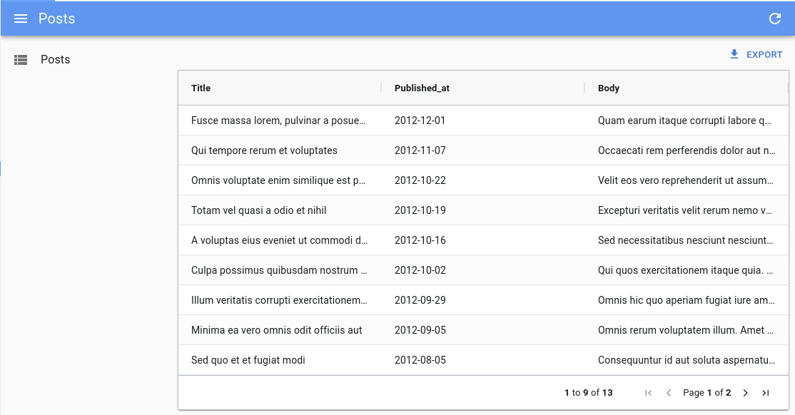
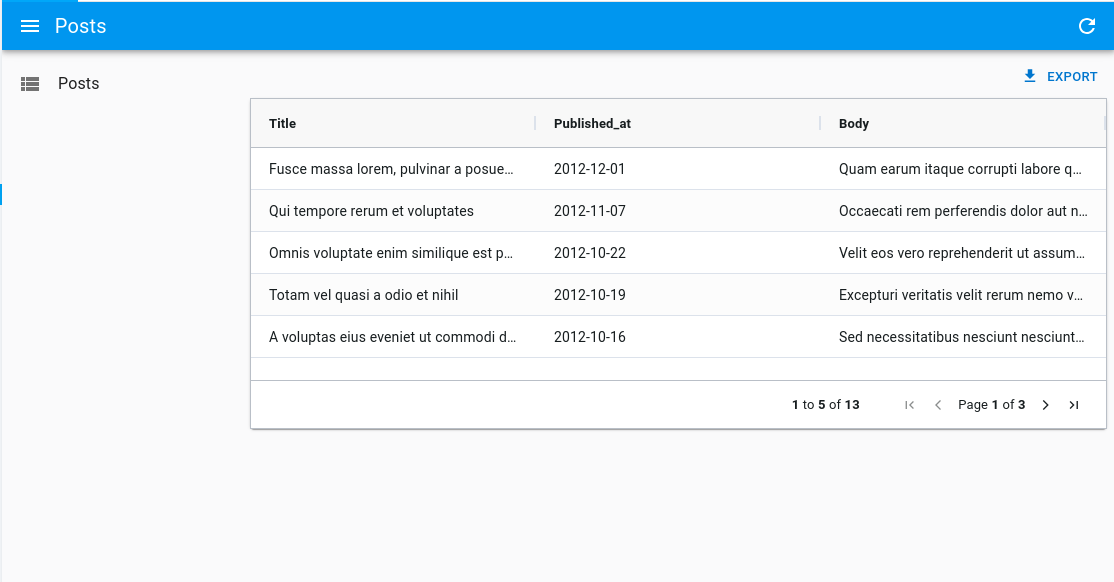
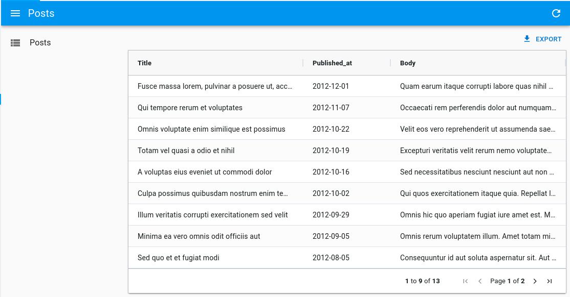
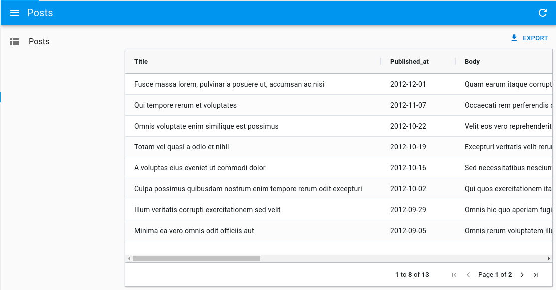
export const PostList = () => {
const columnDefs = [
{ field: 'title' },
{ field: 'published_at' },
{ field: 'body' },
];
return (
<List>
<DatagridAG columnDefs={columnDefs} />
</List>
);
};
The columns are defined using the columnDefs prop. See the dedicated doc section for more information.
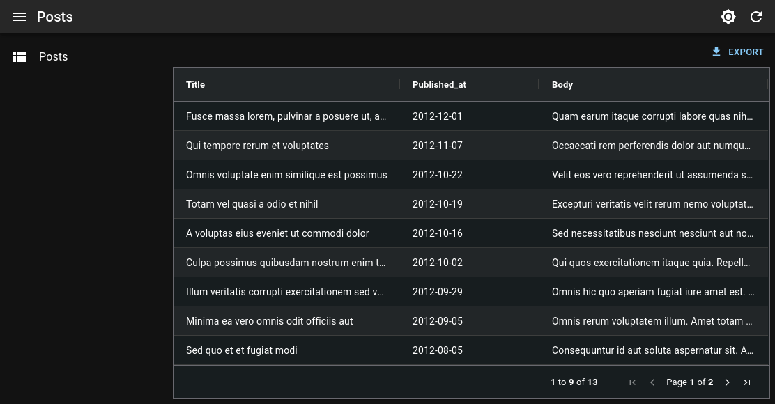
Usage Inside An <InfiniteList>
<DatagridAG> also supports being used as a child of a react-admin <InfiniteList>.
It only requires setting the pagination prop to false, because <DatagridAG> will itself detect when it needs to fetch more data, and the <InfiniteList> default pagination component would conflict with this behavior.
import React from 'react';
import { InfiniteList } from 'react-admin';
import { DatagridAG } from '@react-admin/ra-datagrid-ag';

export const PostList = () => {
    const columnDefs = [
        { field: 'title' },
        { field: 'published_at' },
        { field: 'body' },
    ];
    return (
        <InfiniteList pagination={false}>
            <DatagridAG columnDefs={columnDefs} />
        </InfiniteList>
    );
};
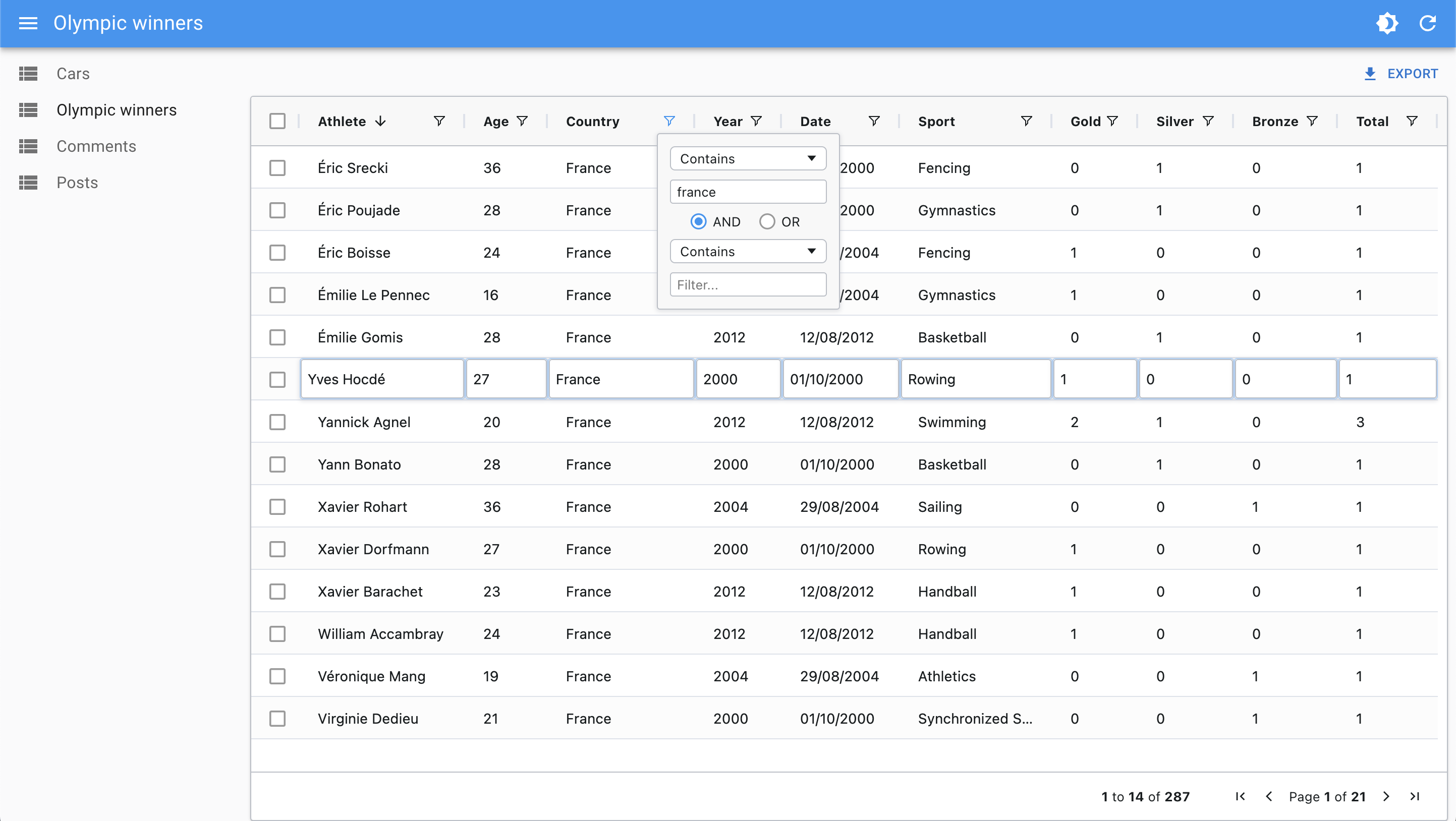
Filter Syntax
<DatagridAG> displays the data fetched by its parent (usually <List>).
<DatagridAG> provides advanced filtering controls and uses a special syntax to support operators (“contains”, “equals”, “not equals”, etc.). This syntax isn’t supported by dataProvider.getList() by default, so <DatagridAG> converts the internal filter representation into key-value pairs, using the familiar filter syntax:
// ag-grid internal filter format
{
    athlete: {
        filterType: 'text',
        type: 'equals',
        filter: 'mich',
    },
    age: {
        filterType: 'number',
        type: 'lessThan',
        filter: 30,
    },
    gold_medals: {
        filterType: 'number',
        type: 'inRange',
        filter: 5,
        filterTo: 10,
    },
    country: {
        filterType: 'text',
        type: 'blank',
    },
}
// is turned into react-admin filter format by default
{
    athlete_eq: 'mich',
    age_lt: 30,
    gold_medals_gte: 5,
    gold_medals_lte: 10,
    country_eq: null,
}
This conversion is done via to the getRaFilters and getAgGridFilters callbacks, that you can override to customize the format of the filter param sent to the dataProvider.
ag-grid provides default filters for text, number, and date columns. Some filters may not be supported by your backend, like startsWith or endsWith. You can remove these unsupported filters using the defaultColDef and the columnDefs props.
import { List } from 'react-admin';
import { DatagridAG } from '@react-admin/datagrid-ag';

const OlympicWinnersList = () => {
    const stringFilterParams = {
        filterParams: {
            // allow only some filter types for string columns
            filterOptions: ['contains', 'equals', 'notEqual', 'blank'],
        },
    };

    const columnDefs = [
        { field: 'athlete', ...stringFilterParams },
        { field: 'age' },
        { field: 'country', ...stringFilterParams },
        { field: 'year' },
    ];

    const defaultColDef = {
        filterParams: {
            maxNumConditions: 1, // limit the number of conditions to 1
            filterOptions: [ // list supported filter types by default
                'equals',
                'notEqual',
                'greaterThan',
                'greaterThanOrEqual',
                'lessThan',
                'lessThanOrEqual',
                'contains',
                'inRange',
                'blank',
            ],
        },
    };

    return (
        <List>
            <DatagridAG columnDefs={columnDefs} defaultColDef={defaultColDef} />
        </List>
    );
};
Limitations
<DatagridAG> is designed to work with partial datasets and load data upon request, thanks to the ListContext. It allows to work with a larger dataset, as it uses the dataProvider to fetch paginated data. However, this means that it can’t use some of the features offered by ag-grid such as:
- Row grouping
- Pivoting
- Aggregation
- Advanced filtering (and having multiple filters)
- Multi-column sorting
- Automatic page size
If you need to use these features, you can use the <DatagridAGClient> component instead of <DatagridAG>.
Props
| Prop | Required | Type | Default | Description |
|---|---|---|---|---|
bulkActionButtons |
Optional | ReactNode |
<BulkDelete Button> |
The component used to render the bulk action buttons |
cellEditor |
Optional | String, Function or Element | Allows to use a custom component to render the cell editor | |
cellRenderer |
Optional | String, Function or Element | Allows to use a custom component to render the cell content | |
columnDefs |
Required | Array | n/a | The columns definitions |
defaultColDef |
Optional | Object | The default column definition (applied to all columns) | |
defaultSort |
Optional | Object | The default sort to apply when clearing all sort | |
getAgGridFilters |
Optional | Function | A function mapping react-admin filters to ag-grid filters | |
getRaFilters |
Optional | Function | A function mapping ag-grid filters to react-admin filters | |
mutationOptions |
Optional | Object | The mutation options | |
preferenceKey |
Optional | String or false |
${resource}.ag-grid.params |
The key used to persist gridState in the Store. false disables persistence. |
sx |
Optional | Object | The sx prop passed down to the wrapping <div> element |
|
theme |
Optional | Object | themeAlpine |
The ag-grid theme object |
<DatagridAG> also accepts the same props as <AgGridReact> with the exception of rowData, since the data is fetched from the List context.
bulkActionButtons
You can use the bulkActionButtons prop to customize the bulk action buttons, displayed when at least one row is selected.
import React from 'react';
import { List, BulkExportButton, BulkDeleteButton } from 'react-admin';
import { DatagridAG } from '@react-admin/ra-datagrid-ag';

// Define the custom bulk action buttons
const PostBulkActionButtons = () => (
    <>
        <BulkExportButton />
        <BulkDeleteButton />
    </>
);

export const PostList = () => {
    const columnDefs = [
        { field: 'title' },
        { field: 'published_at' },
        { field: 'body' },
    ];
    return (
        <List>
            <DatagridAG
                columnDefs={columnDefs}
                // Pass the custom bulk action buttons
                bulkActionButtons={<PostBulkActionButtons />}
            />
        </List>
    );
};
cellEditor
In a column definition, you can use the cellEditor field to specify a custom cell editor. You can use any Edit Component supported by ag-grid, including Custom Components.
In addition to that, <DatagridAG> supports using React Admin inputs as cellEditor, such as <TextInput> or even <ReferenceInput>.
This allows to leverage all the power of react-admin inputs in your grid, including validation, for example to edit a reference.
To use a React Admin input as cellEditor, you need to pass it as a React Element:
import { List, ReferenceInput } from 'react-admin';
import { DatagridAG } from '@react-admin/ra-datagrid-ag';

export const CommentList = () => {
    const columnDefs = [
        // ...
        {
            field: 'post_id',
            cellEditor: (
                <ReferenceInput source="post_id" reference="posts" />
            ),
        },
    ];
    return (
        <List>
            <DatagridAG columnDefs={columnDefs} />
        </List>
    );
};
If you are passing a React Admin input as React Element, there are two additional props you can use: submitOnChange and noThemeOverride.
These props need to be passed as cellEditorParams.
submitOnChange allows to submit the change to ag-grid as soon as the input value changes, without waiting for the user to submit the form (e.g. by pressing Enter or clicking outside the cell).
This provides a better UX for example with components such as <AutocompleteInput> or <SelectInput>, as the value is immediately updated after the user selects an option.
import { List, ReferenceInput } from 'react-admin';
import { DatagridAG } from '@react-admin/ra-datagrid-ag';

export const CommentList = () => {
    const columnDefs = [
        // ...
        {
            field: 'post_id',
            cellEditor: (
                <ReferenceInput source="post_id" reference="posts" />
            ),
            cellEditorParams: {
                submitOnChange: true,
            },
        },
    ];
    return (
        <List>
            <DatagridAG columnDefs={columnDefs} />
        </List>
    );
};
noThemeOverride allows to prevent DatagridAG from applying custom styles to the input.
Indeed, DatagridAG applies custom styles to the inputs to make them look like ag-grid cells. However, this can cause issues for instance when rendering a Dialog containing additional inputs inside the cell editor. This can happen, for example, if you are using a custom create component with <AutocompleteInput create>.
To solve this issue, you can set noThemeOverride to true and apply your own styles to the input component.
import { styled } from '@mui/material';
import { List, ReferenceInput, AutocompleteInput } from 'react-admin';
import { DatagridAG } from '@react-admin/ra-datagrid-ag';
import { CreatePostDialog } from './CreatePostDialog';

export const CommentList = () => {
    const columnDefs = [
        // ...
        {
            field: 'post_id',
            cellEditor: (
                <ReferenceInput source="post_id" reference="posts">
                    <AutocompleteInputWithCreate />
                </ReferenceInput>
            ),
            cellEditorParams: {
                noThemeOverride: true,
            },
        },
    ];
    return (
        <List>
            <DatagridAG columnDefs={columnDefs} />
        </List>
    );
};

const AutocompleteInputWithCreate = () => {
    return (
        <StyledAutocompleteInput
            variant="outlined"
            ListboxComponent={StyledListbox}
            create={<CreatePostDialog />}
        />
    );
};

const StyledAutocompleteInput = styled(AutocompleteInput)({
    '& .MuiTextField-root': {
        margin: '1px 0px',
    },
    '& .MuiTextField-root fieldset': {
        border: 'none',
    },
    '& .MuiTextField-root input': {
        fontSize: 14,
    },
    '& .MuiInputLabel-root': {
        display: 'none',
    },
});

const StyledListbox = styled('ul')({
    fontSize: 14,
});
Tip: Be sure to read the Fine Tuning Input Components Used As Cell Editor section to improve the UX of your custom cell editors.
Tip: Using a custom cellEditor works great in combination with a custom cellRenderer.
You might want to always use React Admin inputs to edit your columns to leverage the validators with builtin i18n support:
import { List, TextInput, ReferenceInput, AutocompleteInput, required } from 'react-admin';
import { DatagridAG } from '@react-admin/ra-datagrid-ag';

export const CommentList = () => {
    const columnDefs = [
        {
            field: 'title',
            cellEditor: (
              <TextInput source="title" validate={required()} />
            ),
        },
        {
            field: 'post_id',
            cellEditor: (
                <ReferenceInput source="post_id" reference="posts">
                  <AutocompleteInput validate={required()} />
                </ReferenceInput>
            ),
        },
    ];
    return (
        <List>
            <DatagridAG columnDefs={columnDefs} />
        </List>
    );
};
cellRenderer
In a column definition, you can use the cellRenderer field to specify a custom cell renderer. In addition to ag-grid’s cell rendering abilities, <DatagridAG> supports react-admin fields in cellRenderer. This is particularly useful to render a <ReferenceField> for instance.
import React from 'react';
import { EmailField, List, ReferenceField, TextField } from 'react-admin';
import { DatagridAG } from '@react-admin/ra-datagrid-ag';

export const CommentList = () => {
    const columnDefs = [
        {
            field: 'id',
            editable: false,
        },
        { field: 'author.name' },
        {
            field: 'author.email',
            cellRenderer: <EmailField source="author.email" />,
        },
        {
            field: 'post_id',
            headerName: 'Post',
            cellRenderer: (
                <ReferenceField source="post_id" reference="posts" />
            ),
        },
        { field: 'created_at' },
        { field: 'body' },
    ];
    return (
        <List>
            <DatagridAG columnDefs={columnDefs} />
        </List>
    );
};
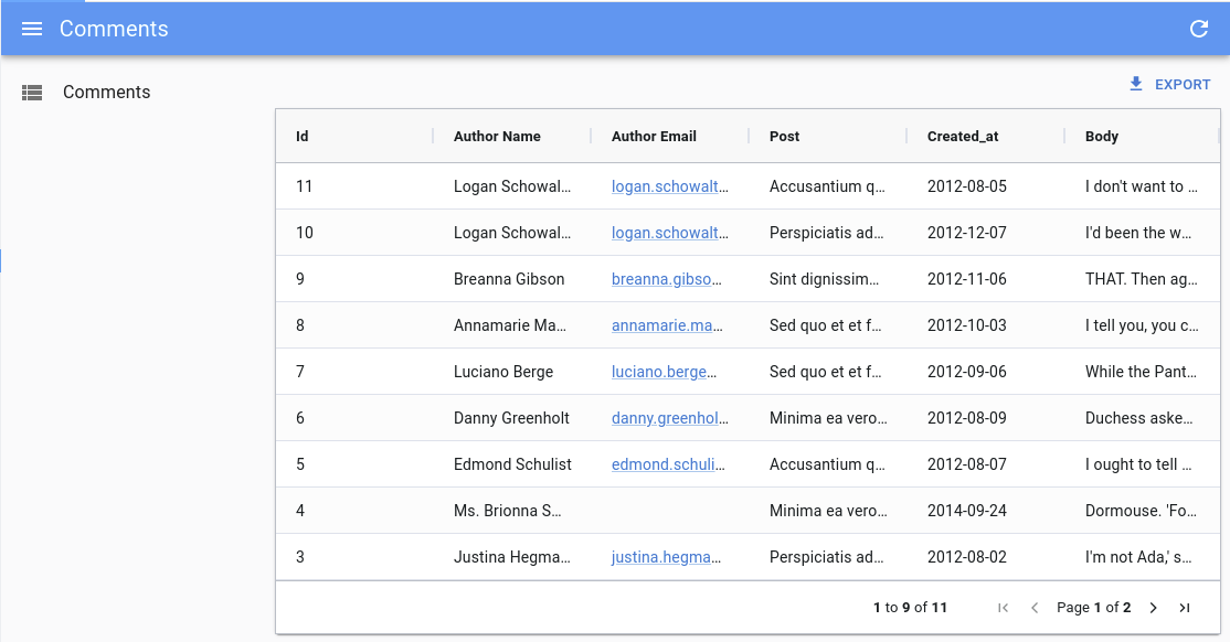
Note: You still need to pass the source prop to the field.
Tip: This works great in combination with a custom cellEditor.
columnDefs
The columnDefs prop is the most important prop of <DatagridAG>. It defines the columns of the grid, and their properties. It is an array of objects, each object representing a column.
Here is an example with a complete column definitions object:
import React from 'react';
import { List } from 'react-admin';
import { DatagridAG } from '@react-admin/ra-datagrid-ag';

const truncate = (str: string, n: number) => {
    return str.length > n ? str.slice(0, n - 1) + '...' : str;
};

export const PostList = () => {
    const columnDefs = [
        {
            field: 'id',
            editable: false,
        },
        { field: 'title' },
        {
            field: 'published_at',
            headerName: 'Publication Date',
        },
        {
            field: 'body',
            cellRenderer: ({ value }) => truncate(value, 20),
        },
    ];
    return (
        <List>
            <DatagridAG columnDefs={columnDefs} />
        </List>
    );
};
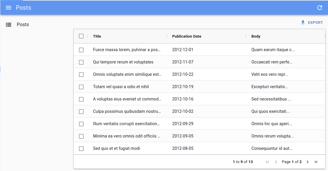
Have a look at the ag-grid documentation for the exhaustive list of column properties.
defaultColDef
The defaultColDef prop allows you to define default properties for all columns. It is an object with the same properties as columnDefs objects.
In the example below, the configuration enables flex mode on the columns, and sets each column to take 1/3 of the available space:
import React from 'react';
import { List } from 'react-admin';
import { DatagridAG } from '@react-admin/ra-datagrid-ag';

export const PostList = () => {
    const columnDefs = [
        { field: 'title' },
        { field: 'published_at' },
        { field: 'body' },
    ];
    const defaultColDef = {
        flex: 1,
    };
    return (
        <List>
            <DatagridAG columnDefs={columnDefs} defaultColDef={defaultColDef} />
        </List>
    );
};
defaultSort
The defaultSort prop allows you to define what sort settings to apply when users clear the sort on a column.
import React from 'react';
import { List } from 'react-admin';
import { DatagridAG } from '@react-admin/ra-datagrid-ag';

export const PostList = () => {
    const columnDefs = [
        // Passing null allows users to clear the sort
        { field: 'title', sortingOrder: ['asc', 'desc', null] },
        { field: 'published_at', sortingOrder: ['asc', 'desc', null] },
        { field: 'body', sortingOrder: ['asc', 'desc', null] },
    ];

    return (
        <List>
            <DatagridAG columnDefs={columnDefs} defaultSort={{ field: 'id', order: 'ASC' }} />
        </List>
    );
};
getAgGridFilters
You can use the getAgGridFilters prop to provide a function that transforms the filters from the dataProvider to the ag-grid format.
The default implementation turns key/value filters into ag-grid filters. For instance, the following data provider filters:
{
    athlete_eq: 'mich',
    age_lt: '30',
    country_q: 'fr',
}
Will be turned into:
{
    athlete: {
        filterType: 'text',
        type: 'equals',
        filter: 'mich',
    },
    age: {
        filterType: 'text',
        type: 'lessThan',
        filter: '30',
    },
    country: {
        filterType: 'text',
        type: 'contains',
        filter: 'fr',
    },
}
Pass your own getAgGridFilter function if your data provider uses another filter format, so that <DatagridAG> can display them correctly. Use the default implementation as a starting point:
import { List } from "react-admin";
import { DatagridAG } from "@react-admin/ra-datagrid-ag";
import type { FilterModel } from "@ag-grid-community/core";

const getAgGridFilter = (
  raFilter: string,
  source: string
): FilterModel => {
  const filterMapping = {
    eq: "equals",
    neq: "notEqual",
    gt: "greaterThan",
    gte: "greaterThanOrEqual",
    lt: "lessThan",
    lte: "lessThanOrEqual",
    q: "contains",
  };

  const hasOperator = source.includes("_");
  const operator = source.split("_").at(-1);
  const colId = source.split("_").slice(0, -1).join("_");

  if (!hasOperator || !operator) {
    return {
      [source]: {
        filterType: "text",
        type: "equals",
        filter: raFilter,
      },
    };
  }

  if (!filterMapping[operator]) {
    console.warn(`Unsupported filter suffix: ${operator}`);
    return {};
  }

  return {
    [colId]: {
      filterType: "text",
      type: filterMapping[operator],
      filter: raFilter,
    },
  };
};

const getAgGridFilters = (raFilters: {
  [key: string]: string;
}): FilterModel => {
  return Object.entries(raFilters).reduce((acc, [source, raFilter]) => {
    return {
      ...acc,
      ...getAgGridFilter(raFilter, source),
    };
  }, {});
};

export const PostList = () => {
  const columnDefs = [
    { field: "title" },
    { field: "published_at" },
    { field: "body" },
  ];
  return (
    <List>
      <DatagridAG columnDefs={columnDefs} getAgGridFilters={getAgGridFilters} />
    </List>
  );
};
getRaFilters
You can use the getRaFilters prop to provide a function that transforms the filters from the ag-grid format to the react-admin format.
The default implementation turns ag-grid filters into key/value pairs. For instance, the following ag-grid filters:
{
    athlete: {
        filterType: 'text',
        type: 'equals',
        filter: 'mich',
    },
    age: {
        filterType: 'number',
        type: 'lessThan',
        filter: 30,
    },
    gold_medals: {
        filterType: 'number',
        type: 'inRange',
        filter: 5,
        filterTo: 10,
    },
    country: {
        filterType: 'text',
        type: 'blank',
    },
}
Will be turned into:
{
    athlete_eq: 'mich',
    age_lt: 30,
    gold_medals_gte: 5,
    gold_medals_lte: 10,
    country_eq: null,
}
Pass your own getRAFilter function if your data provider uses another filter format. Use the default implementation as a starting point:
import { List } from "react-admin";
import { DatagridAG } from "@react-admin/ra-datagrid-ag";
import type { FilterModel } from "@ag-grid-community";

const getRAFilter = (
  agFilter: FilterModel,
  source: string
): { [key: string]: string } => {
  const filterMapping = {
    equals: "_eq",
    notEqual: "_neq",
    greaterThan: "_gt",
    greaterThanOrEqual: "_gte",
    lessThan: "_lt",
    lessThanOrEqual: "_lte",
    contains: "_q",
    inRange: () => ({
      [`${source}_gte`]: agFilter.filter,
      [`${source}_lte`]: agFilter.filterTo,
    }),
    blank: () => ({
      [`${source}_eq`]: null,
    }),
  };

  if (!filterMapping[agFilter.type]) {
    console.warn(`Unsupported filter type: ${agFilter.type}`);
    return {};
  }

  const filter = filterMapping[agFilter.type];

  if (typeof filter === "function") {
    return filter();
  }

  return {
    [`${source}${filter}`]: agFilter.filter,
  };
};

const getRaFilters = (
  agGridFilters: FilterModel
): { [key: string]: string } => {
  return Object.entries(agGridFilters).reduce((acc, [source, agFilter]) => {
    return {
      ...acc,
      ...getRAFilter(agFilter, source),
    };
  }, {});
};

export const PostList = () => {
  const columnDefs = [
    { field: "title" },
    { field: "published_at" },
    { field: "body" },
  ];
  return (
    <List>
      <DatagridAG columnDefs={columnDefs} getRaFilters={getRaFilters} />
    </List>
  );
};
mutationOptions
You can use the mutationOptions prop to provide options to the dataProvider.update() call triggered when a cell or a row is edited.
In particular, this allows to choose the mutationMode, and/or to pass a meta object to the dataProvider.
import React from 'react';
import { List } from 'react-admin';
import { DatagridAG } from '@react-admin/ra-datagrid-ag';

export const PostList = () => {
    const columnDefs = [
        { field: 'title' },
        { field: 'published_at' },
        { field: 'body' },
    ];
    return (
        <List>
            <DatagridAG
                columnDefs={columnDefs}
                mutationOptions={{
                    meta: { foo: 'bar' },
                    mutationMode: 'optimistic',
                }}
            />
        </List>
    );
};
This also allows to display a notification after the mutation succeeds.
import React from 'react';
import { List, useNotify } from 'react-admin';
import { DatagridAG } from '@react-admin/ra-datagrid-ag';

export const PostList = () => {
    const columnDefs = [
        { field: 'title' },
        { field: 'published_at' },
        { field: 'body' },
    ];
    const notify = useNotify();
    const onSuccess = React.useCallback(() => {
        notify('ra.notification.updated', {
            type: 'info',
            messageArgs: {
                smart_count: 1,
            },
            undoable: true,
        });
    }, [notify]);
    return (
        <List>
            <DatagridAG
                columnDefs={columnDefs}
                mutationOptions={{
                    mutationMode: 'undoable',
                    onSuccess,
                }}
            />
        </List>
    );
};
preferenceKey
<DatagridAG> will store the gridState in the Store, under the key ${resource}.ag-grid.params.grid. This gridState persisted in the store is applied once when the grid is created, it means that users will find the grid as they left it previously.
If you wish to change the key used to store the columns order and size, you can pass a preferenceKey prop to <DatagridAG>.
<List>
    <DatagridAG columnDefs={columnDefs} preferenceKey="my-post-list" />
</List>
If, instead, you want to disable the persistence of the columns order and size, you can pass false to the preferenceKey prop:
<List>
    <DatagridAG columnDefs={columnDefs} preferenceKey={false} />
</List>
Tip: If you update the columnDefs prop, and users already customized columns in a previous version of the app, the two versions will conflict. You can invite users to log out to reset the store, or add custom logic to invalidate the react-admin Store.
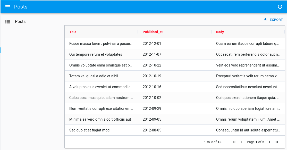
sx
You can use the sx prop to customize the grid’s style:
import React from 'react';
import { List } from 'react-admin';
import { DatagridAG } from '@react-admin/ra-datagrid-ag';

export const PostList = () => {
    const columnDefs = [
        { field: 'title' },
        { field: 'published_at' },
        { field: 'body' },
    ];
    return (
        <List>
            <DatagridAG
                columnDefs={columnDefs}
                sx={{ '& .ag-header-cell-comp-wrapper': { color: 'red' } }}
            />
        </List>
    );
};
It can also be helpful to change the default grid’s height (calc(100vh - 96px - ${theme.spacing(1)})):
import React from 'react';
import { List } from 'react-admin';
import { DatagridAG } from '@react-admin/ra-datagrid-ag';

export const PostList = () => {
    const columnDefs = [
        /* ... */
    ];
    return (
        <List>
            <DatagridAG
                columnDefs={columnDefs}
                sx={{ height: 'calc(100vh - 250px)' }}
            />
        </List>
    );
};
Tip: Be sure to also read the Theming section of the AG Grid documentation, to learn more about customizing the AG Grid themes.
theme
You can use a different theme for the grid by passing a theme prop. You can for instance use one of the themes provided by ag-grid, like themeBalham:
import React from 'react';
import { List } from 'react-admin';
import { DatagridAG } from '@react-admin/ra-datagrid-ag';
import { themeBalham } from 'ag-grid-community';

export const PostList = () => {
    const columnDefs = [
        { field: 'title' },
        { field: 'published_at' },
        { field: 'body' },
    ];
    return (
        <List>
            <DatagridAG columnDefs={columnDefs} theme={themeBalham} />
        </List>
    );
};
Tip: Be sure to also read the Theming section of the AG Grid documentation, to learn more about customizing the AG Grid themes.
AgGrid Defaults
Under the hood, <DatagridAG> is a wrapper around <AgGridReact>. However it sets some important default values:
paginationis set tofalseas the<List>component handles itpaginationAutoPageSizeis set tofalseanimateRowsis set totruerowSelectionis set tomode: 'multiRow'andselectAll: 'currentPage'readOnlyEditis set totruegetRowIdis set to use the recordidfield
It also register the following default modules: ClientSideRowModelModule, AllCommunityModule and CsvExportModule. If you wish to add custom modules, make sure you have at least the ClientSideRowModelModule:
import React from 'react';
import { List } from 'react-admin';
import { DatagridAG } from '@react-admin/ra-datagrid-ag';
import { ClientSideRowModelModule, CsvExportModule } from 'ag-grid-community';
import { ClipboardModule } from 'ag-grid-enterprise';

const modules = [ClientSideRowModelModule, CsvExportModule, ClipboardModule];

export const PostList = () => {
    const columnDefs = [
        {
            field: 'id',
            editable: false,
        },
        { field: 'title' },
        {
            field: 'published_at',
            headerName: 'Publication Date',
        },
    ];
    return (
        <List>
            <DatagridAG columnDefs={columnDefs} modules={modules} />
        </List>
    );
};
It also includes a defaultColDef object with the following properties:
{
    resizable: true,
    filter: true,
    sortable: true,
    sortingOrder: ['asc', 'desc'],
}
You may override any of these defaults by passing the corresponding props to <DatagridAG> (defaultColDef will be merged with the defaults).
Accessing The Grid API
You can access the grid’s api by passing a ref to <DatagridAG>.
In this example, we use the api to automatically resize all columns to fit their content on first render:
import React from 'react';
import { AgGridReact } from 'ag-grid-react';
import { List } from 'react-admin';
import { DatagridAG } from '@react-admin/ra-datagrid-ag';

export const PostList = () => {
    const columnDefs = [
        { field: 'title' },
        { field: 'published_at' },
        { field: 'body' },
    ];
    const gridRef = React.useRef<AgGridReact>(null);
    const onFirstDataRendered = React.useCallback(() => {
        gridRef.current.api.autoSizeAllColumns();
    }, []);
    return (
        <List>
            <DatagridAG
                columnDefs={columnDefs}
                ref={gridRef}
                onFirstDataRendered={onFirstDataRendered}
            />
        </List>
    );
};
Check out the Grid API documentation to learn more.
Changing The Default Column Width
By default, ag-grid will render each column with a fixed size.
You can choose to enable flex mode by setting the flex prop either on the columnDefs or on the defaultColDef:
import React from 'react';
import { List } from 'react-admin';
import { DatagridAG } from '@react-admin/ra-datagrid-ag';

export const PostList = () => {
    const columnDefs = [
        { field: 'title' },
        { field: 'published_at', flex: 1 },
        { field: 'body' },
    ];
    const defaultColDef = {
        flex: 2,
    };
    return (
        <List>
            <DatagridAG columnDefs={columnDefs} defaultColDef={defaultColDef} />
        </List>
    );
};
Alternatively, you can use the grid’s api to call autoSizeAllColumns to automatically resize all columns to fit their content:
import React from 'react';
import { AgGridReact } from 'ag-grid-react';
import { List } from 'react-admin';
import { DatagridAG } from '@react-admin/ra-datagrid-ag';

export const PostList = () => {
    const columnDefs = [
        { field: 'title' },
        { field: 'published_at' },
        { field: 'body' },
    ];
    const gridRef = React.useRef<AgGridReact>(null);
    const onFirstDataRendered = React.useCallback(() => {
        gridRef.current.api.autoSizeAllColumns();
    }, []);
    return (
        <List>
            <DatagridAG
                columnDefs={columnDefs}
                ref={gridRef}
                onFirstDataRendered={onFirstDataRendered}
            />
        </List>
    );
};
Check out the Column Sizing documentation for more information and more alternatives.
Selecting Rows And Enabling Bulk Actions
Just like <Datagrid>, <DatagridAG> supports row selection and bulk actions.
Below is an example with the PostList component:
import React from 'react';
import { List } from 'react-admin';
import { DatagridAG } from '@react-admin/ra-datagrid-ag';

export const PostList = () => {
    const columnDefs = [
        { field: 'title' },
        { field: 'published_at' },
        { field: 'body' },
    ];
    return (
        <List>
            <DatagridAG columnDefs={columnDefs} />
        </List>
    );
};
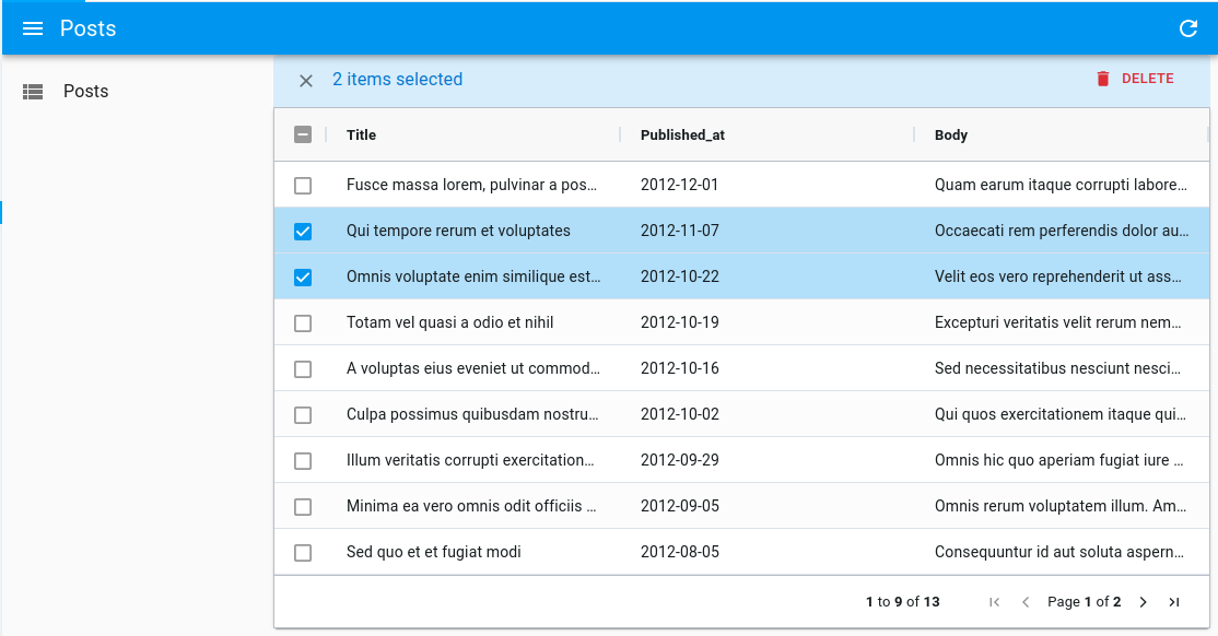
Just like with <Datagrid>, you can customize the bulk actions by passing a bulkActionButtons prop to <DatagridAG>.
import React from 'react';
import { List, BulkExportButton, BulkDeleteButton } from 'react-admin';
import { DatagridAG } from '@react-admin/ra-datagrid-ag';

const PostBulkActionButtons = () => (
    <>
        <BulkExportButton />
        <BulkDeleteButton />
    </>
);

export const PostList = () => {
    const columnDefs = [
        { field: 'title' },
        { field: 'published_at' },
        { field: 'body' },
    ];
    return (
        <List>
            <DatagridAG
                columnDefs={columnDefs}
                bulkActionButtons={<PostBulkActionButtons />}
            />
        </List>
    );
};
Working with Dates
When using DatagridAG with dates, the ag-grid documentation states that:
The default Value Parser and Value Formatter use the ISO string format ‘yyyy-mm-dd’. If you wish to use a different date format, then you can Override the Pre-Defined Cell Data Type Definition.
Access Control
<DatagridAG> has built-in access control. If the authProvider implements the canAccess method, users will only be allowed to edit rows of, say, resource 'cars' if canAccess({ action: 'edit', resource: 'cars' }) returns true.
Note: the access control check can only be done at the resource level and not at the record level.
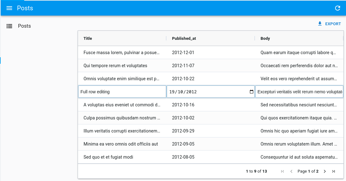
Enabling Full Row Edition
By default, editing is enabled on cells, which means you can edit a cell by double-clicking on it, and it will trigger a call to the dataProvider’s update function.
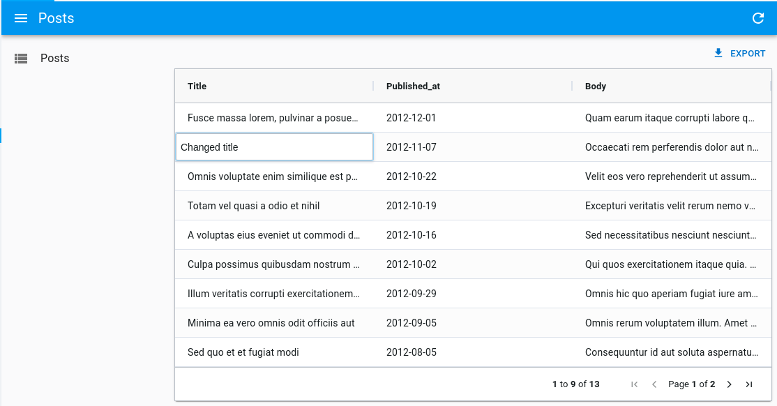
However, if you’d like to update the full row at once instead, you can enable full row editing by passing editType="fullRow" to <DatagridAG>:
import React from 'react';
import { List } from 'react-admin';
import { DatagridAG } from '@react-admin/ra-datagrid-ag';

export const PostList = () => {
    const columnDefs = [
        /* ... */
    ];
    return (
        <List>
            <DatagridAG columnDefs={columnDefs} editType="fullRow" />
        </List>
    );
};
Disabling Cell Edition
Set editable: false in the definition of a column to disable the ability to edit its cells.
import React from 'react';
import { List } from 'react-admin';
import { DatagridAG } from '@react-admin/ra-datagrid-ag';

export const PostList = () => {
    const columnDefs = [
        { field: 'title' },
        { field: 'published_at', editable: false },
        { field: 'body' },
    ];
    return (
        <List>
            <DatagridAG columnDefs={columnDefs} />
        </List>
    );
};
Alternatively, you can disable the ability to edit all cells by passing editable: false to the defaultColDef:
import React from 'react';
import { List } from 'react-admin';
import { DatagridAG } from '@react-admin/ra-datagrid-ag';

export const PostList = () => {
    const columnDefs = [
        { field: 'title' },
        { field: 'published_at' },
        { field: 'body' },
    ];
    const defaultColDef = {
        editable: false,
    };
    return (
        <List>
            <DatagridAG columnDefs={columnDefs} defaultColDef={defaultColDef} />
        </List>
    );
};
Fine-Tuning Input Components Used As Cell Editor
The cellEditor section already explains how you can use React Admin inputs as cell editor in ag-grid.
However, there are some tweaks you can apply to the input components to improve their UX when used as a cell editor.
Automatically Focus And Select The Input Value With <AutocompleteInput>
When rendering an <AutocompleteInput> as a cell editor, it can be useful to automatically focus and select the input value when the cell editor is opened. This saves time for the user, as they can start typing right away, or select an option from the list as it is already open.
This can be achieved using refs like so:
const AutocompleteInputWithAutoSelect = props => {
    const inputRef = React.useRef<HTMLInputElement>(null);
    return (
        <AutocompleteInput
            {...props}
            TextFieldProps={{
                inputRef,
                ref: () => {
                    setTimeout(() => {
                        inputRef.current?.select();
                    }, 50);
                },
            }}
        />
    );
};
Automatically Open The Options List With <SelectInput>
When rendering a <SelectInput> as a cell editor, it can be useful to automatically open the list of options when the cell editor is opened. This saves time for the user, as they can select an option from the list right away.
This can be achieved using the defaultOpen prop like so:
const SelectInputWithDefaultOpen = props => {
    return (
        <SelectInput
            {...props}
            SelectProps={{
                defaultOpen: true,
            }}
        />
    );
};
Allow To Create New Options On The Fly With <AutocompleteInput> Or <SelectInput>
As explained in the cellEditor section, a custom MUI theme will be applied to React Admin inputs to make them look like ag-grid cells. This theme can conflict with other input components that are rendered in the Dialog you open to create a new option on the fly.
This can be solved by passing noThemeOverride: true to the cellEditorParams.
Besides, the submit button of the Dialog can conflict with the built-in cell editor event handler, resulting in the cell leaving the Edit mode before the newly created option could be selected.
This can be solved by stopping the event propagation when the submit button is clicked in the Dialog.
Here is a complete example of how to create a custom AutocompleteInputWithCreate component that solves both issues:
import React from 'react';
import {
    Button,
    Dialog,
    DialogActions,
    DialogContent,
    TextField as MUITextField,
    Stack,
    styled,
} from '@mui/material';
import {
    AutocompleteInput,
    List,
    ReferenceInput,
    useCreate,
    useCreateSuggestionContext,
} from 'react-admin';
import { DatagridAG } from '@react-admin/ra-datagrid-ag';

const CreatePostDialog = () => {
    const { filter, onCancel, onCreate } = useCreateSuggestionContext();
    const [title, setTitle] = React.useState(filter || '');
    const [create] = useCreate();

    const handleSubmit = event => {
        event.preventDefault();
        event.stopPropagation(); // prevent the default handler from ag-grid
        create(
            'posts',
            {
                data: { title },
            },
            {
                onSuccess: data => {
                    setTitle('');
                    onCreate(data);
                },
            }
        );
    };

    return (
        <Dialog open onClose={onCancel}>
            <form onSubmit={handleSubmit}>
                <DialogContent>
                    <Stack sx={{ gap: 4 }}>
                        <MUITextField
                            name="title"
                            value={title}
                            onChange={event => setTitle(event.target.value)}
                        />
                    </Stack>
                </DialogContent>
                <DialogActions>
                    <Button type="submit">Save</Button>
                    <Button onClick={onCancel}>Cancel</Button>
                </DialogActions>
            </form>
        </Dialog>
    );
};

const AutocompleteInputWithCreate = props => {
    const inputRef = React.useRef<HTMLInputElement>(null);
    return (
        <StyledAutocompleteInput
            {...props}
            variant="outlined"
            ListboxComponent={StyledListbox}
            TextFieldProps={{
                inputRef,
                ref: () => {
                    setTimeout(() => {
                        inputRef.current?.select();
                    }, 50);
                },
            }}
            create={<CreatePostDialog />}
        />
    );
};

const StyledAutocompleteInput = styled(AutocompleteInput)({
    '& .MuiTextField-root': {
        margin: '1px 0px',
    },
    '& .MuiTextField-root fieldset': {
        border: 'none',
    },
    '& .MuiTextField-root input': {
        fontSize: 14,
    },
    '& .MuiInputLabel-root': {
        display: 'none',
    },
});

const StyledListbox = styled('ul')({
    fontSize: 14,
});

export const CommentListWithAutocompleteWithCreate = () => {
    const columnDefs = [
        // ...
        {
            field: 'post_id',
            cellEditor: (
                <ReferenceInput source="post_id" reference="posts">
                    <AutocompleteInputWithCreate />
                </ReferenceInput>
            ),
            cellEditorParams: {
                submitOnChange: true,
                noThemeOverride: true, // prevent the default theme override
            },
        },
    ];
    return (
        <List>
            <DatagridAG columnDefs={columnDefs} />
        </List>
    );
};
Using AG Grid Enterprise
<DatagridAG> is also compatible with the Enterprise version of ag-grid.
You can try out AG Grid Enterprise for free. If you don’t have a license key installed, AG Grid Enterprise will display a watermark. To remove this watermark, you’ll need to purchase a license key from AG Grid.
To use an AG Grid Enterprise Module with <DatagridAG>, you simply need to install it and then add it to the list of registered modules via the modules prop.
Below is an example of what you can achieve using the following AG Grid Enterprise Modules:
ClipboardModuleColumnsToolPanelModuleExcelExportModuleFiltersToolPanelModuleColumnMenuModuleContextMenuModuleRowGroupingModuleRowGroupingPanelModuleGroupFilterModule
First install the enterprise package:
npm install ag-grid-enterprise
Then register them in <DatagridAG> using the modules prop:
import {
    AllCommunityModule,
    ClientSideRowModelModule,
    ColDef,
    CsvExportModule,
    GetContextMenuItems,
    RowSelectionOptions,
} from 'ag-grid-community';
import {
    ClipboardModule,
    ColumnsToolPanelModule,
    ExcelExportModule,
    FiltersToolPanelModule,
    ColumnMenuModule,
    ContextMenuModule,
    RowGroupingModule,
    RowGroupingPanelModule,
    GroupFilterModule,
    MasterDetailModule,
} from 'ag-grid-enterprise';
import React from 'react';
import { List } from 'react-admin';
import { DatagridAG } from '@react-admin/ra-datagrid-ag';

const getContextMenuItems: GetContextMenuItems = () => [
    'copy',
    'copyWithHeaders',
    'copyWithGroupHeaders',
    'paste',
    'separator',
    'export',
];

const enterpriseModules = [
    AllCommunityModule,
    ClientSideRowModelModule,
    CsvExportModule,
    ClipboardModule,
    ColumnsToolPanelModule,
    ExcelExportModule,
    FiltersToolPanelModule,
    ColumnMenuModule,
    ContextMenuModule,
    RowGroupingModule,
    RowGroupingPanelModule,
    GroupFilterModule,
];

const rowSelection: RowSelectionOptions = {
    mode: 'multiRow',
    groupSelects: 'descendants',
    selectAll: 'currentPage',
};

const OlympicWinnersList = () => {
    const columnDefs: ColDef<any, any>[] = [
        { field: 'athlete' },
        { field: 'age' },
        { field: 'country' },
        { field: 'year' },
        { field: 'date' },
        { field: 'sport' },
        { field: 'gold' },
        { field: 'silver' },
        { field: 'bronze' },
        { field: 'total' },
    ];

const defaultColDef = {
        enableRowGroup: true,
        menuTabs: ['filterMenuTab', 'generalMenuTab', 'columnsMenuTab'],
    };

    return (
        <List>
            <DatagridAG
                columnDefs={columnDefs}
                defaultColDef={defaultColDef}
                rowGroupPanelShow="always"
                rowSelection={rowSelection}
                getContextMenuItems={getContextMenuItems}
                modules={enterpriseModules}
            />
        </List>
    );
};
Tip: <DatagridAG> registers the following modules by default: ClientSideRowModelModule, AllCommunityModule and CsvExportModule. If you add other modules, make sure to have at least the ClientSideRowModelModule.
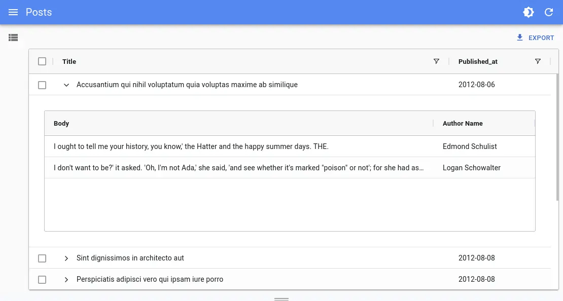
Adding An Expandable Panel (Master/Detail)
You can leverage ag-grid Master Detail Module to add an expandable panel.
For instance, here’s how to show the comments of a post in an expandable panel:
import {
    ColDef,
    AllCommunityModule,
    ClientSideRowModelModule,
    CsvExportModule
} from 'ag-grid-community';
import { MasterDetailModule } from 'ag-grid-enterprise';
import React from 'react';
import { List, useDataProvider, useNotify } from 'react-admin';
import { DatagridAG } from '@react-admin/ra-datagrid-ag';

const modulesWithMasterDetails = [
    ClientSideRowModelModule,
    AllCommunityModule,
    CsvExportModule,
    MasterDetailModule,
];

export const PostList = () => {
    const dataProvider = useDataProvider();
    const notify = useNotify();

    const columnDefs: ColDef<any, any>[] = [
        { field: 'title', flex: 1, cellRenderer: 'agGroupCellRenderer' },
        { field: 'published_at' },
    ];

    const detailCellRendererParams = {
        // provide the Grid Options to use on the Detail Grid
        detailGridOptions: {
            columnDefs: [{ field: 'body', flex: 1 }, { field: 'author.name' }],
        },
        // get the rows for each Detail Grid
        getDetailRowData: params => {
            dataProvider
                .getManyReference('comments', {
                    target: 'post_id',
                    id: params.data.id,
                    pagination: { page: 1, perPage: 100 },
                    sort: { field: 'created_at', order: 'DESC' },
                    filter: {},
                })
                .then(({ data }) => {
                    params.successCallback(data);
                })
                .catch(error => {
                    notify(error.message, { type: 'error' });
                });
        },
    };

    return (
        <List resource="posts">
            <DatagridAG
                masterDetail
                columnDefs={columnDefs}
                detailCellRendererParams={detailCellRendererParams}
                modules={modulesWithMasterDetails}
            />
        </List>
    );
};
Tip: <DatagridAG> registers the following modules by default: ClientSideRowModelModule, AllCommunityModule and CsvExportModule. If you add other modules, make sure to have at least the ClientSideRowModelModule.
Creating New Records
There are multiple options to create new records:
- The simple
createview that redirects users to a dedicated create page:
// in src/posts.tsx
import * as React from 'react';
import { Create, SimpleForm, TextInput, DateInput, required } from 'react-admin';
import RichTextInput from 'ra-input-rich-text';

export const PostCreate = () => (
    <Create>
        <SimpleForm>
            <TextInput source="title" validate={[required()]} />
            <TextInput source="teaser" multiline={true} label="Short description" />
            <RichTextInput source="body" />
            <DateInput label="Publication date" source="published_at" defaultValue={new Date()} />
        </SimpleForm>
    </Create>
);

// in src/App.tsx
import * as React from 'react';
import { Admin, Resource } from 'react-admin';
import jsonServerProvider from 'ra-data-json-server';

import { PostCreate, PostList } from './posts';

const App = () => (
    <Admin dataProvider={jsonServerProvider('https://jsonplaceholder.typicode.com')}>
        <Resource name="posts" list={PostList} create={PostCreate} />
    </Admin>
);

export default App;
- The
<CreateDialog>component from@react-admin/ra-form-layoutthat opens a dialog without leaving the list page:
// In src/posts.tsx
import { List, ListActions, SimpleForm, TextInput, DateInput } from 'react-admin';
import { DatagridAG } from '@react-admin/ra-datagrid-ag';
import { CreateDialog } from '@react-admin/ra-form-layout';

const columnDefs = [
    { field: 'id', editable: false },
    { field: 'title' },
    { field: 'published_at', headerName: 'Publication Date' },
    { field: 'body' },
];

export const PostList = () => (
    <>
        <List actions={<ListActions hasCreate />}>
            <DatagridAG columnDefs={columnDefs} />
        </List>
        <CreateDialog>
            <SimpleForm>
                <TextInput source="title" />
                <DateInput source="published_at" />
                <TextInput source="body" />
            </SimpleForm>
        </CreateDialog>
    </>
);
Note: You can’t use the
<CreateDialog>and have a standard<Edit>specified on your<Resource>, because the<Routes>declarations would conflict. If you need this, use the<CreateInDialogButton>instead.
- The
<CreateInDialogButton>component from@react-admin/ra-form-layoutthat opens a dialog without leaving the list page but does not add a/createroute:
// In src/posts.tsx
import { List, ListActions, SimpleForm, TextInput, DateInput, TopToolbar } from 'react-admin';
import { DatagridAG } from '@react-admin/ra-datagrid-ag';
import { CreateInDialogButton } from '@react-admin/ra-form-layout';

const columnDefs = [
    { field: 'id', editable: false },
    { field: 'title' },
    { field: 'published_at', headerName: 'Publication Date' },
    { field: 'body' },
];

const PostListActions = () => (
    <TopToolbar>
        <CreateInDialogButton>
            <SimpleForm>
                <TextInput source="title" />
                <DateInput source="published_at" />
                <TextInput source="body" />
            </SimpleForm>
        </CreateInDialogButton>
    </TopToolbar>
)

export const PostList = () => (·
    <List actions={<PostListActions />}>
        <DatagridAG columnDefs={columnDefs} />
    </List>
);
<DatagridAGClient>
<DatagridAGClient> is an alternative datagrid component with advanced features, based on ag-grid. It is designed for small datasets that can be entirely loaded client-side (around a few thousand records). It supports infinite scrolling, grouping, multi-column sorting, and advanced filtering.
The client-side performance isn’t affected by a large number of records, as ag-grid uses DOM virtualization.
Usage
Use <DatagridAGClient> as a child of a react-admin <List>, <ReferenceManyField>, or any other component that creates a ListContext.
import React from 'react';
import { List } from 'react-admin';
import { DatagridAGClient } from '@react-admin/ra-datagrid-ag';

export const PostList = () => {
    const columnDefs = [
        { field: 'title' },
        { field: 'published_at' },
        { field: 'body' },
    ];
    return (
        <List perPage={10000} pagination={false}>
            <DatagridAGClient columnDefs={columnDefs} />
        </List>
    );
};
Here are the important things to note:
- To benefit from ag-grid’s filtering and sorting features (as well as some Enterprise features like grouping), you need to load the entire list of records client-side. To do so, you must set
<List perPage>to a high number (e.g. 10,000). - As the pagination is handled by ag-grid, you can disable react-admin’s pagination with
<List pagination={false}>. - The columns are defined using the
columnDefsprop. See the dedicated doc section for more information. <InfiniteList>is not supported.
The client-side performance isn’t affected by a large number of records, as ag-grid uses DOM virtualization. <DatagridAGClient> has been tested with 10,000 records without any performance issue.
Props
| Prop | Required | Type | Default | Description |
|---|---|---|---|---|
bulkActionButtons |
Optional | ReactNode |
<BulkDelete Button> |
The component used to render the bulk action buttons |
cellEditor |
Optional | String, Function or Element | Allows to use a custom component to render the cell editor | |
cellRenderer |
Optional | String, Function or Element | Allows to use a custom component to render the cell content | |
columnDefs |
Required | Array | n/a | The columns definitions |
defaultColDef |
Optional | Object | The default column definition (applied to all columns) | |
mutationOptions |
Optional | Object | The mutation options | |
pagination |
Optional | Boolean | true |
Enable or disable pagination |
preferenceKey |
Optional | String or false |
${resource}.ag-grid.params |
The key used to persist gridState in the Store. false disables persistence. |
sx |
Optional | Object | The sx prop passed down to the wrapping <div> element |
<DatagridAGClient> also accepts the same props as <AgGridReact> with the exception of rowData, since the data is fetched from the List context.
bulkActionButtons
You can use the bulkActionButtons prop to customize the bulk action buttons, displayed when at least one row is selected.
import React from 'react';
import { List, BulkExportButton, BulkDeleteButton } from 'react-admin';
import { DatagridAGClient } from '@react-admin/ra-datagrid-ag';

const PostBulkActionButtons = () => (
    <>
        <BulkExportButton />
        <BulkDeleteButton />
    </>
);

export const PostList = () => {
    const columnDefs = [
        { field: 'title' },
        { field: 'published_at' },
        { field: 'body' },
    ];
    return (
        <List perPage={10000} pagination={false}>
            <DatagridAGClient
                columnDefs={columnDefs}
                bulkActionButtons={<PostBulkActionButtons />}
            />
        </List>
    );
};
cellEditor
In a column definition, you can use the cellEditor field to specify a custom cell editor. You can use any Edit Component supported by ag-grid, including Custom Components.
In addition to that, <DatagridAGClient> supports using React Admin inputs as cellEditor, such as <TextInput> or even <ReferenceInput>.
This allows to leverage all the power of react-admin inputs in your grid, including validation, for example to edit a reference.
To use a React Admin input as cellEditor, you need to pass it as a React Element:
import { List, ReferenceInput } from 'react-admin';
import { DatagridAGClient } from '@react-admin/ra-datagrid-ag';

export const CommentList = () => {
    const columnDefs = [
        // ...
        {
            field: 'post_id',
            cellEditor: (
                <ReferenceInput source="post_id" reference="posts" />
            ),
        },
    ];
    return (
        <List perPage={10000} pagination={false}>
            <DatagridAGClient columnDefs={columnDefs} />
        </List>
    );
};
If you are passing a React Admin input as React Element, there are two additional props you can use: submitOnChange and noThemeOverride.
These props need to be passed as cellEditorParams.
submitOnChange allows to submit the change to ag-grid as soon as the input value changes, without waiting for the user to submit the form (e.g. by pressing Enter or clicking outside the cell).
This provides a better UX for example with components such as <AutocompleteInput> or <SelectInput>, as the value is immediately updated after the user selects an option.
import { List, ReferenceInput } from 'react-admin';
import { DatagridAGClient } from '@react-admin/ra-datagrid-ag';

export const CommentList = () => {
    const columnDefs = [
        // ...
        {
            field: 'post_id',
            cellEditor: (
                <ReferenceInput source="post_id" reference="posts" />
            ),
            cellEditorParams: {
                submitOnChange: true,
            },
        },
    ];
    return (
        <List perPage={10000} pagination={false}>
            <DatagridAGClient columnDefs={columnDefs} />
        </List>
    );
};
noThemeOverride allows to prevent DatagridAGClient from applying custom styles to the input.
Indeed, DatagridAGClient applies custom styles to the inputs to make them look like ag-grid cells. However, this can cause issues for instance when rendering a Dialog containing additional inputs inside the cell editor. This can happen, for example, if you are using a custom create component with <AutocompleteInput create>.
To solve this issue, you can set noThemeOverride to true and apply your own styles to the input component.
import { styled } from '@mui/material';
import { List, ReferenceInput, AutocompleteInput } from 'react-admin';
import { DatagridAGClient } from '@react-admin/ra-datagrid-ag';
import { CreatePostDialog } from './CreatePostDialog';

export const CommentList = () => {
    const columnDefs = [
        // ...
        {
            field: 'post_id',
            cellEditor: (
                <ReferenceInput source="post_id" reference="posts">
                    <AutocompleteInputWithCreate />
                </ReferenceInput>
            ),
            cellEditorParams: {
                noThemeOverride: true,
            },
        },
    ];
    return (
        <List perPage={10000} pagination={false}>
            <DatagridAGClient columnDefs={columnDefs} />
        </List>
    );
};

const AutocompleteInputWithCreate = () => {
    return (
        <StyledAutocompleteInput
            variant="outlined"
            ListboxComponent={StyledListbox}
            create={<CreatePostDialog />}
        />
    );
};

const StyledAutocompleteInput = styled(AutocompleteInput)({
    '& .MuiTextField-root': {
        margin: '1px 0px',
    },
    '& .MuiTextField-root fieldset': {
        border: 'none',
    },
    '& .MuiTextField-root input': {
        fontSize: 14,
    },
    '& .MuiInputLabel-root': {
        display: 'none',
    },
});

const StyledListbox = styled('ul')({
    fontSize: 14,
});
Tip: Be sure to read the Fine Tuning Input Components Used As Cell Editor section to improve the UX of your custom cell editors.
Tip: Using a custom cellEditor works great in combination with a custom cellRenderer.
You might want to always use React Admin inputs to edit your columns to leverage the validators with builtin i18n support:
import { List, TextInput, ReferenceInput, AutocompleteInput, required } from 'react-admin';
import { DatagridAGClient } from '@react-admin/ra-datagrid-ag';

export const CommentList = () => {
    const columnDefs = [
        {
            field: 'title',
            cellEditor: (
              <TextInput source="title" validate={required()} />
            ),
        },
        {
            field: 'post_id',
            cellEditor: (
                <ReferenceInput source="post_id" reference="posts">
                  <AutocompleteInput validate={required()} />
                </ReferenceInput>
            ),
        },
    ];
    return (
        <List perPage={10000} pagination={false}>
            <DatagridAGClient columnDefs={columnDefs} />
        </List>
    );
};
cellRenderer
In a column definition, you can use the cellRenderer field to specify a custom cell renderer. In addition to ag-grid’s cell rendering abilities, <DatagridAGClient> supports react-admin fields in cellRenderer. This is particularly useful to render a <ReferenceField> for instance.
import React from 'react';
import { EmailField, List, ReferenceField, TextField } from 'react-admin';
import { DatagridAGClient } from '@react-admin/ra-datagrid-ag';

export const CommentList = () => {
    const columnDefs = [
        {
            field: 'id',
            editable: false,
        },
        { field: 'author.name' },
        {
            field: 'author.email',
            cellRenderer: <EmailField source="author.email" />,
        },
        {
            field: 'post_id',
            headerName: 'Post',
            cellRenderer: (
                <ReferenceField source="post_id" reference="posts" />
            ),
        },
        { field: 'created_at' },
        { field: 'body' },
    ];
    return (
        <List perPage={10000} pagination={false}>
            <DatagridAGClient columnDefs={columnDefs} />
        </List>
    );
};
Note: You still need to pass the source prop to the field.
Tip: This works great in combination with a custom cellEditor.
columnDefs
The columnDefs prop is the most important prop of <DatagridAGClient>. It defines the columns of the grid, and their properties. It is an array of objects, each object representing a column.
Here is an example with a complete column definitions object:
import React from 'react';
import { List } from 'react-admin';
import { DatagridAGClient } from '@react-admin/ra-datagrid-ag';

const truncate = (str: string, n: number) => {
    return str.length > n ? str.slice(0, n - 1) + '...' : str;
};

export const PostList = () => {
    const columnDefs = [
        {
            field: 'id',
            editable: false,
        },
        { field: 'title' },
        {
            field: 'published_at',
            headerName: 'Publication Date',
        },
        {
            field: 'body',
            cellRenderer: ({ value }) => truncate(value, 20),
        },
    ];
    return (
        <List perPage={10000} pagination={false}>
            <DatagridAGClient columnDefs={columnDefs} />
        </List>
    );
};
Have a look at the ag-grid documentation for the exhaustive list of column properties.
defaultColDef
The defaultColDef prop allows you to define default properties for all columns. It is an object with the same properties as columnDefs objects.
In the example below, we enable flex mode on the columns, and set each column to take 1/3 of the available space:
import React from 'react';
import { List } from 'react-admin';
import { DatagridAGClient } from '@react-admin/ra-datagrid-ag';

export const PostList = () => {
    const columnDefs = [
        { field: 'title' },
        { field: 'published_at' },
        { field: 'body' },
    ];
    const defaultColDef = {
        flex: 1,
    };
    return (
        <List perPage={10000} pagination={false}>
            <DatagridAGClient columnDefs={columnDefs} defaultColDef={defaultColDef} />
        </List>
    );
};
mutationOptions
You can use the mutationOptions prop to provide options to the dataProvider.update() call triggered when a cell or a row is edited.
In particular, this allows to choose the mutationMode, and/or to pass a meta object to the dataProvider.
import React from 'react';
import { List } from 'react-admin';
import { DatagridAGClient } from '@react-admin/ra-datagrid-ag';

export const PostList = () => {
    const columnDefs = [
        { field: 'title' },
        { field: 'published_at' },
        { field: 'body' },
    ];
    return (
        <List perPage={10000} pagination={false}>
            <DatagridAGClient
                columnDefs={columnDefs}
                mutationOptions={{
                    meta: { foo: 'bar' },
                    mutationMode: 'optimistic',
                }}
            />
        </List>
    );
};
This also allows to display a notification after the mutation succeeds.
import React from 'react';
import { List, useNotify } from 'react-admin';
import { DatagridAGClient } from '@react-admin/ra-datagrid-ag';

export const PostList = () => {
    const columnDefs = [
        { field: 'title' },
        { field: 'published_at' },
        { field: 'body' },
    ];
    const notify = useNotify();
    const onSuccess = React.useCallback(() => {
        notify('ra.notification.updated', {
            type: 'info',
            messageArgs: {
                smart_count: 1,
            },
            undoable: true,
        });
    }, [notify]);
    return (
        <List perPage={10000} pagination={false}>
            <DatagridAGClient
                columnDefs={columnDefs}
                mutationOptions={{
                    mutationMode: 'undoable',
                    onSuccess,
                }}
            />
        </List>
    );
};
pagination
By default, the pagination prop is set to true, so that the records are paginated.
If you would like to view all the records at once, you can set the pagination prop to false. Thanks to ag-grid’s DOM virtualization, you will be able to scroll across all of them with no performance issues.
import React from 'react';
import { List } from 'react-admin';
import { DatagridAGClient } from '@react-admin/ra-datagrid-ag';
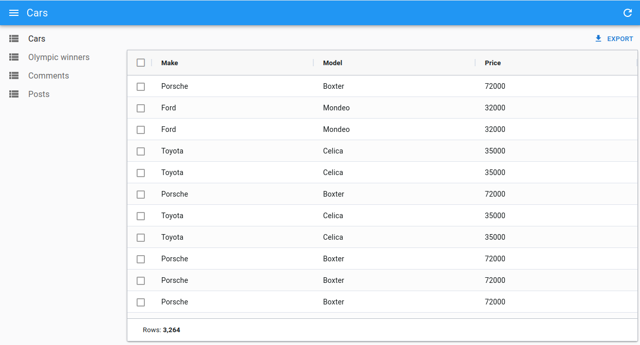
const CarList = () => {
const columnDefs = [
{ field: 'make' },
{ field: 'model' },
{ field: 'price' },
];
const defaultColDef = {
flex: 1,
};
return (
<List perPage={10000} pagination={false}>
<DatagridAGClient
columnDefs={columnDefs}
defaultColDef={defaultColDef}
pagination={false}
/>
</List>
);
};
If you have subscribed to the Enterprise version of ag-grid, you can also add a Status Bar to show the total number of rows.
import React, { useMemo } from 'react';
import { List } from 'react-admin';
import { DatagridAGClient } from '@react-admin/ra-datagrid-ag';
import {
    AllCommunityModule,
    ClientSideRowModelModule,
    CsvExportModule
} from 'ag-grid-community';
import { StatusBarModule } from 'ag-grid-enterprise';

const modulesWithStatusBar = [
    ClientSideRowModelModule,
    AllCommunityModule,
    CsvExportModule,
    StatusBarModule,
];

const statusBar = {
    statusPanels: [
        {
            statusPanel: 'agTotalAndFilteredRowCountComponent',
            align: 'left',
        },
    ],
};

const CarList = () => {
    const columnDefs = [
        { field: 'make' },
        { field: 'model' },
        { field: 'price' },
    ];
    const defaultColDef = {
        flex: 1,
    };
    return (
        <List perPage={10000} pagination={false}>
            <DatagridAGClient
                columnDefs={columnDefs}
                defaultColDef={defaultColDef}
                pagination={false}
                statusBar={statusBar}
                modules={modulesWithMasterDetails}
            />
        </List>
    );
};
Tip: <DatagridAGClient> registers the following modules by default: ClientSideRowModelModule, AllCommunityModule and CsvExportModule. If you add other modules, make sure to have at least the ClientSideRowModelModule.
preferenceKey
<DatagridAGClient> will store the gridState in the Store, under the key ${resource}.ag-grid.params.grid. This gridState persisted in the store is applied once when the grid is created, it means that users will find the grid as they left it previously.
If you wish to change the key used to store the columns order and size, you can pass a preferenceKey prop to <DatagridAGClient>.
<List perPage={10000} pagination={false}>
    <DatagridAGClient columnDefs={columnDefs} preferenceKey="my-post-list" />
</List>
If, instead, you want to disable the persistence of the columns order and size, you can pass false to the preferenceKey prop:
<List perPage={10000} pagination={false}>
    <DatagridAGClient columnDefs={columnDefs} preferenceKey={false} />
</List>
Tip: If you update the columnDefs prop, and users already customized columns in a previous version of the app, the two versions will conflict. You can invite users to log out to reset the store, or add custom logic to invalidate the react-admin Store.
sx
You can also use the sx prop to customize the grid’s style:
import React from 'react';
import { List } from 'react-admin';
import { DatagridAGClient } from '@react-admin/ra-datagrid-ag';

export const PostList = () => {
    const columnDefs = [
        { field: 'title' },
        { field: 'published_at' },
        { field: 'body' },
    ];
    return (
        <List perPage={10000} pagination={false}>
            <DatagridAGClient
                columnDefs={columnDefs}
                sx={{ '& .ag-header-cell-comp-wrapper': { color: 'red' } }}
            />
        </List>
    );
};
It can also be helpful to change the default grid’s height (calc(100vh - 96px - ${theme.spacing(1)})):
import React from 'react';
import { List } from 'react-admin';
import { DatagridAGClient } from '@react-admin/ra-datagrid-ag';

export const PostList = () => {
    const columnDefs = [
        /* ... */
    ];
    return (
        <List perPage={10000} pagination={false}>
            <DatagridAGClient
                columnDefs={columnDefs}
                sx={{ height: 'calc(100vh - 250px)' }}
            />
        </List>
    );
};
Tip: Be sure to also read the Theming section of the AG Grid documentation, to learn more about customizing the AG Grid themes.
theme
You can use a different theme for the grid by passing a theme prop. You can for instance use one of the themes provided by ag-grid, like themeBalham:
import React from 'react';
import { List } from 'react-admin';
import { DatagridAGClient } from '@react-admin/ra-datagrid-ag';
import { themeBalham } from 'ag-grid-community';

export const PostList = () => {
    const columnDefs = [
        { field: 'title' },
        { field: 'published_at' },
        { field: 'body' },
    ];
    return (
        <List perPage={10000} pagination={false}>
            <DatagridAGClient columnDefs={columnDefs} theme={themeBalham} />
        </List>
    );
};
Tip: Be sure to also read the Theming section of the AG Grid documentation, to learn more about customizing the AG Grid themes.
AgGrid Defaults
Under the hood, <DatagridAGClient> is a wrapper around <AgGridReact>. However, it sets some important default values:
paginationis set totruepaginationAutoPageSizeis set totrueanimateRowsis set totruerowSelectionis set tomode: 'multiRow'andselectAll: 'currentPage'readOnlyEditis set totruegetRowIdis set to use the recordidfield
It also register the following default modules: ClientSideRowModelModule, AllCommunityModule and CsvExportModule. If you wish to add custom modules, make sure you have at least the ClientSideRowModelModule:
import React from 'react';
import { List } from 'react-admin';
import { DatagridAGClient } from '@react-admin/ra-datagrid-ag';
import { ClientSideRowModelModule, CsvExportModule } from 'ag-grid-community';
import { ClipboardModule } from 'ag-grid-enterprise';

const modules = [ClientSideRowModelModule, CsvExportModule, ClipboardModule];

export const PostList = () => {
    const columnDefs = [
        {
            field: 'id',
            editable: false,
        },
        { field: 'title' },
        {
            field: 'published_at',
            headerName: 'Publication Date',
        },
    ];
    return (
        <List perPage={10000} pagination={false}>
            <DatagridAGClient columnDefs={columnDefs} modules={modules} />
        </List>
    );
};
It also includes a defaultColDef object with the following properties:
{
    resizable: true,
    filter: true,
    sortable: true,
    sortingOrder: ['asc', 'desc'],
}
You may override any of these defaults by passing the corresponding props to <DatagridAGClient> (defaultColDef will be merged with the defaults).
Accessing The Grid API
You can access the grid’s api by passing a ref to <DatagridAGClient>.
In this example, we use the api to automatically resize all columns to fit their content on first render:
import React from 'react';
import { AgGridReact } from 'ag-grid-react';
import { List } from 'react-admin';
import { DatagridAGClient } from '@react-admin/ra-datagrid-ag';

export const PostList = () => {
    const columnDefs = [
        { field: 'title' },
        { field: 'published_at' },
        { field: 'body' },
    ];
    const onFirstDataRendered = React.useCallback(() => {
        gridRef.current.api.autoSizeAllColumns();
    }, []);
    return (
        <List perPage={10000} pagination={false}>
            <DatagridAGClient
                columnDefs={columnDefs}
                ref={gridRef}
                onFirstDataRendered={onFirstDataRendered}
            />
        </List>
    );
};
Check out the Grid API documentations to learn more.
Changing The Default Column Width
By default, ag-grid will render each column with a fixed size.
You can choose to enable flex mode by setting the flex prop either on the columnDefs or on the defaultColDef:
import React from 'react';
import { List } from 'react-admin';
import { DatagridAGClient } from '@react-admin/ra-datagrid-ag';

export const PostList = () => {
    const columnDefs = [
        { field: 'title' },
        { field: 'published_at', flex: 1 },
        { field: 'body' },
    ];
    const defaultColDef = {
        flex: 2,
    };
    return (
        <List perPage={10000} pagination={false}>
            <DatagridAGClient columnDefs={columnDefs} defaultColDef={defaultColDef} />
        </List>
    );
};
Alternatively, you can use the grid’s api to call autoSizeAllColumns to automatically resize all columns to fit their content:
import React from 'react';
import { AgGridReact } from 'ag-grid-react';
import { List } from 'react-admin';
import { DatagridAGClient } from '@react-admin/ra-datagrid-ag';

export const PostList = () => {
    const columnDefs = [
        { field: 'title' },
        { field: 'published_at' },
        { field: 'body' },
    ];
    const gridRef = React.useRef<AgGridReact>(null);
    const onFirstDataRendered = React.useCallback(() => {
        gridRef.current.api.autoSizeAllColumns();
    }, []);
    return (
        <List perPage={10000} pagination={false}>
            <DatagridAGClient
                columnDefs={columnDefs}
                ref={gridRef}
                onFirstDataRendered={onFirstDataRendered}
            />
        </List>
    );
};
Check out the Column Sizing documentation for more information and more alternatives.
Selecting Rows And Enabling Bulk Actions
Just like <Datagrid>, <DatagridAGClient> supports row selection and bulk actions.
Below is an example with the PostList component:
import React from 'react';
import { List } from 'react-admin';
import { DatagridAGClient } from '@react-admin/ra-datagrid-ag';

export const PostList = () => {
    const columnDefs = [
        { field: 'title' },
        { field: 'published_at' },
        { field: 'body' },
    ];
    return (
        <List perPage={10000} pagination={false}>
            <DatagridAGClient columnDefs={columnDefs} />
        </List>
    );
};
Just like with <Datagrid>, you can customize the bulk actions by passing a bulkActionButtons prop to <DatagridAGClient>.
import React from 'react';
import { List, BulkExportButton, BulkDeleteButton } from 'react-admin';
import { DatagridAGClient } from '@react-admin/ra-datagrid-ag';

const PostBulkActionButtons = () => (
    <>
        <BulkExportButton />
        <BulkDeleteButton />
    </>
);

export const PostList = () => {
    const columnDefs = [
        { field: 'title' },
        { field: 'published_at' },
        { field: 'body' },
    ];
    return (
        <List perPage={10000} pagination={false}>
            <DatagridAGClient
                columnDefs={columnDefs}
                bulkActionButtons={<PostBulkActionButtons />}
            />
        </List>
    );
};
Working with Dates
When using DatagridAG with dates, the ag-grid documentation states that:
The default Value Parser and Value Formatter use the ISO string format ‘yyyy-mm-dd’. If you wish to use a different date format, then you can Override the Pre-Defined Cell Data Type Definition.
Enabling Infinite Pagination
By default, <DatagridAGClient> renders pagination controls at the bottom of the list. You can disable these controls to switch to an infinite pagination mode, where the grid shows the next rows on scroll. Thanks to ag-grid’s DOM virtualization, this mode causes no performance problem.
To enable infinite pagination, set the pagination prop to false.
import React from 'react';
import { List } from 'react-admin';
import { DatagridAGClient } from '@react-admin/ra-datagrid-ag';

const CarList = () => {
    const columnDefs = [
        { field: 'make' },
        { field: 'model' },
        { field: 'price' },
    ];
    const defaultColDef = {
        flex: 1,
    };
    return (
        <List perPage={10000} pagination={false}>
            <DatagridAGClient
                columnDefs={columnDefs}
                defaultColDef={defaultColDef}
                pagination={false}
            />
        </List>
    );
};
If you have subscribed to the Enterprise version of ag-grid, you can also add a Status Bar to show the total number of rows.
import React, { useMemo } from 'react';
import { List } from 'react-admin';
import { DatagridAGClient } from '@react-admin/ra-datagrid-ag';
import {
    AllCommunityModule,
    ClientSideRowModelModule,
    CsvExportModule
} from 'ag-grid-community';
import { StatusBarModule } from 'ag-grid-enterprise';

const modulesWithStatusBar = [
    ClientSideRowModelModule,
    AllCommunityModule,
    CsvExportModule,
    StatusBarModule,
];

const statusBar = {
    statusPanels: [
        {
            statusPanel: 'agTotalAndFilteredRowCountComponent',
            align: 'left',
        },
    ],
};

const CarList = () => {
    const columnDefs = [
        { field: 'make' },
        { field: 'model' },
        { field: 'price' },
    ];
    const defaultColDef = {
        flex: 1,
    };
    return (
        <List perPage={10000} pagination={false}>
            <DatagridAGClient
                columnDefs={columnDefs}
                defaultColDef={defaultColDef}
                pagination={false}
                statusBar={statusBar}
                modules={modulesWithMasterDetails}
            />
        </List>
    );
};
Tip: <DatagridAGClient> registers the following modules by default: ClientSideRowModelModule, AllCommunityModule and CsvExportModule. If you add other modules, make sure to have at least the ClientSideRowModelModule.
Access Control
<DatagridAGClient> has built-in access control. If the authProvider implements the canAccess method, users will only be allowed to edit rows of, say, resource 'cars' if canAccess({ action: 'edit', resource: 'cars' }) returns true.
Note: the access control check can only be done at the resource level and not at the record level.
Enabling Full Row Edition
By default, editing is enabled on cells, which means you can edit a cell by double-clicking on it, and it will trigger a call to the dataProvider’s update function.
However, if you’d like to update the full row at once instead, you can enable full row editing by passing editType="fullRow" to <DatagridAGClient>:
import React from 'react';
import { List } from 'react-admin';
import { DatagridAGClient } from '@react-admin/ra-datagrid-ag';

export const PostList = () => {
    const columnDefs = [
        /* ... */
    ];
    return (
        <List perPage={10000} pagination={false}>
            <DatagridAGClient columnDefs={columnDefs} editType="fullRow" />
        </List>
    );
};
Disabling Cell Edition
Set editable: false in the definition of a column to disable the ability to edit its cells.
import React from 'react';
import { List } from 'react-admin';
import { DatagridAGClient } from '@react-admin/ra-datagrid-ag';

export const PostList = () => {
    const columnDefs = [
        { field: 'title' },
        { field: 'published_at', editable: false },
        { field: 'body' },
    ];
    return (
        <List perPage={10000} pagination={false}>
            <DatagridAGClient columnDefs={columnDefs} />
        </List>
    );
};
Alternatively, you can disable the ability to edit all cells by passing editable: false to the defaultColDef:
import React from 'react';
import { List } from 'react-admin';
import { DatagridAGClient } from '@react-admin/ra-datagrid-ag';

export const PostList = () => {
    const columnDefs = [
        { field: 'title' },
        { field: 'published_at' },
        { field: 'body' },
    ];
    const defaultColDef = {
        editable: false,
    };
    return (
        <List perPage={10000} pagination={false}>
            <DatagridAGClient
                columnDefs={columnDefs}
                defaultColDef={defaultColDef}
            />
        </List>
    );
};
Using AG Grid Enterprise
<DatagridAGClient> is also compatible with the Enterprise version of ag-grid.
You can try out AG Grid Enterprise for free. If you don’t have a license key installed, AG Grid Enterprise will display a watermark. To remove this watermark, you’ll need to purchase a license key from AG Grid.
To use an AG Grid Enterprise Module with <DatagridAGClient>, you simply need to install it and then add it to the list of registered modules via the modules prop.
Below is an example of what you can achieve using the following AG Grid Enterprise Modules:
ClipboardModuleColumnsToolPanelModuleExcelExportModuleFiltersToolPanelModuleColumnMenuModuleContextMenuModuleRowGroupingModuleRowGroupingPanelModuleGroupFilterModule
First install the enterprise package:
npm install ag-grid-enterprise
Then register them in <DatagridAGClient> using the modules prop:
import {
    AllCommunityModule,
    ClientSideRowModelModule,
    ColDef,
    CsvExportModule,
    GetContextMenuItems,
    RowSelectionOptions,
} from 'ag-grid-community';
import {
    ClipboardModule,
    ColumnsToolPanelModule,
    ExcelExportModule,
    FiltersToolPanelModule,
    ColumnMenuModule,
    ContextMenuModule,
    RowGroupingModule,
    RowGroupingPanelModule,
    GroupFilterModule,
    MasterDetailModule,
} from 'ag-grid-enterprise';
import React from 'react';
import { List } from 'react-admin';
import { DatagridAGClient } from '@react-admin/ra-datagrid-ag';

const getContextMenuItems: GetContextMenuItems = () => [
    'copy',
    'copyWithHeaders',
    'copyWithGroupHeaders',
    'paste',
    'separator',
    'export',
];

const enterpriseModules = [
    AllCommunityModule,
    ClientSideRowModelModule,
    CsvExportModule,
    ClipboardModule,
    ColumnsToolPanelModule,
    ExcelExportModule,
    FiltersToolPanelModule,
    ColumnMenuModule,
    ContextMenuModule,
    RowGroupingModule,
    RowGroupingPanelModule,
    GroupFilterModule,
];

const rowSelection: RowSelectionOptions = {
    mode: 'multiRow',
    groupSelects: 'descendants',
    selectAll: 'currentPage',
};

const OlympicWinnersList = () => {
    const columnDefs: ColDef<any, any>[] = [
        { field: 'athlete' },
        { field: 'age' },
        { field: 'country' },
        { field: 'year' },
        { field: 'date' },
        { field: 'sport' },
        { field: 'gold' },
        { field: 'silver' },
        { field: 'bronze' },
        { field: 'total' },
    ];
    const defaultColDef = {
        enableRowGroup: true,
        menuTabs: ['filterMenuTab', 'generalMenuTab', 'columnsMenuTab'],
    };

return (
        <List perPage={10000} pagination={false}>
            <DatagridAGClient
                columnDefs={columnDefs}
                defaultColDef={defaultColDef}
                rowGroupPanelShow="always"
                rowSelection={rowSelection}
                getContextMenuItems={getContextMenuItems}
                modules={enterpriseModules}
            />
        </List>
    );
};
Tip: <DatagridAGClient> registers the following modules by default: ClientSideRowModelModule, AllCommunityModule and CsvExportModule. If you add other modules, make sure to have at least the ClientSideRowModelModule.
Adding An Expandable Panel (Master/Detail)
You can leverage ag-grid Master Detail Module to add an expandable panel.
For instance, here’s how to show the comments of a post in an expandable panel:
import {
    ColDef,
    AllCommunityModule,
    ClientSideRowModelModule,
    CsvExportModule
} from 'ag-grid-community';
import { MasterDetailModule } from 'ag-grid-enterprise';
import React from 'react';
import { List, useDataProvider, useNotify } from 'react-admin';
import { DatagridAGClient } from '@react-admin/ra-datagrid-ag';

const modulesWithMasterDetails = [
    ClientSideRowModelModule,
    AllCommunityModule,
    CsvExportModule,
    MasterDetailModule,
];

export const PostList = () => {
    const dataProvider = useDataProvider();
    const notify = useNotify();
    const columnDefs: ColDef<any, any>[] = [
        { field: 'title', flex: 1, cellRenderer: 'agGroupCellRenderer' },
        { field: 'published_at' },
    ];
    const detailCellRendererParams = {
        // provide the Grid Options to use on the Detail Grid
        detailGridOptions: {
            columnDefs: [{ field: 'body', flex: 1 }, { field: 'author.name' }],
        },
        // get the rows for each Detail Grid
        getDetailRowData: params => {
            dataProvider
                .getManyReference('comments', {
                    target: 'post_id',
                    id: params.data.id,
                    pagination: { page: 1, perPage: 100 },
                    sort: { field: 'created_at', order: 'DESC' },
                    filter: {},
                })
                .then(({ data }) => {
                    params.successCallback(data);
                })
                .catch(error => {
                    notify(error.message, { type: 'error' });
                });
        },
    };

    return (
        <List resource="posts" perPage={10000} pagination={false}>
            <DatagridAGClient
                masterDetail
                columnDefs={columnDefs}
                detailCellRendererParams={detailCellRendererParams}
                modules={modulesWithMasterDetails}
            />
        </List>
    );
};
Tip: <DatagridAGClient> registers the following modules by default: ClientSideRowModelModule, AllCommunityModule and CsvExportModule. If you add other modules, make sure to have at least the ClientSideRowModelModule.
Creating New Records
There are multiple options to create new records:
- The simple
createview that redirects users to a dedicated create page:
// in src/posts.tsx
import * as React from 'react';
import { Create, SimpleForm, TextInput, DateInput, required } from 'react-admin';
import RichTextInput from 'ra-input-rich-text';

export const PostCreate = () => (
    <Create>
        <SimpleForm>
            <TextInput source="title" validate={[required()]} />
            <TextInput source="teaser" multiline={true} label="Short description" />
            <RichTextInput source="body" />
            <DateInput label="Publication date" source="published_at" defaultValue={new Date()} />
        </SimpleForm>
    </Create>
);

// in src/App.tsx
import * as React from 'react';
import { Admin, Resource } from 'react-admin';
import jsonServerProvider from 'ra-data-json-server';

import { PostCreate, PostList } from './posts';

const App = () => (
    <Admin dataProvider={jsonServerProvider('https://jsonplaceholder.typicode.com')}>
        <Resource name="posts" list={PostList} create={PostCreate} />
    </Admin>
);

export default App;
- The
<CreateDialog>component from@react-admin/ra-form-layoutthat opens a dialog without leaving the list page:
// In src/posts.tsx
import { List, ListActions, SimpleForm, TextInput, DateInput } from 'react-admin';
import { DatagridAGClient } from '@react-admin/ra-datagrid-ag';
import { CreateDialog } from '@react-admin/ra-form-layout';

const columnDefs = [
    { field: 'id', editable: false },
    { field: 'title' },
    { field: 'published_at', headerName: 'Publication Date' },
    { field: 'body' },
];

export const PostList = () => (
    <>
        <List actions={<ListActions hasCreate />} perPage={10000} pagination={false}>
            <DatagridAGClient columnDefs={columnDefs} />
        </List>
        <CreateDialog>
            <SimpleForm>
                <TextInput source="title" />
                <DateInput source="published_at" />
                <TextInput source="body" />
            </SimpleForm>
        </CreateDialog>
    </>
);
Note: You can’t use the
<CreateDialog>and have a standard<Edit>specified on your<Resource>, because the<Routes>declarations would conflict. If you need this, use the<CreateInDialogButton>instead.
- The
<CreateInDialogButton>component from@react-admin/ra-form-layoutthat opens a dialog without leaving the list page but does not add a/createroute:
// In src/posts.tsx
import { List, ListActions, SimpleForm, TextInput, DateInput, TopToolbar } from 'react-admin';
import { DatagridAGClient } from '@react-admin/ra-datagrid-ag';
import { CreateInDialogButton } from '@react-admin/ra-form-layout';

const columnDefs = [
    { field: 'id', editable: false },
    { field: 'title' },
    { field: 'published_at', headerName: 'Publication Date' },
    { field: 'body' },
];

const PostListActions = () => (
    <TopToolbar>
        <CreateInDialogButton>
            <SimpleForm>
                <TextInput source="title" />
                <DateInput source="published_at" />
                <TextInput source="body" />
            </SimpleForm>
        </CreateInDialogButton>
    </TopToolbar>
)

export const PostList = () => (·
    <List actions={<PostListActions />} perPage={10000} pagination={false}>
        <DatagridAGClient columnDefs={columnDefs} />
    </List>
);