
The sx prop
All react-admin components expose an sx prop, which allows to customize the component style. This sx prop is kind of like React’s style prop, but it’s more powerful. It uses the CSS-in-JS solution offered by MUI, MUI System, powered by emotion.
Syntax
The sx prop accepts an object with CSS properties as keys and values, just like the style prop. It uses the JavaScript name of CSS properties (e.g. fontWeight instead of font-weight).
import { NumberField, List, DataTable, EditButton } from 'react-admin';

export const ProductList = () => (
    <List>
        <DataTable>
            <DataTable.Col source="sku" />
            <DataTable.Col source="price" />
            <DataTable.Col>
                <EditButton sx={{ fontWeight: "bold" }}/>
            </DataTable.Col>
        </DataTable>
    </List>
);
In the rendered HTML, this will result in a custom class name, like EditButton-root-123. This class name will be added to the DOM element, and the corresponding CSS will be injected in the <head> of the document.
The sx prop supports CSS syntax including child and pseudo-selectors, media queries, raw CSS values, and more.
Here is another example, taken from the CRM demo:
export const Welcome = () => (
    <Card
        sx={{
            background: `#c5dedd`,
            color: 'rgba(0, 0, 0, 0.87)',
            p: 1,
            mb: 1,
            mt: 2,
            [`& .MuiCardActions-root`]: {
                p: 2,
                mt: -2,
                mb: -1,
                flexDirection: 'column',
                '& a': {
                    mb: 1,
                    color: 'rgba(0, 0, 0, 0.87)',
                    backgroundColor: 'white',
                    marginLeft: '0 !important',
                },
            },
        }}
    >
        // ...
    </Card>
);
You can use any CSS property (see the list of all accepted CSS properties in the MUI documentation). Take advantage of IDE autocompletion to discover the available properties.
Shorthand Properties
The sx prop accepts shorthand properties, like m for margin or mt for marginTop:
<Box
  sx={{
    m: 1, // margin: theme.spacing(1)
    px: 1, // padding-left, padding-right: theme.spacing(1)
  }}
>
Common shorthands are:
m:marginmt:margin-topmr:margin-rightmb:margin-bottomml:margin-leftmx:margin-left, margin-rightmy:margin-top, margin-bottomp:paddingpt:padding-toppr:padding-rightpb:padding-bottompl:padding-leftpx:padding-left, padding-rightpy:padding-top, padding-bottombgcolor:backgroundColor
Theme-Aware Values
Some CSS properties accept theme-aware values, i.e. the sx to CSS conversion uses the application theme. Check the material-ui default theme for the list of values you can use.
The typography property can receive a string, which represents the path in theme.typography:
<Box sx={{ typography: 'subtitle2' }} /> // theme.typography.subtitle2
<Box sx={{ typography: 'body1' }} />
<Box sx={{ typography: 'body2' }} />
The color and backgroundColor properties can receive a string, which represents the path in theme.palette:
<Box sx={{ color: 'primary.main' }} />
// equivalent to color: theme => theme.palette.primary.main
<Box sx={{ color: 'secondary.main' }} />
<Box sx={{ color: 'error.main' }} />
<Box sx={{ color: 'warning.main' }} />
<Box sx={{ color: 'info.main' }} />
<Box sx={{ color: 'success.main' }} />
<Box sx={{ color: 'text.primary' }} />
<Box sx={{ color: 'text.secondary' }} />
<Box sx={{ color: 'text.disabled' }} />
The value of sizing properties width, height, minHeight, maxHeight, minWidth, and maxWidth is converted to a percentage if it is between [0, 1]. Otherwise, it is directly set on the CSS property:
<Box sx={{ width: 1/2 }} /> // equivalent to width: '50%'
<Box sx={{ width: 20 }} /> // equivalent to width: '20px'
The spacing properties margin, padding, and the corresponding longhand properties multiply the values they receive by the theme.spacing value (the default for the value is 8px):
<Box sx={{ margin: 2 }} />
// equivalent to margin: theme => theme.spacing(2)
The fontFamily, fontSize, fontStyle, fontWeight properties map their value to the theme.typography value:
<Box sx={{ fontWeight: 'fontWeightLight' }} />
// equivalent to fontWeight: theme.typography.fontWeightLight
Responsive Values
The sx prop simplifies the process of defining and implementing responsive breakpoints. You can define a set of breakpoints as an object, using the breakpoint values as keys.
<Box
  sx={{
    width: {
      xs: 100, // theme.breakpoints.up('xs')
      sm: 200, // theme.breakpoints.up('sm')
      md: 300, // theme.breakpoints.up('md')
      lg: 400, // theme.breakpoints.up('lg')
      xl: 500, // theme.breakpoints.up('xl')
    },
  }}
>
  This box has a responsive width.
</Box>
Note that each property for a given breakpoint also applies to all larger breakpoints in the set. For example, width: { lg: 100 } is equivalent to theme.breakpoints.up('lg').
You can use this syntax to show or hide a component based on the screen size:
- Hidden on all:
sx={{ display: 'none' }} - Hidden only on xs:
sx={{ display: { xs: 'none', sm: 'block' } }} - Hidden only on sm:
sx={{ display: { xs: 'block', sm: 'none', md: 'block' } }} - Hidden only on md:
sx={{ display: { xs: 'block', md: 'none', lg: 'block' } }} - Hidden only on lg:
sx={{ display: { xs: 'block', lg: 'none', xl: 'block' } }} - Hidden only on xl:
sx={{ display: { xs: 'block', xl: 'none' } }} - Visible only on xs:
sx={{ display: { xs: 'block', sm: 'none' } }} - Visible only on sm:
sx={{ display: { xs: 'none', sm: 'block', md: 'none' } }} - Visible only on md:
sx={{ display: { xs: 'none', md: 'block', lg: 'none' } }} - Visible only on lg:
sx={{ display: { xs: 'none', lg: 'block', xl: 'none' } }} - Visible only on xl:
sx={{ display: { xs: 'none', xl: 'block' } }}
Media Queries
You can use media queries in the sx prop:
<Box
  sx={{
    // some styles
    '@media print': {
      width: 300,
    },
  }}
>
Tip: Don’t use media queries for responsive values. Use the responsive values syntax instead.
Tip: The displayPrint property allows you to specify a CSS display value that will only be applied when printing:
<Box sx={{ displayPrint: 'none' }} /> // equivalent to '@media print': { display: 'none' }
Pseudo-Classes
You can use pseudo-classes to style a component only when it’s in a specific state. For instance, you can use the :hover pseudo-class to style a component when the mouse is over it:
<Box
  sx={{
    // some styles
    ":hover": {
      boxShadow: 6,
    },
  }}
>
Common pseudo-classes used for styling are :hover, :disabled, :active, :focus, :first-child, :last-child. Check the list of CSS pseudo classes for more information.
Styling Children
The real power of the sx prop is that it allows to override the style of sub-components. For instance, you can use it to style the <Avatar> inside another element:
const CustomUserCard = ({ user }) => (
    <UserCard
        user={user}
        sx={{
            display: 'flex',
            alignItems: 'center',
            '& .MuiAvatar-root': {
                width: 48,
                height: 48,
                mr: 1,
            },
        }}
    />
);
Here is another example, illustrating the ability to customize the header of a <DataTable>:
import {
    BooleanField,
    DataTable,
    DateField,
    EditButton,
    List,
    ShowButton,
} from 'react-admin';
import Icon from '@mui/icons-material/Person';

export const VisitorIcon = Icon;

export const PostList = () => (
    <List>
        <DataTable
            sx={{
                backgroundColor: "Lavender",
                "& .RaDataTable-headerCell": {
                    backgroundColor: "MistyRose",
                },
            }}
        >
            <DataTable.Col source="id" />
            <DataTable.Col source="title" />
            <DataTable.Col source="published_at" sortByOrder="DESC" field={DateField} />
            <DataTable.Col source="commentable" sortable={false} field={BooleanField} />
            <DataTable.NumberCol source="views" sortByOrder="DESC">
            <DataTable.Col>
                <EditButton />
                <ShowButton />
            </DataTable.Col>
        </DataTable>
    </List>
);
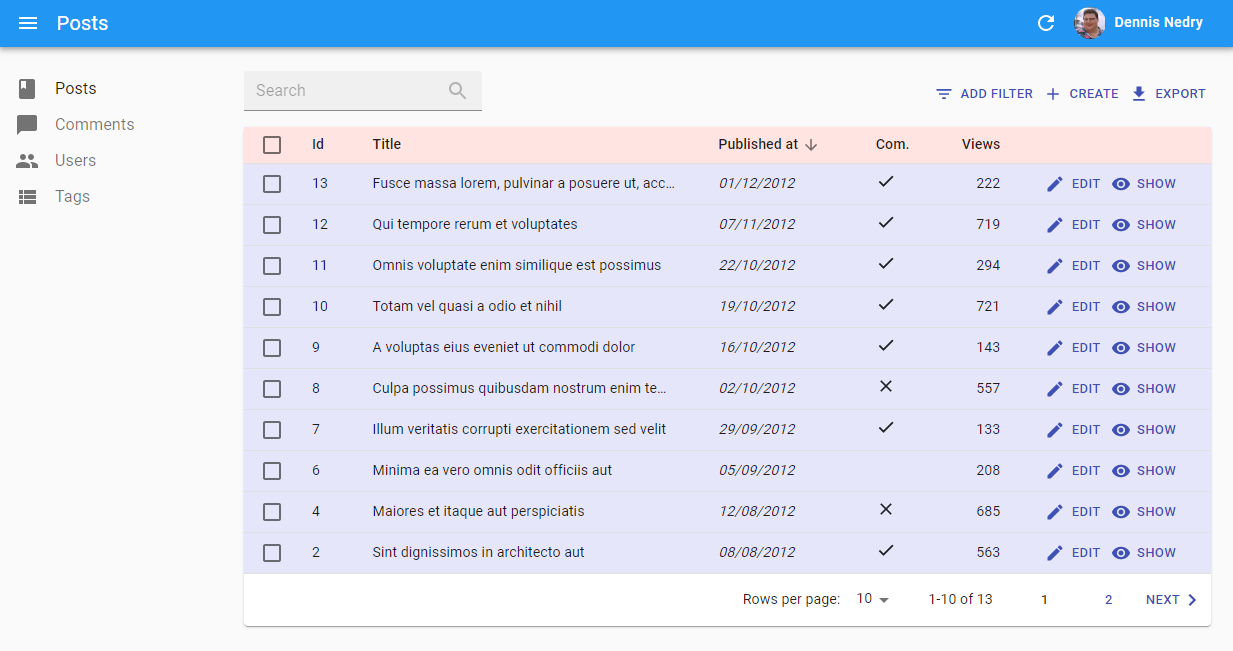
This example results in:
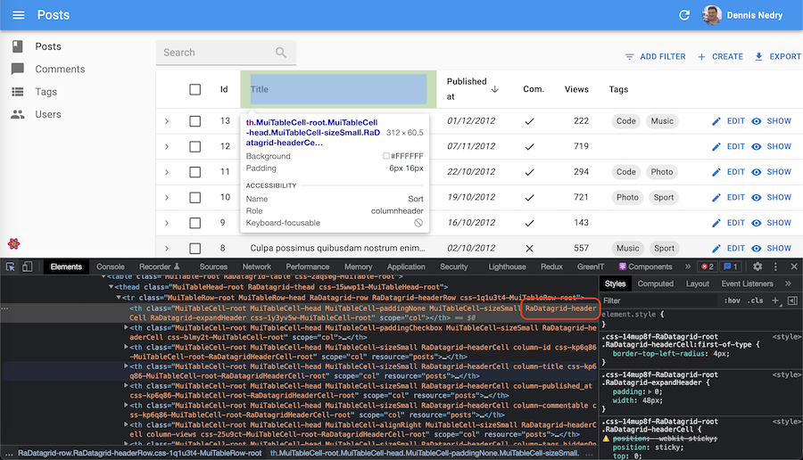
To guess the name of the subclass to use (like .RaDataTable-headerCell above) for customizing a component, you can use the developer tools of your browser:
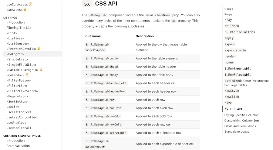
The react-admin documentation for individual components also lists the classes available for styling. For instance, here is the <DataTable> CSS documentation:
Callback Values
Each property in the sx prop can receive a function callback as a value. This is useful when you want to use the theme for calculating a value:
<Box sx={{ height: (theme) => theme.spacing(10) }} />
The sx prop can also receive a callback when you need to get theme values that are objects:
<Box
  sx={(theme) => ({
    ...theme.typography.body,
    color: theme.palette.primary.main,
  })}
/>
Tip: If you use TypeScript, you’ll have to specify the type of the theme in the callback:
import { Box, Theme } from '@mui/material';

export const MyComponent = () => (
    <Box
    sx={{
        p: 1,
        border: 1,
        borderColor: (theme: Theme) => theme.palette.primary.main,
    }}
    >
    Border color with theme value.
    </Box>
)
Conditional Formatting
Sometimes you want the format to depend on the value. Use useRecordContext to grab the record in a component, and the sx prop to apply the format.
The following example shows how to create a new <ColoredNumberField> component, which renders with red text when its value is less than 0.
import { useRecordContext, NumberField, List, DataTable, EditButton } from 'react-admin';
import type { NumberFieldProps } from 'react-admin';

const ColoredNumberField = (props: NumberFieldProps) => {
    const record = useRecordContext();
    return (
        <NumberField
            sx={{ color: record[prop.source] < 0 ? 'red' : 'black' }}
            {...props}
        />
    );
};

// Ensure the original component defaultProps are still applied as they may be used by its parents (such as the `Show` component):
ColoredNumberField.defaultProps = NumberField.defaultProps;

export const PostList = () => (
    <List>
        <DataTable>
            <DataTable.Col source="id" />
            ...
            <DataTable.Col source="nb_views" field={ColoredNumberField} />
            <DataTable.Col>
                <EditButton />
            </DataTable.Col>
        </DataTable>
    </List>
);
Tip: if you don’t want to create a custom component to apply conditional formatting, you can also use the <WithRecord> component.
Reusable Components
To reuse the same style overrides in different locations across your application, create a reusable component using the Material UI styled() utility. It’s a function that creates a new component based on a source component and custom styles. The basic syntax is styled(Component)(styles) => Component (where styles follows the same syntax as the sx prop).
For instance, to create a custom <DataTable> component with the header style defined in the previous section:
// in src/MyDataTable.js
import { styled } from '@mui/system';
import { DataTable } from 'react-admin';

export const MyDataTable = styled(DataTable)({
    backgroundColor: "Lavender",
    "& .RaDataTable-headerCell": {
        backgroundColor: "MistyRose",
    },
});
You can then use this component instead of react-admin’s <DataTable> component:
// in src/post/PostList.js
import {
    BooleanField,
-   DataTable,
    DateField,
    EditButton,
    List,
    ShowButton,
} from 'react-admin';
+import { MyDataTable } from '../MyDataTable';

export const PostList = () => (
    <List>
-       <DataTable
-           sx={{
-               backgroundColor: "Lavender",
-               "& .RaDataTable-headerCell": {
-                   backgroundColor: "MistyRose",
-               },
-           }}
-       >
+       <MyDataTable>
            <DataTable.Col source="id" />
            <DataTable.Col source="title" />
            <DataTable.Col source="published_at" sortByOrder="DESC" field={DateField} />
            <DataTable.Col source="commentable" sortable={false} field={BooleanField} />
            <DataTable.NumberCol source="views" sortByOrder="DESC">
            <DataTable.Col>
                <EditButton />
                <ShowButton />
            </DataTable.Col>
+       </MyDataTable>
-       </DataTable>
    </List>
);
Again, to guess the name of the subclass to use (like .RaDataTable-headerCell above) for customizing a component, you can use the developer tools of your browser, or check the react-admin documentation for individual components (e.g. the <DataTable> CSS documentation).
Going Further
Check The Material UI documentation on the sx prop for more information.