<EditableDatagrid>
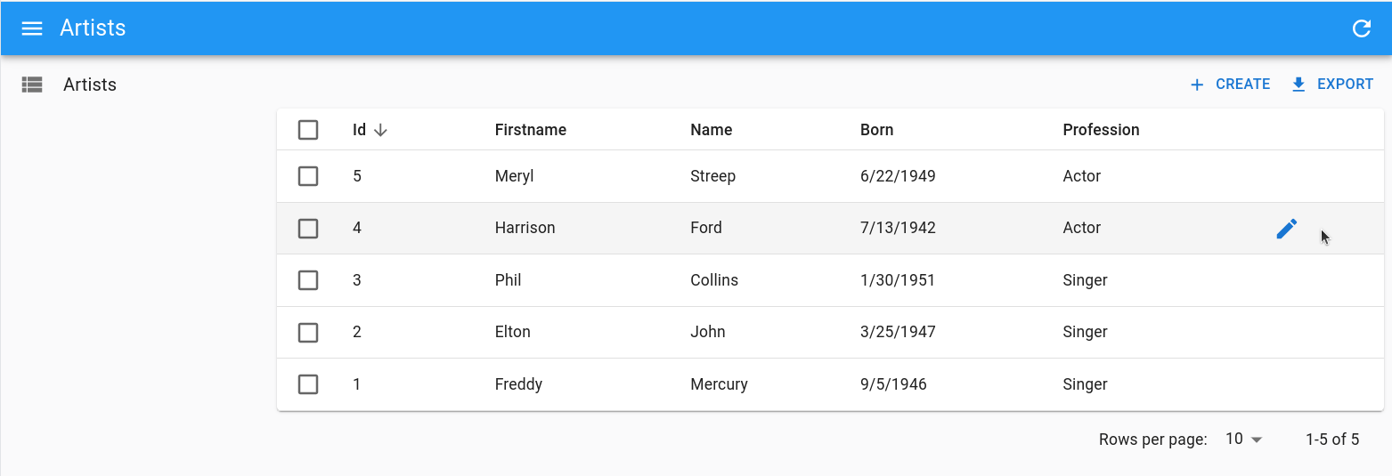
The default react-admin user experience consists of three pages: List, Edit, and Create. However, in some cases, users may prefer to do all CRUD tasks in one page.
<EditableDatagrid> is an Enterprise Edition component that offers an “edit-in-place” experience, allowing users to edit, create, and delete records in place inside a
 <Datagrid>.
With <EditableDatagrid>, when users click on a row in the datagrid, the row content is replaced by the edition form. They can also create new records by clicking on the Create button, which inserts an empty editable row as the first line of the list. Finally, they can delete a record by clicking on the Delete button on each row.
You can test it live in the Enterprise Edition Storybook and the e-commerce demo.
<EditableDatagrid> allows you to use any Input component to edit the record - including Reference Inputs for foreign keys.
Usage
First, install the @react-admin/ra-editable-datagrid package:
npm install --save @react-admin/ra-editable-datagrid
# or
yarn add @react-admin/ra-editable-datagrid
Tip: ra-editable-datagrid is part of the React-Admin Enterprise Edition, and hosted in a private npm registry. You need to subscribe to one of the Enterprise Edition plans to access this registry.
Then, replace <Datagrid> with <EditableDatagrid> in a react-admin <List>, <ReferenceManyField>, or any other component that creates a ListContext. In addition, pass a form component to be displayed when the user switches to edit or create mode.
import {
    List,
    ListActions,
    TextField,
    TextInput,
    DateField,
    DateInput,
    SelectField,
    SelectInput,
    required,
} from 'react-admin';
import { EditableDatagrid, RowForm } from '@react-admin/ra-editable-datagrid';

export const ArtistList = () => (
    <List actions={<ListActions hasCreate />} empty={false}>
        <EditableDatagrid createForm={<ArtistForm />} editForm={<ArtistForm />}>
            <TextField source="id" />
            <TextField source="firstName" />
            <TextField source="lastName" />
            <DateField source="dob" label="born" />
            <SelectField source="profession" choices={professions} />
        </EditableDatagrid>
    </List>
);

const ArtistForm = () => (
    <RowForm>
        <TextField source="id" />
        <TextInput source="firstName" validate={required()} />
        <TextInput source="lastName" validate={required()} />
        <DateInput source="dob" label="born" validate={required()} />
        <SelectInput source="profession" choices={professions} />
    </RowForm>
);

const professions = [
    { id: 'actor', name: 'Actor' },
    { id: 'singer', name: 'Singer' },
    { id: 'other', name: 'Other' },
];
Tip: No need to include an <EditButton> in the datagrid children, as <EditableDatagrid> automatically adds a column with edit/delete buttons.
Props
As <EditableDatagrid> is a drop-in replacement for <Datagrid>, it accepts all the <Datagrid> props, plus a few extra props:
| Prop | Required | Type | Default | Description |
|---|---|---|---|---|
editForm |
Required | ReactElement | - | The component to display instead of a row when the users edit a record. |
actions |
Optional | ReactElement | - | The component used to customize the actions buttons. |
createForm |
Optional | ReactElement | - | The component to display as the first row when the user creates a record. |
mutationMode |
Optional | string |
undoable |
Mutation mode ('undoable', 'pessimistic' or 'optimistic'). |
noDelete |
Optional | boolean | - | Disable the inline Delete button. |
actions
By default, the <EditableDatagrid> will show both edit and delete buttons when users hover a row. If you want to either customize the button’s behavior or provide more actions, you can leverage the actions prop. It accepts a React element.
For instance, here’s how to customize the delete button so that it asks users for a confirmation but still allows them to undo the deletion:
import React from 'react';
import { List, TextField } from 'react-admin';
import {
    DeleteWithConfirmIconButton,
    EditableDatagrid,
    EditRowButton,
} from '@react-admin/ra-editable-datagrid';
import { ArtistForm } from './ArtistForm';

export const ArtistList = () => (
    <List>
        <EditableDatagrid
            actions={<RowAction />}
            // The mutation mode is still applied to updates
            mutationMode="undoable"
            editForm={<ArtistForm />}
        >
            <TextField source="id" />
            <TextField source="firstName" />
            <TextField source="name" />
        </EditableDatagrid>
    </List>
);

const RowAction = () => (
    <>
        <EditRowButton />
        <DeleteWithConfirmIconButton mutationMode="undoable" />
    </>
);
createForm
The component displayed as the first row when a user clicks on the Create button. It’s usually a form built with <RowForm>, with the same number of children as the <EditableDatagrid> has children.
export const ArtistList = () => (
    <List actions={<ListActions hasCreate />} empty={false}>
        <EditableDatagrid
            editForm={<ArtistForm />}
            createForm={<ArtistForm />}
        >
            <TextField source="id" />
            <TextField source="firstName" />
            <TextField source="lastName" />
            {/*...*/}
        </EditableDatagrid>
    </List>
);

const ArtistForm = () => (
    <RowForm>
        <TextField source="id" />
        <TextInput source="firstName" />
        <TextInput source="lastName" />
        {/*...*/}
    </RowForm>
);
Tip: It’s a good idea to reuse the same form component for createForm and editForm, as in the example above.
Since the creation form is embedded in the List view, you shouldn’t set the <Resource create> prop. But react-admin’s <List> only displays a Create button if the current Resource has a create page. That’s why you must force the <List actions> value, as in the example above, to have the Create button show up with <EditableDatagrid>.
Also, when the list is empty, the <List> component normally doesn’t render its children (it renders an empty component instead). To bypass this system and see the empty editable datagrid with a create button instead, you need to force the <List empty={false}> prop, as in the example above.
<EditableDatagrid> renders the createForm elements in a <table>, so the create form element should render a <tr>. We advise you to use the <RowForm> component, which renders a <tr> by default. But you can also use your own component to render the creation form (see <RowForm> below).
Tip: The createForm component must render as many columns as there are children in the <EditableDatagrid>. That’s why in the example above, the <ArtistForm> component renders a <TextInput> for each <TextField> (except for the read-only id field, for which it renders a <TextField>).
Tip: To display a create button on top of the list, you should add a <ListActions hasCreate /> component to the actions prop of the <List> component, as in the example below.
Tip: To display a custom create button, pass a custom component as the empty prop. It can use the useEditableDatagridContext hook to access to openStandaloneCreateForm and closeStandaloneCreateForm callbacks.
editForm
The component displayed when a user clicks on a row to edit it. It’s usually a form built with <RowForm>, with the same number of children as the <EditableDatagrid> has children.
export const ArtistList = () => (
    <List>
        <EditableDatagrid  editForm={<ArtistForm />}>
            <TextField source="id" />
            <TextField source="firstName" />
            <TextField source="lastName" />
            {/*...*/}
        </EditableDatagrid>
    </List>
);

const ArtistForm = () => (
    <RowForm>
        <TextField source="id" />
        <TextInput source="firstName" />
        <TextInput source="lastName" />
        {/*...*/}
    </RowForm>
);
Tip: No need to include a <SaveButton> in the form, as <RowForm> automatically adds a column with save/cancel buttons.
Tip: If one column isn’t editable, use a <Field> component instead of an <Input> component (like the <TextField> in the <RowForm> above).
The <EditableDatagrid> component renders the editForm elements in a <table>, so these elements should render a <tr>. We advise you to use the <RowForm> component for editForm, which renders a <tr> by default. But you can also use your own component to render the row form.
mutationMode
Use the mutationMode prop to specify the mutation mode for the edit and delete actions. By default, the <EditableDatagrid> uses the undoable mutation mode. You can change it to optimistic or pessimistic if you prefer.
<EditableDatagrid mutationMode="pessimistic">
    {/*...*/}
</EditableDatagrid>
noDelete
You can disable the delete button by setting the noDelete prop to true:
<EditableDatagrid noDelete>
    {/*...*/}
</EditableDatagrid>
<RowForm>
<RowForm> renders a form in a table row, with one table cell per child. It is designed to be used as editForm and createForm element.
<RowForm> and <EditableDatagrid> should have the same number of children, and these children should concern the same source.
import { List, ListActions, TextField, TextInput } from 'react-admin';
import { EditableDatagrid, RowForm } from '@react-admin/ra-editable-datagrid';

export const ArtistList = () => (
    <List actions={<ListActions hasCreate />} empty={false}>
        <EditableDatagrid
            createForm={<ArtistForm />}
            editForm={<ArtistForm />}
        >
            <TextField source="id" />
            <TextField source="firstName" />
            <TextField source="lastName" />
        </EditableDatagrid>
    </List>
);

const ArtistForm = () => (
    <RowForm>
        <TextField source="id" />
        <TextInput source="firstName" />
        <TextInput source="lastName" />
    </RowForm>
);
Tip: No need to include a <SaveButton> in the form, as <RowForm> automatically adds a column with save/cancel buttons.
If you want to avoid the edition of a column, use a <Field> component instead of an <Input> component (like the <TextField> in the example above).
<RowForm> accepts the following props:
| Prop | Required | Type | Default | Description |
|---|---|---|---|---|
mutationOptions |
Optional | Object |
- | An object that can contain onSuccess and onError functions to be executed after the row has been saved and after the row has failed to be saved respectively. |
submitOnEnter |
Optional | boolean |
true |
Whether the form can be submitted by pressing the Enter key. |
transform |
Optional | function |
- | A function to transform the row before it is saved. |
Any additional props passed to <RowForm> are passed down to the underlying react-admin <Form> component. That means that you can pass e.g. defaultValues, or validate props.
import { RowForm } from '@react-admin/ra-editable-datagrid';

const ArtistForm = () => (
    <RowForm defaultValues={{ firstName: 'John', name: 'Doe' }}>
        <TextField source="id" disabled />
        <TextInput source="name" validate={required()} />
    </RowForm>
);
useEditableDatagridContext
For advanced use cases, you can use the useEditableDatagridContext hook to manage the visibility of the creation form. It returns the following callbacks:
openStandaloneCreateForm: A function to open the create form.closeStandaloneCreateForm: A function to close the create form.
For instance, the following example displays a custom message when the list is empty, and a button to open the create form:
import React from 'react';
import { Typography, Box } from '@mui/material';
import { CreateButton, List, ListActions } from 'react-admin';
import {
    EditableDatagrid,
    useEditableDatagridContext,
} from '@react-admin/ra-editable-datagrid';

const MyCreateButton = () => {
    const { openStandaloneCreateForm } = useEditableDatagridContext();
    const handleClick = () => {
        openStandaloneCreateForm();
    };
    return (
        <Box>
            <Typography>No books yet</Typography>
            <Typography>Do you want to add one?</Typography>
            <CreateButton onClick={handleClick} label="Create the first book" />
        </Box>
    );
};

export const BookList = () => (
    <List actions={<ListActions hasCreate />} empty={false}>
        <EditableDatagrid empty={<MyCreateButton />}>
           {/*...*/}
        </EditableDatagrid>
    </List>
);
Feel free to visit the dedicated stories to see more examples.
Using Inside a <ReferenceManyField>
You can use <EditableDatagrid> inside a <ReferenceManyField>. The only difference with its usage in a <List> is that you have to initialize the foreign key in the creation form using the defaultValues prop:
import {
    DateField,
    DateInput,
    Edit,
    NumberField,
    NumberInput,
    ReferenceManyField,
    required,
    SimpleForm,
    TextField,
    TextInput,
} from 'react-admin';
import { useFormContext } from 'react-hook-form';
import { EditableDatagrid, RowForm } from '@react-admin/ra-editable-datagrid';

const OrderEdit = () => (
    <Edit>
        <SimpleForm>
            <ReferenceManyField
                fullWidth
                label="Products"
                reference="products"
                target="order_id"
            >
                <EditableDatagrid
                    mutationMode="undoable"
                    createForm={<ProductForm />}
                    editForm={<ProductForm />}
                    rowClick="edit"
                >
                    <TextField source="id" />
                    <TextField source="name" />
                    <NumberField source="price" />
                    <DateField source="available_since" />
                </EditableDatagrid>
            </ReferenceManyField>
            <DateInput source="purchase_date" />
        </SimpleForm>
    </Edit>
);

const ProductForm = () => {
    const { getValues } = useFormContext();
    return (
        <RowForm defaultValues={{ order_id: getValues('id') }}>
            <TextInput source="id" disabled />
            <TextInput source="name" validate={required()} />
            <NumberInput source="price" validate={required()} />
            <DateInput source="available_since" validate={required()} />
        </RowForm>
    );
};
In these examples, the same form component is used in createForm and editForm, but you can pass different forms (e.g. if some fields can be set at creation but not changed afterward).
Tip: To edit a one-to-many relationship, you can also use the <ReferenceManyInput> component.
Providing Custom Side Effects
You can provide your own side effects in response to successful or failed save and delete actions, by passing functions to the onSuccess or onError inside the mutationOptions prop:
import { RowForm, useRowContext } from '@react-admin/ra-editable-datagrid';

const ArtistEditionForm = () => {
    const notify = useNotify();
    const { close } = useRowContext();

    const handleSuccess = response => {
        notify(
            `Artist ${response.name} ${response.firstName} has been updated`
        );
        close();
    };

    return (
        <RowForm mutationOptions={{ onSuccess: handleSuccess }}>
            {/*...*/}
        </RowForm>
    );
};

const ArtistCreationForm = () => {
    const notify = useNotify();
    const { close } = useRowContext();

    const handleSuccess = response => {
        notify(`Artist ${response.name} ${response.firstName} has been added`);
        close();
    };

    return (
        <RowForm mutationOptions={{ onSuccess: handleSuccess }}>
            {/*...*/}
        </RowForm>
    );
};
Note that we provide an additional side effects hook: useRowContext allows you to close the form.
Tip: If you use useNotify inside an onSuccess side effect for an Edit form in addition to the <EditableDatagrid mutationMode="undoable"> prop, you will need to set the notification as undoable for the changes to take effects. Also, note that, on undoable forms, the onSuccess side effect will be called immediately, without any response argument.
const handleSuccess = () => {
    notify('Artist has been updated', { type: 'info', undoable: true });
    close();
};
Besides, the <RowForm> also accepts a function for its transform prop allowing you to alter the data before sending it to the dataProvider:
import { TextInput, DateInput, SelectInput } from 'react-admin';
import { RowForm } from '@react-admin/ra-editable-datagrid';

const ArtistCreateForm = () => {
    const handleTransform = data => {
        return {
            ...data,
            fullName: `${data.firstName} ${data.name}`,
        };
    };

    return (
        <RowForm transform={handleTransform}>
            <TextInput source="firstName" validate={required()} />
            <TextInput source="name" validate={required()} />
            <DateInput source="dob" label="born" validate={required()} />
            <SelectInput
                source="prof"
                label="Profession"
                choices={professionChoices}
            />
        </RowForm>
    );
};
Adding A meta Prop To All Mutations
Just like with <Datagrid>, if you’d like to add a meta prop to all the dataProvider calls, you will need to provide custom mutationOptions at all the places where mutations occur:
- the
createForm - the
editForm - the
<DeleteRowButton>
Here is a complete example:
import {
    TextInput,
    DateInput,
    SelectInput,
    TextField,
    DateField,
    SelectField,
    required,
    List,
    ListActions,
} from 'react-admin';
import {
    EditableDatagrid,
    RowForm,
    RowFormProps,
    EditRowButton,
    DeleteRowButton,
} from '@react-admin/ra-editable-datagrid';

const ArtistForm = ({ meta }) => (
    <RowForm
        defaultValues={{ firstName: 'John', name: 'Doe' }}
        mutationOptions={{ meta }}
    >
        <TextField source="id" />
        <TextInput source="firstName" validate={required()} />
        <TextInput source="name" validate={required()} />
        <DateInput source="dob" label="Born" validate={required()} />
        <SelectInput
            source="prof"
            label="Profession"
            choices={professionChoices}
        />
    </RowForm>
);

const ArtistListWithMeta = () => {
    const meta = { foo: 'bar' };
    return (
        <List
            actions={<ListActions hasCreate />}
            sort={{ field: 'id', order: 'DESC' }}
            empty={false}
        >
            <EditableDatagrid
                createForm={<ArtistForm meta={meta} />}
                editForm={<ArtistForm meta={meta} />}
                rowClick="edit"
                actions={
                    <>
                        <EditRowButton />
                        <DeleteRowButton mutationOptions={{ meta }} />
                    </>
                }
            >
                <TextField source="id" />
                <TextField source="firstName" />
                <TextField source="name" />
                <DateField source="dob" label="Born" />
                <SelectField
                    source="prof"
                    label="Profession"
                    choices={professionChoices}
                />
            </EditableDatagrid>
        </List>
    );
};
Configurable Variant
You can let end users customize what fields are displayed in the <EditableDatagrid> by using the <EditableDatagridConfigurable> component instead, together with the <RowFormConfigurable> component.
import { List, ListActions, TextField } from 'react-admin';
import {
-   EditableDatagrid,
+   EditableDatagridConfigurable,
-   RowForm,
+   RowFormConfigurable,
} from '@react-admin/ra-editable-datagrid';

const ArtistForm = ({ meta }) => (
-    <RowForm>
+    <RowFormConfigurable>
        <TextField source="id" />
        <TextInput source="firstName" validate={required()} />
        <TextInput source="name" validate={required()} />
        <DateInput source="dob" label="Born" validate={required()} />
        <SelectInput
            source="prof"
            label="Profession"
            choices={professionChoices}
        />
-   </RowForm>
+    </RowFormConfigurable>
);

const ArtistList = () => (
    <List actions={<ListActions hasCreate />} empty={false}>
-        <EditableDatagrid
+        <EditableDatagridConfigurable
            mutationMode="undoable"
            createForm={<ArtistForm />}
            editForm={<ArtistForm />}
        >
            <TextField source="id" />
            <TextField source="firstName" />
            <TextField source="name" />
            <DateField source="dob" label="born" />
            <SelectField
                source="prof"
                label="Profession"
                choices={professionChoices}
            />
-        </EditableDatagrid>
+        </EditableDatagridConfigurable>
    </List>
);
When users enter the configuration mode and select the <EditableDatagrid>, they can show/hide datagrid columns. They can also use the <SelectColumnsButton>
By default, <EditableDatagridConfigurable> renders all child fields. But you can also omit some of them by passing an omit prop containing an array of field sources:
// by default, hide the id and author columns
// users can choose to show them in configuration mode
const PostList = () => (
    <List>
        <EditableDatagridConfigurable omit={['id', 'author']}>
            <TextField source="id" />
            <TextField source="title" />
            <TextField source="author" />
            <TextField source="year" />
        </EditableDatagridConfigurable>
    </List>
);
If you render more than one <EditableDatagridConfigurable> on the same page, you must pass a unique preferenceKey prop to each one:
const PostList = () => (
    <List>
        <EditableDatagridConfigurable preferenceKey="posts.datagrid">
            <TextField source="id" />
            <TextField source="title" />
            <TextField source="author" />
            <TextField source="year" />
        </EditableDatagridConfigurable>
    </List>
);
The inspector uses the field source (or label when it’s a string) to display the column name. If you use non-field children (e.g. action buttons), then it’s your responsibility to wrap them in a component with a label prop, that will be used by the inspector:
const FieldWrapper = ({ children, label }) => children;
const PostList = () => (
    <List>
        <EditableDatagridConfigurable>
            <TextField source="id" />
            <TextField source="title" />
            <TextField source="author" />
            <TextField source="year" />
            <FieldWrapper label="Actions">
                <EditButton />
            </FieldWrapper>
        </EditableDatagridConfigurable>
    </List>
);
<EditableDatagridConfigurable> accepts the same props as <EditableDatagrid>.