
<TextArrayField>
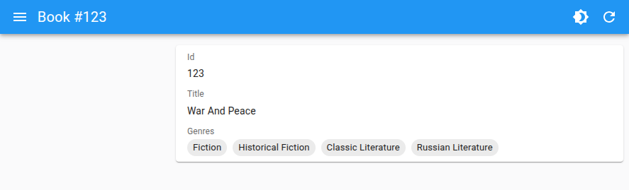
<TextArrayField> renders an array of scalar values using Material-UI’s Stack and Chips.
<TextArrayField> is ideal for displaying lists of simple text values, such as genres or tags, in a visually appealing way.
Usage
<TextArrayField> can be used in a Show view to display an array of values from a record. For example:
const book = {
    id: 1,
    title: 'War and Peace',
    genres: [
        'Fiction',
        'Historical Fiction',
        'Classic Literature',
        'Russian Literature',
    ],
};
You can render the TextArrayField like this:
import { Show, SimpleShowLayout, TextArrayField } from 'react-admin';

const BookShow = () => (
    <Show>
        <SimpleShowLayout>
            <TextField source="title" />
            <TextArrayField source="genres" />
        </SimpleShowLayout>
    </Show>
);
Props
The following props are available for <TextArrayField>:
| Prop | Required | Type | Default | Description |
|---|---|---|---|---|
source |
Yes | string |
- | The name of the record field containing the array to display. |
color |
- | string |
- | The color of the Chip components. |
direction |
- | string |
row |
The direction of the Stack layout. |
emptyText |
- | ReactNode |
- | Text to display when the array is empty. |
record |
- | RecordType |
- | The record containing the data to display. |
size |
- | string |
small |
The size of the Chip components. |
variant |
- | string |
filled |
The variant of the Chip components. |
Additional props are passed to the underlying Material-UI Stack component.
color
The color of the Chip components. Accepts any value supported by MUI’s Chip (primary, secondary, etc).
<TextArrayField source="genres" color="secondary" />
direction
The direction of the Stack layout. Accepts row or column. The default is row.
<TextArrayField source="genres" direction="column" />
emptyText
Text to display when the array is empty.
<TextArrayField source="genres" emptyText="No genres available" />
record
The record containing the data to display. Usually provided by react-admin automatically.
const book = {
    id: 1,
    title: 'War and Peace',
    genres: [
        'Fiction',
        'Historical Fiction',
        'Classic Literature',
        'Russian Literature',
    ],
};

<TextArrayField source="genres" record={book} />
size
The size of the Chip components. Accepts any value supported by MUI’s Chip (small, medium). The default is small.
<TextArrayField source="genres" size="medium" />
source
The name of the record field containing the array to display.
<TextArrayField source="genres" />
sx
Custom styles for the Stack, using MUI’s sx prop.
<TextArrayField source="genres" sx={{ gap: 2 }} />
variant
The variant of the Chip components. Accepts any value supported by MUI’s Chip (filled, outlined). The default is filled.
<TextArrayField source="genres" variant="outlined" />